How To Get A Logo Accepted: 8 Steps To A Better Design Workflow
On Dribbble, brand designers are in the minority. The greater part of the Dribbble community comprises those who deal with interfaces, UX and animations. So when traveling to Gdańsk, Poland last July to their first Dribbble Meetup, I expected to meet a similar audience. Indeed, there were mostly freelance web designers and multidisciplinary folks who have been asked to design a logo at least once.
However, I decided not to talk about how to create a good logo. You can find a lot of articles about how a timeless logo should look or the core characteristics of a good logo online. Instead, I focused on the process itself.
As logo and brand designers, our work starts long before the first concept sketches, and finishes long after the last perfectly placed pixel.
Our work requires so much more than just creative ideas and technical skills — it compels us to be a marketer, strategist, psychologist, salesperson, showman and project manager at the same time. It’s difficult, but it’s also exciting and challenging!
The goal of my article is to help you rethink your (logo) design workflow. Some of these tips are mine, others are borrowed from world-famous designers. All these tips and tricks are tested and proven, and are tailored to improve your workflow for (re)branding projects.
“By The Way, I Also Need A Logo.”
Ta-da! You’ve just got a web design project. A new product or service is about to show up on the worldwide market and needs your creative help. Then you asked for brand guidelines and heard, “Oh, we don’t have a logo yet. Can you create it?”
A moment of doubt (because branding is not your main area of business) and you reply, “Yeah, sure!”
Such an answer is quite common. Clients prefer not to split one project between several designers. However, the logo design process has its own characteristics. And its outcome depends not only on how meaningful and elegant the logo will be, but also on the workflow you have.
1. Explain Your Design Workflow
Whether it is a private client or an agency, when they hire you they are hiring your workflow as well.
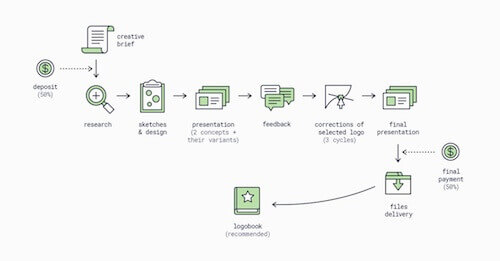
Your process is what enables you to do good work. It is a framework you have developed throughout your career and have been adjusting after every project.
Do your best to make your client understand and trust this process. Show them your process (visualized, of course) in the very first meeting and explain why it is so important to follow it. Set the number of logo options you will provide in the first presentation, the number of revisions and corrections, and what the payment and delivery milestones are.
A good client will respect your process as long as you keep it transparent.
2. Provide Your Client With A Creative Brief
My main advice at this point of the design workflow is to ask a lot of questions. Don’t be afraid to ask about anything, even if it seems off-topic. In the first meeting with a client, I always open with: “I will ask a lot of questions. Some of them may seem to have nothing to do with our project or not be necessary for the designer to know. But all this information is crucial. It will help me create an identity that expresses who you are and tap into your customers’ emotions.”
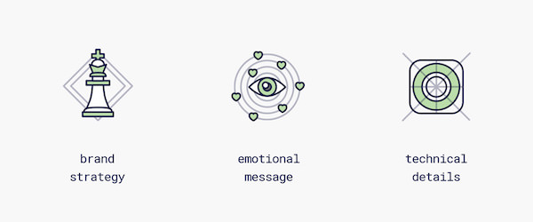
Questions To Ask About The Brand
- Who are you?
- What do you do, and why?
- What do you promise your customers?
- What is your unique selling point (“We are the only company to [provide this service]“)
- What is your story?
- What is your future?
- Who are your competitors?
- Who loves or may love you, and why?
- Are you going to influence the lifestyle of your customers and how?
- What emotions do you want to evoke in your customers?
Some of these questions are difficult to answer immediately. Ask the client to send you answers when they are ready, but don’t forget to mention that their responses are a part of the creative brief, and you cannot start working on a logo without them.
I have a brief template that I ask clients to fill out after our first meeting if they want to think about some of the questions a bit further. (Usually, this happens with the unique selling point – it’s not easy to explain why people will choose you in one sentence.)
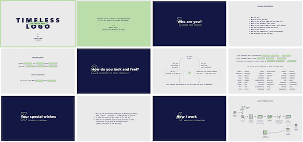
If you want to go further and increase your client’s engagement, run a small workshop!
I created a brand personalities deck of cards for this purpose. It consists of 24 cards showing 24 contrasting adjectives on each side such as young/mature, peaceful/rebellious, serious/playful, etc. It helps to define the core feelings that the client wants its customers to perceive when interacting with the brand.
3. Know How To Deal With Creative Clients
Did you ever experience a client sitting next to you while you work on their project? I did, luckily only two or three times in my career. (Having more than five years of studio/agency experience, I can say that I’m a lucky person.) These were our studio clients, so I wasn’t able to resist my boss and refuse to work in such close collaboration. And yes, when the clients left our office at the end of the day I got loud applause from the whole team. However, it was enough for me to set another rule for my creative process: do your best to engage clients in the process of brand creation. Make sure you understand each other. It also helps if you do all the corrections remotely.

How do we handle a situation when a creative client starts suggesting their ideas at the first meeting or while completing the brief? This situation makes a lot of designers roll their eyes, including me. But eventually I change my mind, knowing that collaboration with clients improves.
This doesn’t mean you should follow your client when they suggest, “Let’s do this.” Client ideas are a very valuable resource. It means they really care! And they want you to help.
That said, respect your client’s ideas. Listen to them carefully. Ask why they think it might be a good solution, even if you disagree. You should always assure them that you will take their idea into consideration and that you will work on it.
Normally clients won’t come up with an ultimate branding idea, but that’s no surprise: their job is to run a company, and yours is to brand it. What to do in this situation? Here are two tricks for you:
- Treat the client’s idea as a set of keywords and try to redesign it.
- Even if you know that the client’s sketches neither match the brand’s goals nor appeal to the target audience, include these logos in the first presentation and explain to the client why you won’t take their concepts further: “I really like your idea, but it won’t work for your business. Here’s why…” Be prepared with some robust arguments.
The final advice I’d like to give here: you should be very careful with clients who already have made a sketch on their own or by another designer and want you to turn it into a logo. You need to define yourself: are you a professional who suggests design solutions, or a technician with Adobe Illustrator skills? “What a question! Of course, I’m a pro,” you say. So feel free to reply to the client honestly:
“If you just want just vectorize your sketch, hire a design student. They will do it well and it won't cost you too much. But if you would like to hire me for this project, we will follow the complete logo design process. Of course, I will remember your sketch and will try to work on it. For now, without knowing all the project details, I cannot promise that it will be the best solution in your case and I will come up with other concepts.”
If your client agrees, your credibility as a designer is established. If not, then they were not the right client for you.
4. Start With Research, Finish With Research
Research is the essential and first part of any design process. Before starting to think about how a new logo might look, you should examine the design situation in your client’s business sector.
For example, you are creating a brand identity for a startup which has just created a new wearable for… let’s say, snowboarders. While filling out a creative brief, the client will write down only a few of their competitors. Usually these are local companies — in the same city, country or part of the world, depending on their target market and, of course, ambitions.
A few companies aren’t enough to get the complete picture. That is why you need research that goes beyond what your client provides. There are two research phases.
First, you should find logos of other companies in the same area of business (worldwide) — as many as you can. This is your first (market) research. Collect the logos on one slide and show them to your client: “Here is what your potential competitors look like”.
Sometimes a company name contains a noun that you can easily visualize with one particular image. Or the founders may ask you to test their idea, or to make an animal their mascot. That is the right moment for the second (creative) research: find as many logos as possible with this symbol. Thus, you will avoid repeating existing concepts. As Austin Kleon puts it: “Nothing is completely original.” Regardless of how unique your idea seems to you, there may be another designer who had the same idea before you.
I always repeat the same creative research to check my ideas before presenting them to a client. Once I’m ready with the two best logos, I list all possible keywords and search for them in these five places: Behance, Dribbble, Pinterest, Designspiration and Underconsideration.
Do you need to show all the research to the client? No. I always include market research in the first presentation to give the client a brief overview of the existing identities in their industry, and explain what a good case is and what doesn’t work at all. I leave the creative research for myself.
It sometimes happens that the client asks you to make amendments and unintentionally makes your concept resemble an existing design. Now is the time to pull a card from your sleeve: “Actually, I’d suggest not to go this way. Because then we will end up with a logo very similar to this one.”
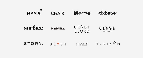
Such research protects both sides: you, from being falsely accused of infringement; and your client, from problems with trademark registration.
5. Create A Mood Board
A mood board is a traditional design tool. Clients don’t expect to see a mood board when they hire an independent freelancer. So here is an opportunity to surprise, impress and prepare your client for the presentation of logo concepts.
Why Use A Mood Board?
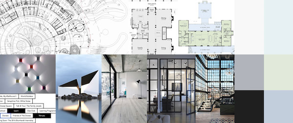
First, it shows the look and feel of the brand. It is an illustration of the client’s answer to one of the creative brief questions: “What emotions do you want to bring out in your customers’ minds?” Sometimes clients even ask to change particular images on the mood board or merge two mood boards into one.

Second, if done right, it puts your clients in a good mood before presenting them logo concepts. Have you ever heard of the “Three Yes” method of negotiation? This may be your first “yes”.
And finally, mood boards save you time and put you in control. Once a client has accepted the mood board, you may refer back to it if you see that design revisions and corrections have taken you away from where you aimed to go.
6. Present Designs Like An Ad Agency
Design doesn’t speak for itself, nor does design sell itself. These are great myths created by lazy project managers from big corporations, where designers are not allowed to speak to clients and where there are several presenters between you and a client. I used to be part of such a system. I escaped from there to a smaller software house.
Don’t wait for the client to understand the concept — take a lead in the presentation. Show what you have done and explain how these solutions will help the customer achieve their business goals.
The following tips will help you to run a more efficient presentation.
Make It Live
I always do my best to present first concepts in person, or on a Skype call, or a Google hangout. Why? Because you can control the flow, you can make additional comments and answer client questions immediately. Know the right order. Have you read The Presentation Secrets of Steve Jobs by Carmine Gallo? If not, I highly recommend it.
The most useful takeaway was the rule of three: people remember only three things from each list. Three is a magic number for persuasion. And if these items are quite big (like in the case of concepts), the order also matters. People remember the first position most easily, then the last position, then second, third, and so on. So when it comes to presenting concepts, put the best concept first, the second best at the end, and (if you present three concepts) the third in the middle.
How many logo concepts you present depends on you. I used to present three, but I found that refining a third option is usually just a waste of time. It is much better to choose only the two best solutions from those 30 ideas you brainstormed in the concept phase.
Show The Story
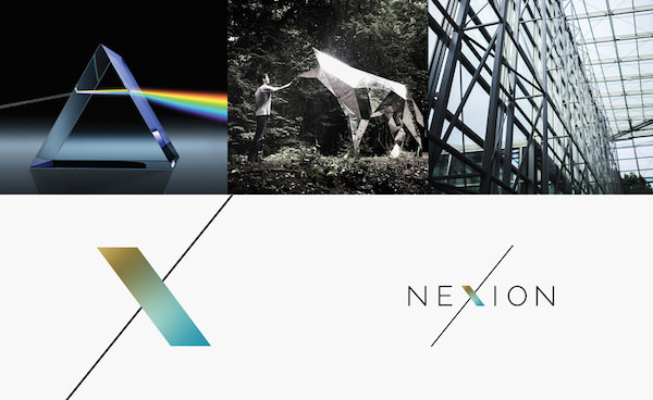
Do you know why people like peeking behind the scenes? How often do you get an “A-ha!” moment during making-of videos? It’s the same with logos. Don’t guide the client through the final design — they can already see it on the slide. Instead, take them to the roots of the concept. Explain why and how you came up with this idea. After all, you are not only creating an icon or logo, you are creating a brand story.

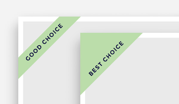
Use Badges
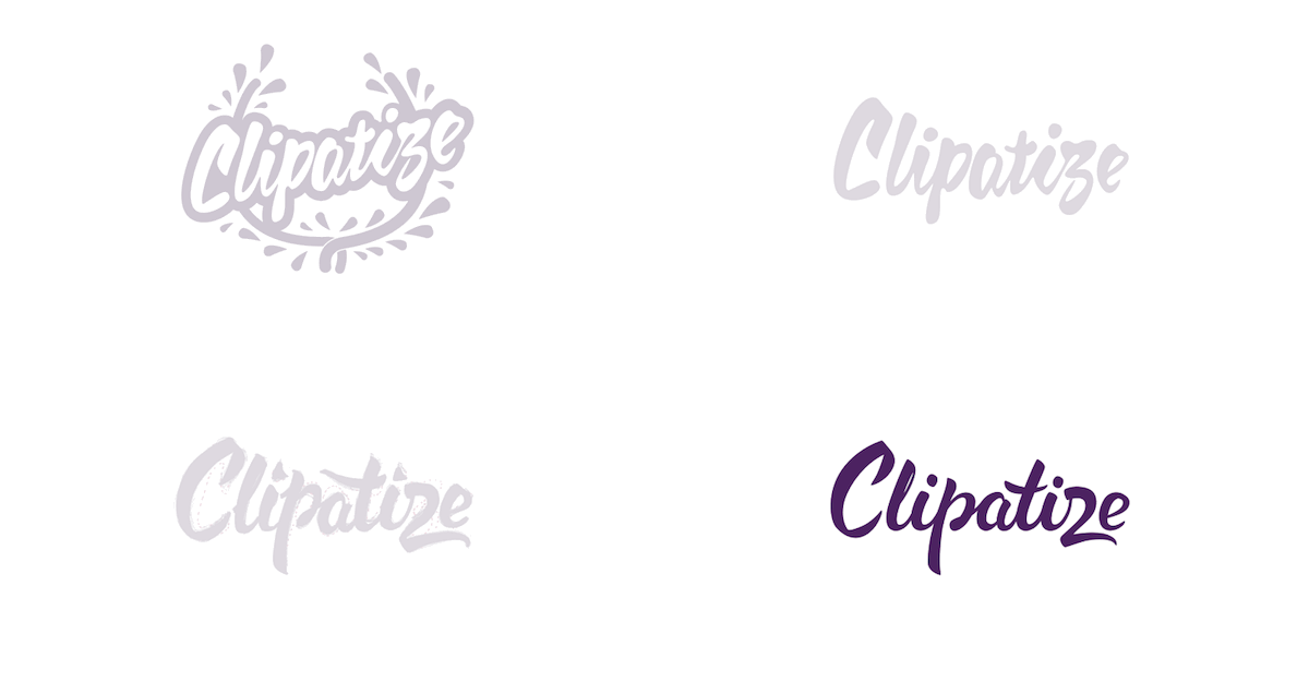
This works really well. How? Let’s imagine you have just finished a face-to-face presentation of logo concepts. You have expressed your professional opinion, which concept will work best for your client’s business goals, and why. The client will get back to you with their feedback in a few days, because they need to sleep on their decision. So when they are looking through your presentation the next day, they will notice these badges again and remember what your advice was.
Use The Right Kind Of Mockup
Mockups are very helpful, because people perceive the final product much more easily than a flat layout itself. But it is a pity to say that most designers use them in the wrong way. Why? There are two types of mockups: mockups for presentations, and mockups for portfolios.
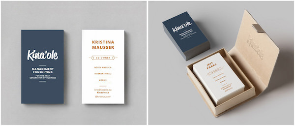
All these flying business cards, iPhones on the table shot at an angle are… nice, but they’re not for presenting concepts. Do you read the information on a business card when holding it straight in your hand or when it is lying on a table at a distance of one meter? Do you use your phone looking at it straight or holding it at an angle of 45 degrees? You get the idea. That is why it is better to use straight mockups in your presentation.
7. Mind The App Icons
I’m a big fan of wordmarks. But there is one disadvantage to such logos — it may be incredibly difficult to create a unique app icon from them. The situation is better with favicons, because favicons don’t need to be unique. App icons, however, must be unique (and preferably not be even remotely similar to icons in the App Store).
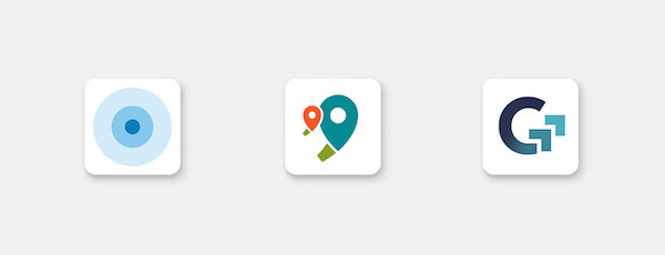

If you are creating a brand for a startup or service that will have an app, I advise you to go with a symbol plus logotype brand mark.
8. Think Big, Think Ahead
A logo is not a brand. (There is so much to say here. It’s a great topic for a whole new article series.)
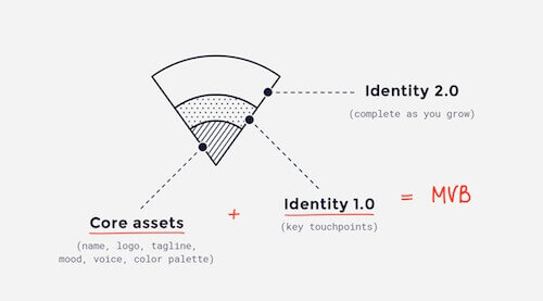
Yes, along with the name, the logo is the most valuable brand asset, but it is still only one of numerous elements in the brand visual identity system. When you create a logo concept, think about how the whole brand may look:
- Is it easy to evolve your idea? Or did you design a neutral (maybe generic) logo that leaves much space for new ideas?
- Can you create a living brand identity?
- What brand characteristics have you expressed in the logo and which are left to reveal in other assets?
How can you know who is going to work on this project later? Today you were asked to design a logo, but tomorrow you may be asked to continue with the rest of the assets.
Remember: Design Is A Job
We are not artists. We don’t express ourselves by designing things. We are passionate about design, but for us design is not just a passion. And it is definitely not a hobby.
It is our job. We make money by helping others achieve their business goals.
Always tailor your designs to project goals. Take responsibility for what you have created. Be confident in selling your concepts and be ready to hear any feedback.
Keep learning from your projects and continuously refine your design workflow. Remember that your design process is a reflection of your professionalism. It is a part of your reputation as a designer.
Further Reading
- The Design Matrix: A Powerful Tool For Guiding Client Input
- Designing With Your Clients
- Logo Design For Responsive Websites
- How To Design A Brand Logo (With Ease)


 Agent Ready is the new Headless
 SurveyJS: White-Label Survey Solution for Your JS App


