Isn’t it sweet? Mascots in Web Design
The more emotional a site design is, the more likely it is to evoke positive feelings within its visitors. To achieve a lasting impression, designers tend to use visual cues and offer some eye candy for hurried and hectic users. E.g. vibrant color schemes, photos and illustrations can be used to draw user’s attention to some specific site section.
But are there any further options? Yes, there are. Actually, mascots are traditional for sports competitions such as Football World Championship or Olympic Games. Mascot is a more or less nicely designed creature which is symbolic for something and is supposed to evoke sympathy and strengthen the sense of belonging to one single team.
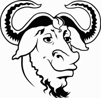
Heckert, a handsome wildebeest with typical beard and smart-looking curled horns, is the GNU’s mascot.
Today mascots are used almost everywhere — e.g. by a number of software applications, groups and communties. It can also support the corporate identity for companies and services. Consequently, they are also becoming more and more popular in web designs.
Further Reading on SmashingMag:
- 10 Awesome, Contemporary Character Designs
- Drunken Monkey Photoshop Tutorial
- The Personality Layer
- How To Get A Logo Accepted
What Do Mascots Look Like?
Animals and human-like creatures are used more frequently than some abstract creatures. The reason is quite trivial: users are more likely to associate their emotions with something they can easily recognize and find emotional binding to. Abstract creatures need to be studied and understood first. Most users don’t have the time and patience to do that. And that’s definitely not sometihng they are looking for in the first place. Still, abstract creatures are also possible.
As the carrier of positive feelings, mascots usually laugh and transport the feeling of joy, contentment and happiness. To leave a lasting impression, mascots have to look as cute, as sweet, as adorable, as pity and sometimes even as silly as possible. Unfortunately, most mascots have no names; however, having a name is rather usual for large communities as it can be easier referred to.
Some mascots are just hand-drawn illustrations, others are combined with a logo. They appear throughout the site and motivate users to some actions — e.g. to visit some site section or fill in the sign-up form.
Mascots in Web Design
A mascot can provide a site design with a fine and nice detail which the site would miss otherwise. This detail is used on private pages as often as in an online-shop or by a web-service. It’s important that the final mascot design is clean and fits to the overall site design. For instance, a laughing beaver doesn’t really help a site which tries to sell some underwater accessories.
We have collected a number of cute, well-designed and visually appealing mascots. The images are linked and lead to the pages from which they’ve been taken.
BobrDobr
Justin Bird — animated. Don’t forget to hover your mouse over the bird.
Stoodeo
Wishlistr
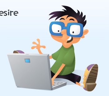
Brent Ayers
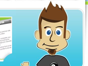
NetNova
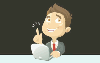
Netmaths
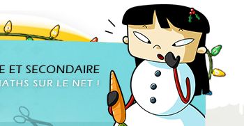
Kent Pribbernow
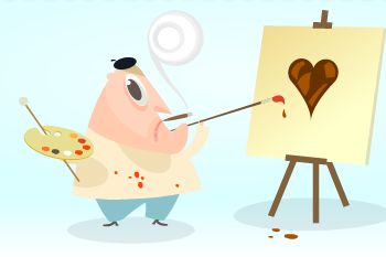
Cork’d
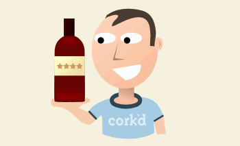
Freelanceswitch
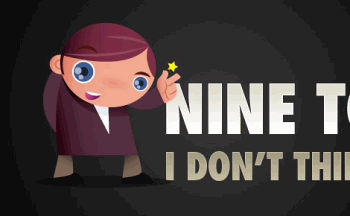
Octwelve
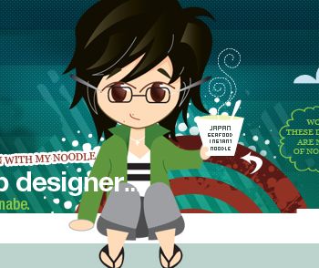
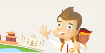
GlobalZoo
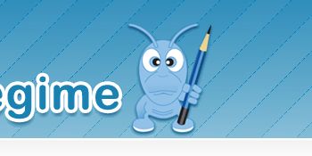
Nü Regime
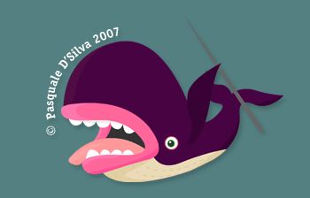
Pasquale D’Silva
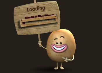
Potato Parade — Flash. This is an McCain’s advertisement.
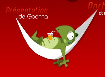
Goanna Webdesign (Flash)
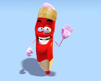
Crayons — animated.
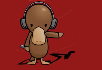
Outshouts
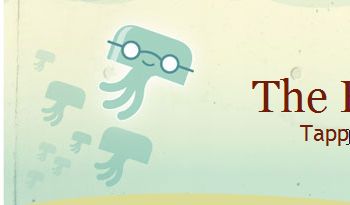
Fluther
Companion
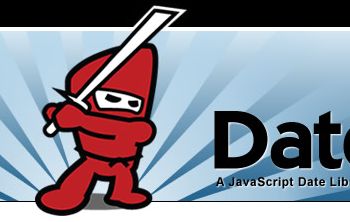
Datejs: Ninjas at work.
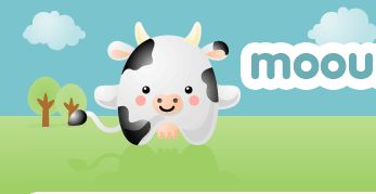
Mooourl — the mascot supports the logo.
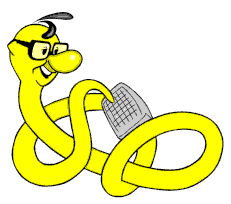
Dr. Web Magazin
MeinProf.de
Amiami Village
Sourcebench


 JavaScript Form Builder — Create JSON-driven forms without coding.
 Devs love Storyblok - Learn why!
 Register For Free


