Taking A Second Look At Professional Free Fonts
Once thought of as amateurish by professional designers, free and open-source fonts have gone through something of a renaissance in just the last few years. The quality of available free fonts has increased dramatically. To be frank, free fonts don’t have a good reputation, and often they are knock-offs of thoroughly crafted, already established typefaces. So is it time for professional designers to take a second look?
First, A Story
Early in my design career, around 2003, I wanted to purchase the font DIN for a project at work. My manager promptly dismissed the idea of paying for a font and instead handed me a CD that had “5,000 free fonts” on it, saying “This CD has every font a designer could possibly need. No need to waste money buying fonts!”
I popped the CD in my computer and found a collection of the most horrendous fonts you could imagine. Novelty and “retro” fonts. Spooky Halloween fonts. “Techno” fonts. Fonts with letterforms made up of cats posing in crazy positions. Fonts with terrible kerning, missing glyphs and wonky rendering. Fonts available only in single weights with no italics.
Nowhere to be found was DIN or, for that matter, any font that a professional designer would actually use. Feeling dejected, I ended up just using Helvetica because we actually owned that one.
Fast-forward to 2014. When I hear the words “free fonts,” I still can’t help but picture that horrible CD. But things have completely changed since then, and I find myself actually using free fonts quite often in my projects.
Where Do Free Fonts Come From?
In the past, free fonts typically came from one of two places: amateur designers who created fonts for fun or as a learning experience, and professional type designers who released a single variant of a font family for free as a form of marketing, the idea being that people would come back to purchase the full family once they realized the limited usefulness of a font without multiple weights and italics.
Why Is Having Multiple Weights With Italics So Important?
To set body copy properly, a font family requires four variants: normal, italic, bold and bold italic. A font used on the Web that doesn’t include these four basic variants will inevitably get the dreaded faux bold and faux italic treatment generated by the browser, which should be avoided at all costs — in fact, there are ways to avoid them for good. Other weights, such as light and extra bold, are helpful for creating typographic contrast between elements.
Free Fonts Are Not What They Used To Be
Recently, large companies such as Adobe and Google have been commissioning fonts for open-source projects and releasing them for free on the Web. Professional typeface designers have been getting involved in open source as well, sharing complete font families on Google Fonts.
Thanks to the open-source community, there are now free fonts available that even typography snobs would be happy to use. The following fonts all have multiple weights with matching italics. They are suitable for headlines as well as body copy, and they render well on screen and at small sizes.
Alegreya
Alegreya is an award-winning serif typeface, chosen by ATypI as one of 53 “Fonts of the Decade” in its Letter.2 competition. It is available for free on Google Fonts, but, sadly, most designers don’t seem to know about it. I hardly see Alegreya used anywhere online, which is a shame because this is a truly great font. Alegreya was designed with printed text in mind, but it is excellent to read on screen as well.
The designer, Juan Pablo del Peral, claims that just as much care and attention to detail was spent on designing the italic as the roman and it definitely shows — the italic style is especially beautiful. I hope more designers become aware of this excellent typeface and that we’ll see it used more widely on the Web in 2014.
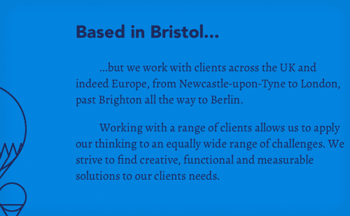
Beef uses Alegreya for the body copy on their website, giving it a stately appearance, which contrasts nicely with the use of Avenir for headings.
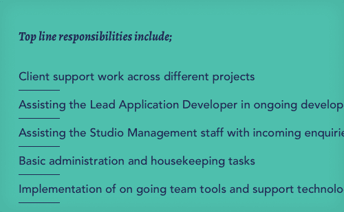
The beautiful bold italic style of Alegreya is used for a heading on Beef’s job section.
Source Sans Pro
Released by Adobe in August 2012, Source Sans Pro is Adobe’s first open-source font. Its designer, Paul D. Hunt, was inspired by early-20th-century gothics such as Franklin Gothic and News Gothic. To my eyes, Source Sans Pro feels much more modern, a little reminiscent of FF Meta. Its intended use is for user interfaces so it renders very well at small sizes. The font is available in an impressive 6 weights, making it extremely versatile.
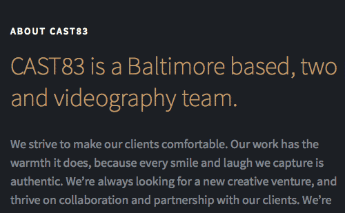
CAST83 uses Source Sans Pro throughout its website, showing off the diversity of the family; large headlines are set in the lighter weights, while the heavier weights are used at smaller sizes and set in uppercase, creating excellent typographic contrast.

Plentific uses the extra-light and normal weights of Source Sans Pro to create contrast between different levels of headings.
Open Sans
Designed by well-known type designer Steve Matteson and commissioned by Google, Open Sans is one of the most widely used open-source fonts on the Web. It is the default font for Zurb’s new Foundation 5 framework and is used on many of Google’s redesigned pages. I’ve even heard Open Sans described as the “flat design” font. The five weights with matching italics make this humanist sans-serif useful for a wide variety of situations
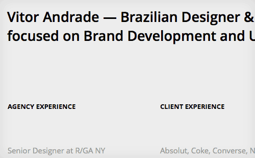
Vitor Andrade’s website uses Open Sans in a very understated way; the minimal, type-driven design doesn’t draw attention to itself, appearing very neutral and lending focus to the excellent work being featured on the website.
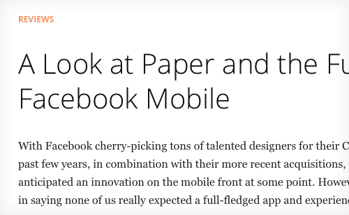
The light weight of Open Sans is used for the article titles on The Industry’s website.
Anonymous Pro
Anonymous Pro is a monospaced font that I’m surprised so few designers know about, considering it was designed by Mark Simonson, the type designer behind Proxima Nova. Monospaced fonts seem to be popular with designers at the moment, and Anonymous Pro is an excellent option.
Inconsolata is a much more widely used monospaced font, also available on Google Fonts, but doesn’t include italics, as Anonymous Pro does. Setting body copy in a monospaced font isn’t always a good idea, but in the right context it can give a design a very clean and refreshingly sparse feel.
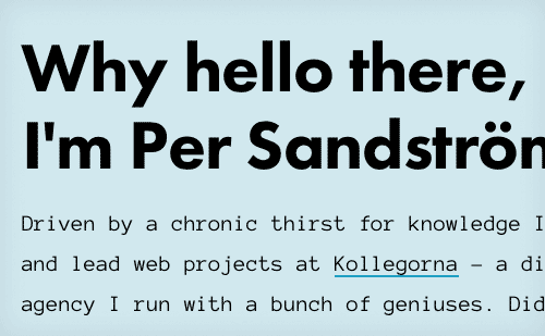
Per Sandström uses Anonymous Pro at a large size for the body copy on his website, where it works surprisingly well paired with Futura for headings.
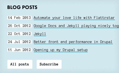
The bold weight of Anonymous Pro is used for the buttons on Per’s website.
Playfair Display
Playfair Display is a high-contrast serif designed by Claus Eggers Sørensen. Reminiscent of Baskerville, it takes its cues from the typeface designs of the late-18th century. Although designed primarily for titles and headings, the three weights with matching italics make it suitable for short stretches of body copy as well. For longer stretches of body copy, Playfair Display pairs very well with Georgia.
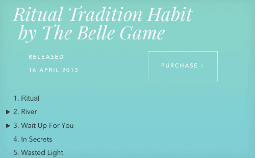
Playfair Display features a beautiful italic variant, seen in the headings on Boompa Records’ website.
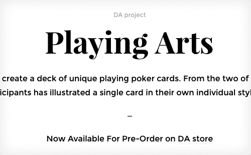
The bold weight of Playfair Display is used on the headings of Digital Abstracts’ website.
Roboto
Roboto has been accused of being a “Frankenfont” — a mashup of Helvetica, DIN and Myriad. I understand where the criticisms come from, but I quite like Roboto. Updates and improvements have been made to Roboto since that “Frankenfont” article, and I think the font works great on screen at different sizes and device resolutions, which is its purpose.
The font feels familiar, yet still possesses unique character the more you look at it. The Roboto family also includes a very nice slab version as well as a condensed version.
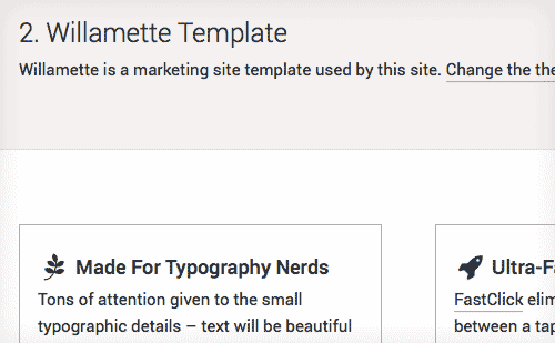
I use Roboto on my Type & Grids side project, and the font renders beautifully on high-density displays at small sizes.
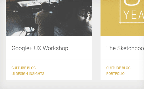
Paone Creative uses the light weight of Roboto on their blog section.
Lato
Lato is Polish for “summer,” and the name perfectly fits this warm-feeling sans-serif. The designer, Łukasz Dziedzic, originally designed Lato as a corporate font for a large client. After the client decided to go in a different design direction, Łukasz released the font for public use. Lato feels very modest and unassuming when set at small sizes in body copy, but the italic variant is distinctive and easily recognizable. Lato is used in WordPress’ latest default theme, Twenty Fourteen, so its popularity on the Web is sure to increase.
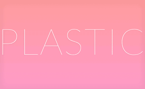
Frank Chimero makes elegant use of the hairline weight in his article “What Screens Want,” setting it in uppercase at a large size, which is needed for such a thin, delicate weight.
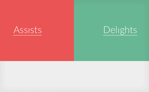
On AIGA’s “100 Years of Design” website, a customized “dotless i” version of Lato is used.
Merriweather
Designed by Eben Sorkin, Merriweather is a serif font created for on-screen reading. Its tall x-height and hefty serifs give it excellent legibility. Merriweather is under active development, and improvements are constantly being made. There is also a sans-serif version of Merriweather available that makes an excellent companion.
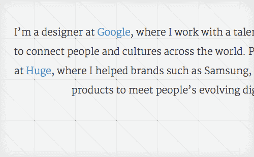
Dickson Fong uses the light weight of Merriweather, which gives his design an elegant look.
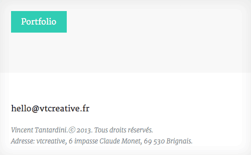
Vtcreative show off the light italic style of Merriweather in their footer.
Karla
Karla is a grotesque sans-serif designed by Jonathan Pinhorn that is full of character and quirks. Something about it reminds me of the trendy Apercu font. The tracking might be set a little wide for body copy, and some of the kerning can be a little wonky, but something about this font makes me overlook those downsides. This is a perfect font to add a touch of personality to your design.
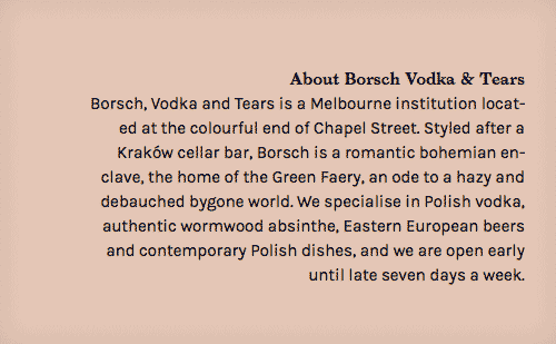
Borsch, Vodka & Tears use Karla for the short bursts of body copy on its website, and it works really well.
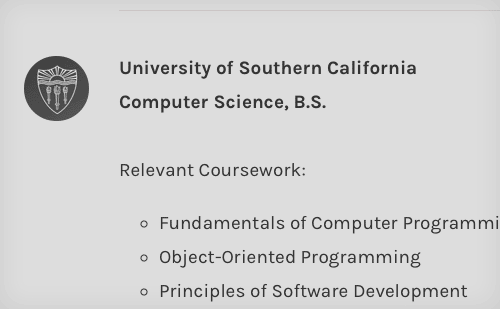
Kalyn Nakano shows off the normal and bold weights of Karla on her portfolio site.
Clear Sans
Clear Sans is Intel’s recent contribution to the open-source font community. Designed with on-screen legibility in mind, Clear Sans prides itself on its unambiguous character design. For example, the uppercase “I” has serifs added to distinguish itself from the lowercase “l”. This makes it an excellent choice for UI design work where clarity is key. Clear Sans is currently not available through Google Fonts, so designers looking to use this font will need to host it themselves.
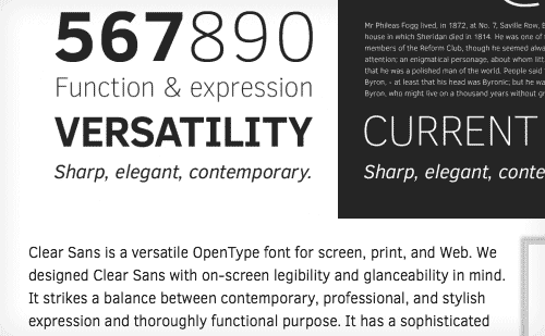
The delicate, light weight of Clear Sans is used for the body copy on the Clear Sans website.
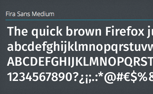
Fira Sans
Designed for the Firefox Operating System, Fira Sans was recently released as a free font available for public use. The font shares many similarities to FF Meta, which makes sense as Erik Spiekermann is the designer of both. It’s rare to find a free font created by such a renowned typeface designer. Fira Sans also includes a monospaced version called Fira Mono. Interestingly, the web font used on the official Fira Sans page is Open Sans, not Fira Sans. You’d think Mozilla would want to show off their new font on their site.
Other Free Fonts Worth Checking Out
Don’t Rely On Free Fonts For Every Project
As nice as the fonts above are, designers shouldn’t rely entirely on free fonts. Free fonts will never match the quality of the fonts offered by top type design foundries. Budget for professional fonts in every project when possible. Type foundries need the support of the design community to continue innovating and producing excellent fonts.
That being said, if a project requires free fonts, whether due to budget constraints or other reasons, then rest easy knowing that an ever-growing selection of professional-quality fonts are available at your disposal. I continually update a curated list of open-source Web fonts in my side project, Typewolf. You can also follow me @typewolf and check out my other side project, Type & Grids, which uses many of the fonts featured in this article.
Designing a typeface requires a lot of time, patience and very hard work, and type designers should be rewarded for their work. So if you decide to use a free font, please always make sure to support type designers by purchasing the other fonts that they created or donating to support their efforts.
Further Reading
- Free Fonts With Personality
- Avoiding Faux Weights And Styles With Google Web Fonts
- 40 Delightful High-Quality Free Fonts
- The Best Free Fonts for Designers
Front page image credits: Vitor Andrade.


 SurveyJS: White-Label Survey Solution for Your JS App
 Agent Ready is the new Headless