7 Essential Guidelines For Functional Design
Look at what you’ve made. Beautiful, isn’t it? But does it work? For whom does it work? Of course you can use it, but can anyone else? In short, is it functional?
At the heart of every piece of practical design, whether it be a website, product package, office building, manufacturing system, piece of furniture, software interface, book cover, tool, or anything else, there is a function, a task the item is expected to perform. Most functions can be achieved in a variety of ways, but there are some basic elements a designer needs to take into account to create a product that best fulfills its intended function.
These are the elements of functional design, the process of responding to the needs or desires of the people who will use an item in a way that allows their needs or desires to be met. Functional design is both an outcome and a process. As an outcome, it describes products that work well to perform their assigned tasks; as a process, functional design is a set of practices guided by the principles that produce that positive outcome. (Functional design is also a computer modeling technique, but that’s not what we’re discussing here.)
You may want to take a look at related articles:
In order to create a product that works, there are seven questions you should keep in mind about the product you’re designing, who will be using it, and how they’ll be using it.
1. Consider the product’s goal
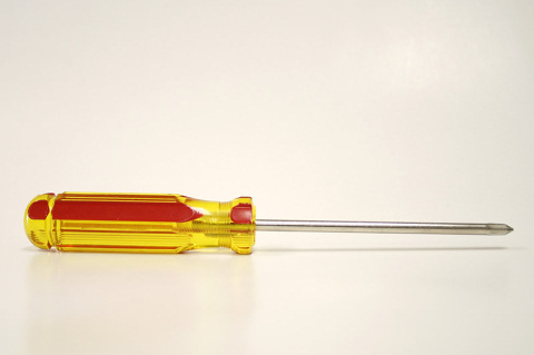
Consider the screwdriver. The goal of a screwdriver is pretty straight-forward: to drive screws. Although there’s certainly a lot of room for innovation in screwdriver design — there are screwdrivers with more ergonomic handles, ratchet-assemblies, magnetic tips, and exchangeable heads — ultimately everything in a screwdriver’s design is aimed towards the accomplishment of that single goal: driving screws.

Ultimately everything in a screwdriver's design is aimed towards the accomplishment of that single goal: driving screws. Image source.
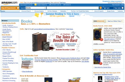
Now, consider a website like Amazon.com. What is the goal of Amazon’s website? Amazon has a lot of different uses, some intended by Amazon and its designers and some not intended — you can look up reviews, compare product prices while you’re in a store considering a purchase, promote your brand by leaving lots of reviews, scam shoppers by creating fake storefronts, collect images of book covers for a school project, search book text for half-remembered quotes, and so on.

For the folks at Amazon, the website has one purpose: to sell stuff. All the features that allow those other uses were put in place as ways to sell more products.
But none of those are the reason the site was built. For the folks at Amazon, the website has one purpose: to sell stuff. All the features that allow those other uses were put in place as ways to sell more products. (And it seems to be working!)
2. Consider who will be using it
Perhaps the single most important consideration in the design process — and the one most often forgotten — is the intended audience for the product. What works perfectly well for one user might be completely dysfunctional for another. And if the hoped-for users fall more into the second category than the first, you’ve got a problem.
Think about the way your parents or grandparents use their computers. Anyone with a bit of tech-savviness has probably fielded dozens of “tech support” calls from family members who are simply baffled by things like adding an email account to their email program, downloading family pictures from the Web, or dealing with a too-full hard drive.

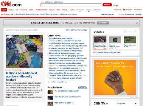
Since CNN's web-site is supposed to be used by huge and versatile audience, it has to work equally well for all its potential users if it's to accomplish its goal.
Why do people have so much trouble with their computers?
- They don’t know enough about how computers work.
- They don’t have enough experience with computers.
- They don’t have time to figure things out.
- They don’t enjoy tinkering until they find a solution to a computer problem.
- The manuals are written in a dense, uninviting language that they find boring and difficult to comprehend.
Considering the kinds of problems they have can give us a clue about the kinds of questions designers should be asking about their audience.
- What kind of knowledge do your users bring with them?
- How much experience do they have?
- What kind of time do they have? Are they looking for a leisurely diversion or do they want to get in and out fast?
- What kind of personalities do they have?
- How much support will they need, and what form should it take?
Obviously there are likely to be several audiences for any given product. Plenty of computer users have the knowledge, experience, and personality types to easily do whatever they choose to do on their computers. If you’re designing a niche product — a website for Linux users, for example — perhaps you can get away with directing yourself towards only one, narrow audience. In most cases, though, a product has to work equally for all its potential users if it’s to accomplish its goal.
3. Consider what your audience intends to do with it
As we saw in the case of Amazon.com, there are a lot of ways that users use a product besides those that directly fulfill the product’s main goal. In fact, every user comes to a product with his or her own intention — and they are rarely the goals that designers have in mind. For example, nobody in the history of humankind has ever wanted to record what was on channel Three between 9 pm and 10pm on Thursday the 27th — yet for years that was how VCR designers insisted we program our VCRs. No surprise, then, that few people programmed their VCRs.
Instead, what people want to do is record House tomorrow night. Likewise, your dad doesn’t want to configure his POP3 and SMTP settings. He doesn’t even want to send and receive email. He wants to send pictures of the baby to Aunt Jill in Iowa. Engineers and designers have long suffered from a tendency to substitute concrete specifications and processes for fuzzy user behaviors — but users don’t do that.

Engineers and designers have long suffered from a tendency to substitute concrete specifications and processes for fuzzy user behaviors — but users don't do that.
Adequate knowledge of who your audience is requires some sense of what their intentions are and how they are going to think about your product. That’s what Tivo did when they replaced the complicated process of recording a show on a VCR with a process that better reflected their users’ intentions — just select a show you want to record and hit “Record”.
4. Is it clear how to use it?
The best design, as often said, “speaks for itself”. It is immediately clear — at least to its target audience(s) — what a product does and how to use it. Clarity is key to functional design. Probably one of the best-designed objects in the world is the ball. With minimal instruction, even infants can use it!
In contrast, look at the website above. That’s the home page for Chipotle, the Mexican fast food restaurant known for its use of free-range, organic, and locally-grown ingredients. Not that you’d know that from the homepage. What you know is a) they have a logo, and b) there’s something you should know about jalapeño peppers. If there were no food scare involving jalapeños, you’d see only the logo. What do you do? We can assume the site has a goal — probably to get you to buy some tasty Mexican food — but how do you, the visitor, fulfill your own goal of finding what you want to know about Chipotle?
This is a classic example of what Vincent Flanders calls mystery meat navigation (presumably free-range, organically-grown mystery meat), a website navigation system so clever, so stylish, that visitors have no idea what the site does or how to do it. Make your product difficult enough to understand and it won’t get used at all — which means it doesn’t achieve its goal, which in turn means it doesn’t function.
5. How does your user know it’s working?

Remember in the Bad Old Days of the Web, when you’d make a purchase online and the “Submit” button would say underneath something like:
Please press the “Submit” button only once. Pressing more than once will duplicate your purchase.
We’ve come a way since then, but it’s surprising how many times you still come across a website feedback form that doesn’t tell you when your message has been sent, or a search form that doesn’t tell you that it’s working on your request.
This problem is by no means limited to the online world. How often do you double-check to see that your alarm clock is set to go off, and at the right time, before you can relax and go to sleep? Or maybe you’ve run into this problem: you hit “Program” on your CD player (assuming you still have one) and key in the tracks you want to hear, but aren’t sure whether to hit “Program” again or just hit “Play” — and if you hit the wrong one, whether your program will be lost and you’ll have to re-do it.
These are all examples of inadequate feedback — it’s not clear whether you’ve completed the task you inteded to do or if there are more steps still required. While technically a product is functioning even if you don’t know it’s working, it’s not functioning well from the user’s standpoint — and products that don’t function well tend not to create very loyal users.
6. Is it engaging to your users?
One of the great products of recent years, at least in terms of engagement, is the Blackberry. Blackberry owners can’t stop fiddling with their devices — they check their email, flick the trackball around, check email again, send a text, scroll around the home screen, and then do it all over again. And again.
It’s no accident it’s earned the nickname “Crackberry.”

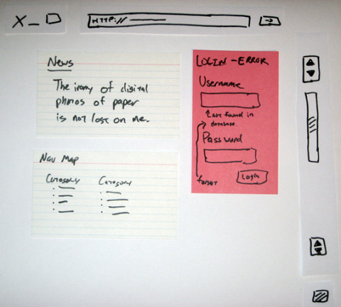
Usability testing and paper prototyping are common methods to understand the way your target group will interact with you web-site and find out if it is engaging to your users. Image source.
Good design draws users in, whether through visual appeal, feel, ease of use, or sheer amazement. Anyone who has ever picked up a well-made hand tool and felt the desire to build something has experienced this — the tool just feels right.
This is, in part, the aesthetic value of the design — we are naturally drawn to things we find pretty. But aesthetics are hardly the limit of what makes something engaging. There are plenty of websites out there that are downright hideous — but they work. Those long-form sales pages that litter the Web hawking “get rich quick” programs and miracle cures (like this landing page which won the SEOmoz landing page contest last year) are as ugly as human ingenuity can make them — but they consistently succeed in leading visitors (at least the kind of users that the pages are designed for) to the inevitable sale.
7. How does it handle mistakes?

How often have you visited a web page, realized it didn’t have the information you were looking for, clicked the “Back” button, and ended up on the same page again?
You made a mistake, to be sure — you clicked the wrong link — but that happens. It was the designer, though, who decided to make your mistake difficult to undo. Good design takes into account the possibility that users make mistakes.
Unless your only desired user is a member of that very small demographic of people who don’t ever make mistakes, your design should accommodate and even anticipate mistakes as much as possible. Web designers have come up with all sorts of ways to accommodate visitors’ mistakes, from persistent menus and “breadcrumbs” to 404 pages (“Page Not Found” pages) that link to the pages the websurfer was likely to have been looking for.
Designers who don’t make room for — and offer solutions to — users’ mistakes create non-functioning products.
Conclusion
Design is necessarily a relationship between users with problems to solve and designers with solutions to offer. Too often, though, users are left out of the designer’s considerations. Whoever designed the Chipotle site, for instance, had no conception of how any part of their target audience would approach the site. They had a clever idea — “it’s minimalism, man!” — and ran with it, to the detriment of potential diners, and possibly to the detriment of Chipotle.
Unless your specialty is creating concepts that have no possibility of being made into actual products, the ultimate goal is to design things that will be used. Think about how and why your product will be used, and by whom, as a central part of the design process to assure that your designs not only can be used, but will.


 Build skills. Boost ROI.
 Check the frontend report!
 Click here to kickstart your project for free in a matter of minutes.
 Start with a free demo —

 Sponsor OWD on GitHub

