Designing With Your Clients
We have all known the pain of a client interfering in the design process. Phrases like “Make the logo bigger” and “Put that above the fold” have become a running joke in the web design community.
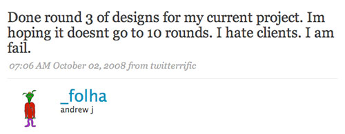
It is not unusual for web designers to lose money on a project as a result of the client endlessly iterating on the design. After a few bad experiences, we start to exclude the client from the process. We limit their number of iterations and avoid consulting with them.
Unfortunately, this often makes interaction with the client even worse. Each iteration then becomes more important in the client’s mind, so they interfere even more, creating a vicious cycle.
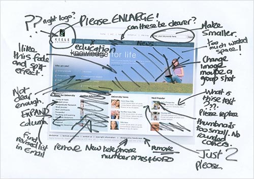
There must be a better way — a way that enables you to produce outstanding design and maintain your profit margin.
The answer lies in involving the client in the process, rather than excluding them. It involves collaborating with the client to produce a design.
Why You Should Collaborate On Design
The idea of allowing the client greater involvement in the design process may sound terrifying. All of those uninformed suggestions! All of that endless tweaking! How could that lead to better design, let alone any profit for you?
A big part of the reason comes down to psychology.
The Psychology Of Client Behavior
Why do clients interfere in the design process? Why do they not trust your judgment?
Much of the time, it is because they are afraid of the unknown. They are not experts in design or the web. They feel out of their depth in the process, and so they attempt to gain some measure of control. The more we exclude them or resist them, the more concerned they become and the more control they try to exert.
After all, you want them to sign off on the design. This means that they will be responsible if it fails. Their job, their reputation in the company, are on the line.
What’s more, they have to live with the consequences of your design. You get to walk away, but they have to live with that design for years. It’s not surprising, then, that they want it to be right, that they will worry about the process.
By collaborating with them on the design, you accomplish two things: You give them a sense of control, and you educate them about the design process. This allays their fears because the process will no longer be unknown to them.
If the client has helped to create the design, they will not only worry less, but will have a greater sense of ownership over it and will be less likely to reject the result. They are also more likely to defend it when they show it to colleagues. The client shifts from being a critic of the design to an advocate.
But it also makes your job easier, too.
Collaboration Is Better For The Designer
As designers, we care about two things: producing high-quality work and making a profit. Working with a client on a design enables us to accomplish both.
Clients will spot problems early on if you involve them. We have all worked on projects in which the client moves the goal posts at the last minute. They are not trying to be a pain. They are just learning as they go, and sometimes ideas occur to them later because they haven’t spent much time with the design.
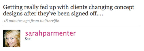
If they are engaged in the process, they will think about the design more and, consequently, will spot problems earlier. It also means you will have to do fewer iterations.
Iterations happen for a few reasons: because the client has a different vision and failed to communicate that; because the client is afraid of getting it wrong; or because they want to put their mark on the design. All of these issues go away when you work hand in hand with the client.
Hopefully, you are now convinced that collaboration is worthwhile. But how do you make it happen?
How To Collaborate
Let’s be clear. Collaboration is not about the client sitting next to you while you work in your design application of choice. It is not about reducing you to a pixel-pusher.
In an ideal world, it does involve you sitting in the same room as the client, showing them things as you work, getting their feedback on a grid structure, navigation layout or color scheme as you play with it.
It’s like that constant dialogue you have with people on “your team.” You should treat the client as part of that team.
Unfortunately, working with the client in their office is not always an option. So, what else can you do?
You probably held a kickoff meeting with the client, in which you covered things like business objectives, target users, etc. But discussion of design is often limited to, “What other websites do you like?” That is just too superficial. What if we use this time instead to run a couple of workshops?
Design boils down to two areas: aesthetics and structure. Let’s look at what you can do in your kickoff meeting to involve the client in these two areas.
Collaborating On Aesthetics
Aesthetics are subjective. People fall back on personal opinion if given no other framework within which to judge a design. A workshop on aesthetics gives you an opportunity to provide that framework. It also gives the client a sense of ownership over the aesthetics.
Teach the client to judge aesthetics according to two criteria:
- Will the user like it?
- Is it in line with the image that the company wishes to project?
We can do this through three exercises.
The Famous-Person Discussion
Ask your client and any other stakeholders in attendance one simple question: “If your organization were a famous person, who would it be and why?”
Without fail, this question always leads to passionate discussion. Out of the suggestions will emerge a set of words that represent the people discussed. You can use these to shape the aesthetics of the website. And you can refer to them when asking for feedback on the design later.
Having a tangible personality to work from will also help you design. Designing a website that represents somebody like Barack Obama is easier than designing from a list of vague brand values.
Design A Reception
Another way to dig into how an organization wants to project itself is by asking stakeholders to imagine the organization’s perfect reception area. The series of questions you might ask include:
- How big would it be?
- What would be on the walls?
- What signage would you have?
- What furniture would be there?
- What music would be playing?
- What would be on the coffee table?
- Would there be a receptionist?
This will get the client thinking about design without dictating the specifics of the website. As with the famous-person exercise, you can refer to this exercise when creating the design and asking for approval.
The client is less likely to reject a design that reflects the elements of this exercise — elements they chose, elements they feel committed to.
User-Focused Moodboarding
The final aesthetics exercise is collaborative moodboarding. The idea is to focus the client on the aesthetic tastes of their audience.
Ask them to create a moodboard of things that their target audience would like. To get them started, focus them on:
- color (using a tool like Kuler);
- typefaces (using Google Fonts);
- style (by exploring a website like Design Meltdown);
- imagery (using Flickr or Google Images).
Getting them to produce more than one moodboard might be necessary if they have different audiences. This will not only improve the design, but also help the client think about users’ needs.
However, focusing the client on aesthetics is not enough. We also need to engage them with the website’s structure.
Collaborating On Structure
One of the big challenges for a designer is balancing user needs with business objectives. The solution is to put emphasis in the right places.
Designs are often rejected by clients because they focus on the wrong aspects of the business or on the wrong audience — or sometimes because they focus at all! (Some clients just hate to prioritize.)
Fortunately, three exercises will help you to focus. This will save you a lot of revisions because the client will have already agreed on the focus.
Design A Book Cover
A book has a front cover, a back cover and an inside flap. The front cover makes the first impression; the back cover provides more detailed information; and the inside flap goes into even greater depth.
You can use this hierarchy to help the client prioritize their messages. Ask them to design a book that communicates the core messages of their organization. What would appear on the front cover? What do you most want people to know? What would appear on the back cover or inside flap?
By completing this exercise, the client will start to focus their messaging, and you will better understand the organization’s core messages.
The User Points Exercise
Given the chance, clients will cram their home page with as much information as possible. To educate them about why this is a bad idea, I run a user points exercise.
It begins by showing them Google and Yahoo’s home pages. I ask which is more effective, and they always say Google’s. I explain that this is because Google has focused the user’s attention on a single thing: the search box.
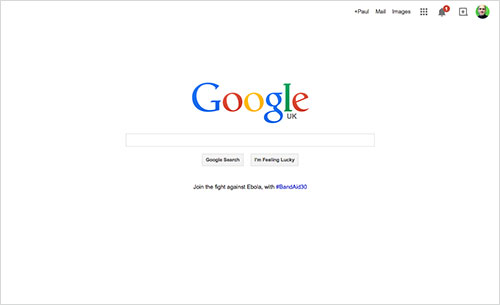
I go on to talk about the limited attention span of users. In this exercise, you would represent that attention span as 15 to 20 points (depending on how generous you’re feeling).
Each element that the client adds to their imaginary home page costs one point. If they want to place more emphasis on an element (as Google does with its search box), then they would have to add more points.
This exercise helps them to understand the tradeoffs you need to make as a designer. It also highlights the importance of prioritizing what we want the user to focus on.
The Six Versions Exercise
The final exercise I do with clients helps them to understand the many options available to them and encourages them to set a firm direction.
The exercise is simple. Ask stakeholders to sketch six different approaches to the home page. This could be a series of scribbled boxes representing the header, news, footer and so on.
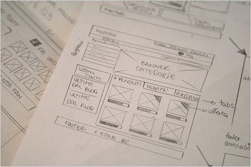
The client will do two or three and then start to struggle. At that point, you might want to prompt them. Suggest that they consider what the home page would look like for different audiences. Or suggest emphasizing different calls to action.
This could lead to an interesting discussion, one about the emphasis of the website and how the design could fulfill its requirements.
Yeah, But…
No doubt, this article has left you with concerns. Working collaboratively with clients does come with risks, particularly the risk of losing control or having to deal with impractical suggestions. But with careful planning, you can mitigate these risks.
As you work more collaboratively, you will learn how to deal with these dangers. You will discover that you are less likely to lose control if you focus the client on identifying problems.
When a client suggests a solution, you have to either accept it or reject it. You are stuck between losing control and alienating them. But if you get them to talk about a problem that they’ve perceived, then you can suggest a solution. This keeps you in the driver’s seat.
You will also come to appreciate wish lists for future development. Wish lists help to put off impractical suggestions, encourage continual development and secure future work.
Even at its worst, collaborative design will save you hours in iteration and lead to happier, more engaged clients. Sure, it has some dangers, but nothing worse than the dangers you are already dealing with.
The only way you will learn to deal with these dangers is by giving it a go. Yes, you will make mistakes. But, in time, you will find that your projects become much more pleasurable experiences, for both parties.
Further Reading
- Choosing The Right Prototyping Tool
- How To Identify and Deal With Different Types Of Clients
- Guidelines For Mobile Web Development
- Client Experience Design


 Agent Ready is the new Headless
 SurveyJS: White-Label Survey Solution for Your JS App


