Improve Your E-Commerce Design With Brilliant Product Photos
Product photography could well be the single most important design aspect of any e-commerce website. Without the ability to touch, hold, smell, taste or otherwise handle the products they are interested in, potential customers have only images to interact with. Ultimately, the softer, tastier, flashier and more attractive your products look to shoppers, the more confident they’ll feel about purchasing from you and the better your conversion rate will be.
While any product can look great in a photo (sometimes deceptively so), keep in mind that your images should match your website’s overall aesthetic and your company’s image. Let’s start with a few great examples of how online retailers have incorporated high-quality product photos onto their websites. In this article, we will focus on images of actual items, rather than models, events or landscapes.
Also consider the following related articles:
- How To Use Photos To Sell More Online
- 50 Incredible Photography Techniques and Photo Tutorials
- 50 Excellent Digital Photography Photoshop Tutorials
- Design To Sell: 8 Useful Tips To Help Your Website Convert
Examples Of Beautiful Product Photography
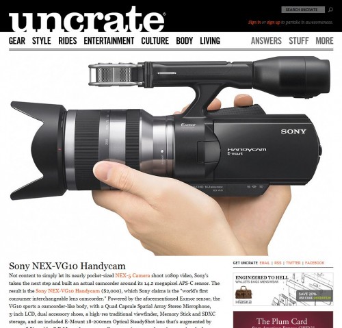
Uncrate Uncrate is probably the best-looking men’s shopping blog, and a lot of the credit goes to the product photos in its posts. One of the criteria for its blog posts seems to be for product photos to be incredibly well shot. This is a great place to get inspired for your own product photography project.
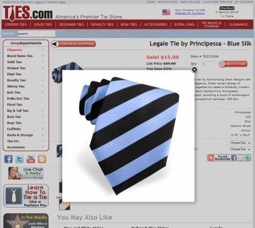
Ties.com Ties.com has years of experience with dress-tie photography and has improved the quality of its photos over the years. Now it uses a lightbox effect to offer close-ups of its ties. The layout of the website is similar to that of Amazon. As with any website of this nature, super-clear photos are essential to compensate for the customer’s inability to feel the ties.
Made.com Turning to furniture, UK website Made.com does a great job of showing its products from multiple angles and perspectives without cluttering the website or making the images feel redundant. Its lamps, for example, can be viewed up close or at a distance within the same frame, while its tables and desks can be viewed from both eye level and low angles. Again, the selective use of color throughout the website directs attention to the products themselves, while giving the overall design a sleek minimalist feel.
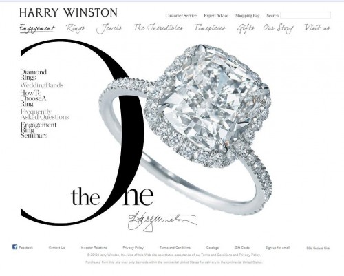
Harry Winston High-end jewelry website Harry Winston emphasizes the brilliancy and luxury of its products by integrating them in a relatively stripped-down website. The sharp, vibrant images of colored gemstones and sparkling crystals command the viewer’s attention on every page, without overpowering the other elements of the design. The brilliant reds, greens and oranges of these products contrast with the neutral black, white and gray color scheme, while complementing the refined cursive and rolling script scattered throughout the website.
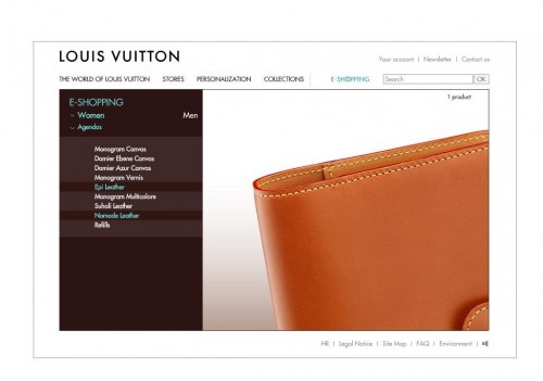
Louis Vuitton Another up-market website, Louis Vuitton also uses wonderful high-res product shots and zooms for its non-clothing items, such as calendars and wallets. While this website predictably has numerous photos of models posing with the products in lifestyle and fashion vignettes, it also does an excellent job of emphasizing the craftsmanship and quality of its items.
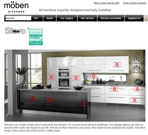
Moben Kitchen designer Moben has a much busier website, using pictures and videos of its products in various locations. The photos here show potential customers the innovative design and style of these products in a unified setting, while still offering detailed shots of individual items. This is a great strategy for e-commerce companies that sell large products or that sell services that are difficult to visualize.
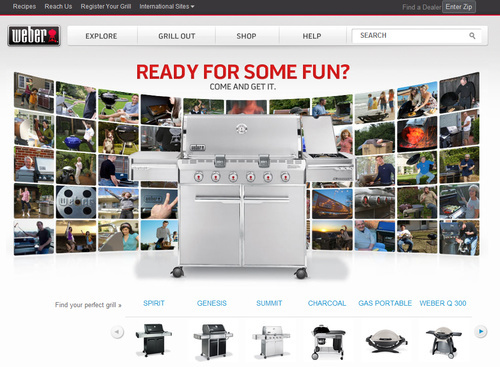
Weber Moving out of the kitchen and into the backyard, Weber, a well-known maker of grilling and other cooking equipment, has a fine product photography area on its website. The website itself is pretty basic, as you might expect, without much in the way of attractive text or icons, but the sharp images and high-quality close-ups add a lot of visual appeal. If nothing else, this is a good example of how good images can help a website overcome a mediocre design.
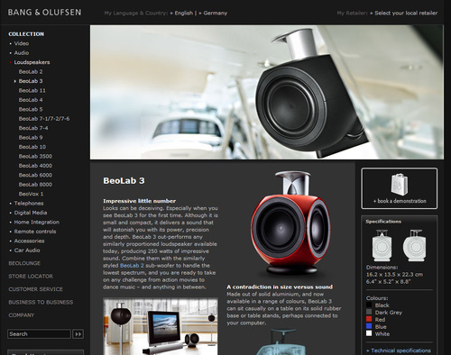
Bang & Olufsen Turning to a website that at first glance seems a bit less inviting, audio-video manufacturer Bang & Olufsen opts for a harder, more architectural aesthetic than some of the other websites we’ve looked at. While there is plenty of black, gray and white throughout, this website is far from cold and sterile, thanks to the side-sweeping product photos, which are bright but do not compromise the futuristic feel of the design. The pages of Bang & Olufsen’s collection have another nice touch: product thumbnails glow when you hover over them.
Leica As you might expect from one of the world’s biggest names in photography and imaging technology, Leica has some high-quality images, especially of its camera equipment. You won’t find a ton of photos here, but in keeping with the brand’s no-frills, no-nonsense approach, the pictures you do see are high-res and sharp, a perfect example of how to do more with less.
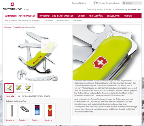
Victorinox Another brand known for precision equipment, Victorinox has an impressive range of visual content on its website, especially in the product area. The sliding photo gallery in the “Timepiece” section, for example, captures both the mechanical and aesthetic beauty of the brand’s watches: you can really imagine how it would feel to hold and wear the watch, while still being able to see the complexity of its internals. The website is also notable for its great examples of selective focusing and dramatic lighting, which really make the products eye-catching.
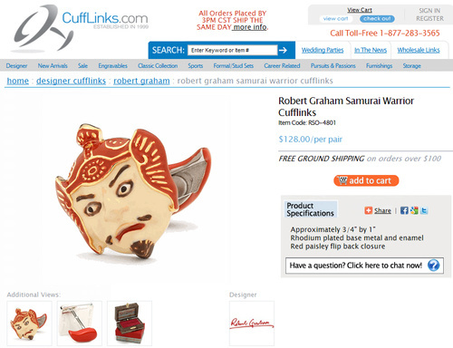
CuffLinks.com CuffLinks.com clearly puts effort into photographing its vast selection of cufflinks. It offers customers a good view of its cufflinks from all angles. It also shows the packaging or box that the cufflinks will ship in, giving us a well-rounded impression. Fortunately for this company, the size and inflexibility of cuff links make them a relatively easy product to photograph. Take a look at their many other products and the different angles the shots have been taken from.
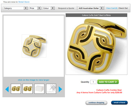
Ties ’n’ Cuffs Ties ’n’ Cuffs is another e-commerce store with a large selection of cufflinks, ties and other accessories. Like CuffLinks.com, it offers a handful of photos for each product. But Ties ’n’ Cuffs lets customers also zoom into its cufflinks, giving a super-clear picture of product details that one might miss in a wide shot and showing how the crystals reflect the light. Browse around this website to see how they’ve implemented their zoom function for many different products.
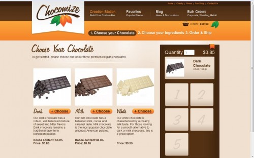
Chocomize Chocomize lets chocolate lovers make their own custom chocolate bars by allowing them to select from a variety of ingredients. Here is a great example of using photos for products that offer a high degree of customization, without bogging down viewers with too many choices and images. The pictures on Chocomize—bright, glossy piles of candy, nuts, berries and decorations that can be added to a milk, dark or white chocolate base—are relatively uniform in size and shape yet distinctive enough to be unique and noticeable. It also has detailed photos of each ingredient.
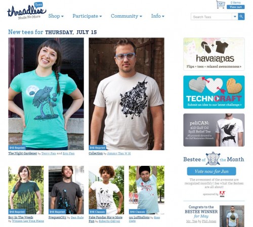
Threadless.com The t-shirt giant Threadless.com has a particular culture, and it has done a great job of keeping that culture intact with its photos, while still keeping the product itself front and center. Check out the many creative ways that it displays its t-shirts.
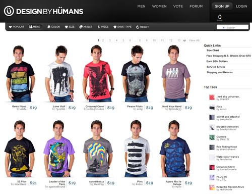
Designbyhumans.com Another great t-shirt company. It has a super-clean website and keeps the product well in focus, despite the human models (which can sometimes distract from the product).
Apple While it sounds cliché, the product photos at Apple would make anyone want to purchase an iPad or iPhone. With a limited number of images and a simple twistable 360-degree viewing mode, the designers behind this website visually sum up Apple’s mantra of simplicity and fun.
Four Steps Of Product Photography
1. Prepare Product
To take quality photographs, the complexity and time required will depend greatly on the type of product you’re shooting. Some of the easiest products to photograph are solid objects such as cups and toys; you may just have to give them a good polish before shooting.
Clothing, textiles and other items that can bend, stretch and wrinkle are much harder to photograph and could require hours of ironing and arranging to get a perfect result. Details, like whether a shirt collar is straight, will determine whether the photographs look like they were shot in a serious studio or by an amateur with a point-and-shoot camera.
Whatever the product, inspect it carefully for tears, stains, chips and other imperfections before beginning.
2. Light
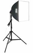 To get a great-looking photo, lighting is crucial. Fortunately, with many products, you don’t need much equipment to get a well-lit balanced exposure. For objects the size of a digital camera or smaller, you can use an EZcube light tent with two small 30-watt bulbs on either side. For larger items, such as clothing, two 60-watt soft boxes on either side of the product should suffice. Also consider using a light reflector to get rid of any shadows and obvious highlights.
3. Set Your Camera
Watch out for noticeable light reflections on shiny surfaces. Even though most product photos look very staged, you don’t want yours to look too artificial.
Obviously, you’ll need a camera to take pictures, so make sure you have one. It doesn’t have to be the best or most expensive on the market, but it should at least have manual focus and shutter and aperture controls. These are all standard on most SLR cameras.
Once you’ve arranged the product and lighting equipment, take a few test shots until you get an exposure that isn’t too bright or too dark. Keep track of the shutter speed and aperture settings of your best photos, and use them again in future to maintain consistency. If you aren’t sure how things like shutter speed, aperture and lens focal length affect images, you might want to do some basic research.
If you understand the basics of photography but your photos still don’t look quite right, don’t worry, because you may have to change several in-camera settings before getting the kind of shots you want.
If your pictures look soft or don’t enlarge well, make sure the ISO setting on your camera is as low as possible. The ISO setting affects the light sensitivity of a camera’s photo sensor. By setting yours to 100 or 200, you’ll get a higher-resolution shot with less grain and pixellation. While you’re at it, change the camera’s image size to the highest possible setting. Most cameras default to a medium-sized resolution (around 1500 x 850 pixels).
Next, make sure the white balance is set to handle the kind of light you’re working in. Most cameras have modes for incandescent, fluorescent, direct sunlight and cloudy environments, and you should adjust your camera’s white balance according to these different conditions. If the white balance controls are off, your images might either look too bright or have a sickly yellow cast, especially if your product is white.
Color control settings are important to consider as well. Most digital cameras allow you to select several degrees of color saturation, ranging from muted to normal to vibrant. If your product is already colorful (flowers, for example), a less saturated setting would probably work better. This is especially true with red, which many digital cameras (even high-end ones) have difficulty processing.
Finally, make sure the image format is appropriate. If you’re just putting the photos online, high-resolution JPEGs are probably fine. RAW files, on the other hand, carry more data because they aren’t compressed like JPEG or TIFF files, and they carry fewer digital artifacts; but they take up more space and require special codices and converters to be viewed and edited. Some cameras have a “RAW + high-res JPEG” setting, which gives you both compressed and uncompressed versions of an image. Do a little research on your camera when deciding which format to use, because some models are automatically set to give a softer focus in JPEG mode.
4. Edit the Photos
This is the final and perhaps most important step of product photography. This is when you really take your photos to the next level and make them pop. If you’ve gotten the lighting right and your camera properly configured, then you are well on your way to great photos. Factors such as unwanted colors and objects that couldn’t be removed during the shoot, though, will require some adjustment.
Surrounding a product in white space is common practice. This makes the photo convenient to use on websites and in catalogs because it won’t clash with other elements. To make a product float freely in white space, you have to remove the background with masking in your photo editing program. As common as it is, it is often done poorly, making an otherwise fine photo look amateurish. Masking properly takes time, especially when you are not working with straight lines. Photoshop CS4 has a great “Refine edge” tool that makes it much easier to correct crooked lines.
Many people also use a variety of artistic effects in Photoshop and other bitmap editors to subtly manipulate their photos. One such effect is the soft or selective focus, which, as the name implies, softens a portion of the photo while leaving other areas sharp. This is great for creating the illusion of depth and size, and the trick is often used for pictures of food, jewelry and watches (see the examples above). Depending on your lens, you can get a similar in-camera effect by setting the aperture low and zooming in on the product from a distance.
Also, depending on the product and the look you’re aiming for, you could also experiment with the perspective controls in Photoshop. Most people assume this tool is only good for tall buildings and scenes with noticeable vanishing points, but you can also use it to make geometric objects such as tables and desks appear overpowering, especially when photographed from a low angle (see Made.com for examples).
Additional Tips
Blend Photos With Design
When putting together a collection of product photos, ask yourself if the images you’re taking will match the color scheme and aesthetic of your website. The easiest way around such a challenge is to just keep things simple and minimalist.
Use a Gray Card
A gray card is a middle-gray reference that you can set your camera to for accurate and consistent color rendering, especially on older cameras that have limited controls for white balance and color. A gray card gives a more realistic depiction of your product’s color and reduces the amount of post-exposure color adjustment you have to make later. They can be bought at any photography store and for about $10. Most cameras have a function for taking gray card test photos; read through the owner’s manual carefully.
Get a Flexible and Sturdy Tripod
Taking sharp, consistent and professional product photos is nearly impossible without a good tripod. It can be any regular tripod, but if you are shooting a product on the floor from above, you’ll probably need a horizontal extension: as the name implies, this tool extends horizontally from the head of the tripod so that you can position your camera directly above and parallel to the product itself. This prevents linear distortion, vanishing lines and uneven image depth.
The tripod you need will depend on the size of your camera. If you have a heavy-duty SLR with a long horizontal extension, you’ll need a solid tripod to support the weight of the camera and prevent shaking.
If you put your tripod in storage, make sure you are able to reset it to the same height and position for your next shoot. Measure the legs of the tripod, and mark with tape where the feet of the tripod should stand on the ground.
Use Light Reflectors
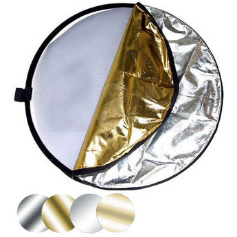
As mentioned, light reflectors give photos an even spread of light and a fresh look. They come in many sizes and shapes. A medium-sized light reflector, one as big as a large pizza, should be more than enough for product photography. Anything bigger is more appropriate for videography or photographs of people.
Reflectors come with three different surfaces: silver foliated, gold foliated and white. The gold- and silver-sided reflectors usually reflect the most light, while white reflectors give a softer, warmer glow.
Define the Decision-Making Process
If your standard of quality is high or you’re working on a team, the lack of a decision-making process can waste a lot of time. Set clear criteria for what you’re looking for, and make sure your workflow allows all parties to follow the criteria without constant interruption.
Outsource When Appropriate
If your product is easy to shoot, then outsourcing is a great option. The most important points to discuss with the photographer beforehand are quality and their willingness and ability to contribute to the editing process.
The quality of the photos will depend on the time spent editing them. Some photographers don’t want to get involved with this part, feeling that image masking and other such tedious tasks are below them. Cover all your bases before starting with the photographer, otherwise the process could turn out to be more expensive and time-consuming than you expected.
Further Resources
If you liked this article, then read Smashing Magazine’s recent article How to Use Photos to Sell More Online for another look at photography and e-commerce.
Also consider these:
- An extensive practical guide to photographing various products.
- A guide to photographing watches, jewelry and other products.
Zachary Lowell contributed to this article.


 SurveyJS: White-Label Survey Solution for Your JS App
 Agent Ready is the new Headless

