7 Ingredients Of Good Corporate Design
It’s hard to define design. We have a broad range of definitions to choose from: design refers not only to graphic design, but to design strategy, too. It is used in a variety of industries, such as engineering, architecture and Web design.
This means that design is not just graphical in nature (which is a form of visual artistic representation), but also the planning of processes to achieve certain goals. Large corporations clearly understand this and incorporate every form of design into their strategy to achieve success.
For a good corporate design, we need to be aware of two main elements, which can be further broken down into a total of seven “ingredients”:
- design, as in artistic representation (logo, typography, colors), and
- design strategy (brand, quality, community, culture).
1. Logo

Typically, a logo is designed for immediate recognition. Users often identify a corporation by its logo. Just look at the above images: the names of the companies should immediately pop into your head.But a logo is only one aspect of a company’s brand strategy. It helps, of course, to differentiate a company from its competitors, but a great logo doesn’t mean anything until the brand makes it worth something. If you’re given the task of creating a logo for an organization, create an abstract image that is clean, simple and carries very little meaning until the brand of the organization adds that meaning. You can read more about the importance of logo design in Seth Godin’s article.
2. Typography
A well-proportioned, clean font can make all the difference on a website or even a corporate flyer. Good typography creates that “There’s something about that” feeling in people’s consciousness.
One of the most successful fonts that can be seen everywhere (signs, buildings, planes, etc.) is Helvetica. This is the King Kong of typefaces, and it’s more than 50 years old. Helvetica changed the world of typography. It showed typographers and graphic designers that simple is good.


Large corporations tend to adopt clear sans-serif typefaces. A typeface should reflect the company’s image and beliefs. If a company is a little conservative, then it should use serif typefaces, such as Times New Roman: these typefaces reflect classical designs. With the help of large typography, an organization should enhance the motto or message delivered to its users.
All website text, not just for corporate websites, should be readable. A Web designer should take into consideration the different browser rendering engines; text fonts are not displayed the same across browsers.
With large corporate websites, usability plays an increasingly large role in typography design. A company should also care about its users with disabilities who can only read with the help of a screen reader, etc. It isn’t always a good approach to embed text in images and not include <alt> tags, because screen readers can’t read the text. Sadly, the majority of large organizations are still struggling with this issue.
Also consider the following links to resources on corporate typography:
- Helvetica: A Documentary Film by Gary Hustwit
- 60 Brilliant Typefaces For Corporate Design
- 30 Brilliant Typefaces For Corporate Design
3. Colors
A graphic designer usually should be careful when designing the visual identity of a large corporation. We should take into consideration different color combinations, color meanings and color theory.
The corporate color scheme that the designer chooses makes a strong statement about the organization and how it does business. As with all of the other seven elements, colors should emphasize the philosophy and strategy of the corporation.
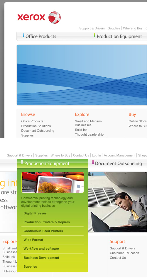
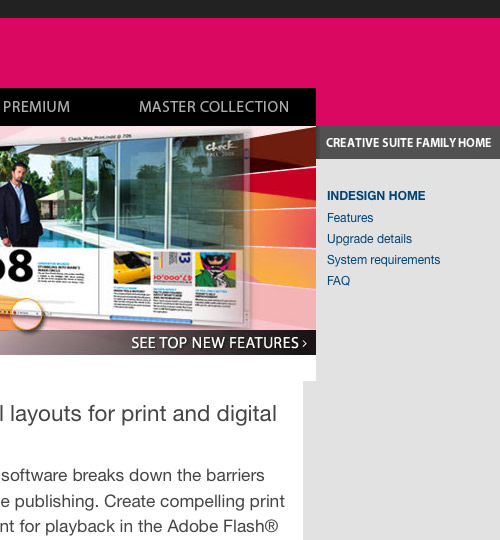
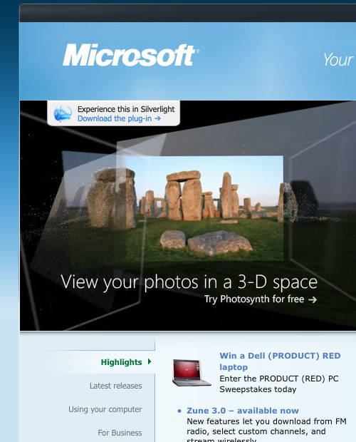
Research conducted by the Institute of Color Research reveals that all human beings make a subconscious judgment about a person, environment or item within 90 seconds and that that assessment is based on color alone. This demonstrates the important role of colors in corporate graphic design.
Enter the world of color harmony and palettes. There are lots of useful online tools for creating beautiful, appealing colors, such as COLOURlovers, which showcases color trends and palettes.
One particular tool is interesting for the technological point of view behind it. Apparently, our brains did not evolve to see or appreciate the concentrated and saturated colors that are considered “basic colors.” Our eyes evolved to see natural and sophisticated colors that rarely clash with each other.
Consider the following links for more detailed color theory:
- Color Theory for Designers, Part 1: The Meaning of Color
- Color Theory For Designers, Part 2: Understanding Concepts And Terminology
- Color Theory for Designer, Part 3: Creating Your Own Color Palettes
4. Brand
Brand is the definition of corporate business. The name of an organization can also serve as its brand. Brand value reflects how a company is perceived in the marketplace. Brand identity communicates an organization’s strategy in a universal way to target audiences.
Branding is not about getting a target market to choose one corporation over its competition, but about getting prospects to see the corporation as the only one that provides a solution to their problems.
A company should lay down brand objectives from the beginning. These are the organization’s characteristics, and they must reflect the organization’s philosophy, processes, image, etc. A strong brand builds credibility and motivates clients.
Further reading:
5. Quality
Quality is one of the most important elements. It defines a company through its policies, procedures and responsibilities to its users. A company that offers quality products or services has a great chance of bringing a user back not just once but many times over.
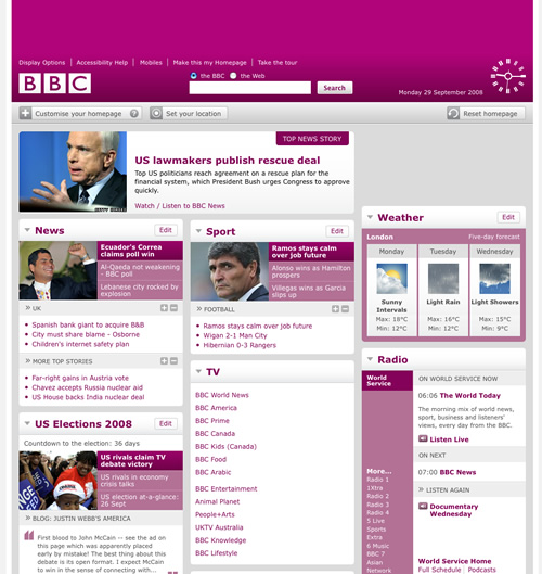
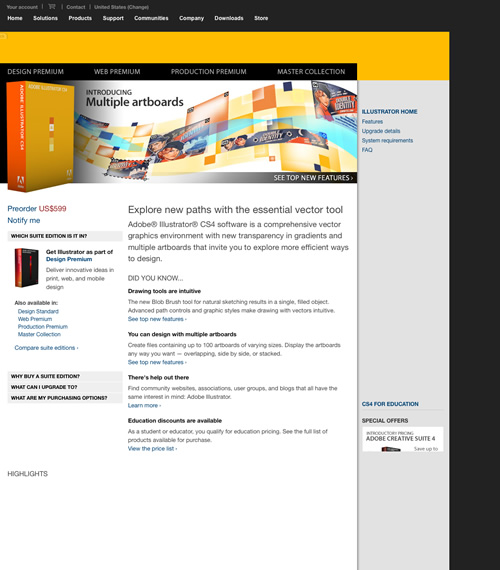
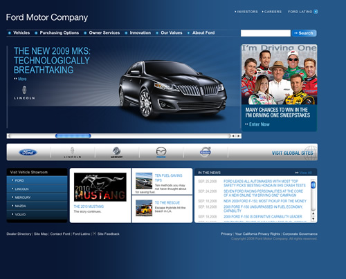
Quality should be reflected in every aspect of a corporation: how it does business, the kind of products or services it produces, how it handles its prospects and clients. The same is true for the corporation’s website design, too.
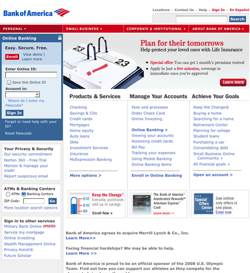
The following screenshots do indeed reflect quality:
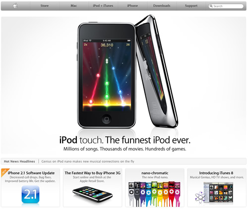
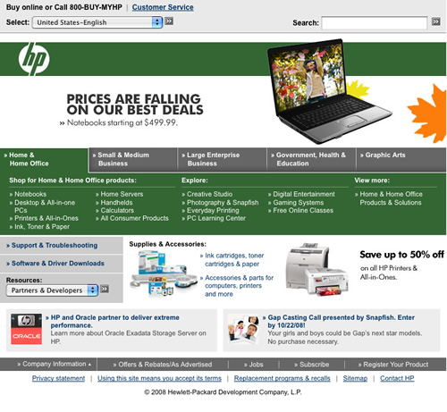
And not quite so memorable designs:
6. Community
Many large corporations tend to neglect this aspect of their business. The first large company that recognized this important element was Apple. It created a dedicated, enthusiastic community around its products, which eventually paid off in the long run.
It’s not an easy task to form enthusiastic communities and to leverage that power. A company should always keep in mind that without quality products or services, it can’t project a positive image to its user base.
One way of forming a community is by recruiting company product evangelists. Evangelism is a form of word-of-mouth marketing in which a company nurtures customers who strongly believe in the company’s products, with the result that these customers actively promote them and try to convince others to buy and use them. These people often become the key influencers in the community, and because they’re not paid or affiliated with the company, they are perceived by others as being credible.
Let’s take Apple’s example and find out the three steps of creating a community:
- As a first step, which is the most important one, it creates quality products that are targeted to a specific audience.
- It encourages customers to meet and share, as is the case with iPods.
- It focuses on specific key aspects of the product and associates them with the company’s philosophy. In Apple’s case, that aspect is a better user experience.
7. Culture
When speaking of culture, one shouldn’t take it to mean community. Culture is the tastes, manners, knowledge and values that are shared and favored by the community. If a corporation has communities formed around its products, it doesn’t necessarily mean that these communities have a healthy culture. In fact, a bad culture can ruin a company’s reputation with future prospects.
Microsoft is, sadly, a good example of bad community culture. This culture is mainly the result of the company’s policies and how it has nurtured its community. On the other hand, Apple created a relatively healthy community by enveloping its products in mystery and rumor. Think of the long lines in front of Apple stores around the US, Europe and even Asia, anxiously waiting for the iPhone. The customers even called it the iLine.


In recent years, not only have cultures formed around Apple products, but subcultures have, too. Subcultures around product rumors have resulted in many websites, such as MacRumors.com and AppleInsider.com.


 Get a Free Trial

 Devs love Storyblok - Learn why!
 How To Measure UX and Design Impact, 8h video + UX training
 Register For Free

