Online Advertising And Its Impact On Web Design
In recent years, advertising has become a major revenue source for many websites. Not too long ago, online ads were often met with disapproval from visitors, and advertisers were unsure about their value or effectiveness. Today, most visitors have come to expect ads on commercial websites, and advertisers have recognized the potential of various online ad opportunities. Ads have long been a part of print publications, such as magazines and newspapers, and now they essentially have the same role in online periodicals and publications.
Although advertising is a concern for website owners and those pushing products or services, it is also has an impact on Web designers, because they have to be able to design and develop websites that can produce ad revenue and still meet the needs of visitors. Clients with websites that depend on ad revenue need a design that provides the necessary screen space and a proper layout for selling ads, and advertisers need placement that will get them the exposure they seek.
You might be interested in the following related posts:
- 60+ Amazing Poster and Advertisement Tutorials
- Getting Started with Banner Advertisements
- Successful Strategies For Selling Ad Space On Low-Traffic Websites
- 10 Clever and Effective Series of Advertisements
While advertisements are hardly the primary concern of Web designers in general, not accounting for them will result in a very awkward layout that can either detract from the flow of the website or put the ads in a spot where they will not receive enough attention from visitors. In order to maximize ad revenue for the client, with minimal interference in the appearance and usability of the website, the designer must take advertising needs into consideration throughout the design process.
Starting with the Basics
Of course, not all websites sell advertising space, but a growing number of them do. As the popularity of blogs continues to rise and designers get more requests for custom blog themes, this issue will only become more common. An adequate discussion of the subject requires starting with some basic issues.
Why do advertisers pay for ads?
Obviously, advertisers buy ads to gain exposure and improve their bottom line. The goals vary from one campaign to the next. Some may be primarily concerned with brand recognition and general exposure, while others are only concerned with sales of products. Online advertisers may be looking for click-through visitors from their ads, but ultimately all advertisers look for a strengthened business as a result of their campaigns.
Web designers can have some impact on this issue by their placement of ads. Of course, designers cannot completely sell products or services for advertisers, but ad placement is key to click-through rates and so has a sizeable impact on the success of an ad campaign.

What are advertisers paying for?
Are advertisers paying for clicks by visitors? Are they paying for sales conversions? Are they paying simply for the screen space? Each of these is a possibility and depends on the situation. AdSense ads, for example, pay publishers per click. Affiliate ads pay per sale or per action. Direct ads, such as most banner sales, are generally sold at a set price for the screen space and location.
Keeping the desires of advertisers in mind throughout the design process is critical if the website is going to be selling ads directly to other businesses. AdSense and affiliate ads can be placed just about anywhere on a website, although the results will vary, but direct ad revenue will depend on what advertisers feel they are getting for their money. If they are paying for prime on-screen real estate, that’s what they’ll expect.
Why do websites or businesses publish ads?
Advertising can be very lucrative for websites with a large volume of traffic. Although there are other ways to monetize a website, ads are one of the few ways in which a website owner can quickly capitalize on existing traffic without any additional work, such as developing products or providing services.
Bloggers publish ads because the revenue allows them to earn income and essentially pay themselves for the time it takes to write content and maintain the blog. News websites sell ads because they typically have large audiences and because their offline business models, such as for printed newspapers, aren’t able to produce as much ad revenue as they have in past years. As a growing number of consumers turn to online publications rather than the daily paper for their news, ad revenue will shift from print publications to online options.
In most cases, ad revenue is critical to the success of the business. For this reason, it must be a priority during the design process. For a service-based business that uses a website to sell its services to visitors, the designer’s job includes creating a website that effectively promotes those services to visitors. The same thing can be said of websites and businesses that rely on ad income.
Why are Advertisements an Important Part of Web Design?
For website owners and businesses that rely on advertising income from their websites, this is obviously an important part of the website that needs major consideration during the design process. Not having enough space or the right locations for ads will have a dramatically negative impact on the business. Once that happens, attempts will probably be made to move ads or open up new slots for sale, which could cause the website to look awkward and unorganized, because these areas were not originally accounted for in the design.
Websites with advertising revenue as their main source of income can be compared to e-commerce websites that depend on selling products in order to continue doing business. No designer is going to create an e-commerce website without making the placement of products, descriptions, and images in the layout a priority. Likewise, website businesses that require ad revenue cannot compromise on advertising space.
Advertisements are also a significant part of the design process because of the impact on visitors. Although a website may rely on advertising income, visitors are a critical part of the equation. Without them, ad revenue disappears. The website owner and designer need to incorporate ads in a way that still allows for a positive visitor experience.
The Conundrum of Online Ads
While website businesses that sell advertisements want and need those ads to be noticed and appreciated by visitors, a delicate balance is required. Aside from made-for-AdSense websites and websites set up solely for affiliate income, a typical website set up for ads needs to send a portion of its visitors away to the websites of advertisers in order to continue generating that revenue, but it also needs to retain a majority of visitors in order to grow itself. Keeping all visitors will result in no ad revenue, and losing all visitors to advertisers will result in no growth for itself.
Website owners and designers need to consider this issue during the design process so that the locations and sizes of ads are appropriate and so that the ads produce revenue with minimal negative impact on the website. Offline ad publishers don’t necessarily face the same dilemma. A magazine may run full-page ads throughout the publication, but when readers see an ad that interests them, they don’t necessarily stop reading and put down the magazine.
In the online world, a click on an ad could result in a visitor not coming back. Ads can be set to open in a new window to prevent this, but that still doesn’t guarantee that the visitor will come back after clicking the ad.
How Do Advertisements Impact the Design of a Website?
Regardless of how much attention designers give to advertisements in the layout of a website, ads will in some way impact the design. Ideally, the designer has accounted for specific ad slots in the design and laid out the website accordingly. In this case, ads can be implemented on the website in a way that does not disrupt the flow of content or information and that gives the ads a specific and strategic location.
On the other hand, if ads are not adequately considered during the design process, they can look very much out of place, which will disrupt the rest of the website. Layout and design decisions that were made without consideration for ads will rarely work well when ads are incorporated in the website.
Layout and Spacing
Advertisements can easily take up big chunks of space in the layout of a website. Whether it has one large banner ad or several smaller ones bunched together, the layout will be affected. Some websites will spread out various advertisements throughout the website, others will confine them to a specific area and leave the rest of the website ad-free.
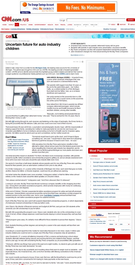
The strategy here depends of several factors, but websites in particular industries and niches tend to take similar approaches. For example, major news websites typically have advertisements spread throughout the website’s layout. They may not include several ads in any one specific area, but they do have many spots that contain few ads.
CNN contains a few advertisements spread throughout the website.
In contrast to news websites, many blogs keep banner ads contained within a designated area of the layout, typically the sidebar, and the rest of the blog may contain no ads. With this approach, the designer needs to account for advertisements in one large area of the layout, but the rest of the website will have little or no need to accommodate ads.
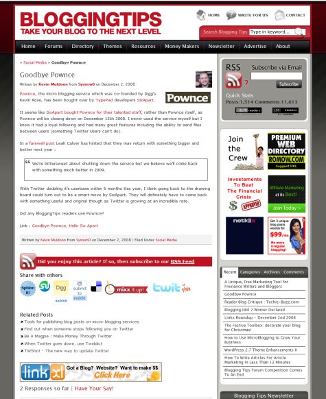
Blogging Tips includes six 125 x 125-pixel banners in the right sidebar, and the only other ad is a banner just above the comments on individual posts.
Because ads are often used in sidebars of both blogs and news websites, one major consideration in designing the layout is the width needed to hold ads in the sidebar. For example, many news websites have 300 x 250 banners in their sidebars, so the sidebars must be big enough to contain the banners. If this consideration is not a part of the design process, monetization opportunities and potential income will suffer, or the layout will have to be changed later.
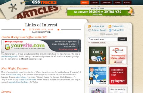
Of course, the sidebar isn’t the only common location for ads. Many websites sell ad space in their headers because this location usually brings the highest ad price on the page. In that case, advertising needs to be a consideration when the website is designed or else there will likely be no space available in the header. Typical website headers include a logo/branding area and primary navigation. To include space for advertisements, all of these items could be made to fit in the header design, or primary navigation could be moved elsewhere.
CSS Tricks is one of many blogs to include a banner in the header. In this case, the 468 x 60 banner fits nicely in the design of the header.
Colors
Web designers can’t control the color or design of banner ads used on their websites, and definitely won’t be able to in future, but they can consider the possibilities when developing a color scheme for the design. Banner ads are often colorful and bright, for the purpose of grabbing the attention of the visitor. If a website is designed with lots of different colors and shades, it could look awkward and too busy with ads that are also full of color, especially when those colors don’t go together.
Some websites that display a lot of banners will need a muted color scheme that avoids potential color overload for visitors. In some cases, these websites need the ads to stand out in order to draw more attention to them, and color can be a very effective way of achieving that.
Flow
One of the challenges designers face with any type of website is to present the content so that the visitor’s eye is drawn to important information. The typical pattern of the eye’s movement on screen and the flow of content in the website’s layout can be influenced by ads. Website owners looking to maximize ad revenue will often include ads in locations where the eye is drawn to, because these locations tend to produce the best results and the most ad revenue.
Those who want some ad revenue but with minimal impact on the visitor will keep ads away from the primary flow of content. Examples of this are blogs that place ads within the content of the post or just in the sidebar. Ads directly above or below post titles are typically seen and clicked by more visitors than ads in the sidebar, so they will sell at a higher rate. Decisions here need to be made by the owner of the website, but the designer needs to be aware of the decision so that the ads can be implemented in the design.
The New York Times keeps its header and main content area free of ads on article pages, but there is a large area in the right sidebar for ads.

What is the Designer’s Responsibility with Advertisements?
1. To understand the level of priority of advertising revenue. Many websites include no advertisements at all, and others rely on ad revenue to stay in business. Still others include some ads but not as the primary source of revenue. The designer needs to communicate with the client to understand how much of a priority ads should have in the design. If ad revenue is critical to the business, advertising slots will be one of the most significant factors in the layout. If selling products or services is more important, then the products or services should be given priority in the design over any ads that may be included.
The designer’s job is not to determine how much of a role ads should play in the website’s design and layout, but he or she should make the effort to completely understand the needs and desires of the client in this area. Starting the design process with the right perspective and being on the same page as the client is critical.
2. To design a website that meets the needs of the clients. Most Web designers would probably prefer never to have to design for ads and to be able to use the allotted space in other ways. However, the client’s needs include a website designed to allow for ad revenue, so these areas must be a part of the design.
3. To design an attractive and usable website that includes ad space. Regardless of whether ads are a high or low priority, the designer needs to create a website that is attractive and gets the job done. Ads can be a difficult element to work with in the design because of the lost space and the interrupted flow, however, the designer must still create an effective website. If there are a lot of ads on the website, care must be taken to still make the website usable for visitors with minimal interference.
Trends in Ads and Design
By looking at websites that sell ads, particularly those that depend on ads as a major source of income, we see a number of trends:
Header ads. Many websites sell advertising space in their header; often this space is located to the side of a logo and above or below a navigation menu. This trend is common across many different types of websites and will likely continue as long as these ads produce solid results for advertisers.
The Washington Post actually uses two header ads on article pages. The first is a 300 x 45 banner that sits across from the logo, and below that is a 728 x 90 banner that lies between the logo and the navigation menu.

Lifehacker, like other websites in the Gawker network, has a large header that allows for a 300 x 250 banner. Notice that the website clearly is designed and laid out to suit this size of ad perfectly.
Ads above all content. Instead of having an ad inside, or perhaps beside, the header, some websites place ads completely above everything else on the page, including the header. This puts the ad as high as possible on the page but takes it out of the flow of the content. This minimizes the potential interference of the ad, but it pushes everything else on the page down, and less content will be visible above the fold. This trend is noticeable on a number of news websites.
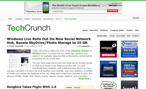
TechCrunch uses a 720 x 90 banner above its header. Only the green border of the body is above this banner.
The L.A. Times also includes a banner above all content, but not on the home page.
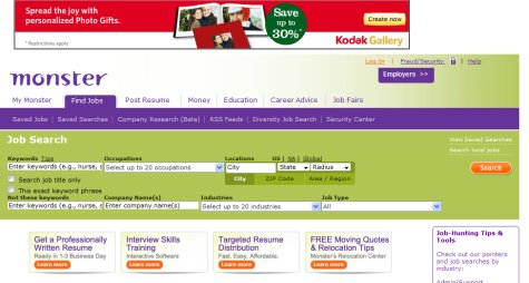
Monster places a 728 x 90 banner at the very top of its job search page.
More ads on secondary pages than on home page. Some websites, such as the L.A. Times just mentioned, keep the home page more welcoming to visitors and more user-friendly by using the space for things other than advertisements. However, these websites include ads on other pages. This is another common trend on news websites.
The Reader’s Digest home page avoids any ads high on the page.
However, pages of individual articles include a 728 x 90 banner above the header, a 300 x 250 banner at the top of the right sidebar and a 135 x 600 skyscraper in the left sidebar, plus some additional ads lower on the page.

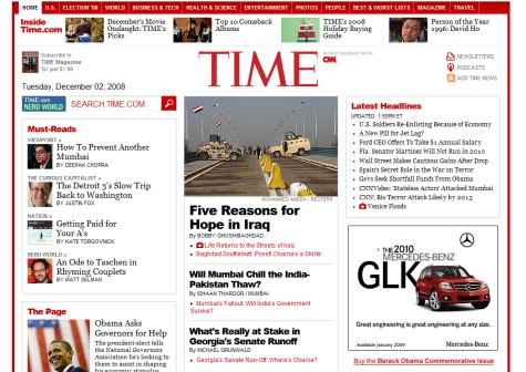
Like Reader’s Digest, Time also uses an almost ad-free home page.
Pages of individual articles include a 728 x 90 header banner and a 300 x 250 banner at the top of the sidebar.
Common banner sizes. As you browse a number of websites, you notice that banners come in all different proportions, but most of them are standard sizes. The Interactive Advertising Bureau has established standard sizes to be used for online ads. While a website owner can sell ads of any dimension, it is usually advisable to stick to the standards because potential advertisers likely already have ads designed for those sizes and would be more likely to buy if spaces of the same sizes were available. Web designers should know the ad dimensions that clients want on their websites.
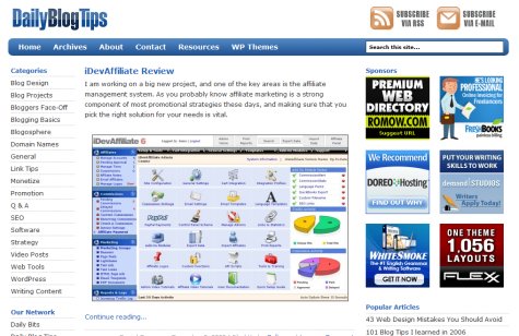
Blogs commonly use 125 x 125 banners, although many other sizes are used as well. Daily Blog Tips is an example of a website with typical blog banner ads. Six 125 x 125 ads are placed in the right sidebar, but the only other ad on the website is a skyscraper lower down in the left sidebar.
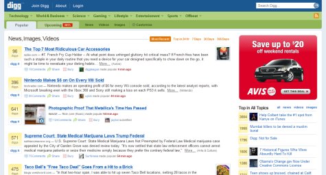
Another common dimension for banners is 300 x 250. Many news websites use ads of this dimension in sidebars. Yahoo’s right sidebar contains a 300 x 250 banner right around the fold.

Digg also uses a 300 x 250 banner at the top of its sidebar.
Best Practices for Designers
1. Design to meet the needs of the client The ultimate responsibility of the designer is to the client. The designer should advise the client when needed, but ultimately the website needs to please the client. Although the designer may disagree with the client’s approach to using ads on the website, if the client wants it a certain way, that’s how they should get it.
There are many websites that appear to outsiders to have too many advertisements, but without knowing the details of how much income the ads produce and how they affect or don’t affect the audience, it’s impossible to know if it is a good or bad approach for the business.
2. Lay out the website so that ads are a part of the design The websites that look the most natural and normal with advertisements were designed with them in mind. It’s no accident that a banner fits nicely in a specified area of the sidebar. Incorporate ad slots in the layout to achieve the best-looking website possible. Ads that are thrown in will look out of place and will overpower an otherwise well-designed layout.
The sidebar on ABC News is sized just right to contain the 300 x 250 banners used throughout the website.

3. Consider future needs You may find yourself in a situation in which you’re designing a website that isn’t particularly ad-heavy at the moment but that could be more dependent on ad revenue in the near future. Many websites start out with few advertisements and then, once the audience is built up, incorporate more ads. Ideally, this would be considered during the design process, and plans would be made for where new ad slots could be placed. Sidebars are generally a good spot to increase the amount of ads without disrupting the layout or the content, but header ads are much more difficult.
It’s generally good practice to discuss long-term plans with clients during the initial process so that situations like this can be avoided. If more ads are to be used in the near future, before a redesign is done, it’s possible to hold some spots with temporary content until they are needed for ads. For example, an area could be used to promote something on the website itself, with that content being removed once ad revenue becomes more important.
4. Consider the impact on visitors Designers should make an effort to include ad slots that will appeal to advertisers, but visitors also need to be considered. When it comes to ads, a lot of decisions need to be made and judgment taken about what is appropriate and what would be too much. All of these issues need to be looked at in the context of the website in question, and there are rarely black-and-white answers.
What’s Your Opinion?
What’s your take on the impact of advertisements on design? When designing a website or a custom blog theme, how much consideration do you give to advertising?


 Start with a free demo —
 Click here to kickstart your project for free in a matter of minutes.
 Check the frontend report!
 Take a break with a 3D game built on Netlify!
 Sponsor OWD on GitHub