Clear And Effective Communication In Web Design
Communication is one of the foundational elements of a good website. It is essential for a positive user experience and for a successful website that truly benefits its owners. All types of websites are affected by the need for good communication in one way or another. Regardless of whether the website in question is an e-commerce website, a blog, a portfolio website, an information website for a service company, a government website or any other type of website, there is a significant need to communicate effectively with visitors.
Because of the significance of communication with visitors, it is an essential consideration for every designer and website owner and the responsibility of both. Unfortunately, communication is sometimes overlooked and takes a backseat to the visual attractiveness of a website. Ideally, the design and other elements that do the communicating work together to create a clear, unified message to visitors.
In this article, we’ll take a broad look at the subject of clear communication in Web design. We’ll start with a discussion of the primary methods of communication for websites and typical challenges that designers face. From there, we’ll move on to look at what specifically should be communicated to visitors and tips for implementing this in your own work. At the end, we’ll look at some of the goals that should be established in terms of communication when developing websites, as well as some of the results of having a website that communicates effectively.
You might be interested in the following related posts:
- 10 Principles Of Effective Web Design
- Web Design Elements: Examples And Best Practices
- Web Design Industry Jargon and Web Terms: Glossary and Resources
1. Methods of Communication
Websites communicate with visitors in a number of different ways. Not all websites take the same approach, but almost every website will use at least a few common methods of communication. To get started, let’s first look at some of the basic ways that websites communicate with visitors before going into more depth on the subject.
1.1. Text
Text is, of course, the most obvious form of communication that takes place online. Whether the text is in the main body content of the page or a headline, most website visitors rely on text to understand the basic messages of a website. Depending on the type of the website, text may be extremely critical to communication, as in the case of blogs.
The approach taken with text will depend on the purpose of the website. For example, sales copy on an e-commerce or membership website will differ from article content on an informational website.
1.2. Images
We’ve all heard the saying “A picture is worth a thousand words.” Photos and images are excellent resources not only for creating an attractive and interesting design, but also for communication purposes. Images can often communicate a message faster, more clearly and more emphatically than text. The designer needs to be aware of the messages being communicated via images and ensure they work in harmony with the rest of the website’s communication.
1.3. Titles and Headers
Whether you’re examining Web design, magazine layout, newspaper design, etc., titles and headers are critical to effective communication. Human nature is to want to know something quickly, and especially when on the Web. Titles and headers help to communicate major points and ideas to visitors, and they tell visitors what to expect from the rest of the content.
1.4. Icons
One of the reasons icons are so useful in Web design is that they communicate messages without any text being used. A visitor may see a familiar icon, such as a house that represents a link to the home page, and immediately know what the item represents and what to do.
1.5. Design Styles
The style of a website’s design may also communicate a message to visitors. Certain design styles are common in particular industries, and other styles may not be an appropriate fit for a specific type of website. The style can, in these cases, indicate to visitors something about your website and how it fits their needs. For example, a website that sells skateboards would likely feature a grunge style design. This is a style that most visitors in the target market would appreciate, and by seeing this type of style, visitors in that target market will likely feel comfortable with the website and feel an association with it. In this case, the design style helps communicate to visitors that this is where they belong and that the website was created for them.
1.6. Colors
Obviously, there is an infinite variety of colors and color schemes in Web design. Sometimes colors are chosen just based on what looks good, but other times the psychology of color comes into play. Colors not only play a large role in determining how a website looks, but also communicate messages to visitors in certain ways.
1.7. Audio and Video
While most of the Web is made up of text, audio and video have become increasingly common over the past few years as more and more Internet users are on high-speed connections. As audio and video have become increasingly common, many new opportunities have arisen for effective communication online. Designers and website owners have plenty of options in how they communicate with their visitors, and audio and video have some definite strengths that make them a tremendous method of communication.
2. Challenges of Creating a Website with Clear Communication
In order to build a website that effectively and clearly communicates with visitors, a number of challenges need to be overcome. Not all websites are the same, so challenges may differ from one website to the next, but the challenges discussed below are some of the most common.
2.1. Too Much Content
One of the biggest challenges that designers have to overcome is simply deciding on the amount of content and information to use. Of course, having a lot of quality information is a good thing, but it can also get in the way and make it difficult to communicate clearly with visitors. In many cases, websites with less content have an easier time effectively communicating a particular message to visitors because there is no excess to get in the way.
By trying to fit a lot of content onto a page, the website owner can very easily create a cluttered page that confuses visitors. Primary messages are often overpowered by the busyness of a page, and sometimes the content may even send mixed or unclear messages.
2.2. Every Visitor is Different
When developing websites, one needs to keep in mind that each visitor is unique and that it is impossible to classify all of them in the same group. Websites are designed with their target audience in mind, but even within that group of users, some diversity will still exist. These differences can have an impact on the communication of the website, because not every visitor will respond in the same way or understand the same messages.
How are visitors different? First, demographics play a role. A website is likely to attract visitors from all over the globe, and a visitor in one part of the world will differ from a visitor in another part of the world. Age and sex will also be important factors.
Beyond demographics, not every visitor will have the same purpose in visiting the website. They may be looking for different things or have different agendas on the website. Visitors will also come from a variety of sources, and visitors from one source will not always have the same characteristics as visitors from another source.
Additionally, not all of your visitors will have the same level of knowledge of the subject of your website. All of these things make each visitor unique, and they all have an impact on the communication between the website and the user.
2.3. Clarity
Communicating through a website is easy. Every website communicates in a number of different ways, even unintentionally. Communicating with clarity, on the other hand, is much more of a challenge. Because of the short amount of time that a new visitor is likely to spend on a website before leaving, there is a strong need for the website to quickly and clearly communicate.
In order for a message to be clear, there must be a clear purpose and priority of the website that is understandable to the visitor; there must not be too much noise or clutter; and the message must be communicated in a way that it can be understood by the visitor.
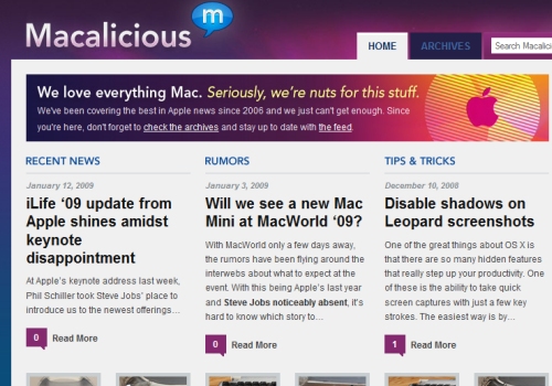
Blogs can sometimes be difficult for new visitors to quickly understand the purpose of. Macalicious uses a small box at the top of the page to quickly communicate the website’s purpose and background so that new visitors can immediately know something about it.
2.4. Keeping Communication Brief, But Complete
Because of the need for clarity and the benefits of communicating quickly, there are advantages to keeping messages as short and concise as possible. A brief, clear message will generally be most effective for communicating quickly online. Of course, there are exceptions to this, such as situations where in-depth articles are used to provide detailed information to visitors who are interested in such information.
Keeping a message brief and complete is a major challenge. One of the reasons taglines are so effective is that they can communicate something significant about the company or the website in a brief statement that, ideally, leaves a memorable impression on the visitor.
Shuteye uses three simple short questions at the top of its home page to help identify visitors who could benefit from its offerings. If a visitor answers “Yes” to these questions, he or she immediately has a reason to look into the report offered by Shuteye. The communication at the top of the page is brief but highly effective for filtering potential customers.

2.5. Having Personality
Online communication is unlike forms of communication that allow face-to-face interaction between two people. In online communication, the human visitor receives a message from a website, not directly from a person. However, the most effective communication generally occurs on websites that show some kind of personality in that communication. The website is a representation of the company or the person behind it, and showing that in the communication is important.
Digital Mash, the portfolio website of designer Rob Morris, shows some personality with the tagline “Hero for Hire.” While there are tons of designer portfolio websites out there, Rob’s stands out in part because this statement shows some personality.
2.6. Not Overpowering the Communication with the Design
The design and appearance of a website should be used strategically to enhance the message of the website, but it can also become an overpowering element that hinders communication. The content of the website is of primary importance, while the appearance of the website should be used to make the visit more pleasant, memorable and easier. The design of a website should not become a priority over the content, or else the website will suffer in usability.
2.7. Gaining the Trust of Visitors
Depending on your type of website or the purpose of your communication, one of the biggest challenges may be simply gaining the trust of visitors. One example would be a sales page. When a page communicates something to visitors in an attempt to convince them to buy something, there is a natural resistance to trust. Overcoming this is a major challenge.
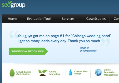
SEO Group uses testimonials from satisfied clients at the top of its page to help build trust.
2.8. Getting and Keeping Attention
If you have an audience with a very short attention span and that is quick to close the browser or visit another website, getting and keeping its attention is a necessary prerequisite to effective communication. This also goes back to the issue of having a clear and concise message that communicates to visitors before they get confused or bored with the website. If visitors arrive at a website and cannot easily understand its purpose or what it offers them, they’re likely to move elsewhere.
3. What Should Be Communicated
When creating a website, what things should you focus on in terms of communication? Knowing what should be communicated is a key step that cannot be overlooked. While the answer to this question will vary from one website to the next, the basics are discussed below.
3.1. Purpose of the Company or Website
The most important message that must be communicated by every website is its purpose. Some visitors will likely already be familiar with the website or the company behind it, but many may not. As visitors arrive at the website, they should be able to quickly and accurately understand why the website exists and what is offered, and from this they should be able to determine if it is something that interests them.
When visitors arrive at a website that does not clearly communicate its purpose or what it does, it almost always results in a frustrating visit, which leads to a website not achieving maximum effectiveness for its owner.
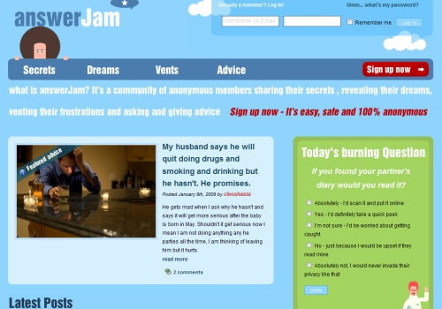
AnswerJam communicates its purpose by answering the question “What is answerJam?” on the home page.
3.2. What is Offered?
In addition to simply understanding the purpose of the website, visitors should also be able to quickly learn what the company or website offers them. Of course, this will vary from one website to another. E-commerce websites need to clearly communicate to visitors the types of products that can be purchased. Service companies should clearly communicate the services that are available to visitors. Websites that are content-rich, such as blogs, should communicate to new visitors what type of content is available to visitors and subscribers.
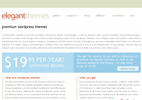
Elegant Themes offers premium WordPress themes for an annual membership fee. The website uses a light blue box to quickly and clearly communicate the details of what is offered to visitors.
3.3. How Can Visitors Benefit?
Simply listing services or products that are available may not be enough. In most cases, the website should communicate to visitors how these products and services can specifically benefit them and why they would be better off with them.
3.4. What Action Can Visitors Take?
If a website does an effective job of clearly communicating its purpose, including what is offered and how it can benefit visitors, some of those visitors will want to take action. But is it clear what type of action they should take and how they can do so? Of course, e-commerce websites should make it easy for visitors to take action by buying items. Service companies should make it clear how visitors can take the next step towards using their services. Can visitors place an order online? Should they fill out a contact form to have someone get in touch with them? Should they call the company by phone?
4. Tips for Effective Communication:
Now that we’ve looked at how websites communicate with visitors, some typical challenges and what should be communicated, here are some tips that can be put into practice to help with the process of developing websites that communicate effectively.
4.1. Prioritize
The most important step to developing a website that features clear communication is prioritizing your messages and knowing exactly what should be communicated to visitors. If you’re not able to easily state the main point, purpose or message of your website, it’s unlikely that visitors will be able to understand that message accurately.
Most websites, especially larger ones, have multiple messages that are communicated throughout their pages. In these cases, it’s important to determine a priority so that the most important messages are given more prominence.
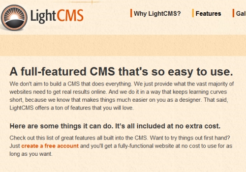
LightCMS has prioritized the simplicity and ease of use of its product. The home page, “Features” page and “Why LightCMS” page all prominently display a message that emphasizes this point.
4.2. Determine What Visitors Should Know About the Company or Website
Every company and website has something that it specifically wants visitors to learn about it. It’s critical that this is identified, otherwise it will be impossible to communicate it effectively to visitors. Ideally, the website would be used as a tool to brand the company, so the messages that are being communicated should fit the overall branding efforts and strengthen those efforts.
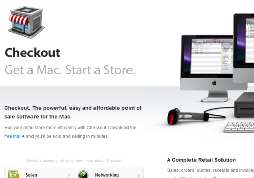
Checkout offers point-of-sale software for Macs. It has determined what is most important for visitors to know about the software and makes it clear with the simple statement, “Get a Mac. Start a Store.”
4.3. Keep it Simple
Communicating effectively is much easier when the messages are simple and when excess can be eliminated. Any way that online communication can be simplified (without losing anything important) will make it easier for you and your visitors. In some cases, this may mean cutting down on communicating too many different things and just focusing on the most important aspects. By reducing the amount of information that is communicated, each message or piece of information will have more of an impact.
Umbrella Today? is an outstanding example of keeping it simple. While there are plenty of options for checking the weather online, Umbrella Today is aimed at those who simply want to know if they’ll need an umbrella. Enter your zip code and you’ll get an answer.

While most websites will not be able to practically achieve this level of simplicity, it is a good example of what can be achieved when excess communication is cut out.
4.4. Keep it Relevant to Your Target Audience
Because your visitors are likely to be diverse, it’s important to consider your target market and audience when developing the website. Who is the most critical audience for your company and website? The website should be designed and developed so that it can communicate specifically with these visitors. Additional efforts can be taken to communicate with other audiences as well, but the target audience should be prioritized; and if sacrifices are made, they should be made in other areas.
FreeAgent provides online accounting for freelancers and small businesses. Its target audience is not large companies that are looking for a more complex accounting system. The customers it is targeting are not likely to be experts in accounting, and they’ll probably be interested in simplicity in an accounting system. FreeAgent effectively keeps its message relevant to this target audience by stating that it is “Accounting for the rest of us.” If a visitor has been frustrated by other more complex accounting systems, they’re likely to immediately feel that FreeAgent was made with them in mind.
4.5. Make the Message Impossible to Miss
The most effective way to ensure that visitors receive the most important messages of a website is by making them nearly impossible to miss. This can be done in a few different ways, but using large text, colored text or some other design technique to make the message stand out are common. Other techniques include automatically loading audio, video and pop-ups, each of which brings its own usability issues and concerns.
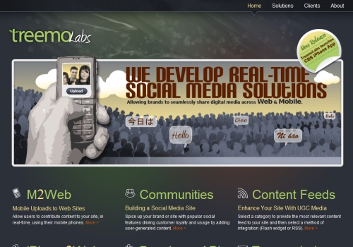
Treemo Labs used a large bold font to immediately communicate what services it offers.
4.6. Style Text
Messages can easily be made to stand out by using bold text, colored text or larger font sizes. These things are all visual clues to visitors that something is important and prioritized. Of course, the more that is added to a website, the less impact that piece of text will have.
For example, if a page is styled in a very basic manner, with only one line that stands out in large bold text, this line will be extremely noticeable and likely have a significant impact. On the other hand, if a page using bold or colored text in several different places and various font sizes all over the place, the result is that nothing will really stand out because there is not enough uniformity.
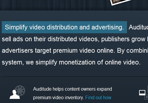
Another option for styling text was demonstrated by Auditude. It uses a simple change in background color to create a box that separates a particular section of text. As a result, that section of text stands out.
4.7. Use Headers and Sub-Headers
On pages that consist of a significant amount of text, breaking it up and identifying the main points with headers and sub-headers can be very effective. Headers not only help to make the text more readable by creating white space and using bold font to add variety to the page, but they also communicate a structure of the content to visitors and can summarize the primary messages of the content.
4.8. Make Everything Count, or Get Rid of It
When it comes to communication online, it’s very easy to complicate a message by adding more than is necessary. The best solution is to use only what has an impact. Make everything count, or just get rid of it. If text or an image doesn’t really serve a purpose, it’s only complicating things by cluttering the most important messages. In this situation, you’re better off without it, and the result will be a simpler, clearer message.
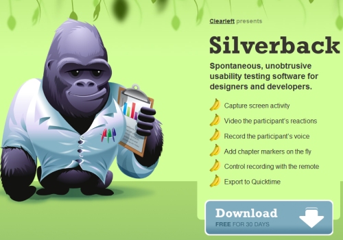
The website for Silverback contains no unnecessary text. Above the fold, visitors see a list of what Silverback does, and further down the page are some more details on the service, but only essential information is included.
5. Goals for Communication When Developing a Website
As you’re designing and developing websites, here are some goals to keep in mind that should help you stay focused on creating ones that communicate effectively.
5.1. Clarity
One of the major goals of communication for website designers, developers and owners should be to present a clear message through the website. Regardless of what methods are used to achieve this clarity, the message must not be difficult for visitors to recognize or understand. By the time visitors leave the website, they should have received and understood the primary message.
5.2. Communication that Truly Helps the Business and Visitors
While clarity is critical, clarity alone does little good for the business if the right message is not conveyed. Of course, the website will be most effective for the business and most useful to visitors if the messages being communicated are the most appropriate and significant ones.
LongTermClients offers business greeting cards, but that is not quite clear simply from the name LongTermClients. Below the title of the website, it says “business greeting cards,” which makes it much easier for visitors to know what the website is all about, and which should also improve the results of the website for the company.

5.3. Consistency of Message
Particularly with websites, consistency must be addressed. While the website’s home page may do an effective job of clearly communicating with visitors, many visitors will be entering the website through other pages. Are those secondary pages equally effective in communicating the same message? Secondary pages likely include additional information and messages for visitors, but the website should work as a whole to create a unified, consistent message.
5.4. Design that Enhances the Message
The appearance and style of the website should fit and complement the communication that is taking place, not interfere with it. A great-looking website is a wonderful thing, but it should never exist at the expense of its content or communication.
5.5. Communication that Relates to the Target Audience
In order for the website to maximize effectiveness, the communication must be relevant to the target audience of the website. If the website targets a specific audience, but the communication isn’t catered to them, the content will be ineffective. Make it a priority to meet your visitors at their level, whatever that level may be.
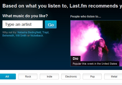
Last.fm uses a subtle but effective twist to the standard search box. Rather than simply saying “Search,” it asks the visitor “What music do you like?” Because its target audience consists of music lovers of all kinds, this simple question above the search box encourages visitors to enter a response of their own. Once they search for something that they like, they may find something that keeps them on the website for a while.
5.6. Use of Website Structure to Build on Communication
Part of building a website that communicates effectively is developing a clear website structure and navigation. A highly usable website with an effective structure can help further improve communication by making it clear to visitors what is available on the website and where they can go to find what they are looking for. Help make it easier for visitors to find what they want, and you’ll improve the overall communication that takes place.
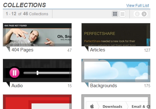
Gallery website Pattern Tap uses effective categorization to create structure and to make it super easy for visitors to find what interests them.
6. Results of Good Communication
Websites that are able to achieve effective communication with visitors benefit in several different ways. Likewise, websites that do not communicate effectively usually struggle in these areas.
6.1. Visitors who Understand the Purpose of a Website
A website that communicates effectively will benefit immensely if visitors are able to understand what the website is all about; and the experience will also be more pleasant for and useful to them. It’s hard to build a successful website that doesn’t start with a solid foundation of effective communication.
6.2. Improved Branding
Another significant result of effective communication is improved branding. If the message or purpose of the website is communicated effectively to visitors, it will leave an impression on them that will help form their image of the company. Branding is important online and off, and the messages being sent are a major factor.
6.3. Reduced Bounce Rates
Websites that communicate effectively will be more user-friendly and more helpful to visitors. Fewer visitors typically leave such websites quickly as a result of not being able to find what they are looking for. Instead, they’re likely to remain on the website for a longer period of time and view a higher number of pages. Because of effective communication, visitors find the right content easily.
6.4. Less Frustration for Visitors
We’ve all had the unpleasant experience of being on a website that simply doesn’t communicate well with visitors. Maybe the purpose of the website was unclear, or maybe you weren’t sure how to find what you were looking for. Websites that fail to communicate effectively frustrate many visitors, which is obviously not a good way to build a successful website.
6.5. More Sales, Leads, Subscribers, etc.
Websites have all kinds of different goals; but regardless of what the specific goals of your website are, the website is more likely to achieve them with effective communication. Whether you’re selling products, promoting a service, building a blog readership, developing a social network or simply providing information, communication is essential to success.
The website of Mia & Maggie uses color to make the text “Free shipping” stand out. By drawing more attention to that statement, the company will likely receive more orders from people who want to take advantage of the offer. Keeping that text white would likely not produce the same results.

6.6. Less Unnecessary Inquiries
If visitors can’t find what they’re looking for on your website or if they’re not sure what is offered, you’re likely to receive emails or contact form submissions that could be avoided with better communication. Receiving inquiries is certainly not a bad thing, but when you’re answering questions that are either already answered on the website or are asked repeatedly but not answered on the website, a breakdown in communication has occurred somewhere. Websites that do a good job of communicating with visitors may receive some of these kinds of inquiries from visitors who don’t make any effort to find the information, but generally they will receive less unnecessary inquiries because visitors will be able to find what they are looking for without needing to ask for help.


 Celebrating 10 million developers
 Register Free Now
 SurveyJS: White-Label Survey Solution for Your JS App


