Switch From Print To Web: Where To Start?
Making the switch from print publishing to digital publishing is a big step. But as costs for everything from paper to shipping increase, making the jump to digital is becoming more appealing to publishers of both newspapers and magazines. It’s a complicated process, though, and if not executed effectively, it can leave readers feeling alienated and disenfranchised.
Not exactly what you want, considering that it can be more difficult to attract and retain digital subscribers than to sell something outside of the virtual world. Below are some things to consider when making the switch, one of them being a free online PDF catalog creator for instance. Research up front will prevent headaches down the road.
You might be interested in the following related posts:
- The Future Of Content Delivery – How Print Loves Web
- So You Want To Write A Digital Strategy?
- An Organizational Structure That Supports Your Digital Presence
- Are We Thinking About Digital All Wrong?
1. Digital Publication Formats
There are three basic formats for digital publication, each with its own pros and cons.
Flip-Books
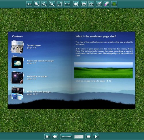
Digital flip-book-style magazines, commonly known simply as “digital magazines,” are a great option if you’re keeping a print presence. A number of companies offer flip-book solutions, and a few different formats are available. Encore Magazine is one of numerous examples of a Flash-based online magazine with a “print” look.
Distribution of this type of magazine is generally done via emailed links as well as links from your publication’s website and from online advertisements. Rights management for this type of file is very easy to set up. You can prevent text from being cut and pasted onto other websites, control the quality that pages are print in and make it impossible to copy or save the magazine files.
The biggest advantages of this format are the similarities to print publications. Readers turn pages and view things much as they would in a magazine or newspaper in real life. Page layouts can be taken directly from the files that go to the printer. In addition to including everything that appears in the standard print publication, most digital magazines in this format can add multimedia content, either for editorial sections or advertisers.
Click-throughs are easy to track for this type of publication, making it simple to provide advertisers with reports on traffic and even views. Some providers even tell you the amount of time visitors spend on each page in addition to overall views and click-through rates. Advertisers are almost always interested in how much attention their ads are getting, and this format can make it easier to track which pages and features increase click-throughs and viewership, making premium placements and add-ons easier to sell.
The disadvantages to this type of digital magazine are mostly related to cost and server space. You’ll either have to pay a service provider, such as Texterity or Zinio, to convert your PDF files to flip-book format, or you’ll have to have a staff member on hand capable of creating it (which generally requires pretty advanced knowledge of Flash). Most service providers charge a basic setup fee, an additional per-page surcharge and often a monthly hosting fee for completed magazines.
Search engine optimization is also more difficult with flip-book solutions because most are Flash- or image-based. Long-tail search results are harder to attain because, in most cases, not all text is available to search engines.
Resources:
- Flash Page Flip Engine is a good solution for in-house creation of digital magazines.
- Texterity is a flip-book creator that includes a built-in lead management system.
- Zinio is probably the largest digital magazine creator and has an online newsstand where it sells subscriptions and single copies.
PDF Magazines
PDF magazines are excellent for a more budget-conscious publication that still wants to keep its print format or wants to make the publication more portable. Creating PDFs for distribution online is no more difficult than creating them for printing, and in many ways is much more forgiving.
Distribution is similar to that of a flip-book-style magazine, though depending on the size of your file, you may also be able to email it directly to subscribers. Digital rights management can be controlled through the security settings in your PDF editor.
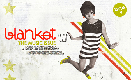
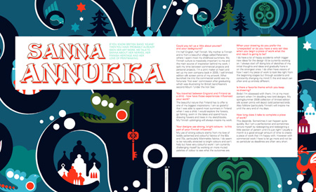 Blanket is a PDF magazine. It offers a mix of excellent writing, colorful layouts, and good content.
One of the biggest advantages of simple PDF magazines is their ease of setup. Page files are generally sent to printers in PDF format, so setting up the same files for Web distribution is an easy-enough transition. Another advantage is cost. In all likelihood, a publication already owns the software required to create the magazine, and staff wouldn’t need additional training.
Depending on the size of the files created, hosting and bandwidth needs would not be too high. Consideration should be given to size, because publications will need to be downloaded to be viewed. Portability is another advantage, as readers can download and save the magazine or newspaper to their hard drive or any portable device capable of reading PDFs.
Newer PDF formats can include multimedia files and links, making them more competitive with flip-book-style magazines. Inclusion of multimedia files does, however, increase the overall file size and should be used sparingly to prevent the file from becoming unwieldy. And because search engines can index PDFs like any other content online, SEO is easier than with flip-book-format magazines.
PDF does have disadvantages. File size needs to be carefully monitored. In publications that are image-heavy or include multimedia, files can quickly exceed 100 MB. Image compression can go a long way to remedying this problem, but if you go too far, you’ll sacrifice quality and images won’t appear crisp on the screen. To encourage readers to download, the optimal file size is generally around 10 MB. If your target readership likely has a slower connection speed, you’ll need to be even more diligent about file size.
Resources:
- Adobe Acrobat is the most fully featured PDF creation software out there.
- pdf-mags.com is a distribution website for free PDF-based magazines.
Blog- and Website-Based Magazines
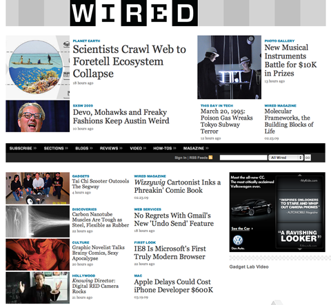
The best solution for many types of publications, especially ones not keeping a print presence, is to discard the print-style magazine or newspaper format and simply set up a blog or website with a news- or magazine-style theme. This is one of the most cost-effective solutions for digital publications. Often, whoever does your website design or maintenance can set up a section of your website to serve as an online publication.
Distribution is as simple as sending out an announcement whenever new articles are added and setting up RSS feed capability (generally built into blog software). Security is a bigger concern because cut-and-paste functions are enabled by default on this type of website, making it easier for others to steal content for use on their own websites. These capabilities can be disabled, however, and you may want to consider doing so.
The biggest advantages of this type of format are the costs and ease of use on both the publication’s and reader’s end. Your readers are already accustomed to reading articles online, so the transition won’t likely alienate them. Bandwidth and storage issues are no worse than for any high-traffic website. Readers can choose how to be notified of new content, either through RSS or email. Re-distribution to friends and other interested contacts is easy enough through email, and an “Email to a friend” button is a useful feature to include right at the article level.
If your publication is image-heavy, this format may not be the right solution, or at least more care will need to be taken during the initial design and setup stages. Take into account how many images you’ll want to have for each article and how important those images really are. Consideration should be given to how the images will look on screen and in the context of the overall text layout.
Resources:
- WordPress is a great, free platform for creating blog-based publications.
- Movable Type is another platform for blog-based publications.
- This article on free WordPress templates contains a number of high-quality magazine themes perfect for online publications.
A Hybrid Approach
A hybrid approach is another option. Combine any or all of the approaches above to increase options for your readers. Providing an online flip-book that can be downloaded in PDF format gives your readers the best of both worlds. Letting casual visitors read articles right on your website is a good solution that can increase subscriber numbers, with little investment on the part of the visitor.
If you use this approach, make sure to integrate each solution fully and that your publication has a style that carries over between the different formats. Otherwise, you risk making things look like they have been pieced together after the fact.
Resources:
- Magazooms provides a variety of flip-book options with the ability to download a personal PDF copy.
2. Special Design Considerations
Typography and images are the two major design elements you’ll need to reconsider when making the switch from print to online publishing. No matter which format you’ve chosen, there are distinct differences between the way something appears on screen and the way it appears in print. In many ways, online publishing is much more forgiving than print of image compression and quality. On the other hand, digital typography is, in many ways, harder to master than print typography.
Typography
A couple of major differences exist between best practices in print typography and those in digital typography. Font type and size should be reconsidered when transitioning between print and digital. Contrast between the font color and background color should also be taken into consideration.
1. Font Choice Typography is probably the most important decision you’ll make when transitioning from print to digital. Serif fonts have traditionally been used for body text in print publications because they are easier to read on paper. But studies have shown that sans-serif fonts have higher readability on screen. Switching the body text of your articles to a sans-serif font will often change the entire look of the publication and may require tweaking the overall design to maintain a unified style.
While many fonts originally designed for print are perfectly readable on screen, using fonts that are optimized for on-screen readability often comes with advantages. Georgia (serif) and Verdana (sans-serif) were both designed for on-screen use.
Compare the difference between 11-point Times New Roman…
Times New Roman 11 point Phasellus codnimentum, est eu congue dapibus, justo trtor lobortis massa, sit amet dictum massa erat in lectus. Donec turpis mauris, mattis in, consequat nec, faucibus. Aliquam auctor mattis odio. Fusce congue commodo felis.
…and 11-point Georgia:
Georgia 11 point Phasellus codnimentum, est eu congue dapibus, justo trtor lobortis massa, sit amet dictum massa erat in lectus. Donec turpis mauris, mattis in, consequat nec, faucibus. Aliquam auctor mattis odio. Fusce congue commodo felis.
Most will agree that the Georgia is much more readable than the Times New Roman example.
The same is true for sans-serif fonts. Here’s 11-point Arial…
Arial 11 point Phasellus codnimentum, est eu congue dapibus, justo trtor lobortis massa, sit amet dictum massa erat in lectus. Donec turpis mauris, mattis in, consequat nec, faucibus. Aliquam auctor mattis odio. Fusce congue commodo felis.
…and 11-point Verdana:
Verdana 11 point Phasellus codnimentum, est eu congue dapibus, justo trtor lobortis massa, sit amet dictum massa erat in lectus. Donec turpis mauris, mattis in, consequat nec, faucibus. Aliquam auctor mattis odio. Fusce congue commodo felis.
While both were designed specifically for on-screen use, Verdana still comes out easier to read in most cases.
Use Verdana and Georgia as your “gold standards” of on-screen typography; when searching for fonts, compare the readability of those to these. If a font is at least as readable as either of these, then you’re on the right track. If it falls short, you’ll have to either increase the font size or play around with contrast to make the type more legible. And remember, if you’re using a website- or blog-based publication format, you’ll need to stick with Web-safe fonts (I’d just recommend Verdana or Georgia in this case).
2. Font Size Most print publications use a 10- or 11-point font (some even go as small as 9 points). While this is perfectly legible on paper, it is often very difficult to read on-screen. And in the case of flip-book magazines, it means that even readers with excellent eyesight will have to zoom in to read articles. Increasing your font size to 12- or even 14-point type will make your articles much more reader-friendly.
Here is an illustration of how increasing the font size to 12 points makes a big difference in readability:


Compare the difference between Verdana and Georgia:


Notice how Verdana is, for the most part, still easier to read than Georgia.
If you’ve opted for a website- or blog-based digital publication, including links to increase or decrease font size is a nice feature to add. Depending on your target market, your users may not be familiar with their browser’s ability to increase and decrease type size.
The size you choose should correspond directly to the font’s complexity. If you’re using an elaborate script or grunge font (and I would recommend using these only for headers and sub-headings), you’ll want to increase the font size. Simpler fonts usually can be kept smaller.
3. Contrast and Color For some reason, a lot of people who design perfectly beautiful print products sometimes go nuts with color when they design digital products. Here are some best practices for color and contrast.
Using a very dark gray type instead of black is sometimes easier on the eyes. Even switching to a #999999 gray on a white background can make a world of difference in preventing eye strain in your readers. Going for too light and too low a contrast can have the opposite effect and make it harder to read (i.e. don’t use a #333333 gray on a white background).


While the first two are perfectly legible, the medium-gray type is noticeably harder to read for long periods of time. The light-gray font is very difficult to read and is probably best not used at all or reserved for things like image captions.
Beware of using a dark background with white type. Large blocks of white text set against a black background become very difficult to read. If you’re determined to use a combination of dark background and light text, decrease the contrast. Use a #333333 gray type on a black background, or even a #999999 background. In the examples below, notice how harsh the white text on the black background looks. When the text color is changed to a light gray or the background is changed to a dark gray, it is noticeably smoother.


Colored headings are perfectly fine to use, though fluorescent colors are often harder to read. Also, don’t use a type color and background color that are opposite on the color wheel (blue and orange, purple and yellow, red and green, etc.) Color combinations like these are almost impossible to read.

Colored body text is much trickier than colored headings. Navy blue, hunter green, dark brown and similar colors are generally fine on a white or very light-colored background. But the further you stray from black and gray and the brighter you go, the harder your text becomes to read.


While the dark blue is completely readable, the green is almost illegible. The red is readable but much more likely to cause eye strain in long passages of text. Use it sparingly.
Images
There are two major differences between print and on-screen images. The first is the color space used, CMYK vs. RGB. The second is compression and overall image size.
CMYK vs. RGB CMYK stands for Cyan, Magenta, Yellow and Key (Key being whatever ink color makes black on the paper color you’re using – usually just black itself) and is the standard color space for printed material. Using these four ink colors in different screens, you can produce virtually any color in print. RBG, on the other hand, stands for Red, Green and Blue and is what every computer monitor, television and other digital equipment uses to produce color.
RGB generally produces brighter and more vibrant colors. As the photo below illustrates, blue is especially affected by the conversion from RGB to CMYK. Shades of just about any color can be affected and will generally appear duller in CMYK.

Because images in digital publications are viewed in RGB, no conversion is needed (scanners and digital cameras both render images natively in RGB). The other major advantage is that what you see on screen is what your readers will see (barring differences in monitor calibration). This means that proofing on screen is adequate, without the need to print out individual pages.
Image Compression and Sizing Because images in digital publications are viewed on screen, they can be compressed much more.
To determine the size your image needs to be, figure out how large your image will be at full zoom in your digital publication’s format. Your image will need to be at least that size at 72 dpi. If you’re working with a digital flip-book or PDF-style magazine, you may need to increase the dpi to make the image fit on the page at the proper size. For example, if your magazine can be zoomed in to twice its normal size, you’ll need to make your images at least 144 dpi. If you can zoom in to three times the normal size, your images will need to be at least 216 dpi.
I recommend using JPEG (set to “high” quality, usually level 8 or 9) or PNG format for your image files. Be careful with compression in JPEG, however, because you’re more likely to end up with “artifacts” in your final image. PNG offers a number of advantages to GIF, particularly when it comes to options for transparency and true-color palettes. And PNG images can be compressed to between 10 to 30% more than GIF images. For the most part, unless you are repeatedly re-saving images, the format you choose will make little difference to anything other than file size.
Resources:
- Graphic Design from Print vs. the Web covers the basic differences between print and digital design.
- Print Design vs. Web Design covers some of the specific differences between print and Web design.
- This Way to the Web, Print Designers! gives a good overview of switching from print to Web design.
3. Subscribers And Distribution
Distribution of the magazine can be handled in different ways. An RSS feed is a great way for all of the formats discussed above. Email announcements are another method.
RSS feeds are great for magazines with more tech-savvy readerships. Your own target readership may or may not be familiar with RSS, though the format is becoming more popular and widely known every day. It’s a good option to offer across the board, though, because delivery by this method is more reliable than by email.
Email distribution can be plagued with problems. Maintaining unsubscriber lists can be a headache and come with legal ramifications if laws and regulations are not adhered to. Bulk emails always run the risk of ending up in spam or junk folders, and special programs are needed to manage large mailing lists. A number of providers out there will manage email lists and mailings for you, though prices vary and sometimes long-term contracts are required, as are monthly fees.
Getting subscribers is a bit more difficult, too. Targeted advertising is probably the most useful method, along with search engine optimization. Including both RSS and email subscription options is another way to increase your subscriber numbers. Both should serve as valid measurements when discussing subscriber rates with potential advertisers.
Use Verdana and Georgia as your “gold standards” of on-screen typography; when searching for fonts, compare the readability of those to these. If a font is at least as readable as either of these, then you’re on the right track. If it falls short, you’ll have to either increase the font size or play around with contrast to make the type more legible. And remember, if you’re using a website- or blog-based publication format, you’ll need to stick with Web-safe fonts (I’d just recommend Verdana or Georgia in this case).
2. Font Size Most print publications use a 10- or 11-point font (some even go as small as 9 points). While this is perfectly legible on paper, it is often very difficult to read on-screen. And in the case of flip-book magazines, it means that even readers with excellent eyesight will have to zoom in to read articles. Increasing your font size to 12- or even 14-point type will make your articles much more reader-friendly.
Here is an illustration of how increasing the font size to 12 points makes a big difference in readability:


Compare the difference between Verdana and Georgia:


Notice how Verdana is, for the most part, still easier to read than Georgia.
If you’ve opted for a website- or blog-based digital publication, including links to increase or decrease font size is a nice feature to add. Depending on your target market, your users may not be familiar with their browser’s ability to increase and decrease type size.
The size you choose should correspond directly to the font’s complexity. If you’re using an elaborate script or grunge font (and I would recommend using these only for headers and sub-headings), you’ll want to increase the font size. Simpler fonts usually can be kept smaller.
3. Contrast and Color For some reason, a lot of people who design perfectly beautiful print products sometimes go nuts with color when they design digital products. Here are some best practices for color and contrast.
Using a very dark gray type instead of black is sometimes easier on the eyes. Even switching to a #999999 gray on a white background can make a world of difference in preventing eye strain in your readers. Going for too light and too low a contrast can have the opposite effect and make it harder to read (i.e. don’t use a #333333 gray on a white background).


While the first two are perfectly legible, the medium-gray type is noticeably harder to read for long periods of time. The light-gray font is very difficult to read and is probably best not used at all or reserved for things like image captions.
Beware of using a dark background with white type. Large blocks of white text set against a black background become very difficult to read. If you’re determined to use a combination of dark background and light text, decrease the contrast. Use a #333333 gray type on a black background, or even a #999999 background. In the examples below, notice how harsh the white text on the black background looks. When the text color is changed to a light gray or the background is changed to a dark gray, it is noticeably smoother.


Colored headings are perfectly fine to use, though fluorescent colors are often harder to read. Also, don’t use a type color and background color that are opposite on the color wheel (blue and orange, purple and yellow, red and green, etc.) Color combinations like these are almost impossible to read.

Colored body text is much trickier than colored headings. Navy blue, hunter green, dark brown and similar colors are generally fine on a white or very light-colored background. But the further you stray from black and gray and the brighter you go, the harder your text becomes to read.


While the dark blue is completely readable, the green is almost illegible. The red is readable but much more likely to cause eye strain in long passages of text. Use it sparingly.
Images
There are two major differences between print and on-screen images. The first is the color space used, CMYK vs. RGB. The second is compression and overall image size.
CMYK vs. RGB CMYK stands for Cyan, Magenta, Yellow and Key (Key being whatever ink color makes black on the paper color you’re using – usually just black itself) and is the standard color space for printed material. Using these four ink colors in different screens, you can produce virtually any color in print. RBG, on the other hand, stands for Red, Green and Blue and is what every computer monitor, television and other digital equipment uses to produce color.
RGB generally produces brighter and more vibrant colors. As the photo below illustrates, blue is especially affected by the conversion from RGB to CMYK. Shades of just about any color can be affected and will generally appear duller in CMYK.

Because images in digital publications are viewed in RGB, no conversion is needed (scanners and digital cameras both render images natively in RGB). The other major advantage is that what you see on screen is what your readers will see (barring differences in monitor calibration). This means that proofing on screen is adequate, without the need to print out individual pages.
Image Compression and Sizing Because images in digital publications are viewed on screen, they can be compressed much more.
To determine the size your image needs to be, figure out how large your image will be at full zoom in your digital publication’s format. Your image will need to be at least that size at 72 dpi. If you’re working with a digital flip-book or PDF-style magazine, you may need to increase the dpi to make the image fit on the page at the proper size. For example, if your magazine can be zoomed in to twice its normal size, you’ll need to make your images at least 144 dpi. If you can zoom in to three times the normal size, your images will need to be at least 216 dpi.
I recommend using JPEG (set to “high” quality, usually level 8 or 9) or PNG format for your image files. Be careful with compression in JPEG, however, because you’re more likely to end up with “artifacts” in your final image. PNG offers a number of advantages to GIF, particularly when it comes to options for transparency and true-color palettes. And PNG images can be compressed to between 10 to 30% more than GIF images. For the most part, unless you are repeatedly re-saving images, the format you choose will make little difference to anything other than file size.
Resources:
- Graphic Design from Print vs. the Web covers the basic differences between print and digital design.
- Print Design vs. Web Design covers some of the specific differences between print and Web design.
- This Way to the Web, Print Designers! gives a good overview of switching from print to Web design.
3. Subscribers And Distribution
Distribution of the magazine can be handled in different ways. An RSS feed is a great way for all of the formats discussed above. Email announcements are another method.
RSS feeds are great for magazines with more tech-savvy readerships. Your own target readership may or may not be familiar with RSS, though the format is becoming more popular and widely known every day. It’s a good option to offer across the board, though, because delivery by this method is more reliable than by email.
Email distribution can be plagued with problems. Maintaining unsubscriber lists can be a headache and come with legal ramifications if laws and regulations are not adhered to. Bulk emails always run the risk of ending up in spam or junk folders, and special programs are needed to manage large mailing lists. A number of providers out there will manage email lists and mailings for you, though prices vary and sometimes long-term contracts are required, as are monthly fees.
Getting subscribers is a bit more difficult, too. Targeted advertising is probably the most useful method, along with search engine optimization. Including both RSS and email subscription options is another way to increase your subscriber numbers. Both should serve as valid measurements when discussing subscriber rates with potential advertisers.
Resources:
- ConstantContact is an email marketing platform that comes with a 60-day free trial.
- iContact is another email marketing platform that includes a number of extra features.
- poMMo is open-source mass-emailing software that is a good solution for those who want to do everything in-house.
4. Revenue Generation
Advertising is probably the most promising revenue stream for digital publications, as it is with most print magazines and newspapers. Subscriber-based methods of generating revenue are more difficult online unless you are dealing with a very specialized niche market. With so much free information available online, you have to offer something very unique to attract enough people who are willing to pay for your content.
More advertising options are available with flip-book and PDF magazines than with standard print magazines. Common add-ons for which you can charge are active website links, multimedia content (Flash videos, audio files, etc.) and special sponsorships. Charging for each add-on can increase revenue streams.
Generally, pricing should be based on traffic and readership numbers. Compare these numbers to the rate per thousand impressions on websites in similar niches to get a good baseline for advertising rates. Website advertisements can be done in the same formats that most other websites offer.
Don’t overlook advertising opportunities in subscription delivery. You can sell ads that appear within RSS feeds and in email announcements. Ads on the website where your magazine is distributed are another oft-overlooked opportunity for more revenue.
Resources:
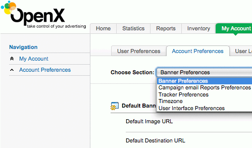
- OpenX is free, open-source ad-server software.
- This article on Google AdSense provides a good overview of this option for advertising on the pages that serve your magazine.
- This article on monetizing your RSS feeds lists eight ways to make money from your RSS feeds.
5. Other Considerations
Article length and even paragraph length should be considered in digital publications. While PDF and flip-book formats are more forgiving (because they more closely resemble print), remember that people often tire of reading things online more quickly than in print. Allowing readers to print pages and articles can help curb this problem.
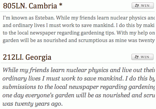 TypeChart lets you flip through, preview and compare Web typography while retrieving the CSS.
With website- and blog-based publications, paragraph and article length is more important. Keep your paragraphs shorter and break up long articles into multiple pages if possible.
Resources:
- TypeChart is a great place to find readable online fonts and get their CSS code.
- 5 Principles and Ideas of Setting Type on the Web is a great article that covers typography issues online that may not be encountered in a print environment.
- A collection of tutorials, resources and more on Image Optimization for the Web.
While print and Web publications have many similarities, they also have a lot of subtle differences. The Web offers more options with multimedia and is, in many ways, an easier format to work with. Take time to plan out your solution. Changing your mind after a few issues can be a costly and time-consuming decision. Good planning and full investigation of the options available to you can save headaches later on.
Further Resources
- Newspaper Website Design: Trends and Examples
- Award-Winning Newspaper Designs
- When To Use Magazine-Style Themes For Blogs?
- Blog vs. Web vs. PDF (magazine)
- Making The Transition From Print To Web
- What Magazines Still Don’t Understand About The Web
- What Newspapers Still Don’t Understand About The Web


 JavaScript Form Builder — Create JSON-driven forms without coding.
 Get a Free Trial
 Register For Free
 Devs love Storyblok - Learn why!
