Progressive Enhancement: What It Is, And How To Use It?
Progressive Enhancement is a powerful methodology that allows Web developers to concentrate on building the best possible websites while balancing the issues inherent in those websites being accessed by multiple unknown user-agents. Progressive Enhancement (PE) is the principle of starting with a rock-solid foundation and then adding enhancements to it if you know certain visiting user-agents can handle the improved experience.
PE differs from Graceful Degradation (GD) in that GD is the journey from complexity to simplicity, whereas PE is the journey from simplicity to complexity. PE is considered a better methodology than GD because it tends to cover a greater range of potential issues as a baseline. PE is the whitelist to GD’s blacklist.
Further Reading on SmashingMag:
- Progressive Enhancement Is Faster
- Progressive Enhancement And Standards Do Not Limit Web Design
- Reimagining Single-Page Applications With Progressive Enhancement
- Preload: What is it good for?
That’s All Well and Good, But Why Would I Want To Use It?
Part of the appeal of PE is the strength of the end result. PE forces you to initially plan out your project as a functional system using only the most basic of Web technologies. This means that you know you’ll always have a strong foundation to fall back on as complexity is introduced to the project.
PE goes well with the principle of “Release early, release often.” By starting with a strong foundation, you are able to release projects that work and then concentrate on adding the bells and whistles at a more appropriate time.
PE projects are easier to maintain. With this focus on “first principles,” developers can concentrate on more complex sections of system interaction without worrying about the foundation.
PE is also good for your users. It gives them the security of knowing they can visit your website using any of the thousands of user-agents available to them and still interact with your content as that agent allows.
All Right, So How Do I Use It?
In practical terms, it’s easiest to break the concept of PE into different layers, each one building on the previous to improve the experience of interacting with the website.
The Layers
The first layer is clean, semantic HTML. This allows text-based, speech-based, antiquated and robotic user-agents to navigate the content of your website properly.
The second layer is CSS. This allows visual-based user-agents to display or alter the visual representation of your website’s content.
The third layer is JavaScript. This allows user-agents that are capable of using it to provide your users with enhanced usability.
A practical example
We’ll create a Progressively Enhanced list of website navigation items whose order is saved by the user. Our ultimate goal is for users to have a drag-and-drop experience that saves the menu order via AJAX. But because we’ll be reaching that end goal through the principles of PE, all user-agents should be able to interact with our list in the way most appropriate to them.
The first layer
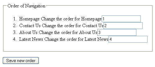
Here we have the semantic markup of the navigation. See navigation-1.html.
<form action="save_order.php" method="post">
        <fieldset>
            <legend>Order of Navigation</legend>
            <ol>
                <li id="homepage-12">Homepage <label for="menu-id-12">Change the order for Homepage</label><input type="text" name="homepage-12" id="menu-id-12" value="1" /></li>
                <li id="contact-23">Contact Us <label for="menu-id-23">Change the order for Contact Us</label><input type="text" name="contact-23"  id="menu-id-23" value="2" /></li>
                <li id="about-16">About Us <label for="menu-id-16">Change the order for About Us</label><input type="text" name="about-16"  id="menu-id-16" value="3" /></li>
                <li id="latest-14">Latest News <label for="menu-id-14">Change the order for Latest News</label><input type="text" name="latest-14"  id="menu-id-14" value="4" /></li>
            </ol>
        </fieldset>
        <p><input type="submit" value="Save new order" /></p>
    </form>
The navigation is laid out as an ordered list within a form so that the user can alter the order using the input boxes provided. The individual list items are given an ID that correlates to the name of the input box (for reasons that will become apparent later – for now, it does nothing but add a little weight to the markup). The labels for the input fields help the user figure out how to use the form.
Clicking “Save” will POST to the PHP page, which will determine the new order and print the results, but which could just as easily save to a database. The page is not very attractive to look at, but the important thing is that every element is in place to allow any user-agent, no matter how basic, to read and make sense of the form. Screen readers should be able to process this form easily, and keyboard navigation is functional and enabled by default.
Our save_order.php page is very simple and just echos the order of the menu items sent through in the POST.
<?php
    foreach($_POST as $menu_item=>$order) {
        echo "The order for $menu_item is $order";
    }
    ?>
Obviously, this isn’t a production script. It simply illustrates that the procedure for processing a form should be one of the first interactions in PE.
The second layer
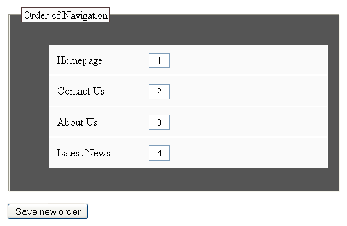
Now, we’ll add a CSS layer to give the form a bit of visual elegance. See navigation-2.html.
name="code">
    <style type="text/css">
        form { width: 50%; margin: 0 auto;  }
        fieldset { background: #555555; padding: 1em; }
        legend { border: 1px #513939 solid; background: #FAFAFA;}
        label { position: absolute; margin-left: -999em; }
        ol { list-style: none; position: relative; }
        body { font: 100% serif; }
        ol li { border: 1px #FFF solid; background: #FAFAFA; padding: 0.7em; }
        ol li:hover { border: 1px #513939 solid; }
        input[type='text'] { width: 2em; text-align: center; position: absolute; left: 40%; }
    </style>
We took the labels out of the document flow with position: absolute and then gave them an outrageous negative margin to remove them visually while leaving them in place for screen readers (which can still read them in the original order because we’re not removing them with display: none).
We removed the numbers from the ordered list to avoid the potential confusion of having two sets of numbers for the list items.
We maintained the font size to initially be equal to whatever the user-agent has set as a preference and asked the user-agent to use its own default serif font.
We gave the individual list elements an outline and a bit of padding to see them more easily. To give the user a little more of a visual hint that the list items are movable, we also gave them a hover state that we know will be used by any user-agent that can handle it. Input boxes are neatened up a little, too, for browsers that can handle attribute selectors.
The form now looks a lot neater and is still just as functional as the first layer.
The third layer
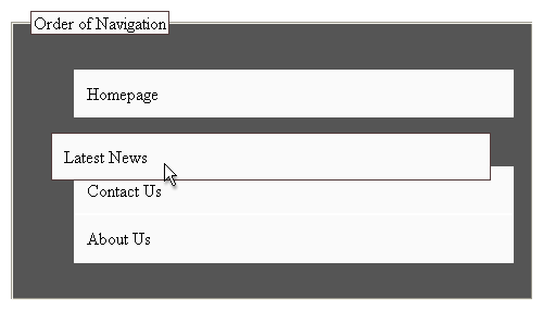
Finally, we’ll add the JavaScript layer, which allows the user to simply drag and drop the navigation items into the desired order. We’ll use jQuery to make the process as painless as possible (both for us and our users). See navigation-3.html.
    <script type=“text/javascript”>
        $(document).ready(function() {
            $(‘input’).hide();
            $(‘ol’).sortable({items: ‘li’,
                update: function(event, ui) {
                    var new_order = $(‘ol’).sortable(‘toArray’);
                    $.each(new_order, function(i, element) {
                        $(‘input[name=‘+element+’]‘).attr(‘value’, i+1);
                    });
                    $.post(“save_order.php”, {
                        ‘new_order’: $(‘form’).serialize()
                    })
                }
            });
        });
    </script>

- Hide the input fields because we’re providing users with a different usability experience.
- Make the ordered list sortable using the jQuery UI sortable plug-in.
- Update the new order each time the DOM changes. We’ll use the options and utility functions in jQuery and the plug-in to get the new order for the list items and to set the value of each text field to match each list item’s unique ID.
- Send the newly updated form to the server via POST.
- Parse the new_order variable that we sent via AJAX to match the values expected by the original PHP script.
Our server-level script in save_order.php needs to change very little to still work. We simply take the new AJAX posted value and parse it into the POST that the original form was looking for. This is another of the strengths of PE: by adding the basic form interactions in the first layer, it becomes much easier to add potentially complex interactions in later stages with minimal fuss.
<?php
        if(isset($_POST['new_order'])) {
            parse_str($_POST['new_order'], $_POST);
        }
        foreach($_POST as $menu_item=>$order) {
            echo "The order for $menu_item is $order";
        }
    ?>
Now, here’s the interesting thing about this last layer: while the drag-and-drop functionality makes menu ordering more usable for many users, it actually makes it less accessible, too. Our users now have to use the mouse to reorder menu items; those who prefer keyboard shortcuts will have a frustrating experience, and blind users would find it totally unusable (even if they could drag and drop the new menu elements, they have no way of updating the new values to their screen reader).
There are a few solutions to this problem, from as complex as rewriting the sortable jQuery plug-in to be keyboard-accessible and WAI-ARIA-compliant to as simple as providing a quick link at the top of the page that allows users to turn off JavaScript and use the more accessible version we had in layer 2.
Okay, You’ve Convinced Me…
While this is a very basic example, it illustrates the power of using Progressive Enhancement in development. By clearly establishing how a system’s interactive elements are supposed to function at the most basic level, you gain a clearer understanding of the project’s requirements. Your clients will be happy with the rock-solid results, the more accurate time-frame estimates and the easier maintenance, and you will be happy knowing you’ve provided a better, stronger product that benefits more people.
Related Articles To Progressive Enhancement
You may be interested in the following related articles:
- Graceful degradation versus progressive enhancement
- Delivering the right experience to the right device
- Pragmatic progressive enhancement - why you should bother with it


 Celebrating 10 million developers
 SurveyJS: White-Label Survey Solution for Your JS App
 Register Free Now

