30 Beautiful Real Estate Websites
Real estate is a valuable and often expensive purchase. Copious research is done by home buyers before venturing out to acquire real estate. In this day and age, gathering information about a property is typically done online, and an effective and captivating website design can make or break a home sale.
In this showcase, we’ll explore some great designs of real estate websites. We’ll also discuss some commonalities between them to tease out current trends in real estate websites.
You may also be interested in the following related posts:
- Web Design Showcases From Various Industries
- Global Web Design Showcases
- Portfolio Web Design Showcases
Trends In Real Estate Websites
1. Traditional/Sophisticated Themes Versus Modern/Contemporary Themes
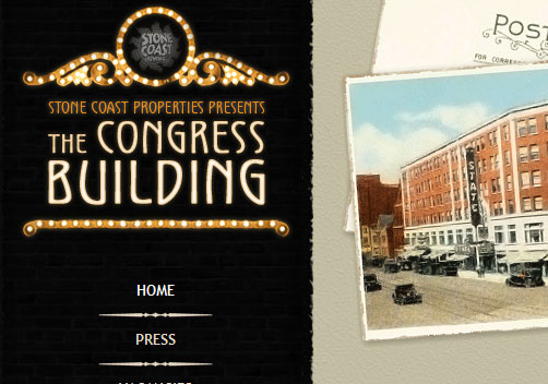
Property realtors want to convey the message that they’re reliable and well-established. They want home buyers to feel that they will be purchasing property from a company that’s dependable, steadfast and time-tested. That’s why most of them opt for a classic and sophisticated theme for their websites, rather than a sleek, modern theme.

2. Image-Heavy Designs
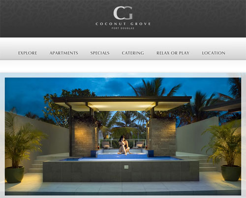
Home buyers want to see what they’re potentially buying without having to take the time to travel to a property. Real estate websites typically contain a lot of images for this very purpose.
3. Photo Galleries
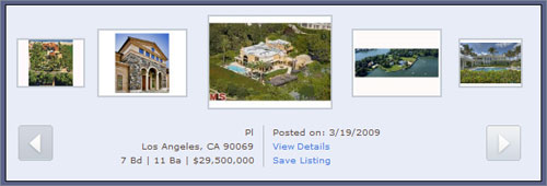
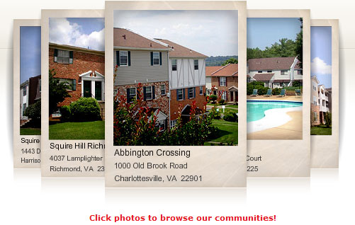
Again, photo galleries allow website visitors to see what properties look like without having to leave their computer. That is why you’ll often find image galleries that feature properties that realtors currently have available.
4. Property Locator Feature
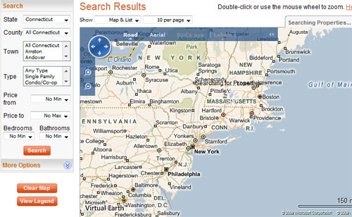
Many real estate websites provide a property locator feature for home buyers to find properties for sale in areas they are interested in.
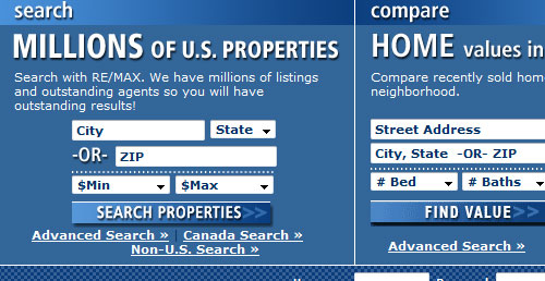
Real estate property locator features are usually a Web form with various input fields – such as property type, property features, price range, zip code, etc. – so that you can easily narrow down your search to the exact type of property you’re looking for.

Many realtors use a third-party service or application (such as Google Maps) to enable this feature on their websites.
Showcase
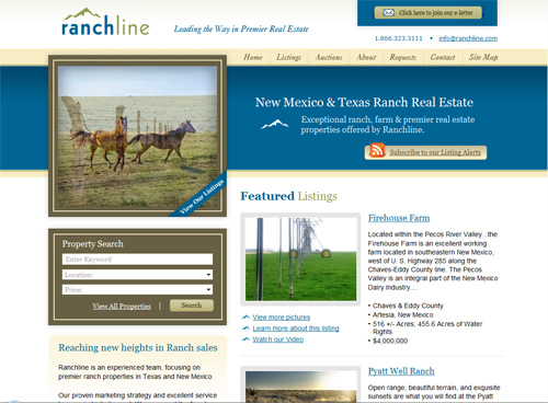
Ranchline Ranchline is an excellent example of a real estate website that embodies the trends discussed above: clean and sophisticated design, image-heavy and graphic-centric, with a property search feature conveniently located in the left-hand column.
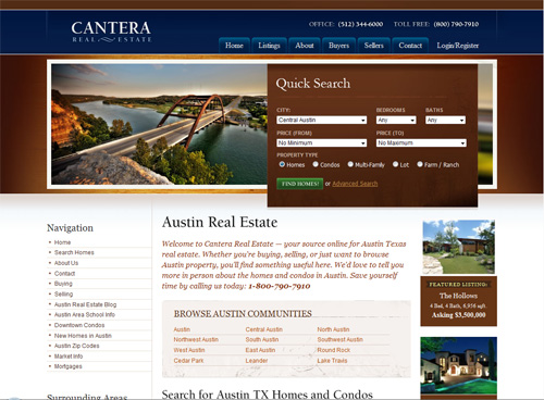
Cantera Real Estate Cantera Real Estate has a clean, captivating traditional design and presents a housing locator to visitors in the top half of the home page.
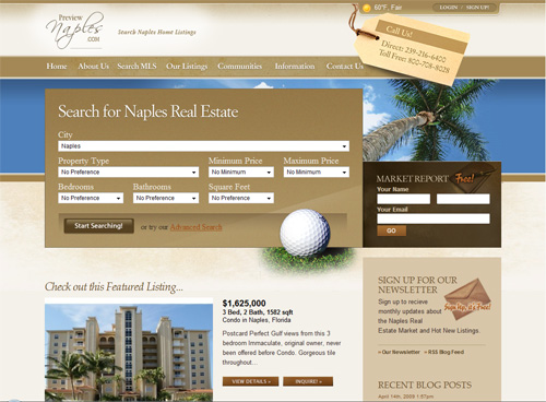
Naples Real Estate Naples Real Estate features a property for sale on the home page to highlight a piece of real estate that they’re currently promoting.
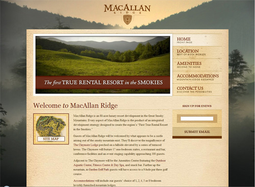
MacAllan Ridge MacAllan Ridge’s beautiful design uses an illustrated background as its defining feature.
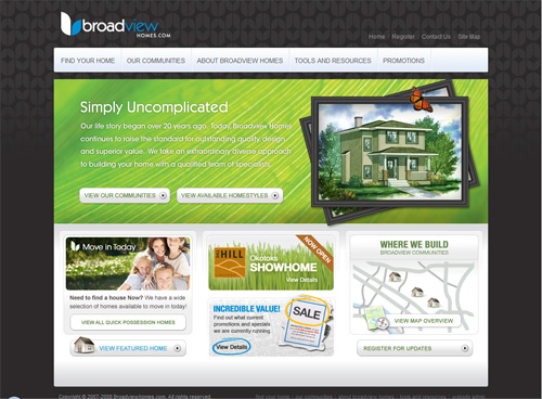
Broadview Homes Broadview Homes ventures out of the box with a dark and very modern theme.
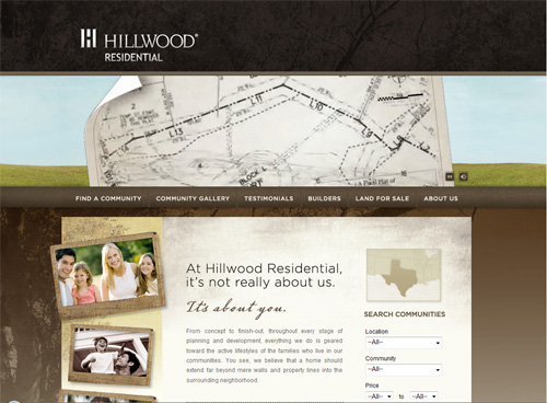
Hillwood Residential Hillwood Residential uses family photos in frames to give off a feeling of traditionalism and family values.
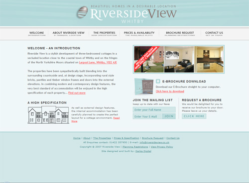
Riverside View Riverside View uses a light-blue color palette that evokes a feeling of modernity coupled with sophistication.
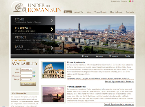
Under the Roman Sun Under the Roman Sun captivates viewers with its large beautiful images of Rome in the top half of the home page.
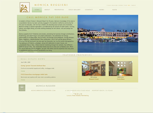
Monica Ruggieri Real Estate Monica Ruggieri’s design is a great example of using classic and sophisticated themes on a real estate website.
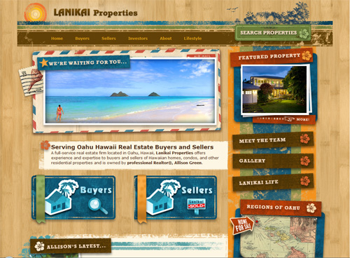
Lanikai Properties Lanikai Properties uses a bold and colorful theme to portray the nature of its properties in Hawaii.
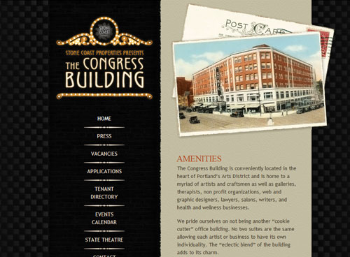
Stone Coast Properties Stone Coast Properties has a dark background with classic and vintage design elements.
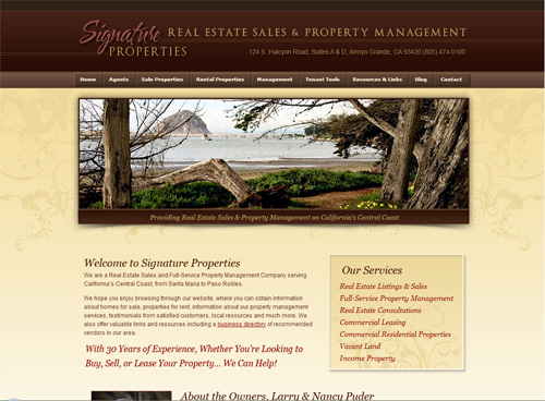
Signature Properties Signature Properties has a clean and sophisticated design.
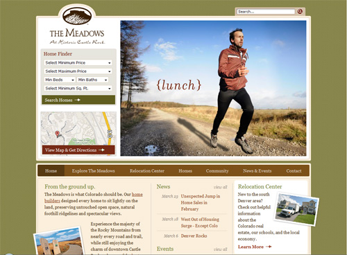
The Meadows at Historic Castle Rock On the home page of The Meadows at Historic Castle Rock, you’ll see an image-heavy, Flash-based slideshow.
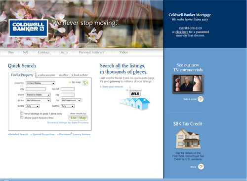
Coldwell Banker Real Estate This well-established real estate agency, Coldwell Banker, has a clean Web form at the center of its design.
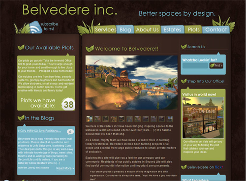
Belvedere Inc. Belvedere Inc. uses a dark-brown textured page background and green leaf elements to evoke a feeling of nature and environmental friendliness.
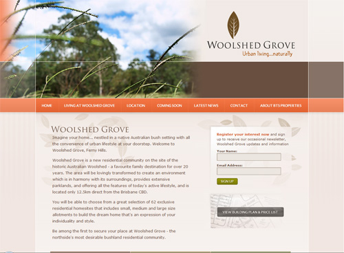
Woolshed Grove Woolshed Grove has images of families in the header.
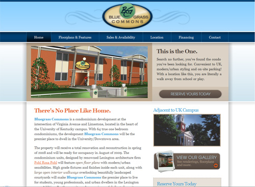
Bluegrass Commons Bluegrass Commons captures the viewer’s attention with the promise that, “This is the one.”
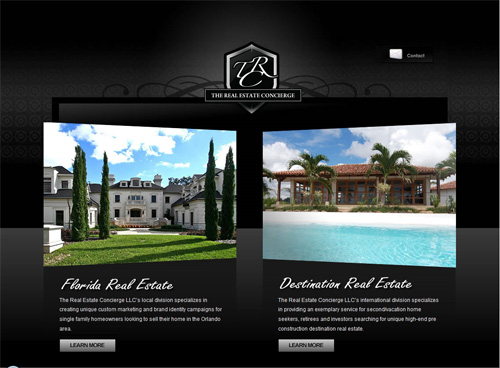
The Real Estate Concierge The Real Estate Concierge’s website has a dark theme to create a sense of sophistication and affluence.
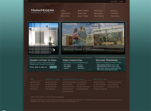
Marin Real Estate Marin Real Estate relies on the slideshow on its home page to captivate viewers.
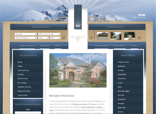
Bellingham Real Estate Bellingham Real Estate has an engaging image of a mountain range in the header section.
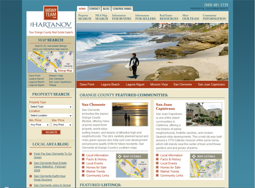
San Clemente Real Estate “Clean” best describes the design of the San Clemente Real Estate website.
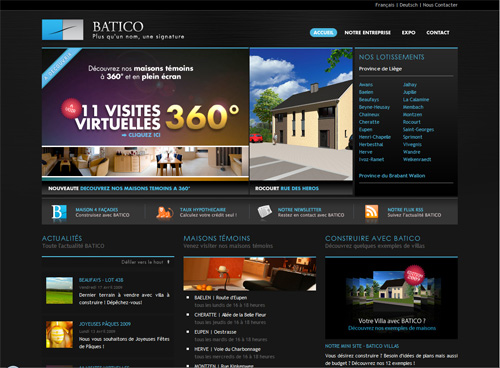
BATICO BATICO has a dark theme and image-heavy home page.
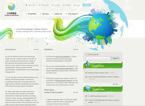
Oypro Oypro, which deals with commercial real estate, has a very clean design.
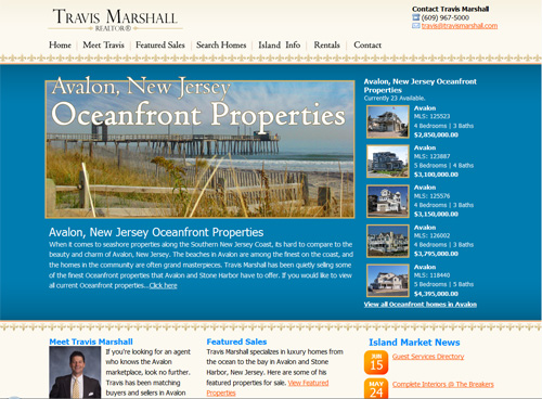
Travis Marshall Realtor Travis Marshall has a clean and sophisticated Web design.
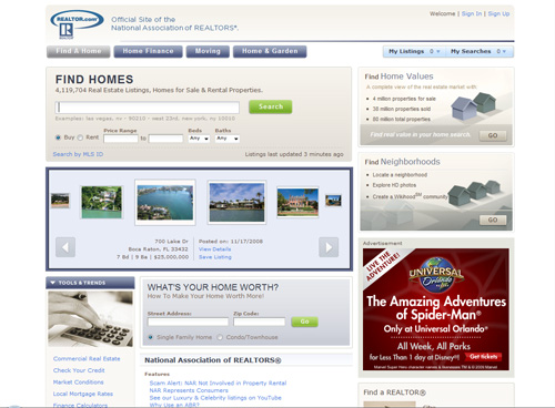
REALTOR.com REALTOR.com focuses on the content by using light, unobtrusive colors in its website design.
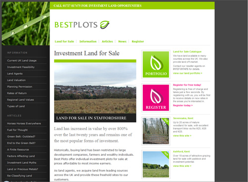
Best Plots Best Plots couples a dark theme with a clean and uncluttered design.
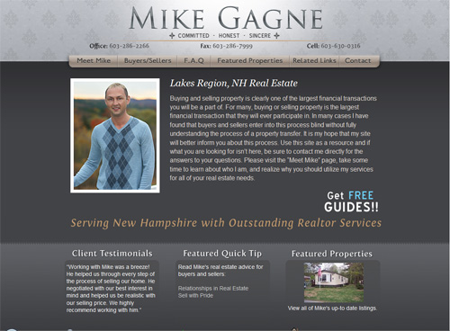
Mike Gagne Realtor Services Mike Gagne includes a photo of himself to create a personal, rather than corporate, touch for his website.
Kensington Lakes Kensington Lakes’ dark-themed design makes the images really pop out.



 Enterprise UX Masterclass, with Marko Dugonjic
 Devs love Storyblok - Learn why!
 Get a Free Trial
 Register For Free

