Social Network Design: Examples and Best Practices
There’s a lot of variety out there in the realm of social network design. Some sites keep a very professional approach (like LinkedIn) while others have a more organic, free-form look (like MySpace). Most sites fall somewhere in between, mixing professionalism with personalization (like Facebook). But what’s the best way to design a social network? What are the elements that make a social network more user-friendly and more attractive to users? Read on to find out.
Also consider our previous articles:
- 9 Common Usability Mistakes In Web Design which details how to prevent common usability blunders.
- More Web Design Trends For 2009 offers information on some important design trends for this year, many of which can be applied to social network design.
- Clear And Effective Communication In Web Design tells how to make sure you web site communicating efficiently with your users.
1. Engage Quickly
Engagement is crucial for the success of any website. You need to make sure that visitors are immediately drawn into your site, either through great content, a compelling call to action, or some other means.
What’s It For?
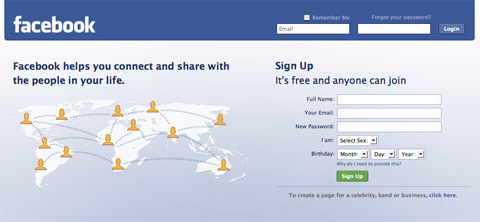
Users need to know what your site is all about within seconds of reaching your home page. Most people don’t have time (or inclination) to try to figure out what a website is for if it’s not immediately apparent to them. A simple tag line, the use of graphics, your site’s title, or any number of other elements on your home page can serve to provide new visitors with some indication of what your site’s purpose is.
Give Visitors Something To Do
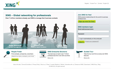
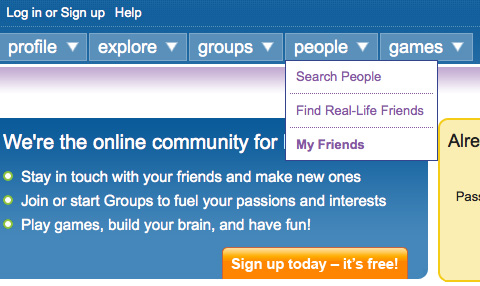
Your home page should present visitors, both new and returning, with something to do. Logging in or signing up is the most obvious thing for visitors to do, but think about other options. Give them the opportunity to explore what the site is all about before they sign up. Let them search for people they already know on the site. Give them a chance to see why they should sign up before forcing them to. It builds a sense of trust between your site and its users right from the start.
Promote Interesting Content From Friends
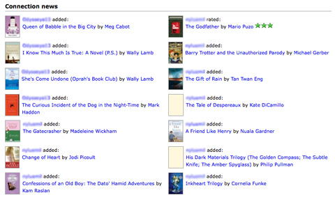
Show your users what their friends are doing. From the moment someone logs in, they should be able to see what their friends have been doing, posting, and otherwise promoting. Most sites approach this with a news feed or similar listing of all the activities your friends are up to.
Make It Easy To Find Friends
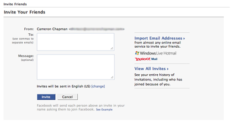
There’s nothing sadder than a social network account with few or no friends. Make it easy for your users to find friends, both new and old. Letting users search by email, school, company, name, and other identifying factors makes it more likely they’ll engage with a lot of other users, improving everyone’s user experience. The more friends a user has, the more active their profile and news feeds will be, meaning they’re more likely to come back often.
2. Let Users Express Themselves
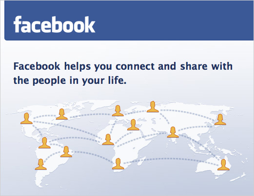
Self-expression is one of the hallmarks of social media. Some sites approach this by giving users almost full control over the way their profile page looks (MySpace). Others restrict the design options but let users add content to suit their own preferences (Facebook). The degree to which your social network allows users to cusotmize and personalize their profiles is up to you; just make sure there’s some functionality in that area.
Profile Pages Should Promote Personal Expression
Whether you allow full control over user profiles or only limited access to changing their appearances, users should at least have some ability to make their profile reflect their personality. This can be done through changing color schemes and backgrounds or adding content.
Promoting Individuality In Applications
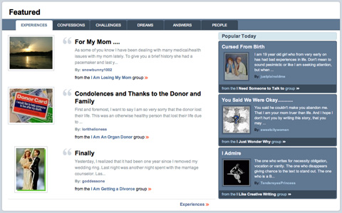
Letting users show their individuality within applications is also a good idea in social networking design. You can do this by allowing users to comment on their activities within applications (as Facebook does) or in other ways. Some applications can be used directly to express a user’s personality. Applications like this include the various gifting, flair, and survey applications. One of the best examples of an application that lets users express who they are is the Living Social application (which is kind of a social network within itself), which allows users to create “top 5” lists about almost anything.
3. Be Dynamic
Dynamic content is the lifeblood of Web 2.0 sites. Social networks are no different. Content should change constantly, with the newest, most popular, and most valuable information continually pushed to the forefront for users.
Have Regularly-Changing Content
Because of the nature of social networking sites, there’s new content constantly available from users. Take advantage of this by including content, both on the home page and on individual users’ profiles or main pages, comprised of these updates. Updated content keeps users coming back, as there’s more to see each time they visit.
Update Content in Real-Time
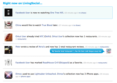
Utilizing a real-time news feed for your users is a huge convenience. At this point, very few sites are doing this. Facebook has the closest thing to a real-time news feed I’ve seen. It shows you when there are updates, but still requires a click to actually view them (and is often buggy when displaying them). The ideal would be an ajax or similar news feed that updated every minute or so without requiring any user input.
4. Allow Friends To Be Grouped
As friend numbers grow, the ability to group them becomes more important. When you only have thirty or forty friends, it’s often not a big deal to just lump them all together. But when your friend numbers grow to 100, 200, 500 or higher, being able to group them together almost becomes a necessity. After all, you might want to keep your work friends, college friends, casual acquaintances, close friends, and family all in separate groups, both to filter whose updates you see and how much others see of your updates and other information.
Let Users Define Groups
User-defined groups make the most sense when it comes to organizing friends. Some users may only want to organize their friends into a couple of different groups (such as business and personal or family and friends). Others might want to set up dozens of groups for their friends. In either case, make sure users can add their friends to more than one group at a time.
Create Automatic Groups
Automatically grouping friends makes sense, too. Grouping friends by which applications they’re using seems to be the most popular of this kind. Other options might include friends who are also members of the same groups or who share common friends.
5. Use OpenSocial
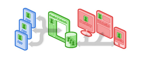
OpenSocial, Google’s application platform for social networks, opens up a range of possibilities for your social networking site. The primary function of OpenSocial is to allow developers to create applications that can be used across a wide range of social networks. But OpenSocial has other benefits, too, like letting your users take their profile information across the range of sites using OpenSocial.
Provide More Applications To Users
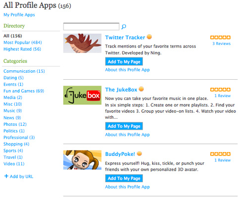
Applications have become one of the most important and most-used features of social networks. Everything from productivity apps to games to gifting apps to apps for expressing yourself are available through OpenSocial. And developers are adding new applications on a daily basis. Because Google runs it, you also don’t need to worry about the program closing down anytime soon.
Let Users Take Their Profiles Anywhere
Allowing your users to take their profile information to other sites implementing OpenSocial is another big advantage. This, of course, means they can also bring their profile information over to your network, which can increase the number of new registrations you get.
 ## 6\. Make It Easy To Communicate
The entire point of a social network is to foster communication. If you make it difficult for users to converse with each other, your site most definitely will not last for very long. Make sure when you're planning and developing your site that you keep communication at the forefront of every decision you make. If it does anything to hinder your users from talking to each other, drop it.### Provide Multiple Means Of Communication
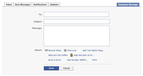
Most social networks provide multiple means of communication for their users. The basics are private messages, public wall messages or comments, and live chat or instant messaging. While it's best to include all three of these, at a bare minimum your site should provide some way to send public messages and a way to send private messages.
Foster Conversations
Make it easy for users to have conversations with each other. Whether this is done through threaded messages, commenting, or some other method, you want your users to have effective conversations. Make it easy to pull additional people into the conversation, too, to make your site even more dynamic.
7. Show Only Relevant Information
Social networks are generally teeming with information. Between friend updates, users’ own activities, and notices from groups they’re associated with, there’s a constant stream of data coming at your users. Don’t compound the problem by sending them even more information that they dont’ necessarily need.
What Really Needs To Be Here?
When designing your user interface, ask yourself this question repeatedly. Is it really necessary for a certain bit of information or an option to be included on a given page? If the answer is no, then don’t include it there. Only give your users the minimum necessary information to perform the tasks you want them to perform. Just make sure if there’s additional information some users might want that you make it easy enough for them to find it.
Don’t Overwhelm Your Users
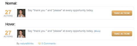
The volume of information on a social network can quickly become overwhelming. Don’t contribute to this problem by then offering them a dozen different options for each action they might take on your site. Simplify the information and choices you give them to make their user experience better.
The same principal applies to the volume of information the site itself provides to users. If your site is constantly sending out updates and news announcements, it can quickly overwhelm users. Only send out notifications when absolutely necessary. Set up a blog or news page (with an RSS feed) for posting non-essential information. This way users can see what’s happening on their own terms.
Give Users The Ability To Filter
Allowing users to filter out information from some users or groups is another way to improve a user’s experience. Letting users filter out updates from certain users or applications makes it easier for them to see the information they want to see without getting overloaded.
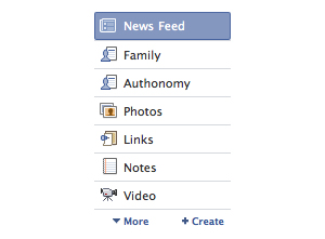
8. Make It Easy To Take Action
Every social network has certain actions they want users to take. Whether it’s to join more groups, invite more friends, click on ads or sponsored links, or post more updates, there’s likely a laundry list of desired activities every site would like to have all of their users perform. The key to getting users to actually take these actions is to make it both easy and appealing to do so.
Emphasize The Desired Response
Make it obvious which response or action you want users to make. This can be as simple as using larger buttons for the preferred response and a small text link for the less desirable one, or using different colors or language for different options. In either case, make the desired response appear to be the more desirable one.

Make It Easy To Find Things
If you want users to perform certain actions, make it easy for them to find those actions. The most obvious example is in inviting new friends. Make it straightforward and easy for users to find the form to invite their friends who might not be members of your network. Organize available actions in a semantic manner so users can logically find the options they’re looking for.
 ## 9\. Show Avatar Photos
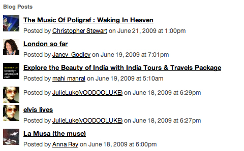
Virtually every social network out there allows users to upload a profile photo. Display this image near any activity a user performs. This could be next to their updates in a news stream, in lists of friends, or in the general site directories.### People Like Seeing Other People
Social network users like to see other social network users. And seeing your friend's picture next to a particular application or other element of the site makes it more likely you'll click on whatever they're promoting. It builds a sense of trust to see a face you recognize, even if you've never actually met that person in real life.
 ## 10\. Include Ways For Members To Connect
When social networks first started, most people only friended other people they knew in real life. But as social networks have grown, they've become a way to meet new people. Empower your users to find each other based on common interests. Provide tools to let people who don't know each other, and who possibly aren't even friends on the network, to communicate and get to know each other.### Include User Groups
Many social networks now allow users to create and join groups based on common interests. Sometimes these groups are serious (such as professional groups) while other times they're just for fun. What they all share in common, though, is that they allow users to find other users who are interested in the same things they are.
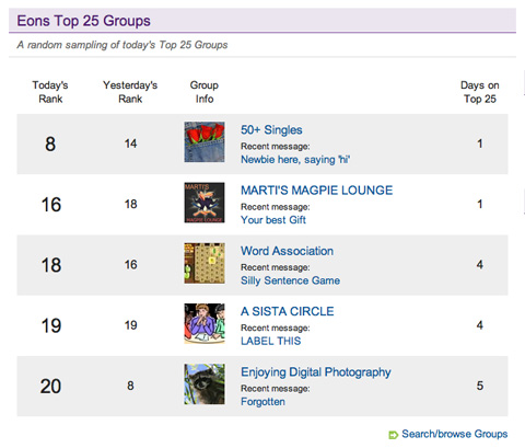
Eons showcases user groups right on their home page.
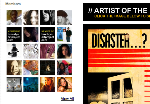
Provide A Member Directory
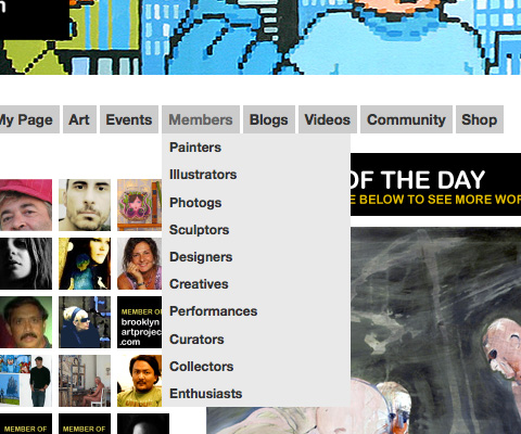
Member directories are another good way to allow your users to find each other. These are particularly useful for small, niche social networks, as they allow every member to see every other member. In a large social network they quickly become less valuable unless you also include ways for members to filter the directory (such as by age or location). In large social networks it’s also a good idea to let members opt out of being included in the directory (kind of like having an unlisted phone number).
Further Resources
Area for further articles and related resources.
- Applications of Usability Principles on a Social Network Offers useful information on making your social network more user-friendly.
- A Collection of Social Networking Stats for 2009
Gives great stats on how social networks are being used worldwide. - Social Design Best Practices
From the OpenSocial wiki. - Social Network Websites: Best Practices from Leading Services
A slideshow covering the practices of a number of leading social networks.


 Register For Free
 How To Measure UX and Design Impact, 8h video + UX training

 JavaScript Form Builder — Create JSON-driven forms without coding.
 Devs love Storyblok - Learn why!

