50 Fresh Portfolio Websites for Your Inspiration
Creating personal portfolio website is probably the most challenging task for designers as it should reveal the talent and some special unique style of its author. Beautiful portfolio is like a good setting – it makes design works sparkle and grabs visitors’ attention immediately.
Look though this collection of stylish and exquisite portfolio designs to draw some inspiration for your own projects. Either through minimalist neat layout or via rich, color expressive design elements, each of these portfolios delivers an exceptional, truly inspiring visual experience to visitors. So this design showcase is worth seeing whether you are in a creative search or just looking for some entertainment.
You might also like the previous article:
- 50 Beautiful And Creative Portfolio Designs
- 10 Steps To The Perfect Portfolio Website
- Portfolio Web Design Showcases
- My (Simple) Workflow To Design And Develop A Portfolio Website
Creative and Exquisite Portfolio Designs
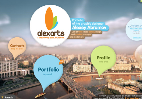
Alexarts Graphic designer Alexey Abramov featured his portfolio with a tilt-shift photo background and beautiful typo. As a result, you see a neat and original design.
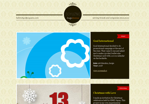
Soyuzno This portfolio belongs to Tokyo-based designer Soyuzno, so no wonder that Japanese laconism is the foreground theme of the design. Elegant solution, isn’t it?
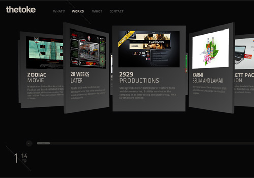
thetoke Flexible 3D gallery and stylish typography give some unique flavor to this site. You can choose the way of showcase display.
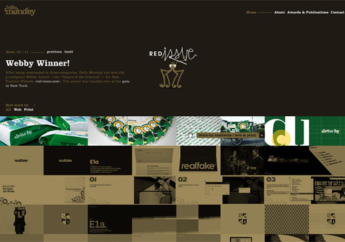
Hello Monday Hello Monday’s portfolio featured with lovely chocolate color scheme and draggable navigation provides a memorable user interface.
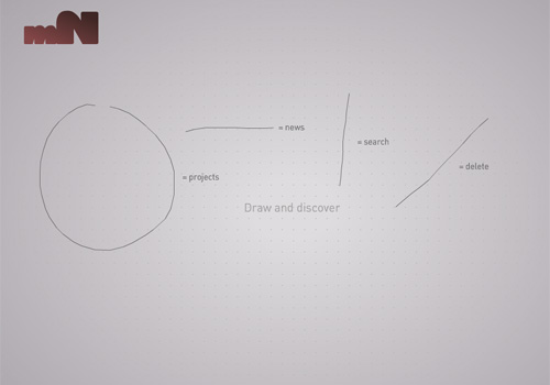
magneticNorth magneticNorth’s portfolio brings an extraordinary interactive interface to the visitors. Drawing shapes on the page discovers company’s projects.
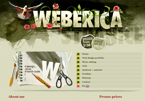
Weberica Scattered brushes, rich colors, subtle strokes of the paint brush – welcome to artist’s studio! This design is very attractive and tasty.
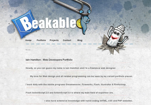
Beakable Iain Hamilton’s portfolio is interesting and unconventional. Maybe funny characters in the header make up the core feature that singles out this design.
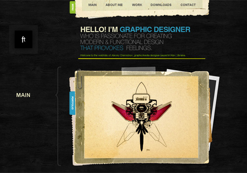
Ft Background made in imitation of ebony, old paper effect in frames and ascetic typography make the portfolio of Alexey Chernishov look elegant and impressive.
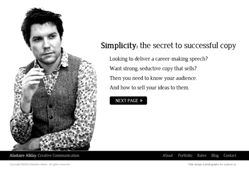
Alastaire Allday The main theme which runs all through Alastaire Allday’s portfolio is… Alastaire Allday. It makes sense as pure and sincere presentation arouses trust.
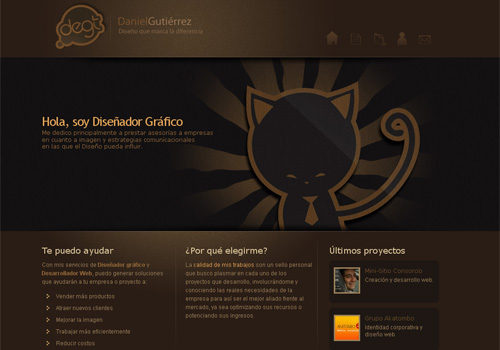
Daniel Gutierrez Beautiful portfolio design with captivating color scheme, simple but neat grid-based gallery and charming paper kitten in the header.
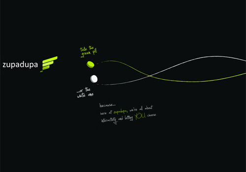
Zupadupa Romanian web agency Zupadupa offers visitors to take white or green pill to navigate the website. Doesn’t it remind you anything? No matter whether designers are quoting Matrix trilogy or not, this choose-a-pill-thing is something quite creative and interactive.
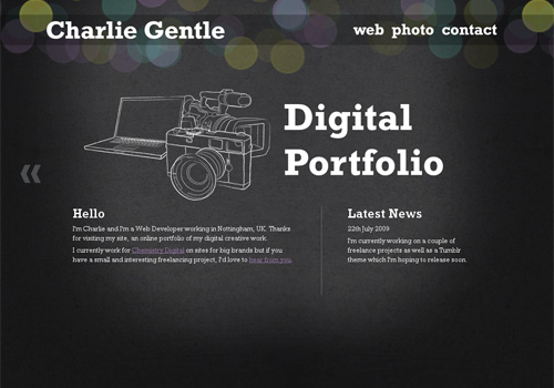
Charlie Gentle Charlie Gentle implements perfect jQuery style in his portfolio. Nice sketch elements, clean typo and illuminated centered content accentuate the original nature of the design.
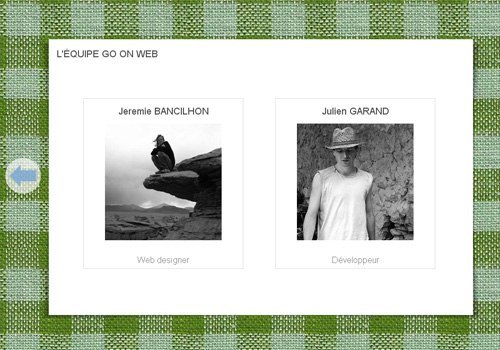
Go On Web The following portfolio is created using HTML 5. Cloth imitating background that changes its color while you scroll is superb.
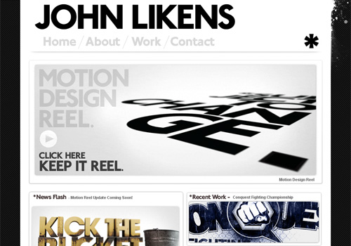
John Likens Big typo, big showcase grid, big success.
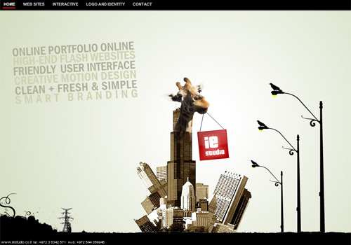
IE Studio IE Studio created their portfolio with unusual stylish approach. Interesting collage in the center of the home page is a highlight of company’s identity.
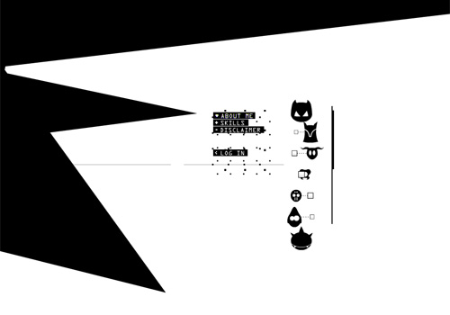
Inside Piet With this portfolio Belgian Flash developer Piet Dewinjgaert gives you an access to his own brain! it’s difficult to describe what is going on there, so you’d better visit and see it!
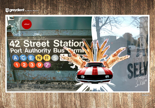
Greydient Another example of beautiful personal portfolio with draggable navigation and appealing interface.
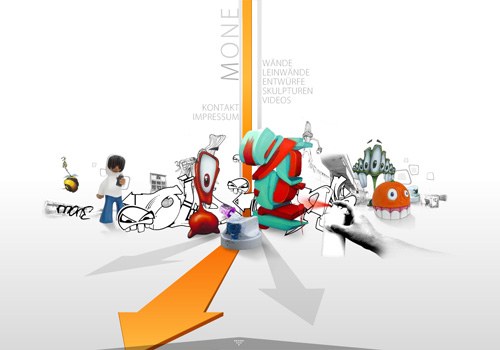
M1 Design Incredible Flash portfolio of German design studio M1 Design provides a unique interactive project showcase.
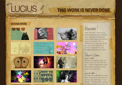
Kevin Lucius This original portfolio is a good example of one-page website design. It brings a really personal look and feel.
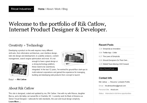
Rikcat Industries Rik Catlow’s portfolio is done in a simple minimalist manner. Neat layout and stylish black-and-white color scheme drive visitor’s attention exactly to designer’s works.
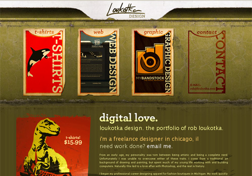
Loukotka Design Here vintage style of portfolio menu and website background is combined with trendy typography and up-to-date image transparency. Quite successful design mix.
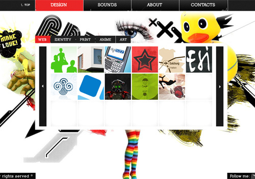
Dreamer Lines Very colorful and expressive portfolio of Janis Godins provides a really unique and rich user interface. It’s just brimming over with life, truly inspiring design.
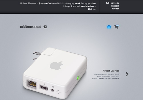
Midtone Design Due to stylish typography, advanced carousel effect applied to project showcase and unconventional approach to “About” section, Jonatan Castro’s portfolio has an ultra-modern high-tech look.
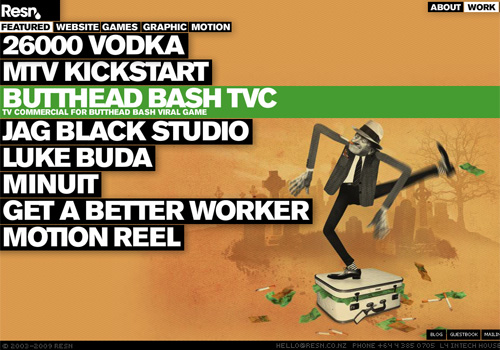
Resn The portfolio website of Resn Interactive Agency is like a magic box – it contains an inconceivable amount of various design techniques. Rich motion graphics, big typography, controllable 3D elements – this portfolio is very hard to forget.
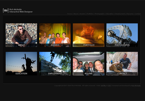
Rich McNabb Rich McNabb’s portfolio is shown as a business card which breaks up into website menu categories when you click on it.
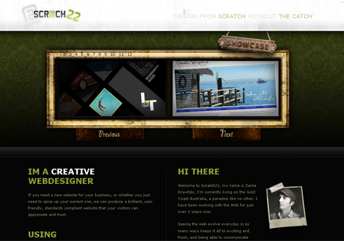
Scratch 22 Zarne Dravitzki provides a nifty carousel user interface which decreases the need to scroll and allows design layout to stay compact. Old-school grunge frame is a tasty feature.
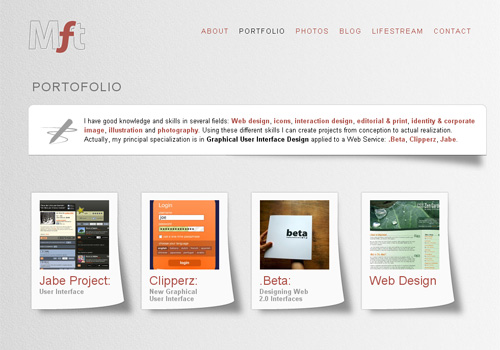
My Favorite Thing Light and clean layout meets simple grid-based work showcase. However, a thumbnail gallery available on each single project page would be an advantage.
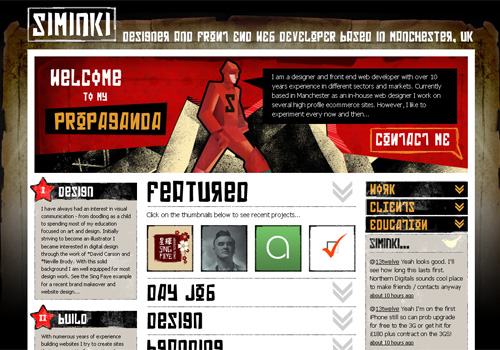
Siminki Illustrations and crazy typography hints at the designer’s liking for experiments and most daring ideas fulfilling. Or maybe it’s just a little trick to keep visitors’ longer stay? In any case, this portfolio is worth viewing.
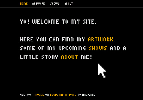
Teo Skaffa One can’t help smiling while viewing this portfolio. This incredible piece of pixel art will allow you to make an exciting journey through time.
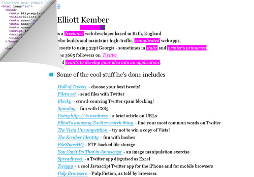
Elliott Kember Another pleasant memories evoking website. You can play old-time “Snake” game while browsing Elliott Kember’s portfolio. But be careful - don’t forget the initial purpose of your visit!
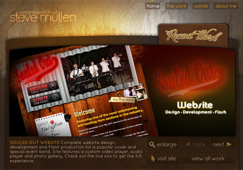
Steve Mullen Steve Mullen uses common “grid with lightbox” design technique for his portfolio. However neat frames, attention to details, beautiful typography and eye-catching recent work showcase, make this portfolio design exquisite indeed.
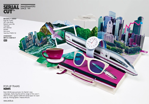
Serial Cut These guys don’t waste valuable website space and use each page as a ground for project presentation. Project list is available at the right side of the page. Wonderful example of design creativity.
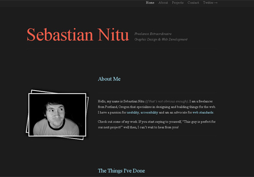
Sebastian Nitu Perfection in simplicity. The portfolio of Sebastian Nitu proves this statement one more time. This website uses HTML 5 as well.
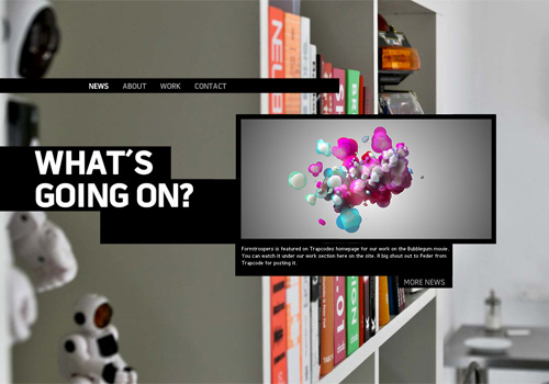
Form Troopers Outstanding and stylish portfolio featured with flashing photo backgrounds and usable project showcasing technique.
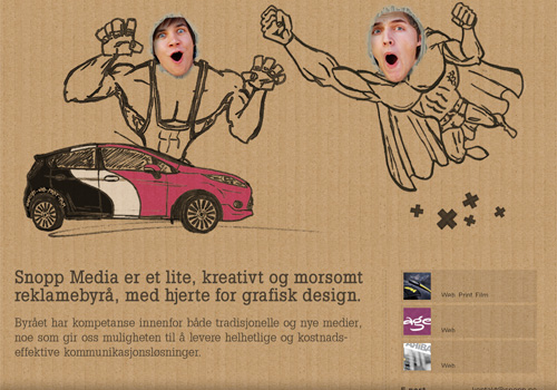
Snopp Media Truly creative and lively portfolio design which introduces Snopp Media in a sincere and outgoing manner.
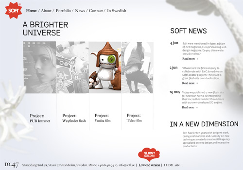
Soft Whiteroom Another beautiful minimalist portfolio. Grid-based project gallery shows colorless thumbnails, hovering over them will slightly revive images by filling them with color.
Chuck U The portfolio of Chuck U delivers graphic design of inimitable beauty. This is what can be called a web design delicacy.
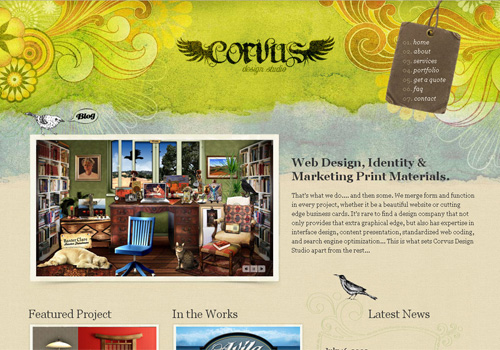
Fabrik Agency Unique and usable interface, which shows portfolio as a stapled stack of cards, elegant typography and backgrounds provide a quite pleasant navigation experience.
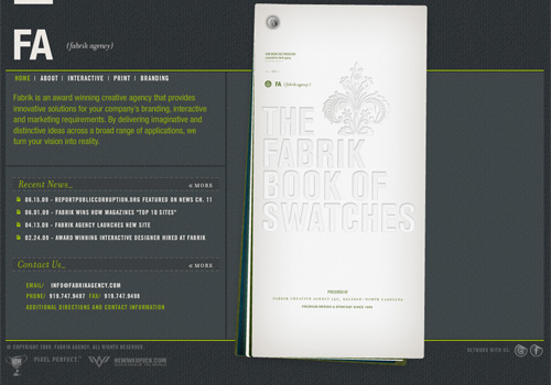
Edelwwweiss A bit muted colors give this portfolio a soft and friendly look. While recent works are showcased using a carousel effect, the main portfolio is displayed in light box grid.
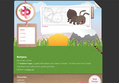
Web Talents Space related theme and nifty navigation technique make this portfolio worthy of being included to the collection of most beautiful and creative portfolio designs.

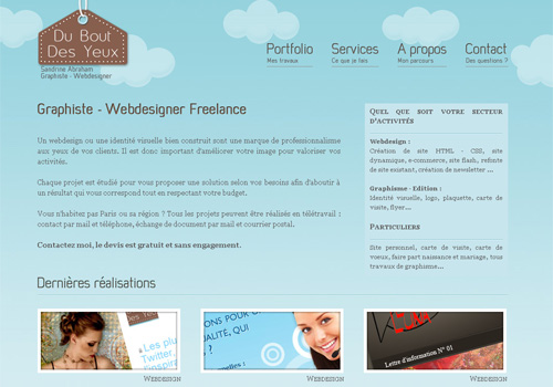
Sandrine Abraham Clean and somewhat cartoon looking background together with simple and usable project showcasing make up a lovely portfolio design which brings a positive feel to visitors.
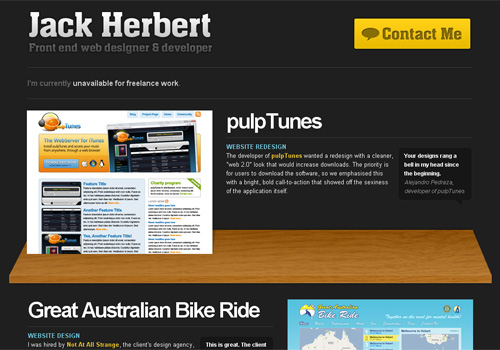
Jack Herbert Great typography based personal portfolio. Jack Herbert simply laid his projects on the shelves (in literal sense only).
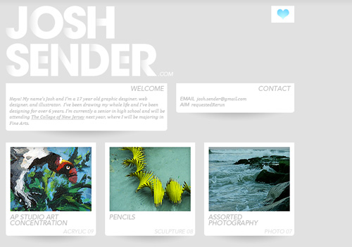
Josh Sender This portfolio brings a fresh and young look and feel. Maybe that’s because Josh Sender is just 17 years old.
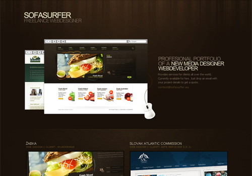
Sofa Surfer A captivating personal portfolio with excellent structure. Again, simplicity and usability rule.
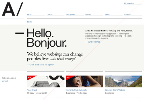
Area 17 Area 17 is an obvious trend-maker in the world of design. Perhaps the style of their portfolio can give you some tips and hints for creating an outstanding portfolio of your own.
Thought & Theory It’s amazing how some absolutely simple and unpretentious designs can be so much attractive. Thought & Theory Portfolio is definitely among them.
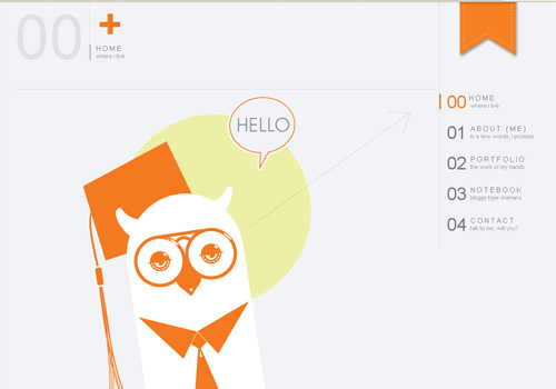
Joe Nyaggah Joe Nyaggah combines unobtrusive color scheme along with easy and usable navigation. Orange owl grabs attention straight away. This portfolio is clean, simple and featured with some spicy details - great design!
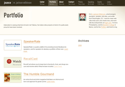
Jounce Portfolio of M. Jackson Wilkinson has an appealing slightly gradiented background and quite simple but original header.

Serial Cut These guys don’t waste valuable website space and use each page as a ground for project presentation. Project list is available at the right side of the page. Wonderful example of design creativity.

Sebastian Nitu Perfection in simplicity. The portfolio of Sebastian Nitu proves this statement one more time. This website uses HTML 5 as well.

Form Troopers Outstanding and stylish portfolio featured with flashing photo backgrounds and usable project showcasing technique.

Snopp Media Truly creative and lively portfolio design which introduces Snopp Media in a sincere and outgoing manner.

Soft Whiteroom Another beautiful minimalist portfolio. Grid-based project gallery shows colorless thumbnails, hovering over them will slightly revive images by filling them with color.

Chuck U The portfolio of Chuck U delivers graphic design of inimitable beauty. This is what can be called a web design delicacy.

Fabrik Agency Unique and usable interface, which shows portfolio as a stapled stack of cards, elegant typography and backgrounds provide a quite pleasant navigation experience.

Edelwwweiss A bit muted colors give this portfolio a soft and friendly look. While recent works are showcased using a carousel effect, the main portfolio is displayed in light box grid.

Web Talents Space related theme and nifty navigation technique make this portfolio worthy of being included to the collection of most beautiful and creative portfolio designs.

Sandrine Abraham Clean and somewhat cartoon looking background together with simple and usable project showcasing make up a lovely portfolio design which brings a positive feel to visitors.

Jack Herbert Great typography based personal portfolio. Jack Herbert simply laid his projects on the shelves (in literal sense only).

Josh Sender This portfolio brings a fresh and young look and feel. Maybe that’s because Josh Sender is just 17 years old.

Sofa Surfer A captivating personal portfolio with excellent structure. Again, simplicity and usability rule.

Area 17 Area 17 is an obvious trend-maker in the world of design. Perhaps the style of their portfolio can give you some tips and hints for creating an outstanding portfolio of your own.

Thought & Theory It’s amazing how some absolutely simple and unpretentious designs can be so much attractive. Thought & Theory Portfolio is definitely among them.

Joe Nyaggah Joe Nyaggah combines unobtrusive color scheme along with easy and usable navigation. Orange owl grabs attention straight away. This portfolio is clean, simple and featured with some spicy details - great design!

Jounce Portfolio of M. Jackson Wilkinson has an appealing slightly gradiented background and quite simple but original header.
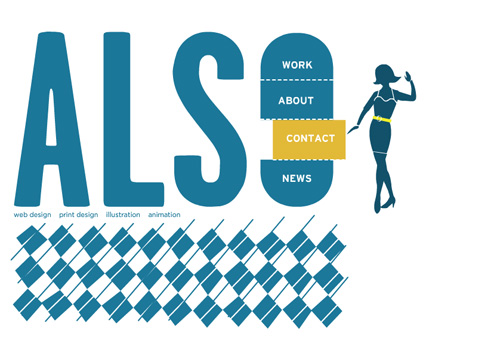
Also This portfolio was created a while ago, but its unique creativity puts it beyond time limits. So it would be a mistake not to share such a design treasure with Smashing Magazine audience. Absolutely stunning portfolio. Bravo Also!
…and for dessert
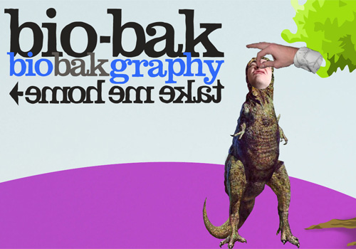
Bio-Bak A little bonus for everyone who enjoys laughing and likes a bit cuckoo design style which stands out of all rules. While browsing this portfolio, it becomes clear that Bio-Bak could appear nowhere but in Netherlands.


 Register For Free
 JavaScript Form Builder — Create JSON-driven forms without coding.
 Enterprise UX Masterclass, with Marko Dugonjic

 Get a Free Trial

