Search Results Design: Best Practices and Design Patterns
If you’ve been assigned to design or provide the architecture for a large e-commerce project or other information-heavy website whose success depends on content findability, it is vital that the design and layout of the search functionality for that website is considered carefully.
The search results page is the prime focus of the search experience, and can make or break a site’s conversion rates. Therefore, bridging the gap between a user and the content or products they seek is a crucial factor in the success of any large website. The responsibility to design an effective search results page is best considered after a thorough examination of some of the features and functions found on search results pages from a number of popular niches.
Be sure to check out our previous articles:
- Designing The Holy Search Box: Examples And Best Practices
- 30 Usability Issues To Be Aware Of
- Infinite Scrolling, Pagination Or “Load More” Buttons? Usability Findings In eCommerce
In this article, we’ll look at a number of trends and practices incorporated on a variety of websites. From this examination, we’ll conclude with a summary of the best practices learned from the examples those sites have set.
1. Trends In Search Engines
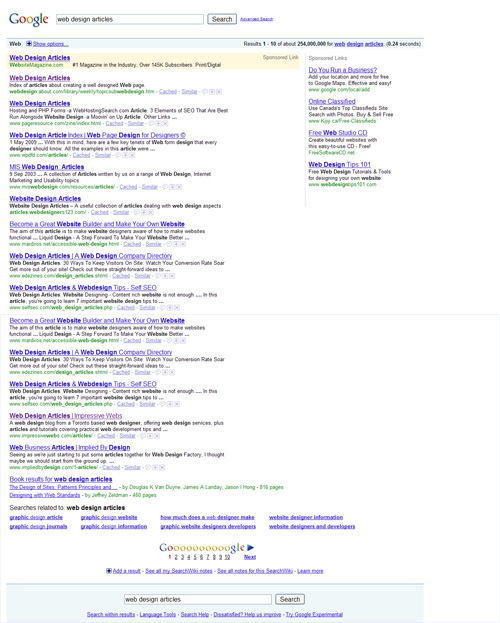
Google’s search result page sets the pattern for all the search result pages we’ll be considering. We’ll list the primary features of Google’s page, and then we’ll point out some additional unique features found on other search results pages, including those found on the other popular search engines.
Below are the primary features of Google’s search results page:
- Search box, with searched words, remains prominent at top
- Option to view an “advanced” search page
- Total number of results shown at top
- Ajax-driven auto-complete for typed follow-up searches
- Sponsored links at top and right
- Paginated results
- Results titles are large, bold, and hyperlinked
- Searched words are shown in bold in a page snippet, in context
- URLs shown in a different color under each result
- Each result allows options to view “similar” and “cached”
- Visited links are in a different color
- Related search phrases listed at bottom
- Search box with search terms repeated at the bottom
- “Show options” link opens a sidebar for further filtering of the results
In the search engine niche, the other websites we’re considering follow very similar patterns as those set above by Google, with a few variations. Here are some unique features of those search results pages that are not found on Google’s.
Bing
Microsoft’s new search engine Bing lists the user’s “search history” in the sidebar (outlined in red above), allowing the history to be cleared or turned off. The search history remains intact even when the browser is closed and the page is revisited.
Another helpful feature on Bing is shown below:
The pagination unit at the bottom of the results page is more user-friendly than Google’s version. While Google’s version consists of “blocked” table cells, which somewhat help the clickability of these units, Bing’s is much cleaner and a clearer distinction is made between paginated units. Also improving the usability, Bing’s pagination units have a hover effect, which Google’s doesn’t, making Google’s confusing as to which unit is being clicked.
Yahoo’s search results page includes a couple of JavaScript-driven enhancements that improve on features of Google’s and Bing’s pages:
Yahoo
The search results page on Yahoo displays an Ajax-driven slide-down unit that appears below the search box when a search query is being typed. This is similar to the Ajax drop-down featured on Google and Bing, but with a few extra enhancements.
Also, Yahoo offers two features still in Beta: “Search Pad”, which allows the user to record notes on searches; and “SearchScan” to help protect from harmful websites:
Google, Microsoft, and Yahoo have the experience and industry expertise to enable them to design an effective search results page. The patterns and trends they have set are worthy of consideration when designing your own search results page. Even if many of their features are out of your project’s budget and scope, the principles behind those features can be considered and incorporated in practical ways.
2. Search Results In Video Sharing Sites
Search results pages on video-sharing websites have set important patterns worth noting. The search results page on top video-sharing sites contain many of the features that we’ve already mentioned under the “Search Engines” section, plus some additional features shown below.
YouTube
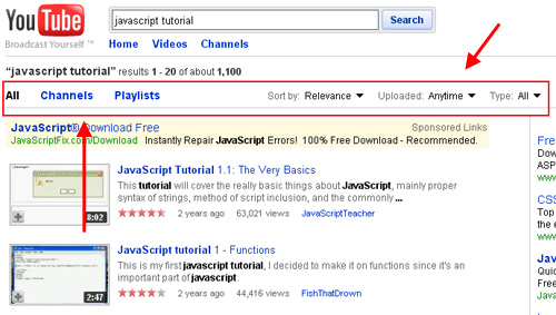
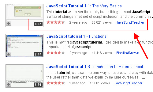
YouTube has easily-accessible filtering options near the top of the search results page, shown above. Additionally, each item on a YouTube search result page lists detailed information, including a thumbnail preview, running time of the clip, user rating, and age of the item:
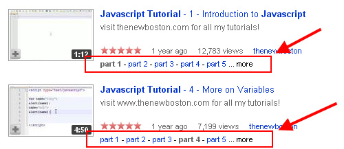
Also, if a particular item is part of a series, this is indicated:
Metacafe
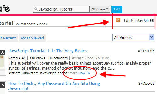
Metacafe (above) includes many of the features that YouTube offers, plus an XML feed for a particular set of results, an option to enable or disable a “family filter”, and a “more” link that takes the user to a search for related content.
Veoh
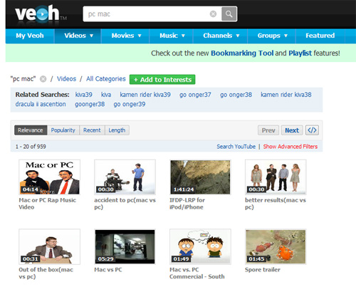
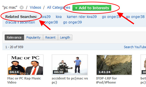
Veoh’s search result page (above) displays the items in grid format, which differs from the one-item-per-row or “list” format of the search results pages we’ve considered so far. Veoh also includes a button to “add to interests”, as well as a “Related Searches” box at the top of the results (although those related items were never very practical in the searches I conducted):
Break
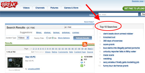
Break.com’s search results page (above) includes a “Top 10 Searches” box on the right side of the page, allowing the user to view what others have been searching for.
3. Search Results in Social News & Mini-Blogging
Many sites that offer user-driven news, mini-blogging, and bookmarking offer search results pages with unique features. Here are a few examples:
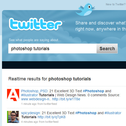
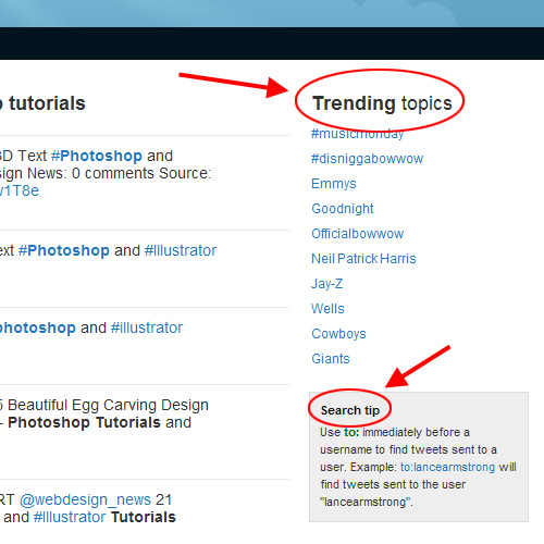
Twitter (above) offers a very clean, intuitive JavaScript-driven interface that includes “Realtime” results. Their page also offers a list of “Trending topics” and a “Search tip” box:
Additionally, Twitter gives the user the option to refresh the page after it detects additional results in real time, shown in the yellow box below:
Digg
Each result on the Digg search results page (above) includes the number of comments that have been posted for that particular story, in addition to other features that are unique to Digg, including “share” and “bury”.
Delicious
Delicious lists search results in a very simple, list format that includes tags associated with each result, plus the number of times the result has been bookmarked.
4. Search in Merchandise & E-Commerce
An effective and user-friendly search results page is crucial to the success of an e-commerce website, since that is the means by which most users will attempt to find content. Let’s look at some unique features on search results pages from popular e-commerce sites.
Amazon
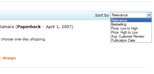
Amazon’s search results page (above) allows for the results to be sorted based on a variety of methods, including “Bestselling” and “Avg. Customer Review”. This is done by means of a <select> box that adds or removes sorting options based on the department the user is currently viewing.
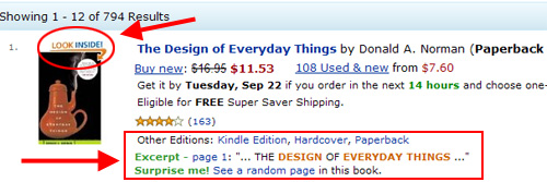
When displaying results for books, Amazon’s results page indicates if a book has the “Look Inside” feature. There is also a brief excerpt from each book, plus links to view other editions of the same item:
eBay
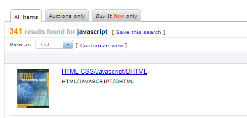
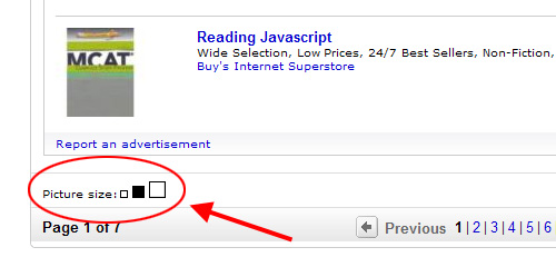
eBay’s search results page (above) allows for easy filtering via tabs at the top. eBay also provides a unique feature at the bottom of the page: the option to view the thumbnail preview images in a different size:
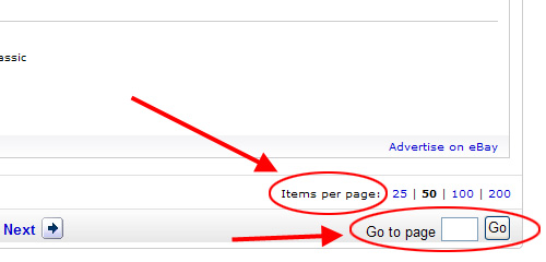
Other features unique to eBay’s search results page are the options to change the amount of items displayed per page and the ability to go directly to a specific page by entering a number into a text box:
Walmart
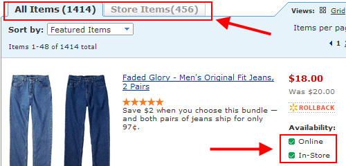
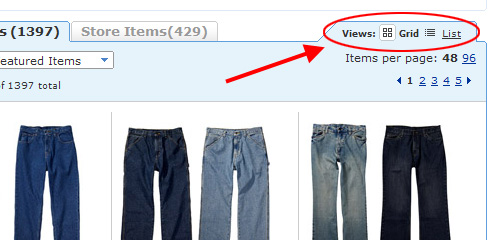
Walmart’s search results page clearly distinguishes between products available in-store and those only available online, allowing the user to filter items through a tabbed interface.
There is also an option to toggle the search results view between “grid” and “list”:
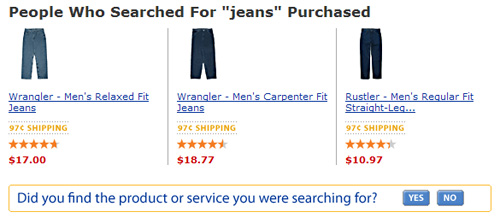
The bottom of Walmart’s search results page includes links to items that were purchased after other shoppers conducted the same search. There is also a feedback option offered, indicating that Walmart is conducting ongoing analyses of user interaction with their search features:
In addition to the features on the e-commerce search pages discussed in the previous section, below are some examples of practical features found on a few less-popular e-commerce sites.
Coast
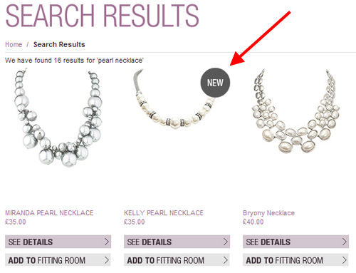
Coast’s search results page (above) includes a “new” indicator to inform the user which items have been added recently.
Shoon
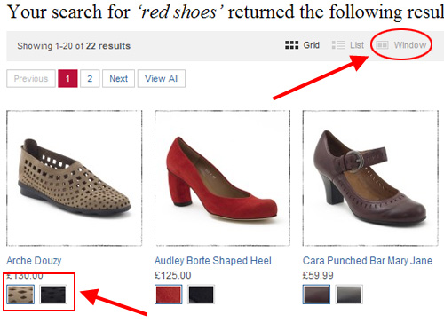
Shoon lists products on their search results page in grid format, and allows the option to view the same results in list format or “window” format. “Window” format puts all items into a JavaScript-driven scrolling window-like element. Shoon also lists alternative color options for the individual products. Clicking a new color option changes the product photo dynamically via JavaScript.
Eddie Bauer
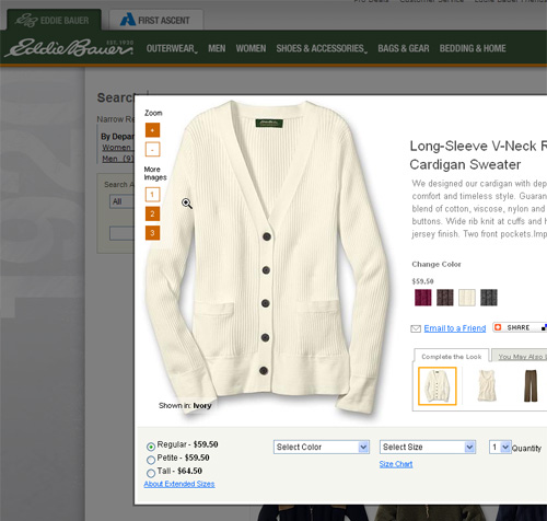
Eddie Bauer opens details for an item inside of a JavaScript light box. Inside the light box window the user is able to take advantage of a number of practical functions including product zooming, size selection, related product display, and shopping cart options.
5. Search Results on Photo Sharing Sites
Photo sharing sites offer a few helpful features on their search results pages. Below are some examples.
Flickr
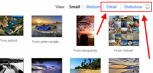
Flickr (above) displays results by default in a simple grid-based format, and they include some of the filtering options we’ve already discussed. Flickr also allows the images to be displayed either in a detail-heavy list-style view or inside of a Flash-based slideshow gallery.
PhotoBucket
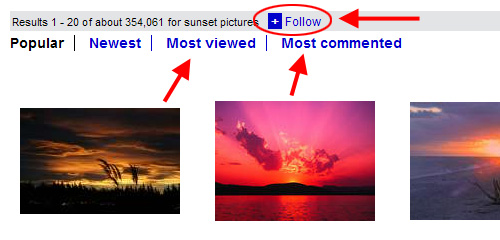
Photobucket (above) allows filtering of search results by “Most viewed” and “Most commented”. It also includes a link strangely titled “Follow”, which allows the user to enter their email address to receive notifications when the results for a particular search term are updated. A more appropriate title for this feature would be “Subscribe”, or similar.
6. Search Results on Technology-Related Sites
Naturally, technology and web-related sites should have strong usability and functionality on their search results pages. These types of sites can incorporate more complex functionality due to their tech-savvy readership, however, care should be taken to make sure any complex features are practical and do not hinder the user experience.
Adobe
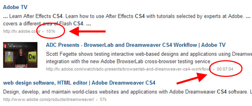
Adobe’s search page (above) includes the size in kilobytes of the individual pages that appear in the results, as well as the running time of a video that appears on the results page.
Apple
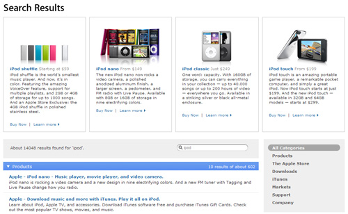
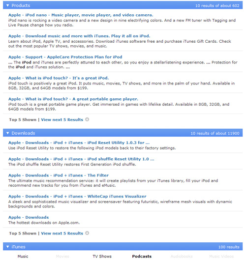
The Apple search results page (above) includes promotional boxes displaying featured items related to the search terms entered by the user. Then, under the promotional boxes, list-style results are displayed under different headings (“Products”, “Downloads”, etc) so that results are associated with relevant sections of the website:
CNET
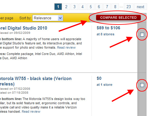
CNET (above) allows users by means of checkboxes to select multiple items on a search results page for a side-by-side comparison.
SitePoint
SitePoint’s search page includes a simple, but practical tip to help refine results. Also, the tip itself links to a popup window that lists further search tips.
7. Search Results in News Websites
Mainstream news websites rely heavily on search, and so they incorporate many of the practical functions we’ve already discussed. Below are a few more features from well-known sites worth noting.
FOX News
FOXNews (above) includes video results in their search results page, with an indicator showing at what time in the video the entered search terms appear. The results also offer a brief quote from the video, with search terms underlined in context.
The Guardian
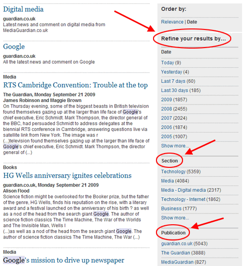
Guardian.co.uk (above) displays to the right of search results a sidebar that allows items to be refined by “Date”, “Section”, “Publication”, and more. The sidebar also indicates by means of numbers in parentheses how many pages appear under each refined heading. Also, as shown above, the search results are displayed under section headings, and the search term (in this case “Google”) is highlighted in context in the text snippet that appears for each result.
New York Times
NYTimes.com (above), in addition to some common filtering options, includes the author name and/or section in which each search result appears.
The Wall Street Journal
The Wall Street Journal’s search results page (above) includes a “save this” link next to each search result. This option allows users to organize, personalize, and share saved content.
Summary of Best Practices
For easy reference, here is a list of some of the best practices that have been gleaned from the different search results pages considered in this article:
- User should have easy access to the search box for follow-up searches
- Where possible, search terms should be clearly indicated at the top, and in context in the results
- Related sponsored links can be included below the search box, near the bottom, or on the right
- Titles should be clickable and clearly differentiated from details
- Visited links should be indicated
- Pagination units should be visibly block-shaped and have a hover effect, to easily differentiate from one another
- Related products, tags, or keywords should be displayed in a non-obtrusive section
- E-Commerce sites should allow the “view” to be toggled between “list” and “grid”
- Advanced search options should be easily accessible
- Should allow re-sorting or filtering of results
- Where possible, results pages should have RSS feeds or “subscribe” options
- For complex interfaces, clear, easy-to-access search tips or instructions should be provided
- Sorting and Filters should be JavaScript or Ajax-driven, where possible
- Popularity or star-ratings should be shown for individual results
- Include an option to increase the number of results per page
- To monitor future improvements, request feedback from users after searches are conducted
- If results span different sections of the website, indicate this by sub-headings or other dividers
Conclusion
This article has looked at a wide variety of features, options, and functions found on search results pages in a number of industries and niches. It is not possible, and neither is it practical, to include all these functions in your own search pages.
Coast’s search results page (above) includes a “new” indicator to inform the user which items have been added recently.
Shoon
Shoon lists products on their search results page in grid format, and allows the option to view the same results in list format or “window” format. “Window” format puts all items into a JavaScript-driven scrolling window-like element. Shoon also lists alternative color options for the individual products. Clicking a new color option changes the product photo dynamically via JavaScript.
Eddie Bauer
Eddie Bauer opens details for an item inside of a JavaScript light box. Inside the light box window the user is able to take advantage of a number of practical functions including product zooming, size selection, related product display, and shopping cart options.
5. Search Results on Photo Sharing Sites
Photo sharing sites offer a few helpful features on their search results pages. Below are some examples.
Flickr
Flickr (above) displays results by default in a simple grid-based format, and they include some of the filtering options we’ve already discussed. Flickr also allows the images to be displayed either in a detail-heavy list-style view or inside of a Flash-based slideshow gallery.
PhotoBucket
Photobucket (above) allows filtering of search results by “Most viewed” and “Most commented”. It also includes a link strangely titled “Follow”, which allows the user to enter their email address to receive notifications when the results for a particular search term are updated. A more appropriate title for this feature would be “Subscribe”, or similar.
6. Search Results on Technology-Related Sites
Naturally, technology and web-related sites should have strong usability and functionality on their search results pages. These types of sites can incorporate more complex functionality due to their tech-savvy readership, however, care should be taken to make sure any complex features are practical and do not hinder the user experience.
Adobe
Adobe’s search page (above) includes the size in kilobytes of the individual pages that appear in the results, as well as the running time of a video that appears on the results page.
Apple
The Apple search results page (above) includes promotional boxes displaying featured items related to the search terms entered by the user. Then, under the promotional boxes, list-style results are displayed under different headings (“Products”, “Downloads”, etc) so that results are associated with relevant sections of the website:
CNET
CNET (above) allows users by means of checkboxes to select multiple items on a search results page for a side-by-side comparison.
SitePoint
SitePoint’s search page includes a simple, but practical tip to help refine results. Also, the tip itself links to a popup window that lists further search tips.
7. Search Results in News Websites
Mainstream news websites rely heavily on search, and so they incorporate many of the practical functions we’ve already discussed. Below are a few more features from well-known sites worth noting.
FOX News
FOXNews (above) includes video results in their search results page, with an indicator showing at what time in the video the entered search terms appear. The results also offer a brief quote from the video, with search terms underlined in context.
The Guardian

Guardian.co.uk (above) displays to the right of search results a sidebar that allows items to be refined by “Date”, “Section”, “Publication”, and more. The sidebar also indicates by means of numbers in parentheses how many pages appear under each refined heading. Also, as shown above, the search results are displayed under section headings, and the search term (in this case “Google”) is highlighted in context in the text snippet that appears for each result.
New York Times
NYTimes.com (above), in addition to some common filtering options, includes the author name and/or section in which each search result appears.
The Wall Street Journal
The Wall Street Journal’s search results page (above) includes a “save this” link next to each search result. This option allows users to organize, personalize, and share saved content.
Summary of Best Practices
For easy reference, here is a list of some of the best practices that have been gleaned from the different search results pages considered in this article:
- User should have easy access to the search box for follow-up searches
- Where possible, search terms should be clearly indicated at the top, and in context in the results
- Related sponsored links can be included below the search box, near the bottom, or on the right
- Titles should be clickable and clearly differentiated from details
- Visited links should be indicated
- Pagination units should be visibly block-shaped and have a hover effect, to easily differentiate from one another
- Related products, tags, or keywords should be displayed in a non-obtrusive section
- E-Commerce sites should allow the “view” to be toggled between “list” and “grid”
- Advanced search options should be easily accessible
- Should allow re-sorting or filtering of results
- Where possible, results pages should have RSS feeds or “subscribe” options
- For complex interfaces, clear, easy-to-access search tips or instructions should be provided
- Sorting and Filters should be JavaScript or Ajax-driven, where possible
- Popularity or star-ratings should be shown for individual results
- Include an option to increase the number of results per page
- To monitor future improvements, request feedback from users after searches are conducted
- If results span different sections of the website, indicate this by sub-headings or other dividers
Conclusion
This article has looked at a wide variety of features, options, and functions found on search results pages in a number of industries and niches. It is not possible, and neither is it practical, to include all these functions in your own search pages.
After considering target audience, budget, and technical limitations, some of these features and their underlying principles can thus be incorporated with a view towards improving the user experience in the area of search.
Further Reading
- Search Results - Interaction Design Pattern Library
- Search Behavior Patterns
- Best Practices for Designing Faceted Search Filters


 Agent Ready is the new Headless
 SurveyJS: White-Label Survey Solution for Your JS App

