Minimizing Complexity In User Interfaces
 We recently faced this very challenge while designing two Web-based applications, including an enterprise-level content management system. What follows are several techniques that have helped us streamline complex applications into lightweight user experiences.
The first weapon for fighting the villain of complexity is a hatchet. Studies have found that 80% of users use only 20% of software features. Not only are all those unused features a waste of development time, but they frequently detract rather than add value by making the application more difficult to use. Applications that try to do everything often struggle to do anything well.
We recently faced this very challenge while designing two Web-based applications, including an enterprise-level content management system. What follows are several techniques that have helped us streamline complex applications into lightweight user experiences.
The first weapon for fighting the villain of complexity is a hatchet. Studies have found that 80% of users use only 20% of software features. Not only are all those unused features a waste of development time, but they frequently detract rather than add value by making the application more difficult to use. Applications that try to do everything often struggle to do anything well.Clean. Easy to use. User-friendly. Intuitive. This mantra is proclaimed by many but often gets lost in translation. The culprit: complexity. How one deals with complexity can make or break an application. A complex interface can disorient the user in a mild case and completely alienate them in an extreme case. But if you take measures first to reduce actual complexity and then to minimize perceived complexity, the user will be rewarded with a gratifying experience.
We recently faced this very challenge while designing two Web-based applications, including an enterprise-level content management system. What follows are several techniques that have helped us streamline complex applications into lightweight user experiences.
You may want to take a look at related articles:
- The History Of Usability: From Simplicity To Complexity
- True Lies Of Optimistic User Interfaces
- 10 Useful Techniques To Improve Your User Interface Designs
- 12 Useful Techniques For Good User Interface Design
Grab The Hatchet
The first weapon for fighting the villain of complexity is a hatchet. Studies have found that 80% of users use only 20% of software features. Not only are all those unused features a waste of development time, but they frequently detract rather than add value by making the application more difficult to use. Applications that try to do everything often struggle to do anything well. A successful application is a lean application: one that isolates a single problem and solves it brilliantly. As 37signals would say, “Underdo your competition.”
The best way to get a lean streamlined application is by eliminating features. When deciding whether a feature is necessary, the default answer should be “No.” Make features really fight to be included. If it doesn’t help the majority of users accomplish their frequent tasks, then it should probably be left out. Don’t get me wrong, being the one who swings the axe is tough, but when customers wax lyrical later on about how easy the application is to use, you can take all the credit.
Hide Complexity
If you can’t kill a complex feature, the next best thing is to hide it. Too often, rarely used yet complex features take up more screen real estate than frequently used yet simple features. This shouldn’t be. A good user interface should make the most common tasks the most prominent and then hide rare tasks so that they don’t get in the way.
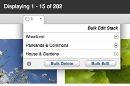
When we were redesigning our content management system, we weren’t able to kill one complex feature in particular: the bulk edit function. In the previous version of the CMS, an entire column of a main screen was devoted to the bulk edit basket. The feature consumed about 30% of the screen real estate, but we found that very few people actually used it. Our solution was to introduce a single icon with a number beside it indicating how many items were in the basket. Clicking on the icon or number revealed the list of items in the basket through a modal dialog. This saved a huge amount of space and prevented the majority of users from being distracted from their primary task.

In the words of design guru John Maeda, “When a small, unassuming object exceeds our expectations, we are not only surprised but pleased.”
Minimize Visual Noise
So far, we’ve discussed minimizing complexity by killing or hiding features. But minimizing “perceived” complexity is also important. UX designer Brandon Walkin says, “The amount of visual noise in an interface has a great deal of impact on the perceived complexity of the interface.” Keeping visual noise to a bare minimum will make an interface seem easier to use. The two primary tools for reducing visual noise are white space and contrast.
White space, as defined by Mark Boulton, “is the space between elements in a composition.” White space should be your default layout tool. One rule of thumb is never to introduce a design element if you could accomplish the same goal with white space. You will be surprised by just how much you can accomplish with white space alone.
While white space should be used in abundance, contrast should be used as little as possible. Design theorist Edward Tufte, who is responsible for the notion of the “least effective difference,” urges designers to use the smallest visual variation required in order to effectively communicate an idea. Practically, this means emphasizing what’s important and dialing back everything else.
To illustrate both of these points, take a look at this pricing chart from TypeKit and then look at the modified version:

Modified version.
You’ll notice that the modified version contains a dark heavy border, not unlike the default border around HTML tables. Which version does a better job of minimizing visual noise? (The answer, of course, is the original.) Plenty of white space and minimal contrast help reduce visual noise and will make your application feel simpler.
Reduce, Reuse, Recycle
As an application begins to take shape, problems often recur in various parts of the application. And recurring problems characteristically tend to have similar solutions. Look for ways to reuse components of the interface. Reusing elements for different purposes has two advantages: less development time is needed, and a more consistent experience is given to the person using the application. If a user learns how to achieve one task, they can apply that same knowledge to accomplishing a second task as long as it is implemented consistently.
In the process of designing a CMS, we spent a lot of time perfecting form validation. We outlined invalid fields in red and even added red validation bubbles to indicate how many errors were in each section of the form.
Later in the process, a version comparison feature was added to the requirements list. Instead of creating an entirely new mechanism, we piggybacked on the validation framework. Form fields that had changed were outlined in blue, and we used blue bubbles for section totals. It was quick for us to deploy, and the interface was already familiar to users.
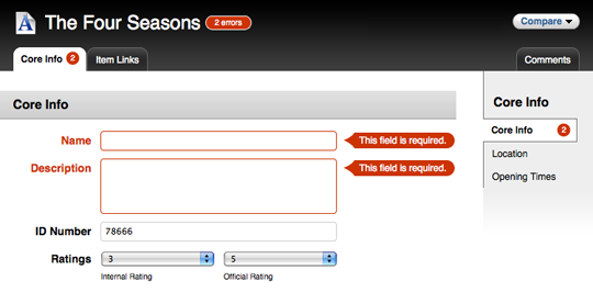
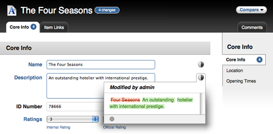
Reusing interface components is another way to reduce perceived complexity because users will then quickly become familiar with the application and know what to expect from it.
The Blank State Should Not Be Blank
The blank state is how an interface appears when no data is available, such as when someone uses an application for the first time. As designers, we spend most of our time figuring out how best to present content, and too often we forget that content simply won’t always be there.
It is vital to build in sensible defaults. The blank state is often the first impression someone has of a product and can be a deciding factor in whether or not they even get started using the application. A good blank state acts as a wayfinding device, helping the user take their first few steps.
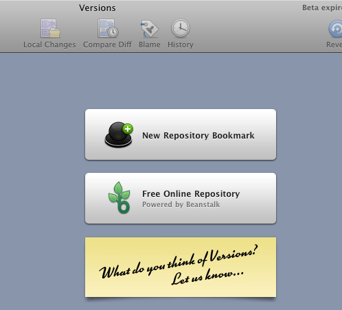
The people behind Versions (a subversion client for Mac) obviously put a lot of thought into the blank state of the application. The application prominently highlights the top two actions a user might want to take when using it for the first time.
It bears repeating: don’t forget the blank state!
Showcase
We’ve all seen plenty of cluttered, complex software. Applications that effectively minimize complexity, however, are a bit harder to come by. Here are few that pull it off with flying colors.
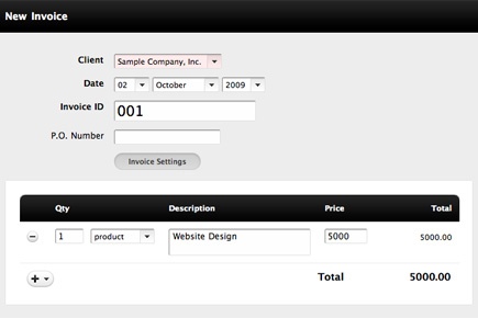
Invoice Machine is user interface minimalism at its best. The application exemplifies economy of expression and pays extreme attention to detail.
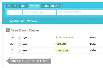
Freckle just makes you want to keep track of your time. The conveniently condensed interface shines with energetic color, turning a routine task into something fun.
Image Spark combines sleek black-and-white gradients with elegant typography. Its interface has few controls, making it simple to get around.

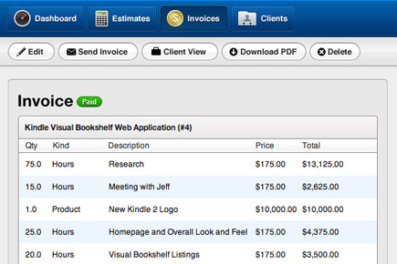
Ballpark has clear controls and an uncluttered interface, without being sparing in its use of color.
Krop, at its core, is just two form fields: location and keyword. It takes literally about five seconds to find relevant job postings.
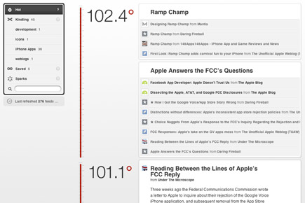
Fever’s entire purpose is to reduce the barrier between you and blog posts you’re interested in. It accomplishes this through a simple, unique interface.
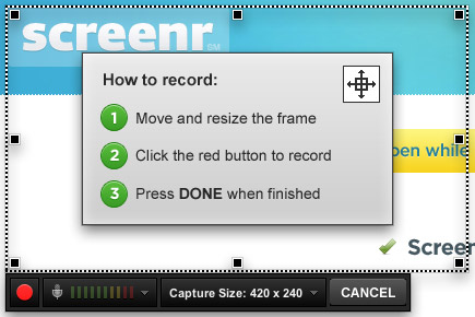
Screenr is an amazingly simple tool for recording screencasts and posting them to Twitter. It is notable not for all of the features it has, but for all of the features it doesn’t have.
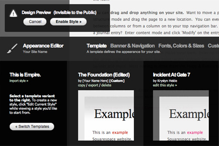
Squarespace does a great job of hiding complexity. While it is a full-featured Web publishing platform, it does an impressive job of hiding its power behind a simple user interface.
The Final Word
First, reduce actual complexity by eliminating unnecessary features and then hiding what you can’t eliminate. Secondly, reduce perceived complexity by minimizing visual noise and reusing elements. And finally, use the blank state to help orient users.
Minimizing complexity in the user interface will help people learn your application more quickly, use it more effectively and be happier all the while. As jazz musician Charles Mingus said, “Making the simple complicated is commonplace; making the complicated simple, awesomely simple, that’s creativity.”
Further Resources
- Watch Ryan Singer’s talk on UI Fundamentals for Programmers (even if you’re not a programmer).
- Managing UI Complexity by Brandon Walkin is a good read on perceived complexity.
- Read a synopsis of Don Norman’s UX London ‘09 talk, In Favor of Complexity
- Check out Leisa Reichelt and Mark Boulton’s work on the Drupal 7 redesign project. They were given a ton of complexity and it’s interesting to see how they’ve been sorting through it.
- Designing the Obvious: A Common Sense Approach to Web Application Design by Robert Hoekman Jr.
- Getting Real: The book by 37signals. If you haven’t read it yet, lock yourself into a small room with your laptop for the rest of the afternoon until you finish it.


 JavaScript Form Builder — Create JSON-driven forms without coding.
 Enterprise UX Masterclass, with Marko Dugonjic
 Devs love Storyblok - Learn why!
 Get a Free Trial

