Showcase of Web Design in Russia
Web Design in Russia
The land mass that is one-sixth of the Earth is always surprising. As the founder of one of design-related magazines in Russia (Designcollector.net), I am happy to present the hidden force that is Russia. I won’t dwell on the classic stereotypes but will rather look at the creativity flowing through.
The era of professional and commercial online design started in Russia about a decade ago. We’re now seeing an increase in professional design and development. I won’t concentrate much on the history of Web design in Russia; that has been happening for ages. Like everywhere in the world, Web design came to Russia as a modern way to present any kind of information to an audience online. So, principles such as simplicity, accessibility and eye-catching design have been cultivated for several years.
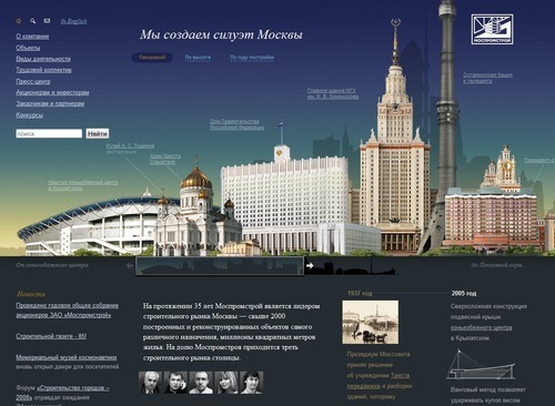
Russian Web Design: Mospromstroy
Web development as a profession was relegated to the elite for years until geek heads and artists took it over. For a few years there was a boom of home pages and tiny corporate websites that were built with any regard for the end user. This trend ended thankfully, in large part due to the highly scaled websites that came out the original and still unique studio founded by Artemy Lebedev, which has produced more than 760 websites.
Today, the professional scene of web design consists of thousands of freelancers, studios, agencies and large media companies, along with offshore and outsourcing businesses. I won’t do a “Top 20” this or that rating, but I will try to touch on the most established parts of Russian Web design, including agencies, freelancers, portals and so on.
State Of Things
Measuring a Web design market by the products of its agencies is not quite fair. Russian agencies have also proven their management technologies and quality-control processes. As someone once said, “The best way to understand a new city is to go to the central market.” And in Russia, Web design is still concentrated in the hands of freelancers and small studios. To get a better picture of freelancing in Russia and the bordering Ukraine, I have asked two freelancers to talk about their work.
I spoke with Gennady V. Osypenko, who is the rather famous Kiev-based designer working with companies from Eastern Europe (he is also known as Genn), and Dmitry Sulliwan, a Russian freelance Web designer.
Q: Could you please describe the life of a freelancer, developer and designer?
Gennady Osypenko: You do work, get inspiration and then do more work: that is freelancing. For sure, you meet clients and collaborate a lot. Compared with an office job, you travel around the city a lot, wasting your time on that. Freelance designers become the center of the project, and even oversees developers, acting as a kind of art director. Designers in offices just do the routine, yelling at account managers and listening to art directors. Hence, I am a freelancer, and I do not remain at one job for long.
Dmitry Sulliwan: The work of freelancer is very interesting. You get new experiences from working with different companies on diverse projects, and some of those experiences may not even be related to design. Different cultural and professional events make the life of the freelancer easier and allow him to share his experience and understand the value of his job. A freelancer’s life is good because he manages himself, which allows you to get more pleasure from your work. But that does not mean you work any less. From my perspective, freelancers work one-and-a-half times more than permanent contractors. The only barrier to getting the best results is laziness. Hence, there are not a whole lot of true professionals in the freelancing space.
Q: Are there any regular meetings or events?
Genn: We hold festivals and different advertisement exhibitions. The only exhibition I have visited abroad was the designers market in Budapest (Sziget). Web-oriented conferences were very popular last year. Not all of them were about design, but some were useful and interesting anyway. I’ve done things like short master classes at some of them, and I plan to do that in future; I’ve been invited at the end of October to say something about being a freelance designer. I like talking about what I do to people who are eager to listen.
Dmitry: There is a good set of conferences in Russia. I can name the last ones: DesignAct in Moscow, and the 404 Web Designers Conference in Samara. Many Russians also visit foreign events in Europe and around the world.
Q: Where do you get inspiration from?
Genn: I get inspiration from everything around me. That is a typical answer, but any object could lead my imagination to the unique and perfect idea. It is like in the House M.D. series on TV, when House is stuck on a diagnosis and suddenly gets inspiration to solve it. I got inspiration for my last project from the Wipeout Pulse game on PSP. I played it for hours and eventually got an idea for a website architecture.
Dmitry: Design books, magazines and Internet resources. Nowadays, we have a nice bunch of local design blogs on which they share their experiences and thoughts.
Q: What’s the situation with the market? How much do designers earn?
Genn: I don’t know the situation in the market, but I know for sure that a lot of people want to make a website or establish an online identity. As a freelance designer or creative process supervisor, I prefer more interesting and specific projects, ones that don’t reflect the whole market situation.
Dmitry: True designers, like any other good specialists, cost a good amount of money. The question is whether there are enough positions. There are many agencies and studios, and so fewer of them would be able to provide a good experience or take on interesting projects.
Q: Is being a Web designer considered high-level, sophisticated work?
Genn: When you see an ad on every (literally every) open surface saying, “Site for $100,” how could you regard Web designers or anyone connected with website creation to be high level or sophisticated? Luckily for us, customers who really need complex, functional websites understand that they have to work with professionals. Just because you can illustrate something does not mean you are a Web designer. If you can organize the craziest information in a usable and readable way, and then decorate it, then you are a Web designer. So, we could say that being a Web designer is both high level and not high level at the same time. Actually a lot of Web designers also create perfect identities and motions, so I’d better call them designers, even though we create beautiful websites.
Dmitry: Unfortunately, not always. Mostly because people still confuse Web designers with system administrators [Interviewer note: That’s true, because most Russian Web designers can do Shell and Apache tasks, hosting stuff and email management and develop a reputation for mixing them together. When a Russian customer orders a website, they want it 100% with domains, parking, hosting, support. This is the main issue with the profession.] But in most IT and related companies, the position of Web designer (and developer, UI designer and visual designer) is valued and respected because of the high-level skills and usually complex work involved. These days, the Web design profession has cut out its own place in the market and is recognized for it.
Q: There are rumours that many designers in Russia still use tables, and that most designs are 100% fluid, regardless of screen resolution?
Genn: Are you referring to HTML coders and Web developers? As far as I know, the trend is to use semantic code and follow accessibility and other compliance standards. One Ukrainian HTML coder even coded his own blog in HTML 5 and met all standards requirements, even if only for a few browsers. So they’re all progressive and forward-looking. As for 100% fluid width, there was an assumption that all websites had to be 100% wide and fill the whole browser window. As I explain in my training and master classes, the width of websites should fit the requirements. As I can tell, incorrect use of fluid widths is declining and used in only specific instances.
Dmitry: Those are only rumors. Professional Web developers follow standards and adopt the latest trends in coding. Fluid width is a distinction of Russian Web development and a common standard. Good fluid layouts are usable, dynamic and look good at different resolutions. And good Web developers can avoid common issues, such as those related to floating and typography, by using fluid width.
Q: What about typography and Web standards?
Genn: It’s a common joke that all designers hate Cyrillic letters. The letters really look odd if you want to create something fancy, but we adapt to it. I like the story of one logo made in the US for some candy trademark. The designer decided to add a feature to the logo and name, so he made ö out of o. Years later, he found out that Scandinavian designers hate umlauts, but he used them as decoration and it worked well. We have to abstract and not see hieroglyphs in letters but rather understand their nature and use them in the best way.
Dmitry: Cyrillic type has far-reaching issues. The main illusion is that Cyrillic type is not better than Latin. That issue is outdated. We have great Russian typography designers who do amazing type that fits certain designs well and win awards. Nowadays, even Web editorials order custom typography for their titles. Typography on the Web has become user-friendly and readable.
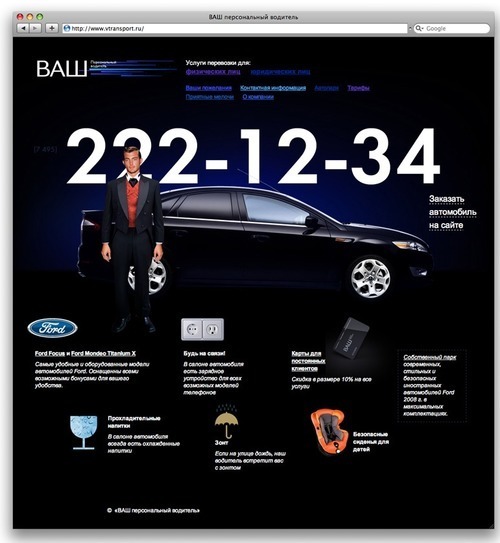
vtransport.ru
Q: Are there any issues unique to Russian Web design?
Genn: Yeah, there might be some difference between design in Ukraine and in Russia. As long as designers are not regarded as high-level specialists in the community, then customers will continue to believe that they are perfect designers, too. So, they will always want to move this a bit, repaint that a touch, and change the whole layout five minutes before the deadline. With any project, I try to be as specific as possible in explaining almost every pixel (or dot, if we are talking about print) so that the customer can see why the product is the way it is. It’s surprising, but it works more than half the time. The other problem is that no one wants to part with their money, so you could end up waiting some time before getting money for a project that is done, implemented and working.
Dmitry: Russian customers still do not understand that designers do not blindly follow their ideas but are rather themselves highly motivated workers who want to produce the best results for the given job. Whoever the customer, whether foreign or local, every time it is a minor war. Designer-client relations are not stable in Russia and are not even regulated. We have no professional unions and, of course, no support from the government. Newcomers to freelancing are often not aware that some customers are unfair, but they find out when they do not get paid.
Q: Do you see any remarkable differences between Russian designs and ones in the US and Western Europe?
Genn: I am happy that distinguishing between designs in Russia and those on the worldwide scene is becoming harder and harder. The designs here are unique in their own way, but then the work of every good designer is unique.
Dmitry: As mentioned, the main difference is fluid layouts. Good Russian websites have a clear and semantic structure, and they don’t follow strict grids, which make the layouts dynamic and fresh. They use modern Web technologies, combining unobtrusive JavaScript with clean xHTML.
Q: How does all of this work?
Genn: I don’t know. I didn’t like physics in university much. When I ask myself that question, I start reading British science fiction. It doesn’t answer the question, but it has a lot of funny jokes.
Dmitry: Briefly, the situation is good. Russian Web designers are always looking forward and no longer do clumsy, heavy Flash-based websites. We have started to concentrate on usability and accessibility and become more integrated with the rest of the professional world.
DC: Russian Web designers are even starting to organize professional unions (like WSG Russia) and visit local conferences, such as 404, RIT, Drupal Camp and many others.
Showcase Of Creative Agencies
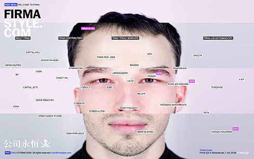
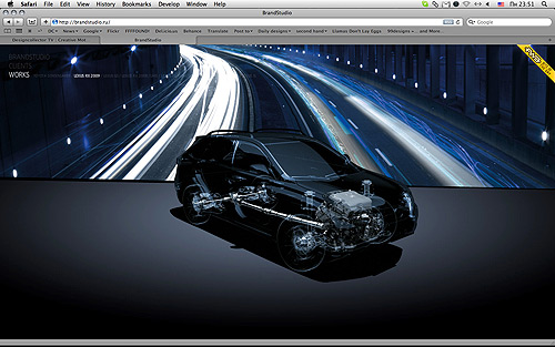
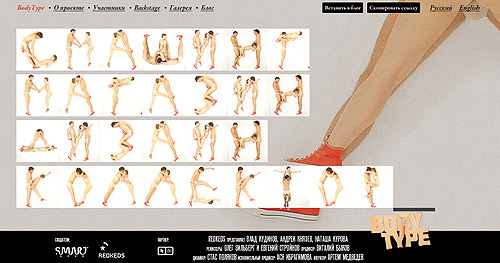
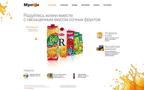
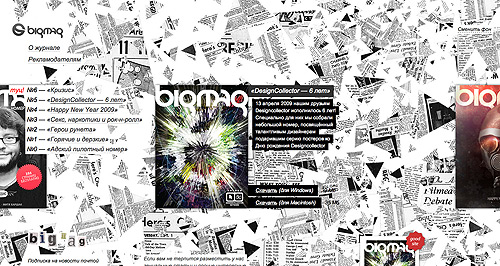
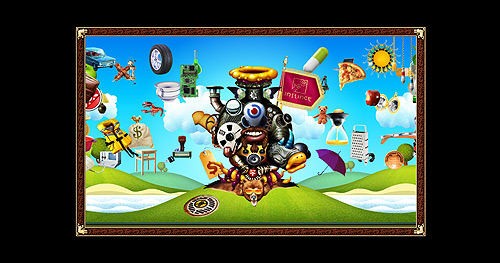
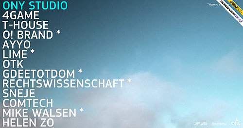
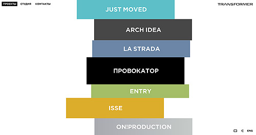
Let’s turn now from the freelancing life in Russia to the FMCG and promotional sectors, where Russian creative agencies live. They do their best to impress consumers with their products and corporate websites. The results are meant to impress visitors and make them spread the news like a virus. Here are some agencies that have gained public attention as well as prestigious awards, such as the FWA, ADCR and even the Cyber Lions shortlist.
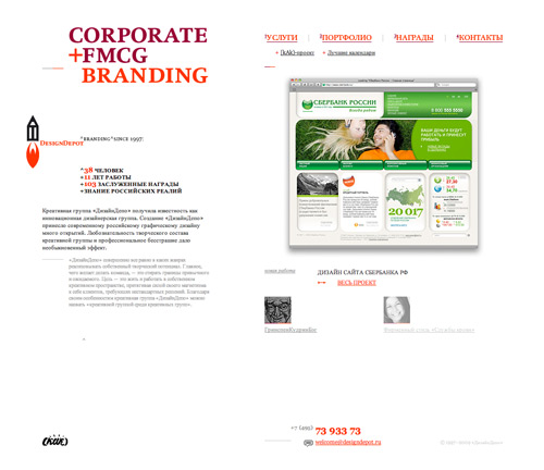
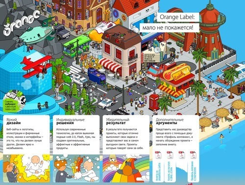

FIRMA
Showcase Of Web Agencies
These guys create great websites and form the foundation of the Russian Web design scene. They’re not necessarily the best; they just do their work better than most.
As mentioned, ArtLebedev Studio is still the largest studio in the Russian market, based on portfolio size. To date, it has done more than 760 websites, 725 graphic designs, 113 product designs, 44 interfaces, 32 environmental designs and 30 presentations. This record is still unbeaten, and its brand is something of a guarantee on the Russian Web design scene. Also worthy of mention is its Bronze Cannes Cyber Lion award (the only studio in Russia to win it), and its internship program, which helps international students realize their ideas.
The next largest studio in Russia is DEFA Interaktiv. It was founded by Dmitry Kozlov eight years ago and has made a success of its customers’ businesses with its highly professional skills.
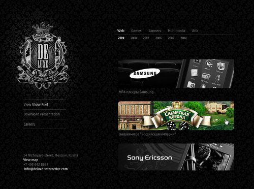
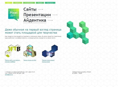
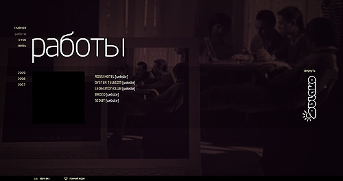
The quite new and fast-moving creative agency Deluxe Interactive has already been mentioned at the Favorite Web Awards (FWA) and continues to produce great promotional Flash websites.
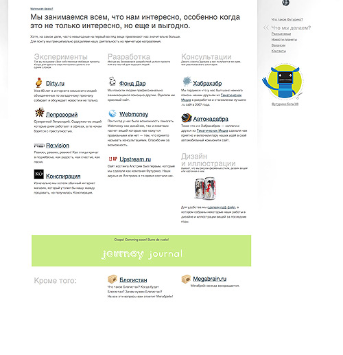
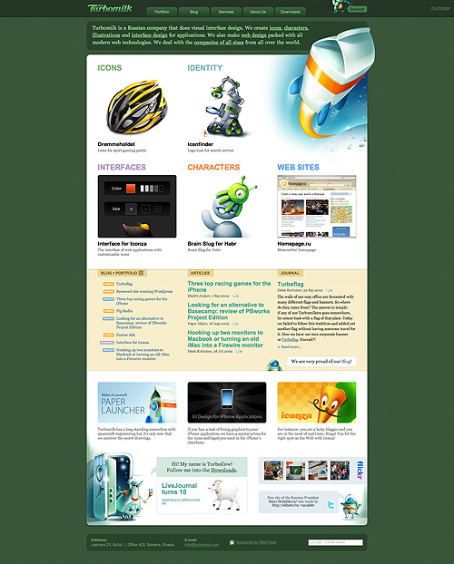
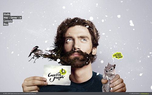
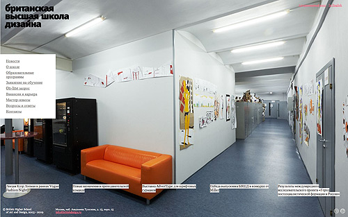
Showcase Of Freelancers
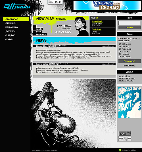
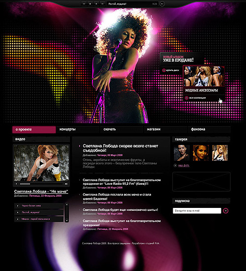
Freelancers are the hidden force of Russian creativity. As we mentioned, anyone who can successfully freelance in Russia could handle art direction at any agency with no problem. To grow as professionals, freelancers need a decent place to showcase their work and share insight. Such places include Deforum.ru, free-lance.ru, illustrators.ru, behance.net, revision.ru and russiancreators.ru. Quite a few magazines and blogs profile the best practitioners: kak.ru, Designet.ru, Designlenta.com, Revision.ru, Creativenews.ru, Peopleofdesign.ru, Omami.ru, ru.designeast.eu, designwar.net, djournal.com.ua and Designcollector Network

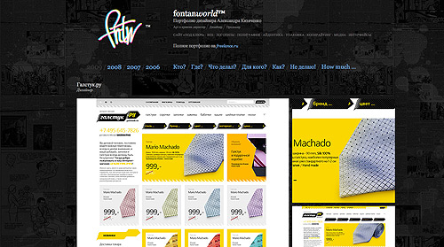
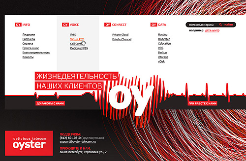
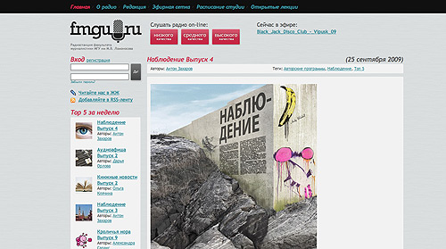
Andrew Tron
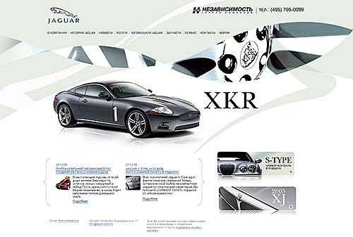
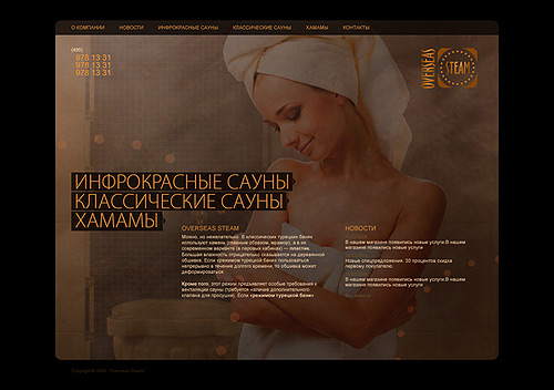
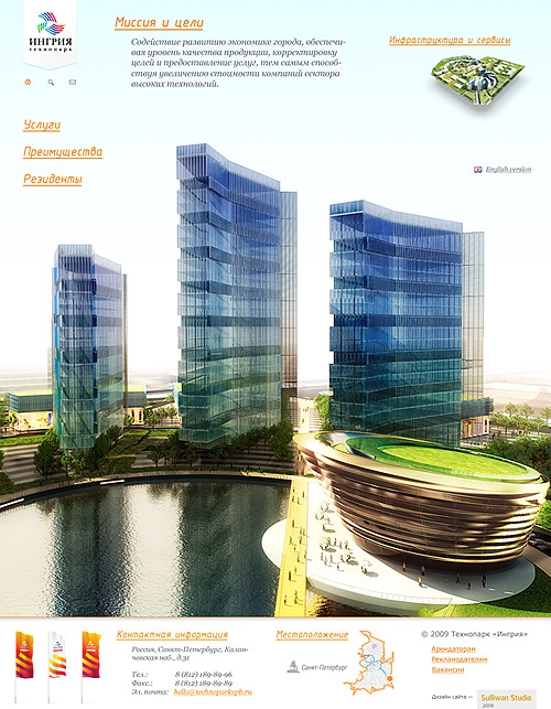
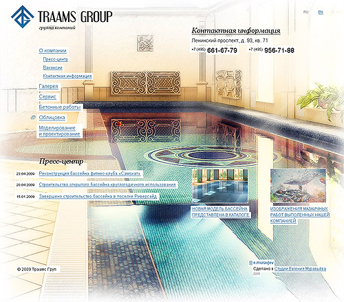
Nazir Khasavov
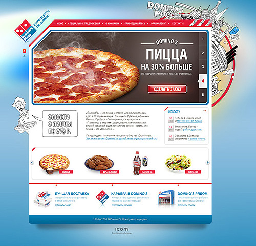
Dmitry Evstropov
Web Developers Online
The Web developer scene in Russia is well represented on blogs, too. We’ll cherry-pick the best ones here among the dozens that exist. On them, Web developers and intelligent commentators share their thoughts on various topics and host friendly communities. Vadim Makeev and Constantine Osnos chose these ones for us.
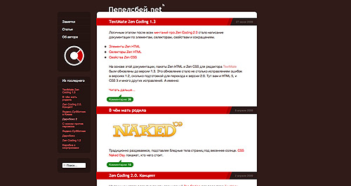
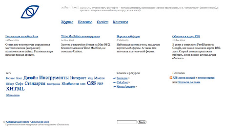
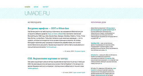
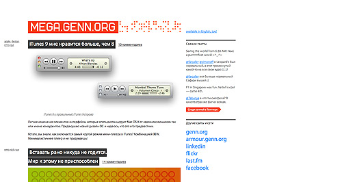
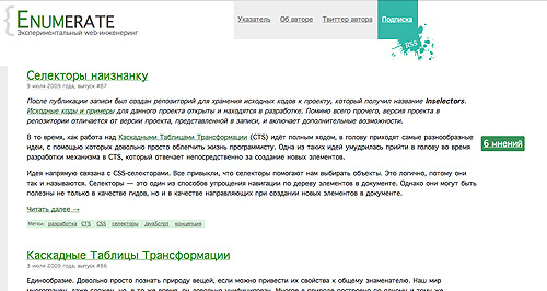
The particular nature of Russian communication has produced these huge community platforms, where any topic can rise or fall according to the “vox populi.” Everything IT-related, from Web 2.0 to Web development, is discussed on Habrahabr. The best place to talk about Russian Web standards is Webmascon magazine. And Deforum is the place to share your creative work and welcome a crowd of decent, and sometimes obscene, critics.
Also worthy of mention is Injun, a Flash and ColdFusion development blog, as well as Inforedesign and SEOBaby, for their useful content. Nbsp and Internet Things are great for their professional content related to Web design, development and promotion.
Creative Formations
To round out our picture of Russian creativity, we’ll mention some online resources related to other design industries. For example, advertising: Adme and Advertka. For fashion: LookAtMe and Fashion Communication. And the 3-D and CG arts: Render Ru and CGTalk.
Russian creativity bears fruit every day, and the best way to stay on top of it is to read our Designcollector Network and stay connected to Russia’s magic networks.
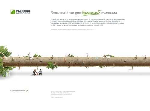
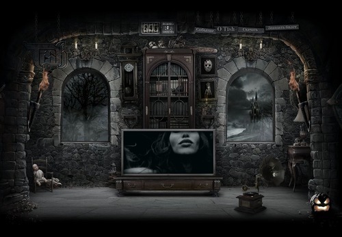
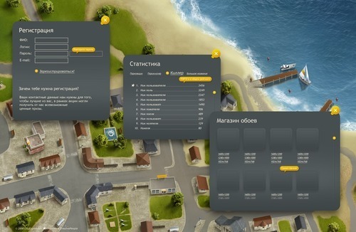
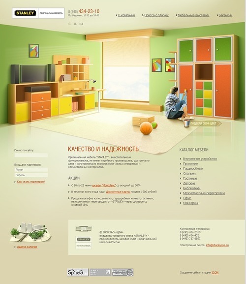
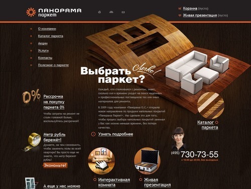
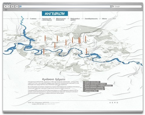
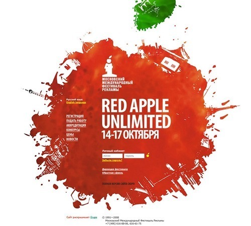
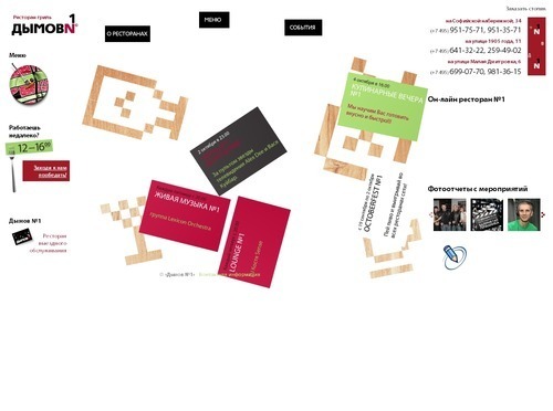
Showcase of Russian Web Designs
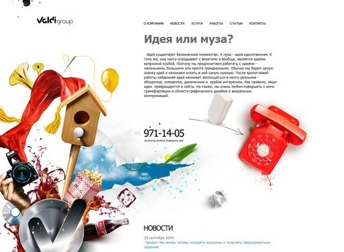
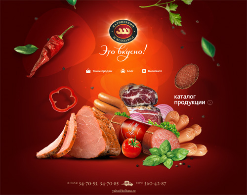
Yaltinsky Mjasozavod
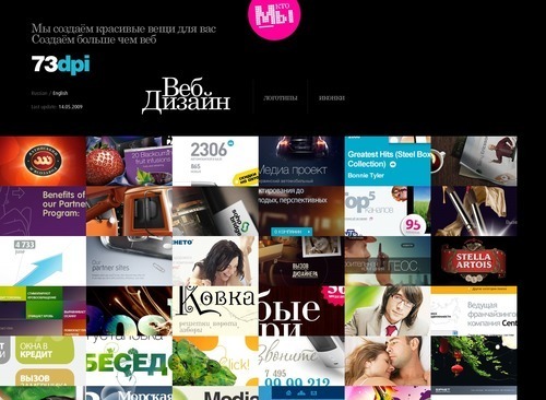
73dpi


You may also want to check out the following Smashing Magazine articles:
- From Russia With Love: Behind The Responsive Redesign Of Kremlin.ru
- 100 Years Of Propaganda: The Good, The Bad and The Ugly


 Enterprise UX Masterclass, with Marko Dugonjic
 Register For Free
 Devs love Storyblok - Learn why!
 JavaScript Form Builder — Create JSON-driven forms without coding.