Increasing Online Sales: Simple Usability Problems To Avoid
1. Hidden Search Box
A solid information architecture can do wonders for people who enjoy browsing, but some customers just want to find what they’re looking for, buy it and get out. These people are search dominant, and as soon as they land on your website, they will start searching. And if they can’t find your search box, they will leave. As simple as that.
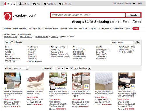
A great example of a prominent search box is the one on Overstock.com. It is the second thing I notice on the home page because of its size, proximity to the top and dominant red border.
Imagine stopping at a grocery store on your way home from work to pick up some pine nuts for your world-famous pesto sauce. The nuts could be anywhere, so you decide to ask an employee for help. After a few minutes of looking around, you can’t find anyone who works there. So you leave frustrated and empty-handed. Would-be customers who can’t find somewhere to search your products feel the exact same way.
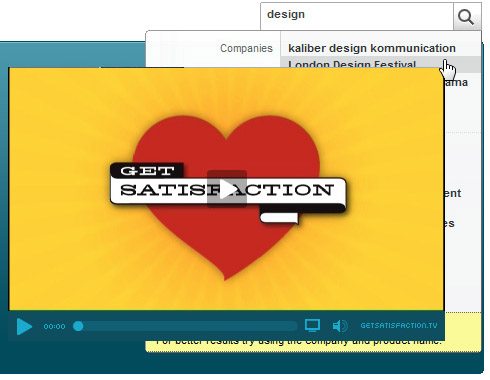
Get Satisfaction has a prominent search box with a hardly usable drop-down menu. The search box appears only on the front page.
Also, make sure that the user can actually use the search functionality and will not be confused or irritated by design elements surrounding the search box. In the example above, Get Satisfaction has placed a search box above a video-block. Once the user types in a keyword, a drop-down menu appears below. However, this menu is hardly readable and is therefore quite confusing. Unfortunately, the search box appears only on the start page of the site which makes the search hardly usable. That’s not user-friendly.
How to Fix It
Make your search box more prominent, and keep it in a consistent location. It doesn’t have to be as big and dominant as Overstock’s, but visitors do commonly look for it in the top-right corner. Also make sure that the search box isn’t surrounded by elements that may affect its functionality. It concerns the search results page, too.
2. Unhelpful Search Results
This dovetails with the last point. Visitors who use the search box want to find what they’re looking for quickly. They are probably searching either for a specific product or for a specific feature of a product that may not be listed in the website’s main categories.
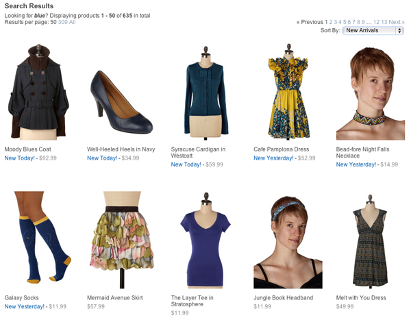
When I search for “blue,” ModCloth does an excellent job of showing me items that are… well, blue! It sounds simple, until you notice that the word “blue” does not appear in any product names or descriptions. The website seems to have used some kind of witchcraft to magically retrieve only blue items. (In fact, it probably uses a tagging system, and when you search for “blue,” all of the products with that tag are displayed… but still!)
How To Fix It
Support common misspellings. Example: See how Google does it.
Make the “Zero results” page clear, and suggest alternative search terms. Example: eBay not only suggests that I rephrase my search but guides me with examples.
Unhelpful search results are usually fixed with back-end magic. This can be a tricky job and usually calls for a custom solution. You can start by looking at your search log to see what people are searching for. The terms that need the most improvement will be the ones that consistently turn up in that log.
3. Not Enough Products On Each Listing Page
The goal of any online store is to sell as many products as possible, and a great way to increase sales is to get visitors to look at more products during each visit. When you are in a grocery store, you have the freedom to look at as many items as you want with few barriers (the main one being how fast you can skip down the aisles behind a cart).
We lose that freedom when shopping online. We come up against this foreign concept of “pages.” We can look at only one of them at a time, and to get to the next one we have to click on a “Next page” link. That means more work for your visitors, so make it easier for them by displaying more products at a time. This reduces the “Next page” barrier and encourages them to browse more.
You don’t want to overload visitors with too many products. Adding more products to each page is like making the aisles in a grocery store longer. You don’t want to trap your customers in an aisle as long as a football field.
How to Fix It
Add more products to each page, but consider the nature of your products before blindly increasing the number of products. Are your products visual? Or technical in nature?
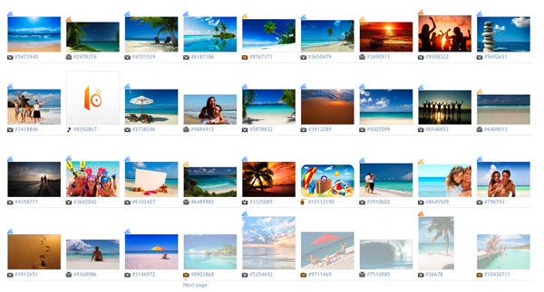
When you search iStockPhoto for “beach,” the results are almost 100% visual, which shrinks the gap between browsing and purchasing. Not much thought goes into comparing products once you’ve scanned an image. If your products are highly visual, then the more you put on the page, the better. Anywhere between 50 and 100 is ideal.
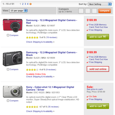
On the other hand, if your products require technical explanation, limiting the products to about 15–20 per page is best. On Best Buy, customers can compare cameras without feeling overwhelmed or getting lost in a sea of megapixels and LCD screen sizes.
4. Small Pagination Links
Make your pagination links more usable by increasing the clickable area. This lowers the barrier between pages that we talked about above and encourages visitors to view more products.
The pagination link above appears to have a large clickable area, but only the small oddly positioned blue box is actually clickable. This confuses visitors and makes the navigation more difficult. Consequently, readers have to think about positioning the mouse properly which has a negative effect on overall user experience.
The best example of pagination links I’ve come across is Flickr’s. Though not an online store, the same concept applies. These links have a large clickable area, clearly marked by the gray border. They also reinforce Flickr’s brand by using the logo colors to let viewers know what page they are on and which elements can be clicked.
How to Fix It
Increasing the clickable area of your page links is as easy as adding one line to your CSS:
.pagination a { padding: 4px; }As a bare-bones usability test, visit your website on an iPhone, and try to click each pagination link with your thumb. If you can’t do it, you probably have to give the link some breathing room by adding more padding.
5. Non-descriptive Product Page Links
When your customers send each other links to your product pages, they should be able to tell what the product is even before clicking on the link.
What I mean are links like https://www.ecrater.com/product.php?pid=5540041; if you get that link in an e-mail, you would have no idea what the product would be. A much more user-friendly URL would be https://www.ecrater.com/products/kodak-slide-projector. Being able to see the product name gives potential customers an incentive to click on the link.
Friendly URLs improve your search engine ranking because they give search engines more information about what is on the page. If a customer is searching for a chrome faucet that you happen to sell on your state-of-the-art faucet website, which URL would they be more likely to click on:

or

Amazon does a great job of using customer-friendly URLs for its products. Take this typical product page link as an example:
https://www.amazon.com/Crush-Time-Cash-Your-Passion/dp/0061914177/
The book title comes right after amazon.com. This helps visitors confirm that they’re on the right page by glancing at the URL, and it helps potential customers share links with each other. Amazon URLs would be even more user-friendly without the gibberish at the end. But the company still does an amazing job, given their product catalog of hundreds of thousands of unique products.
How To Fix It
Add product titles to the beginnings of your links, using URL-friendly strings such as Crush-Time-Cash-Your-Passion.
6. Forcing Registration For Purchases
When a customer wants to buy a product from you, by all means get out of the way. They want to fork over their hard-earned cash!
One way to get in their way is by requiring them to register an account before purchasing anything. This is commonly done to keep track of purchasing details and make it more convenient for customers to make future purchases. This is all well and good, until you realize that this is a significant barrier between the customer and check-out page. The home stretch is the absolute worst place to give the customer a reason to abandon their cart.
Don’t believe me? Read how Amazon increased its sales by $300 million (yes, 300,000,000 dollars) simply by changing one button in its checkout process.
How to Fix It
Instead of forcing potential customers to register during the check-out process, sell them on the benefits of registration. Highlighting the convenience, increased security and fraud detection can convince them to do it. But leave the choice to the customer.
7. Ads Throughout The Store
Displaying ads in your online store tells the customer that you’re trying to squeeze every cent possible from them. Ads detract from the goal of your store, which is to get customers to buy products they want.
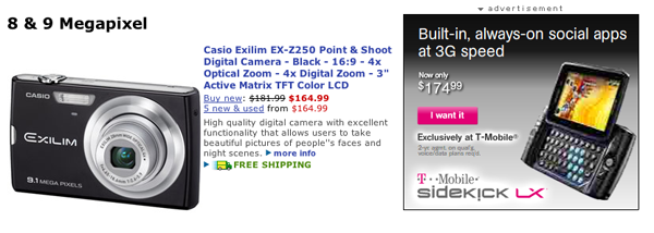
When I first land on Buy.com’s camera page, the first thing I see isn’t the camera listings, but the flashy animated ad for the Sidekick. Ignoring the ad and focusing on the cameras is not easy. I came here to buy a camera, and it gets in the way.
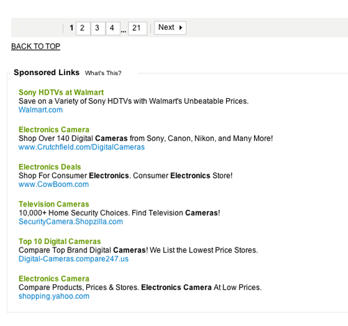
It turns out that some sites actually link to its biggest competitors right in its search results. Imagine if your shop were a physical store. Would you let your competitors advertise their cameras right beside where you are selling your products? By putting ads on its website, you would be doing exactly that.
Don’t confuse this with cross-promotion, which is selling ancillary items from your own store based on what the customer is looking at. Ads don’t drive your own sales but rather drive customers to your competitors while adding a measly 5 or 10 cents to your bottom line.
8. No Notice of Out-of-Stock Items
If a customer pays for a product only to find out later that it is on back order, they won’t be happy. They will either cancel their order or contact customer support to complain. Neglecting to notify customers that an item is out of stock is a customer service problem and makes for a poor user experience.
How to Fix It
Be up front with visitors. Tell them about your inventory level so that they can factor that into their decision.
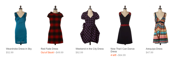
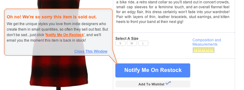
ModCloth immediately tells visitors on its product listing page about the current inventory level. If an item is out of stock, the friendly orange (and not harsh red) text tells me right away. If inventory is low, I’m warned that only a certain number of items are left, in this case four. This nudges me to be snappy about my decision but doesn’t stress me out either. If the message had said, “Our stock will be out in 19 minutes,” I would feel like I’m diffusing a bomb on Mission Impossible. You have no reason to panic your customers.
ModCloth also tells me on each product page whether an item is sold out. It is the first thing I see when I land, so I know about the stock right away. ModCloth’s user experience designers get bonus points for letting me quickly add my name to a list to be notified when the item is back in stock. While I may be upset that the red dress I want is out of stock, I’m quickly appeased by the friendly and helpful messages on the page.
Summary
The goal of user interface design is to make a website easier for visitors to use. For online stores, fixing problems brings in more visitors who browse more products for a longer period of time. Even simple fixes, like not requiring registration for purchases, can have a huge effect on your bottom line. Keep these common problems in mind the next time you design an online store. Your customers will thank you for it.
Related Posts
- 10 Usability Nightmares You Should Be Aware Of
- Usability 101: Introduction to Usability You may also want to check out the following Smashing Magazine articles:
- 15 Common Mistakes in E-Commerce Design
- 5 Universal Principles For Successful eCommerce-Sites
- Fundamental Guidelines Of E-Commerce Checkout Design
- An E-Commerce Study: Guidelines For Better Navigation And Categories
- Usability Testing Demystified, from A List Apart
- Is the “Remember Me” Checkbox a Thing of the Past?
(vf), (al)


 Agent Ready is the new Headless


 SurveyJS: White-Label Survey Solution for Your JS App