Styling HTML Lists with CSS: Techniques and Resources
If you’re new to CSS, this article should provide a good overview of the different types of lists available, as well as some of the browser quirks that occur in relation to HTML lists, with some helpful advice that should prevent those quirks from becoming major road blocks to good design.
You might be interested in the following related posts:
- Mastering CSS Coding: Getting Started
- CSS3 Flexible Box Layout Explained
- Challenging CSS Best Practices
- The Mystery Of The CSS Float Property
In addition, we’ll look at a showcase of various uses, techniques, and tutorials that utilize HTML lists. All of this should put strong emphasis on the importance of using lists in modern web design, reminding even experienced coders how HTML lists can improve the flexibility and maintainability of a website.
Available List Options
Unordered Lists:
Unordered lists are the most commonly used lists. Here is an image showing what an unstyled unordered list looks like in different browsers:
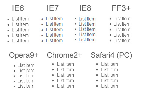
As you can see above, the default settings for unordered lists are somewhat different across various browsers. Of course, nowadays it is rare to see a naked unordered list on any website. Also, a good CSS reset will normalize those differences, bringing the list down to bare text with no bullets and no margins or padding.
CSS properties that are specific to unordered lists include list-style-type, list-style-position, and list-style-image. These properties set the type of marker (or bullet), the position of the marker, and an image to replace the marker. These three properties can be combined using the shorthand list-style property.
The list-style-type property can be set to a number of different values, some of which are shown in the chart below:
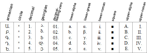
Depending on the user’s browser and system, certain values for list-style-item may not appear correctly, often defaulting to decimal. Using an incrementing value for an unordered list is not recommended since that would take away the semantic value of the unordered list.
The list-style-position property specifies the position of the list marker, and can be set to either outside (the default) or inside. This property would also set the position of an image, if the list-style-image property is set.
The list-style-image property can be used to give the unordered list a custom look with unique “bullets”. Unfortunately, this method of adding a bullet to an unordered list is buggy in Internet Explorer, and is rarely used. A much better solution is to add a background image to the <li> elements on the list, adjusting the position of the background image accordingly, and setting it to no-repeat. This solution is explained through a series of steps at maxdesign.com, and works nicely in all browsers.
Ordered Lists:
Ordered lists are used when a list of items requires a visible incrementing value before each item. The value for the marker on an ordered list can be set to any of the values also available for an unordered list, as discussed above. In most cases, an ordered list would either have an incrementing marker on the list items, or no marker at all. So, it would be unlikely that you would change the marker from an incrementing one to a non-incrementing one on an ordered list, since that would remove the semantic value of the items.
Definition Lists:
Definition lists are used to mark up lists of items that have definitions. They consist of definition terms (<dt>) along with definitions (<dd>). The pairings for definition list items do not have to be exactly paired up. The following is perfectly valid in XHTML Strict:
<dl>
  <dt>calculator</dt>
  <dt>abacus</dt>
  <dd>A machine used for making numerical calculations.</dd>
</dl>
Thus, you could have more than one <dt> with a single <dd>, or even have multiple <dd> tags and only one <dt>.
The visual display of a definition list, by default, is virtually the same across all browsers, as shown in the image below:

Deprecated Lists:
The <menu> and <dir> elements also, technically, qualify as “HTML lists”, but they are deprecated in XHTML, so I won’t discuss those in detail here.
Lists in HTML5
In HTML5, the unordered list has basically remained the same, although now it seems to be referred to simply as a “list”. The new <nav> element will be used to wrap a list that is used for navigation.
The <ol> element has slightly changed, gaining two new attributes: reversed, which is a Boolean that indicates if the list should be ascending or descending, and start, which is an integer that declares the starting point of the ordered list items.
Also, the <figure> and <details> elements have been added. Those new tags will have children that include <dt> and <dd> elements.
For further information on lists in HTML5, see the HTML5 Draft Standard.
Browser Differences
There are some notable differences across the most commonly-used browsers when certain styles are applied to ordered or unordered lists. Let’s take a look at some of these differences. Of course, this assumes there are no other styles associated with the elements, including those in a CSS reset.
Adding “display: block” to List Items
In Internet Explorer 8, Opera 9, Chrome, Firefox 2 & 3, and Safari, adding display: block to the <li> elements in an ordered or unordered list will make the bullets or numbers disappear.

In IE6 and IE7 the bullets and numbers will still be visible, even with display: block applied to the list items.

Adding “float: left” to List Items
In Internet Explorer 6 and 7, adding float: left to the list items (with no other styles present) will align the list items horizontally and the list bullets (or list numbers) will disappear. In IE8 and all other browsers, the list items will align horizontally, but the list bullets (or list numbers) will still be visible.
Another factor to keep in mind when the list items are floated is that the list container (the <ul> element) will collapse when it contains only floated elements. This occurs the same way in all browsers. Adding overflow: hidden to the <ul> or <ol> element is one way to resolve this issue.
To achieve virtually the same effect as float: left in all browsers, the best solution is to use display: inline.
Ordered List Items That Have “Layout” in IE
In IE6 & IE7, if the list items in an ordered list have “Layout”, the numbers in the ordered list will not increment, and will all show as “1”, as shown in the image below:
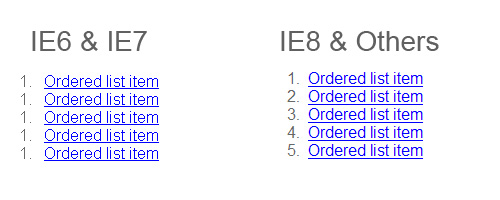
The hasLayout property cannot be set directly, but it can be changed if an element is given an explicit width or height, or the element is floated or absolutely positioned, among other things. For a thorough discussion of the hasLayout property, see this article.
Padding & Margins in IE 6⁄7
In most browsers, in order to remove the bullets or numbers from a list and push the list flush to the left, the left padding needs to be set to zero. But this has no effect in IE6 and IE7. Instead, the left margin needs to be set to zero for this to be achieved in those browsers.

Achieving Consistent List-Styling in all Browsers
To avoid the issues that arise in the handling of list styles in the different browsers, the best method is to use a CSS reset. A CSS reset will set virtually all default browser settings to the bare minimum, and will allow you to work from a common ground in all browsers. There will still be differences after certain styles are applied, but they will not be as difficult to deal with after a reset is put in place.
Also, as mentioned earlier, it is best to completely avoid using the list-style-image property, and to instead set a background on the <li> elements. This will provide a cross-browser, easy-to-maintain solution for achieving custom bullets on an unordered list.
Showcase of Trends, Examples, & Tutorials
Now that we’ve reviewed the basics of HTML lists, as well as some browser inconsistencies, let’s look at a number of different examples and tutorials that display practical examples and uses for HTML lists.
Navigation Bars
By far the most common use for the unordered list is the navigation bar, whether vertical or horizontal. Ever since table-based layouts became obsolete, the unordered list has been widely implemented as a basis for navigation elements for a number of reasons, listed below.
- An unordered list is a block-level element, and so does not need to be wrapped in an extra
<div>to apply a background or other graphical enhancement - When styles are disabled, a styled list will degrade gracefully, ensuring the navigation items appear distinct from the rest of the page’s content
- Although an unordered list might add more markup than just a plain list of
<a>tags, having the extra<li>elements allows the navigation bar to be graphically flexible - Navigation divided into lists and/or sub-lists allows users with assistive technology (such as screen readers) to easily skip entire navigation sections
Pure CSS Fish Eye Menu This vertical navigation menu that mimics the Apple “fisheye” effect on rollover is done with pure CSS and utilizes an unordered list to display the icons.

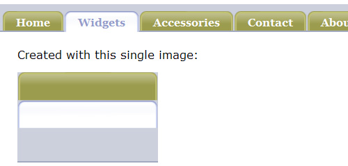
Sliding Doors Meets CSS Sprites An HTML list can also provide the foundation for a tabbed navigation bar using the famous sliding doors technique, as demonstrated in this example.
LavaLamp for jQuery Lovers A “Lava Lamp” hover animation effect on a list-based navigation bar, written for jQuery.

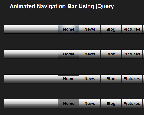
Animated Navigation Bar Using jQuery This tutorial on WebMunch uses list-based navigation to create an animated navigation bar powered by jQuery. The demo page displays four different variations of the animated effect.
Apple’s Navigation bar using only CSS This tutorial describes how to recreate Apple’s navigation bar, based on a list, with some CSS3 enhancements that degrade gracefully in IE and older browsers. The final result also includes an animated hover effect that works in Safari.

Drop-Down Menus
Older drop-down menus, like Brainjar’s Revenge of the Menu Bar used <div> elements to divide sections of anchor tags, implementing JavaScript to show and hide menus. Later, drop-down menus were developed that were more semantic, and more dependent on CSS.
Suckerfish Dropdowns The classic Suckerfish dropdowns by Patrick Griffiths and Dan Webb were one of the earliest drop-down (or fly-out) menus to be based on nested lists.
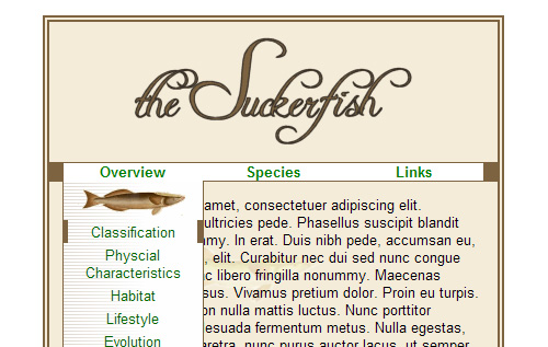
Professional Drop-Down Stu Nicholls provides another list-based solution for drop-downs.
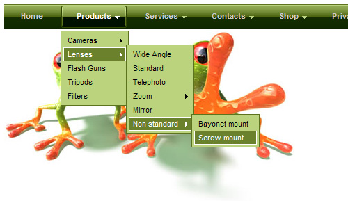
Animated Drop Down Menu with jQuery This tutorial demonstrates how to create a simple, single animated drop-down menu based on an unordered list, with jQuery.

Create Dropdown Menus with CSS Only This simple technique creates list-based drop-down menus without JavaScript.
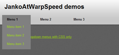
JavaScript Dropdown Menu with Multi Levels These multi-level, cross-browser, list-based drop-down menus include an animated slide and fade effect.
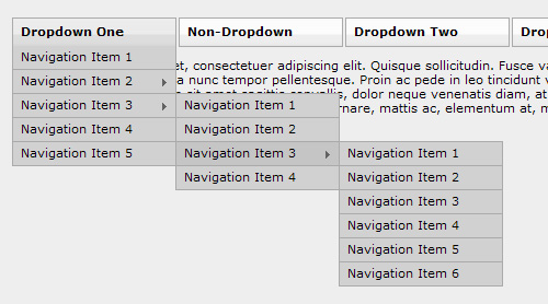
Photo Displays
HTML lists serve as an effective way to display a list of photos, for many of the same reasons that were mentioned above for navigation bars. Below are some examples of photo galleries and other photo-based widgets that are styled with HTML lists.
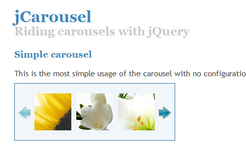
jCarousel The jCarousel photo carousel jQuery plugin applies customizable jQuery functionality to an unordered list that can display the carousel in a number of different ways.
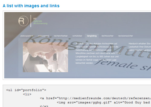
InnerFade with JQuery This plugin allows an unordered list of images to serve as the basis for a fading image rotator that displays one image at a time. The screen grab below displays two of the images in mid-transition.
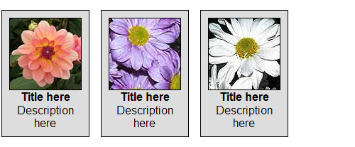
CSS Photo Gallery Template This is a free photo gallery template that displays a caption on hover. This simple gallery uses an unordered list with floated list items.

Definition Lists for Image Gallery This demonstration on Max Design shows how to transform a definition list into an image gallery.
Styling and Dividing Other Types of Content
In addition to displaying images, lists also come in handy for display of content in sometimes atypical fashion, as demonstrated by the examples below.
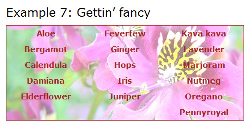
Multi-Column Lists A few years back, A List Apart demonstrated how to convert a single unordered list into a multi-columned display, without the need to divide the items into multiple lists.
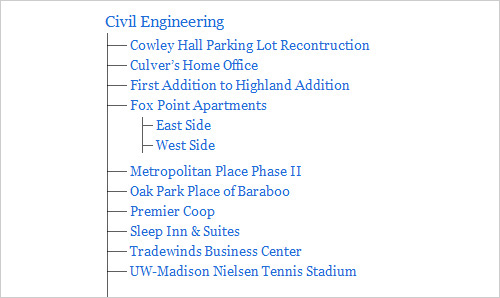
Style a List with One Pixel Chris Coyier demonstrates a neat CSS trick – how to create a “depth-chart looking unordered list” using just a 1-pixel GIF.
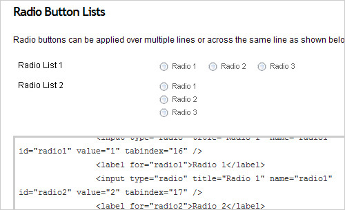
Accessible HTML Forms using Definition Lists Andrew Sellick steps through the styling of a lengthy form with the help of definition lists to group sets of text boxes, radio buttons, and checkboxes.
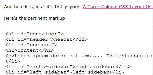
A Three Column CSS Layout Using Just an Unordered List
Rob Larsen of DrunkenFist.com demonstrates how to create a 3-column page layout using an unordered list in place of the usual <div> elements.
Animated Tabbed Content with jQuery This tutorial on Gaya Design demonstrates how to create an animated tabbed content box with jQuery. The content is structured using unordered lists.

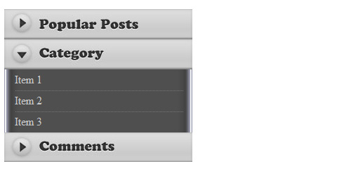
A Simple and Beautiful jQuery Accordion Tutorial This is a simple tutorial that uses nested unordered lists as a basis for a jQuery animated accordion menu.
Code Highlighters
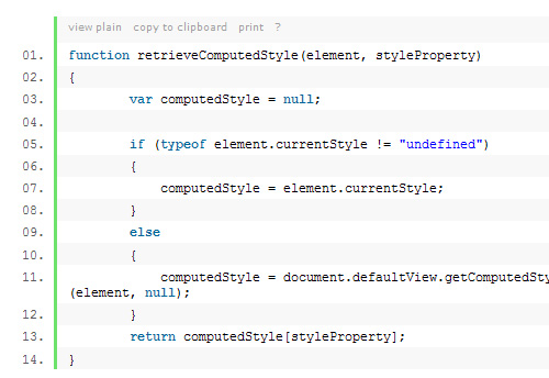
Many blogs and tutorial sites include JavaScript-driven code highlighters that convert <pre> elements into ordered lists, as shown in the screen capture below. One such code highlighter is Alex Gorbatchev’s SyntaxHighlighter
Blog Comments
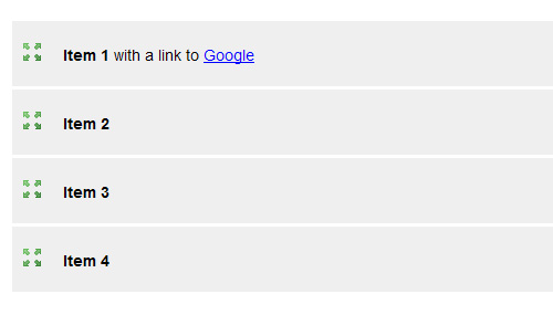
Blog comments, including those on WordPress-driven sites, are structured with ordered lists, providing very flexible options for styling, and laying a foundation for nested comments. Nested, or “threaded” comments are now built into WordPress.
Fancy Styles and Techniques with Lists
jQuery Sortable Lists With Drag Drop Handle Will Linssen demonstrates, with jQuery, how to create an ordered or unordered list that allows the user to manually sort the list items.
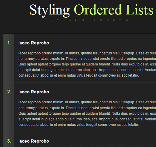
Sexy Ordered Lists with CSS Soh Tanaka shows users how to add some fancy styling to an ordered list.
Veerle’s Block Hover Effect on List Items In the “Approved” section in the footer of her home page, Veerle Pieters implements a cross-browser block-hover effect on an unordered list. Each list item contains a number of separate elements, but the hover effect works on the entire list item, and even works in IE6. The same effect is discussed in tutorials on Smiley Cat and randsco.com.

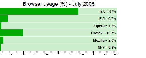
A Definition List Bar Chart The ever-creative Stu Nicholls shows us how to display a bar chart (with very old browser stats!) with a styled definition list.
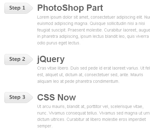
jQuery Sequential List This tutorial on Web Designer Wall will show you how to use jQuery to add sequential CSS classes to list items to create a graphical list.
Creating an Accessible Tag Cloud in PHP and CSS This tutorial describes how to create an accessible, standards compliant tag cloud with simple code. The resulting HTML output is a simple unordered list.

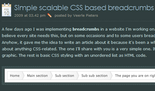
Simple Scalable CSS Based Breadcrumbs Veerle Pieters describes how to create a breadcrumb navigation section using an unordered list.
CSS Step Menu A demonstration of a “step menu” that’s based on unordered lists.
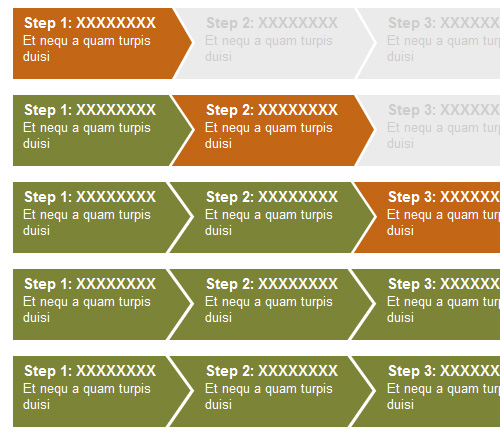
Overlap That Menu! A tutorial that describes how to create overlapping menu items using a styled unordered list.
In most browsers, in order to remove the bullets or numbers from a list and push the list flush to the left, the left padding needs to be set to zero. But this has no effect in IE6 and IE7. Instead, the left margin needs to be set to zero for this to be achieved in those browsers.

Achieving Consistent List-Styling in all Browsers
To avoid the issues that arise in the handling of list styles in the different browsers, the best method is to use a CSS reset. A CSS reset will set virtually all default browser settings to the bare minimum, and will allow you to work from a common ground in all browsers. There will still be differences after certain styles are applied, but they will not be as difficult to deal with after a reset is put in place.
Also, as mentioned earlier, it is best to completely avoid using the list-style-image property, and to instead set a background on the <li> elements. This will provide a cross-browser, easy-to-maintain solution for achieving custom bullets on an unordered list.
Showcase of Trends, Examples, & Tutorials
Now that we’ve reviewed the basics of HTML lists, as well as some browser inconsistencies, let’s look at a number of different examples and tutorials that display practical examples and uses for HTML lists.
Navigation Bars
By far the most common use for the unordered list is the navigation bar, whether vertical or horizontal. Ever since table-based layouts became obsolete, the unordered list has been widely implemented as a basis for navigation elements for a number of reasons, listed below.
- An unordered list is a block-level element, and so does not need to be wrapped in an extra
<div>to apply a background or other graphical enhancement - When styles are disabled, a styled list will degrade gracefully, ensuring the navigation items appear distinct from the rest of the page’s content
- Although an unordered list might add more markup than just a plain list of
<a>tags, having the extra<li>elements allows the navigation bar to be graphically flexible - Navigation divided into lists and/or sub-lists allows users with assistive technology (such as screen readers) to easily skip entire navigation sections
Pure CSS Fish Eye Menu This vertical navigation menu that mimics the Apple “fisheye” effect on rollover is done with pure CSS and utilizes an unordered list to display the icons.

Sliding Doors Meets CSS Sprites An HTML list can also provide the foundation for a tabbed navigation bar using the famous sliding doors technique, as demonstrated in this example.

LavaLamp for jQuery Lovers A “Lava Lamp” hover animation effect on a list-based navigation bar, written for jQuery.

Animated Navigation Bar Using jQuery This tutorial on WebMunch uses list-based navigation to create an animated navigation bar powered by jQuery. The demo page displays four different variations of the animated effect.

Apple’s Navigation bar using only CSS This tutorial describes how to recreate Apple’s navigation bar, based on a list, with some CSS3 enhancements that degrade gracefully in IE and older browsers. The final result also includes an animated hover effect that works in Safari.

Drop-Down Menus
Older drop-down menus, like Brainjar’s Revenge of the Menu Bar used <div> elements to divide sections of anchor tags, implementing JavaScript to show and hide menus. Later, drop-down menus were developed that were more semantic, and more dependent on CSS.
Suckerfish Dropdowns The classic Suckerfish dropdowns by Patrick Griffiths and Dan Webb were one of the earliest drop-down (or fly-out) menus to be based on nested lists.

Professional Drop-Down Stu Nicholls provides another list-based solution for drop-downs.

Animated Drop Down Menu with jQuery This tutorial demonstrates how to create a simple, single animated drop-down menu based on an unordered list, with jQuery.

Create Dropdown Menus with CSS Only This simple technique creates list-based drop-down menus without JavaScript.

JavaScript Dropdown Menu with Multi Levels These multi-level, cross-browser, list-based drop-down menus include an animated slide and fade effect.

Photo Displays
HTML lists serve as an effective way to display a list of photos, for many of the same reasons that were mentioned above for navigation bars. Below are some examples of photo galleries and other photo-based widgets that are styled with HTML lists.
jCarousel The jCarousel photo carousel jQuery plugin applies customizable jQuery functionality to an unordered list that can display the carousel in a number of different ways.

InnerFade with JQuery This plugin allows an unordered list of images to serve as the basis for a fading image rotator that displays one image at a time. The screen grab below displays two of the images in mid-transition.

CSS Photo Gallery Template This is a free photo gallery template that displays a caption on hover. This simple gallery uses an unordered list with floated list items.

Definition Lists for Image Gallery This demonstration on Max Design shows how to transform a definition list into an image gallery.

Styling and Dividing Other Types of Content
In addition to displaying images, lists also come in handy for display of content in sometimes atypical fashion, as demonstrated by the examples below.
Multi-Column Lists A few years back, A List Apart demonstrated how to convert a single unordered list into a multi-columned display, without the need to divide the items into multiple lists.

Style a List with One Pixel Chris Coyier demonstrates a neat CSS trick – how to create a “depth-chart looking unordered list” using just a 1-pixel GIF.

Accessible HTML Forms using Definition Lists Andrew Sellick steps through the styling of a lengthy form with the help of definition lists to group sets of text boxes, radio buttons, and checkboxes.

A Three Column CSS Layout Using Just an Unordered List
Rob Larsen of DrunkenFist.com demonstrates how to create a 3-column page layout using an unordered list in place of the usual <div> elements.

Animated Tabbed Content with jQuery This tutorial on Gaya Design demonstrates how to create an animated tabbed content box with jQuery. The content is structured using unordered lists.

A Simple and Beautiful jQuery Accordion Tutorial This is a simple tutorial that uses nested unordered lists as a basis for a jQuery animated accordion menu.

Code Highlighters
Many blogs and tutorial sites include JavaScript-driven code highlighters that convert <pre> elements into ordered lists, as shown in the screen capture below. One such code highlighter is Alex Gorbatchev’s SyntaxHighlighter

Blog Comments
Blog comments, including those on WordPress-driven sites, are structured with ordered lists, providing very flexible options for styling, and laying a foundation for nested comments. Nested, or “threaded” comments are now built into WordPress.
Fancy Styles and Techniques with Lists
jQuery Sortable Lists With Drag Drop Handle Will Linssen demonstrates, with jQuery, how to create an ordered or unordered list that allows the user to manually sort the list items.

Sexy Ordered Lists with CSS Soh Tanaka shows users how to add some fancy styling to an ordered list.

Veerle’s Block Hover Effect on List Items In the “Approved” section in the footer of her home page, Veerle Pieters implements a cross-browser block-hover effect on an unordered list. Each list item contains a number of separate elements, but the hover effect works on the entire list item, and even works in IE6. The same effect is discussed in tutorials on Smiley Cat and randsco.com.

A Definition List Bar Chart The ever-creative Stu Nicholls shows us how to display a bar chart (with very old browser stats!) with a styled definition list.

jQuery Sequential List This tutorial on Web Designer Wall will show you how to use jQuery to add sequential CSS classes to list items to create a graphical list.

Creating an Accessible Tag Cloud in PHP and CSS This tutorial describes how to create an accessible, standards compliant tag cloud with simple code. The resulting HTML output is a simple unordered list.

Simple Scalable CSS Based Breadcrumbs Veerle Pieters describes how to create a breadcrumb navigation section using an unordered list.

CSS Step Menu A demonstration of a “step menu” that’s based on unordered lists.

Overlap That Menu! A tutorial that describes how to create overlapping menu items using a styled unordered list.

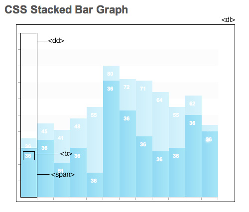
CSS Stacked Bar Graphs A fancy stacked bar graph in CSS that uses an unordered list and a definition list.
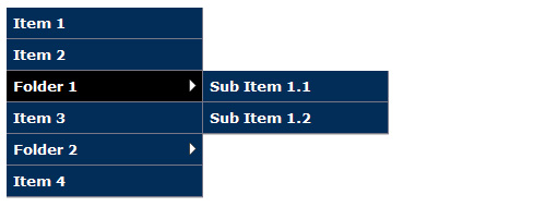
Nested Side Bar Menu Using the same principle as drop-down menus, this demonstration shows a cross-browser vertical menu with fly-outs, based on nested unordered lists.
OMG Durham’s Tag Popularity Graph OMG Durham’s website displays popular tags using a bar graph that is based on an unordered list.

Conclusion
A beautiful, CSS-styled, cross-browser HTML list has the power to resolve thousands of potential layout or design challenges. Although dozens more uses and techniques could be discussed in this article, the above material should be enough to give a thorough overview of HTML lists, demonstrating how powerful and flexible they are in the hands of an experienced coder.


 How To Measure UX and Design Impact, 8h video + UX training
 Devs love Storyblok - Learn why!
 JavaScript Form Builder — Create JSON-driven forms without coding.
 Register For Free
 Get a Free Trial


