Stronger, Better, Faster Design with CSS3
In this second article we’re going to focus on using those CSS techniques (and a little JavaScript) to create some practical elements and layouts. As before, caveat coder — a lot of the CSS properties we’re going to use have limited support, if any, in IE6/7 and probably 8. Firefox 3.5+ and Safari 4 are your best bet right now to see all the cool stuff going on in CSS right now (Chrome does a pretty good job, too).
Be sure to check out the following articles:
- Take Your Design To The Next Level With CSS3
- Push Your Web Design Into The Future With CSS3
- Responsive Web Design: What It Is And How To Use It
Why bother with CSS that has such limited support? It won’t always have limited support, and these articles are all about preparing for the future of web design (and just doing some really cool stuff). Apparently, if you are one of those people who is waiting until using progressive CSS is safe because all major browsers support the same CSS at the same time, you are living in a fantasy world, so it’s just the right time to get things rolling with CSS3.
Ready? Let’s roll.
Inline Form Labels
Everyone’s familiar with inline form labels — storing the label of the field in the value attribute and using some minor JavaScript to erase the text when the field gains focus. This works…okay, but the major problem is that as soon as the user clicks, they lose the label entirely. If they tabbed right into it they may not even have read the label, in which case they’re just guessing.
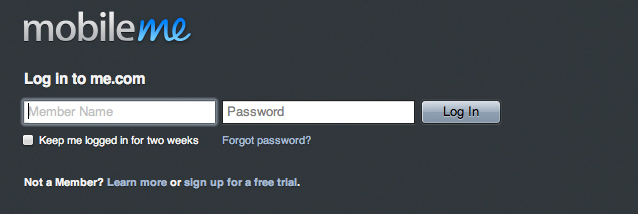
The first site we saw that fixed this was MobileMe from Apple, on their login screen.
What happens with Apple is that clicking into the field fades the label back, but doesn’t erase it. Cooler still is that the cursor stays positioned left so you can start typing, and the JavaScript making that happen is not overly complex — it’s just layout tricks. They position a label behind the input containing the name of the field.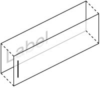 When you click into the field they use JavaScript to apply a class to the label that knocks it back, and another class as you start typing to make the label vanish.
We wrote a blog post about this effect some time ago, describing how you could replicate it yourself. The problem is that over time setting up the page to support this isn’t as turnkey as we’d like, so we’ve revised and rebuilt it just for you (and, of course, for us).
The New Inline Label
Our new approach is considerably easier — to use it in our own products (like Notable and Scrumptious) we simply add class=“inlined” to the label and voila! Here’s how we do it.
Start with a regular label and input:
<label for="demoForm1">Email Address</label>
    <input class="input-text" id="demoForm1" />
In previous iterations of this technique we went to the trouble of wrapping the label and input in a block-level element and used absolute positioning to put the label behind the input. Not anymore. First, we’ll add the “inlined” class to only the label:
<label for="demoForm1" class="inlined">Email Address</label>
    <input class="input-text" id="demoForm1" />
Now we need to do a couple of things to get our labels to display correctly. First, we use negative margins to pull the input up and over the label. We’ll do this by using the CSS adjacent selector, which looks like this:
label.inlined + input.input-text {
        margin-top: -22px;
        background-color: transparent;
        position: relative; z-index: 2;
    }
That code tells the browser to apply the style to any input.input-text which immediately follows a label.inlined — this way we can use the negative margin to pull the input up and over the label itself. We also set the background color to transparent and give the input a relative position and a z-index value.
Next we need to style the label itself. You’ll need to adapt the styling here to mirror your input text style — the goal is for the text inside the label to appear as though it is actually part of the input. Here are the critical pieces:
label.inlined {
        padding-left: 6px;
        font: normal 12px/18px "Helvetica Neue";
        position: relative; z-index: 1;
        opacity: 0.75;
        -webkit-transition: opacity 0.15s linear;
    }
Let’s break that down. Padding and font are simply to mirror the input style. The positioning and z-index make sure the label stays behind the input — otherwise the input can’t be selected. Now the fun parts: opacity and -webkit-transition.
Our form labels work by fading back the label at different points. We start with the label faded back a little, hence the opacity: 0.75. You could also use color to drop the label back, but opacity works regardless of the font color. We add in the -webkit-transition so that whenever the opacity changes, the browser (Safari or Chrome, in this case) will change the opacity smoothly over about 1/8th of a second. So when does the opacity change?
Two times — when the user focuses on the field, and when they start typing. Let’s create two CSS classes we can apply for those states: focus and has-text.
label.focus {
        opacity: 0.35;
    }

    label.has-text {
        opacity: 0.0;
        -webkit-transition-duration: 0s;
    }
As you can see, we reduce the opacity of the label when the user clicks in, then make it invisible when they start to type. We change the duration of our transition so that as a user starts to type, the label disappears immediately, rather than fading back as they type. Now that we have our fields structurally set up and styled the way we want, the last step is a little bit of JavaScript.
Adding the JavaScript
Even though CSS3 has added new tricks like animations and transitions, JavaScript is still king when it comes to interaction. To get our labels to behave, we need to use a few simple JavaScript functions. In these examples we’ll be writing for jQuery, but they’re easy to adapt to Prototype or straight JavaScript.
The JavaScript needs to do three things:
- Add the
focusclass to the label when the user clicks into a field - Add the
has-textclass as soon as they start typing - Bring the label back if they leave the field empty and switch to another field.
$(document).ready(function(){
    $("label.inlined + input.input-text").each(function (type) {

        $(this).focus(function () {
            $(this).prev("label.inlined").addClass("focus");
        });

        $(this).keypress(function () {
            $(this).prev("label.inlined").addClass("has-text").removeClass("focus");
        });

        $(this).blur(function () {
            if($(this).val() == "") {
                $(this).prev("label.inlined").removeClass("has-text").removeClass("focus");
            }
        });
    });
});
We won’t pore over the JavaScript much — it’s pretty self-explanatory. jQuery let’s us quickly target the inputs we want by recognizing the same selector we’re using in CSS, but otherwise it’s all cut and dried. And there it is: inline labels that appear as refined versions of standard inline labels, but have much smoother interaction. Going forward now we can make any label inline by adding class=“inlined” to the label — CSS and JavaScript will take care of the rest.
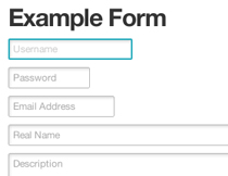
See the Live Demo »
We’ve created a live demo page for these forms in our Playground, a place for us to create small side projects and examples of cool toys. We’ll be linking to the Playground examples throughout this post and the rest of the series.
Fast, Easy Drop-in Modals
Next we’ll show you how to create easy modals that you can control with just one line of JavaScript. We use modals to great effect in our feedback tool, Notable, and while in Notable we use Ajax to load modals on the fly, this example will show you how easy it is to create an on-page modal.
The basic structure of our modals is a div.modal containing whatever we want. It could be an alert triggered by your page, a sign-in or sign-up form, or other information or actions that we don’t want to trigger a full page load. We’ll use some of our new CSS3 styles to make the modals look awesome and feel…well, modal, then turn them on with a single line of JavaScript.
The Simple Modal
Our first modal example is a simpler style, with a simpler animation. We’ll style the div to resemble a padded, floating box with a standard drop shadow so it appears to hover over the page. To make it appear, we’ll fade it up from an opacity of 0, and to close it, we’ll dismiss it immediately.
The modal style here uses a couple new CSS3 elements: -webkit-box-shadow to create the drop shadow and -webkit-transition (which you’ll recognize from the inline labels above) to fade it in without using JavaScript animation. Below are the styles for the modal; we’ll go over the new pieces in a second.
div#simpleModal {
        width: 560px;
        position: absolute; top: 40px; left: 170px;
        padding: 20px;
        border: solid 1px #bbb;
        background: #fff;
        -webkit-box-shadow: 0px 3px 6px rgba(0,0,0,0.25);
        -webkit-transition: -opacity 0.0s ease-out;
    }

    div#simpleModal.shown {
        opacity: 1.0;
        z-index: 100;
        -webkit-transition-duration: 0.25s;
    }
Most of the styling here is pretty standard — size and position as well as decent padding and a light grey border. The new pieces here are -webkit-box-shadow and -webkit-transition. We covered both of those new attributes in our article on CSS3 buttons so we’ll go over them quickly.
-webkit-box-shadow (or box-shadow as it will be called when the CSS3 spec is finalized and implemented) takes a few arguments. The first two properties are the offset, X and Y. In this case no X offset, 3px of Y offset. This puts the shadow just below the object. The next argument, 6px, sets the spread size: 6 pixels out from the box shape.
Finally we set a box-shadow color using RGBa, which lets us set an RGB color (black, in this case) and then set an opacity, or alpha channel. By using black with 25% opacity we can be sure it will darken whatever color it overlays; if we used something like #333 it would actually appear to glow on a black background, rather than look like a shadow.
The Fancy Modal
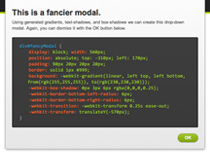
That modal is okay — it gets the job done and once you know it, the pieces can be put together in less than 5 minutes. We wanted to do a little more for Notable, so we cooked up a fancier style using a few other CSS tricks like -webkit-gradient and -webkit-transform.
This modal is a little flashier and more akin to a desktop app in terms of interaction: it slides down from the top and gets a little more chroming than the simple modal. We accomplish this through a couple of cool tricks.
div#fancyModal {
        display: block; width: 560px;
        position: absolute; top: -310px; left: 170px;
        padding: 90px 20px 20px 20px;
        border: solid 1px #999;
        background: -webkit-gradient(linear, left top, left bottom, from(rgb(255,255,255)), to(rgb(230,230,230)));
        -webkit-box-shadow: 0px 3px 6px rgba(0,0,0,0.25);
        -webkit-border-bottom-left-radius: 6px;
        -webkit-border-bottom-right-radius: 6px;
        -webkit-transition: -webkit-transform 0.25s ease-out;
        -webkit-transform: translateY(-570px);
        -moz-box-shadow: 0px 3px 6px rgba(0,0,0,0.25);
        -moz-border-radius: 0 0 6px 6px;
        -moz-transform: translateY(-570px);
    }
First we generate a gradient for the background. Obviously we could just create a tiling background image for the gradient, but where’s the fun in that? We’ll have the browser create one using -webkit-gradient, which is a CSS function that creates a gradient you can use anywhere you would use an image. As you can see above, -webkit-gradient has quite a few attributes; it’s not as bad as it seems. Let’s break it down:
linearmeans that this gradient goes from one point to another, in a straight line. You can also useradialto create a circular gradient.left top, left bottomare the coordinates for starting and stopping, in this case going from top to bottom with no angle. If we usedleft top, right bottomthe gradient would stretch diagonally across the div.from(rgb(255,255,255))is the starting color, in this case white.to(rgb(230,230,230))is the ending color. We could also putcolor-stopelements in between if we wanted to vary the color as we went.
That wasn’t so hard! Gradients are going to be a great way to add those flourishes to design without having to futz around with image backgrounds - these are easily created and modified in just a couple of lines. Now let’s look at the fancier part of this modal: the appearance animation.
div#fancyModal {
        …
        -webkit-transition: -webkit-transform 0.25s ease-out;
        -webkit-transform: translateY(-570px);
    }
What we’re doing here is using a property called -webkit-transform to move the modal up and out of the viewport. Since transforms don’t impact the DOM we don’t get any weird effects or problems — the div just moves up without impacting anything else. So when the page loads, our div will be located above the page. When we add class=“shown” to the div, it will get a new transform position, and the -webkit-transition will cause the transformation to be applied over a quarter of a second — this is what causes the modal to slide down from the top of the page.
As you can see, creating a fairly fancy modal style is pretty easy with these new CSS3 effects. Our last step is a simple line of JavaScript to apply a shown class to the modal. For our simple modal, it changes the opacity to 1; for our fancy modal, it changes the transform position to 0 (rather than -570px). Our transition then takes care of the actual animation.
See the Live Demo »
You can check out the live demo on the Playground. We’ve got the source code and clickable examples of the two modals (requires WebKit).
Newspaper Layouts with Columns and Image Masks
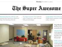
Our final example in this article will demonstrate how to use a couple of new CSS attributes and functions to create a cool newspaper layout — in this case the Super Awesome Times.
The faux-newspaper look goes in and out of style online pretty frequently, but these tricks can be used for quite a few cool applications. What we’ll talk about here is using -webkit-mask-image and -webkit-column-count.
Using Image Masks
Image masking is a way to affect the alpha channel of a block-level element by masking it with another image (or anything that can take the place of an image, like a gradient). For the Super Awesome Times we wanted to apply a subtle gradient to the masthead. We could simply render an image, but that’s no fun. Instead we masked the text (which in this case is an image, but with @font-face you could use text instead) with a generated gradient. Check it out:
div#masthead img {
    -webkit-mask-image:
        -webkit-gradient(
            linear,
            left top, left bottom,
            from(rgba(0,0,0,.75)), to(rgba(0,0,0,1)));
    }
The only property we need is -webkit-mask-image — the browser will use whatever you supply to create an alpha mask for the image or block element you’ve applied the mask to. In this case we use a gradient, which causes the masthead to fade from 75% opacity to 100%. Below is the masthead with the mask, and without — so you can see the difference:
It’s a subtle change, but some added depth can go a long way. There’s a great introduction to using masks over on Surfin’ Safari, the official WebKit blog. You can see how masks can be used for all sorts of interesting effects — even masking out an actual playing video.
Stunningly Easy Text Columns
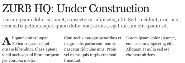
Finally, we’ll show you how to use a new (and very poorly supported, so far) property in CSS3: text columns. Not the floated div kind, but the kind where you can simply set the number of columns and the gutter and have the browser do the rest.
In the example above you can see three columns of text, but if you click through to the live example and view the source code, you’ll see that we’ve used just one div containing a number of paragraphs. Nothing tricky, no floats, no bizarre height manipulations — we’re just telling the browser to put the content of that block into 3 columns with 15px of space between them. Here’s how:
div.three-col {
        -webkit-column-count: 3;
        -webkit-column-gap: 15px;
        -moz-column-count: 3;
        -moz-column-gap: 15px;
    }
That’s it! Simple, easy markup and styling. The catch here is that even in forward-thinking browsers this property has pretty poor support — there are a number of other properties (like dividers, breakers, etc) that haven’t been implemented or at all supported yet. This is just a taste of what’s to come — simple columns are on the way, but not here just yet.
See the Live Demo »
Check out the Super Awesome Times on the Playground – just creating this prototype got some cool ideas kicking for our own site and blog.
Coming Up in CSS3…
We hope you enjoyed this further foray into CSS3. You can still check out our article on CSS3 buttons (including one which, no kidding, glows radioactively). Stay tuned for the third and final article in the series, where we’ll take the CSS properties and really go to town with polaroids, an OS X dock, vinyl album music players and more.


 JavaScript Form Builder — Create JSON-driven forms without coding.
 Register For Free
 Get a Free Trial

 Devs love Storyblok - Learn why!