Shopping For Bedsheets: How Hard Could It Be? (Usability Study)
Online shopping is a great way to economize and reduce the stress of shopping, but shopping online for certain types of products can be harder than shopping in person. Recently, I looked at how well major online retailers (Macy’s, Target and Overstock.com) facilitate shopping for a deceptively complex, though very common, item: a set of 300-thread-count, white cotton sheets for a queen-sized bed. Here’s what I found.
Macy’s
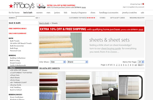
As with all things Macy’s, its website is highly polished and savvy with marketing. The home page is clear and well organized, with categories that are well delineated and prominently displayed. This clarity continues on the “Bed & Bath” landing page, where the “Sheets” option is emphasized, being listed under “Bedding” as well as in the “Featured Categories” on the right. But once they’ve made their big choices, most shoppers will undoubtedly run into problems.
The “Sheets & Sheet Sets” page is a stumbling block. The ways of filtering the hundreds of options in this list are limited, and the filters we find are confusing and inconsistent anyway. Although a prominent “Brand” filter is available, I don’t purchase sheets regularly, and so I don’t have a strong commitment to any one brand (at least not any stronger than I do to color, pattern, material, etc.).
The left navigation menu provides additional options, but these are of limited value. The list mixes promotional navigation (“One Day Sale”) with content (“Sheets Buying Guide”) and filters (“By Threadcount”). The best way to help shoppers narrow down a long list of items is by adding a filtering function, allowing shoppers to prioritize. This page would greatly benefit from a function that allows users to sort or filter based on common criteria such as color, price, size and material.
So, I try the “Sheet Buying Guide,” the link to which is prominently highlighted on the “Sheets” page. The “Guide” is a well-written glossary of terms, but it doesn’t deliver on my expectation of assistance with selecting sheets. Strike two.
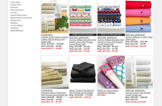
The left column offers more product categories. Because the difference between “Sheet Sets” and “Bed Sheets” isn’t clear, I choose “By Threadcount” as the next best option. Selecting “200-320 Threadcount” reduces the results to a more manageable size. The pictures help me to distinguish the items, making it easy to dismiss patterned sheets and focus on the seven solid-color choices that fit the bill. However, with each item displaying as many as six different prices and four lines of underlined descriptive text, even this small handful of options is difficult to scan. Being able to compile a few options into a comparison table would really help!
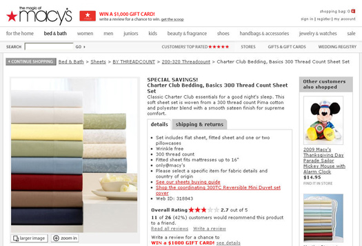
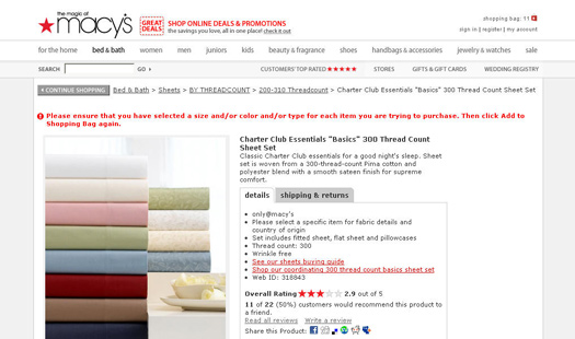
It seems the only way to tell which sheets are available in white and queen size is to check them out one by one. So I start clicking on items. The first looked fine but got poor customer ratings. Seeing the rating on the product page, along the number of people who reviewed and would recommend the item, is helpful, but seeing this information on the results page would have saved me a click.
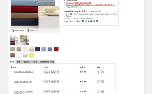
The second item might work, but I have to scroll down the page to see the available sizes and prices. Listing the sheet sets of different sizes alongside pillow cases and single sheets makes it a bit hard to scan for what I’m looking for. Also, I notice that printed and solid colors are listed as separate items, making the list longer and more complex than it needs to be. Being able to make my selection in a simple multi-step process would be better (e.g. Step 1: select the size. Step 2: select the color, etc.); either that or combining all of the colors into a DHTML drop-down menu that includes a thumbnail image. I decide to keep looking. The third item is a possibility, but it’s a bit pricey.
The fourth item isn’t available in queen size. The fifth doesn’t come in white. Now I have to remember: was it the first or second one that I liked? I wish I could mark candidates so that I didn’t have to remember (or takes notes). The inconspicuous “Compare to best sellers” link might have been helpful, but it isn’t: items are displayed in a nicely organized table, but they seem randomly selected from multiple product categories, such as mattress pads and pillow cases, and relevant data is missing from the comparison rows.
Moving on, I notice something new on the sixth product page. While previous pages displayed all sizes in a single-item selection list, this one has “Size tabs” at the top of the list. Did I miss this before? Because these tabs are so discrete and appear only on some product pages, I can’t be the only shopper who missed finding the best option for my needs.
Once I’m ready to make my selection, I scroll down to find… “Add to bag”? Macy’s would do better to stick with the standard “Add to Cart” phrase, and not introduce verbal cleverness—and uncertainty—at the moment a shopper is ready to commit to the sale. I click this, and the page refreshes with an error message at the top of the page. I’ve forgotten something, though the message isn’t specific about whether I omitted color, size or item type. I need to scroll down to learn that I haven’t entered a quantity. Displaying the error message next to the offending field would be better, or better yet, default the quantity to “1” when I select an item color.
I correct the error and proceed, getting important feedback in the form of a pop-up window that confirms my selection, the cost and a running total of items in my bag. Appropriately, two options are presented: “Continue shopping” or “Checkout.”
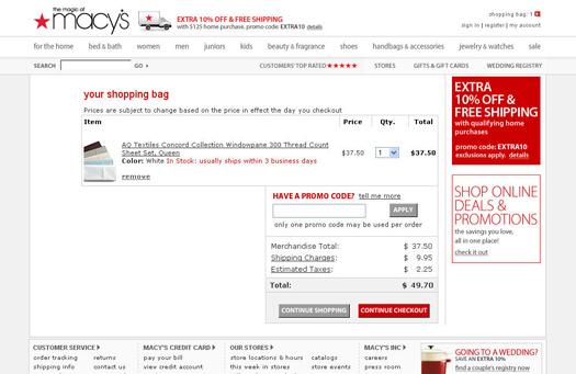
The check-out page displays a clear and detailed list of items I’ve chosen, with an option to easily change quantities by using a drop-down menu next to each item. Any change quickly recalculates the total cost, including shipping charges and estimated tax, without requiring me to “update” or “save” the change, as one sees on many other commerce websites. At least this part of the process was a good experience.
Though Macyvs website has many nice features, the most important function of finding the right product is unwieldy at best. The absence of an effective method of narrowing down a list of products to find the item I’m looking for made the experience more difficult than it should have been. Although the high-quality photography makes it quick and easy to scan products, the combination of multiple colors or elements in a single shot sometimes confused me.
Target
I had high hopes for Target, which has done such a great job of transforming itself from a cheap discount chain into an affordable, appealing and style-conscious retailer. I went onto its website hoping it brought its customer focus to the online experience.
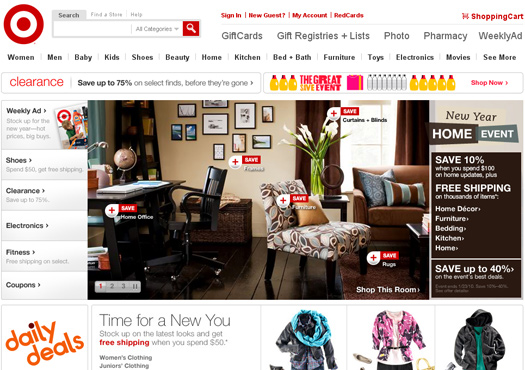
The home page is cheery, though a bit overwhelming. Colorful graphics and promotional headlines vie for attention and thus decrease the prominence of the main navigation a bit. On mouse roll-over, the main navigation pops up a list of categories and sub-categories. For my purposes, “Home” seemed the best option, and “Bed + Bath” the most logical choice. But then I notice a “Bedding” category in the promotional rotating carousel, which looks more relevant. Big mistake. There’s nothing there about sheets. I’ve landed in the seasonal section for some reason.
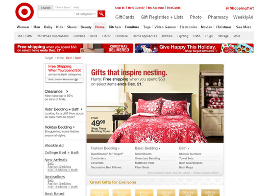
I return to my first choice, selecting “Bed + Bath” from the main navigation. This page has several other overlapping categories, such as “Bedding collections” and Home bedding basics.” I have to look hard to find “Sheets” under “Bedding Basics” just above the fold.
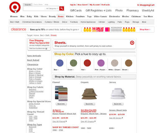
The “Sheets” page looks friendly, with bright-colored dots and a “Shop by color” option front and center. A quick scan reveals several other obvious filtering possibilities: I can also shop by “Material” or, on the left side, by “Color” (again), “Fabric,” “Special sizes,” “Thread count,” “Type,” or “Brands + designers.” Although I’m not sure what the difference is between the two colors, I choose the “White + Cream” color dot.
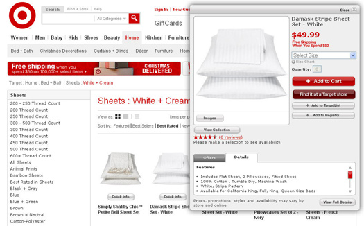
The “Results” page has a clean appearance, with various options for displaying items: as a thumbnail grid (the default) with larger images or as a list; although these options are indicated by icon and are not immediately obvious. I can also sort by such useful attributes as price and rating. A single price range is displayed for comparison. And knowing how much credence to give a rating is easy with the number of reviews indicated.
But there are too many items to sort through. I choose “300 thread count” from the filters in the left column, expecting the results to reduce to a manageable number. Instead, I get a whole new list of results, in all colors. Stranger still, bedskirts and duvets also appear in the long list of items. Apparently one can’t combine the color filter with the thread count filter. Not ideal. I guess I’ll have to wade through the list of “white” sheets.
The “Quick info” pop-up helps a bit, displaying additional information in a pop-up window atop the results page. It’s useful for seeing which sheets are available in queen size. Many of the “sheets,” though, are just pillow cases (too bad I can’t filter these out). In some cases, critical information such as color and thread count are missing, even on the “Full Details” page. One item comes in assorted colors, but I have no way to select the one I want. No wonder it has no reviews.
I find one option I like, but I’d like to compare it with others. I notice an “Add to TargetList” button in the “Quick info” window. I hope this marks the item as a strong candidate so that I don’t have to take notes. Unfortunately, I’m required to “Create a new list” before I can save the item. I want to keep shopping, but perhaps this won’t take long after all: it asks for my name, email address, reason for creating the list… and this is only step one of two! This is too much work. The retailer should let unregistered shoppers use this feature. Relatively few people must cross this high barrier to entry.
Once I’ve made my selection, I see a clear option to “Add to cart” or “Find it at a Target store.” This second feature is very good. It returns a list of nearby stores, showing the availability of the item along with address, phone number, hours and a map link: great if I wanted to do a little pre-shopping. Instead, I choose “Add to cart” to complete my online purchase. My “Quick info” pop-up refreshes, confirming my selection and recommending items that other guests have “shopped for.” Two buttons let me either “View cart + checkout” or “Continue shopping.” Choosing the latter simply closes the pop-up so that I can continue where I left off. Nice.
I liked the Target experience a bit better than Macy’s. Even though I was left with a long list of products to browse on both websites, Target allowed me to drill down a bit further. Also, the “Quick info” window made browsing quicker, freeing me from having to click through to successive product pages, as I had to do on Macy’s website.
Overstock
Unlike many of its competitors that have taken traditional brick-and-mortar businesses onto the Web, Overstock focuses exclusively on its online business. But has it taken advantage of this focus to create a better shopping experience for consumers?
The home page is simple, with a rotating promotional carousel featuring products intended to catch interest. With a specific task in mind, I easily locate the “Bedding & Bath” category among the primary navigation options near the top. On roll-over, a drop-down list presents sub-categories that are sufficiently distinguishable, and I select “Sheets.” So far, so good.
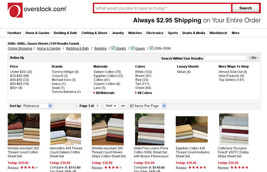
The main “Sheets” page is nice. Overstock.com has obviously considered the needs of the shopper. A set of clear filters displays the number of items in each category. It allows me to apply filters additively, with useful options such as size, thread count, color and material. The effect is a manageable set of relevant options. One nice feature is that the number of results in the unselected categories refreshes automatically whenever a new filter is applied. One can even remove a parameter by simply unchecking a box.
Another good feature is the prominent display of user ratings for each search result. This makes it easy to compare items without clicking into the full descriptions. But I would also like to see the number of reviews. For me a four-star rating averaged from 10 reviews holds more weight than a single five-star review.
When filtering by color, I expected only solid colors to be returned, but several had a clear pattern. Still, the images made it easy to distinguish between them. Also, I didn’t see any way to set multiple criteria within a category. For example, I couldn’t choose to see all options priced under $50. But price is one of many sort options, so this is less of a concern. And Overstock.com sticks to a single price, regardless of size, which makes items easier to scan; unlike competitors that present a range of prices. Despite minor issues, the page gets me very close to finding my new sheets.
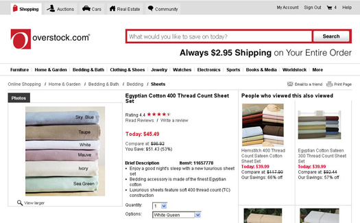
Clicking an item on the results page takes me to a product detail page. At first I’m a little confused. I didn’t expect other products to be shown so prominently here. Then I notice the discrete “People who viewed this also viewed” label above the items in the right column. Seeing other products distracts me from the task at hand. Rather than provide an unobstructed route to my purchase, the website has introduced alternatives—and indecision—at the crucial moment of sale. Also, should I care about items that others have merely “viewed” and not actually bought (bought items being shown lower down on the page)?
I make my decision and select a product. The drop-down menu is fairly long, with all size and color combinations presented in a single list. A more usable interface would be to display these attributes in two separate lists, with the options in the second list updated according to what you select in the first.
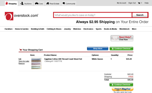
The shopping cart page is presented very clearly, with the options to “Shop more” or “Continue checkout” prominently displayed. But when I decide that I need two rather than one set of sheets, I really have to search to find the “Edit” link. Making the quantity field editable and then updating the total price, as other websites do, would be much better.
I also notice the “Save for later” link. This sounds great for setting aside items that I am not ready to purchase now but might want later. But having to put the item in my cart first doesn’t seem right. I’d much rather be able to do this from the product page, where the function could act as a kind of bookmark, while I continuing browsing.
Now I’m ready to complete my purchase. Once I register, the checkout is contained on one page, with clearly numbered steps. Though a bit overwhelming, a quick scan shows that the page asks for only the necessary information. Moreover, I don’t need to worry about losing my order, which has happened a few times on other websites midway through their multi-page process.
Overall, using Overstock.com was a positive experience. Despite a few very minor issues, I was able to make my purchase quickly and easily with comfort and confidence. Other online retailers should aspire to its virtues: a concern for the needs of the consumer, intuitive and effective tools and a clean crisp layout.
Shopping Made Easier
It’s clear from my exploration of Macy’s, Target and Overstock.com that a “one size fits all” approach to e-commerce design leads to some user experience challenges when the product category is complex or varied. On the one hand, online stores shouldn’t be obliged to customize the shopping experience for each product category, which would be economically unfeasible. On the other hand, appropriate, well-presented product filtering options go a long way towards ironing out the bumps in an “uncommon” shopping experience.
Interestingly, all three websites I looked at seemed to be constantly changing their design and tweaking the language and navigation options to see what works best. I’m glad to see incremental improvements being made on major retail websites. But given how long these websites have had to improve their processes, it’s surprising more haven’t done so already. Hopefully, as retailers become more aware of best practices and see the value of engaging skilled usability experts, the online shopping experience will reach its full potential as a stress-free alternative to shopping in store.
Further Reading
- Search Results Design: Best Practices and Design Patterns
- Principles Of Effective Search In E-Commerce Design
- 15 Common Mistakes in E-Commerce Design
- 5 Universal Principles For Successful eCommerce-Sites


 SurveyJS: White-Label Survey Solution for Your JS App

 Agent Ready is the new Headless