Find The Right JavaScript Solution With A 7-Step Test
As Web developers and designers, we are spoilt for choice right now. To build a complex Web application or even just spice up a website with some highly interactive interface element, we have hundreds of pre-built solutions to choose from. Every library comes with widgets and solutions, and every developer tries to make a name for him or herself by releasing a funky JavaScript solution to a certain interface problem. We can pick from dozens of menus, image carousels, tabs, form validators and “lightboxes.
Having this much choice makes it easy for us to pick and choose, which is where things go wrong. In most cases, we measure the quality of a solution by its convenience to us. Our main reasons for picking one solution over another are:
- Does it do what I need it to do?
- Does it look cool?
- Does it sound easy to use?
- Would I want to use it?
- Does it use the framework I’m committed to?
The things you should really look for are different, though:
- How stable is the solution? Is a good alternative available if this one doesn’t work?
- How easy is it to customize? Do you need to be a JavaScript expert to modify the widget?
- How usable and accessible is it? Are users who don’t have a mouse or are on a mobile browser blocked?
- Do you understand what’s going on? Would you be able to fix a problem and explain it to others?
- Is it a contained solution? Will other scripts be able to interfere with it, or would it contaminate the document?
- How dedicated is the developer? Will the solution be maintained in the future?
- What is supported, and how can you extend functionality? A new browser and client request is always around the corner?
In this article, we’ll show some ways to find out more about these issues. First of all, though, understanding what it means to develop for the Web is important.
It’s Not About You
Most of the reasons why we choose a particular solution right away are very much about us, and this is where we tread on thin ice. We don’t consume what we put on the Web; rather, people we don’t know do, and we can’t make assumptions about their ability, set-up, technical understanding or taste. We won’t make our product a success; we only build it, and thus we are the worst testers of it possible.
I’ve been developing for the Web professionally for over 10 years now, working on everything from personal blogs to multi-language enterprise CMS solutions to complex Web applications, and I’ve learnt one thing on the journey: never build for yourself or the client. Instead, build for the people who will use the product and the poor person who has to take over the project when you leave.
Much as we have to act now to minimize our massive carbon footprint, we need to leave a cleaner Web behind. To keep the Web a thriving market and sustainable work environment, we have to change the way we work in it and leave behind unmaintainable, bloated and semi-workable, albeit pretty, solutions. We have to make it easier for people to use Web applications and save other developers from wasting hours trying to understand what we did when they are asked to change or extend it at a later stage.
Introducing The 7-Step Test For JavaScript Widgets
To this end, I’ve put together a seven-step test to apply to any out-of-the-box widget you find. All of the recommendations have a rationale, so please ponder it before dismissing the arguments as “elitist” or “not really suitable to our environment.”
Let’s not forget that even when something is free, its developer will try to sell it to you for the fame, and many a solution is defended tooth and nail on mailing lists instead of being changed or updated. The reason is that, as developers we are always on the move. Maintaining and extending an old solution is not as sexy as creating a cool new one. This leads to ruins that once enjoyed love when they were state of the art but now rust away on the Internet.
To kick the tires of any out-of-the box solution, I mostly use one tool: the Firefox Web developer toolbar. It is availableon the Firefox Add-On website and gives you an easy way to test what’s happening in your widget of choice.
Okay, here goes: seven things to test when deciding on a JavaScript solution.
1. What Happens If JavaScript Is Turned Off?
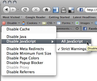
The first test I do with any widget is turn off JavaScript… not after the document has loaded but before. Turning off JavaScript with the Web developer toolbar is very easy. Simply select “Disable All JavaScript” from the “Disable” menu and reload the page:

The rationale is that there are a lot of reasons why JavaScript may not be used: company proxies or personal firewalls could filter it out, other scripts could create errors and mess with yours, or the system in use could simply not have JavaScript enabled. Think of mobile environments, for example.
You don’t need full functionality when JavaScript is not available, just a working interface that doesn’t overload users and interactive elements that work. If a button does nothing when users activate it, those users will stop trusting you; after all, you haven’t kept your promises.
Overloading is another issue. A lot of widgets use CSS and JavaScript to squeeze a lot of content into a very small space: think tabbed content elements and image carousels. What should be their fallback? If you turn off JavaScript and have 50 pictures where you planned for 2, then that would be a good user experience. A better fallback would be a server-side solution for the same functionality or to show the first 2 and then offer a link to a gallery page with the remaining pictures.
Sometimes the JavaScript for a particular widget is actually very good but the demo websites have been done badly. Hiding elements with CSS and then revealing them with JavaScript, for example, is very common. But if JavaScript is turned off, the solution will break. Good demos and solutions use JavaScript to add a class to the body of the document and make all of the CSS dependent on that class.
The trick that any good JavaScript widget should do is to make any functionality depend on JavaScript by using JavaScript; that way, you never have any functionality that won’t work. This technique is called “unobtrusive JavaScript,” and I have written a course on it and set a few rules for it a while back.
2. How To Change The Look, Feel And Content?
A widget whose look and feel are hard-coded is a pain to maintain. You cannot expect future designers to know how to change a certain color by hunting through your JavaScript files. This is how we end up with bloated CSS files, because people add random IDs and classes to enhance the specificity of their CSS selectors.
Good widgets have their look and feel contained in a CSS file and give you handles (i.e. dynamically applied classes) to apply your own styling. If you find yourself having to change JavaScript to change the look and feel, alarm bells should go off in your head.
This gets worse if you have content such as text labels in the JavaScript or if only a fixed number of elements can be displayed (as in the case of navigation menus). Labels and number of elements are what change the most in any Web product. For starters, you will probably roll out your product across different markets and will have to translate the buttons and menus.
Good gadgets have configuration objects that allow you to change the number of elements and define the text labels without having to change the main JavaScript. The reason for this is that the functional part of the widget should be separated from the maintainer. If the widget has a security or performance problem, you should be able to replace it without losing your configuration and localization work. Otherwise people would be very likely to keep insecure code on the Web, which is one of the reasons why our inboxes are full of spam.
3. How Usable And Semantic Is The Final Product?
A lot of widget creators are very happy to announce that their products are “Web-standards compliant” and accessible because of it. While Web-standards compliance is important, it does not indicate the quality or usefulness of the product. One cannot really validate semantics with an automated tool. For example, the following examples are both valid HTML:
<div class="menu">
  <div class="section">
    <span class="label">Animals</span>
    <div class="subsection">
      <div class="item">Giraffe</div>
      <div class="item">Donkey</div>
      <div class="item">Cheetah</div>
      <div class="item">Hippo</div>
    </div>
  </div>
  <div class="section">
    <span class="label">Stones</span>
    <div class="subsection">
      <div class="item">Diamond</div>
      <div class="item">Ruby</div>
      <div class="item">Onyx</div>
    </div>
  </div>
</div>
<ul class="menu">
<li><button>Animals</button>
<ul>
<li><a href="giraffe.html">Giraffe</a></li>
<li><a href="donkey.html">Donkey</a></li>
<li><a href="cheetah.html">Cheetah</a></li>
<li><a href="hippo.html">Hippo</a></li>
</ul>
</li>
<li><button>Stones</button>
<ul>
<li><a href="diamond.html">Diamond</a></li>
<li><a href="ruby.html">Ruby</a></li>
<li><a href="onyx.html">Onyx</a></li>
</ul>
</li>
</ul>The second example works without JavaScript and uses much less HTML. It also requires much less CSS for styling because you would simply take advantage of the cascade.
Furthermore, the HTML on which the widget is based is only half the story. What the JavaScript generates also needs to be valid, usable and accessible, and you can check this when you check the generated source in the Web developer toolbar.
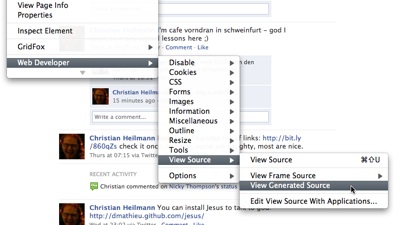
To do this, right-click anywhere in the document and select Web Developer → View Source → View Generated Source:

Usability and accessibility (accessibility being, in essence, merely a more comprehensive understanding of usability) are harder to test. But one very good test is to check how keyboard-accessible a widget it. Keyboard-only users are on the rise, and widgets that work only with mouse-over events would not usable on a touchscreen mobile, for instance. Many widgets provide basic keyboard access (e.g. using the Tab key to jump from one link to another, and the Enter key to activate each), but this is not proper accessibility.
A menu, for example, should not be navigated by tabbing through each of the items because this would require far too many keystrokes. Instead, the user should be able to tab to the main menu bar and from there use the cursor keys to navigate.
A modal pop-up (commonly called a lightbox) should be able to be closed with a keyboard by hitting the Escape key or by tabbing to the “Close” button. If it is a multi-item lightbox, you should also be able to navigate the items with the cursor keys.
The W3C’s WAI websites have some great examples of how widgets should react to keyboard use, and Todd Kloots of Yahoo does a great job of explaining the techniques behind good keyboard usability (also as a video and using YUI3 and focusing on WAI-ARIA). Patrick Lauke of Opera also wrote a great article on the subject and gave a presentation at last year’s Future of Web Design. If you are a Mac user, make sure to turn on keyboard access before declaring a widget faulty.
People also need to be able to resize the text in their browser. So test the widgets at several text sizes. Using Internet Explorer 6 for this is important because it is the main culprit in font-resizing issues. Newer browsers do a much better job of zooming the entire interface, but you cannot expect end users to know how to use them.
4. Do You Understand What’s Going On?
If you’ve read the Harry Potter books (or even seen the movies), you know that you shouldn’t trust magic without knowing what is going on. A book that responds to your writing is as suspicious as a widget that does something so amazing that you have no clue how it happened.
Remember, if the doo-dad stops working, you will be asked to fix it or explain what went wrong. Therefore, it is important to at least know the basics of what JavaScript spell was cast to transform a list of images into an all-singing, all-dancing carousel.
Good widgets have technical documentation for that kind of thing, and some even fire off custom events that tell you when something is happening. That way, you can debug the tool by waiting for these events and analyzing the current state of play. It also allows you to extend functionality, which we’ll come back to in step #7.
5. Does It Play Well With Others?
The biggest problem with any JavaScript on the Web right now is that its security model gives every script on the page the same rights. This means that one bad script can mess up the user’s whole experience because it may override parts of another script.
The places where scripts can clash are in variable and function names and events. If your widget does not protect its variables and function names or if it applies event functionality to elements without checking that other scripts are doing the same, you’ll have a problem.
Say you have an element with the ID menu, and you have one script that turns its HTML content into a drop-down menu and another that enhances the different links by showing a beautiful roll-over message. If neither of these scripts append to the existing functionality and just apply it, you’ll have either a beautiful roll-over or a menu, depending on which script is applied last.
The good news is that for widgets that are based on libraries, this “event clash” is very unlikely because libraries work around that out of the box. You can test for the problem of function and variable names that can be overwritten by other scripts. JSLint is a tool and website where you can check JavaScript for syntactical problems such as unprotected variables. It is a very strict tool, though, and not all of its warnings are actually deal-breakers. But testing with JSLint is the hallmark of a professional Web developer. You do want your code to play well with others.
6. How Dedicated Is The Maintainer?
When choosing a widget, you want to be very sure that the maintainer is dedicated to keeping it up to date and to fixing the script for future browsers and environments. This is rarely the case, and a lot of software is released with an “as is” statement, absolving the creator of any liability for problems it may cause now or in the future.
Software, especially the kind that is executed in the browser and for Web consumption, has to constantly evolve. Things that were once state of the art might be clumsy now. Some software turned out to perform poorly or be outright security holes.
Whenever people claim that we have a great baseline environment on the Web for screen space and processing power, something comes along that debunks it. Right now, testing on dual or quad-core processors with resolutions starting at 1280 might be normal for us designers, but given the sales figures of smartphones and netbooks, planning for audiences other than these high-end ones might be a good idea.
For developers, maintenance is the most boring task. When we release awesome widgets to the world, we don’t want to think about that phase of software delivery. Granted, most widgets are released as open source, but sadly, not many developers fix or improve on other people’s work; building and releasing something almost identical but slightly modified is much more fun.
As the user of someone else’s widget, you don’t want this to fly back in your face, so you need to see just how dedicated the developer is. A few questions to ask are:
- Is there a simple way to report bugs?
- Is there trail of improvements and bug fixes?
- Is there a history of comments and changes to the widget based on that feedback?
- Has the widget been used in real scenarios, large projects or implementations similar to yours? What were the experiences of those who used it?
- Does the solution have a community (i.e. are there a few people on mailing lists or in forums helping each other out, rather than overloading the original developer)?
If the developer has no big personal stake in the widget or there is no group of developers or commercial users, then there is a high chance that you will see few or no fixes or improvements in future, and you will be responsible for supporting the next browser version that behaves badly.
7. Is There A Testing Plan, And Is Upgrading And Extending Easy?
One last thing to consider is what will happen in future. Claims that the widget will “work in every environment” are bogus because that cannot be done. The great power of the Web is that software solutions can adapt to the environment they are being used in. If you use Netscape 4, you should see a few images; if you use the newest Webkit browser, you should see a fancy image carousel with animation and fading; that sort of thing.
A good widget will have a proven test report covering which browsers and environments it has been tested in and what the known issues are. There will always be issues, and claiming otherwise is arrogant or ignorant.
Upgrading your widget should be easy and painless, and there should be some versioning in place, with new versions being backwards-compatible.
Extending the widget should be easy. We spoke earlier about not being limited to a particular number of items or a certain look and feel. But if you really use a widget, you will find you have to override certain functionality and react to various changes. Good widgets either have an API (a programming interface to extend it) or fire custom events for you to listen to. Custom events are “interesting moments” in a user’s interaction with the widget. For example, a button will tell the script when you have activated it, and if you write the widget a certain way, you can tell the world (or in this case, other scripts) when something happens to it. You can notify that a container has been opened, that data has returned from the Web or that a menu was too large to be displayed to the right and had to be moved to the left.
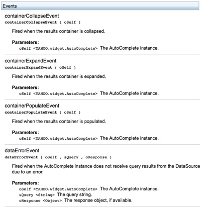
Widgets built with the Yahoo User Interface library, for example, come with a lot of custom events:

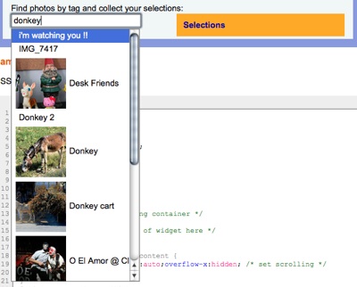
This allows you to monitor what is going on (like for debugging purposes) and extend functionality. The demo page for the AutoComplete control, for example, displays in a logging console on the right what happens “under the hood” when you use the auto-complete field.

By subscribing to these events in JavaScript, overriding the original functionality for something new is pretty easy; in this case, we have an auto-complete that returns photos and allows you to collect them.

Custom events are a great way to extend a widget while keeping the core code easy to upgrade.
One Final Word On Size
One last thing to mention: some widget developers use a certain argument to advocate for their solution but which is totally irrelevant to your decision, and that is size.
Advertising-speak like “A drop-down menu in 20 lines of JavaScript” or “A full featured lightbox in under 2 KB” is fun and good for the developer’s ego, but in reality it is no measure of the quality of the solution. While you should avoid JavaScript solutions that are massive (let’s say 100 KB), code that has been written to be very generic and easy to extend will always be bigger than code that has been written to serve a single purpose. Any widget whose size is proudly trumpeted and is meant to be used by people who are not as good at developing as the initial owner will get bigger over time anyway. Developers like to play the numbers game, but maintainable code is different than extreme number-crunching.
You may want to take a look at these related articles:
- 50 Useful JavaScript Tools
- Writing Fast, Memory-Efficient JavaScript
- 15 Essential Checks Before Launching Your Website
- Practical JavaScript Libraries and jQuery Plugins


 SurveyJS: White-Label Survey Solution for Your JS App
 Agent Ready is the new Headless


