Handy Tools and Tips for E-Commerce Websites
If you own or operate an e-commerce webs, you’ll find one or two things that you haven’t tried before. If you’re new to e-commerce, this article should give you insight into some of the possibilities available to you as you enter the market. A plethora of merchants out there could benefit from lower-cost e-commerce help and advice. Covered in this article are analytics tips, visualisation tools, product page tips, checkout tips,li>4 testing tools to try right now and a final tip.
You may also want to check out the following Smashing Magazine articles:
- An E-Commerce Study: Guidelines For Better Navigation And Categories
- Starting Out Organized: Website Content Planning The Right Way
- Better User Experience With Storytelling – Part One
- 15 Essential Checks Before Launching Your Website
This article is only the tip of the iceberg. If you have any tips on usability, the check-out process, product pages, analytics or testing, please add them to the comments, so that this article becomes even more useful to readers.
Analytics
Analytics are the key to knowing what’s going on with your website. This section gives five tips for using Google Analytics to get the most out of your stats. If you have a high-traffic e-commerce website or wish to get even more in-depth with analytics, it might also be worth considering some higher-level analytics packages such as Coremetrics, Omniture or Webtrends.
We’ll focus here on more advanced analytics with the Google tool and assume that you know the basics of metrics.
Analytics Tip 1: Advanced Segments
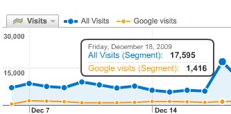 Advanced segments allow you to do everything you normally do with Analytics, but with only on a small subset of data. How is this useful? Say your e-commerce website serves both the UK and US. You could create two advanced segments, one for your US visitors and one for your UK visitors. This allows you to zero in on how your US visitors differ from your UK visitors in terms of purchasing habits, website usage, searches and so on.
Also, why not compare two or more different referrer sources by a number of metrics to see which provides better-quality traffic? The list is endless and limited only by your imagination.
Want to find out more with more examples? Read Avinash Kaushik’s advanced segments article.
Analytics Tip 2: Custom Reports
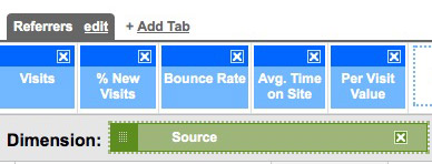 Let’s face it: the default reports in Google Analytics aren’t superb; they don’t tell you what you really want to know. That’s where custom reports come in.
You can add the metrics that matter to you, on the dimensions you want to see. An example would be a report of referring websites, with their average per-visit value, bounce rates and time spent on site (see graphic above).
This report is so much more useful than your standard referrers report, with better information in one place.
Analytics Tip 3: Advanced Filters
In the example above, the report gave me 392 rows of information. In a world of top 10s and top 25s, humans can’t process that many rows and make sense of that information.
This is where advanced filters come in. If we want to find the best-quality referrers on the list, we can get Google Analytics to filter out what we don’t want. Click “Advanced filter” at the bottom of the page and add this:
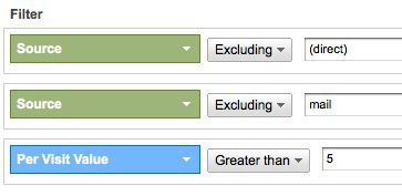
This brings our 392 sources down to just 8; knowing what those 8 are is great. The filters above exclude all direct traffic (because we want to identify referring websites) and mail server referrals (we’re looking for websites), and they give us the highest success rates on per-visit value. Quick, valuable data.
Analytics Tip 4: Intelligence
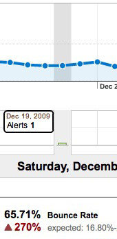 This is a newer feature of Google Analytics, one that does some heavy lifting for you. Intelligence allows you to see changing traffic patterns without having to set up reports for everything you want to track. If one day your bounce rate goes up by 10%, you’ll see an alert and won’t have to rely on spotting it.
This is really useful for discovering patterns. The image to the right shows an alert we got for one of our websites for which the bounce rate went through the roof. There was obvious panic until we realized that the last date to submit orders in time for Christmas had just passed. Panic over. The message on the home page was the cause of the spike in the bounce rate. We were notified of the issue quickly and could dig right away for the cause.
Other Analytics Tools
We’ve focused here mainly on Google Analytics because it is so widely used. However, that’s not to disrespect the plethora of worthy analytics tools out there:
- Clicky An interesting take on analytics: more useful standard reports and immediately accessible data, but lacks power user features.
- Motally Mobile analytics. If your website has high mobile phone usage, then you should try this tool to see more in-depth analytics.
Visualization
Data can be pretty overwhelming when you have thousands of entries. Visualization gives you quick insight into your data without overloading.
Visualization Tip 1: Wordle
A genius service from Jonathan Feinburg, Worlde allows you to enter any kind of textual information and get a visual representation of that text on the screen. This is very useful for getting an overall view of your keywords and the structure of what’s going into your website. My blog returns the following visualization.

What does this tell me? Well, given how much I’ve written about e-commerce, that word doesn’t appear! So, I need to pay much closer attention to my keyword selection and usage. I also need to pay attention to why the word “offline” is so big.
If you need to export more than 500 words out of Google Analytics for your keyword report, check out this tutorial.
Visualization Tip 2: Heat Maps
Heat maps give you an easy way to look at your important pages without having to scour rows of data on your top content. They also provide much-needed information on what people are doing relative to the page size, length and placement of items, which data cannot do alone.
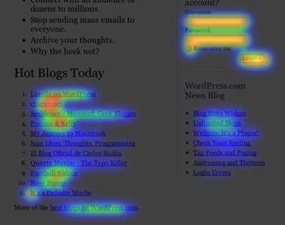
Run heat maps on your most important pages: check-out pages, product pages, search pages. This will give you quick, useful information on whether people seem to be glossing over vital information or ignoring key functionality.
Key questions could be:
- Are people finding my calls to action (such as “Add to basket”) easily?
- Is an important part of my navigation being ignored?
- Are page elements taking up space that no one is noticing?
Crazy Egg is a decent heat map service. Another good tool is clickdensity.
Visualization Tip 3: Website Overlay Tool
This feature in Google Analytics overlays percentages, conversion rates and other usable statistics on pages to tell you what people have done and clicked on different pages. Most usable is that when you click on a link you’re taken to that page, with the overlay in place, allowing you to see how people are navigating the website. Did 20% of visitors go to the next most important page after this one? Is that what you were projecting? Gems of information abound.
Visualization Tip 4: Scrutinizer
 Learning how users view your website without having to ask them can be very beneficial. Of course, user testing has no true substitute, but a few tools can help:
Scrutinizer shows you slowly how people may be viewing your website. It applies a filter over top the website, spotlighting the area where your mouse is pointing at. I don’t know the science behind it, but it might be useful to get users to perform tasks while the filter is applied; it would really show usability.
Visualization Tip 5: Feng GUI
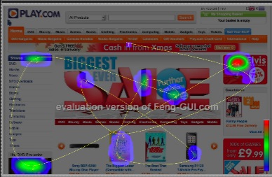 Feng GUI allows you to look at any marketing piece (including a website) to see which parts attract attention and in what order. It uses algorithms to simulate eye-tracking and is useful for seeing whether what you thought was prominent really is. Not a substitute for user testing either, though.
Product Page Tips
One of they keys to e-commerce success is a good product page. Here are a few tips to improve your product pages.
Product Page Tip 1: Obvious Call To Action
 Your “Add to basket” button is obviously key to your e-commerce website’s success. Make sure the button is not hidden, too small or confusing in any way. It should be above the fold and not difficult to click.
Get Elastic has a good article on “Add to cart” buttons; an oldie but a goodie on statistics, even if the buttons are a bit out of date.
Product Page Tip 2: Delivery Information
 Do not withhold delivery information till the last minute when people are checking out. It leads to mass frustration and ill feeling towards your website. Make sure people can see an item’s stock status (“in stock,” “out of stock,” “date expected back in stock”) and the delivery lead time. This will prevent a slew of customers from abandoning their baskets further along the check-out process.
The image above is from Play.com: delivery cost, dispatch estimate and stock levels. Great job.
Product Page Tip 3: Progressive Disclosure of Information
 People are very different in how they want to consume information. Some prefer social information such as reviews, ratings and comments. Others prefer technical specifications. Still others like to read a store’s description of a product (if it’s well written).
The point is to give everyone access to the information they want without cluttering the page. Whether it’s grouping information under different tabs or providing a “More details” link, there are many ways to give progressively more information. Without compromising the layout, this should give 80% of visitors what they need.
The image above is from Currys, an electronics retailer. It has main bullet points for each product and a “More info” link. The link merely takes you further down the page, but it prevents the top of the screen from being cluttered with information that many people may not be interested in.
Product Page Tip 4: Copy Is King
Make sure your copy is well written and unique. Too many websites use the standard manufacturer’s description. This harms you two-fold. First, the copy is in so many other places on the Internet that your SEO will be harmed. Secondly, you’re not giving the purchaser any reason why they should purchase that product from you. Good copy should inspire confidence in you and the product as well as give your personal slant on the product, thus building your website’s personality.
Hire a copy-writer, or do it yourself. But do it. Even if a product is your top revenue generator, still do something!
Check-Out Tips
Don’t let this last hurdle of purchasing trip you up.
Check-Out Tip 1: Allow Guests to Check Out
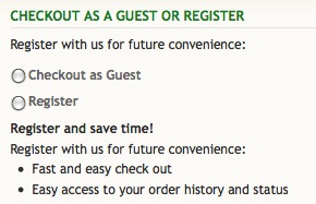 You need to be able to give very good reasons why forcing guests to register to purchase products is essential. Think of offline shopping. Do you have to open an account with a news agent to buy a newspaper? Of course not. Don’t make that mistake online. Allow guests to check out.
But you also need to sell reasons why guests should register. It’s all about making it easy, now and in future.
Check-Out Tip 2: Enclose the Check-Out Process
Once someone wants to check out, the process should be as fast and slick as possible. Remove distractions, including ads, navigation and offers that might distract them from what they are trying to accomplish, which is to pay.
Some will say this stage is a great opportunity to up-sell or feature related products. I disagree. That can be done effectively on the product page or just after the product has been added to the basket. Distracting the visitor or encouraging them to choose something else before giving you their money is an invitation to them to abandon their cart.
Check-Out Tip 3: Ask for Feedback After the Visitor Has Submitted Their Order
Once a visitor has converted, rather than show the standard confirmation page, why not also ask for some feedback on their experience? SurveyMonkey lets you quickly build an online survey, including questions such as:
- “On a scale of 1 to 10, were you able to easily find what you were looking for?”
- “Was there something in you particularly liked or disliked about our website?”
- “On a scale of 1 to 10, how easy was the check-out process?”
- “Please tell us what we can do to improve your next visit?”
This qualitative feedback is invaluable to e-commerce website owners. Sure, not everyone will fill out the survey, but several will be more than willing to voice their opinions. If you do this, though, remember to follow up to let people know what you’ve changed and why.
Check-Out Tip 4: Handle Errors Gracefully
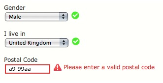 Problems occur during the check-out stage. Cards are declined, people enter invalid email addresses and they forget to specify their preferred delivery method. To cover all eventualities, you should display messages that are:
- Contextual. Put the message next to where the error occurred.
- Useful. No “Error code 21” messages please. Write friendly, useful error messages, such as, “Sorry, we believe your email address is invalid. Did you accidentally add an extra full stop or space?”
- Conventional. Error messages should be red. People understand that red indicates a problem.
Luke Wroblewski has a great article on A List Apart about this.
Testing Tools
Test, test, test: the mantra of all e-commerce website creators. Only your market knows the answers.
Testing Tool 1: UserTesting.com
 At only $29 a test, UserTesting.com delivers incredible value for the money. For $290, you choose the test to be carried out and the demographics of the audience, and hit “Go.” Not much later, you get 10 pieces of highly detailed video and written feedback. The information contained in those reports will earn you a lot more revenue than $290.
Spend some time thinking about the type of people you want to participate in your testing. If you run a baby clothing website, naturally you would want mothers to participate in the testing. However, it might also be useful to run the tests on fathers as well as aunts and uncles (typical gift purchasers) because their purchasing behavior is very different.
Possible briefs are:
- Find, evaluate and purchase product x.
- Find the information on delivery.
- Purchase our gift voucher.
Testing Tool 2: Google Website Optimizer
A lot has been written about Google Website Optimizer. It’s easy to use, so give it a run. It’s great for testing different “Add to cart” buttons to see which gets a better conversion rate.
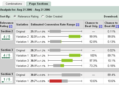
The main advantage of Google Website Optimizer is that you can test things on your actual market (whereas services like UserTesting.com merely attempt to match your target market). This also means that you’re able to choose how large a percentage of your traffic to test and thus achieve statistical relevance.
Bryan Eisenberg has written a great book about it.
Testing Tool 3: 5-Second Test
 This does what its name implies: gives you quick feedback on your website—entirely subjective feedback, of course, but interesting when used in conjunction with analytics to correlate the data.
It can be very useful to testing elements you want to be prominent. What’s the purpose of your website? Where’s the call to action? And exept for some premium features, it’s free. No brainer? Indeed.
Testing Tool 4: SEO Tools
SEOmoz, GeoTarget, Linkscape and Trifecta are four among many tools you can use to test your website’s on-page and off-page SEO scores. They can quickly identify problems with your website so that you can fix them and hopefully improve your ranking.
Final Tip
Technologies come and go. Who knows what we’ll be using for analytics in five years’ time or what kind of information we’ll be tracking across devices and channels. The key to a good e-commerce strategy is customer insight and engagement. In other words, find out what people want, and give it to them (in an engaging way). Always be listening, asking questions and monitoring every facet of your website, business, industry and competition, and use whatever technology is appropriate to help you achieve your goals.


 Agent Ready is the new Headless
 SurveyJS: White-Label Survey Solution for Your JS App


