Showcase Of Web Design In China: From Imitation To Innovation
China is a country with five thousand years of civilization. It is a multi-national entity extending over a large area of East Asia. China’s cultural influence extends across the continent, with customs and writing systems adopted by neighboring countries including Japan, Korea and Vietnam.
China has gone through numerous ups and downs and twists and turns, from wealthy and prosperous (as during the Tang Dynasty back in 618–907 AD) to powerless and colonized (as during the Qing Dynasty, just around 100 years ago). Now China is reopening its door to the world again, embracing the latest trends, concepts and technologies, the World Wide Web being one of them.
You may be interested in the following related posts:
- On China’s Bleeding Edge: Web Design Trends 2015
- Five Rules Of App Localization In China: Money, Dating And App Store
- Writing Systems And Calligraphy Of The World
- Global Web Design Showcases
In our interviews with six well-known designers in China, each of whom wears different hats, the recurring theme was that China’s Web design industry is rising like a spiral from imitation to innovation and user-centered design.
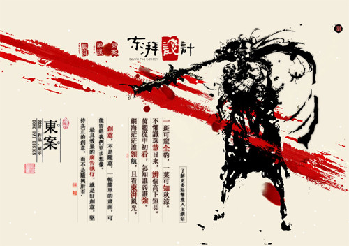
Chinese Web Design: Dongpai
State Of Affairs
The designers we interviewed had much to say about the direction of Web design in China, the status quo and trends. The individuals are spread out across four major cities in China, and they are:
- Yu Guo Former chief designer at Baidu, China’s largest search engine. Current city: Beijing.
- Whitecrow Zhu Co-founder of UCDChina, and principal product experience designer at Alipay, a subsidiary of Alibaba. Current city: Hangzhou.
- Junchen Wu Co-founder of UCDChina, and director of products at Tuniu Travel. Current city: Nanjing.
- Lytous Zhou Visual designer, UI lead at CK Telecom and author of the book UI Evolutionism. Current city: Shenzhen.
- John Woo Lead of the user-experience team at Google China. Current city: Beijing.
- Rex Song Freelance information architect; co-founder of UCDChina. Current city: Beijing.
The interviews were conducted via phone, Skype and Google Talk. Questions were sent to the designers before the interviews to give them context, but the actual interviews were semi-structured. Being interested in the scope of their thoughts, we asked them not to limit their answers to just “Web design.” The designers were told that Web design here refers not only to visuals, CSS and the front end, but also the back end, infrastructure, design rationale, cultural elements, user-experience design and research and so on. We wanted the designers to express their thoughts as openly and as creatively as they wanted to.
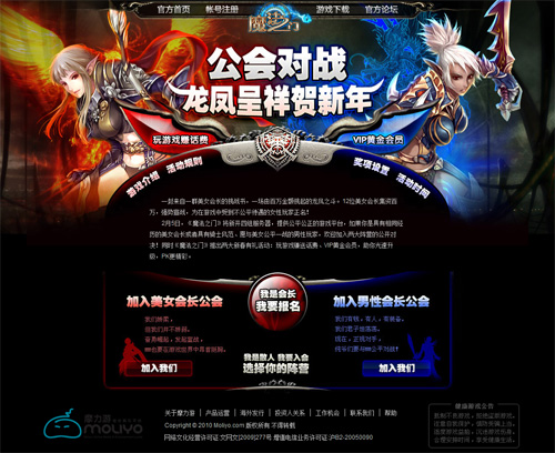
MFM Moliyo, a game website.
Question: How do you see the status quo of Web design in China?
Yu Guo: Almost 70% of Chinese Internet users are under 30 years of age. They are young, open, and they adapt to new things quickly. They like to play games online and enjoy looking for ways to entertain themselves online. So, you may see visually attractive elements on many Chinese websites, the purpose of which is to cater to this group of users.
Whitecrow Zhu: About two years ago, we witnessed a huge trend where designers in China were imitating Korean websites in their use of Flash. Flashy and colorful design was once the trend. However, with the introduction of Web 2.0, websites in China are improving. Users are exploring the content as opposed to exploring solely the visuals. Visuals alone do not satisfy Chinese users any more. They are looking for useful and helpful content, and they want to contribute to the websites as well.
Junchen Wu: It’s on an upward trend, getting better and better, but like a spiral. In terms of Web knowledge and techniques, Chinese designers are on par with designers in Western countries, but they have not reached the point of fully utilizing that body of knowledge. An excellent example of this is user research. Many designers know the concept, but they hardly include it in their design practices. They know of usability testing, but they rarely do it.
Lytous Zhou: Well, two points. One, limited budgets are very common in China’s Web design market. As a result, Web design ends up with overwhelming visuals to attract attention. It might be flashy and pretty at first sight, but the information architecture might not be well planned, and usability can be poor. Regarding the second point, Chinese Web design tends to be very localized, as it should be.
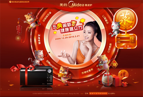
Chinese web design: Midea Microwave Oven
For example, Alipay, a byproduct of Taobao, became a successful standalone product because it took into consideration the purchasing behavior and psychology of Chinese users. China is a big country, and some websites are successful because they cater to particular geographical locations. The other side of the coin is that Chinese Web design is not quite international yet. It’s such a huge market and can sustain itself without even reaching out to the international market. You will see that UCDChina.com and a lot of other Chinese websites don’t have English versions, even in their navigation.
John Woo: China has not formed one distinctive Web design style yet, because the country is big, and Chinese users are complicated in many ways. The impression of foreigners of Chinese Web design might be that it is busy and flashy, but I take it as practical. When Flash design was the fashion, many designers (or their bosses) wanted to use Flash to make their Web pages attractive. When SNS was booming in the US, it was soon introduced in China, together with the Facebook and Twitter design styles. When it’s practical and useful, many Chinese people will just borrow the concept and develop it further. Baidu, QQ and Taobao won business and respect this way.
Rex Song: China has a large population, and the saying “the more, the merrier” applies to its Web design. You will see some Web pages that are busy and cluttered, with designers or stakeholders trying to put everything on the page. The other thing is that, currently, the primary motivation to go online for the average web surfer in China is entertainment. So, Web designers in China tend to make their websites play-ish, SNS-ish and visually attractive, as we saw with the popular trend back in 2004 to imitate Korean Flash websites.
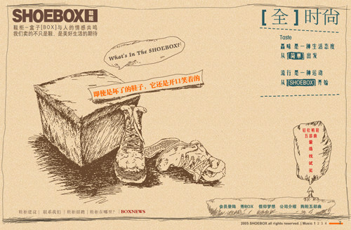 Shoebox
Chinese Web Design In A Nutshell
So, do you now have a rough idea of the status quo in Chinese Web design? Although our interviewees tended not to reduce Web design in China to certain patterns, we summarized a few bullet points based on the topics most frequently mentioned in our interviews.
1. Flash-Heaviness: Born of Imitation
Flash design has been a source of constant debates for years. The fact that optimizing Flash objects for search engines can be difficult is a major turn-off for some designers.
However, Flash was called out, and it’s the most frequently mentioned keyword in our interviews. Back in 2004, when Korean websites were all in Flash, Chinese designers and business owners considered Flash the “fashion.” Rex Song mentioned that when this trend was extremely popular a few years ago, you could even download ready-made Korean-style Flash ZIP files from online stores for little money, so that you could do it quick without spending a lot of effort.
Google is renowned for its focus on simplicity. But take a peek at the nuances that distinguish Google China and Google US:
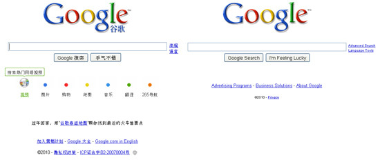
The design of Google China is a bit more vivid than that of Google US, with a hint of animation added to the former to enhance the richness of Google search. By the way, this concept was first implemented on Google Korea and Japan, although both of them have since reverted to a more static interface.
Although Flash implementation began as imitation, it is now increasingly featured in the portfolios of design studios and freelancers, on websites to launch new products and for products geared to the younger generation.
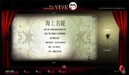
Shanghai Vive is an old Shanghai cosmetics company that is trying to rebrand and attract high-end consumers. Its branding uses Flash heavily, depicting an elegant and high-class life.
Cool Bear Hi, one of the product lines of Great Wall Motor, has a Flash website to promote its new car release.
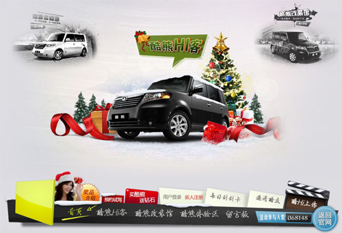
To accommodate low-speed Internet connections, Cool Bear Hi does a good job of showing the progress of the loading Flash.
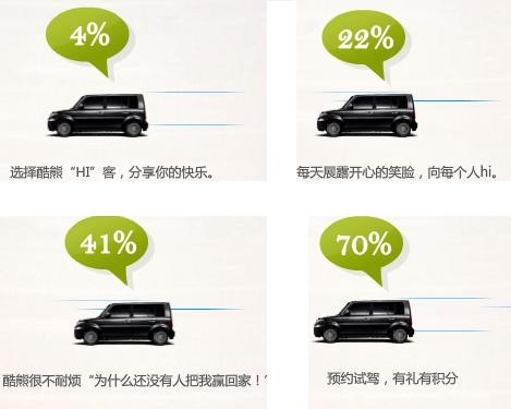
The text below the car on Cool Bear Hi changes as more Flash loads. With the chipper text there to assuage visitors, the loading Flash doesn’t seem that boring to watch. Above are a few screenshots we took, and below is what it says at various points in the loading process:
- At 4%: “Choose Cool Bear Hi. Share your happiness.”
- At 22%: “Wear a smiling face every day, and say Hi to everybody.”
- At 41%: “Cool Bear is impatient, ‘Why hasn’t anybody taken me home!’”
- At 70%: “Book a test-drive appoint. Get your special gift and reward points.”
Mian Dian Fang, a ready-to-serve breakfast company, also uses heavily Flash on its corporate website. The animation gives the steam bread and “baozi” a human touch, having them do morning exercises and other activities. The metaphor persuades customers that the company serves a healthy breakfast.
Let’s look at how Mian Dian Fang shows its loading progress:
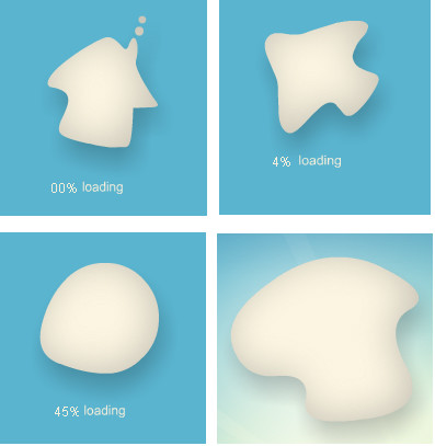
The loading animation parodies the yeast process: the flour gets bigger and bigger, until you can see a full-blown website.
Shoebox, a shoe brand for the younger generation in China, uses Flash across the whole website to show its grasp of fashion. In addition, the sketched art on the home page and old brown newspaper color for the background set up Shoebox’s philosophy: taste is an attitude of life; start with the simple; fashion is a kind of sport; start with Shoebox.

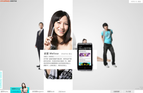
Lenovo Mobile O1 takes advantage of personalities and embeds their stories in Flash to present the features, functionality and usefulness of its new product, Lenovo O1.
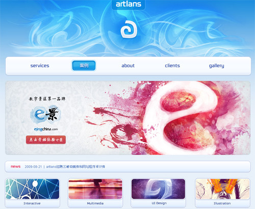
Artlans, an interactive design studio, also uses Flash, especially for its menu buttons, the call to action and the language switcher. Design studios may not want to use Flash all over their portfolios, but rather in a few key places to show their skill at using Flash for clients.
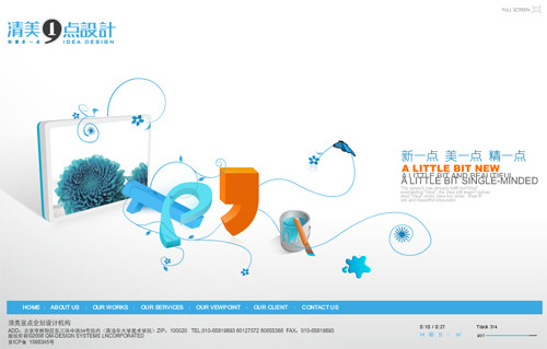
Idea Design, a design studio that uses Flash in full swing.
2. Designing for Entertainment
We really liked our one-on-one interviews because not only did we hear different stories from different people, but we also heard certain other stories from everyone. For example, Whitecrow, Lytous, Yu, and Rex all talked about the “entertainmentalization” of Chinese Web design. “When a social networking website comes to China, it must become a game website,” said Whitecrow.
A case in point is a feature provided by Kaixin.com (Kaixin means “happy”), which recently spurred a social phenomenon in China: “Stealing vegetables.” Kaixin pretty much copied Facebook’s navigation and user interaction. But it’s different in what it allows you to do: set up your “Happy Farm,” build your house, grow your own vegetables and then steal your friends’ vegetables when they are ready to be harvested. Some dedicated players even made Excel spreadsheets to track their friends’ harvest season in order to expedite stealing. It’s like any other video game but embedded on a social networking website, allowing you to play with a wider variety of users. “Stealing vegetables” became so popular that it drew the attention of censors from China’s Ministry of Culture. Under pressure from the Ministry, the game is now called “Picking vegetables,” a less offensive euphemism for mainstream Chinese culture. Online players still prefer the more accurate name.
Happy Farm
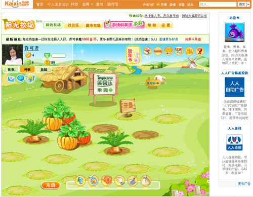
Happy Ranch
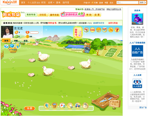
Happy Orchard
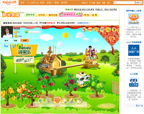
The application was recently added to Facebook, but it is only for Chinese-speaking users at this time.
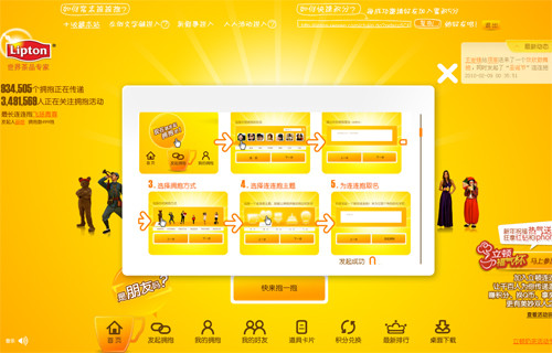
Lipton Milk Tea features a “Hug Relay” game that you can play right on the website. Hug your friends by validating your account on Renren, another social networking website in China, and gain hug points.
Once you accumulate enough hug points, you can shop on the online store and purchase gifts, an incentive to maintain momentum in the game:
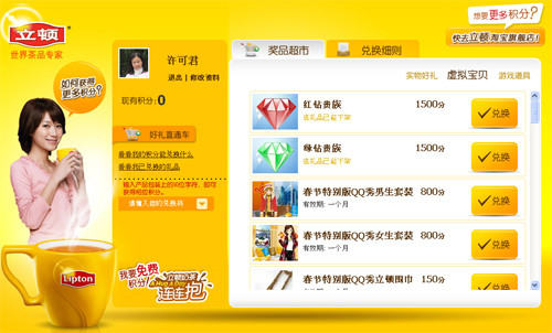
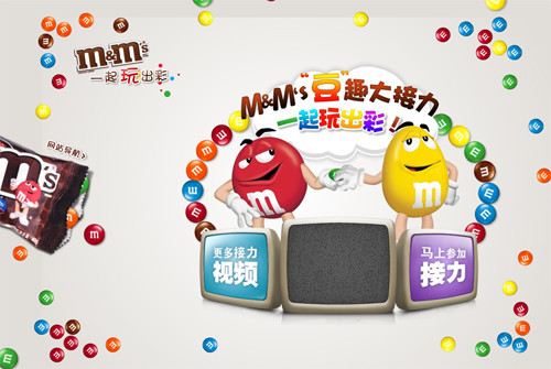
Like Lipton, M&M China also uses an online “relay” game to engage visitors to its website.
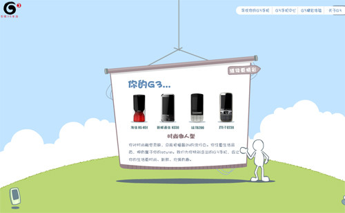
I Love G3, a website from China Mobile to promote the 3G network and 3G cell phones, presents an animated Flash questionnaire for users to play around with.
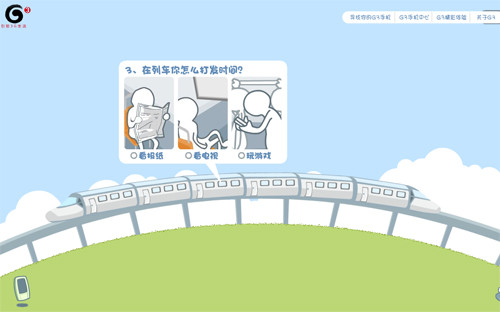
After you have answered a series of questions such as, “How would you kill time on a train?” and “How would you cross the ocean?” the system analyzes your personality and recommends 3G cell phones to match you:
3. Designing for Clicks
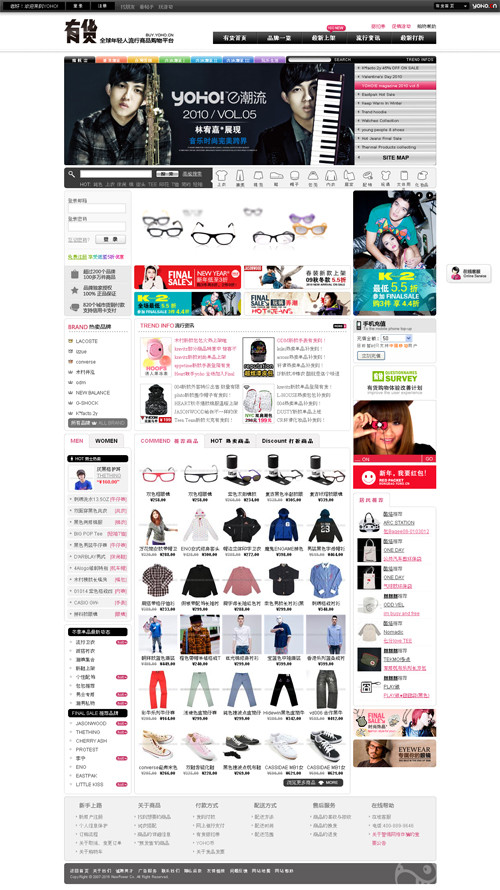
Unlike Latin and Germanic languages, Chinese is rooted in hieroglyphic characters. Typing in Chinese on an alphabet-based keyboard can be slow, especially for middle-aged and older users. So, you will see that some website user interfaces are extremely busy: text and image links everywhere—”the more, the merrier,” as Rex Song points out. These websites are designed for clicking, as opposed to searching (although keyword search is an essential component of any information-rich website).
Yoho, an online shopping platform for the younger generation, takes advantage of every sliver of real estate on the page to promote its products. Yes, a search box is in the top-right for you to search, but with all of these images and hyperlinks, it’s more enticing to just click, click, click.
It’s the same with China Visual, a visual design resource portal. The home page presents all sections of the website as text and image links, giving you a quick peek of the content.
NetEase (aka 163.com), one of the largest news portals in China, takes full advantage of the Web reading pattern of Chinese users: i.e. clicking.
Above is a screenshot of NetEase’s home page. The Chinese lunar New Year was approaching when we were writing this article, and you can see that this website uses red, a color symbolic of festivals, for the background. The page is filled with headlines of news and featured articles as well as ad spots. You can perform a search at the top of the page, but by scanning the entire page, you get a sense of what’s happening today. And if you’re interested in any of the headlines, just click—that easy.
All that said, many websites are working to unclutter their UI, increase the font size and line spacing and enhance readability. “Sina.com, if you have been paying attention to its redesigns all the way back to the late 1990s, is doing better and better at information design,” said John Woo, lead of the Google China UX team.
4. Designing for Culture
When asked, “Can the world learn anything from Chinese web design?” Lytous Zhou answered without hesitation: “Culture. The Chinese respect Dao, and we have our own set of values and mores. Websites targeted to the Chinese market should follow the online habits and aesthetics of Chinese users. For example, cultural symbols, calligraphic elements and festivities: all of these could be integrated into a Web design if applicable. A lake may just be a lake, but associating a fairy tale with a lake makes it prettier.”
True, if you add a fairy tale and human touch to a lake, the user’s perception of it would change.
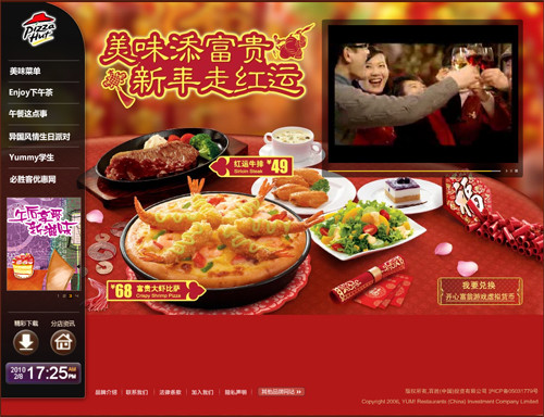
Pizza Hut China, which is an example I like to use every time I explain cultural differences, uses Chinese elements heavily all over its website: in the color scheme and family theme. Warm reds and yellows are colors symbolic of festivity in China, and the family dinner is highly regarded in Chinese society.
By comparison, Pizza Hut US highlights fast food and online ordering on its home page. Red is also Pizza Hut US’ theme color, but it’s more solid, darker and cooler than the warm red on the Chinese website.
Same with McDonald’s China website, where one main menu is dedicated to the “Happy Family Party.”
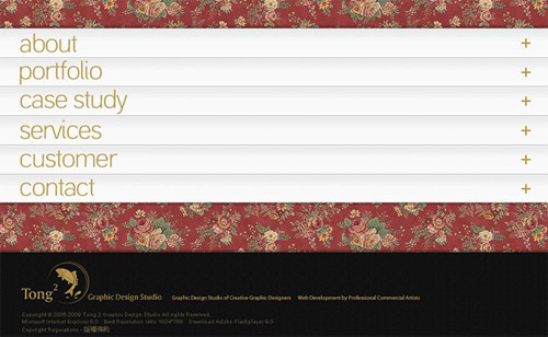
Tong2 Studio has a unique look and feel with this traditional Chinese floral pattern on its background.
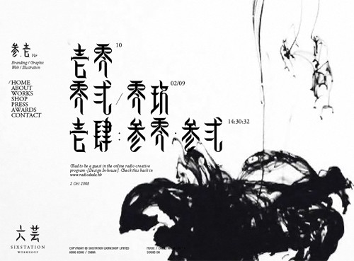
Six Station, whose home page is a Chinese ink and watercolor painting in Flash, opens its creative and innovative mind to clients.
Dongpai Design, an interactive design studio, has an interesting mini-website that borrows from the “Three Kingdom” story (a period of Chinese history) to communicate its design philosophy and values.
While John Woo points out that incorporating national and cultural elements into design is not limited to the Web, he acknowledges the practicality of Chinese Web design—that designers will borrow anything that might be useful to them or their users.
Want An Even Bigger Showcase?
Not enough visuals for you? Here is a whole bunch of more websites to give you a better sense of design in China.
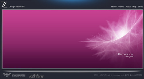
UI Seven A design studio.
IDT A personal showcase that records the designer’s 12-year love affair with his girlfriend (now wife) and his own professional growth as the Web evolved during those years.
Youguan Cookies Also uses Flash animation to promote its product line.

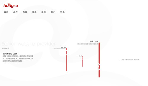
Xin Hongru An interactive design agency that uses both Chinese elements and Flash to showcase its work.
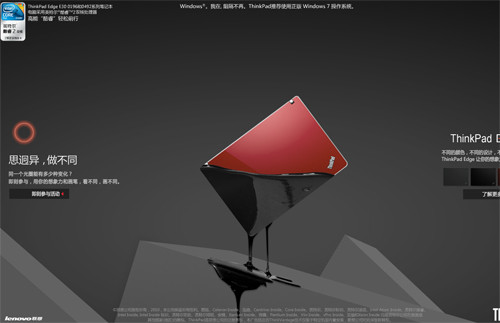
Thinkpad Edge A new product line of the Thinkpad laptop.
Moliyo MFM An online video game website, designed for clicks.
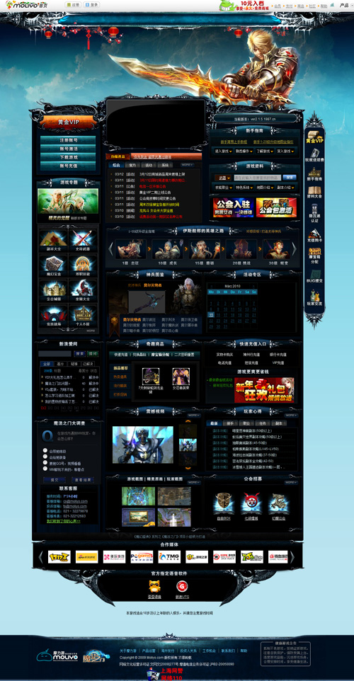
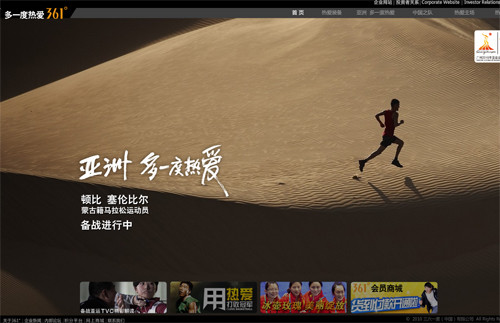
361 Sports Borrows the theme of the 2010 Guangzhou Asian Games for its home page.
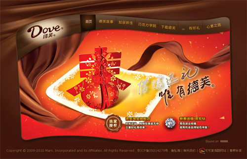
Dove Chocolate China Uses Chinese elements and the lunar New Year to decorate its home page.
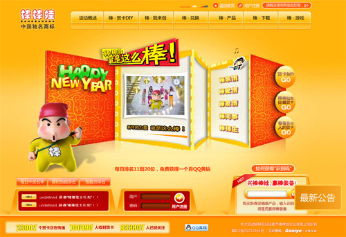
BangbangWa A snack company whose website is rich in games and Flash.
Brain Town A personal portfolio website.
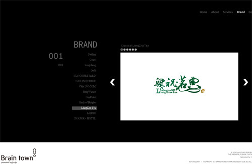
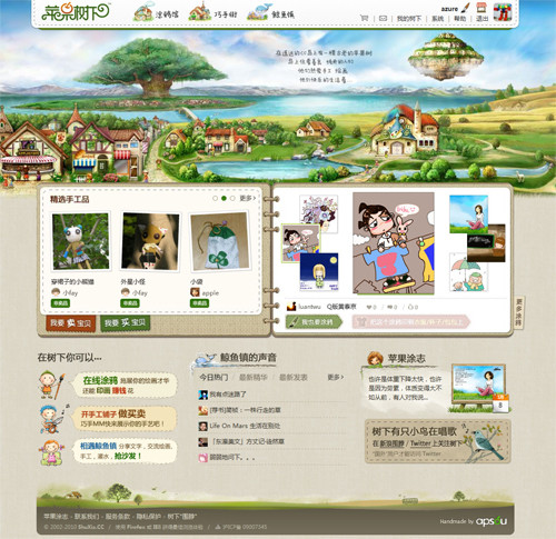
ShuXia A platform to showcase the creations of members.
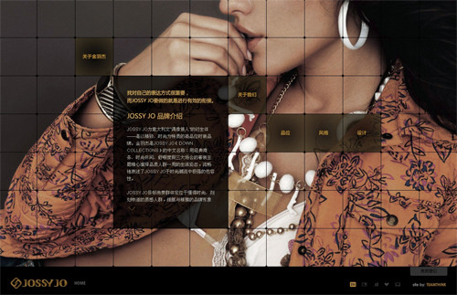
Jossy Jo A clothing brand.
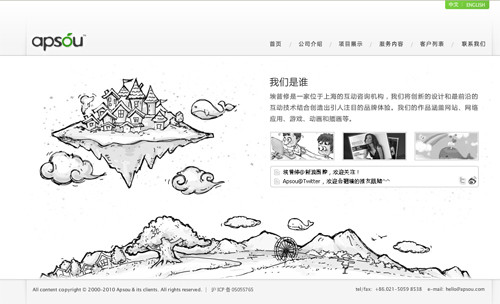
Apsou An interactive consulting agency.
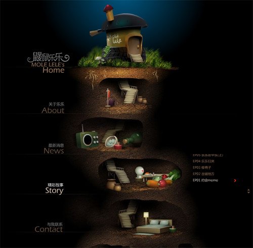
Mole Lele A cartoonist’s personal website.
WEBE7 Enterprise Network Interactive A portfolio website.
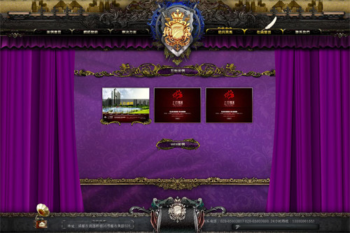
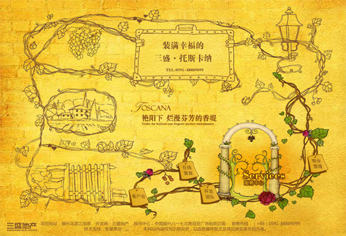
Sanshen Toscana A real-estate website that relies heavily on Flash.
Wotoon Design A design agency.
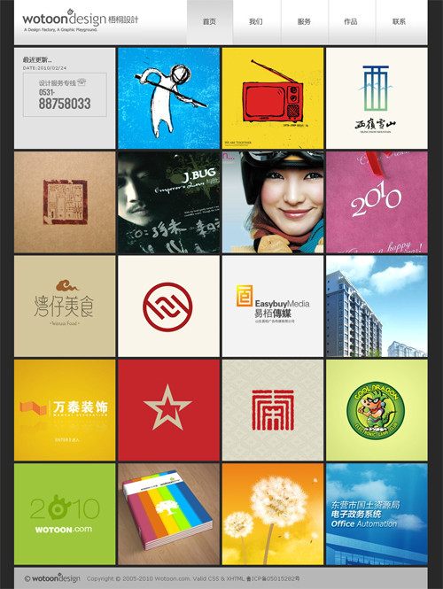
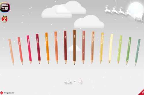
X’mas Tree Workshop A mini games website where you can create your own Christmas tree and send it as an e-card to your friends.
The GF Space A design agency.

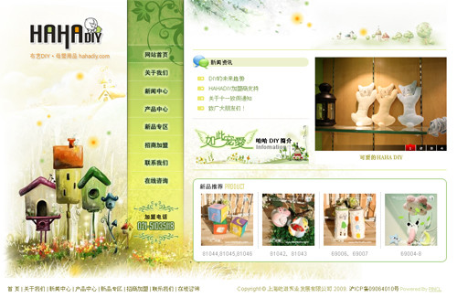
HAHA DIY A neat website for DIY home ornaments.
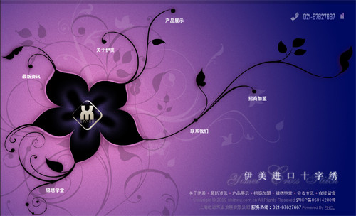
Yimei Cross Stitch
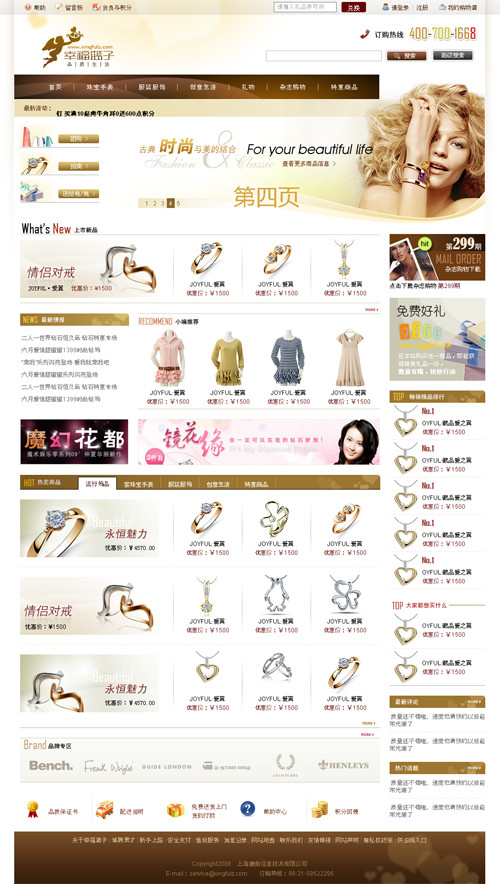
Happy Basket Designed for clicks.
WuHansoufang A pretty cool Flash website.
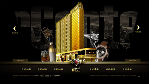
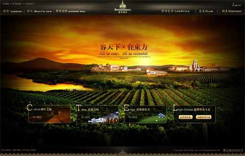
Chateau Junding A domestic wine brand.
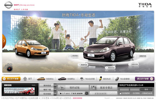
TIIDA Incorporates a family theme into its Flash design.
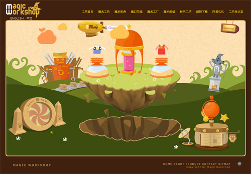
Magic Workshop A kids clothing company, using Flash-animated cartoons to capture the company’s culture.
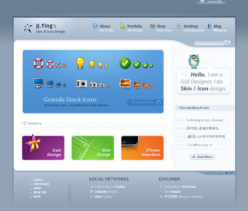
JJ Ying A neat personal portfolio website.
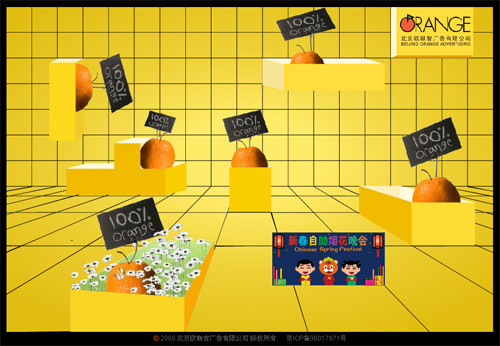
Beijing Orange Advertising A creative showcase website.
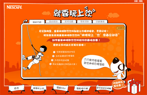
Nescafe Another website rich in both games and Flash.
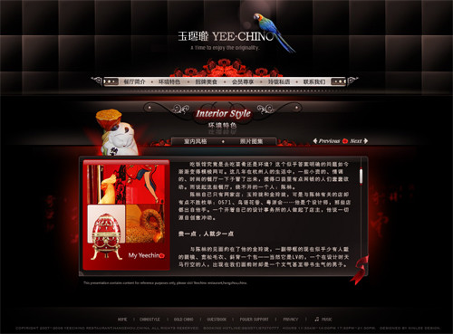
Yee Chino A restaurant.
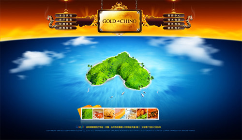
Gold Chino The sister restaurant of Yee Chino.
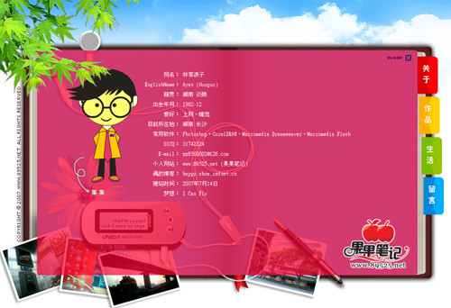
Guoguo Diary A fairly simple but creative personal website.
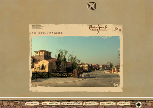
Rancho Santa Fe A real-estate developer in Shanghai.
Challenges, Opportunities, Trends
Challenges
When it comes to challenges in the Internet industry, one of the frustrations mentioned by Whitecrow, Junchen, Rex and Lytous is government censorship. YouTube, Twitter, Facebook, and Flickr are all blocked in China because some of their content is considered “inappropriate.” And for compliance purposes, “Sina Microblogging has a team of humans whose job is to censor content, in addition to machine filtering,” says Whitecrow.
The international debate on how free and open the Internet should be is ongoing (see Nussbaum, 2010), and there is still no universal “policy” for the Internet. But without an open environment, China could be impeded from learning from and catching up to other countries.
Still, every coin has two sides. “It limits your freedom,” says Whitecrow Zhu, “but meanwhile, it has a positive effect on UI design and content presentation. There is less room for gimmicks. It forces you to concentrate on useful content and how to present your content.”
The other challenge mentioned by Junchen Wu and Rex Song was the lack of quality educational programs: “Vocational schools might teach you how to use Photoshop and Dreamweaver and how to code in HTML, CSS and JavaScript, but they may not teach you design thinking and the logic behind design. The World Wide Web is still young, and at higher-education institutions we have not seen any Information Architecture or User Experience Design degrees yet.”
Our interviews did point to the fact that designers in China have not yet taken full advantage of rigorous research methodologies. Take what Junchen Wu said about the status quo of Chinese Web design: “Many designers know the concept, but they hardly include it in their design practices. They know of usability testing, but they rarely do it.”
And in response to the question, “How do you convince stakeholders that a design is right?” Rex Song brought up the notion of “guanxi” and trust, and he thought the concept A/B and multivariate testing was “Western” and might yield a “low ROI.”
This is understandable on the one hand, because China has a long history of interpretive reasoning, be it Confucianism or Daoism. On the other hand, Chinese Web designers in general have a long way to go in using hard data to back up their design choices.
One might argue that the designer’s job is simply to design, the fact is that you need reasons to support your decisions that affect layout, color scheme, positioning of elements, user interaction and so on. Only “25% of the designers who relied on their personal opinion were right. A research study conducted by the Neilsen Norman Group (2009) concluded that “you’d be better off tossing a coin than asking advice of these people.” This cannot, of course, be said of everyone, but it speaks to the importance of data.
Opportunities and Trends
We were inspired in all six interviews by the discussion of the opportunities and trends in Chinese Web design.
Question: What trends do you foresee in Chinese Web design?
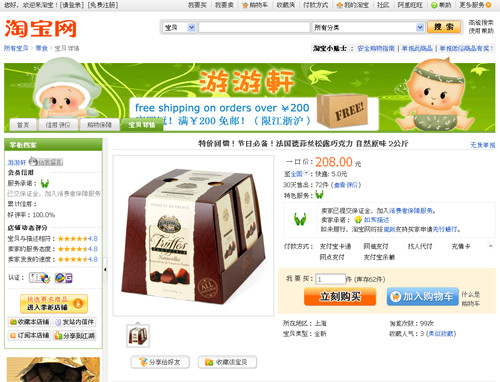
Yu Guo: E-commerce, I would say. Do you know Taobao? Some of my female colleagues have bought soy sauce, pickles and snacks that I’ve never heard of at Taobao. They love it. This is the market in China, and there is demand. I think every company should take advantage of it.
[Authors’ note: Taobao is one of the largest shopping platforms in China to connect buyers and sellers of “baobei” (treasures). Out of curiosity, we searched for chocolate on Taobao and found those seasonal truffles that are sold around Thanksgiving and Christmas exclusively at Costco, the largest warehouse membership club in the US.]
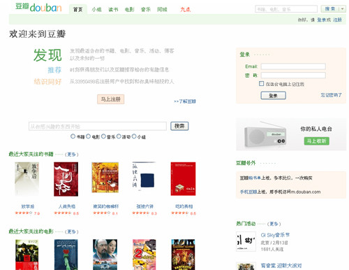
Whitecrow Zhu: I think Web design in China is moving towards integrating more and more user-generated content. Douban, an online book and movie club, is a good example. Like YouTube, the majority of the website’s content is user-generated, and it has been pretty successful. Douban existed before YouTube, by the way.
Several years down the line, e-commerce in China will be in full bloom. E-commerce is not tied to any ideology other than simple economics and consumer interest. It has less of a chance of being censored, and people demand it.
Junchen Wu: Creating more value for customers. Listen to what they say, look at what they do, do what they do and think what they think. My belief is that Chinese Web design is getting better and better, in an upward-spiral trend.
Lytous Zhou: Focus on users and your service. I don’t think we’ll see anything unnecessarily extravagant, like crammed content and excessive visuals. Features, functionality, industry standards and meeting customer needs are the trends, I believe. And you’ve got to think outside of the box.
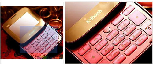
John Woo: Functional, useful and usable. Making websites flashy, with lots of reds and greens, is absolutely unnecessary. Focus on user essentials and user needs. Though not a website, the Tianyu (KTouch) cell phone is very popular in China these days, and I bought six for my family: four with big font display and handwriting input for my parents and parents-in-law, one with 3x optical zoom and an 800 MP camera, and one that looks like lady’s powder case (see picture below). Tianyu was a “Shanzhai” manufacturer but is now a registered company with a pretty good share of China’s cell phone market. Why? It focuses on user essentials and basic needs. Websites are no different.
[Authors’ note: “Shanzhai” literally means “villages in the mountain with stockade houses.” The use of shanzhai became popular with the outstanding sales of shanzhai cell phones. Although shanzhai companies do not use branding as a marketing strategy, they are known for their flexibility in design to meet specific market needs. Shanzhai cell phones can be sold at prices much lower than normal cell phones. (Wikipedia, 2010)]
Rex Song: In terms of online trends, we will develop our own Web design style using the backdrop of Chinese culture. Formatting-wise, we will be in line with the mainstream world, creating more user-centered designs and offering a better user experience.
Wrapping Up
The Web in China is young, and Chinese designers are playing catch-up. Despite the challenges, we see even more opportunities: smart people, a big market, increasing demand, flexibility and innovative and user-centered design thinking.
On many Chinese websites, we’ve already seen the “upward-spiral trend from imitation to innovation and user-centered design”. Innovation in China is a constant goal. It is being pushed in President Hu Jingtao’s State speech all the way down to classroom curricula. Says Bruce Nussbaum (2009), “To its credit, China has made design a national priority and is pouring billions of yuan into design education.”
Through our interviews, we also collected some resources that our designers would like to share with Smashing Magazine readers (including those in languages other than Chinese).
Events
- UCDChina Book Club Meetups These monthly meet-ups occur on the third Sunday of every month in China’s eight major cities: Beijing, Shanghai, Nanjing, Shenzhen, Guangzhou, Hangzhou, Xiamen and Chengdu. They set a topic for each month, and club members can borrow the books from UCDChina library and return them at the next meet-up.
- UCDChina Annual Conference The first conference was held in Guangzhou in 2009. It’s free to attend.
- UPA China Annual Conference The UPA China Chapter conference, different from UPA International. The conference is usually held on “Usability Day” every year.
- Designer and Developer Front End Technology Forum A biannual forum for designers and front-end developers in China.
Books, Blogs and Online Resources
- UI Evolutionism About HCI design on mobile devices, written by local designer Lytous Zhou.
- Emotional Design: Why We Love (or Hate) Everyday Things A classic must-read about design and emotion.
- Designing Web Interfaces: Principles and Patterns for Rich Interactions A book about design patterns for building Web interfaces with rich interaction.
- Yahoo! Design Pattern Library This website was credited by our interviewees as “one of Yahoo’s most important contributions to the design industry.”
- Douban An online book and movie club, mostly user-generated comments and criticism.
- iFeng Phoenix News Media, a new portal.
- Since 1984 About design and beautiful things in the world.
- Metroer About reading, including “design reading.”
- Mooogu About industrial and interior design. A good website to find inspiration.
- Apple4us Community blog for tech demos, reviews and ideas.
- Ffffound! An image bookmarking website.
- Notcot For your ideas, aesthetics and amusement.
- We Heart It A website that lets you create an online album from your favorite images and videos.
- Core77 Design magazine and resource.
- Engadget A Web magazine with obsessive daily coverage of everything new in gadgets and consumer electronics.
- The Design Inspiration Like its name suggests…
- Dbcut A Korean design community portal.
Your Voice Is Important to Us
What do you think about the Web design in China? We couldn’t cover everything in one post, and we are sure we have missed some perspectives. We look forward to hearing your feedback!
Related Posts
You may be interested in the following related posts:
- Shalom! A Showcase of Web Design in Israel
- Showcase of Web Design in Russia
- Showcase of Web Design in Germany
- Showcase of Web Design in Mexico
- Showcase of Web Design in Ireland
About the Authors
This guest post was written by Kejun Xu and Hendry Lee.
Kejun Xu, an information architect devoted to user experience research; a user researcher dedicated to user-centered design; a usability engineer engaged in making the Web easier to use; and a translator and interpreter who loves inter-cultural communication and bridging people together. She designs for her users, making their lives easier and hassle-free. She blogs once a while, about UXRnD, to record the auto parts and loose diamonds, in case she forgets.
Henry Lee helps people overcome strategic and technical challenges in starting and growing their blogs. Read more of his blog tips, including website building with blog software, strategies, hosting, social media, Web writing, design and more. You can also hire his team at Marketing Loop to build a Web presence for your business or personal website. Stay in touch with Hendry by following him on Twitter.


 Agent Ready is the new Headless
 SurveyJS: White-Label Survey Solution for Your JS App
