Applying “A Pattern Language” To Online Community Design
Niche social networks are popping up online all the time, with many designers and developers taking advantage of pre-built social network platforms and making little modification. It makes sense, after all: why reinvent the wheel when perfectly good ones are available?
You may want to take a look at the following related posts:
But if you step back and really consider how your social network or online community is set up, you might be able to improve the user experience and overall user satisfaction by leaps and bounds. Looking to other fields, such as architecture and civil engineering, is one way to gain new ideas without having to reinvent the wheel.
Overall Community Design
We’ll take a top-down approach here and look at broad aspects of community design first. The concepts below cover everything from the actual and perceived size of communities to how your communities should be structured and the types of interaction they should enable.
A Community of 7,000
Communities that are too large are not effective. While this doesn’t mean you should limit the size of your overall website, you should consider ways of creating smaller sub-communities within the website if it is big.
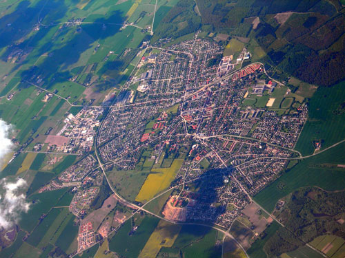
Image Credit: Lars Plougmann
Creating sub-communities within the larger whole is one way to go about this. Another option is to limit exposure to the full membership (such as by not having a membership directory, but only showing members via search). The main goal here is to make the community feel more intimate and manageable to the casual user.
The purpose here is to make each member feel as though they matter in the grand scheme of things. If the user sees a membership roster that includes a 100,000 names, they’ll feel like a tiny fish in a huge pond. But if they’re one of only a few thousand, they’ll feel like their voice might actually be heard.
Identifiable Neighborhoods
People need to feel part of a group, a neighborhood. In the real world this is often done by physical boundaries between actual neighborhoods. Online, it can be a bit trickier, and the need doesn’t go away.

Image Credit: O Palsson
Designers and developers can accomplish this in a few ways. One is to allow members to form groups and allow each group to have its own identity. This can be done through customizable pages, banners, badges or other means. These groups over time will start to feel like neighborhoods and small communities within the larger network.
Main Building
Think of the main building as the focus of your website. Even a cluster of buildings should have one primary building, where new visitors will start.
Think of the main building as your home page. From here, visitors should be able to access the most important parts of the website. They should be able to get a feel for what the website contains and where to go next. Most of all, your home page should be welcoming and unintimidating to new and old visitors alike.
Four-Story Limit
The four-story limit refers, in architecture at least, to the oppressive feeling that taller buildings have on occupants. In Web design, this is relevant to the way information is structured on your website. Think of your layers of navigation as stories.

Image Credit: Jeffrey Beall
Regardless of the structure of your website, keeping the navigation to four levels is user-friendly and makes your entire website seem streamlined and responsive. While the four-level rule is rather arbitrary (similar to the three-clicks rule), keeping your navigation streamlined and simple makes a huge difference to the user experience.
Activity Nodes
Group like activities together. For example, messaging tasks should be grouped together so that users can communicate in a variety of ways (private message, public message, chat, etc.) from a single control panel. Similarly, games should be grouped together, as should tasks dealing with media.
This is definitely a usability challenge for many community websites. For example, Facebook has three basic types of messaging: chat, private messages and wall posts. All three are done in different areas of the website (chats are in the footer, private messages are accessed from the header or a person’s profile page, and wall posts are done on individual profiles). While separating these tasks wouldn’t necessarily be a deal-breker for most websites, clustering them together would definitely improve usability.
Promenade
In a city, a promenade is a central gathering place, a place to see and be seen. Online communities need similar venues. For many websites, this would be a forum or chat room. These are places where members can gather in “public,” discuss issues in an open environment and meet other members.

Image Credit: j_bary
These public spaces are important to growing an online community, especially a niche community in which users don’t know each other but likely share common interests. They foster a broader sense of community and help members forge deeper relationships.
Old People Everywhere
This one always makes me smile. While it sounds a bit arbitrary, it means that you should make it easy for people from different walks of life and with different backgrounds to interact. Encourage a diverse membership, and you’ll have a more vibrant, active community.
Local Town Hall
In the real world, a town hall is where citizens go to voice their opinions on matters of public concern and to interact with their government. Online communities should have similar forums for their members to give suggestions, ask questions and interact with those who govern the website.
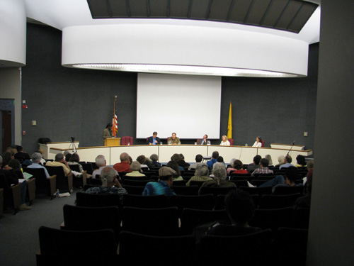
Image Credit: nmfbihop
On some websites, this could be an official support forum, while on others it could just be an open support form. Open forums are especially effective in large communities because fellow members can often answer questions faster than official community leaders. In any case, support forums should always be moderated and monitored to ensure that questions are answered correctly.
Necklace of Community Projects
Unofficial community-based projects should be encouraged. The grassroots movement is alive and well in many social networks and communities, and members are often quite adept at organizing themselves for common causes. This should be fostered within communities and encouraged when appropriate.
Patterns For Neighborhoods And Groups Of Buildings: Group And Subgroup Design
While the organization of groups within your community will, to a certain degree, mimic the overall community structure, there are special considerations. These include subgroups for teenagers and how to encourage interaction between users.
Teenage Society
If you’re building a website that will have teenage members, you’ll need to make special provisions for them. While there are certainly legal and ethical considerations when dealing with minors (such as putting in place reasonable protections from predators), there are also social considerations.

Image Credit: Monica Arellano-Ongpin
Teenagers are neither children nor adults. They’re stuck in the middle, which can often be uncomfortable and frustrating for them. Build features that allow them to express themselves and interact in a way that’s safe but still gives them a sense of freedom.
Also consider segregating teenagers from adult members of a community to some extent, depending on the nature of the website. Depending on the content, this may not be necessary on some websites, but on other websites having teens-only and adults-only areas, as well as some open to both, would help.
Building Complex
Buildings work best when they’re part of a larger complex of buildings, which is made up of big and small parts. To be most effective, a complex of buildings should be based on the social interactions that take place there: small buildings where they’re appropriate, and large buildings where they make sense. And there should be cohesion, too.
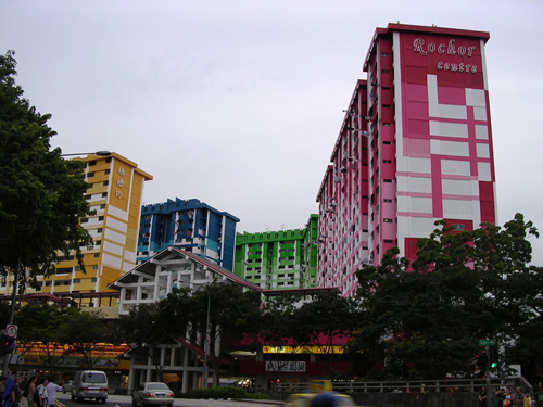
Image Credit: Yabby
A website is similar. It should have a complex of interconnected parts, some large and some small, to make it feel more human. And its structure should make sense, with parts only as big as they need to be. This particularly applies to groups.
Circulation Realms
Circulation realms refer to the navigational structures in buildings that reduce the sense of disorientation one feel when moving through a large sterile building. These circulation realms should grow progressively smaller as one goes deeper into the building, and they should be named appropriately so that you can direct someone by telling then which realms to pass through.
In Web design, this applies specifically to the navigational structure. Create realms that members pass through to reach one area of the website or another, with progressively smaller sections and pages. The main difference with a website, though, is that you will also want to create shortcuts to the inner parts that are used most frequently, bypassing several realms in between.
Common Areas at the Heart
Every group needs a common area where they can congregate. This space can be semi-public or restricted to group members. But it should serve as a common meeting place for group members.
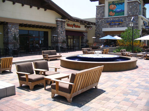
Image Credit: silas216
Communities as a whole need these types of spaces, too. That’s generally accomplished through fully public areas, such as the promenade mentioned above.
Eating Atmosphere
In a home or small group, the atmosphere in which people eat is important. An uncomfortable eating atmosphere makes people rush through their meal so that they can relax. A more inviting and comfortable eating atmosphere encourages people to linger. People often bond more easily if they are able to break bread together.
The “eating atmosphere” on your website is important. Are the communal areas for groups comfortable? Do they foster communication and make people want to linger? The atmosphere you create, both in terms of design and overall user experience, has a direct impact on how long people linger on your website. While some of this is accomplished by the members themselves, consider ways to make these common areas more inviting and enticing to your members.
Something Roughly in the Middle
A public space without a center stays empty. People need a place to congregate. They need a center of activity where they can interact with one another. It’s only logical that this place should be roughly in the center of their community.

Image Credit: Eoghan OLionnain
By “center”, I mean it should be easily accessible from pretty much anywhere on the website or within the group. If it’s easily accessible, people will use it more. If they have to navigate 15 other pages to get there, it won’t get used.
Main Gateways
There should be main entrances to different areas of your website. These gateways let visitors know that they’re transitioning from one area to another. A gateway in Web design is often a landing page. It’s a marker that tells visitors what they might want to do in that particular section or what they might find.
Think of how you would transition visitors from one area of the website to another. Having clear transitions that let visitors know they’re moving from one place to another is helpful, just as natural and man-made landmarks and gateways do in the real world. They prevent confusion, and people feel secure when they know where they are.
Building And Interior Patterns: Profile Design
The design of individual profile pages on your website is often an important part of community design. If members aren’t pleased with how your profile pages are designed and how they function, they’ll likely be unhappy with the website as a whole. After all, these pages represent users to other members and the world. If they can’t represent themselves how they want, they’ll feel insecure about the community as a whole and may leave in favor of websites that give them more control.
Your Own Home
Everyone should have their own home in the real world, a place they can go to at the end of the day that’s safe and secure. In the online world, this would be the profile page.

Image Credit: eamoncurry123
People want to customize their home, make it their own, host friends there, put their mark on it and let people know that this is their space and that it reflects their personality.
In the online world, people want to do the same thing. While you don’t have to let your members go crazy with profile page customizations (a la MySpace), you should allow members to choose the information they share with other members. Remember that some members will be more private than others, just like in real life. One person may have no problem letting everyone in the community see all of their profile information, while another may prefer to limit it to their friends (or even sub-groups of their friends). Implement options that allow this, and you’ll have happier members.
Small Services Without Red Tape
Members should be able to make changes without having to jump through hoops. While certain changes should require verification (such as changing an email address or password), changes that are easy to reverse or undo should be simple to make in the first place.
Don’t make members go through endless verification and confirmation simply to change their “About” information or to upload a photo. Make these things easy to do, with minimal verification required if they’re logged in.
Intimacy Gradients
We’ve already hinted at privacy a bit, but let’s go a bit deeper into it. In an online community, people will have different groups of contacts. Some contacts will be close friends from real life, some family members, others work colleagues, still others acquaintances they’ve met online.
We usually don’t want to share all of our information with all of these groups. We might want to make our phone number available to close friends and family members but not to acquaintances we’ve met online. But what often happens is that we have to hide certain details from everyone because we can’t restrict access to certain groups.
So, allow your members to customize their privacy settings so that they can fine-tune the access their contacts have. Let them categorize contacts according to their own standards and then include or exclude groups from certain areas as they choose. This is already being implemented on some social networks, Facebook being the most well-known example.
Opening to the Street
While many people choose to keep most of their profile information private on a network, most people want to at least be findable. In other words, they need a public face. They need an opening to the street.

Image Credit: takomabibelot
Again, let members choose what to open to casual passers-by and what to restrict to friends. The more power you give to members, the more satisfied they’ll be with your website.
Short Passages
Moving from one profile to another should be quick and comfortable. You want members to interact with one another, and so the pathways between them should be inviting.
Think of ways to encourage interaction between members along these passages. One way to do this is through comments on the activities of others. These comment areas could serve as passages between profiles. In the best implementation, these passages would be quick to travel and would encourage members to communicate with one another and move between profiles.
Patterns For How To Build Things: Overall Design And Information Architecture
We’ve talked a lot about the design and front-end architecture of community websites. But this doesn’t mean that the back-end of the website—the stuff under the hood—is any less important. A Pattern Language offers plenty of guidelines on internal construction, too. Here are a few of the most pertinent concepts.
Paths and Goals
Every pathway on your website should lead to a specific goal. Think through why you’re linking one area to another, and figure out whether it makes sense. Don’t put a navigational pathway somewhere just because you can. Do it because it makes sense and because it leads to some greater goal or purpose for the website.

Image Credit: flickrohit
Main Entrance
The main entrance to your website (usually the home page) should invite visitors to stick around. This page must serve a few different functions. It should encourage new visitors to sign up for an account. It should point new members in the right direction. And it should give long-time members access to the places they want to visit.
Image Credit: access.denied
One way to accomplish these varied tasks is to adjust the home page to different visitors. If a visitor arrives and is not logged in, give them the option to log in or sign up (emphasizing the latter in most cases). If they arrive and are already logged in, you could direct them to certain areas depending on the length of their membership or other metrics. In fact, one of the best ways to welcome established members is to let them choose where to go upon arrival. This way, they can go immediately to their favorite area without having to go through unnecessary navigation.
Structure Follows Social Spaces
The structure of a building should be based on the building’s purpose and the social functions that will take place within it. The same is true of a social network.
Think of how your members would likely use the website, and then build the structure accordingly. If the main functions will revolve around profiles, then structure the website around those profiles. If the main functions will revolve around a forum, then build the website around the forum, making profiles and other areas secondary.
Root Foundations
Trees have a better structural foundation than any other natural object. A tree’s structure simply continues underground. If you dig up a tree and shake off the dirt, you’ll have a hard time figuring out exactly where the ground came up to. The root structures that lie below ground to some extent mimic the branch systems above.

Image Credit: victoriapeckham
The best websites transition smoothly from front-end to back-end structure. And your back-end should mimic as much as possible the front-end’s structure. This simplifies maintenance and makes it easier to train new users.
Good Materials
Solid buildings have to be constructed with good materials. This means not only materials of high quality, but also materials that suit their purpose. You don’t need 10” beams for a house that’s 10’ square. Likewise, even the highest-quality 2x4 wood won’t stay straight across a 30’ span.
Think through what your website needs to accomplish, and then choose the materials that will effectively accomplish those functions. For one website, you might be able to use an out-of-the-box platform with few modifications. On another, starting from the ground up and building a completely custom platform would be better. In either case, use good materials, and don’t take shortcuts if you want your website’s architecture to stand over time (and grow).
Gradual Stiffening
When a building is constructed, the basic frame usually isn’t very stiff relative to its overall size. But gradually, as sheathing and finishing materials are added, the overall structure stiffens. By the time the building is completed, it’s as stiff as it needs to be.
The same is true of websites. Your basic frame should be as flexible as you can make it, while still providing the necessary structural components. Then, as the website grows and evolves, stiffen things up as necessary. Think of the framing phase as beta testing, when things might change. The website will eventually grow into a solid building, as the kinks are worked out.
But remember, even a finished building needs to be able to change if necessary. Applying a new coat of paint (a new design) or tearing down a wall (bridging two sections) should be possible.
Conclusion
Sometimes stepping back from the way we’ve always approached design and looking at it from a different angle leads to better patterns and ideas. Taking principles from architectural design and community planning and applying them to Web design and online communities is only one example. Look at things from a different perspective the next time you’re stuck on a design or development project. You may find a completely new way to approach what seemed an insurmountable problem.
Further Resources
- A Pattern Language Wikipedia’s entry on A Pattern Language.
- Pattern Language Wikipedia’s entry on pattern languages in general.
- A Pattern Language Buy A Pattern Language on Amazon.
- Anatomy of a Pattern Language An article that dissects the basic concept of a pattern language.
- Experiences: A Pattern Language for User Interface Design An example pattern language created for software user-interface design.



 Agent Ready is the new Headless
 SurveyJS: White-Label Survey Solution for Your JS App


