Form Follows Function?
You’ve likely heard the phrase “form follows function,” but have you really thought about what it means or what it implies about Web design? On the surface, “form follows function” seems to make a lot of sense. The way something looks should be determined by its purpose. Is this really true? Does the phrase hold up upon deeper inspection?
In the context of designing a website, “form follows function” is often taken to mean that the designer should first gather the website’s requirements from the client and then determine the aesthetics of the website based on those functional requirements. While that’s certainly good practice, is “form follows function” really being applied? Are client requirements the “function” of a website or something else?
Further Reading on SmashingMag:
- Lessons From Swiss Style Graphic Design
- Authentic Design
- About Art – What Do We Really Mean
- A Frank Lloyd Wright Approach To Digital Design
As you read through this post, keep these questions in mind. Think of your own process for designing and developing websites, and consider whether and how “form follows function” applies to it.
Historical Background
While sometimes attributed to sculptor Horatio Greenough, the phrase “form follows function” was coined by American architect Louis Sullivan. In his 1896 article The Tall Office Building Artistically Considered (PDF) Sullivan wrote:
“It is the pervading law of all things organic and inorganic, of all things physical and metaphysical, of all things human and all things superhuman, of all true manifestations of the head, of the heart, of the soul, that the life is recognizable in its expression, that form ever follows function. This is the law.”
At the time, technology, tastes and economics were rapidly changing. The forms of late-19th century buildings were still being worked out, based on innovation going all the way back to ancient Greek and Roman architecture. It was clear to Sullivan that a new form for buildings was needed, and he thought that form ought to come from the function of a building, not historical precedent.
This new form became the modern structural steel skyscraper.
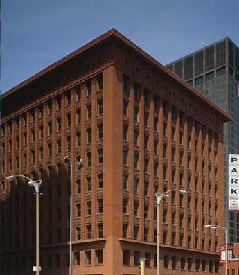
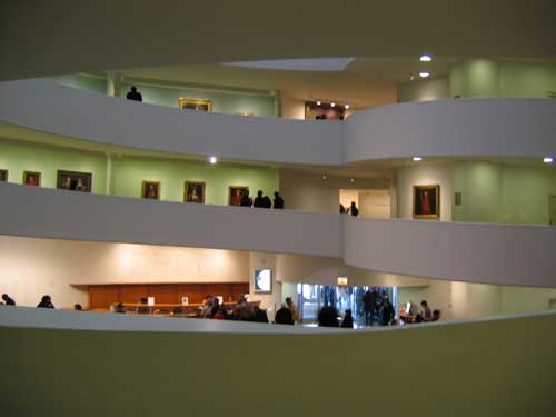
Frank Lloyd Wright, who was then Sullivan’s assistant, adopted the phrase “form follows function” and further promoted it. The Guggenheim Museum is a good example of Wright’s application of the principle. It’s spiral shape was intended to allow visitors to easily view the artwork within.
In 1908 Austrian architect, Adolf Loos proclaimed that architectural “ornament was a crime” (PDF). Modernist architects such as Le Corbusier, Walter Gropius and Mies van der Rohe adopted both “ornamentation is crime” and “form follows function” as moral principles and applied them to design.
The two phrases do not mean the same thing though. “Form follows function” allows for ornamentation as long as it serves a function.
Still, modernism in architecture emerged from both principles. Its goal was to determine the form of a building solely from functional requirements and not traditional aesthetics.
Bauhaus Ideology and the Future of Web Design
Walter Gropius founded the Bauhaus, a school of thought and movement in art that espoused that an object’s design should be dominated by its function. The Bauhaus was in some ways a reaction against the emotional expressionism of the time, and its design aesthetic was based on simple forms, clean lines, rationality and, of course, functionality.
Gropius’ goal was:
“to create a new guild of craftsmen, without the class distinctions which raise an arrogant barrier between craftsman and artist.”
The Bauhaus was eventually closed under pressure from the Nazi regime, which branded the school, and modernism in general, as un-German.
Several members of the Bauhaus found their way to the United States. Mies van der Rohe migrated to Chicago after the school closed, bringing the ideas of the Bauhaus with him to the city that epitomized “form follows function.” Walter Gropius among others began teaching at the Harvard Graduate School of Design. Both influenced American architect Phillip Johnson.
Johnson was a strong proponent of modern architecture and helped assemble the show “The International Style: Architecture Since 1922” at the Museum of Modern Art. The design principles identified by the International Style were:
- Expression of volume rather than mass,
- Balance rather than preconceived symmetry,
- Expulsion of applied ornament.
Johnson’s work was often a balancing act between minimalism and pop art. He later introduced the work of both Mark Rothko and Andy Warhol to the Museum of Modern Art. Johnson belonged to the post-modernist movement in architecture, which was a reaction to Modernism and Functionalism.

Johnson claimed that the profession of architecture has no functional responsibility whatsoever, saying:
“Where form comes from I don’t know, but it has nothing at all to do with the functional or sociological aspects of our architecture.”
Further Resources
The following articles offer additional perspective on the history of the phrase “form follows function” and the Bauhaus.
Interpreting “Form Follows Function”
There are two ways to interpret the phrase “form follows function”:
- Descriptive: beauty results from purity of function;
- Prescriptive: aesthetic considerations in design should be secondary to functional considerations.
Descriptive Interpretation
The descriptive interpretation favors simplicity to complexity. It states that beauty results from purity of function and not from ornamentation. This ideal derives from the belief that form follows function in nature. Is this really true?
Actually, the opposite is true. Evolution passes on genetic traits to subsequent generations without any rationale for their purpose. Each generation of a species then finds a use for the form it has inherited. Function follows form in nature.
Applying functional elements to a design is generally a more objective process than applying aesthetic elements. A functionally objective process results in designs that are timeless but may be perceived as simple and uninteresting.
Prescriptive Interpretation
The prescriptive interpretation prioritizes functionality over all other design considerations, including usability, ergonomics and aesthetics.
Aesthetic considerations in design should be secondary to functional considerations. Is this interpretation problematic? Does it lead designers to ask the wrong questions about a given design?
This interpretation would seem to lead to designers to ask what should be omitted from a design. What elements of a design do not serve a function and thus ought to be removed? Should the form of a design be determined solely by its function?
Taken to the logical conclusion, every element would ultimately have the same design. Every functional item would have one and only one design. Before an object’s form could be changed, it would need to serve a different function.
Better questions come from your criteria for success. What aspects of you design are critical to success? When time or resources is limited, what design trade-offs would least harm the design’s success? Sometimes, certain aesthetics will have to be abandoned, and sometimes certain functionality will have to be abandoned. Sometimes both aesthetics and functionality will need to be compromised.
Further Resources
The following articles argue that the form of a design should follow its function.
- Function Is Dead, Long Live Function
- Form Follows Function (Digital Web Magazine)
The articles below argue that “form follows function” is not an absolute rule.
- Form, Function, Foolishness
- Does Form Really Follow Function?
- The Demise of “Form Follows Function” (New York Times)
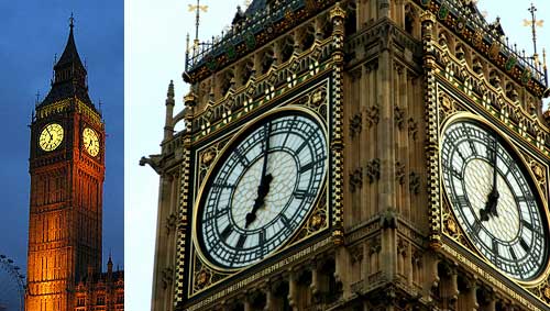
How To Design A Clock
If we were to follow “form follows function” as a hard and fast rule, what would a clock look like. It’s function is to tell time and nothing else. A designer might conclude that the simplest, fastest and most accurate way to show time would be on a digital display. Digital clocks are not particularly beautiful, though.
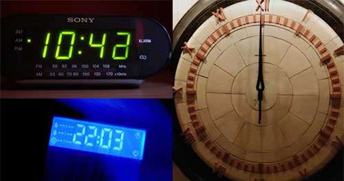
Analog displays are more aesthetically pleasing to most people. They aren’t quite as accurate, and people usually need an extra moment or two to tell the time, but they are generally nicer to look at.
Which clock above is best? Would you feel the same about either clock below if its display was digital?
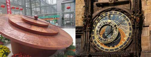
Rather than use “form follows function” as an inflexible rule, a better route would be to design our clock based on success criteria. If speed and accuracy are most important to the clock’s success, then a digital display would be best. If aesthetics are more important, then an analog display would be the better choice.
Success criteria, not function, should determine form.
How do you determine your success criteria? Ultimately, you have to define them yourself or ask your client to define them for the given project. Either way, they would likely do the following:
- Identify everyone with a stake in the project,
- Determine the goals of each stakeholder,
- Prioritize and harmonize those goals,
- Decide how success will be measured.
What will determine the success of our clock?
Is the clock that sells best the most successful? What if fewer clocks sales could bring greater profit? Who is the market for our clock? Is being able to tell the time at a quick glance more important to our target buyers than making a statement on their living room wall? How much are they willing to spend on a clock?
Looking within your own company, how will the clock affect your brand? Would you be proud to put your name on the clock? Are sales figures irrelevant because the clock will mainly serve to get people to buy your line of wrist watches.
Will your clock be mass produced, or is this a one-time project, like some of the clocks in the images above? If it’s one of a kind, who is to benefit from it? The client who commissioned it or the audience that will view it?
The answers to these and many more questions will be specific to the project. Ultimately, you have to determine the goals of your clock and how you will measure the success of those goals. What you come up with will lead you to your success criteria and design objectives. You could decide on an accurate digital clock for mass consumption or a work of art hanging in the terminal of a major railroad station.
Perhaps your clock will need to be both beautiful and accurate.
Beautiful Things Function Better
People spend more time with products that they find beautiful, and they claim they are easier to use. The products seem to function better because they are beautiful.
Human beings have an attractiveness bias; we perceive beautiful things as being better, regardless of whether they actually are better. All else being equal, we prefer beautiful things, and we believe beautiful things function better. As in nature, function can follow form.
Most marketers knows that our purchasing decisions are based primarily on emotion. We use logic to rationalize those decisions. We are emotional beings. Aesthetics influence our opinions of products, and we typically find aesthetically pleasing products to be more effective simply by virtue of their aesthetic appeal.
Steven P. Anderson speaks of the importance of aesthetics in design in his post on A List Apart, “In Defense of Eye Candy.” Drawing on an example in the book Emotional Design, he notes:
“Researchers in Japan set up two ATMs, ‘identical in function, the number of buttons, and how they worked.’ The only difference was that one machine’s buttons and screens were arranged more attractively than the other. In both Japan and Israel (where this study was repeated) researchers observed that subjects encountered fewer difficulties with the more attractive machine. The attractive machine actually worked better.”
Perhaps this can be explained by the “halo effect,” whereby we carry over previous judgements of certain products to future judgements of similar or related products. A beautiful product triggers positive emotions that inform your judgment of its usability. The product does not necessarily function better, but you perceive it as functioning better because of its looks.
You can define aesthetics in many ways, but it comes down to connecting thought, emotion and beauty. How something looks affects us emotionally and influences what we think about it.
If pure aesthetics influence our perception of a product’s functionality, if we’re willing to take an extra second to learn how to use things that we find beautiful, and if we think objects function better because they’re beautiful, then does form follow function or does function follow form?
Further Resources
The articles below deal more with the connection between aesthetics, emotion and usability.
- The Impact of Aesthetics on Attitudes Towards Websites
- Website Aesthetics: What Has It Got to Do With Usability?
- Usability, Aesthetics, Emotions and the User Experience (PDF)
- Aesthetics and Usability
Applying “Form Follows Function” to Web Design
What’s the function of a website? Does a website have a single function? The function of a blog is to communicate information. It might also be a means to deliver advertising or to generate leads to sell a service. An e-commerce website also communicates information. It also exists to sell products.
“Form follows function” might dictate that all e-commerce websites should look the same. But would you design a website for computer networking hardware and one for children’s toys to look exactly the same? Obviously not.
At the start of this post, I described the well-known scenario in which you gather requirements from a client and then proceed to design the website. Are those requirements “functions”? Some no doubt are. How many pages will the website have? Will the content need to be updated often? Is a shopping cart needed? What are the goals of the website in the context of the overall goals of the business?
If you’re asking merely for functional requirements, you aren’t asking the right questions. Better questions seek to define what success looks like for the website. Should the e-commerce website serve to generate leads to draw people into the physical store. Will all of those pages help drive sales, or are some plain fluff?
Define your success criteria first. Think of our clock example. Will success come from function or aesthetics. What would make your website successful? What is most critical to achieve that success.
The principle of “form follows function” assumes that objects exist because of their function. That’s simply not true. There could be any number of reasons why something exists, from chance to some broad aesthetic value and anything in between. An object can exist for reasons other than function.
Mother Ann Lee (1736–1784), founder of the Shaker movement in America, proposed another idea. “Every force evolves a form.” Dynamic forces shape eventual forms. These forces could be functional or could be aesthetic, spiritual, communal or random.
“Every force evolves a form” is a more useful guide for designers to follow:
“Function alone does not drive form. Form evolves from the holistic forces of the project—audience needs, client desires, ethical obligations, aesthetic inclinations, material properties, cultural presuppositions, and yes, functional requirements.“For working designers, “every force evolves a form” is a more useful rule. The design process actually begins with something that doesn’t yet exist but needs to exist, and it moves forward toward a formal result. Function alone doesn’t drive the resultant form. The form evolves from the holistic forces of the project—audience needs, client desires, ethical obligations, aesthetic inclinations, material properties, cultural presuppositions, and yes, functional requirements. “Function” is rightly seen as a single, isolated, quantifiable aspect of the overall “force” driving the form.”
Does all of the above mean that you should ignore “form follows function” completely? Not at all. Use the descriptive interpretation of “form follows function” as an aesthetic guide. Beauty often does come from function. A building should not look like a boat or a magazine. Each has a different function, and that function helps to define what makes it successful.
Objects with different functions should look different aesthetically.
However, don’t apply the prescriptive interpretation of “form follows function” as a design rule. Pure function may not be the most important factor of success. Focus on the relative importance of both form and function as based on your criteria for success when making design decisions. Balance form and function as needed, while letting success criteria guide your decisions.
Further Resources
The articles below take a balanced approach to “form follows function.” They regard form and function as working together, with both following the design’s objectives.
- Form Follows Function Revisited
- Form vs. Function: Finding the Balance
- Communicate Function with Form
- Form and Function in Design and Publishing
Examples
Google’s home page is little more than a search box. Over time, links have been added, but the page has clearly been designed around its primary function, which is search. The sparse design is likely a key factor in Google’s early success. Other search engines at the time did not have pages that communicated a single clear function.
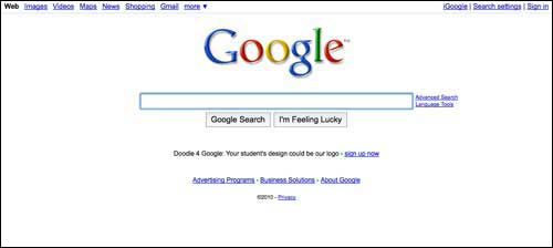
Function, no doubt, guided Google’s success criteria. The only thing the company wanted a visitor to do upon reaching the home page was to type a query in the box and click the “Search” button.
Craigslist
Craigslist is perhaps the poster child for subordinating form to function. Many think the website could use a redesign, but the Craigslist faithful see no reason to change. The website’s design, while not aesthetically pleasing, is functional.
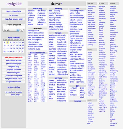
As with Google, Craigslist’s success was based on functional considerations. Beautiful it is not, but the website does work. It doesn’t take long for anyone who stumbles on the website to learn how to use it. Would aesthetic considerations have made the website easier to use and made Craigslist even more successful?
Tweetie
The Twitter application Tweetie lacks some features that other desktop and smart-phone Twitter apps include. Tweetie users claim not to care. The program has earned its loyal audience through its beautiful design. It does what it needs to do, and some functionality has been deliberately left out to stay true to the design objectives.
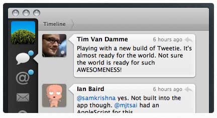
One of the early goals of Tweetie was to embrace the iPhone interface. It was built for people who already use Apple products and who appreciate aesthetics for the sake of aesthetics. Form in and of itself was an important success criterion.
USB Necklace
Most USB drives are essentially the same. Their functionality differs little from one drive to the next. Some hold more data, some transfer data faster, some include encryption and some are more rugged.
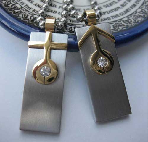
If you were to buy either of the USB necklaces above, would it be because of the specs? Or because of the function of the drive itself? It’s doubtful. You would likely have purchased it based on looks and your emotional response to it. You might glance at the specs to make sure the drive meets your minimum needs, but you would be using the specs to justify your emotional response to the aesthetics.
Summary
Does form follow function? Function certainly influences form in many designs, but does it have to? This post should have enough examples to show that function sometimes follows form.
“Form follows function” works well as an aesthetic guide. Many designers, me included, believe that beauty arises from functional considerations. Functionality is important to design, but it isn’t the only thing that should be considered.
Both function and form can guide design. More often, both follow something else. Ultimately, you need to define your criteria for success, from which the design will evolve.
Success criteria helps you determine the functionality needed in your website and the form it should take.


 Get a Free Trial

 JavaScript Form Builder — Create JSON-driven forms without coding.
 How To Measure UX and Design Impact, 8h video + UX training
 Devs love Storyblok - Learn why!

