The Dying Art Of Design
Taking a close look at the current state of design, we can see that sometimes modern design tools and processes do more harm than good. Please note that in preparing this article, we presented basic questions to designers, from beginner to expert, in an unscientific poll. Close to 600 designers participated.
You may also be interested in the following related posts:
- About Art – What Do We Really Mean
- Pop Art Is Alive: Classics and Modern Artworks
- Milton Glaser on Art & Design
- Eight Inspiring Stories Of ASCII Art
- Modern Art Movements To Inspire Your Logo Design
Draw Comics The Marvel Way
As a teenager, I loved comic books: the art, the stories, the super-powers I wished I had. I remember the point when I went from reading and enjoying comics to wanting to create them. I became obsessed with being able to draw exactly like the great comic book artists of that time, people like Jim Lee. Taking books like How to Draw Comics the Marvel Way out of the library was like having the artists themselves sitting next to me, showing me the way. Many designers can relate to this, because today through blogs and Twitter we can follow those whom we consider to be the best designers in the world, learning what they read and where they go and maybe even getting a glimpse of how they create the work we so admire.
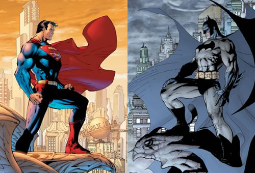
Batman and Superman, drawn by Jim Lee.
This “how to” approach is reflected in the design resources we find today. Soon after a certain style or effect becomes popular, tutorials and other tools to create it become available. But the element that was missing from my “how to” books is the same element that is missing from these tutorials, lists, and galleries: “why.” Why did they choose that typeface? Why did they opt for a minimalist style? Why did they use that particular technique to spotlight the product? We can go through the motions of creating a design, but we really need to understand why it works. As we’ll see, certain historical developments offer additional insight.
Imitation And The Cargo Cults
What is original? More to the point, is anything original? Defining originality in design is one of those complex gray areas. This subject has sparked ongoing debate about what is inspired and what is blatantly copied. Last year, Jeff Veen gave a talk that showed how the cargo cults of the World War II era relate to this discussion about design today.
During the war, islands in the Pacific region were key tactical locations in the battle between the US and Japan. The two countries began to air-drop food, weapons, medicine and other supplies there. Some of these supplies were shared with the indigenous people who lived on the islands. When the war ended and the air bases were abandoned, the cargo stopped dropping.
Cults sprouted up that enacted rituals imitating what they saw the soldiers do, believing this would bless them with supplies. They even constructed air strips, bamboo control towers and straw planes, all in the hope of bringing back the airplanes with their bountiful cargo. The reason this copying didn’t work, Jeff Veen points out, is that they missed all of the underlying principles.

Straw plane made by a cargo cult of the South Pacific.
We can see modern-day examples of this by comparing the iPhone to the subsequent copycat phones that failed by only mimicking what their designers thought made the iPhone a success. Simple imitation completely misses the point of what made the original great. Some phone makers, including HTC, wound up being sued by Apple for patent infringement. This goes back to how we use the design tools and learning resources available to us. There needs to be an element of intention and a deeper understanding first.
The Modern Designer
The Designer’s Diet
The diet of a typical designer is low in in-depth content and high in inspirational lists, tutorials and freebies. A review of blogs and our poll of design professionals shows a clear trend in the informational diet of creatives. They consume a lot but bypass a deeper understanding of design. In-depth articles and case studies are the least-read articles. Over 75% of the articles that designers read are either design tutorials or inspirational lists.
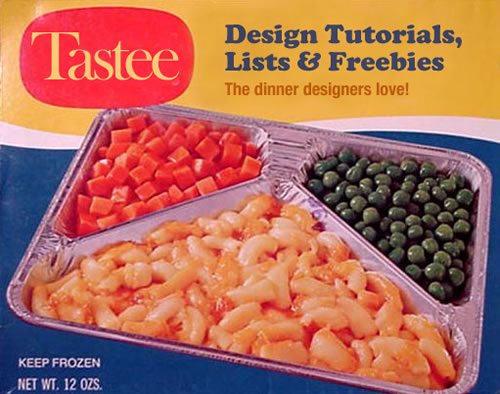
Designers feel most comfortable starting their latest project by sifting through inspirational lists and working in their favorite computer application (Photoshop was used by our poll respondents more than all other software combined). And what about those freebies? Designers devour them for their projects. In fact, they said they use freebies more than client-provided, stock or original assets. To be fair, this is likely because these types of articles and tools are highly visible online, but this is still a bit daunting to hear. This content would not exist without such a big audience.
Tutorials Should Foster Thinking
On nearly every design blog right now, you can find some sort of design tutorial. They range from useful techniques to borderline useless “how-to”s. The problem isn’t just the tutorials themselves or their perceived usefulness; it’s how they are positioned relative to design. These tutorials are not “design” tutorials; they are, more accurately, tool tutorials.
This may seem a negligible difference to some. The problem with the former label is that it implies, falsely, that you are learning to design. If someone follows certain steps in creating an effect, that is learning how to use a particular software application. “Design” has many definitions, and every designer will give you a different one. But I think most designers can agree on what design is not. And it is not a 10-step recipe for creating a “Super-Awesome Laser Beam Effect.”

Online tutorials focus so much on the tools that many designers are learning to use the software well but are losing fundamental design skills. In his article “Don’t Be a Tooler,” Von Glitscha talks about how the craft of design is being watered down and skills like drawing are being forgotten. Many designers have traded in the pencil for the pen tool. He says, “Too many designers look for the easy way out when it comes to a creative process, and that is problematic to their creative growth. Instead of bolstering a core skill like drawing, they pursue a path of least creative resistance, and the end result is a Tooler.”
The focus on trendy effects encourages cargo cult-like ritual in which designers mimic a technique without understanding what makes it suitable for a project. A Photoshop filter or gallery feature becomes the driver and turns a design into a meaningless visual layer. This reflect poorly on the industry, showing designers as being proficient with design applications and resources but not design itself.
Ingredients of Good Design
Good design is the result of great thinking, as well as great ingredients. Typical ingredients are compelling photography and strong content. The job of the designer, as a sort of master chef, is to measure, blend and cook these elements into a successful project. Where do these ingredients come from, and just how good are they? Some elements come from clients, some are original work, and others come from stock vendors like iStockPhoto and Veer. But the majority of ingredients come as freebies. Free WordPress themes abound. One can download thousands of textures, graphics and social icons to use in their next project.

Burger Chef customer service promotional photo, 1960s (via bayswater97).
Using cheap or free design elements is like a five-star chef using canned sauces and pre-made dishes in the spirit of a fast-food restaurant. Creating from scratch seems to be a thing of the past. Photo shoots and original illustration are now usually done only by agencies that work for big clients with deep pockets.
Certainly, factors outside of the designer’s control will affect these decisions, such as budget. But the price of using only cheap or free assets is that designs will increasingly look like replicas of each other. In addition, clients will come to expect assets for free or next to nothing, so budgets will not be there for future projects.
There are even risks with using paid assets such as stock photography. A photo could be used by another company for another purpose, thus diluting your client’s brand. Granted, not every client can afford a certain caliber work. Time and money are often a luxury. Many designers openly use freebie art and pre-designed WordPress themes for clients to save time and money. The question is not whether this is right or wrong. This is up to the designer to disclose to the client. The question is is this making the craft of design more efficient, or is it killing it?
Harmful to Your Design Health
Dependance on resources such as freebies and tutorials is turning our design industry into an assembly line that churns out the same exact piece, with perhaps slight variation. Design is not a commodity, but the more that designers use freebies and the like, the more it will become one. The Web is just a large copy machine, as Kevin Kelley puts it. Design seems to be going down this road, too. Even our information resources—the design blogs themselves—are clones of each other.

“When copies are super abundant, they become worthless. When copies are super abundant, stuff which can’t be copied becomes scarce and valuable.”
— Kevin Kelly (Image: Ibeamee)
No wonder many clients see the designer’s role as being to create eye candy or a beautiful “skin.” With this view prevalent, designers will never be considered people who can solve problems for businesses and their customers and who can effectively communicate ideas. We will simply be a mindless pair of hands that knows how to apply some trendy colors and glossy effects to make things look nice. A technique with no purpose makes a design irrelevant. If design becomes irrelevant, then at some point we may be, too.
Return to the Art of Design
The solution is not to never read this type of content or to use these assets, but it needs to be measured. Designers need to push themselves with the fundamental craft of design.
Inspiration Requires Perspiration
Remember when special effects in movies were real? When the stunt man actually jumped onto a moving car? When characters ran around a luscious green jungle in South America, not in front of a flat green screen in a warehouse in Los Angeles? Computer technology has become integral to the creative workflow. It definitely has benefits; but the problem is that the “should we” has crept into “we can, so we will.” Many shallow stories are built around amazing effects, as opposed to engaging stories being supported by technology. In design, the “story” is communication and problem-solving. We need good reasons to use the techniques and graphics that we use in our designs.
I’ve seen posts in forums from designers looking for great paper textures or certain free graphics. What about finding a real piece of paper, scanning it and creating your own texture? Or sketching a graphic element and importing it to the computer to create your own unique piece of art? Sometimes we need to get our hands dirty. In the end, it will give us a new appreciation of the work, and we will be proud of the result. It doesn’t always work out because of time or budget constraints, but make sure the decision is based on those and not laziness.
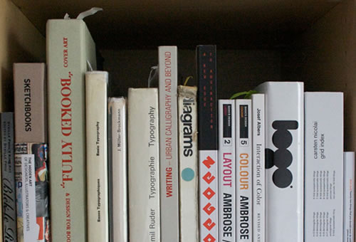
(Image by jamiecoull)
Reading a quick article online or scanning a few nice websites is easy. More difficult is digging deep in a book or finding the time and money to attend a conference. Plenty of books and offline resources have great information on design. A little research is all it takes to find plenty of libraries and universities with good graphic design programs in all parts of the world. Great design takes more effort than a few clicks.
Build Skills With Purpose
Practicing and honing skills are vital to growth. Knowing the ins and outs of our software is an important part of the job, too. Thinking conceptually and devising solutions should come first, though. If a designer finds that he needs to brush up on a tool or technique, then a tutorial is the ideal way to learn. Our tools and resources are a means to good design, not the end. Identify the purpose first. The purpose might relate to the website’s user experience or a message in a product advertisement. After you’ve determined the purpose, find the best tool or technique to support it.
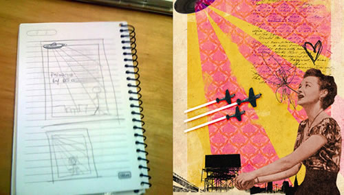
From the article “The Role of Sketching in the Design Process.”
Designers are more comfortable with their favorite design application than with good old pen and paper. Sketching is about getting ideas out and finding the best solution on which to iterate. Some sketchbooks of designers are so beautiful that they are almost intimidating. But great drawing skill doesn’t make the thinking or result any better. And some of that skill is gained with practice. The point, though, is to focus not on how great the sketch looks but on how sound the concept or user experience is. On the computer, we focus too much on getting the lines and colors just right, which ends up distracting us. Buy a pencil and paper: it’s cheaper than any application you’ll find.
Train Your Design Brain
Boxing is one of the most brutal sports. Learning techniques and conditioning the body is critical to being able to compete. But even boxing has more to it than the aggressive physical displays that the audience sees from the seats. Some of the greatest boxers, like Muhammad Ali, recognized this balance; they were great not just at knocking out opponents but at out-thinking them, too. Mike Rooney, a former boxing trainer of Mike Tyson, says, “Boxing is 80% mental and 20% physical. Anyone can get in physical shape.”
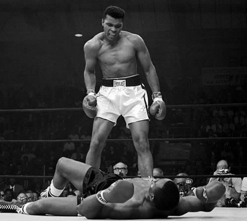
Muhammad Ali versus Sonny Liston (1965), by Neil Leifer.
Design is similar in that anyone can imitate or find free assets that make for pleasing visuals. To be great designers, we need to improve our mental game. We have many ways to get our minds in shape to be the best tool in our arsenal. When we get in the ring with the client, we need to be ready to take some punches. We also need to be trained and armed with the fundamentals so that we can help clients understand that we’re not just sharing our feelings or loose opinions but that we have sound reasons behind our design choices.
If you don’t understand or can’t explain fundamental design principles such as negative (or white) space, balance and contrast, how do you expect to consult with a client on the best approach for a project? The website design industry is great, and many designers are self-taught. They don’t need certification to ply their trade, and they aren’t required to continue their education, as in other professions. But this is also a disadvantage, because anyone without training or understanding can call himself a designer. A deeper understanding or a degree in design (or a related field) can make all the difference.
Great Design Is History
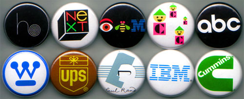
(Image: Paul Rand)
Design began like any craft: people practiced it, studied it and challenged themselves. While modern design tools and resources certainly make our many tasks easier, they don’t always improve our work. Tools and shortcuts are temporary. Great design is timeless. The best tool available is sitting in our heads; we just need to upgrade it once in a while. Training and experience leads to solid solutions and happy clients who demand our expertise.
We determine the type of information made available to us. Every click (and tweet) can be a vote for a better and smarter design community. Please choose wisely.
Resources
- Great Designers Steal, by Jeff Veen
- Don’t Be a Tooler, by Von Glitschka
- The Role of Sketching in the Design Process, by Sean Hodge
- Contrast and Meaning, by Andy Rutledge


 JavaScript Form Builder — Create JSON-driven forms without coding.

 Devs love Storyblok - Learn why!
 Get a Free Trial
 Register For Free

