What If Oscars Were Given To Movie Websites?
Most modern movie websites are built in Flash, even when it’s totally unjustified. The websites often lack usability standards and require users to click through splash pages and introductions in order to access content. They have the luxury of being able to neglect common principles and standards because they garner attention merely by their association with the movies they promote. Let’s suppose, though, that these developers got their own Palmes d’Ors, Oscars and Bears. Wouldn’t this be strong motivation to create outstanding and usable websites?
You may also want to check out the following Smashing Magazine articles:
- Movie Website Designs: Examples And Current Practices
- 30 Unforgettable Movie Opening Sequences
- 50 Beautiful Movie Posters
- 40 Exquisite Independent Film Posters
In this post, we imagine Oscars being given to both movies and their websites. This is, of course, not a new award from Smashing Magazine and far less an attempt to assume the right and honor of the Academy of Motion Picture Arts and Sciences. It’s just a fun way to observe the latest trends in movie website design and to showcase the best websites of the 2009 blockbusters, as well as recent and upcoming movies.
Nomination: Graphics
This is perhaps the most prestigious category in our virtual ceremony. It refers to the way a design uses photos, illustrations and graphic elements to create a pleasing and memorable visual experience.
The Nominees Are…
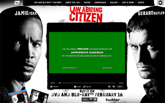
Law Abiding Citizen For its use of bold and expressive photos.
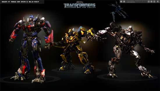
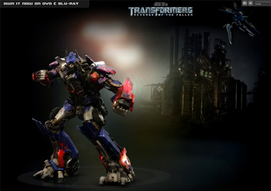
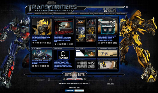
Transformers For the Transformers models (of course).
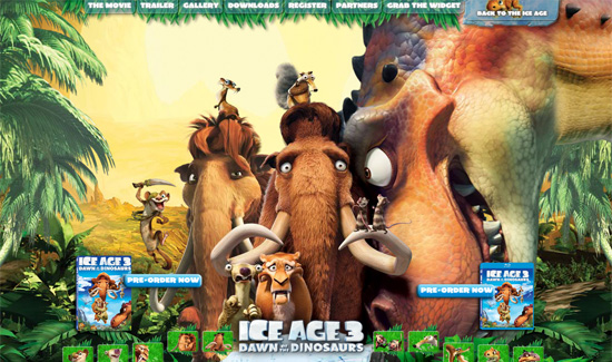
Ice Age 3: Dawn of the Dinosaurs (UK official website) For the icy illustrations.
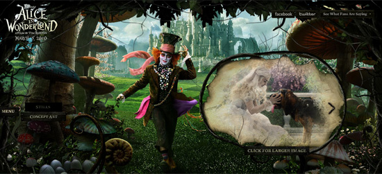
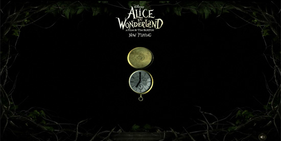
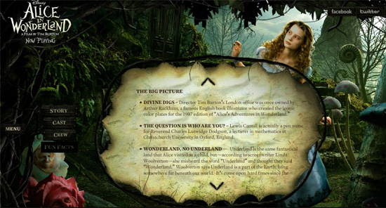
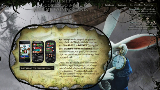
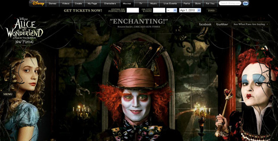
Alice in Wonderland For achieving wonders with illustration and photo manipulation.
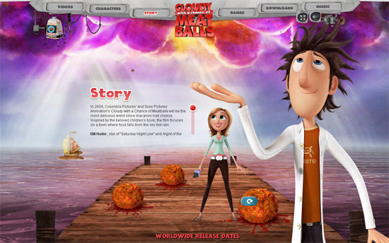
Cloudy With a Chance of Meatballs For the tasty illustrations and delicious little elements in the design.
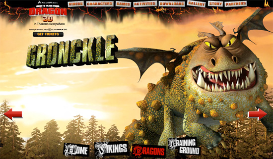
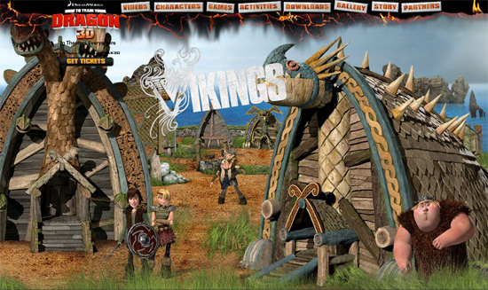
How to Train Your Dragon For some red-hot graphics.
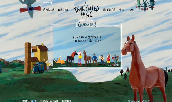
A Town Called Panic For the funky plasticine illustrations.
And the Winner Is…
The attention to detail on the Alice in Wonderland website is impressive. A seamless combination of digital illustrations and photographs and plenty of small Wonderland-style graphic elements makes this design eye candy.
Nomination: Interactivity
Many movie websites, especially ones for animated movies and action blockbusters, rely on interactive elements to engage visitors. The following websites of popular movies from 2009 deliver a solid interactive experience and are deserving nominees.
The Nominees Are…
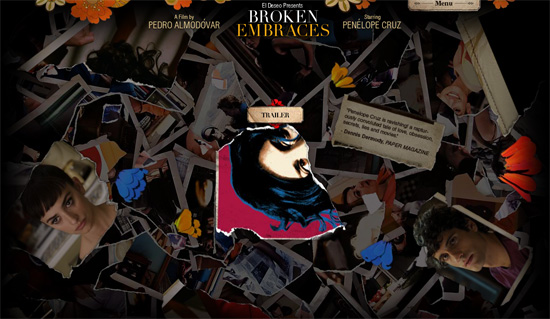
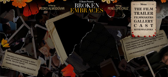
Broken Embraces For the beautifully executed stack of torn photos, which serves as the navigation menu.
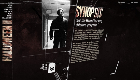
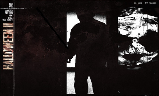
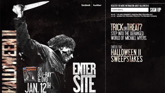
Halloween 2 For the terrific (and terrifying) 3-D elements.
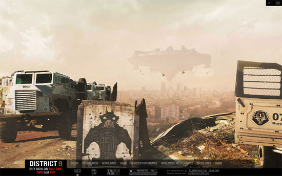
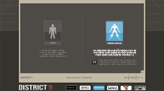
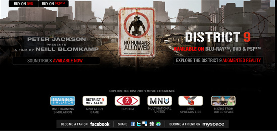
District 9 For the interactive panoramic views of District 9.
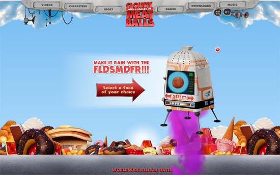
Cloudy With a Chance of Meatballs For the customizable food rain and lively characters.
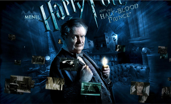
Harry Potter and the Half-Blood Prince For the magical image gallery.
And the Winner Is…
The website for Cloudy With a Chance of Meatballs is a joy to explore, mainly because of its interactive features.
Nomination: Dynamic Effects
Movie websites have invariably included at least one trailer on the home page or on a splash page. The trailer usually plays automatically. But a growing trend is to use clips from the movie as a pre-loader or background. In doing so, film websites typically employ Flash animation and motion graphics for maximum visual impact. The following websites feature some excellent dynamic effects of various types.
The Nominees Are…
Halloween 2 For the spooky and shimmering video clips.
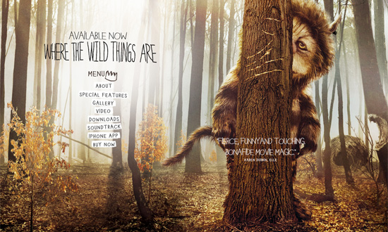
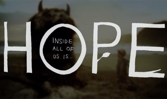
Where the Wild Things Are For the beautiful and organically integrated video.
Transformers For the animated Transformers (showing actual transformations would have been better, though).
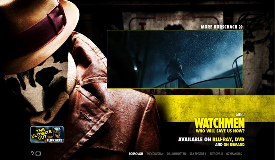
Watchmen For the incredible dynamic effects.
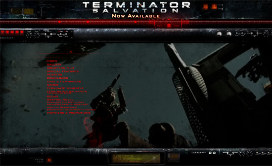
Terminator Salvation For the well-styled video stream.
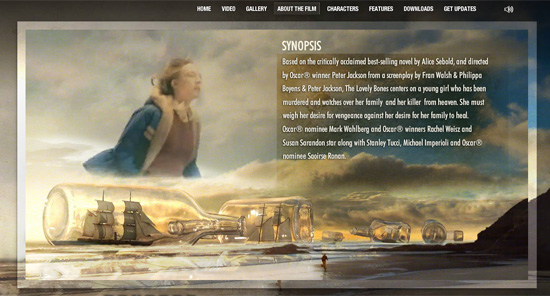
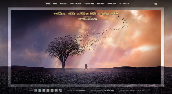
Lovely Bones For the seamless combination of video fragments and images.
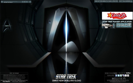
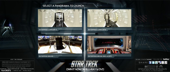
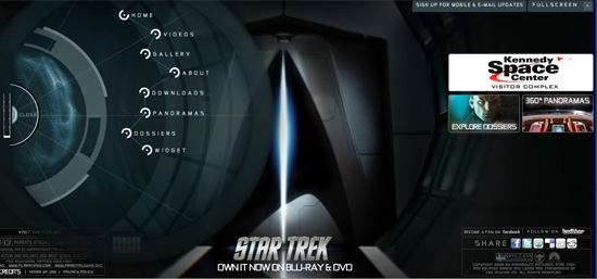
Star Trek For the fantastic transition effects.
And the Winner Is…
The navigation on Star Trek’s official website simulates the experience of walking around the spaceship. This effect is excellently implemented and takes the visitor deep into the movie’s atmosphere.
Nomination: Harmony With Movie
Movie websites are of course all about the movies they promote. But screenshots, trailers, photos and images alone may be not enough to convey the atmosphere of a film. A lot more can by done by weaving the story and concept in with the design elements. Each website showcased below does a great job of recreating its movie’s feel and drawing visitors in.
The Nominees Are…
Alice in Wonderland For the gallymogger details throughout the design.
Star Trek For the great use of space-themed material, which everyone loves.
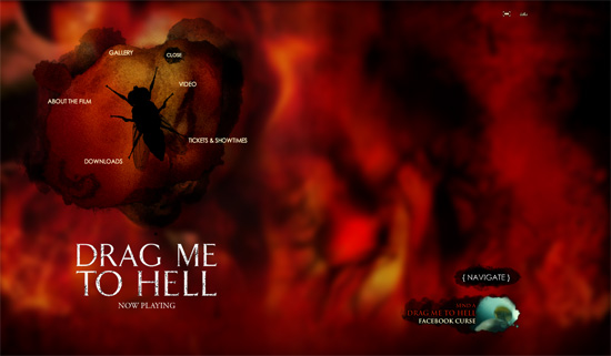
Drag Me to Hell For the shiver-inducing fly animation.
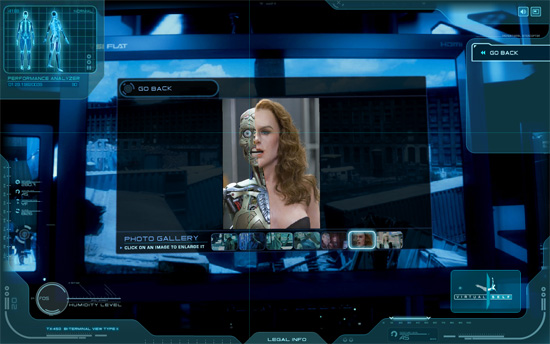
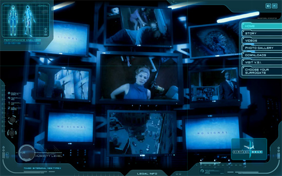
Surrogates For the futuristic robot features.
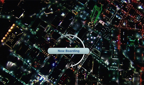
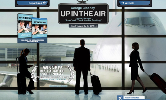
Up in the Air For the nifty airplane-style elements and icons.
District 9 For the great use of alien-themed material.
And the Winner Is…
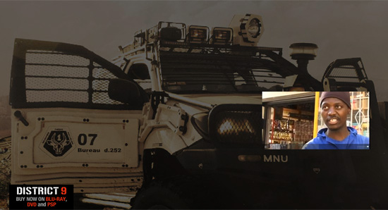
Our virtual Oscar goes to District 9. The movie’s dismal atmosphere is communicated well on all of the website’s pages. In fact, District 9 offers six distinct “experiences” apart from the official website. Features include interactive panoramic images, stylized graphics and video clips, as well as separate pages for humans and aliens (being faithful to the movie’s spirit).
Nomination: Best Exclusive Content
Thousands of online resources and databases are available where users can find out information about past, current and upcoming movies, watch trailers and book tickets. So, exclusive content is a kind of trump card for official movie websites. Without it, the websites are almost useless. Still, many studios continue to offer a minimum of content, such as trailer, screenshots, synopsis and a couple of posters for downloading. By contrast, all of the nominees for our Best Exclusive Content award offer treats for even the most fastidious of movie fans.
The Nominees Are…
Alice in Wonderland For the fun facts about the movie.
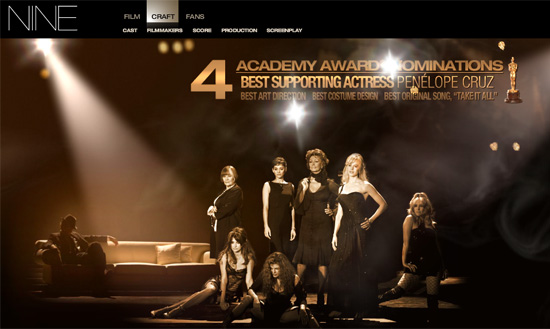
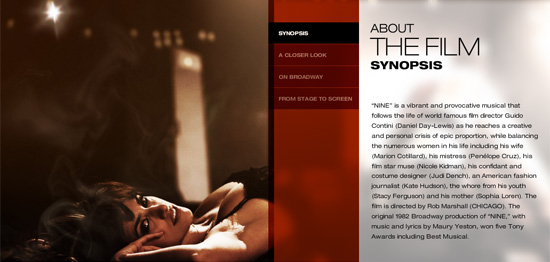
Nine For the screenplay, which is available in PDF format.
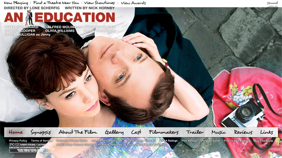
An Education For the extensive information about the film.
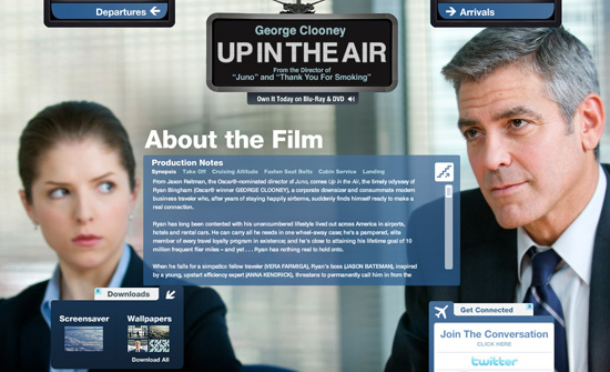
Up in the Air For the precise “departure” and “landing” info.
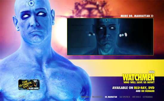
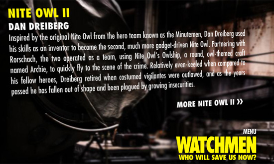
Watchmen For the incredible character profiles.
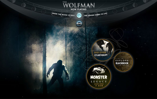
The Wolfman For the fascinating insight into werewolf legends and mystery.
And the Winner Is…
Besides its comprehensive overview of the movie and a number of videos and photos, The Wolfman website offers a good amount of information in the Features section about the mysterious events depicted in the movie and the horror legacy of Universal Studios. Both the content and presentation are wonderful.
Nomination: Typography
Typography greatly affects the user experience. Everyone loves beautiful typography, and we just couldn’t leave this element out of our categories. In most cases, a movie website’s attention to typography amounts to choosing an appropriate font family. On some websites, though, you’ll find some really nice work with styling and arranging.
The Nominees Are…
Watchmen
Where the Wild Things Are
And the Winner Is…
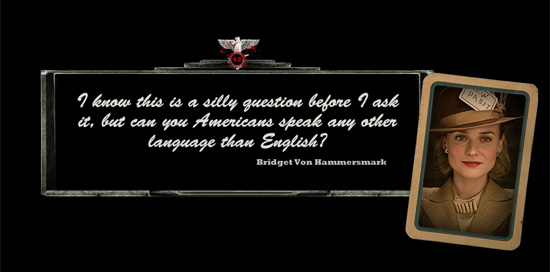
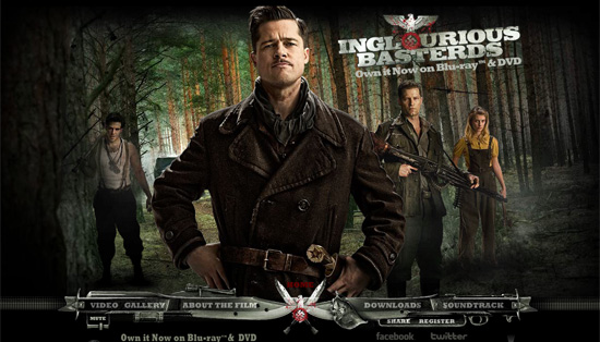
The Inglourious Basterds website is practically the only design here that expands the work of the film’s art through typography. Both the selection and arrangement of type here evoke the spirit of the film and make the website easy and enjoyable to read.
Nomination: Fun Games
Games, fan kits and other activities of the sort can be found on movie websites from various genres, from family comedy to horror. This entertainment engages visitors, in turn further promoting the film. Truly unique and engaging activities have made it into this category.
The Nominees Are…
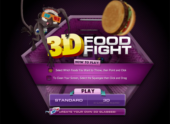
Cloudy With a Chance of Meatballs For its five ways to play with food, one of which is in 3-D!
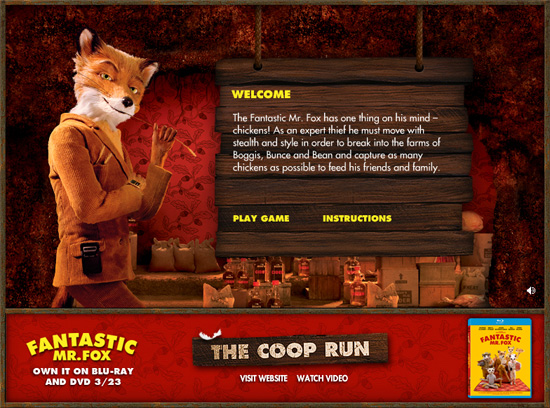
Fantastic Mr. Fox For the lovely game interface design.
Transformers For the fan kit and fan art sections.
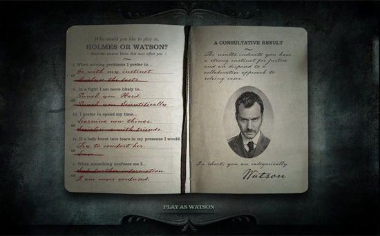
Sherlock Holmes For the clever test of deduction.
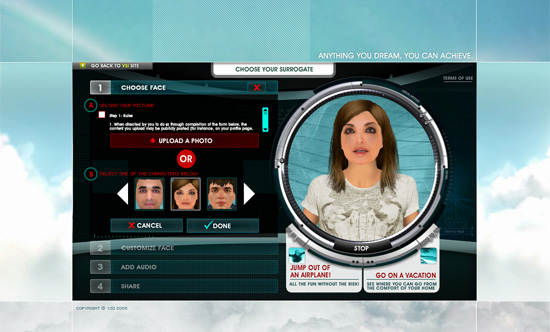
Surrogates For the virtual surrogate creator.
District 9 For the “non-human” support.
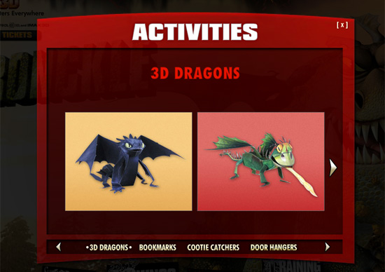
How to Train Your Dragon For its wide range of craft activities.
Avatar For letting you create your own avatar (not as beautiful as the movie’s, though).
And the Winner Is…
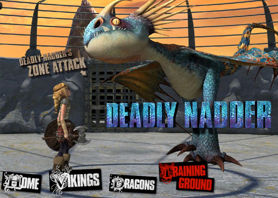
The website for How To Train Your Dragon offers seven online games and fifteen activities to print out and play. Good enjoyment for the whole family.
Nomination: Cross-Media Interaction
The increasingly popular mobile Web and social networks just can’t be ignored by movie companies. Many movies are represented on Twitter, Facebook and other social networks and bookmarking services. Many movie websites have social media panels and widgets that let users get updates and share information about the movies on their own websites and social network pages.
iPhone and iPod apps have become common promotional tools as well. Some movies even have community websites that bring people together around certain topics discussed in a film. The deepest and most versatile social media integration is exemplified by the following websites.
The Nominees Are…
Alice in Wonderland For the wonderful mobile applications.
Star Trek For the complete collection of social network links.
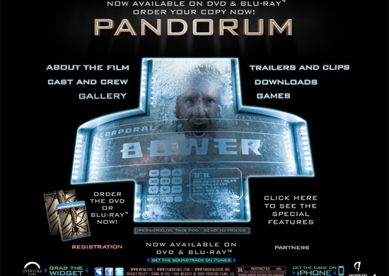
Pandorum For the deep media interaction (widget, social networks, iPhone game, etc.).
District 9 For the earthling and non-human communities.
Avatar For providing numerous ways to spread word about the movie.
![]()
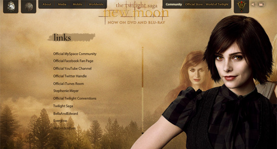
The Twilight Saga: New Moon For attending to all kinds of Twilight fans (take the TwilightMOMs community for instance!).
And the Winner Is…
With 5 official streams on major social networks, over 15 community websites and 4 items in the App Store, The Twilight Saga: New Moon is the clear winner in this category.
Nomination: Best HTML Website
Many movie websites use Flash when HTML, CSS and a couple of good JavaScript effects would do. The four websites below break from this convention and prove that good movie website design does not necessarily have to include Flash.
And the Winner Is…
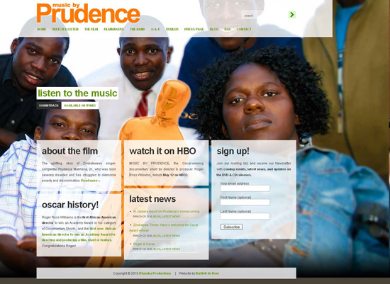
The website for Music By Prudence fully deserves this award. The website was created by New-York based design duet Bartlett de Boer, which explains the idea for this design this way: “Together with our client, we decided on a Flash-like site, to be supported by WordPress’ content management system. We combined bold typography, huge background images and a smart jQuery application that creates a dynamic effect, presenting all the info in semi-transparent sections. This was one of the most exciting projects we’ve worked on so far.” No doubt, the Music By Prudence website is a credit to Matt Mulleneweg’s brainchild, WordPress, too.
Nomination: Best Flash Website
Movie websites usually contain a massive amount of media content, which is why Flash is the most popular platform on which to build them. While many websites either overuse animations and dynamic effects or don’t justify their use of Flash at all, some Flash movie websites deliver attractive, entertaining and informative experiences quite well. Below are six movie websites that are worthy of our imaginary Best Flash Website Oscar.
The Nominees Are…
Surrogates
Up in the Air
And the Winner Is…
Inglourious Basterds! An attention to detail at all levels of the website, nifty yet unobtrusive effects and plenty of information make this Flash movie website stand out gloriously from the others.
Red Carpet Stars
Some movie websites that did not win our imaginary Oscars are still worth being showcased. Most of these, though not all, are done in a minimalist style, containing some basic information and a minimum of Flash effects. They are quite easy to navigate and their interfaces are visually appealing. Despite not being nominated here, they deserve some serious Hollywood buzz.
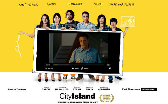
City Island A lovely combination of photographs and sketches makes the website for City Island special.
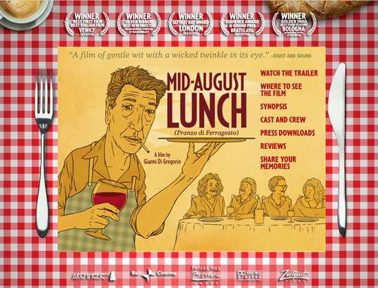
Mid-August Lunch This is more an interactive movie poster than a website. The page contains practically no information about the film itself, referring visitors instead to the studio website. Still, it features an original theme that we just couldn’t pass up.
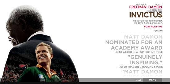
Invictus Like the films of maestro Clint Eastwood’s oeuvre, the website for Invictus tries to show the present through the prism of timeless values. How else to explain the use of Flash for this elegant and contemporary design, which could have been done with plain HTML and jQuery?
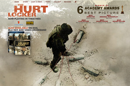
The Hurt Locker Grungy typeface, sandy colors and good still images make this website a worthy online counterpart to the movie.
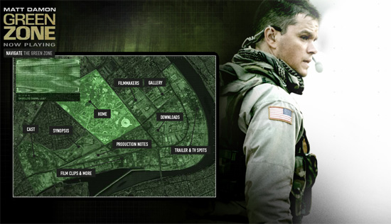
Green Zone Some really great styling in the navigation menu.
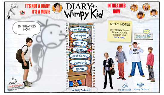
Diary of a Wimpy Kid Funny cartoons and a graph paper texture contribute to the theme for this movie website.
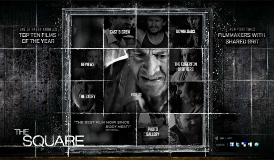
The Square The content here is contained in a stylized grid, which doesn’t in the least impair readability and usability. Dark colors and bold grungy textures make for a true “website noir.”
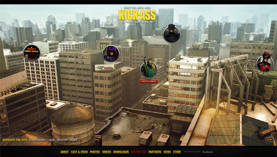
Kick-Ass Plenty of games are integrated smoothly in the content here, resulting in a kick-ass movie website!
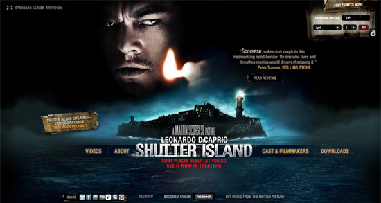
Shutter Island The website for this brilliant movie is another black pearl in our collection. The focus here is on the dark island landscape, complemented by little polished details.
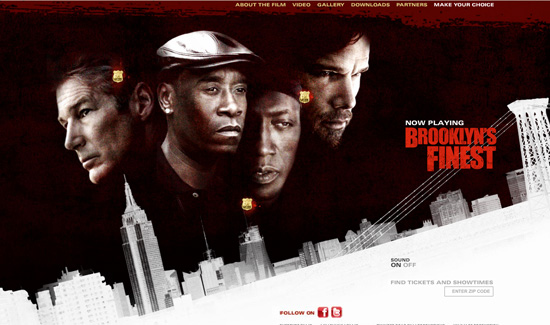
Brooklyn’s Finest This is one of the few websites that have a good splash page. Overall, the website for Brooklyn’s Finest has some great photos and unobtrusive Flash effects. The city line shown as a film negative is the cherry on top.
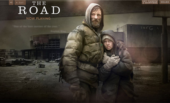
The Road The website for this impressive film, based on the Pulitzer prize-winning novel by Cormac McCarthy, is lean as can be. The minimalist design builds mainly on still images from the movie. The quotes from the novel that appear while the page loads (an feature also seen on the Inglourious Basterds website) contributes to this information-rich website.
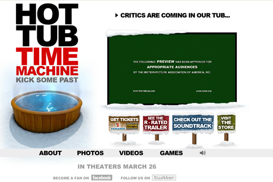
Hot Tub Time Machine The headshots that appear when you mouse over the menu items would make anyone smile. The short introduction is a nice touch, too. The Hot Tub Time Machine website certainly won’t leave you cold.
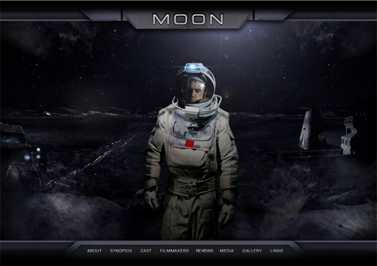
Moon This website is notable for its atmospheric, pseudo-3D background images. The graphics are enriched by transparent elements with frames that mimic a plating effect.
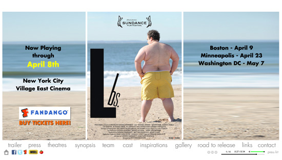
Lbs. This website has what you could call a camouflage design: it looks like pure HTML but is fully Flash. But don’t let that annoy you. The website loads relatively quickly and is easy to use. Also, the panorama on the main page is adorable.
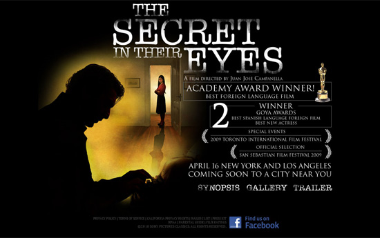
The Secret in Their Eyes When the subject matter is secrets, a dark laconic design is the way to go.
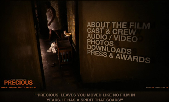
Precious The website for the Oscar-winning film (really!) Precious shows great use of video to get visitors involved in the story.
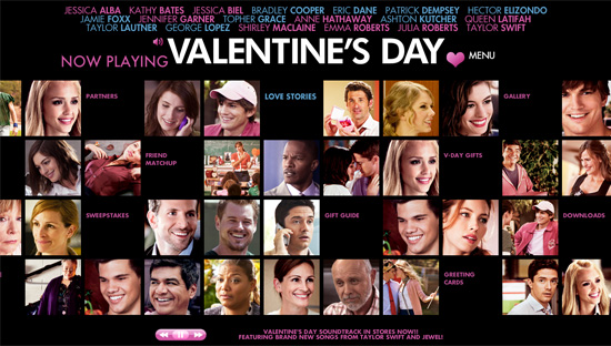
Valentine’s Day The website for Valentine’s Day has a social network-ish look and feel, mainly because the background photos look like the profile pictures on a social network.
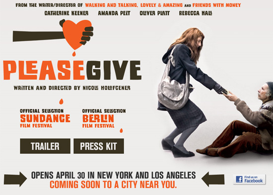
Please Give Although this is only a “Coming soon” page, showing a trailer, press notes and a Facebook link, the typography merits its inclusion on this list.


 JavaScript Form Builder — Create JSON-driven forms without coding.
 Enterprise UX Masterclass, with Marko Dugonjic
 Register For Free
 Devs love Storyblok - Learn why!