Symmetry: A Balancing Act In Two (Or More) Parts
Symmetry is the ordering principle in nature that represents the center of balance between two or more opposing sides. As a fundamental design principle, it permeates everything: from man-made architecture to natural crystalline formations. In nature, symmetry exists with such precision and beauty that we can’t help but attribute it to intelligence–such equal proportions and organization would seem to be created only on purpose. Consequently, humans have borrowed this principle for its most iconic creations and symbols.

There are several types of symmetry, but the most basic are translation, reflection and rotational. Each of them has specific and practical expressions in nature, and each can be used to communicate intuitive principles when appropriately and subtly integrated in a design. As a simple aesthetic, these opposites that work together can add visual appeal.
Please consider reading our related articles:
- Applying Divine Proportion To Your Web Designs
- The Organic Ambigram
- Effective Logo Design, Part 3: How Geometry Influences Logo Design
Translation Symmetry
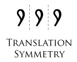
In its simplest form, symmetry is a repeating pattern of identical elements that are equally spaced out along a line. This is called translation symmetry. It is commonly used as a border to hold more complex patterns “in line” on a two-dimensional space. In architecture, it is used for three-dimensional support by distributing weight evenly across load-bearing beams and columns.
Translation symmetry is also found in the basic notion of reproduction, by which a “lineage” is created by one generation inheriting the previous generation’s characteristics. For example, a row of corn kernels contains genetic information for successive crops, and a pure-bred animal contains specially cultivated traits that will be passed down its line.


To take an example from graphic design, translation symmetry has been used to good effect by the PBS network. PBS focuses on multi-generational and multi-cultural educational programming, delivered in an objective style. The repeating human face in its logo, alternating progressively from black to white and black again, visually conveys this purpose very well.
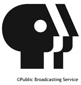
The repeated visual is an effective way for the PBS to represent its balanced programming and to show its equal consideration of the ethnic, age and gender diversity in its audience. The US Department of Health and Human Services also uses a form of translation symmetry. Not as linear as PBS’, this one gradually morphs from people into an eagle, transforming the US population into the country’s primary symbol.

Think about what these logos accomplish. These public messages emphasize equality and unity. Individually, we may stand alone, but as a group, we are essentially the same. Translation symmetry is a visually subtle way to convey this message. How many examples of translation symmetry can you find in identity design? It’s not as common as the other symmetries explored here because it is perhaps not quite as engaging. Is there a reason why this symmetry was chosen by these particular organizations? Bear in mind, too, that these kinds of design choices are often made at an unconscious level by the designer.
Reflection Symmetry
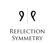
More complex than translation symmetry is reflection symmetry, a fundamental trait of all moving creatures. This symmetry involves coordinated two-sided movement, representing a higher order of symmetry.
The beginning of life itself exhibits this symmetry. After fertilization, an egg splits in half and begins the process of billions of subsequent divisions, resulting in the mirrored symmetry of a bilateral body. Most bodies of animals are bilateral along a mirrored line (i.e. the same on both sides when split down the middle). Whether flying, swimming, crawling or walking, animals must have appendages of equal proportion on both sides if they are to have reliable and balanced movement through space.


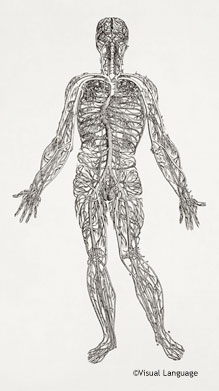
A little over 90% of people are born right-handed, regardless of culture, writing preference and racial or linguistic qualities. Why would nature choose the right hand over the left repeatedly for the human species? Language—the most important human attribute because it allows us to communicate across generations and cultures, thus increasing the likelihood of survival—resides in the left hemisphere of the brain, which controls the right side of our body. Most people who can use both hands with facility, called ambidextrous, are self-trained (and often culturally trained).
Being left-handed has never been popular, and left-handed people learn to use both hands. An even smaller proportion—perhaps 1%—are born innately ambidexterous. However rare, some of the most brilliant minds we’ve known were born with this ability: Leonardo da Vinci, Albert Einstein, Dutch artist Maurits Escher and Benjamin Franklin.
Their ability to balance creative invention with practical execution changed the perceptions of entire cultures. And they did it not over generations (as is characteristic of most radical new ideas) but in their own lifetimes. Did their innate ability to bridge opposites give them the dexterity to change protocol?
Speaking of language, most of the upper-case letterforms in the English alphabet have reflection symmetry along either their vertical or horizontal axis. Can you find the letters that exhibit this symmetry? (Hint: all but nine are symmetrical.)
A B C D E F G H I J K L M N O P Q R S T U V W X Y Z
Here’s a fun trick: take one of my favorite words, “CHOICE.” Print it out on a piece of paper, and fold it horizontally down the middle of the word. Hold it up to a mirror, and you’ll see the “either/or” propensity of the human species that separates us from all others. You can also do this in a vector program such as Illustrator or Freehand by cutting away half of the word and horizontally reflecting the remaining half.
This is similar in concept to a logo I designed using mirror symmetry for a client named Body Wisdom. You can see how this kind of symmetry would link the name and idea: the hands represent body work, and “wisdom” is implied by the owl’s face that this particular configuration of horizontal line symmetry created. This principle made for a memorable symbol that balanced the functional aspect of the name with its visual representation.
Rotational Symmetry
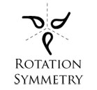
Rotational symmetry involves a central point around which an image is rotated in equal degrees without distortion or change. By rotating the image evenly around the circle (remember, that’s 360°), you can create two, three, four or more rotational symmetries. For instance, the Aerosmith logotype below displays two-point rotational symmetry (or two identical elements turned 180° degrees).

The Mercedes Benz logo has a three-point (or 120°) symmetry.

And the Sun Microsystems logotype has four-point symmetry (or 90° rotation) of four identical elements. The higher the number of rotations, the simpler the element must be for it to work.

In nature, symmetry is essential to life insofar as movement is dependent on form. And we recognize the importance of this principle in architecture, physics, art and visual design. We derive meaning by relating form to function, and symmetry creates this meaning. We incline in our designs towards this balance that we see in nature.
Applying this principle to our own designs is eminently practical in whatever field, because it employs a universally pleasing ratio that anyone can relate to. In consciously using this principle, we also draw closer to nature, thus imbuing our own designs with usefulness and intuitive logic.
Symmetry is an excellent principle on which to base a logo or a poster—any project, in fact, that is restricted by time or space and that has to resonate deeply with the audience.
Win Maggie’s Book on Twitter
We are also giving away 3 copies of Maggie’s book “Decoding Design” on Twitter. To win one, just tweet us with the hashtag “#smgiveaway” and let us know why you want to win the book!


 Agent Ready is the new Headless
 SurveyJS: White-Label Survey Solution for Your JS App


