Website Archives Design: Good Practices and Examples
The archive is one of those often-overlooked parts of a website that doesn’t get the attention it deserves. Too often it’s thrown on a page that’s no different from any other page on the website, or it’s ignored altogether. The archive offers a lot of room for creativity, though. Whether you opt for an abbreviated one in the sidebar or footer or devote an entire page to it, the archive an opportunity to make your design stand out.
Be sure to check out the following articles:
- Powerful Workflow Tips, Tools And Tricks For Web Designers
- Building A Custom Archive Page For WordPress
Common Design Approaches
While there is plenty of room for creativity, there is also a number of things to keep in mind to make sure your archive is functional and user-friendly.
1. Use as Much Space as You Need
There’s no sense cramming your archive into a space that’s too small. If your archive is extensive, consider devoting an entire page to it, rather than forcing it into the sidebar or footer.
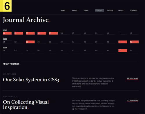
Neography uses a lot of white space to showcase its posts. Every single post is highlighted with red on the calendar. Also, short excerpts are displayed in the chronological order under the calendar. Nice design.
The opposite is also true. If your archive is small or fairly simple, you may not need an entire page for it. Instead, consider putting it in the sidebar or footer or even in a drop-down menu.
2. Make It Easy to Find
You archive should be findable by casual visitors. Put it (or a link to it) somewhere obvious: the header, footer or sidebar are the best choices. Label it clearly, too, so that visitors know this is your archive and not an off-site link.
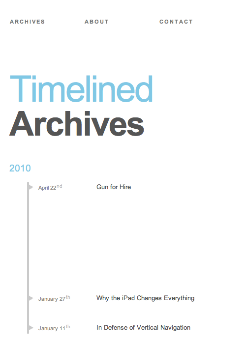
Instead of naming its archive section “blog posts”, “older blog posts”, “recent articles” etc., Kyle Meyer calls it “Archives” and prominently places it in the main navigation on the top of the page. Also notice the archive design approach: the posts are placed vertically according to the timeline. An interesting solution.
There’s no point in having an archive if you make it impossible to find.
3. Clearly Delineate It
Especially if it appears in your sidebar or footer, your archive should be clearly defined and distinct from surrounding content. This can be achieved with a border, a different font, color, whatever you want. Make sure it’s immediately apparent where your archive begins and ends.
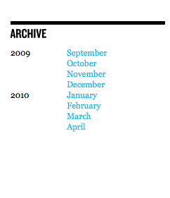
If your archive is on its own page, consider omitting things like the sidebar, which might add to the visual clutter. If not, make sure it’s at least obvious which parts of the page are the archive and which are the regular sidebar, header and footer content.
4. Use Categories
If your archive is big, use categories to make it easier for visitors to find content they’re interested in. Even in a smaller archive, categories can be useful. Just remember that too many categories can confuse users more than they help.
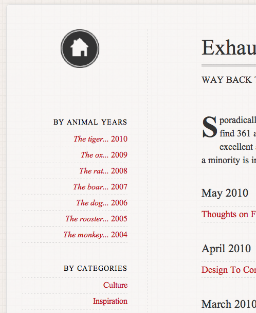
On Colly.com users can browse archives by year or by categories.
Alternatives are a date-based archive (which works well for personal blogs but is less effective for topic-based websites) and a tag-based archive (which is particularly helpful on blogs with diverse content and for very large archives).
5. Don’t Show the Full Content
If you give the archive its own page, don’t show the full articles on that page. All that does is take up space and make it more difficult to navigate.
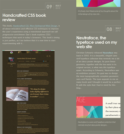
On her redesigned portfolio site, Veerle Pieters gives her archive an own page and shows only excerpts of the articles together with illustrations. The excerpts are placed in two columns and are sorted by date.
Instead, include just the title or the title and a short excerpt (one or two sentences). This keeps the page looking clean and organized and makes skimming much easier.
6. Give Your Visitors Various View Options
If you are displaying excerpts on your archive page, it may be useful to provide users with an option to quickly scan the titles of the articles instead of scrolling the excerpts of the articles endlessly. A simple switcher would be enough. You may want to use cookies to save the current preference of the user, though.

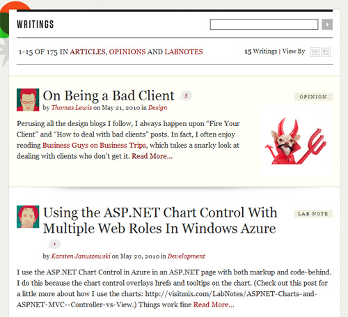
VisitMix provides two view options to its readers: by default, the excerpts view is selected, but if you click on the corresponding icon in the right upper corner, the view changes right away. Unfortunately, this state is not saved, so if you prefer to browse archives in the “short” view, you would need to always click on the icon first.
7. Split Things Up
No one says your entire archive has to be contained within a single list. Especially if your archive is in the sidebar, consider breaking it up with lists of the most popular posts, random posts, most recent posts, etc.
Lists like these can help visitors find interesting and relevant content that they might not find in a conventional archive. They also add more visual interest to your website, depending on how you structure them. A list of random or featured posts also draws attention to posts deep in your archive that might not get much traffic otherwise.
Do You Even Need an Archive?
Not every website needs a dedicated archive. Some designers opt for just category-based navigation instead. Others have no archive navigation other than an “Old posts” link.
If your website has timeless content that visitors might find useful six months or a year down the line, then an archive can be valuable. On the other hand, if it’s a personal blog that has mainly a chronological structure, then you could safely forget about an archive unless you really want one.
Also, consider offering a category-based or tag cloud-based system to access older posts, instead of a formal archive. Either might be more useful for visitors looking for specific content. An archive, though, can present an interesting and efficient method for visitors to find content that they’re not explicitly searching for. Consider this carefully before deciding not to include one on your website.
Showcase
QN5 Blog QN5 includes an area in the sidebar to show both recent posts and posts with the most comments.
WellMedicated WellMedicated includes a small section in its sidebar for most popular and most recent posts.
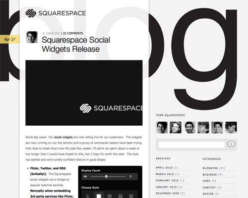
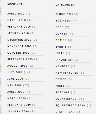
The Official Squarespace Blog The Squarespace blog displays its archive by month, right alongside the category archive in the sidebar.
Inspect Element Inspect Element sets its “Most Popular Posts” section apart with a background texture.
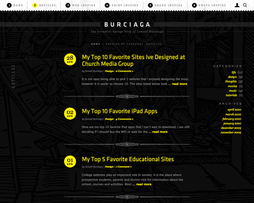
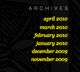
Burciaga The archive here is kept simple: just a list of links by date.
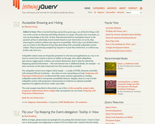
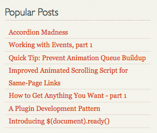
Learning jQuery In addition to an “Archives” link in the header, Learning jQuery includes a brief list of popular posts at the top of the sidebar.
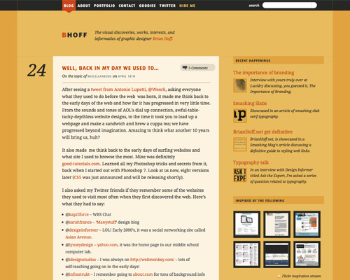
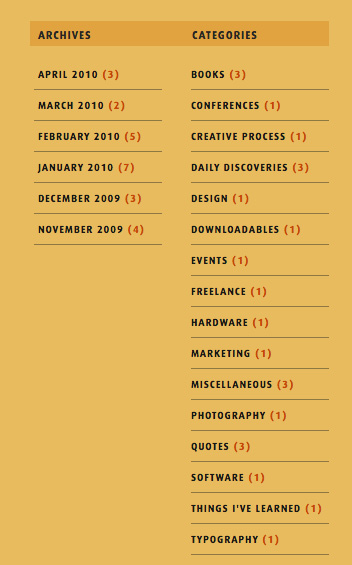
BHoff BHoff’s archive is located in the sidebar, organized by date and shown alongside the category list.
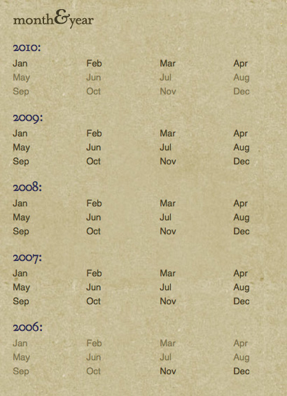
jord&chan The archive here is in the footer, organized as a simple chart by month and year. Months with no entries are shown in lighter type than those with entries.
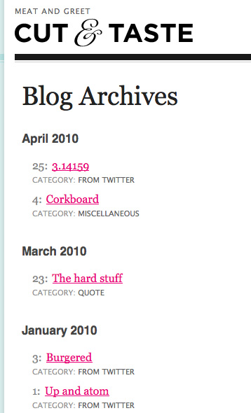
Cut & Taste Cut & Taste puts its archive on a separate page, with a link in the header. On the archive page, articles are organized by date.
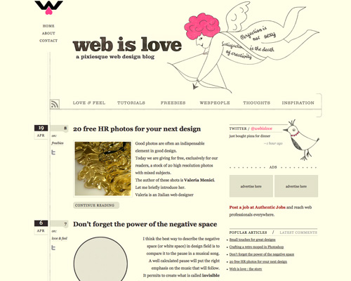
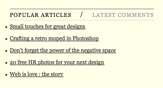
Web Is Love Web Is Love has a brief list of its most popular articles in the sidebar. Other archived posts can be accessed through the categories in the header.
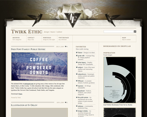
Twirk Ethic Twirk Ethic organizes its archive by category and displays it in an AJAX slider, linked from the main navigation. One of the most elegant solutions in this showcase.
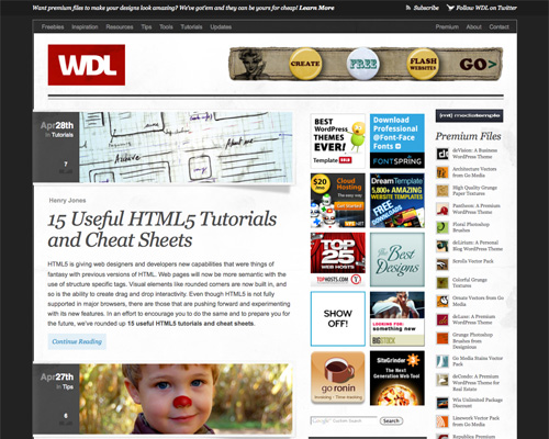
Web Design Ledger Web Design Ledger has an extensive list of recent posts in the sidebar, accompanied by thumbnails.
ThinkVitamin ThinkVitamin puts lists of popular and recent posts in its sidebar.

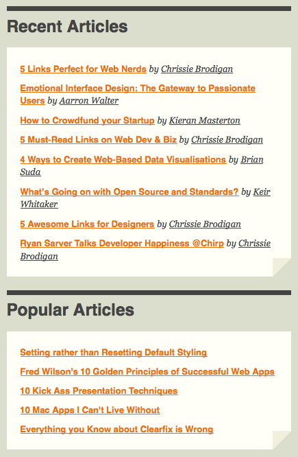
Obox Design Obox includes a brief list of recent posts at the top of its sidebar, with icons.


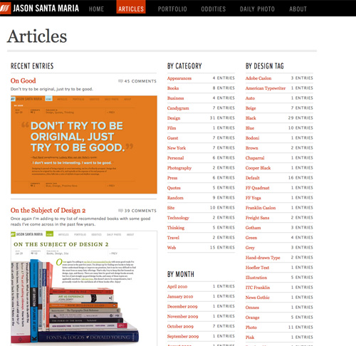
Jason Santa Maria Jason Santa Maria devotes a page to his archive, with a list of recent posts as well as lists broken up by category, date and tag.
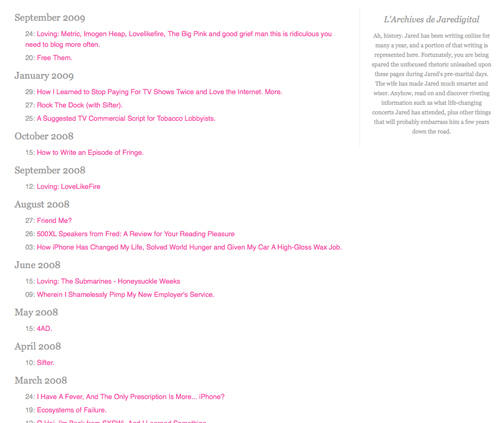
Jaredigital Weblogue A page is devoted to this archive, linked from the sidebar on the main blog page. The archive page itself is kept simple, with articles organized by date.
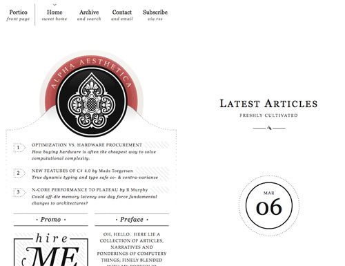
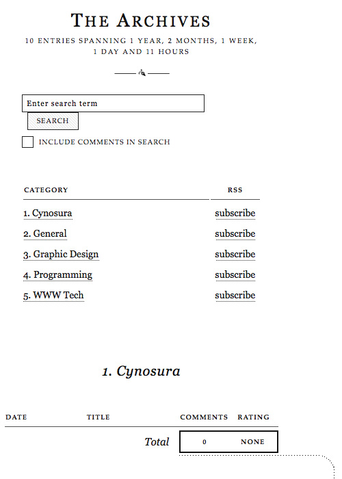
Cynosura The archive here also has its own page (linked from the header) and is organized by category.
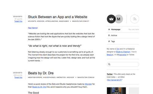
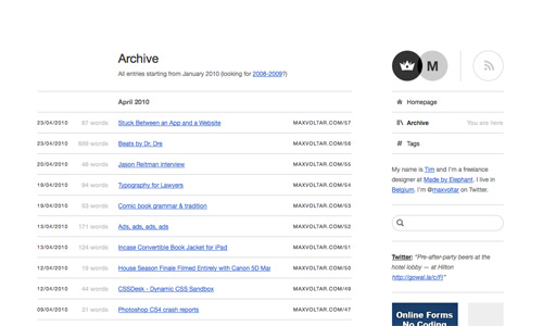
Maxvoltar Maxvoltar’s archive is linked from the sidebar and is presented in a well-organized table on its own page.
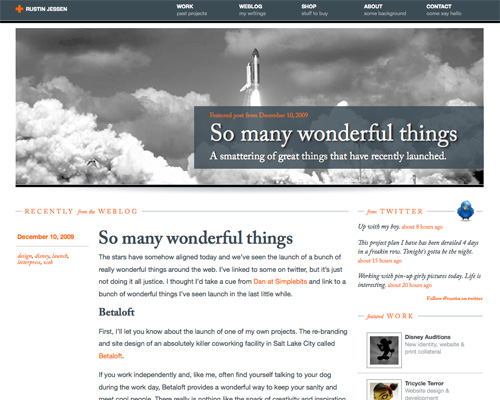
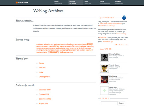
Rustin Jessen Rustin Jessen’s archive is given its own page and is organized by tag, type and date.
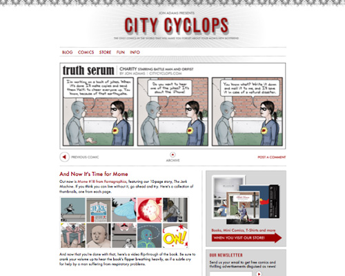
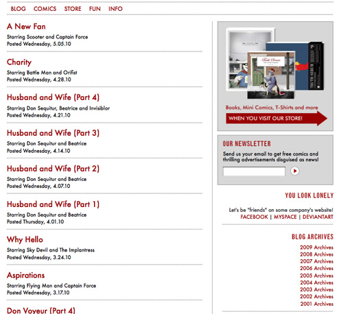
City Cyclops Comics City Cyclops Comics put both its comics archive and its blog archive on a single page, with the blog archive organized by date and positioned in the sidebar. The comics archive is given much more space and detail.
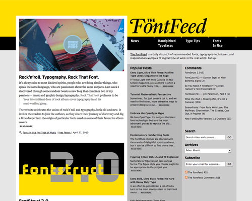
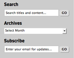
The FontFeed The FontFeed offers a simple drop-down menu, among other options (“Search” and “Subscribe”), to browse its archives by month. Simple but effective.
Spyre Studios Spyre Studios devotes a page to its archives and includes simple date-based links in the sidebar.
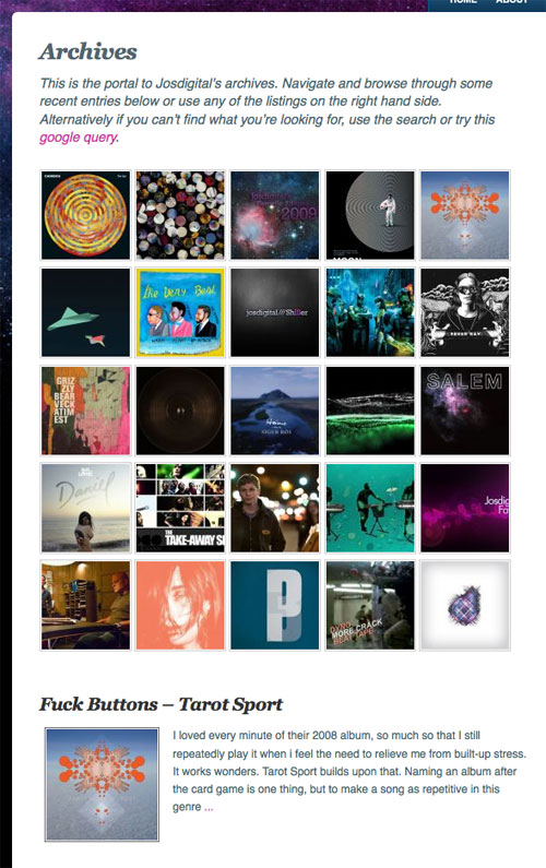
Josdigital Another website that devotes a page to its archive, this time with thumbnails for the main posts instead of text, as well as some featured posts with text excerpts below.

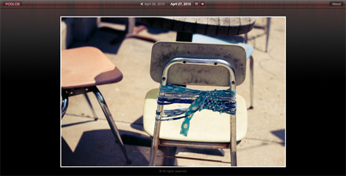
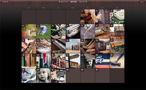
Podlob It makes sense for a photoblog to have a more visual archive, and this calendar with thumbnails works brilliantly. This kind of set-up is obviously best suited to blogs that are updated daily (or close to it).
Epaper Central Another website with a simple sidebar-based list of recent posts.
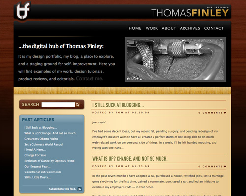
Thomas Finley Thomas Finley dedicates a full page to his archive, with an option for the latest posts as well as links by month.
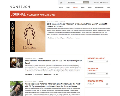
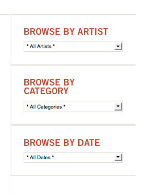
Nonesuch Records Nonesuch Records lets you browse its archive by date, category and artist, all in easy-to-use drop-down menus.


 SurveyJS: White-Label Survey Solution for Your JS App
 Agent Ready is the new Headless
