51 Powerful Propaganda Posters And The People Behind
War Propaganda Posters are well known. But at its core, it is a mode of communication aimed at influencing the attitude of a community toward some cause or position, and that doesn’t have to be a bad thing. Although propaganda is often used to manipulate human emotions by displaying facts selectively, it can also be very effective at conveying messages and hence can be used in web design, too.
Notice that propaganda uses loaded messages to change the attitude toward the subject in the target audience. When applied to web design, you may experiment with techniques used in propaganda posters and use them creatively to achieve a unique and memorable design.
In this article, we look at various types of propaganda posters and the people behind it, people who are rarely seen next to their work. You will also see how the drive for propaganda shaped many of the modern art movements we see today. Notice that this post is more than an ultimate showcase of propaganda artists. Something or somebody is missing? Please let us know in the comments to this post!
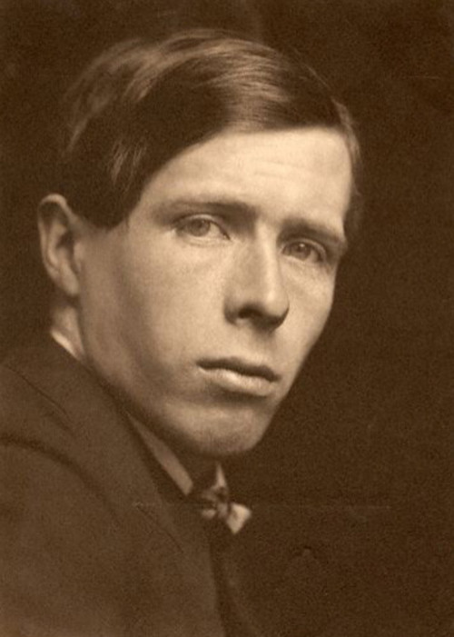
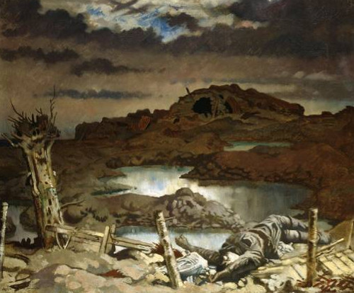
William Orpen: England, 1917
Orpen studied at the Slade School in London alongside the likes of Augustus John and Wyndham Lewis. He produced some of his best work while at the school and became known for his portraits. A friend of Orpen then arranged for him to paint the pictures of senior military officials, such as Lord Derby and Churchill. In 1917, he was recruited by the government’s head of War Propaganda to the Western front to paint images of war-torn France. It was there that Orpen painted his most famous piece, “Dead Germans in a Trench.”
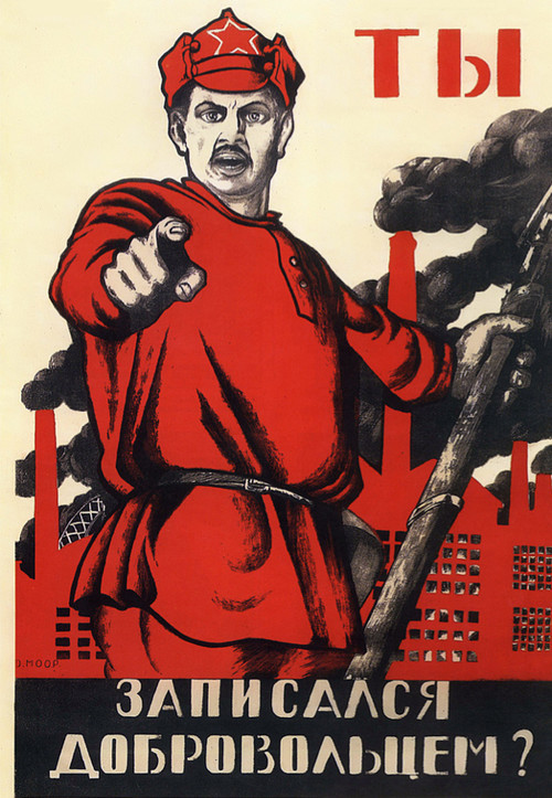
Dimitri Moor: Russia, 1917–1921
Dimitri Moor (or Dmitry Stakhievich Orlov) changed the face of graphic design in Soviet Russia back in 1918. His work dominated both the Bolshevik Era (1917–1921) and the New Economic Policy (1921–1927). The main theme of Moor’s work is the stark contrast between the oppressive evil and the heroic allies. A lot of pressure was put on Russian workers to rise up against imperialism.
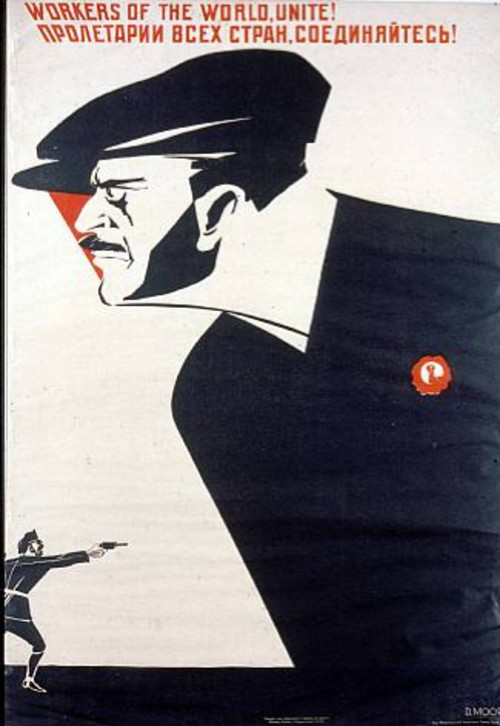
A lot of Moor’s artwork was restricted to black and red. Black was generally used for the main part of the poster, and all of the solid colors for the capitalists. Red was used for socialist elements such as flags and workers’ shirts.
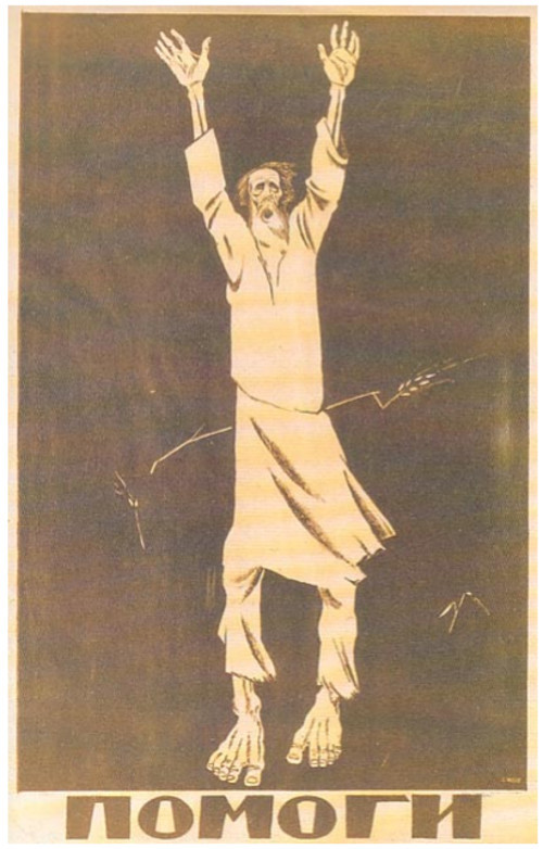
This is a lesser known poster by the artist, appealing for help for those staving from the Russian famine in 1920. It features the single word “Pomogi,” meaning help. The drawing is of an old man who is just skin and bone. The last stalks of barley are barely visible in the background.
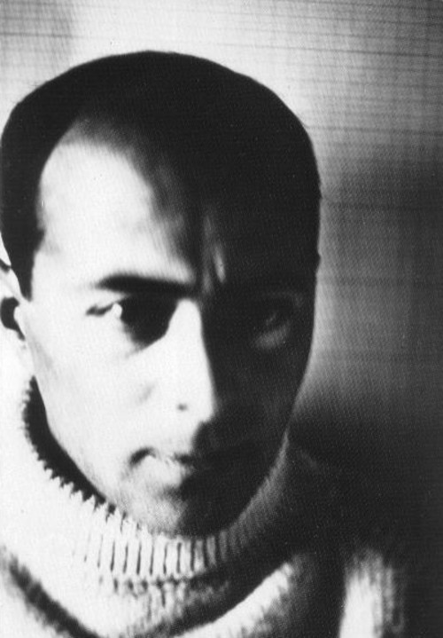
El Lissitzky: Russia, 1920
El Lissitzky spent his whole career absorbed by the belief that the artist could be an agent for change and good, and his work in a lot of respects shows this. He himself was a huge agent of change in the artistic movements of the time. He was one of the fathers of suprematism, along with Kazimir Malevich; and along with many of his peers, he changed the look of typography, exhibition design, photo montage and book cover design. Most of the modern techniques we see today and that appear in film and modern kinetic typography are the product of Lissitzky’s work.
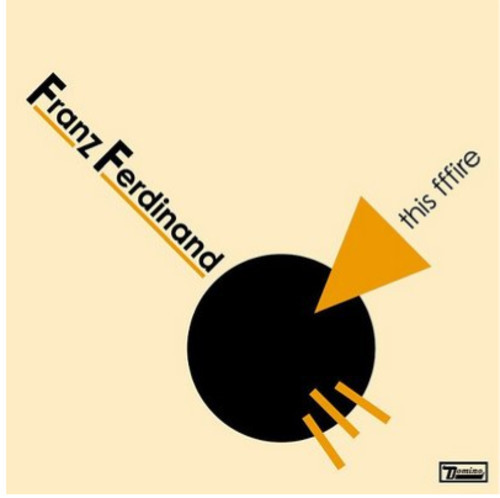
One of his most famous pieces, shown below, really embodies Lissitzky’s work. It is so avant garde that even a lay person could recognize the style. The abstract geometric shapes and clear color pallet scream of modernist art, and yet the poster has a real message. It describes the Russian revolution that took place in 1917. The white circle represents the royalists from the old regime, and the red triangle represents the communists moving in and changing opinion. It has been described as a stylized battle plan for communist victory.
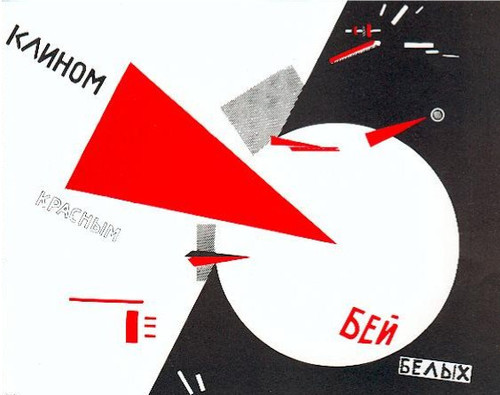
You might also recognize it from Franz Ferdinand’s album cover:
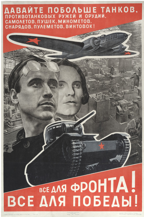
Then in 1921, El Lissitzky accepted a job as the Russian cultural ambassador to Germany. His work influenced a lot of the iconic designs of the Bauhaus and De Stijl movements. His last poster, seen below, was a return to propaganda, with a poster encouraging the Russian people to help Russia build more tanks to win the war against Nazi Germany.
Strakhov Braslavskij: Russia, 1926
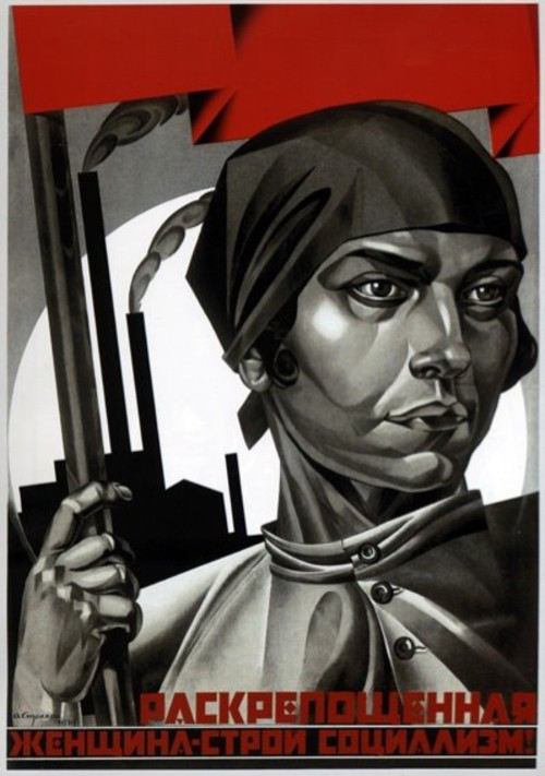
Braslavskij was known for his posters that promoted the emancipation of women. During this time in Russia, the idea of gender equality was growing. Emancipated women were seen to be supporters of the communist agenda, and so they needed to be freed from their so-called duties as wives and mothers.
The emancipation of women and the socialist movement went pretty much hand in hand. In the poster below, we see almost a confluence of the sexes. The woman is drawn somewhat androgynously, wearing masculine clothing that hides her female figure, and a cold hard stare that hides her emotions. Behind her is her place of work, showing that women can do the same hard labor as men, and she carries the red flag of the communist movement.
The curious thing is that the image shows not so much the emancipation of women as it does a way to turn women into men, dressing them in men’s clothing, showing them as working in factories, and hiding their femininity. It seems the real reason to emancipate women was simply to increase the workforce and thus strengthen the communist movement.
Hans Schweitzer: Germany, 1930s
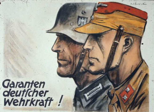
In Germany in the 1930s, propaganda was in full swing and being used by Hitler’s advisers to call the German people to arms and spread lies about the Jews. One of the most famous artists behind Nazi propaganda was Hans Schweitzer, known as “Mjolnir.” This poster by Hans Schweitzer shows the typical pro-Nazi theme of the German army’s strength, depicting an S.A. man standing next to a solider. The text reads, “The guarantee of German military strength!”
This next poster by Mjolnir, titled “Our Last Hope: Hitler” was used in the presidential elections of 1932, when Germany was suffering through its great depression. Nazi propagandists targeted the German people who were unemployed and living on the breadline, and they suggested Hitler as their way out, their savior.
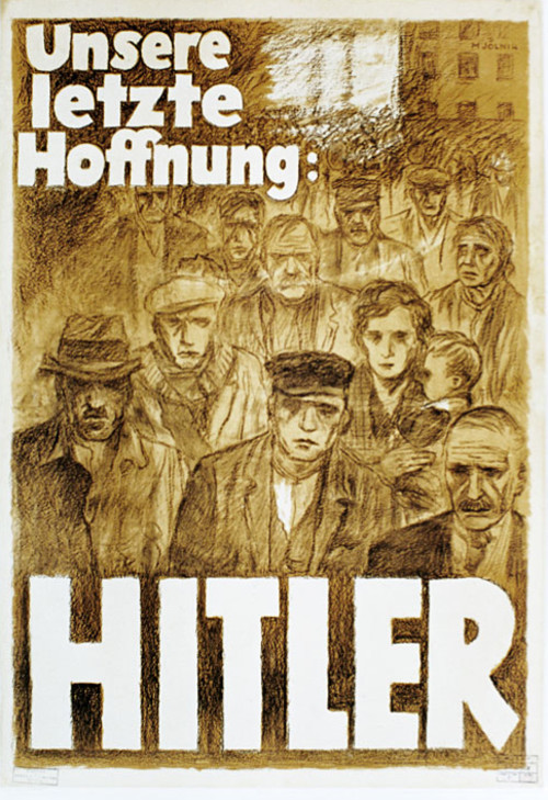
The propaganda then used the scapegoat of the Jews, blaming them for all of Germany’s problems and the war. Many posters were entitled, “He is guilty for the war.” This was the key message of Hitler to start his campaign of terror and for the ethnic cleansing that ensued. Almost the entire campaign from beginning to end was driven by the artist Mjolnir. Just as the media molds public opinion today, Mjolnir most definitely molded the opinion of the German people through his designs. There is no doubts about the immorality and emotional deception of these designs; they are still worth mentioning because they were extremely powerful and effective at the time.
Valentina Kulagina: Russia, 1930
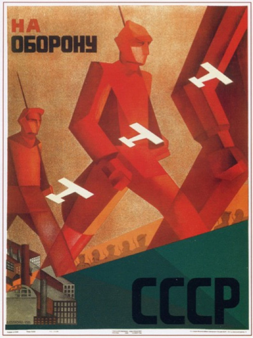
Kulagina was one of the few female poster artists to emerge from the 20th century. Her art was heavily influenced by suprematism, and you can see the similarity between her work and that of El Lissitzky. This poster, called “To Defend USSR” was created by Kulagina in 1930. It takes a cubist perspective in its multi-dimensional shapes, and it shows the Red army as huge almost robotic figures, marching from the factories to fight the war. They are surrounded by the tiny white airplanes of the royalists, which appear to have no effect on them at all and in fact seem to be flying through the figures.
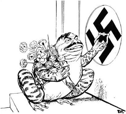
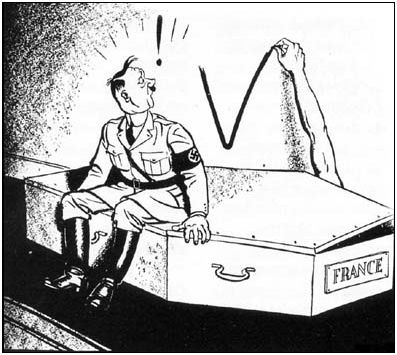
Phillip Zec: England, 1930
Phillip Zec was probably best known for his depictions of Nazis as snakes and vultures. At the time, Nazis were usually drawn as bumbling clowns or buffoons. But Zec brought out the more sinister side of the German regime in his drawings. Hitler reportedly hated Zec so much that he added him to his black list and ordered his arrest following the invasion of Britain. He blamed Zec’s Jewish ancestry for his extreme ideas.

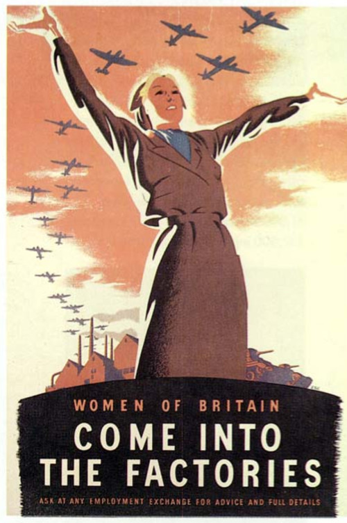
This poster by Zec was a call for women to join the war effort by working in the munitions factories.
This ugly toad is former Prime Minister of France Pierre Laval, who decided to work closely with the Nazi command during World War II.
This illustration is about the French Resistance, telling Hitler that it was very much alive.
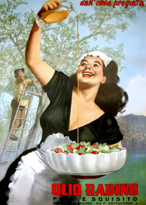
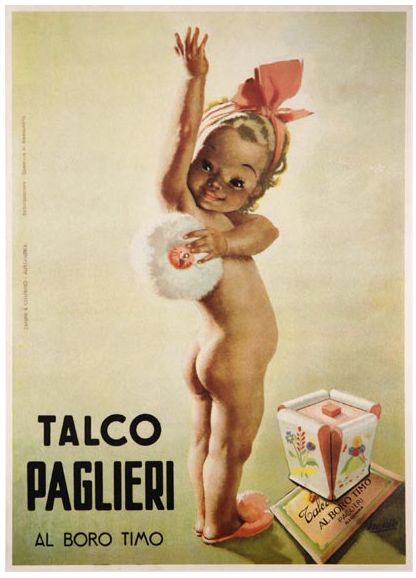
Gino Boccasile: Italy, 1930
Gino Boccasile was a supporter of Benito Mussolini and produced a lot of propaganda for him. His posters became increasingly racist and anti-semitic as his support for the German puppet state increased. After the war, Boccasile was sent to prison for collaborating with the fascist regime. The only work he could find after his release from prison was as a pornographic artist and working in advertising for Paglieri cosmetics and Zenith footwear.
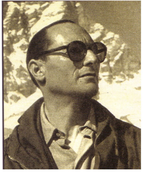
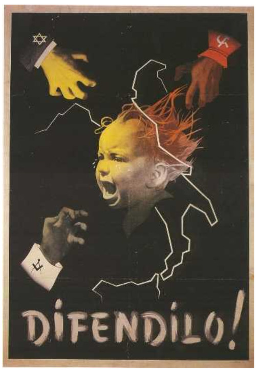
He became well known for his advertising and pornography.
Pablo Picasso: Spain, 1937
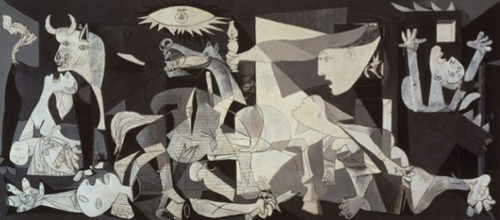
Picasso painted Guernica in response to the bombing of the town by Germany and Italy, which were following orders from Spanish Nationalist forces, on 26 April 1937. It must be said that it was commissioned to Picasso long before the bombing of the town und was supposed to be a classic painting first; after the bombings, Picasso changed his drawing to respond to the recent bombing. The giant mural shows the tragedy of war, using innocent civilians as the focal point. It became a huge symbol of anti-war, and upon completion it was exhibited worldwide to spread the message. The piece also educated other countries about the horror of the Spanish Civil War, which till then most people had never heard of.
Norman Rockwell: US, 1939
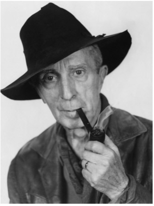
Norman Rockwell is probably one of the best known of the propoganda movement. He admitted that he was just a propaganda stooge for the Saturday Evening Post. The newspaper paid many artists and illustrators to whitewash American news with patriotism and propaganda for around 50 years.
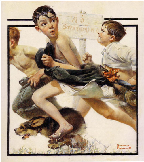
His work has often been dismissed as idealistic or sentimental. His depiction of American life included young boys running away from a “No swimming” sign, and happy-go-lucky US citizens going about their business unaware of the crumbling world around them.
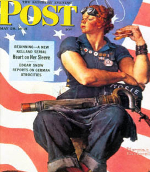
Rockwell’s famous Rosie the Riveter poster is shown below, representing the American women who worked in the munitions and war supplies factories during World War II. This was a call to arms for the women of America to become strong capable females and support the war effort.
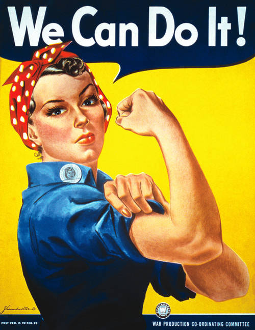
J. Howard Miller’s “We Can Do It!,” commonly mistaken to depict Rosie the Riveter, conveyed the same message:
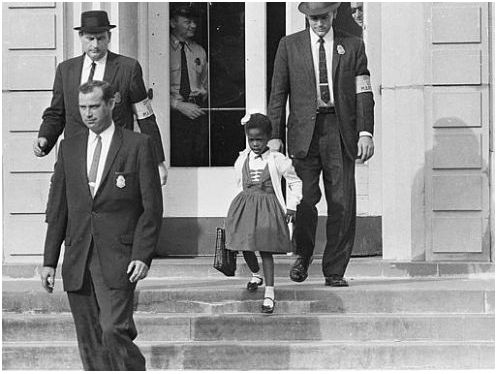
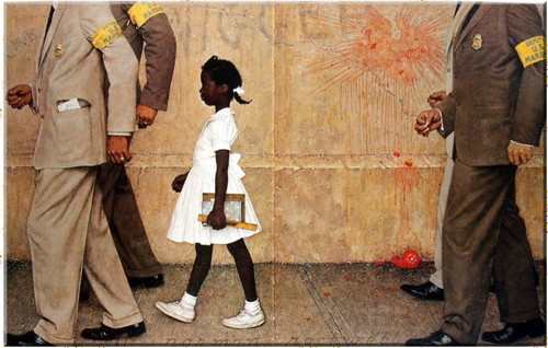
Rockwell was always unhappy with the politics of the Saturday Evening Post, so in his later years, he took up the controversial subject of racism in America. He became respected as a painter for these hard-hitting pieces of American culture, much more so than for his work for the Saturday Evening Post. The piece below is called “The Problem We All Live With.” It is not known whether this painting is based solely on the Ruby Bridges story, because it was also thought that the idea came from John Steinbeck’s book Travels With Charley.
The subject was the integration of black children in American schools. Little Ruby Bridges was filmed making her way into the William Franz School at 8:40 am. At this time, a gigantic crowd of 150 white women and male youth had gathered. They threw tomatoes and shouted vile comments at the tiny girl. It is hard to look at this picture without being affected.
Xu Ling: China, 1950
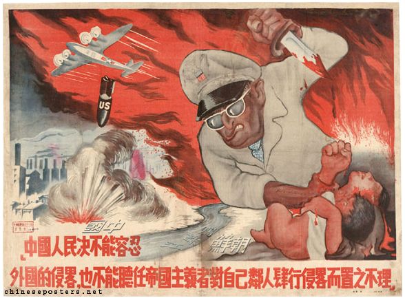
It is hard to find details on these Chinese artists, but we can focus on what they intended to convey with their artwork. This piece is a caricature of the American commander in Korea at that time, General MacArthur. It shows the US as an abhorrent evil, and Macarthur is shown stabbing a Korean mother and child. Bombs labeled US are being dropped on cities in China in the background as the US invades Korea.
Ye Shanlu (???): China, 1952
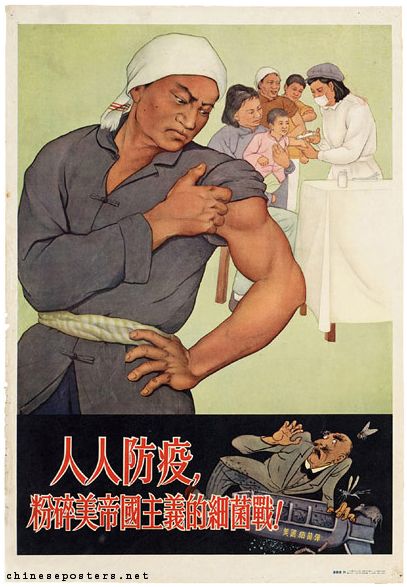
Again, little is known of the artist, but we do know this piece told people to get immunized against any epidemics to combat germ warfare. The Chinese were convinced that the US was planning to use bacterial weaponry against them, so they set about organizing massive inoculation drives to protect the Chinese people.
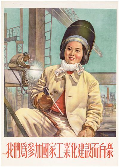
Ning Hao: China, 1954
Along the lines of Rosie the Riveter, this Ning Hao piece reflects women being asked to work in the factories alongside men, partially to support their emancipation, but mostly to increase the labor force in China.
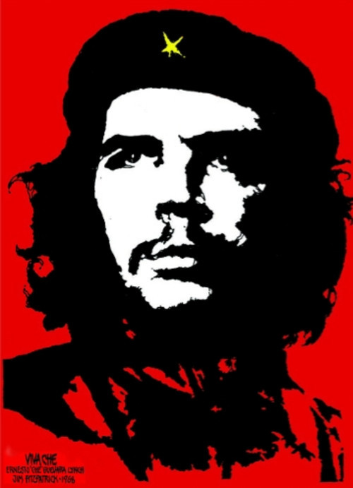
Jim Fitzpatrick: Ireland, 1968
Jim Fitzpatrick was a well-known Irish Celtic artist of his time, but he is probably best known for his Che Guevara poster in 1968. It is said that Fitzpatrick took the death of the revolutionary personally. He had once met him when Guevara flew into Ireland in 1963 and checked into the Marine Hotel pub in Kilkee. Fitzpatrick was only a teenager at the time and had been working there over the summer. The poster became a global icon during the anti-Vietnam war protests and is now the symbol of F.A.R.C. in Columbia, a Marxist-Leninist revolutionary guerrilla organization, which is involved in the ongoing Colombian armed conflict. Zapatista Army of National Liberation (Ejército Zapatista de Liberación Nacional, EZLN), a revolutionary group based in Chiapas, the southernmost state of Mexico, uses this symbol as well.
The image was also used during the violent Paris student riots in 1968. Across the rest of the West, the Marxist Che Guevara image is overused by any kid suffering from teenage angst.
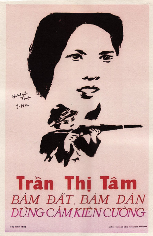
Huynh Van Thuan: Vietnam, 1972
I could not find any information about Huynh Van Thuan, but I found this piece reminiscent of 1960s movie posters about the Vietnam war and so decided to include it.
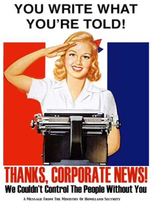
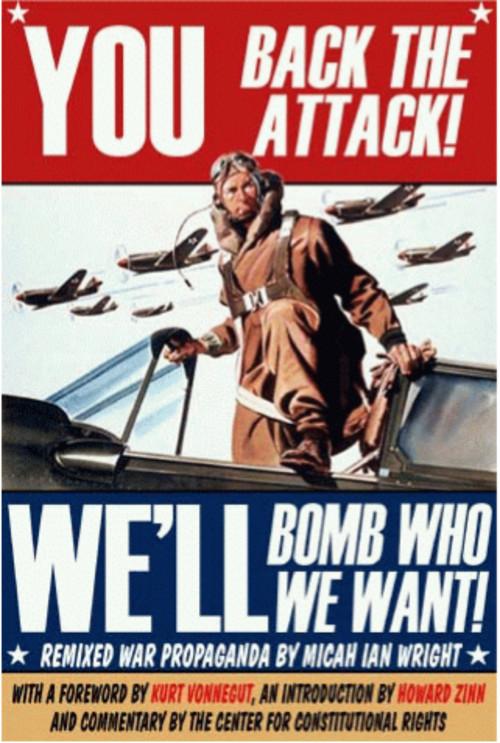
Micah Ian Wright: US, 2003
After Micah Wright graduated, he worked a while for Nickelodeon and wrote for The Angry Beavers cartoon. Then in 2003, just before the invasion of Iraq, Micah published his anti-war protest book. The book was filled with satires of old war propaganda posters that Micah had reprinted with modern war messages.
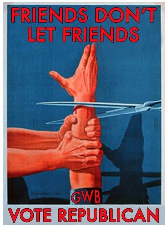
Brian Lane Winfield Moore: US, 2009
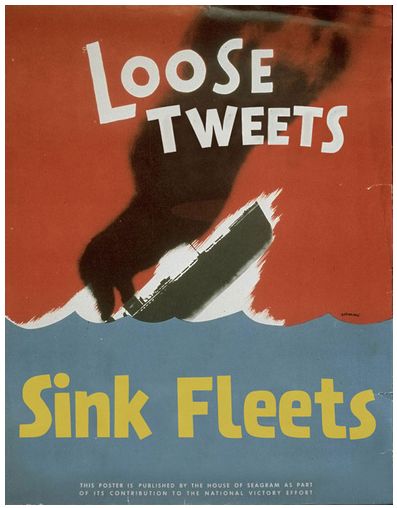
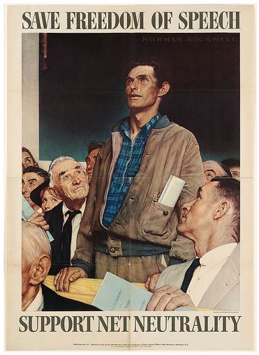
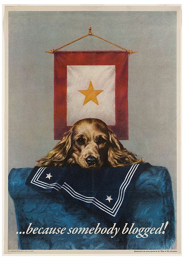
Brain Moore is a modern propaganda artist who exhibits his work on his blog. He lives in Brooklyn and is probably best known for his promotion of net neutrality and his work during the 2009 Iranian election protests. The posters are based on old WWII propaganda posters but updated in their message to match today’s technology and Web culture.
This poster was a comment on the 2009 Iran election protests. He borrowed the old “loose lips” refrain and replaced it with tweets.
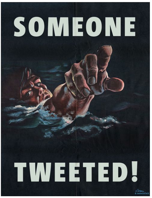
This next one was about the proposed Internet regulation that would supposedly curb illegal activities on the ‘net and help fight the “war on terror.”
Unknown artist: UK, 2010
I could not identify the artist behind this one but had to include it for its clever use of old Tory values and the play on the Scooby Doo gang’s unveiling of the monster. The Tory party now occupies 10 Downing Street, and David Cameron is now Prime Minister of United Kingdom. This poster shows the lack of faith in Cameron’s promise to be a force for change and not just another Thatcher.

Last Click
Nick Griffin is not an artist, he is the chairman of the British National Party (BNP). Just as most other national parties across the globe, BNP is a good example of propaganda techniques being used to produce an emotional rather than rational response to the information presented. BNP has used them to build their hate-filled ranks for years. BNP is extremely good at speaking to people in plain, emotional language and affecting those who experience personal problems and want to find someone who can be blamed for these problems.
Just like many other national parties, BNP is blaming foreigners for these problems and uses strong religious metaphors to deliver the message. Very powerful, yet extremely unethical. This is an example of propaganda being used to manipulate people in a very deceptive, unfair manner.


Further Reading
- The Legacy Of Polish Poster Design
- 35 Beautiful Vintage and Retro Photoshop Tutorials
- Retro Futurism At Its Best: Designs and Tutorials
- Learning From The Past: Design Legacies & Arts


 Register Free Now


 SurveyJS: White-Label Survey Solution for Your JS App
 Celebrating 10 million developers


