The Ugly Showcase of Military, Intelligence And Defense Websites
Members of military and intelligence forces around the world risk their lives daily to defend their countries and assist in peacekeeping and aid missions both at home and abroad. The men and women who make up the world’s defense forces make sacrifices that most civilians wouldn’t consider to serve their countries.
So, with everything they do for us, shouldn’t they be represented online by website designs that reflect the honor and responsibility they undertake every day? Unfortunately, that’s not the case in many countries out there. Many military websites out there are some of the worst designs in any industry. Whether they’re outdated, broken or designed by amateurs, some of the websites showcased below are bad enough to make you cringe.
You might be interested in the following related posts:
- Web Design Showcases From Various Industries
- Global Web Design Showcases
- Portfolio Web Design Showcases
There are some good ones, though. A number of countries have obviously dedicated the time and resources necessary to project a professional and polished Web presence for their members. A number of other websites have obviously put in some effort and are pretty close. If you know of examples of other great military or intelligence websites from around the world, please add them in the comments!
The Outdated
The websites featured here might have looked great 10 or more years ago (which was likely when they were created). But either their designs haven’t been updated in a very long time or their designers are still borrowing conventions from the late ’90s.
Ministry of Defense of the Republic of Argentina Everything from the color scheme to the header image to the skinny three-column layout dates this design.

Royal Bahamas Defence Force This website wouldn’t look quite so dated if it weren’t for the drop-shadows behind the content blocks.
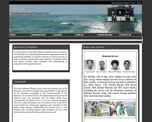
Bolivarian Republic of Venezuela The overall layout of this website screams early-2000s.
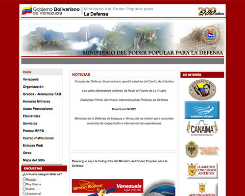
Ministry of Defence of the Republic of Belarus Very minimalistic website. Unfortunately, gradients, tiny links and many -empty spaces make it look dated.
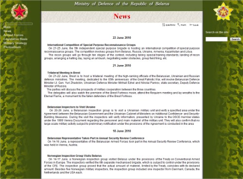
Colombian National Police Here’s another great example of a website that would have looked right at home in the late ’90s or early 2000s.

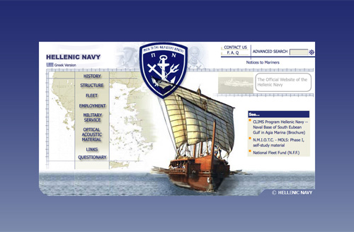
Hellenic Navy The thing that dates this website the most is its width: it would look right at home on a screen with a resolution of 800x600.
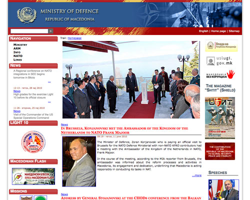
Macedonian Ministry of Defence The layout, the partially rounded corners and the drop-shadow against the background all date this website.
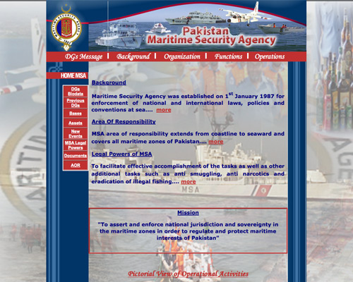
Pakistan Maritime Security Agency Using an image like this one as a background was very popular in the ’90s.
Serbian Ministry of Defense The layout here is almost grid-like, but it doesn’t quite make it. The color scheme is the most outdated, though.

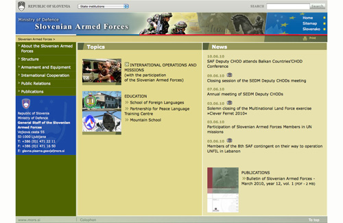
Slovenian Armed Forces Another website that would have been current 8 to 10 years ago.
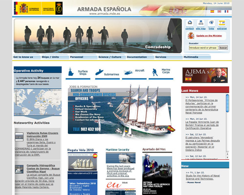
Spanish Armada The rounded colors and glossy buttons would have looked great a few years ago, but now they just harken back to the earliest days of the Web 2.0 style.
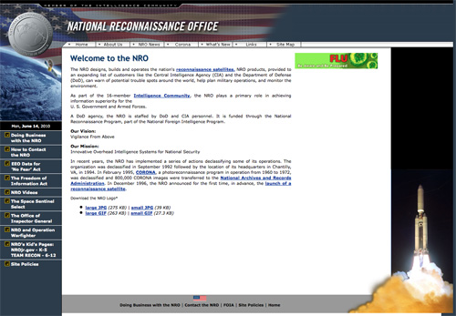
The Russian Federation Ministry of Defence The design has a striking resemblance to traditional Google AdSense blocks, and the line-height property for the content area certainly should be increased..
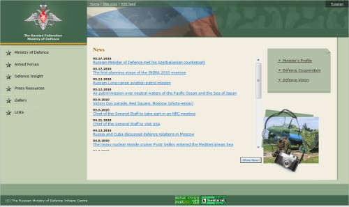
Sri Lanka Ministry of Defence The color scheme and typography here are definitely reminiscent of Web design 5 to 10 years ago.
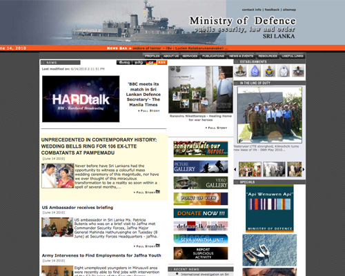
U.S. Federal Bureau of Investigation The skinny layout, color scheme and overall look of this website feel at least 6 to 7 years old.
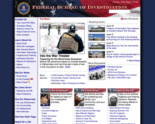
U.S. National Reconnaissance Office This website screams late ’90s and early 2000s, especially the navigation and typography.
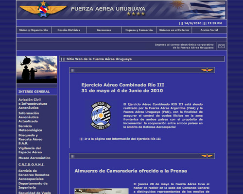
Uruguayan Air Force This looks like it was based on a standard template from 5 to 10 years ago.
The Poorly Coded
These websites might not have been so bad if they were cross-browser compatible and adhered to Web standards even a little. But they are all so poorly coded that they don’t render correctly in browsers such as Firefox or Safari.
Luckily, there aren’t too many of them.
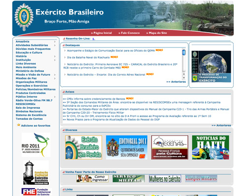
Brazilian Army The coding on this website isn’t noticeably horrible… except for all the thin white lines running through the backgrounds and borders of the content blocks.
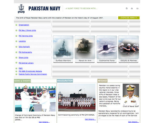
Pakistan Navy I don’t even want to begin figuring out how they got the rounded-corner background to repeat like that in the main content area.
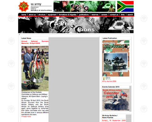
South African Army This website wouldn’t be so bad if it wasn’t for the giant gray bar running down the main column, effectively blocking half the content.
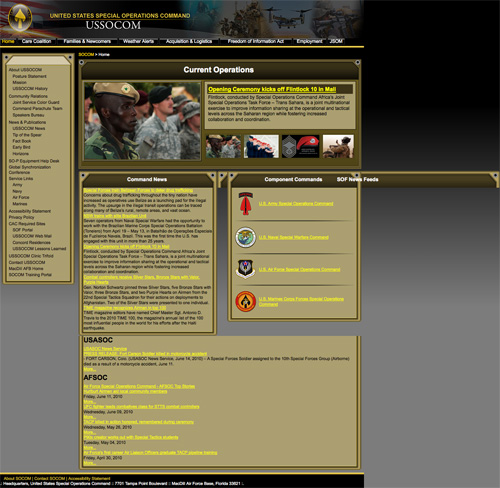
United States Special Operations Command The headers for all the content blocks here are fine, except the one for the news feeds, which prefers to be higher up on the page.
The Poorly Designed
These websites are just poorly designed. Some look like they were based on stock templates… bad ones. Others look like they were designed in programs aimed at hobbyists or those needing to set up personal websites (in any case, definitely not appropriate for government agencies).
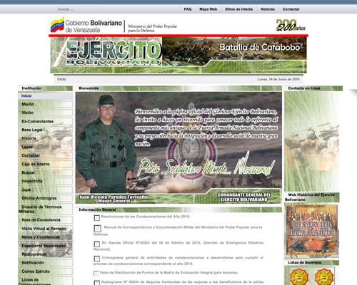
Venezuelan Bolivarian Army Between the color scheme, the header (which doesn’t come close to spanning the whole design) and the broken icons, this website just doesn’t look good at all.
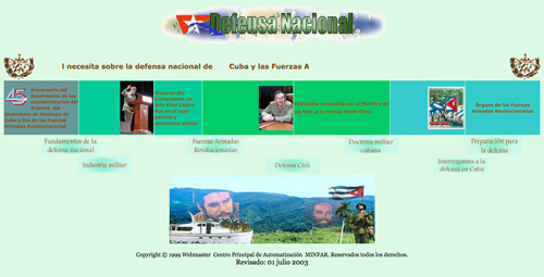
Cuban National Defence I’m not sure where to begin with this one…
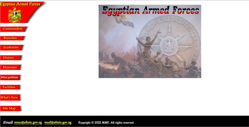
Egyptian Armed Forces It looks like they couldn’t decide whether they wanted a minimalist website.
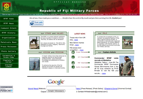
Republic of Fiji Military Forces This looks like your classic template website, with minor modifications.
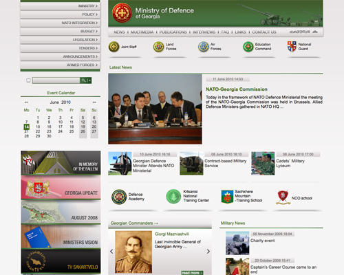
Ministry of Defence of Georgia This wouldn’t be so bad if the content areas weren’t so disjointed.
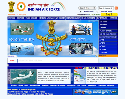
Indian Air Force This might have been salvageable, except for the horrible alignment.
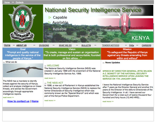
Kenyan National Security Intelligence Service The padding and margins in this website aren’t adequate, and the alignment is off in places. The concept is sound; it just needs to be better executed.
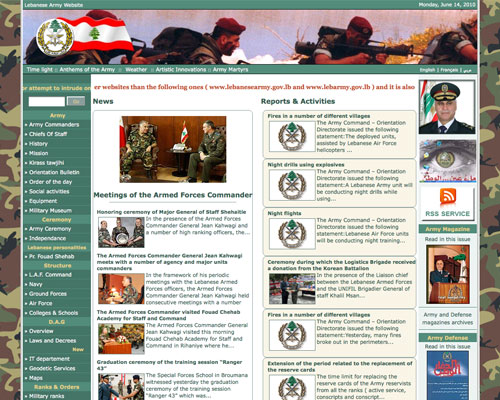
Lebanese Army This website might not have been so bad if the colors complemented the camouflage background, rather than clashed with it.
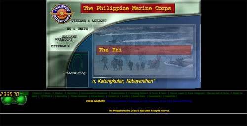
The Philippine Marine Corps This is another one for which I’m not even sure where to start.
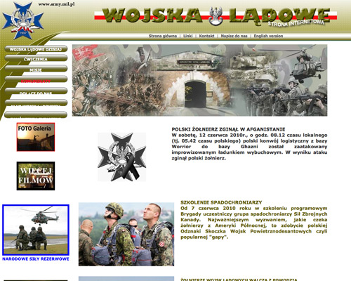
Polish Land Forces Forget for a moment how amateurish this one looks. Notice how the text doesn’t even match up with the navigation buttons.
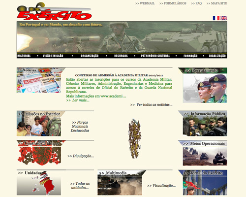
Portuguese Army From the header alone, it’s not so bad. It’s the lower area of this website that doesn’t seem to have any aim.
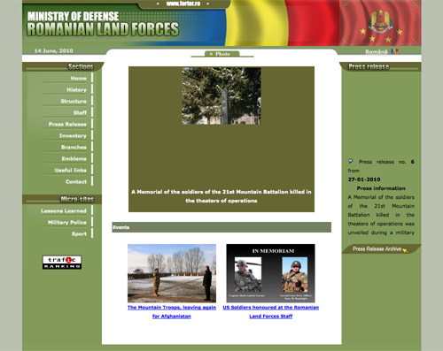
Romanian Land Forces I’m still trying to figure out if that white bar across the top of each column is supposed to be there. Beyond that, they should have paid more attention to how the header colors go with the rest of the color scheme.
Royal Thai Army There’s just way too much going on here, and no focal point to grab your attention.

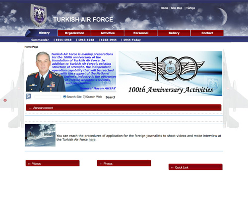
Turkish Air Force This almost made it into the “Not So Bad” category below, except that it doesn’t have any focus, and the alignment of some elements is off.
Ministry of Defence of Ukraine The ads on this website should be better integrated in the overall design. Other than that, the design looks very dated.

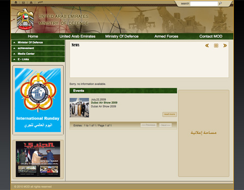
United Arab Emirates Ministry of Defence Where’s the content?
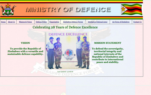
Zimbabwe Ministry of Defence There’s no color scheme here, and the entire thing looks like something a kid did in class.
The Not-So-Bad
The websites here aren’t terrible. In most cases, only minor things hold them back. Most of them could be great with just a bit more work.
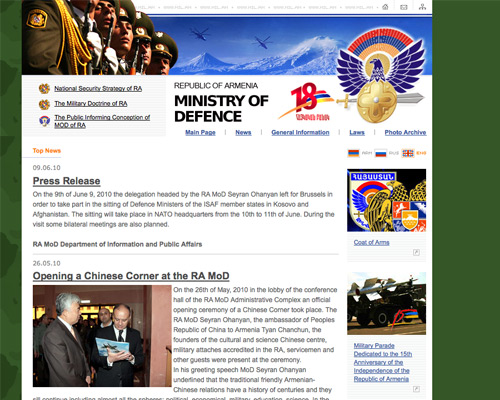
Ministry of Defence of The Republic of Armenia Other than the width of this website (which is a bit narrow for even an 800 x 600 display), it’s not a terrible design.
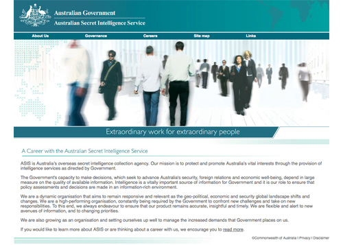
Australian Secret Intelligence Service This design is just fine, other than being a bit boring. And the text could be slightly enlarged for easier reading.
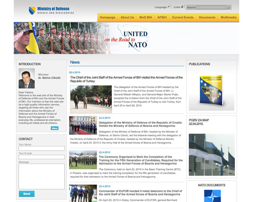
Ministry of Defense of Bosnia and Herzegovina If more attention was paid to the baseline or vertical rhythm, this would be a reasonably good design.
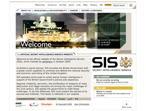
British Secret Intelligence Service The angles in this design should either be better incorporated into the other elements or removed altogether. Other than that, it’s not bad.
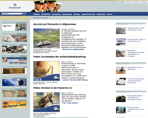
Bundeswehr This is one of those websites that doesn’t have anything particularly wrong with it. It’s just underwhelming.
Ministry of National Defense of the People’s Republic of China The elements on this website don’t quite have enough continuity, but the color scheme and overall layout are good.

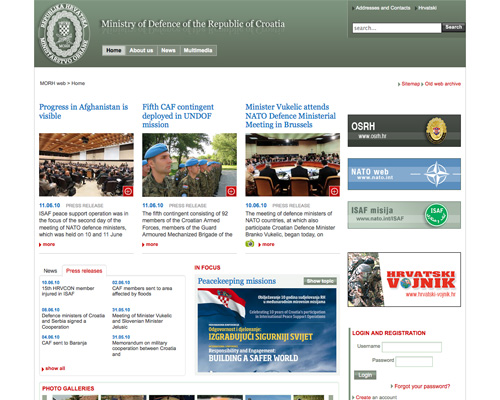
Ministry of Defence of the Republic of Croatia This website is also underwhelming. Nothing particularly “wrong” with it, but not impressive either.
Ecuadorian Army The header here isn’t that bad, but the rest of the website doesn’t match up, and it feels a bit like a generic template.

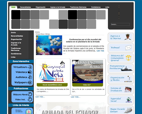
Ecuadorian Navy Parts of this website are great (the slidehow in the header, for instance) but other parts don’t quite match up, particularly the buttons on the right-hand side and the off-center navigation elements.
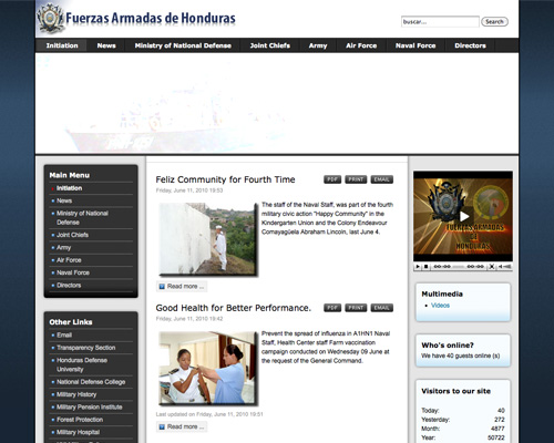
Armed Forces of Honduras This website isn’t bad. But again, nothing makes it stand out.
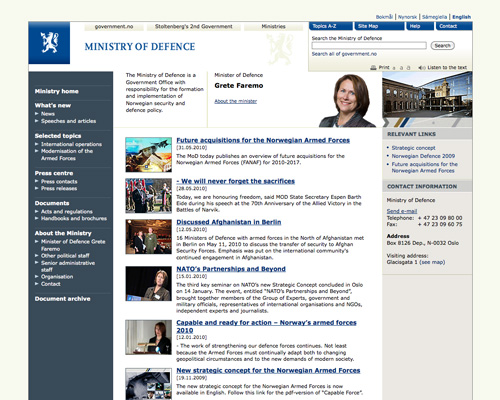
Norwegian Ministry of Defense Another example of a website that doesn’t do anything to stand out.
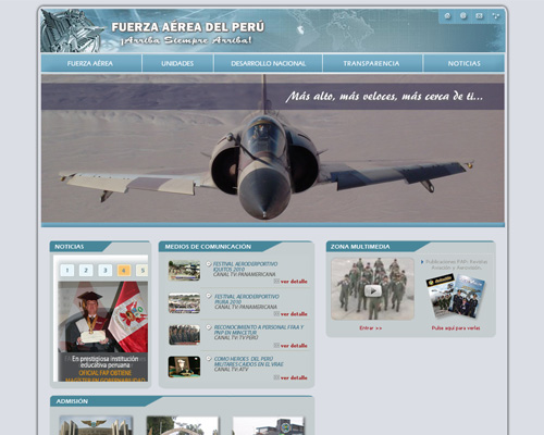
Peruvian Air Force The idea here is good, but the result isn’t very interesting.
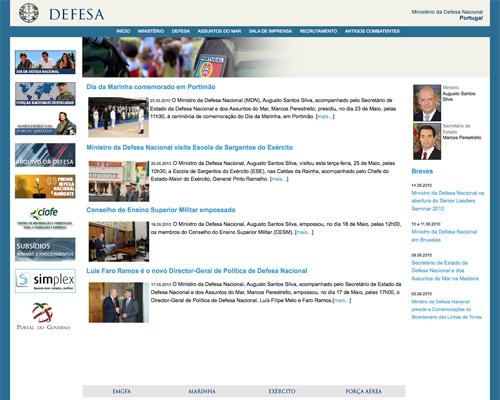
Portuguese Ministry of Defense Another inoffensive yet unimpressive website.
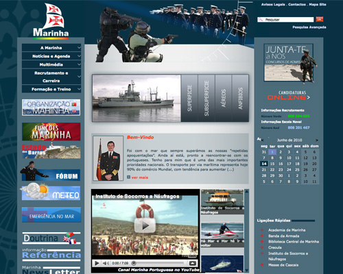
Portuguese Navy This would be great, but it has just a little too much going on. Some negative space would make a huge difference.
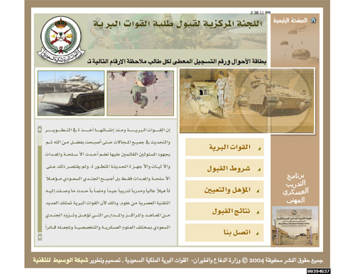
Saudi Arabian Ground Forces This website is more interesting than some of the others here, but it doesn’t quite pull it together.
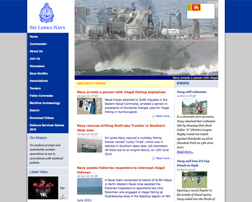
Sri Lanka Navy Here’s another website that looks like a template. The use of white space could be better and makes everything look a bit disjointed.
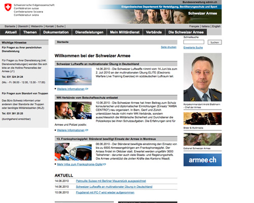
Swiss Army Another underwhelming, uninteresting design. At least it looks professional.

The Philippine Marine Corps This is another one for which I’m not even sure where to start.

Polish Land Forces Forget for a moment how amateurish this one looks. Notice how the text doesn’t even match up with the navigation buttons.

Portuguese Army From the header alone, it’s not so bad. It’s the lower area of this website that doesn’t seem to have any aim.

Romanian Land Forces I’m still trying to figure out if that white bar across the top of each column is supposed to be there. Beyond that, they should have paid more attention to how the header colors go with the rest of the color scheme.

Royal Thai Army There’s just way too much going on here, and no focal point to grab your attention.

Turkish Air Force This almost made it into the “Not So Bad” category below, except that it doesn’t have any focus, and the alignment of some elements is off.

Ministry of Defence of Ukraine The ads on this website should be better integrated in the overall design. Other than that, the design looks very dated.

United Arab Emirates Ministry of Defence Where’s the content?

Zimbabwe Ministry of Defence There’s no color scheme here, and the entire thing looks like something a kid did in class.

The Not-So-Bad
The websites here aren’t terrible. In most cases, only minor things hold them back. Most of them could be great with just a bit more work.
Ministry of Defence of The Republic of Armenia Other than the width of this website (which is a bit narrow for even an 800 x 600 display), it’s not a terrible design.

Australian Secret Intelligence Service This design is just fine, other than being a bit boring. And the text could be slightly enlarged for easier reading.

Ministry of Defense of Bosnia and Herzegovina If more attention was paid to the baseline or vertical rhythm, this would be a reasonably good design.

British Secret Intelligence Service The angles in this design should either be better incorporated into the other elements or removed altogether. Other than that, it’s not bad.

Bundeswehr This is one of those websites that doesn’t have anything particularly wrong with it. It’s just underwhelming.

Ministry of National Defense of the People’s Republic of China The elements on this website don’t quite have enough continuity, but the color scheme and overall layout are good.

Ministry of Defence of the Republic of Croatia This website is also underwhelming. Nothing particularly “wrong” with it, but not impressive either.

Ecuadorian Army The header here isn’t that bad, but the rest of the website doesn’t match up, and it feels a bit like a generic template.

Ecuadorian Navy Parts of this website are great (the slidehow in the header, for instance) but other parts don’t quite match up, particularly the buttons on the right-hand side and the off-center navigation elements.

Armed Forces of Honduras This website isn’t bad. But again, nothing makes it stand out.

Norwegian Ministry of Defense Another example of a website that doesn’t do anything to stand out.

Peruvian Air Force The idea here is good, but the result isn’t very interesting.

Portuguese Ministry of Defense Another inoffensive yet unimpressive website.

Portuguese Navy This would be great, but it has just a little too much going on. Some negative space would make a huge difference.

Saudi Arabian Ground Forces This website is more interesting than some of the others here, but it doesn’t quite pull it together.

Sri Lanka Navy Here’s another website that looks like a template. The use of white space could be better and makes everything look a bit disjointed.

Swiss Army Another underwhelming, uninteresting design. At least it looks professional.
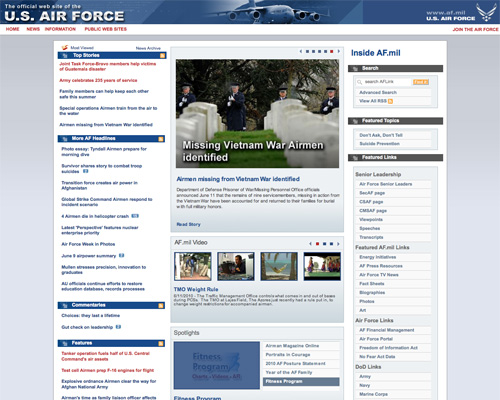
US Air Force A professional yet boring design. But maybe that’s how military websites should look?
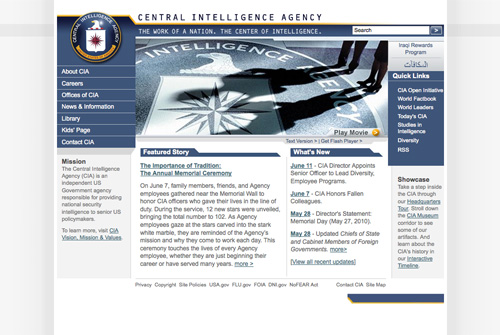
US Central Intelligence Agency This website is way too narrow, and overall it’s just not eye-catching.
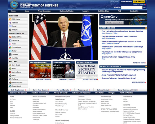
US Department of Defense Too much is going on here, and the social media links (the icons especially) on the left look out of place.
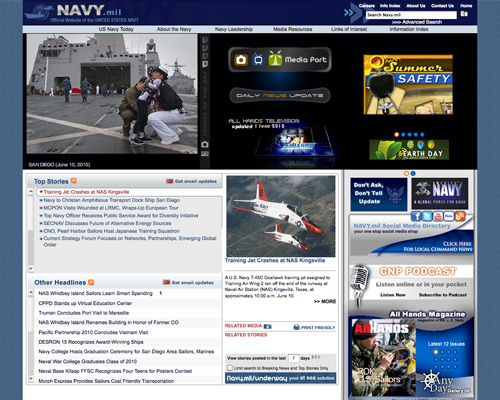
US Navy The icons and banners in the header don’t really fit the rest of this design.
A Few Good Sites
The websites below are the stars of this post. They are well designed, easy to use, professional and worthy of representing the armed forces and intelligence services.
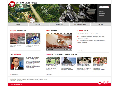
Austrian Armed Forces This one’s clean and well laid out, with plenty of white space and a great color scheme.
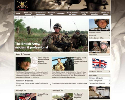
British Army A professional-looking website, with a background that’s more interesting than most.
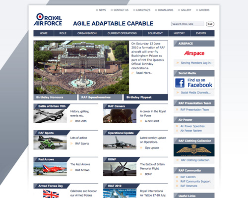
British Royal Air Force Another website with an interesting background and a clean overall design.
British Security Service MI5 The color scheme here is great, as is the overall aesthetic, which is a cross between minimalist and magazine-style.

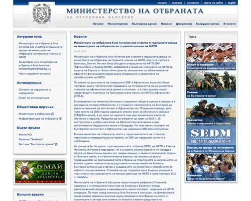
Ministry of Defence of the Republic of Bulgaria A clean, well thought out design that makes good use of textures and gradients.
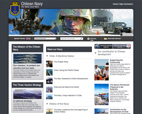
Chilean Navy The header here is fantastic, and the rest of the layout works well.
Ministry of Defence and Armed Forces of the Czech Republic Another great header design: this one doubles as navigation. Each section of the website has a different color scheme, while maintaining the same basic look.

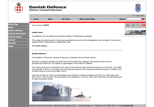
Defence Command Denmark A minimalist layout that leaves plenty of white space.
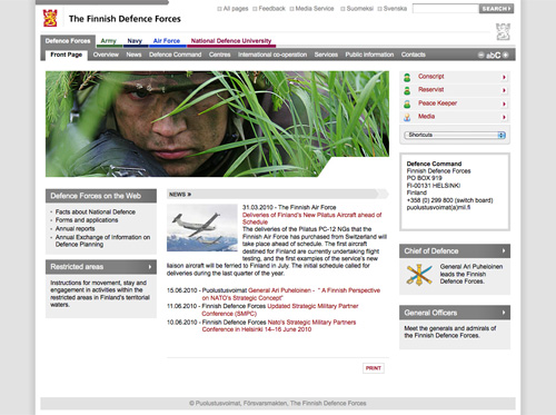
The Finnish Defense Forces A clean and organized design, with double-tabbed navigation bars.
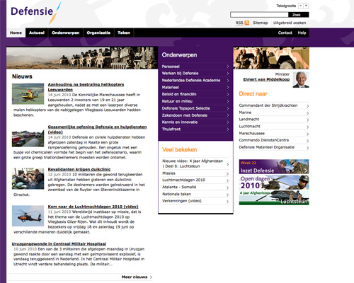
Netherlands Ministry of Defence The purple color scheme here is unexpected, but it works well and sets the website apart.
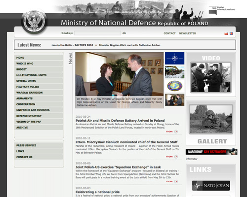
Polish Ministry of National Defense This is one of the nicest designs in this post, especially because of the header.
Swedish Armed Forces A good clean design with a minimalist aesthetic and great typography. The transparent titles over the images on the right really take it up a notch.
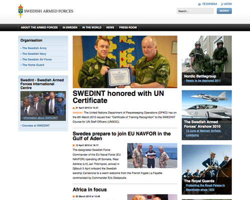
US National Security Agency Professional, easy to use and coherent: everything an intelligence website should be.

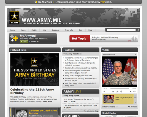
US Army The US Army website brings together a lot of content of various types while maintaining a usable and consistent user interface.
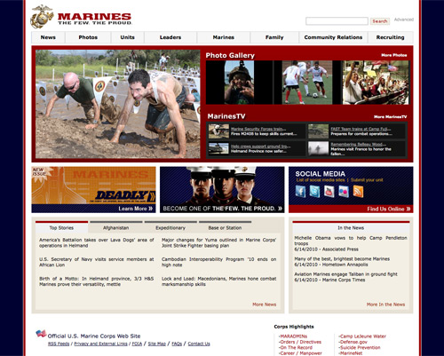
US Marine Corps This website stands out mostly because of the grid used for the main content area and the ample white space everywhere else.


 Agent Ready is the new Headless

 SurveyJS: White-Label Survey Solution for Your JS App


