In Defense Of Photoshop
A militia of designers have assembled to launch this coup. Their propaganda is convincing, and their proposed successor is worthy, capable and sexy. Their cause is important, but their manifesto is flawed.
The Argument
The argument against Photoshop focuses on the effect of the final product. Photoshop can be used to create impeccable designs, but after hours of hard work, you end up with a static mock-up that is incapable of emulating the experience one gets when the design is converted to mark-up and viewed in the browser. HTML and CSS mock-ups require no explanation. They present the final product in the final environment. They also take full advantage of browser capabilities, such as fluid layouts, progressive enhancement and animation. These are things that Photoshop simply can’t do.
If we compare the two methodologies even closer, we find a number of other disadvantages to the Photoshop approach. For example, Photoshop’s text rendering is nothing compared that of modern Web browsers. CSS classes also make the process of updating similar elements easier than hunting down all instances within a Photoshop document. Even making certain structural changes to a website can be done more easily with CSS. Finally, I can’t overlook Photoshop’s propensity to crash, especially when opening the “Save for Web” dialog.
I admit: the benefits of mark-up are undeniable, and Photoshop doesn’t offer any of them. In fact, the mark-up generated across the entire Creative Suite is rather atrocious and unusable. Why then do I think Photoshop is still the most important Web design tool available today? The answer lies in the creative process.
Process Makes Perfect
The creative process is exactly that: a process. Clients may think we simply snap our fingers to make creative goodness flows directly from our brains to the screen, but we know better. We know that it takes hours or days of deep thought to devise the perfect solution. And if you’re anything like me, you often don’t find the perfect solution until you’ve explored a number of dead ends. Essentially, we need time and experimentation to work towards the goals of a project and determine the best way to communicate what needs to be said.
Experimentation is the key to creativity. Without it, the brain simply follows what it regards as the safest route, and the result is as mundane as the thought behind it. Most of the designers I know start all of their designs on paper: creating thumbnail sketches in order to quickly experiment with possible solutions. However, these sketches serve as jumping-off points; the design process is by no means over once the pencil is traded for mouse and keyboard.
Photoshop is vital to good Web design because it extends the process that was started on paper. It gives stakeholders a direct connection to the visuals without regard for the technical execution of the product. In other words, it accommodates visual processing. The designer is given a blank canvas—a playground for experimentation—on which anything is possible.

As designers, our medium is in a visual language. It’s a language of the subconscious, and it allows us to connect to other people through our work in ways that the spoken word cannot. Great design relies on an open dialogue between the artist and the medium. Interfering with that dialogue only impedes the process and distorts the message.
Designing with mark-up, however, creates a disconnect with the medium. Ideas no longer flow fluidly onto the screen. They must first be translated into a language that the computer understands. Like a game of telephone, this methodology requires a great deal of interpretation, which inevitably dilutes the idea and its potency. This chain of translation introduces a latency that kills experimentation and compromises the design.
The Foreman Or The Architect
Truth is often seen clearer in extremes. So, let’s try a little thought experiment. Imagine yourself as an architect tasked with designing a large corporate skyscraper. How would you proceed? If you’re like most architects, you would start by sketching, and then work your way into AutoCAD. Eventually, you’d end up with a computer-generated 3-D model. You’d probably take it even further by constructing a small-scale model. All of this processing gives you a better feel for the project without actually building it. It’d be preposterous for the architect to go out and start welding I-beams together as part of his design process; that is the foreman’s responsibility, and construction begins only once everything has been designed.
Designing with mark-up is like welding I-beams without a blueprint. The client understands—or should understand with your help—that the mock-ups are not the final product and that this actually benefits them. They want to get an idea of what the website will look like without having the entire thing built first. It allows them to change the direction of the project before investing too much. Our responsibility is to explain the differences between the mock-up and the final product. Moral of the story: don’t play foreman when you’re the architect.

A Call To Arms
Although mark-up can provide a truer experience for clients, Photoshop is clearly an important part of the design process. Ridding it from our toolbox could prove disastrous. What we need is not to change our methodology, but rather to amalgamate our tools. We need a tool that supports the creative process but at the same time gives us access to the subtleties of our medium.
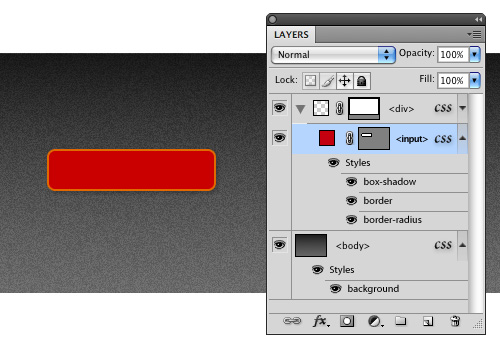
Modern WYSIWYG editors are off the mark. We need something more like Photoshop, but with capabilities that allow us to create DOM elements as easily as we can create shapes. John Nack seems to be on the right track with his idea of HTML layers, which would enable users to create and style HTML elements and render them with the WebKit engine all within a standard PSD file. While this idea is not completely practical, it gives us something to work with. Imagine opening the layer styles dialog and being able to add CSS3 styling to an element. What bliss!

An example of what HTML layers might look like with CSS styling.
Jeffrey Zeldman makes a number of valid points about why creating such a tool is impossible:
HTML is a language with roots in library science. It doesn’t know or care what content looks like. (Even HTML5 doesn’t care what content looks like.) Neither a tool like Photoshop, which is all about pixels, nor a tool like Illustrator, which is all about vectors, can generate semantic HTML, because the visual and the semantic are two different things.
I have to agree. Any tool that is meant to translate visual elements from canvas to code will inevitably fail in the semantic realm. Computers are monolingual: they need us to make that translation. However, do we need perfectly semantic code if we’re only creating a mock-up? Why can’t we accept the reality that we’re not crafting the final product and simply spit out HTML and CSS that’s “good enough” for mock-up purposes. Once the design is approved, we’ll put on our foreman hat and begin the real construction.
Until our paradigm is rocked by some killer new app, Photoshop will reign as the best tool for designing websites. Although it doesn’t currently speak to our medium the way we wish it did, it proves itself priceless when it comes to the process of designing. Photoshop is a virtual playground of experimentation; dropping it from the process only prevents your design from being fully developed. So, before you switch to the mark-up methodology, understand that you’re sacrificing creativity for a few browser capabilities, which could be explained to clients anyway. For the sake of your client, creativity and work, stick with Photoshop.
For more on information on designing websites in Photoshop, check out my Smashing eBook Mastering Photoshop Web Design, a book for advanced and intermediate designers who want to brush up on their workflow and improve their Photoshop skills.
Further Reading
- Make Your Mockup in Markup A walkthrough on designing in the browser.
- Time to Stop Showing Clients Static Design Visuals Describes the benefit of showing clients dynamic mock-ups.
- Designing Websites in Browser (Gasp!) A Stack Overflow discussion on the topic.
- Why We Skip Photoshop 37signals’ take on things.
- Why the “Design in the Browser” Argument Misses the Point Aaron Russell outlines the benefits of Photoshop.
- Feedback, Please: HTML5 Layers in Photoshop? John Nack proposes HTML layers within Photoshop.
- CSS is the New Photoshop John Nack explains the importance of CSS in the argument.
- An InDesign for HTML and CSS? Zeldman in response to John Nack.


 Register Free Now
 Celebrating 10 million developers

 SurveyJS: White-Label Survey Solution for Your JS App


