Showcase Of Delicious Coffee Websites
And in fact, coffee houses and suppliers are quite a business, with online presences ranging from simple layouts with striking typography to advanced layouts with remarkable photography. Coffee websites: what do they look like? What do they have in common? What metaphors, visuals and typography are they using? Well, this is where this showcase comes handy; let’s take a closer look at tasty coffee websites and examine their distinctive features and peculiarities.
Showcase
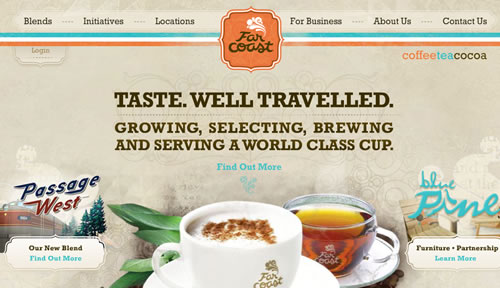
Far Coast Rustic oranges and blues are at play Far Coast’s website, with hints of distressed textures for an even more vintage vibe. The top navigation bar complements the large images that span the bottom, and the size of the centered text balances these for a pleasing look. Contrasting the richness of imagery is a neutral background, as well as low-opacity shots on either side.
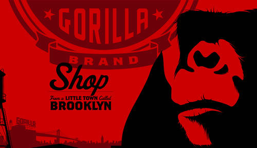
Gorilla Coffee Thick lines, a dark two-toned palette, heavy shapes and an urban setting remind the user that coffee can be just as enjoyable when sipped in a fast-paced city as in the mountains. Flash in use.
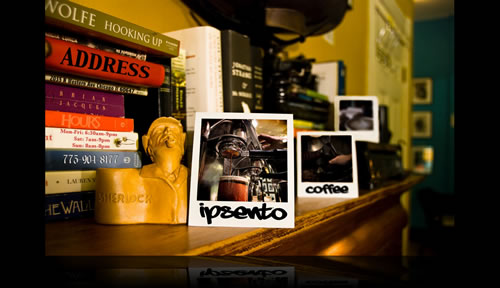
Ipsento Coffee Instead of working with generic templates, Ipsento Coffee provides truly professional photography, displaying various navigation options in a quite unusual but attractive way. No links, no pages, no frustration with poor navigation. Ipsento shows that you can be complex and professional in design without having to indulge in equally complex development.
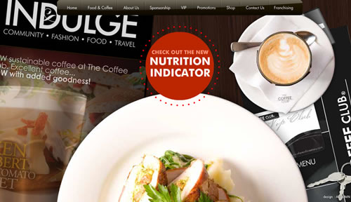
Coffee Club It’s no accident that the word “Indulge” emphasized in this design. With the aerial view of the natural setting, multiple areas of primary and secondary focus and beautiful balance of features, you’ll be indulging in this design as much as the Coffee Club’s menu.
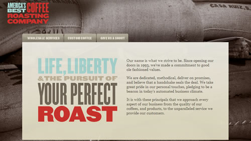
America’s Best Coffee Roasting Company Balance is key in this design, and in many ways. America’s Best balances the abundance of gray tones in the big background image with a few shots of bright blues and rusty reds. In the same vein, the small text on the right side of the text area is balanced by the large focal text on the left. Overall, this text and link area is centered in the design. There are subtle balances as well: the “heavy” part of the picture is the top right, balancing the logo on the left.
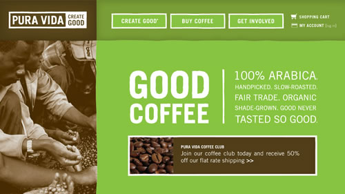
Pura Vida Lime green isn’t an obvious tone to associate with coffee, nor with a website. But Pura Vida uses it to embody the qualities of its coffee: fair-trade certified, organic and shade-grown. The tone is cooled down by the rich browns, crisp whites and suede neutrals.
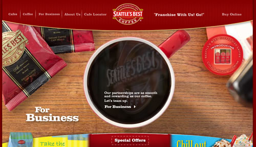
Seattle’s Best Coffee The most interesting part about Seattle’s Best Coffee website is its interactivity. You can rotate the cup to reveal different information about the company, its partners and the coffee. As the website says, “Go ahead. Take it for a spin.” Your design taste buds will be satisfied.
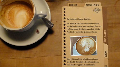
Café Henrici With a simple “flip” of the menu, you get all the information you need about Café Henrici. Café Henrici’s use of perspective in the layout image draws users into the scene, making them feel as though they are sitting at a round table in the Café, sipping a steamy cup.
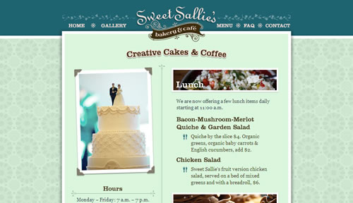
Sweet Sallie’s Bakery & Cafe Though Sweet Sallie is as much a cafe as a bakery, its website exemplifies the cute-cupcake vibe found in many bakeries. With various blues, lavenders and teals and a feminine background pattern and type, this website’s all about baked-goods deliciousness. The cafe is simply the cherry on top.
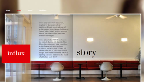
Influx Café With a design as modern as the furniture in the photo, the Influx website is sure to please. On the home page, we are first presented with a sped-up video of goings-on in the cafe, giving us a fly-on-the-wall look at the cafe… and some tasty-looking muffins. From there, users can navigate to the sub-pages, which continue the clean palette.
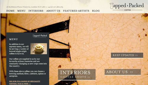
Tapped & Packed Coffee The Tapped & Packed website combines the beauty and simplicity of modern design with traditional charm. A simple yet elegant palette of deep grays, crisp whites and soft yellows is combined with crisp lines to give a modern touch, while the serif fonts and roman numerals lend traditionalism.
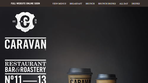
Caravan Caravan’s website (or rather “Coming Soon” page) is decadent in rich grays and browns. Crisp whites bounce off the dark tones in both serif and sans-serif fonts, giving the typography a professional look. The background image gives us a view of its modern product design, which reflects the website itself, with its sparse text and neutral color choices.
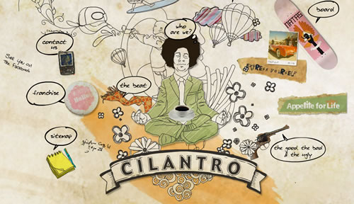
Cilantro Café With drawn images dancing about a meditating man, impulsive swathes of paint and a variety of colors and objects, Cilantro Café reminds us that coffee can be both impulsive and relaxing. Reinforcing this contradiction is the radial balance of links that are off-kilter.
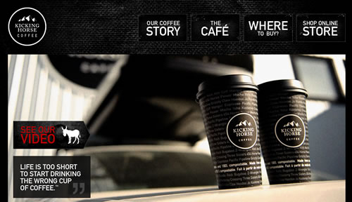
Kicking Horse Coffee The classic black and white palette of this website reflects the product design of Kicking Horse Coffee’s cups. The website uses splashes of bright tones to (ahem) kick it up a notch, and it adds slight textural elements for intrigue. The large focal point anchors the design, allowing the designer to make the links and text area large. It’s big, in your face and effective.
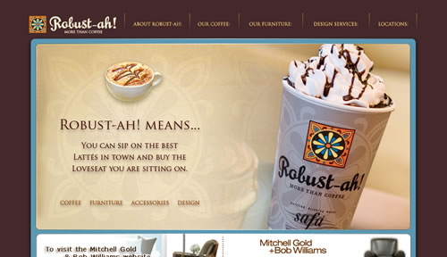
Robust-ah! Robust-ah’s large photo could have easily overwhelmed this space, becoming a distraction from the information featured below. Instead, the design actually benefits from the large photo, which anchors the rest of the information by giving the structure clean lines and the information a hierarchy. Robust-ah’s design is not what you would expect from a coffee website, with its deep-purple and light-blue tones. However, some things need to be improved here: larger font-size would help, and so would removing text-shadow from some parts of the text.
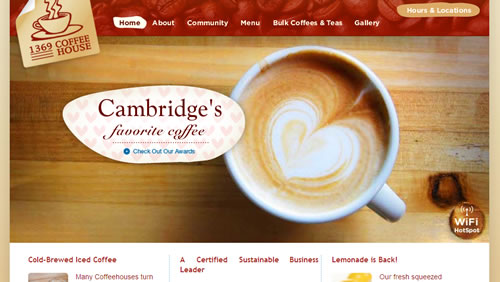
1369 Coffee House This coffee house website may look generic and simple, and that’s because it is. But the generic vibe and simplicity ensure that the large photo and generous information remain clean and organized.
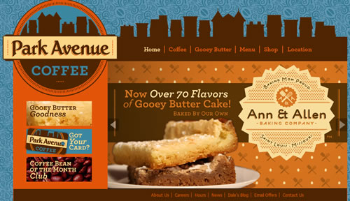
Park Avenue Coffee Park Avenue Coffee gives a playful feel with all the vintage charm of its busy patterns, whimsical logos and strong color palettes.
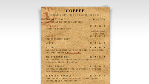
Greyhouse Coffee & Supply Co. Greyhouse Coffee emphasizes its menu so much that you have to hover around the bottom or top for the sleek sub-navigation bars to float into view. Design-wise, the menu’s cork background lends organic relief to the modern feel of the other pages.
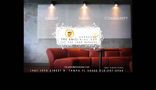
Tre Amici Reminiscent of I Spy books, Tre Amici’s links are scattered across the various photos of its coffee house. With images that skate in and out upon link clicks, Tre Amici shows an interesting, interactive take on the stagnant photo tours of other websites. The transitions in the Flash-based navigation could be certainly improved, though.
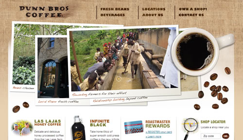
Dunn Bros Coffee The Dunn Bros Coffee website has multiple textures, including burlap, paper, and photography, to exude a cozy vibe. The aerial view is also quite nice, giving us a few extra textures to enjoy: the blackness of the coffee, the shininess of the mug and the roughness of the coffee bean.
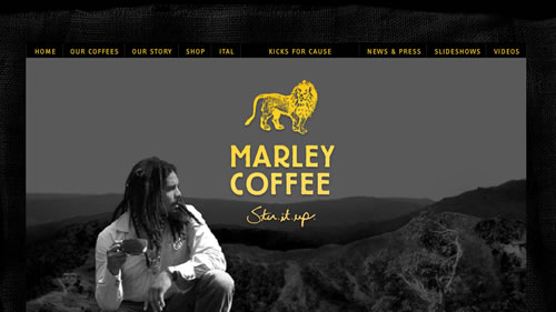
Marley Coffee Marley Coffee’s website is aesthetically pleasing, with a simple yet modern palette, lovely Flash and a simple point of focus. But don’t be so quick to click, not until you see Mr. Marley close up, sipping a cup of coffee and peering over the mountains and wilderness.
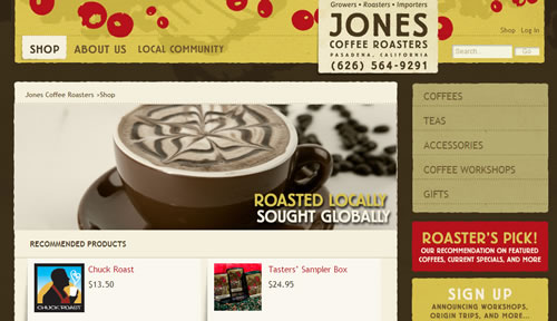
Jones Coffee Roasters Jones Coffee Roasters has a simple website with a simple layout, but the colors are bold and comfortable, and the textures add coziness and warmth. Easy navigation and a homey feel: a workable, beautiful combination.
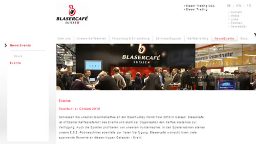
Blaser Café Blaser Café’s website features crisp whites and a no-nonsense, user-friendly structure, which reminds us that coffee isn’t just about sipping brew and enjoying a break. It’s a business. But we all know what all work and no play leads to, and so Blaser Café adds a fun touch, too, with whimsical image transitions on the home page.
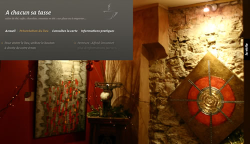
A Chacun Sa Tasse A Chacun Se Tasse lets us take in rich screen-wide images of its coffee house while reading information in an elegant gray information box. Sifting through images requires only a quick hover on the right side of the page, with no jolting image or page transitions.
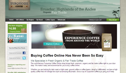
Turquoise Coffee At the opposite end of the color spectrum is Turquoise Coffee, which uses calm neutrals, muted turquoises and subtle splashes of unexpected tones to grab the user’s attention. The website may not be as flashy or inspirational as some others we’ve seen, but it’s pleasant, easy on the eyes and user-friendly, and it gets the job done. It reminds us that simple isn’t so bad. The line-height and padding could be increased though.
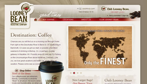
Looney Bean Roasting Company Nothing says decadence quite like red. And nothing is a more perfect match than red and subtle khaki neutrals. Reds and beiges may not be the go-to colors for coffee products, but here they play off the large coffee-swirl background to emphasize the coffee’s creamy delectability, rather than its high-energy potency.
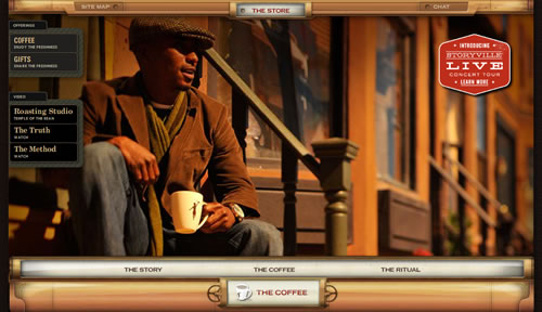
Storyville Coffee Company This website is tasty enough on the low bandwidth option, but go high bandwidth if possible. Here, everything says rich: the warm tones of the large transitional images, the rich grain in the borders, the page transitions, the balance of information on the secondary pages, the decoration upon link-hover and the elegant, deep-toned pattern background. The coffee is “artfully roasted,” and the website is certainly artfully crafted.
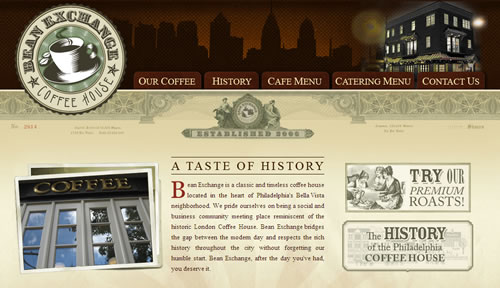
Bean Exchange Coffee House History comes alive on the website for this old Philadelphia coffee hub. The coffee house communicates its rich history in the look and feel of the website, with every bit of ornateness, palette and structure contributing to the theme.
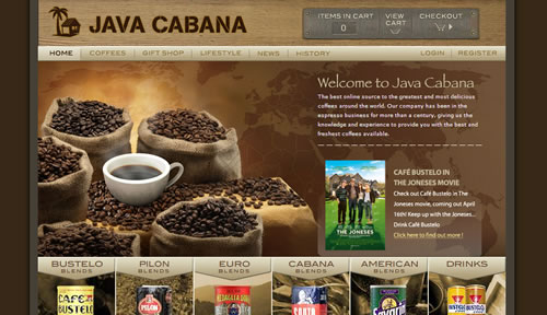
Java Cabana There is such a thing as too much of a good thing, and certainly in the case of color. But Java Cabana’s heavy use of brown—typical of coffee websites—isn’t overbearing, thanks in part to the texturing of most of the brown elements, which help to break up the monotony. In addition, the steel accents bring a gray neutral that breaks up the brown without becoming an overt accent tone. Add in some great illusions of dimension, and you’ve got yourself a delicious website. Flashy transition effects in the footer of the page could be achieved with CSS3; you don’t really need Flash for that any more.
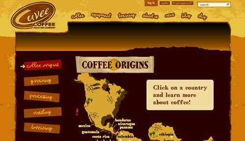
Cuvée Coffee Roasting Company This company boasts, “We take our coffee seriously. But we don’t take ourselves seriously.” It may sound like a cliché, but if its design is any indication, Cuvée Coffee is being honest. With fun cheesy yellows, handwritten fonts and playful graphics, the website feels as whimsical as it is professional. The palette stays grounded in warm hues, helping to maintain professionalism and hint at Cuvée’s birthplace: the arid state of Texas.
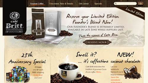
Café Britt An abundance of imagery is on Café Britt’s website to stimulates several of the senses. The stainless steel logo against the rich gray background convey the professionalism of the company. The wood and plant imagery in the navigation bar and footer brings a natural aura. We also get an intimate feel from scrapbook-like elements such as the handwritten fonts, old-paper textures and painted scenery on sub-pages. The website is wide, but that helps to accommodate the abundance of content.
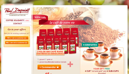
Paul Dequidt Torrefacteur Soft plays on opacity and drop-shadows give texture to the large white information areas at the center of the page. The large background contains the palette from which all tones are pulled. The dimensions could be overwhelming, stifling any smaller images in the text area, but the large image in the white section maintains equal proportions. In addition, we get a definitive sidebar and two-column balance, adding stability to the layout.
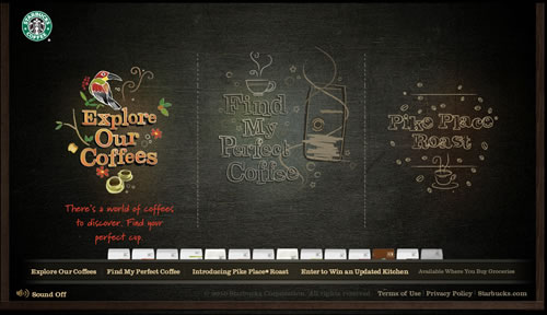
Starbucks Coffee at Home Starbucks uses a chalkboard as it’s background, providing an instant means for texture. The dark hue of the board helps anchor the bright colors that appear upon link-over. Balance is kept centered; this simplistic form of balance keeps the intricate links and unique coffee navigation in check.
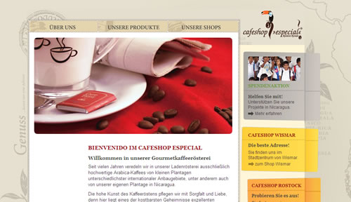
Cafeshop Especial Dimension, texture and the colors in the links and sidebar ensure instant recognition of important sections, while the soft background adds a neutral base and subtle interest.
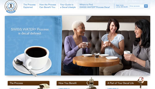
Swiss Water In the rotating pictures, you’ll find women talking to one another over a cup of coffee, women enjoying a solitary cup of coffee, women sipping coffee while working. These scenes highlight coffee’s status as both a vehicle for social interaction and an occasion for brief solitude, and they form the largest part of the website, above the fold and in your face. The soft blues and whites minimize the distraction of the top links, search box and the like. Even the logo takes a back seat to the driving concept: coffee’s friendliness and warmth.
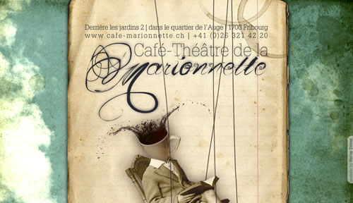
Café Théâtre de la Marionnette It’s not often that a torso with a coffee-cup head descends from above on strings and slides down the page, but with a name like Café Théâtre de la Marionnette, the sight is not surprising. Neither are the rustic textures and intriguing images (such as the doll-like dresses). But what keeps this website in the modern era is the beautiful development, which gives us a realistic bounce as each page loads.
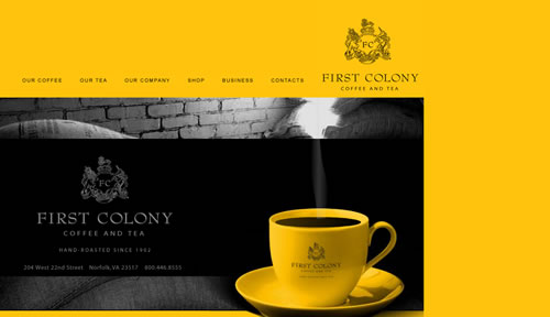
First Colony Coffee and Tea Using a mix of old and new design, First Colony Coffee and Tea definitely breathes new life into tradition. The serif fonts, black and white imagery and crest in the logo create a colonial vibe and take the edge off the stark modern yellow in the image and background. With the expansive space along the right side and abundance of text, this website could easily have been boring at first glance; but the focal point comes to the rescue, with the smooth sway of steam from the coffee cup and the soft scrolling of the background image.
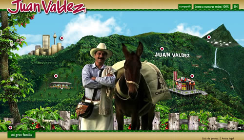
Juan Valdez This website gives us more than a warm welcome. Here, we are personally greeted by Juan Valdez, we traverse the rich countryside scene, and we enjoy all the animated goodness that this design has to offer. And if you don’t have time to take it all in, you’re in luck: the easy navigation makes the content extremely accessible, an advantage that many heavy websites don’t have.
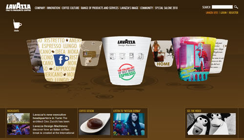
Lavazza Lavazza’s neutral brown background emphasizes the big links of rotating coffee cups that occupy most of the page. The neutral background also accommodates bright tones that run the spectrum. These whimsical touches are balanced by a simple white font for navigation and darker browns for drop-shadows and highlights.
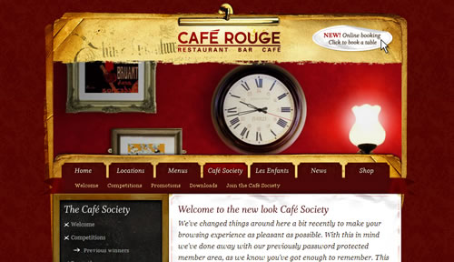
Café Rouge Various textures create a warm, entertaining vibe on Café Rouge’s website. The textured background, rough paper, old stickers and supple light are just a few of the touches that make this website cozy. The movement in the photos and scrolling images below add flare.
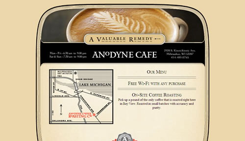
Anodyne Coffee Anodyne’s website is simple. Its coding is basic, and its design is line-based and simple, which might cause some designers and developers to cringe. However, with the Web now so obsessed with bells and whistles, seeing a simply coded, simply designed website is a breath of fresh air. The traditional serif fonts hearken back to simpler times. What would be really necessary, though, is to replace an image used under the header to display opening times and the address with simple text that would have higher contrast against the background.
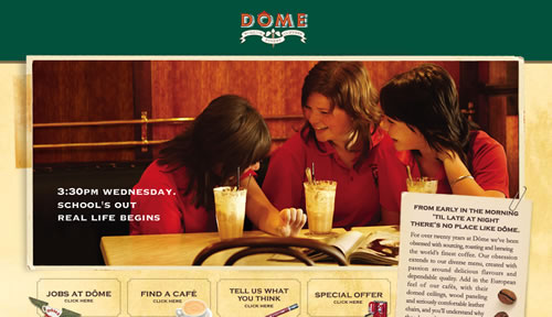
Dôme Café Like Café Rouge, Dôme Café uses a variety of textures to make the user feel cozy. The rotating images add excitement, and elements such as the white ribbon in the logo and the trim around the links instill tradition.
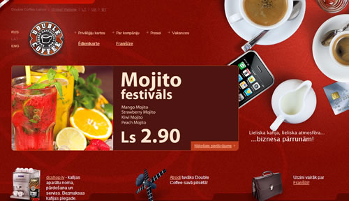
Double Coffee Double Coffee matches its big imagery with big text, big text areas and bold white fonts, achieving proper balance. Red runs rampant across the website in different hues and tones, bringing consistency and cohesion to the website. Adding to the cohesion are white cups, dishes and creamers that mirror the font. It’s proportionately spot-on and features interesting touches, such as a credit card. The consideration for all of these basic design principles make the website appealing and make us want to stay for one more page.
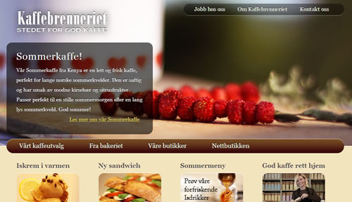
Kaffebrenneriet Like the Far Coast website, Kaffebrenneriet balances big rich imagery at the top with a neutral brown and taupe bottom, as well as focused images and simple fonts. Shadows set off the logo and two navigation bars, and the play on opacity and light make for an overall professional feel.
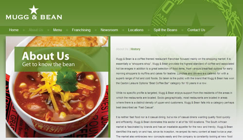
Mugg & Bean The dominance of one color, the balance of the large imagery and text areas, the traditional white font and the accent tones make this website easy on the eyes. Drop-shadows, reflection effects and beautiful image movement make it look even more professional.
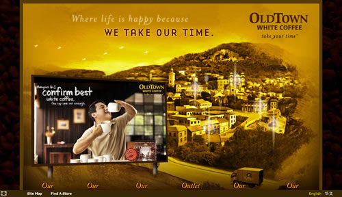
Old Town Old Town plays up its name in this design, with its yellow-sepia blend in the background, the old village nestled in the countryside, the italic serif fonts and the flock of birds in the sky. We also get a touch of modern, with scrolling videos on the billboard and an animated delivery truck. The heaviness of the billboard is balanced by the town, and together they are balanced by the six links along the bottom, which reveal sub-navigation in white boxes upon hover.
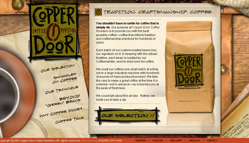
Copper Door Coffee Roasters A multitude of textures, along with paper, wood and nails, give this website its natural look. The nice handwritten font for links and page headers and the drawn lines under hovered links punctuate the naturalness. Warm greens and oranges bring out the equally warm hues in the textures.
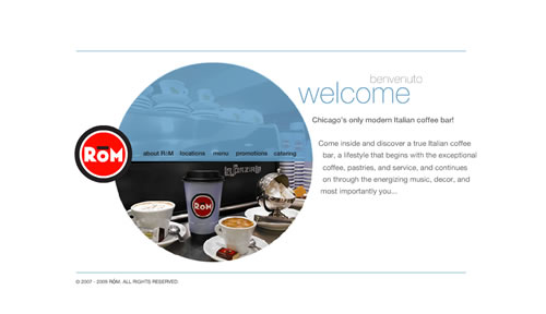
ROM Coffee Bar The circle of ROM Coffee Bar’s logo is reflected throughout the website, providing continuity and visual interest and giving the crisp whites and steel blues a softer feel.
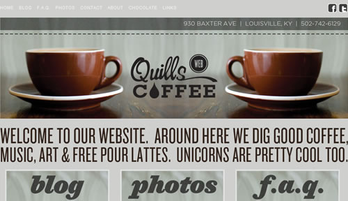
Quills Coffee Big images, fonts and links provide balance, while the contrast of font types adds variety to this big neutral design.
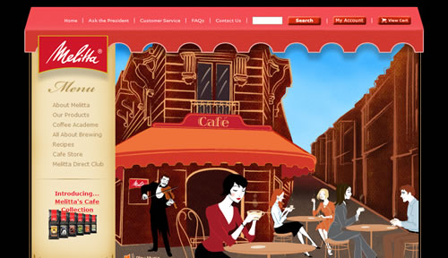
Melitta There’s no better way to involve a user in your product than by simply throwing them into the scene. Most coffee websites do this with a close-up of coffee or a large static image of customers enjoying the atmosphere. Not Melitta. Melitta puts us at eye level with the rest of the coffee shop’s patrons, making us feel as if we too are sitting and sipping. We get a large view of the coffee shop’s charming exterior, and we can even watch as the patrons move, change and enjoy the experience. What’s best is how large the graphic is, giving us a full-on view of the perfect Melitta experience.
Related Posts
You may be interested in the following related posts:
- Showcase of Sweet Chocolate Websites
- “Meet the Team” Pages: Examples and Trends
- Showcase Of Beautiful Vertical Navigation Designs
- Beautiful eCommerce Websites
- The Unusable and Superficial World of Beer and Alcohol Websites
- What If Oscars Were Given To Movie Websites?
- Principles Of Minimalist Web Design, With Examples


 Get a Free Trial
 JavaScript Form Builder — Create JSON-driven forms without coding.
 How To Measure UX and Design Impact, 8h video + UX training

 Register For Free