In Defense Of A/B Testing
Recently, A/B testing has come under (unjust) criticism from different circles on the Internet. Even though this criticism contains some relevant points, the basic argument against A/B testing is flawed. It seems to confuse the A/B testing methodology with a specific implementation of it (e.g. testing red vs. green buttons and other trivial tests). Let’s look at different criticisms that have surfaced on the Web recently and see why they are unfounded.
Further Reading on SmashingMag:
- The Ultimate Guide To A/B Testing
- A Roadmap To Becoming An A/B Testing Expert
- Multivariate Testing In Action
- How Usability Testing Drastically Improved My Client’s App
Argument #1: A/B Testing And The Local Minimum
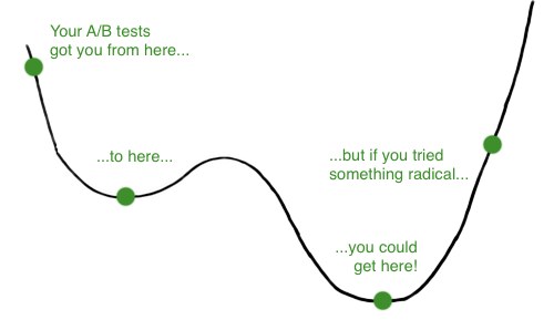
Jason Cohen, in his post titled Out of the Cesspool and Into the Sewer: A/B Testing Trap, argues that A/B testing produces the local minimum, while the goal should be to get to the global minimum. For those who don’t understand the difference between the local and global minimum (or maxima), think of the conversion rate as a function of different elements on your page. It’s like a region in space where every point represents a variation of your page; the lower a point is in space, the better it is. To borrow an example from Jason, here is the issue with the local vs. global minimum:

As even Jason acknowledges in his post, this argument isn’t really concerned with A/B testing, because the same methodology could be used to test radical changes to get to the global minima. So, calling it an A/B testing trap is unfair because it doesn’t have anything to do with A/B testing. Rather, the argument uncovers the futility of testing small changes.
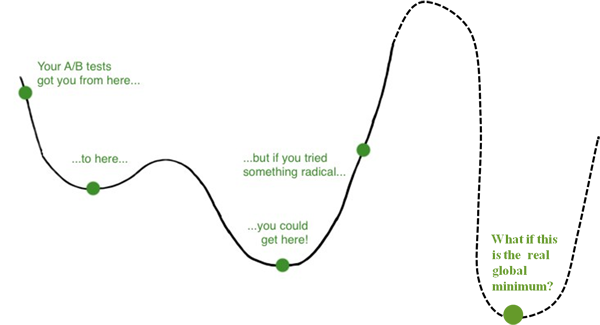
So, if A/B testing is not the culprit, is the real issue the local minima? No, even the theory of discounting local minima is flawed. The image above shows you a very simple one-dimensional fitness landscape. You can imagine the x-axis as the background color and the y-axis as the bounce rate. Jason’s argument goes something like this: if you tested dozens of shades of blue, you might decrease your bounce rate, but if you tried something completely different (such as a yellow), you might achieve the absolute lowest bounce rate possible on your page.
There are two problems with this argument…
1. You Never Know for Sure Whether You’ve Found the Global Minimum (or Maximum)

The global minimum (or absolute best) exists only in theory. Let’s continue with the example of an extreme yellow background giving you the global minima (in the bounce rate). Upon further testing, what if you found that no background color at all gave you a lower bounce rate? Or better yet, that a background full of lolcat images gave you an even lower bounce rate? The point is, unless you have reduced the bounce rate to 0% (or the conversion rate to 100%), you can never be confident that you have indeed achieved the global optimum.
There is another way to determine whether you have found the global optimum: by exhausting all possibilities. Theoretically, if your page didn’t contain anything other than background color (and you couldn’t even add the background image because, well, your boss hates it), then you could cycle through all background colors available and see which one gave you the lowest bounce rate. In exhausting all possibilities, the color that gives you the lowest bounce rate should be the one that is absolutely the best. This brings us to the second point…
2. It’s Not Just About the Background Color, My Friend
When optimizing a Web page, you can vary literally hundreds or thousands of variables (background color being just one of them). Headline, copy, layout, page length, video, text color and images are just a few such variables. Your goal for the page (in terms of conversion or bounce rate) is determined by all of these variables. This means that the fitness landscape (as seen in the images above) is not one-dimensional and never as simple as it appears. In reality, it is multi-dimensional, with a ton of variables affecting the minima and maxima:

Again, imagine the peaks as your conversion rate (or bounce rate) and the different dimensions as the variables on your page (only two are here, but in reality there are hundreds). Unlike a one-dimensional case, exhausting all possibilities in a real-world scenario (i.e. in conversion optimization) is impossible. So, you are never guaranteed to have found the global maxima (or minima). Lesson to be learned: embrace local minima.
Argument #2: A/B Tests Trivial Changes
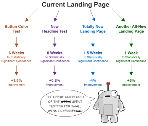
Rand Fishkin of SEOMoz, posted an article titled Don’t Fall Into the Trap of A/B Testing Minutiae in which he reiterates Jason’s argument to not waste time testing small elements on a page (headline, text, etc.). His main argument is that getting to the local maxima (by testing trivial changes) takes up too much energy and time to make it worthwhile. See the image below, reproduced from his blog but modified a little to make the point:
The first point to make is that the opportunity cost is not the time required to run the test (which is weeks) but rather the time needed to set up the test (which is minutes). Once you have set up the test, it is pretty much automated, so you risk only the time spent setting it up. If an investment of 15 minutes to set up a button-color test ultimately yields a 1.5% improvement in your conversion rate, what’s wrong with that?
Many A/B testing tools (including Visual Website Optimizer—disclaimer: my start-up) make setting up small tests a no-brainer. They also monitor your test in the background, so if it isn’t a winner, it is automatically paused. What’s the risk then of doing such trivial tests? I see only the upside: increased sales and conversions.
To make his point, Rand gives the example of a recent Basecamp home page redesign, by which Basecamp managed to increase its conversion rate by 14%. Can you imagine the kind of effort that went into such a redesign (compared to a button-color test)? In fact, because the fitness landscape is multi-dimensional (and very complicated), a total redesign has a much higher probability of performing worse. A complex design can go wrong in many more ways than a simple button color can. Because we never hear of case studies of redesigns gone wrong (hello survivorship bias), we shouldn’t conclude that testing radical changes is a better approach than testing minutiae (especially because radical changes require a huge investment in effort and time compared to small red vs. blue tests).
With the local minima (or maxima), you at least know for sure that you are increasing your conversion rate, which leads directly to increased profit. This isn’t to say that we should give up on our hunt to achieve the global optimum. Global optimum is like world peace: incredibly hard to achieve, but we have to keep moving in that direction. Lesson to be learned: the ideal strategy is a mix of both small (red vs. blue) tests and radical redesign tests. By jumping across the mountains in the conversion rate fitness landscape, you ensure that you are constantly seeking better conversion rates.
Argument #3: A/B Testing Stifles Creativity
Jeff Atwood compares the movie Groundhog Day to (surprise, surprise) A/B testing and concludes that because the protagonist failed in the movie, A/B testing must also fail. Stripped of all (non-)comparisons, Jeff suggests that A/B testing lacks empathy and stifles creativity. He goes on to cite a tweet by Nathan Bowers:
A/B testing is like sandpaper. You can use it to smooth out details, but you can’t actually create anything with it.
Whoever claimed that A/B testing is good for creating anything? Creation happens in the mind, not in a tool. The same flawed reasoning could be applied to a paint brush:
A paint brush is like a stick with some fur. You can use it to poke your cat, but you can’t really create anything with it.
A/B testing, like a paint brush, is a tool, and like all tools, it has its properties and limitations. It doesn’t dictate what you can test; hence, it doesn’t limit your creativity. A/B testing or not, you can apply the full range of your creativity and empathy to coming up with a new design for your website. It is up to you whether to go with your gut and implement it on the website immediately or to take a more scientific approach and determine whether the new design converts better than the existing one. Lesson learned: A/B testing is a tool, not a guidebook for design.
Summary
To reiterate the lessons learned from the three arguments above:
- Because you can never achieve the global minima, embrace the local minima. Testing trivial changes takes a few minutes, but the potential outcome is far greater than the cost of those minutes.
- Constantly explore the best ways to increase your conversion rate by performing both trivial tests and radical redesign tests at regular intervals.
- A/B testing is a tool and does not kill your imagination (in fact, you need your imagination most when designing variations).
- Lastly, don’t feel guilty about performing A/B testing.


 Try ProtoPie AI free →
 Register Free Now
 Celebrating 10 million developers
 SurveyJS: White-Label Survey Solution for Your JS App


