Five Useful Design Techniques and Coding Solutions For Web Designers
As designers, we have to create an intuitive user experience, solve design problems and provide a beautiful and functional user interfaces. Unlike print design, we don’t have the luxury of designing in a static area; rather, our canvas is ever-changing in its content, browser width, page length and more. We do need to be able to code to some extent and be able to build a design around a structure of code. Yet, with these complications comes an opportunity for unique functionality, interactive effects and better user experience.
Further Reading on SmashingMag:
- Why Coding Style Matters
- 5 Useful Coding Solutions For Designers and Developers
- User Interface Design – 12 Useful Techniques
- 10 Useful Web Application Interface Techniques
In this article, we’ll look at five useful coding solutions that we’ve stumble upon recently. All of these solutions enhance a website’s design, not just the code. These solutions affect the user interface and the user’s interaction with the design, and they can make for a more usable and interactive website.
1. Bar Graph Effect For Multiple Items
This effect (pictured below) can be a great way to add some oomph to a Web page, and make it more user-friendly. Its functionality goes beyond just being a cool trick, though. By organizing any set of items on a page — such as tags, categories, comments, product count — a designer can enhance user interaction, provide useful content clues and improve usability. By seeing a count of items such as tags and product types, the visitor can quickly get an idea of what the website mostly consists of. This is a great way to make quick connections with targeted visitors.
For comment counts, visitors can quickly see where the discussions are at. Highlights on highly commented posts can reinforce user-to-user interaction.
Pictured below are two examples of this design. The left organizes tags, and the second ranks the most commented posts on a blog. Be sure to visit both websites to see the full functionality and CSS effects.
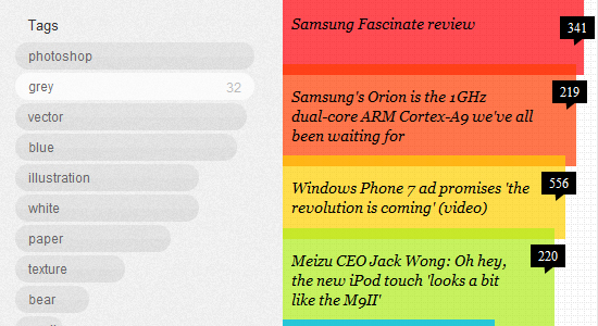
Left, Dribbble (number of tags). Right, Engadget, (most commented posts).
How Is It Done?
Recreating this solution is really quite easy. We have to do three things:
- Lay out the full list of features,
- Create the effect in plain (X)HTML and CSS,
- Pull in the counts dynamically and put them into our static version.
Breaking the feature down into simple, specific steps give us the beginnings of a solution. We now have a direction to follow.
List the Bar Graph’s Features
To get started with the first step, let’s lay out exactly what this design does. By laying out the steps in writing, we can sort it out into coding terms.
- Dynamically pull in a number count (tags, comments, category count, etc.);
- Determine the items with the highest count (perhaps the 10 most commented categories, as opposed to all of them);
- Create a horizontal bar corresponding to the count (or a vertical bar for a different look);
- Organize the bars in order of quantity.
Recreating the Design (Static)
Now, let’s create the design, only without any dynamic data or automation. We’ll leave out pulling in the number count from a database or other source and make up our own numbers for now. We also won’t create a way to determine the highest results or organize them in descending order; instead, we’ll make up our own numbers, manually organize them and use only 10 for now. After that, we’ll redo this in plain (X)HTML and CSS and do all that dynamic stuff.
The (X)HTML:
<div class="block">
  <a href="#" style="width: 100%">Web Interface Design (27)</a>
  <a href="#" style="width: 92.59%">Photoshop Tutorials (25)</a>
  <a href="#" style="width: 74.07%">CSS Tricks (20)</a>
  <a href="#" style="width: 66.66%">Showcases & Inspiration (18)</a>
  <a href="#" style="width: 51.85%">WordPress (14)</a>
  <a href="#" style="width: 48.15%">JavaScript (13)</a>
  <a href="#" style="width: 37.04%">Free Resources (10)</a>
  <a href="#" style="width: 29.63%">Reviews (8)</a>
  <a href="#" style="width: 29.63%">Interviews (8)</a>
  <a href="#" style="width: 25.93%">Typography (7)</a>
</div>
The CSS:
html, body {
  background: #eee;
  font: normal 13px/1.5em Arial, Helvetica, sans-serif;
}
* {
  margin: 0;
  padding: 0;
}
.block {
  width: 400px;
  margin: 100px auto;
}
a {
  display: block;
  padding: 5px;
  margin-bottom: 2px;
  background-color: #666;
  color: #fff;
  text-decoration: none;
}
a:hover {
  background: #9764a0;
}
The above code will create this static mock-up:
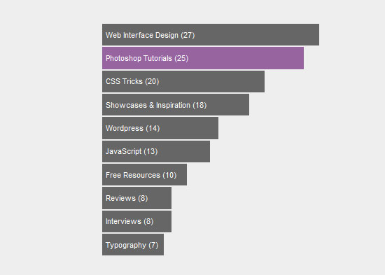
Note that we’ve added some basic styling, just to experiment with how hovers could work. For the most part, though, this version is very basic so that you can customize it as you want.
The (X)HTML and CSS should be self-explanatory, but let’s go over how we created the bars. In our style sheet, we created the basic styles and turned each link into a bar using the display: block property. In this simple example, these are the only links on the page, but to be of practical use, some of these bar links would have to be given a class, to distinguish them from the other links on the page. Alternatively, one could use the :nth-child() selector of CSS3 without defining new classes.
We then went into the (X)HTML and set each bar’s width individually with the style attribute. In the (X)HTML code above, we have specified each width as a percentage. We first assume that the highest value, “Web Interface Design (27)”, is 100%. From there, we calculate the percentages of the others relative to that.
Example: “Photoshop Tutorials (25)”
25 × 100 = 2500
2500 ÷ 27 (our 100%) = 92.59%
<a href="#" style="width: 92.59%">Photoshop Tutorials (25)</a>
Recreating the Design (Dynamically)
We have now figured out the math and the static code, and we just have to put it all together, pulling the code from a database and automatically organizing and creating the bars.
In this example, we’re working with the number of posts in each of our WordPress categories, but the same logic applies to other uses and other programming languages. The code below might seem long, but don’t worry: it’s mostly comments, which explains how to dynamically calculate the percentages and pull the content into the static (X)HTML/CSS.
<!-- In our example, we get a count of categories in WordPress.
Let's first find the category with the most posts.
-->

<?php
  $highest = 0; // Initialize our “highest count” variable
  foreach((get_the_category()) as $category) { // for each category
    $cat_count = $category->category_count;

    // If this category’s count is higher than what we have so far
    // for the highest number…
    if($cat_count > $highest){
      // then re-declare our highest value according to this
      // category’s count
      $highest = $cat_count;
    }
   }
?>

<!-- Below we go through an array of the categories, and for each one
get its name and then its count. We've saved this data in
the $cat_name and $cat_count variables, respectively.

(Because we will get a new category each time the loop runs,
we'll have to process all of our other (X)HTML/CSS code within the loop
for each turn.)
-->
<div class="block">

<?foreach((get_categories(‘orderby=count&order=desc’)) as $category) {
  $cat_name = $category->cat_name;
  $cat_count = $category->category_count;

  // Let's calculate this category’s width
  // (our “100%” is our highest category count number, $highest)
  $width = ($cat_count * 100) / $highest;

  // Finally, echo out our link HTML, including our variables
  // to dynamically bring in the content for the width,
  // category name and count.
  echo '<a href="#" style="width: .'$width'.%">
    .'$cat_name'. (.'$cat_count'.)</a>';
   }
?>
</div>
Demo and Download Files
You can see the demo and download the files from our servers.
2. Animation On Article Hover
Now, this is a very nice aesthetic effect, and it is original, too. Visit CSS Tricks or check out the image below. The articles have a simple clean look, with only an asterisk separating them. When one hovers over a post, we see its meta data: comments, a “Read on” link and date stamp.
What makes this effect especially dynamic is that it features a hover effect for content, not just images. It’s a cool trick and it has some practical uses, too. By hiding content until it’s needed, the designer puts more emphasis on the content and important features. A website can have the appeal of minimalism but still offer rich functionality.
This design solution also makes important content stand out. As on CSS Tricks, when users hover over a post, an action occurs, drawing the user’s eyes to links that will help them interact with the blog.
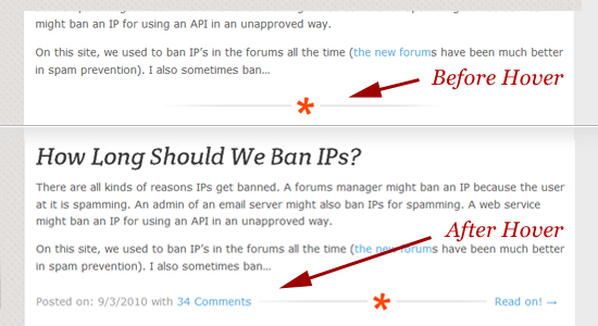
When you hover over a home-page post on CSS-Tricks.com, meta content is revealed.
How Is It Done?
This effect might look more complicated than a simple image roll-over, but the same principle applies. With some CSS and a bit of basic JavaScript, we can do the same thing.
Let’s first look more closely at what this effect does. Then we’ll be able to more easily come up with the solution.
- When any part of a post is hovered over, the effect is triggered.
- Two pieces of content are revealed, to the left and right of the original image: the date and comments section, and the “Read on” section.
- On moving the mouse, the post returns to normal.
Seeing how this is similar to image roll-overs is now easier. For image roll-overs, we use JavaScript to change code for onMouseOver and onMouseOut. We’ll do a similar thing here, but use divs instead of images. Also with image roll-overs, we’ll usually replace one image with another. Our action here instead will be just to show and hide content.
The (X)HTML
We need to wrap a div element around the entire post, and we can manage that as a single step. We can then apply the JavaScript events to it: MouseOver and MouseOut. For each, we simply set the content’s display property (defined by a CSS id) to none or inline. Instead of using inline-attributes, it’s better to separate JavaScript and CSS, e.g. using jQuery.
<div class="post">

<h2>A Blog Post Title</h2>
<p>Lorem ipsum dolor sit amet, consectetur adipiscing elit. Pellentesque dignissim est ultrices neque fermentum convallis. Nulla libero lacus, accumsan sed porta quis, pulvinar in lectus. Sed id justo lorem, eu ullamcorper sapien. Nullam tincidunt lorem nec nisl egestas gravida vel et massa. Donec arcu nisl, venenatis ac suscipit dignissim, egestas auctor lectus. Quisque vulputate fermentum felis sed tristique. Ut enim felis, faucibus ac fermentum rutrum, posuere id nulla. Duis lectus dolor, eleifend in tincidunt eu, sagittis sed sapien. Duis id purus id magna facilisis luctus. Mauris sodales arcu ut arcu laoreet id pulvinar ligula hendrerit.</p>

<!-- This is what appears when not hovering -->
<p id="postimg" class="center">
<img src="triangle.png" alt="Triangle" />
</p>

<!-- This is what appears on hover; hidden otherwise. -->
<p id="hiddencontent" class="center">
Posted on 9/15/10 | <a href="#">23 Comments</a>
<img src="triangle.png" alt="Triangle" />
<a href="#">Continue Reading…</a>
</p>

</div>

<script type="text/javascript">
$('.post').mouseover(function() {
  $('#hiddencontent').css('display', 'inline');
  $('#postimg').css('display', 'none');
});

$('.post').mouseout(function() {
  $('#hiddencontent').css('display','none');
  $('#postimg').css('display', 'block');
});
</script>
The CSS
Here, we’ve just done some basic styling: centered our div, styled the h2 tag, played with fonts, etc. The thing to note here is the #hiddencontent div. Because we need to hide our content on page load, we must set it in the CSS to display: none.
html, body {
  background: #eee;
  font: normal 14px/1.6em Arial, Helvetica, sans-serif;
}

#hiddencontent {
  display: none;
}

h2 {
  margin-bottom: .5em;
}

.center {
  width: 500px;
  text-align: center;
}
Below is our mock-up of the design (top is before the hover, and bottom is after). It’s just some basic CSS and JavaScript, and the code is easy enough to work around when implementing in WordPress or elsewhere.
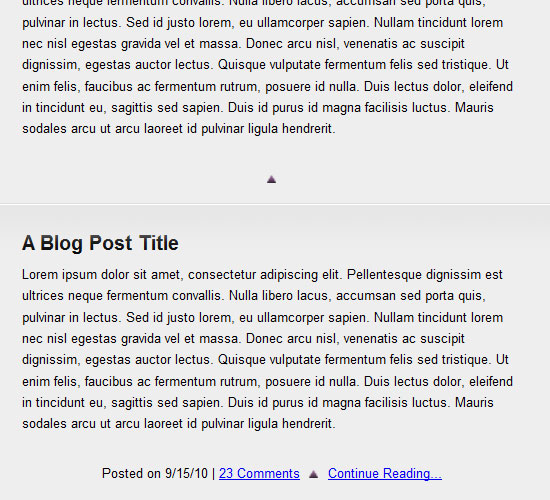
Demo and Download Files
You can see the demo and download the files from our servers.
3. A Color For Each Category
This technique gives each category on a website a different color (see Emprnt for a full implementation). This is a great way to color-code a design to give it better organization and easier navigation. For now, let’s figure out how to repeat this effect with WordPress and categories, as on Emprnt.
The same solution could be applied to other items: roles (authors have one color, editors another); authors (assign colors based on posts, tags, etc.); highlighting popular posts (highlight posts that have 150 to 200 page views with one color, and then 75 to 150 with another, and so on). The experience will vary according to your application. For example, by color-coding categories, you aid navigation and usability. By color-coding popular posts, you help users see which posts are getting the most attention.
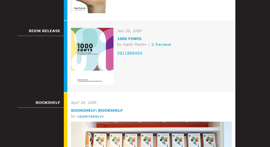
Emprnt uses CSS and a bit of code to create a different color for each category as a post is published.
How Is It Done?
To pull this off, we need to pick a color for each category, identify each category’s id and then match each id with a CSS class that specifies the color and any other basic styling. First, let’s take care of the static (X)HTML and CSS:
Recreating the Effect (Static)
The (X)HTML:
<div class="block">
<div class="post cat_1">
<h2>A Blog Post Title</h2>
<small>Category 1</small>
<p>Lorem ipsum dolor sit amet, consectetur adipiscing elit.
Pellentesque dignissim est ultrices neque fermentum convallis.
Nulla libero lacus, accumsan sed porta quis, pulvinar in lectus.
Sed id justo lorem, eu ullamcorper sapien. Nullam tincidunt
lorem nec nisl egestas gravida vel et massa. Donec arcu nisl,
venenatis ac suscipit dignissim, egestas auctor lectus.</p>
</div>
<div class="post cat_2">
<h2>A Blog Post Title</h2>
<small>Category 2</small>
<p>Lorem ipsum dolor sit amet, consectetur adipiscing elit.
Pellentesque dignissim est ultrices neque fermentum convallis.
Nulla libero lacus, accumsan sed porta quis, pulvinar in lectus.
Sed id justo lorem, eu ullamcorper sapien. Nullam tincidunt
lorem nec nisl egestas gravida vel et massa. Donec arcu nisl,
venenatis ac suscipit dignissim, egestas auctor lectus.</p>
</div>
<div class="post cat_3">
<h2>A Blog Post Title</h2>
<small>Category 3</small>
<p>Lorem ipsum dolor sit amet, consectetur adipiscing elit.
Pellentesque dignissim est ultrices neque fermentum convallis.
Nulla libero lacus, accumsan sed porta quis, pulvinar in lectus.
Sed id justo lorem, eu ullamcorper sapien. Nullam tincidunt
lorem nec nisl egestas gravida vel et massa. Donec arcu nisl,
venenatis ac suscipit dignissim, egestas auctor lectus.</p>
</div>
<div class="post cat_1">
<h2>A Blog Post Title</h2>
<small>Category 1</small>
<p>Lorem ipsum dolor sit amet, consectetur adipiscing elit.
Pellentesque dignissim est ultrices neque fermentum convallis.
Nulla libero lacus, accumsan sed porta quis, pulvinar in lectus.
Sed id justo lorem, eu ullamcorper sapien. Nullam tincidunt
lorem nec nisl egestas gravida vel et massa. Donec arcu nisl,
venenatis ac suscipit dignissim, egestas auctor lectus.</p>
</div>
</div>As you can see, we’ve given each post two classes: post and cat_#. This example has only three categories, with their classes named cat_1, cat_2 and cat_3, but keep in mind that these numbers will change according to our category ids later.
The CSS:
html, body {
  background: #eee;
  font: normal 13px/1.5em Arial, Helvetica, sans-serif;
}

* {
  margin: 0;
  padding: 0;
}

h2 {
  margin-bottom: .5em;
}

small {
  font-size: 9px;
  line-height: 1.4em;
  font-weight: bold;
  text-transform: uppercase;
}

.block {
  width: 500px;
  margin: 50px auto;
}

.post {
  padding: 15px 0 15px 15px;
  margin-bottom: 2px;
}

.cat_1 { border-left: 10px solid #cb005b; }
.cat_1 small { color: #cb005b; }
.cat_2 { border-left: 10px solid #0064cb; }
.cat_2 small{ color: #0064cb; }
.cat_3 { border-left: 10px solid #cb7700; }
.cat_3 small{ color: #cb7700; }
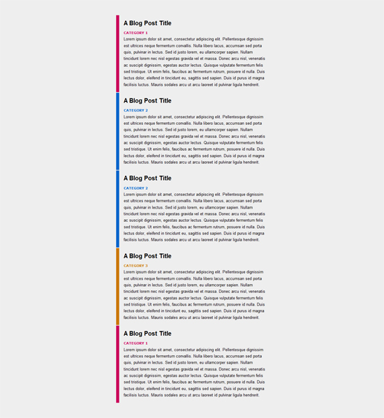
At the top we have basic styling, and toward the bottom we have our category-specific styling. We have given each category’s unique class a colored border and name. With our static (X)HTML and CSS, we should get the following mock-up:
Recreating the Effect (Dynamically)
Doing this dynamically in WordPress is not difficult at all:
<div class="block">

<?php if (have_posts()) : ?>
<?php while (have_posts()) : the_post(); ?>

  <div class="post cat_<?php foreach((get_the_category()) as $category)
      {echo $category->cat_ID . ' ';}
      ?>">
    <h2><?php the_title(); ?></h2>

    <small><?php the_category(', ') ?></small>
    <?php the_content(__('Continue reading', 'example')); ?>
  </div>

<?php endwhile;?>
<?php else : ?>
  <h2 class="center">Not Found

  <p class="center">Sorry, but you are looking for something that isn't here.

  <?php include (TEMPLATEPATH . "/searchform.php"); ?>
<?php endif; ?>

</div>
For our essential piece of code, we just need to dynamically place the category id number inside <div class="post cat_<span style="color: red">#</span>">. Note that the ids will likely not be 1, 2 and 3 (as in our static example), so we’ll have to adjust. Find your category ids, and adjust the CSS class names accordingly. For example, if a featured category has an id of 24, then the corresponding CSS class to create that category should be cat_24.
Note: with this solution, if a post has multiple categories, the post will default to the color of the first listed category.
Demo and Download Files
You can see the demo and download the files from our servers.
4. Interesting Image Captions
This last solution is simple but often overlooked. Image styling and positioning are important in any type of Web design, and attractive captions are also a must. There is really no set HTML standard for image captions, so creating seemingly simple effects requires a bit of creativity.
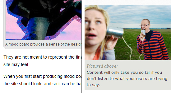
Left, Boagworld. Right, UXbooth
The (X)HTML
To group caption text and images, we need to place them in a div. Then, we’ll style the div and its components.
<div class="image-caption">
<img src="images/testimage.jpg" alt="Test Image" />
<p>Here is the image caption text, and a link.</p>
</div>
Remember, the div must be identified by a class, because we’ll be displaying images and captions multiple times throughout the website. The above code is a great starting point and could yield a number of different solutions. Below are a few CSS options and examples.
CSS Examples
.cat_1 { border-left: 10px solid #cb005b; } .cat_1 small { color: #cb005b; } .cat_2 { border-left: 10px solid #0064cb; } .cat_2 small{ color: #0064cb; } .cat_3 { border-left: 10px solid #cb7700; } .cat_3 small{ color: #cb7700; }
At the top we have basic styling, and toward the bottom we have our category-specific styling. We have given each category’s unique class a colored border and name. With our static (X)HTML and CSS, we should get the following mock-up:

Recreating the Effect (Dynamically)
Doing this dynamically in WordPress is not difficult at all:
<div class="block">

<?php if (have_posts()) : ?>
<?php while (have_posts()) : the_post(); ?>

  <div class="post cat_<?php foreach((get_the_category()) as $category)
      {echo $category->cat_ID . ' ';}
      ?>">
    <h2><?php the_title(); ?></h2>

    <small><?php the_category(', ') ?></small>
    <?php the_content(__('Continue reading', 'example')); ?>
  </div>

<?php endwhile;?>
<?php else : ?>
  <h2 class="center">Not Found

  <p class="center">Sorry, but you are looking for something that isn't here.

  <?php include (TEMPLATEPATH . "/searchform.php"); ?>
<?php endif; ?>

</div>
For our essential piece of code, we just need to dynamically place the category id number inside <div class="post cat_<span style="color: red">#</span>">. Note that the ids will likely not be 1, 2 and 3 (as in our static example), so we’ll have to adjust. Find your category ids, and adjust the CSS class names accordingly. For example, if a featured category has an id of 24, then the corresponding CSS class to create that category should be cat_24.
Note: with this solution, if a post has multiple categories, the post will default to the color of the first listed category.
Demo and Download Files
You can see the demo and download the files from our servers.
4. Interesting Image Captions
This last solution is simple but often overlooked. Image styling and positioning are important in any type of Web design, and attractive captions are also a must. There is really no set HTML standard for image captions, so creating seemingly simple effects requires a bit of creativity.

Left, Boagworld. Right, UXbooth
The (X)HTML
To group caption text and images, we need to place them in a div. Then, we’ll style the div and its components.
<div class="image-caption">
<img src="images/testimage.jpg" alt="Test Image" />
<p>Here is the image caption text, and a link.</p>
</div>
Remember, the div must be identified by a class, because we’ll be displaying images and captions multiple times throughout the website. The above code is a great starting point and could yield a number of different solutions. Below are a few CSS options and examples.
CSS Examples

.image-caption {
  width: 240px;
  background: #fff;
  padding: 3px;
  border: 1px dotted #aaa; }
.image-caption img {
  border: 1px solid #aaa; }
.image-caption p {
  clear: both;
  font: normal 9px/1.45em Verdana, Tahoma, sans-serif;
  color: #444; }
.image-caption a {
  color: #444;
  text-decoration: underline; }
.image-caption a:hover {
  font-style: italic; }
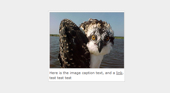
Above is a very simple image caption style: clean, organized and minimal. The “Polaroid” look, if you will.
.image-caption {
  width: 240px;
  position: relative; }

.image-caption img {
  border: 1px solid #333; }

.image-caption p {
  position: absolute;
  bottom: 5px;
  width: 232px;
  filter:alpha(opacity=70);
  -moz-opacity:0.7;
  -khtml-opacity: 0.7;
  opacity: 0.7;
  background: #000;
  padding: 5px;
  color: #fff;
  clear: both; }

.image-caption a {
  color: #fff;
  text-decoration: underline; }

.image-caption a:hover {
  font-style: italic;
}
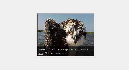
Above is a simple overlay technique for captions. The most important properties here are position: relative under .image-caption, and position: absolute, bottom: 5px and width: 32px under .image-caption img. The bottom would usually be set to 0, but in our case we adjusted it to 5px because of the added padding. Same goes for the width: we adjusted it to accommodate the added padding and image border.
.image-caption {
  width: 240px;
  background: #fff; }
.image-caption img {
  border: 1px solid #aaa; }
.image-caption h1 {
  padding: 0 5px;
  font: bold 10px/1.4em Arial, Helvetica, sans-serif;
  color: #cc0000; }
.image-caption p {
  clear: both;
  padding: 0 5px 10px;
  font: normal 9px/1.45em Verdana, Tahoma, sans-serif;
  color: #444; }
.image-caption a {
  color: #444;
  text-decoration: underline; }
.image-caption a:hover {
  font-style: italic; }
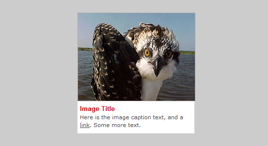
To add other styles (such as the image title here), just add them to the CSS under the .image-caption class, and then remember to add <h1>Image title</h1> where desired in the mark-up.
It takes minimal yet creative CSS to create some pretty cool effects. Experiment with a few other things, such as CSS3 rounded corners, different positioning, border styles and more. Below are more resources and techniques to get interesting image captions, some with plain (X)HTML and CSS and others requiring JavaScript and WordPress.
Demo and Download Files
You can see the demo and download the files from our servers.
Other Neat Solutions
- CSS On-Hover Image Captions
- How to Create Simple, Stylish and Swappable Image Captions
- Create Simple Captions Using CSS
- How to Easily Customize the WordPress Image Caption
- Image Caption Design: Techniques and Trends
5. Print Layouts For The Web
Print-inspired layouts can be a refreshing change from standard Web layouts. While not suitable to all website types, this technique is definitely catchy for those that pull it off. Of course, with Web design, we must use code to create the look we’re going for. How can we create Web designs that resemble print layouts efficiently — with unconventional layouts and interesting typography — and code them in a way that still adheres to web design best practices?
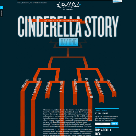
This Web page has a layout and design that look more like a print piece than a traditional website.
Because print-inspired designs can vary so much, there are many various coding solutions available. But there are best practices. Below are just a few of the things to consider.
Web Design Must Be Fluid, While Print Does Not
One reason print design can look so creative is that the content doesn’t have to adapt to varying widths and lengths. On the Web, though, text, images and other content change all the time, sometimes straining the layout. There are a couple solutions to this. First, as in the example above, if the content is set and won’t change (such as blog posts), then feel free in designing around the text. Line height, letter spacing and other elements can be adjusted precisely to play around the images and background and then be left alone.
For non-static content, some thinking may be required:
- Fixed-width designs are probably best if possible. Then, the designer will only have to expect the content to change vertically. (For a different approach, you could set a fixed height and then worry only about varying widths.)
- With well-organized and properly nested code, content that expands or contracts should not be a problem; it might just take some brainstorming to consider design solutions that would look good in a couple of different scenarios.
- Learn how to use (X)HTML and CSS together, avoid
div-itus as much as possible, and always look for ways to make code shorter and smarter.
Coding and positioning a print-inspired design can be difficult, but never impossible. However the content varies, for the most part it will stay within a certain range in each section, which is helpful. For example, an “About us” blurb will not suddenly jump from 200 to 1000 words, but it might increase in height by a few lines of text.
Organized and Reusable CSS
Make CSS classes and ids as reusable as possible by making them as general as possible. Then, apply area-specific styles directly on the page where they need to be applied. Always be thinking of ways to better organize and reuse CSS in the mark-up. Without consistency in the layout, this can be difficult and therefore requires more attention.
Get Inspired
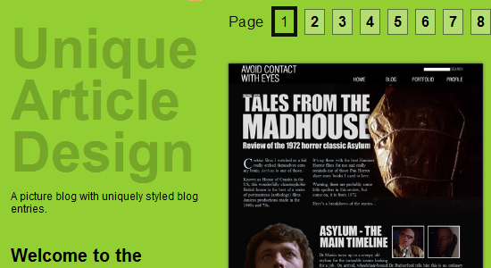
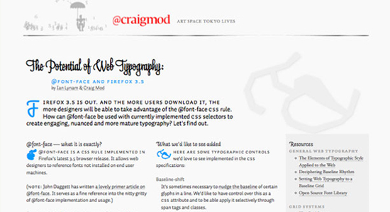
Devising one unique coding solution for a print-inspired Web design is difficult indeed, and so the only real solution is to learn best coding practices and use them to create the most efficient solution for that particular design. For some print-design inspiration on the Web and some live coded examples, check out a few of the showcases below.
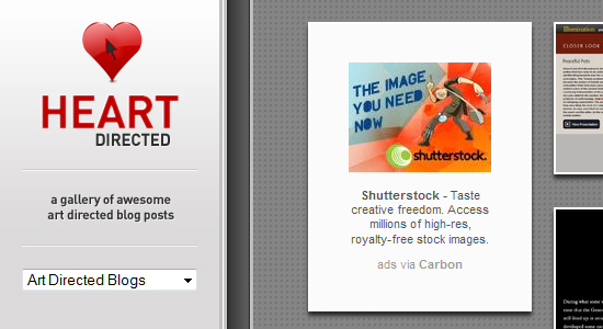
Heart Directed is a showcase of print-inspired blog posts and other website designs.
Coldheat has a general Web design showcase and a a special section for unique layout designs.
This post on WebdesignerDepot showcases several blog posts with a unique print look.
Further Resources
Below are a few more related articles, some from right here on Smashing Magazine and others from around the Web. All share some great ideas and techniques you can experiment with.
- 50 Useful Coding Techniques (CSS Layouts, Visual Effects and Forms)
- 50 Brilliant CSS3/JavaScript Coding Techniques
- 5 Useful CSS/JQuery Techniques for More Dynamic Websites
- 21 Amazing CSS Techniques You Should Know
Conclusion
Without calling ourselves “developers,” we, designers, can add some nice effects and added functionality with a bit of extra coding knowledge. None of these effects are difficult to figure out, but each can really add to a website. Some create an attractive visual experience, while others provide visitors with more information or functionality. Whatever the purpose, each has its proper use.
We’d love to cover more coding solutions that are unique, useful or just interesting. Please feel free to suggest more examples of advanced techniques in the comments below. Hopefully, we’ll be able to include them in a future article.


 Try ProtoPie AI free →
 Register Free Now
 SurveyJS: White-Label Survey Solution for Your JS App


