Web Design Questionnaires, Project Sheets and Work Sheets
It’s nearly impossible to provide an accurate quote to a prospective Web design client without first gathering information about what that particular client needs. Some designers do this in either a face-to-face meeting or over the phone, but more often, they have a questionnaire that prospective clients fill out. This is preferable for a couple of reasons; the most important, is probably that this document then becomes an integral part of the design process and is available to refer back to.
So the question is, whether you should put that questionnaire up on your website or only send it to prospective clients once they’ve contacted you. There are a couple of reasons you may want to make it available online, but the obvious one is that clients are often eager to get started with their projects; providing the questionnaire online eliminates a step in the pre-contract part of the process.
Further Reading on SmashingMag:
- 45 Incredibly Useful Web Design Checklists and Questionnaires
- A Checklist To Creating The Perfect WordPress Website
- Using Brainwriting For Rapid Idea Generation
- Don’t Forget The Small Stuff
Here, we’ve collected questionnaires and worksheets used by actual Web design companies, including some of the leaders in the industry. Both online and downloadable forms are included, as well as the pros and cons for each format.
Downloadable Questionnaires
While online forms are certainly popular, so are downloadable questionnaires. These are generally either PDFs or DOC format, though some firms also include versions in RTF or for Pages. The downloadable questionnaires are sometimes longer than their online counterparts, and are usually the choice for agencies that only take on longer and more complex projects.
We Are Pixel8
![]()
We Are Pixel8 has a planner in PDF format that they ask their prospective clients to download and fill out, and then upload to their website along with their contact form. It’s a great way to gather client information without requiring them to just fill out a Web form, which presumably lets them take more time with their answers. The instructions on the site are very clear as to how the process works.
Great Example Question: Please provide some information about the look and feel you would like for your website. You may also provide examples.
Happy Cog
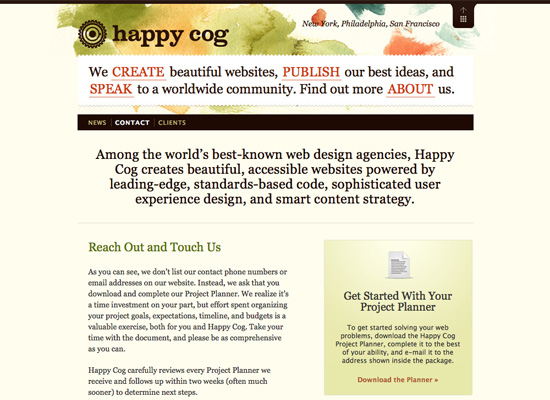
Happy Cog also offers a downloadable project planner, which includes instructions for submission. It’s a good system, especially since Happy Cog projects are generally large projects with a wider scope than many other design firms handle.
Great Example Question: Are you familiar with the concept of Web standards?
Clearleft Ltd
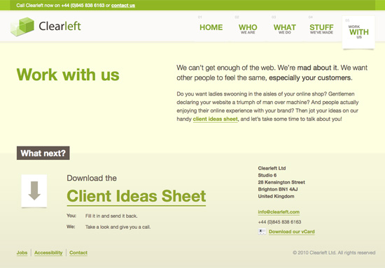
Clearleft Ltd offers a Client Ideas Sheet that prospects can download and fill out in order to get a quote. It’s a simple RTF document, focused entirely on the content. It’s also quite extensive, with a few dozen questions included.
Great Example Question: What is your measure for success, and what are you hoping to achieve?
Lunamedia
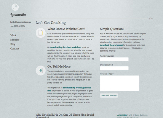
Lunamedia has a client worksheet that includes sections asking about the company requesting the quote—about their customers and competition, and the scope, features, design ideas and requirements of the proposed project. The questionnaire can be downloaded from the Lunamedia website and then sent via e-mail when completed.
Great Example Question: Why do you believe website visitors should do business with you rather than with a competitor?
45royale Inc.
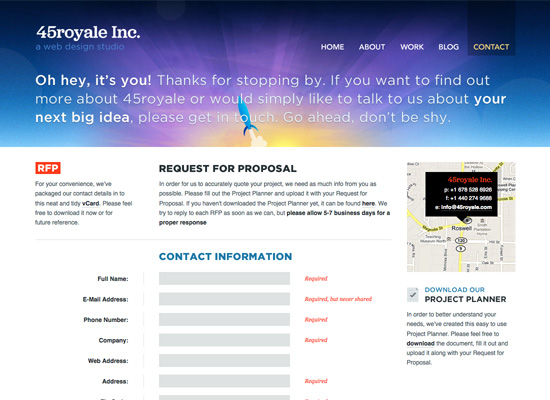
45royale Inc. offers a downloadable project planner that includes questions about the project goals, the look and feel of the proposed website, and general information. It also includes a section specifically for website redesigns.
Great Example Question: What action(s) should the user perform when visiting your website (search for information, sign up for an account, purchase a product/service)?
Erskine Design
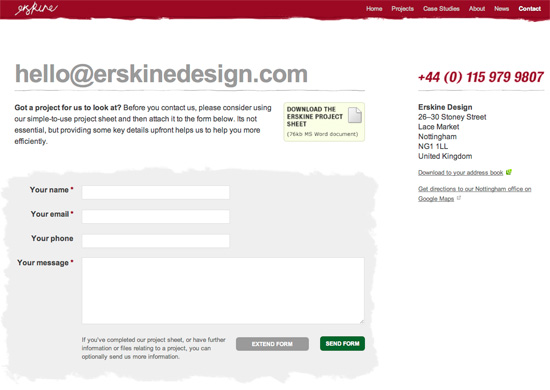
Erskine Design has a detailed project sheet that stretches over five, A4-pages. The questions cover the current website; reasons for redesign; audience, perception, content, technology and marketing. A more convenient (and shorter) Web form is available as well.
Great Example Question: How is your company currently perceived offline? Do you want to carry the same kind of message through your website?
DistinctionHQ
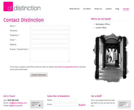
DistinctionHQ has one of the shorter project briefs; it clearly states that all answers will be treated with completely confidentiality. The sheet also contains e-mail and phone details of the company and its logo, which can turn out to be useful in case the sheet gets lost in the shuffle.
Great Example Question: Are you providing all text/images for this project, or do you require copywriting and photography services?
Strawberrysoup
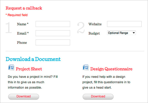
Strawberrysoup allows customers to request a callback, but also has a project sheet and a design questionnaire that clients are asked to fill out. The agency gives customers a number of choices: they can send an e-mail, call the agency or submit the documents online.
Great Example Question: If you need a content management system, please describe the features you would like, e.g. updatable news, multiple authors, stock control, user moderation, etc.
Stuff and Nonsense
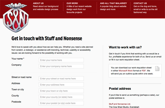
Andy Clarke’s Stuff and Nonsense provides quite a lengthy work requisition sheet which is available in MS Word and in PDF. The tone of writing is very informal (“Go make a cuppa, read this through again to make sure you’ve covered everything you need, then e-mail it”) but inviting. All questions are broken down into nine categories: apart from general information about the proposed website, the questions cover the current website and its performance, reasons for the project, audience, perception, new content, technical staff and marketing. If the clients aren’t sure about something in the sheet, they are encouraged to call Andy Clarke directly.
Great Example Question: Which areas of your current website work well? Why is that?
Mark Boulton Design
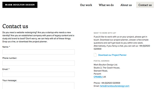
In the project planner on Mark Boulton Design, potential clients are asked 15 questions. Notice the inviting tone and examples mentioned in the sheet; the agency does a good job of explaining why the questions are asked, and what kinds of answers are expected. Apart from general information, questions are asked regarding branding and design, as well as content and website management.
Great Example Question: When we design a brand, or website, it’s often more successful if we can place it within the current market. With that in mind, can you list your competitors? Please provide URL’s, or contact details for us to begin our research.
Duoh!
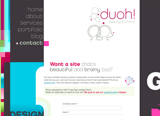
Duoh!, the design firm of Veerle Pieters and Geert Leyseele, has a downloadable client questionnaire that asks about things like brand, audience, and the look and feel of the website. The questionnaire is available in both English and Dutch, and is one of the better visually designed questionnaires out there.
Great Example Question: How does this website figure into your business model?
Pros and Cons of Downloadable Questionnaires
Pros:
- Often more user-friendly, especially for very large projects or projects where a team is involved.
- The client will have a record of their answers for later reference.
- The client can take their time in filling out the form.
Cons:
- There’s potential that the formatting will be affected by different software versions.
- Clients may skip parts of the form, leaving out vital information.
- It’s adding an extra step, and making it possible that the client won’t ever come back to your website after downloading the form.
Online Questionnaires
A lot of Web design agencies have online questionnaires for prospective clients to fill out. Here are some nice examples of firms that use online forms to gather information about prospective clients and their projects. Be sure to click through, and take a look at what their questionnaires include.
Emtwo
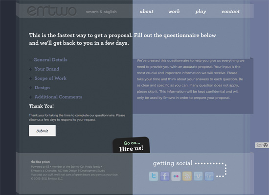
Emtwo has an extensive questionnaire right on their website. What sets it apart is that each section collapses, making the form feel shorter than it actually is. This kind of design helps keep clients from feeling overwhelmed by an overly-long form.
Great Example Question: Why does your target audience need this website?
Studio 7 Designs
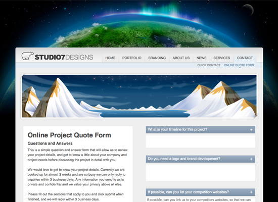
Studio 7 Designs has a short questionnaire on their website, including questions about the project timeline; why you want to work with Studio 7 Designs; and what your website competition is. A short form like this is often more likely to be filled out, though it’s also possible that prospective clients won’t take as much time with their responses as they might with a longer or downloadable form.
Great Example Question: Why do you want to work with Studio 7 Designs?
The Lab Studios
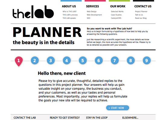
The Lab Studios has an interactive project planner on their website, consisting of nine steps—an interesting way of breaking up what would otherwise be a very long Web form.
Great Example Question: The Web can be a lot of things; some you may apply to your industry and requirements, others you may not. Tell us what you want to achieve with this website (increased sales, brand recognition) so we can suggest the best possible solutions.
Brian Hoff
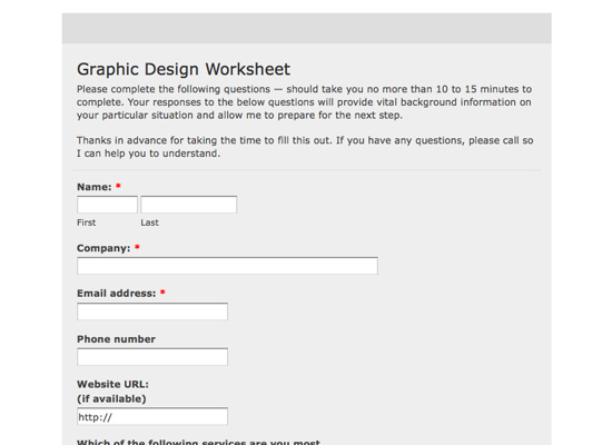
The graphic design worksheet from Brian Hoff is simple and straightforward, and asks only the most pertinent questions—including asking for websites the client likes; what they like about their current website; and information about the target client base.
Great Example Question: What are your top three frustrations with your current website?
You Know Who
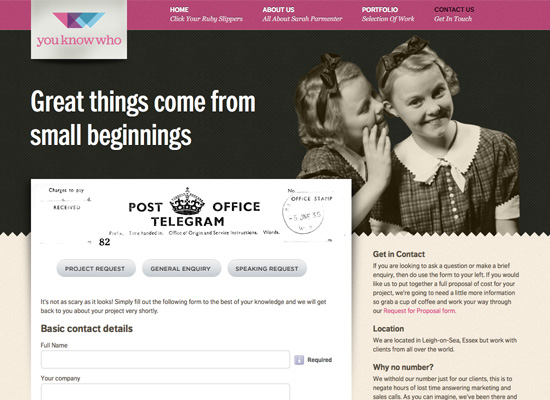
You Know Who has a Request for Proposal form directly on the website. The form is quite in-depth, and is necessary for the client to fill out in order to receive a full proposal. The form is then uploaded within the on-site questionnaire Web form. Clients can also upload any other documents they feel would be useful to the agency.
Great Example Question: Do you feel your current website promotes a favorable user experience?
Pros and Cons of Online Questionnaires
Pros:
- Immediacy. Prospects can fill it out right then and there, reducing the risk that they won’t follow through.
- Makes collecting answers easier.
- Allows designers to require answers to certain questions that clients might otherwise leave unanswered (of course, there is no guarantee of the usefulness of those answers).
Cons:
- Can be harder for a team to collaboratively fill out an online questionnaire.
- Long Web forms can be a psychological turn-off to many people.
- Risks that something will go wrong upon submission. Most clients won’t save their answers elsewhere, and may not bother to fill out the form again if anything goes wrong.
Improve Your Worksheet!
Now that you’ve had a look at real world examples of Web design questionnaires, it’s time to take a look at your own questionnaire. Look at the questions other designers are asking, and think about how they might improve your own process.
This doesn’t mean you need to ask all the questions other designers are asking; if you don’t see the point in a question, then you probably won’t find the answer helpful. But looking at these questionnaires will get you thinking in a new direction, and help you serve your clients better.
Further Resources
- 45 Incredibly Useful Web Design Checklists and Questionnaires This article offers up a ton of questionnaires and checklists that are useful throughout your project, including pre-contract questionnaires and project planners.
- Web Design Questionnaire: Top 10 Questions to Ask This article discusses the top ten questions your questionnaire should include—as well as why they should be included, and what the answers can tell you.
- How to Create an Effective Web Design Questionnaire Here’s an excellent guide for creating a questionnaire, that will help you gather the information you actually need from clients.
- How to Extract the Facts with a Web Design Client Questionnaire This article from Freelance Switch discusses the questions you should ask, as well as why you should ask them.
- Ultimate List of Web Design Checklists: Get Work Done! This roundup of useful checklists includes links to information on project planners and client questionnaires, as well as other useful checklists and questionnaires to use throughout the design process.


 Register for free to attend Axe-con

 SurveyJS: White-Label Survey Solution for Your JS App
 Register Free Now
 Celebrating 10 million developers