A Study of Trends in Mobile Design
This article is a part of our new eBook Mobile Design For iPhone And iPad (just $9.90). The eBook presents articles on professional design for the iPhone and iPad, including guidelines for the development of mobile web pages. Available in PDF, Mobipocket and ePUB formats.
The industry has evolved in many ways, but one particular area has affected how we build websites to a greater extent than any other. The surge in Web-enabled mobile devices has forged a subculture of visitors who require the adaptation of our websites to meet their needs. While mobile design is still in its infancy (and little primary research on mobile trends exist), we need to observe how this now-critical element of our industry is evolving, and the patterns which exist from current development efforts.
The aim of this article is to showcase the variety of methods in which some of today’s most popular websites provide an interactive and (hopefully) useful mobile experience for their end users. There are plenty of big names which were analyzed, such as Facebook and Amazon, and you’ll see plenty of useful graphs to draw some inspiration from. With statistics and some really interesting revelations on the diversity of modern design, you can be excited about the future of mobile Web design!
You may be interested in the following related studies:
- Typographic Design Patterns and Best Practices
- Portfolio Design Study: Design Patterns and Current Practices
- A Small Study of Big Blogs
- Web Form Design Patterns: Sign-Up Forms
What is This Anyway?
To determine some best practices and common trends within the ever growing field of mobile Web design, a study was conducted to analyze how popular websites deal with important factors relating to the information architecture and design implementations within mobile design. Because this research could have covered any number of variables, it’s important to state that this study isn’t going to answer every one of your questions–but it hopefully may help you to learn a few things!
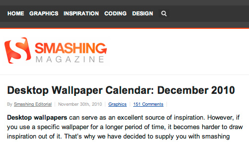
Figure 1: Mobile design has become an essential component of a successful, compatible website. Smashing Magazine has a mobile version, too.
Of the websites that are measured and accounted for within the study, we not only examined how these websites deal with mobile devices and how visitors are served a mobile experience, but also if they had non-Web features, such as mobile apps, that can play a useful role in the process. In addition, some of the layout conventions, design choices, coding levels, and some useful features specific to mobile websites, have been measured (to their existence, their conformance level, and the method they undertake).
Note: While a great deal of effort has been put into making this study as accurate as possible, the number of variables being considered may result in anomalies. Factors such as websites without mobile experience have been accounted for (as has bias–to the greatest extent possible, during the study).
Examining the Variables
Before presenting the results of this study, it’s important to account for a few of the variables and methodology that came into play to explain how the research and results were formed. Using this information you can hopefully recognize the limitations of this particular study, and if you really feel adventurous, perhaps you could expand on the subject and conduct some research of your own to see how the results apply under different situations. It could make for interesting reading!

Figure 2: The above chart explains the process this study undertook to uncover its results
Regarding the methodology for this study, the protocol begin by selecting an independent group of sites (outsourced) and variables to test against–many of which had never been examined on such a scale (or in such depth) previously. The approval for which variables were included had to meet certain criteria; firstly, the results had to be interesting (and could affect how the mobile design situation is seen), and also had to be statistically significant (we don’t want to state the obvious).
Note: Some variables were dropped from the final analysis due to a lack of conclusive, useful results. An example of this is the support for orientation (portrait and landscape modes); as a result of how browsers deal with the layout, this became a non-issue, seeing 100% native support.
Site Selection Protocol
Picking a group of websites to analyze is, of course, a critical part of the process. To eliminate the potential for bias or for focusing on a niche, it was decided that the top 100 websites depicted through Google’s AdPlanner list would be a suitable candidate. While the list held 1,000 websites and the study could easily be expanded, we used the initial 100 websites to receive a good sample and to provide enough variety for the baseline results. This level is used as the qualifier for statistically significant results.
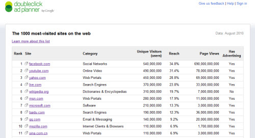
Figure 3: The Google AdPlanner top 1,000 websites list is the unbiased resource used to study from
Variables (Per Category)
The results of this study wouldn’t be anything without its variables. When deciding what to test against, the focus became twofold: how the mobile experience is activated, and how that experience functions. How visitors are directed to a mobile experience became worthy of attention due to the increasing number of implementations that exist. Secondly, it was vital to test those pages to ensure they accounted for speed, bandwidth, display size, touch screens, and other best practices.
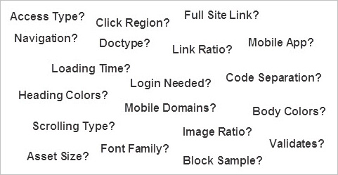
Figure 4: Plenty of variables were considered to give you some informative results to learn from
Margins for Error
As with any study, there is always a potential for error or bias to occur. To avoid as many of these issues as possible not only were the websites independently sourced, but all testing was undertaken on a desktop machine, several handheld devices, and a number of emulators (this occurred on every website). Following this practice reinforced the results (avoiding erroneous numbers), and the testing was verified on two separate dates to ensure that the experience resulted from consistent practices.
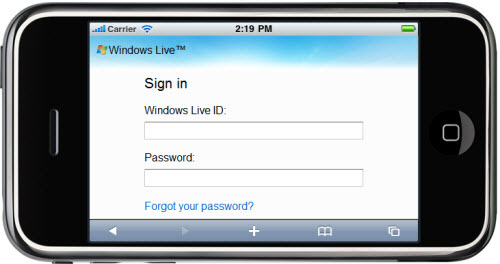
Figure 5: Emulators were used to expand the number of physical devices included
And Our Survey Says…the Results
Now that all of the basics (as to how the study was undertaken) have been explained, it’s time we get down to the really interesting stuff–the results! You should be prepared for plenty of charts and graphs, and some of the results may be really surprising. We’ve broken down each type of result into its own subsection and have provided various ways the results can be interpreted, so hopefully the findings of this study will be quite apparent. Without any further delay, let’s get down to business!
Method of Access
Within this test it was important to establish whether a mobile experience was made apparent to a user immediately. When a user proactively visits a website they want to be made aware that their device is either supported, or that the regular website will load. In this test we not only examined whether a redirection or device detection occurred, but also if the mobile experience was provided on the standard website (rather than a subdomain), and if a regular PC could switch to the mobile version too.
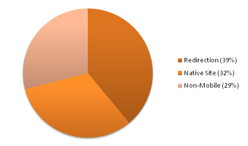
Figure 6: The proportion of automatic redirects against desktop websites with optional mobile support
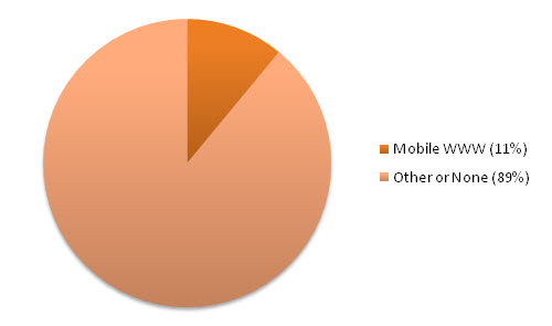
Figure 7: The distribution of websites which implemented a mobile design on the WWW subdomain
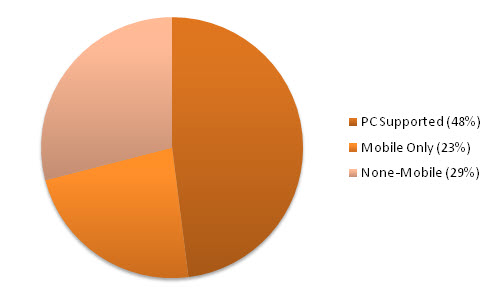
Figure 8: How mobile-friendly websites dealt with desktop PC users trying to access the mobile website

Figure 9: While Amazon’s .mobi website stays mobile friendly, the primary m.amazon.com redirects PC users to the original website.
While the number of websites that employed a script to detect and redirect visitors to a mobile experience wasn’t as high as one might have expected (as many believe that the mobile website should come first to boost loading times), an interesting trend occurred where all but one website (answers.com) employing a mobile version of the experience (on the WWW subdomain) forced the redirection of PC users back to the desktop view without allowing entry to access the mobile edition (if they wished to).
Mobile TLD Usage
This second test aimed to determine the use of TLD conventions in mobile design. In order to keep the scope of the results as strict as possible, only subdomains (such as m.) and the .mobi TLD were considered (along with dedicated mobile websites). As such, directory paths on the WWW domain such as “/mobile/” were not considered. The possible implications of this result could showcase the popularity for the .mobi TLD, and trends which may exist in the use of subdomains on mobile websites.
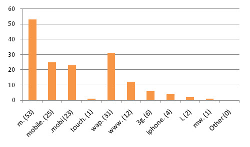
Figure 10: The distribution of mobile TLD subdomains, including the level of extension popularity
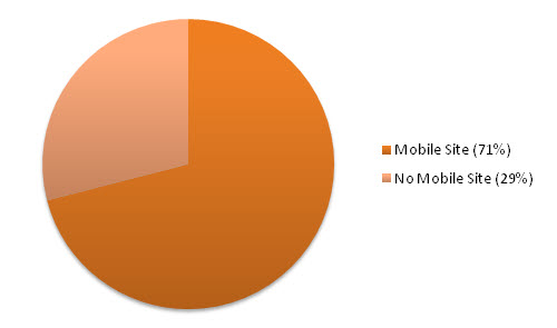
Figure 11: The number of websites which offered no mobile-optimized experience in any form
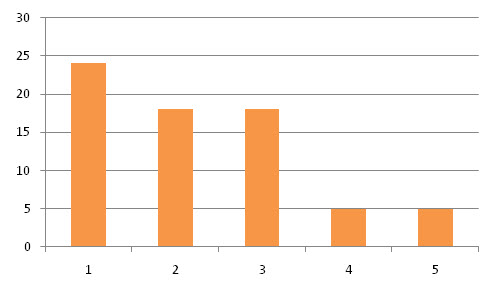
Figure 12: A graph showcasing the number of subdomains supported per website (on average)
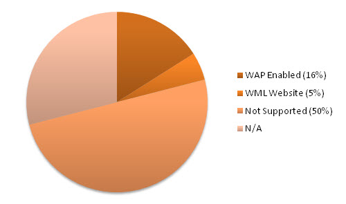
Figure 13: The levels of which WAP- or WML-enabled devices are supported or offered access
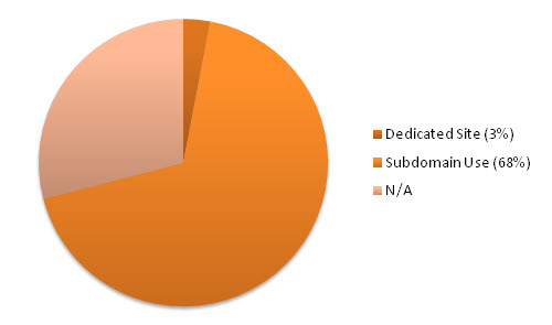
Figure 14: The percentage of websites which redirect the user to a separate mobile TLD

Figure 15: PayPal makes use of a mobile website that uses the m., mobile and .mobi TLD domains
Interestingly, while many sites offered some form of mobile experience and some redirected the visitor, the use of .mobi extensions was much lower than expected. In addition, an unusual trend made itself apparent. Unlike other nations’ mobile websites, Asian ones trended toward using “3G” in preference to “m” or “mobile” (as used elsewhere). It’s worth mentioning in addition that only Apple devices were lucky enough to receive a dedicated website using the “touch” or “i” subdomain.
Mobile Phone Apps
While this test was not so much about the type of code rendered in browsers, it seemed prudent to determine how many websites in the surveyed list provided a mobile application for devices such as iDevices, Android, or Blackberry. The results of this test simply look for the presence of a mobile app; the platform itself is not taken into account. With so many apps having Web connectivity, the results of this test really push the barriers to access in finding how mobile-friendly a website is.
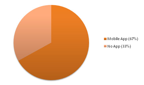
Figure 16: The number of websites that had mobile phone-specific apps (for any platform)
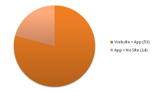
Figure 17: The percentage of websites with a mobile app, but without a mobile-friendly website
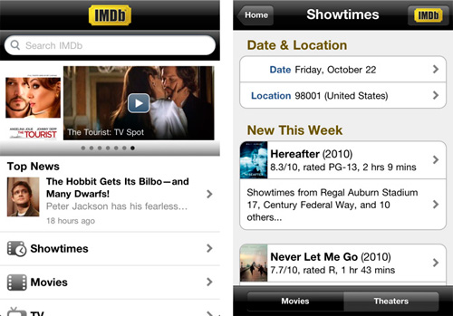
Figure 18: The Internet Movie Database has a mobile website and an iPhone app to further improve the mobile experience
While it’s not surprising that many of the top 100 websites had a mobile app, due to the popularity and the widespread use of their services, what did become apparent and rather interesting is that some of the listed websites which did not have a mobile-friendly website (in any form) still had an app. This particular trend seems to indicate that the transition toward a mobile-friendly set of services, is down to the heightened demand for apps (which unlike mobile websites, have no fallback to function on).
Average Loading Time
In the next test, we felt it was important to measure the loading times of each website to see how mobile experiences account for the bandwidth restraints and temperamental speeds of the average Web user. For the purposes of this study, each of the times were registered over a Wi-Fi connection (not a 3G or Edge stream due to some emulator usage, to ensure balanced results) and were done using an uncached format; therefore, the loading time would be accurate to include any external resources.
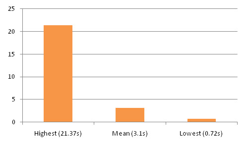
Figure 19: The highest, mean, and lowest loading times as calculated from an uncached “cold boot.”
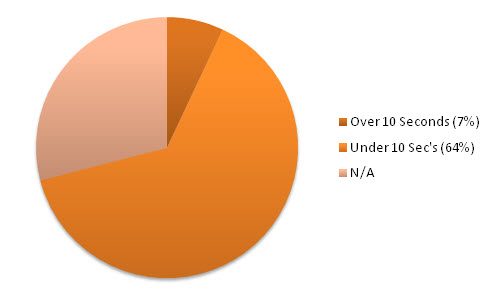
Figure 20: The percentage of websites requiring more than 10 seconds loading time on a Wi-Fi connection
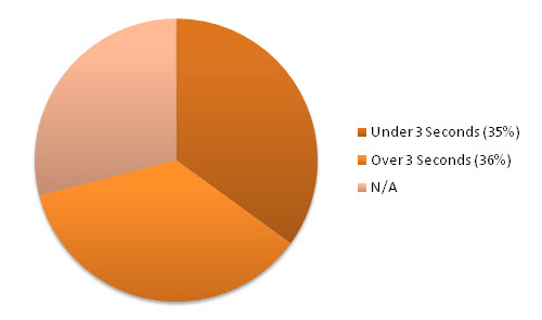
Figure 21: The percentage of websites requiring less than 3 seconds loading time on a Wi-Fi connection
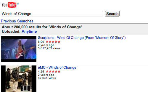
Figure 22: YouTube had one of the fastest loading times for any mobile-oriented website
While caching will produce substantially quicker loading times, the results were fairly conclusive that the loading time of each website was pretty evenly spread, with only a small number of websites having load times of over 5 seconds (often in such cases it was a result of slow server response, rather than of the physical content being transferred). As visitors obviously don’t want to wait for long periods of time to get their data, a speedy and effective loading time has become critical to the design process.
Home Page Asset Size
Along with the time it took to load a page, in equal measure it immediately became obvious that the size of the files and any loaded external resources should be measured. With many mobile Internet plans having capped services and international browsing potentially becoming prohibitively expensive (by the megabyte), it seemed only fair to determine how each website was optimized and whether the amount of uncached data loaded was as small, or big, as a regular desktop-oriented website.
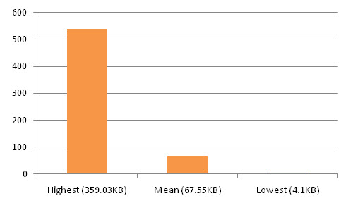
Figure 23: The highest, mean, and lowest file (and asset) size as calculated with caching turned off

Figure 24: The percentage of websites with a total uncached asset size of more than 100KB
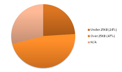
Figure 25: The percentage of websites with a total uncached asset size of less than 25KB

Figure 26: Softonic had the largest file size of any mobile site — quite a surprising result!
The results of this test are rather interesting. While many websites (especially WAP-oriented ones for less capable devices) required less than 25KB to function, which seems like an acceptable level–a large number of websites supposedly providing a mobile experience required over 100KB, some even as high as 0.5MB! More interesting is the coincidence that the percentage of websites that have asset sizes of fewer than 25KB, matched (exactly) the percentage requiring over 100KB.
Doctype Declarations
When producing a website, one of the initial questions we ask ourselves is, what language or version of that language will best meet our contents needs. The debates about HTML vs. XHTML have been endless, and as many mobile variants exist (the mobile profiles for XHTML and WML), it became apparent that statistics related to the types of DTD most often used could be of benefit to readers. This test therefore examined the Doctype of the front page to see if any patterns of usage exist.
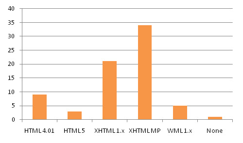
Figure 27: The distribution of mobile website Doctypes, based on language versions and profiles
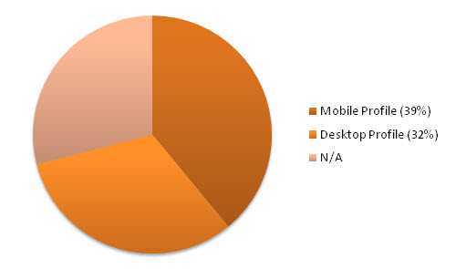
Figure 28: The percentage of websites using a mobile-specific profile in preference to desktop profiles

Figure 29: The percentage of websites that support both a WML and full XHTML experience
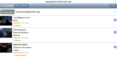
Figure 30: Dailymotion’s iPhone friendly website was one of the few leveraging HTML5
The results show conclusively that XHTML is currently more popular than HTML (or HTML5). This could be down to HTML’s lack of a mobile profile (used in most cases), though it can be noted that many smartphones supported HTML and XHTML. In addition, the spread of mobile vs. desktop profile usage was fairly similar. This questions the need for mobile profiles, if the full specs are supported. In addition, Facebook’s iPhone-friendly website was the only one which failed to provide any Doctype at all!
Code Validation
With the semantic Web and the need for our industry to maintain standards, this test followed an earlier study by Jeffrey Zeldman in which a large number of websites were put through a simple “pass or fail” test against validation. While Zeldman’s research focused on the Alexa top 100, this piece of course used a different set of data. While standards aren’t the be-all and end-all of design, this test was included to provide additional comparisons as to the stage conformity to semantics were at.
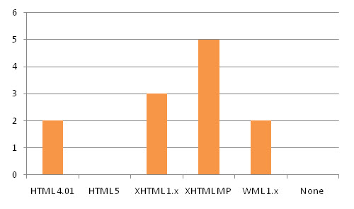
Figure 31: Distribution of website validation (in the case of CSS, proprietary properties were ignored)
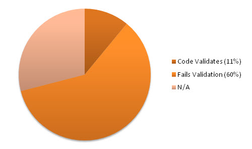
Figure 32: The percentage of top 100 websites with a front page that validates against the DTD chosen
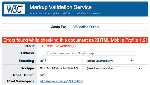
Figure 33: The MySpace website wasn’t unusual, in that its source code didn’t validate.
Because this checkpoint focused only on the front page of mobile-friendly websites, the results are not as complete as they could be. They do instead provide a good indication as to the care being given to mobile experiences. Unfortunately, the results seem to correlate with Zeldman’s research in that the overwhelming majority failed to meet the standards for the DTD they chose to conform too. This seems to reinforce the fact that design is more important to those designers, than optimizations or quality.
Code Separation
The next test that was carried out links quite heavily into a few of those that were previously carried out. The separation of structure, style, and behavior has been shown to have benefits in reducing file sizes (due to avoiding repeat coding, and to cache advantages). It therefore seemed right to see not only if websites did separate their style or behavior, but also if they took advantage of CSS3 or jQuery in the mobile design to provide a more dynamic behavior within the website layout.
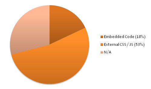
Figure 34: The percentage of websites using embedded inline style rather than external files
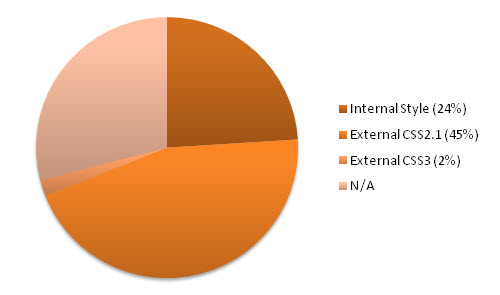
Figure 35: The percentage of websites using external CSS2.1 or CSS3 within their designs
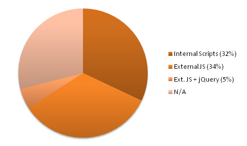
Figure 36: The percentage of websites using external JavaScript or jQuery within their designs
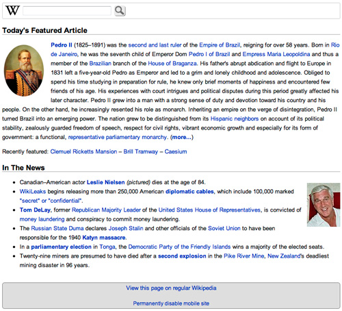
Figure 37: Wikipedia makes use of the jQuery library within its mobile-orientated website.
While you would have thought that most websites would immediately break the style and behavior from their mobile pages in order to improve performance, a moderate number of the websites did have all of their code directly tied into the page. In addition, only a rare number of those mobile websites took advantage of the jQuery framework, and an equally small number made use of CSS3 media queries to dynamically scale the layout. The numbers for CSS3 usage were, predictably, similar to HTML5 usage.
Font Family Types
Typography is an essential element of the Web, and of how information is visualized. This particular test was created to not only see which Websafe typefaces are being implemented on the Web, but to see what font families are being used. In addition, any websites which rely on the default typefaces by not providing a font stack (or which have a stack with multiple typefaces), would be noted. The elements for which this test was created were not only based on headings, but on all manner of content in the page.
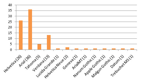
Figure 38: A distribution showcasing the typefaces used within the primary font stack
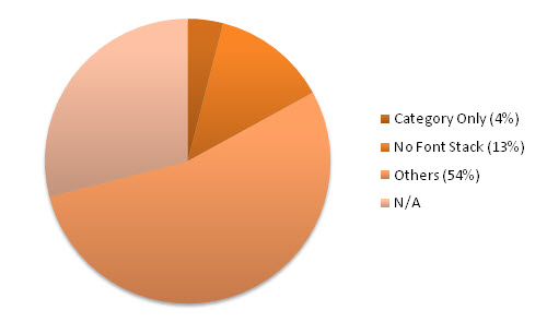
Figure 39: The percentage of mobile designs with no font stack declared (using defaults)
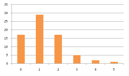
Figure 40: A graph showcasing the number of fonts declared within a family, per website

Figure 41: m.naver.com was slightly more adventurous with non-Websafe typeface usage
The results are quite surprising. In every case where a font family was declared, the category of typefaces used was always sans serif (for both headings and body text). In no instances did serif or another classification get used, and in some cases no font family was declared at all (which could be due to inconsistencies in available fonts for such devices). In addition, the number of occasions where no font stacks were built–resulting in the use of system defaults alone–was fairly significant.
Heading Contrasts
Since the evolution of the cellphone, the ability to have color screens with as much depth and clarity as a desktop PC (using high definition graphics) has increased the ability for us to give our headings and content the colors of the rainbow, both in the foreground and in the background. This test was added to the study in order to see if any trends existed, the range to which color is used within headings, and to determine whether mobile websites made use of background effects such as gradient colors.
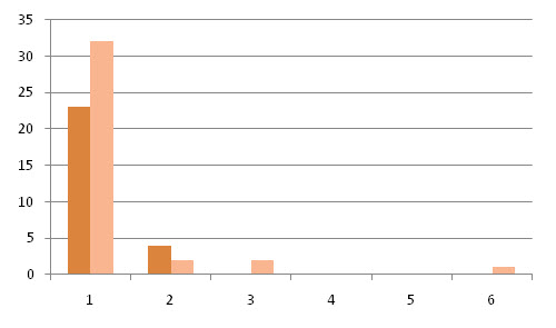
Figure 42: Showcasing the number of colors used within the foreground or background of headings
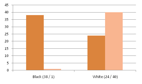
Figure 43: A distribution of websites using a black foreground or white background in headings
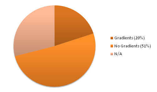
Figure 44: The percentage of mobile websites using a gradient background within a header

Figure 45: 56.com made use of a wide range of colors and contrasts within it’s headings
As you may have expected, the majority of websites showcased in the list made use of either black or white as the primary colors (in certain cases, shades of grey were used). This stands to reason as a method to keep the contrast ratio high on small screen devices, in order to boost the readability of the content. Another trend uncovered was the preferred use of gradients within the background of headings to give them an added layer of texture, instead of using solid colors or an increased text size.
Body Content Contrasts
The ability to showcase color in our designs is central to how we subtly influence our visitors. Carrying on from the previous test targeted at headings, this one involved examining the colors used within non-heading level elements and determining which colors they used. As this has a big impact within accessibility and the general scope of design, a mixture of visible foreground and background variants were recorded (though as with the previous test, the results were limited to the front page).
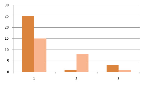
Figure 46: Showcasing the number of colors used within the foreground or background of body content
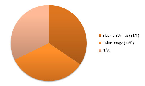
Figure 47: The percentage of websites using a black foreground on a white background in body content
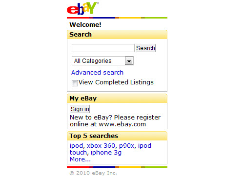
Figure 48: eBay uses a one-paneled black and white contrast ratio for the body text, like most websites
Within the previous set of results for headings, black and white were shown to be dominant within the text in order to maintain a visible level of contrast. This set of results, as you might expect, follows the same trend and uses less additional colors in the palette. While the color contrasts were only built up from a sample of each website’s front page (and then contrasted against each other for the comparison), the results clearly show that a sensible approach to text visibility has been maintained.
Authentication Required
Many places require visitors to login before full access to a service is granted. On most desktop websites, a bunch of information is provided without a user needing to be registered (explaining features or contact details). However, an interesting trend seemed to exist in which mobile users were expected to have an account and know what the service did, as if the mobile website were simply a bonus feature of the service (thereby only offering a login form). The aim of this test was to see if this was the case.
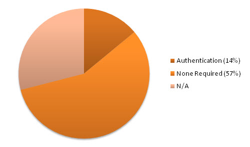
Figure 49: The number of websites requiring the visitor to login before accessing pages

Figure 50: Facebook requires you to authenticate before accessing the website
While it’s understandable that some websites do not require users to authenticate themselves–and this means that the number of recorded “forced logins” will be drastically reduced–the results of this test are quite shocking. While it should be considered bad practice to require logins on a website without any description of the service being present (for mobile-only traffic), a number of popular websites which were contained within the top 100 list proved positive for doing this, as they had no useful site information!
Returning to a Full Website
The next test depended entirely on the mobile website’s ability to follow common requirements and return the visitor back to a non-optimized website upon request. While a website’s mobile experience will be enough for some, it’s important to realize that some people may not adjust well to new a UI or may request functionality that only exists on the main website, and offering a fallback mechanism is worthwhile. The test also aimed to uncover any naming conventions used to represent this link (if one exists).
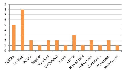
Figure 51: A graph of the various naming conventions used in links toward a full website link
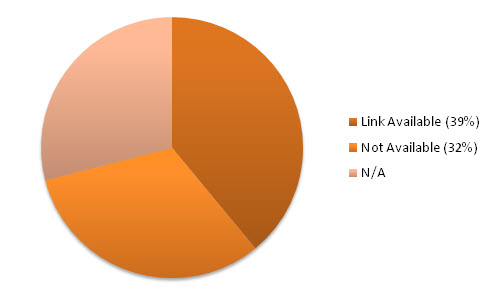
Figure 52: The percentage of websites which do not have a link returning you to the full website

Figure 53: Daum.net allows gaining access to the full website by clicking the “PC Version” link
In the results, some websites offering mobile versions of their services used common words in their links to indicate returning to the main website, such as “full site” or even “desktop version.” In these cases, no common preference could be found even though usage was spread fairly evenly. What is quite surprising however is that many who force-redirected visitors to the mobile website, refused to link or to allow access the full website. This in turn limited the ability of mobile visitors to access some services.
Navigation Conventions
This test was focused upon what could be considered one of the most important elements of a website. A successful navigation scheme can be the difference between an easy-to-use interface, and a complex and potentially unusable website. When carrying out this test, four types of navigation conventions were checked as to whether they were being used on the home page (most sites used more than one): text links, icon-based navigation, image links, and special menus (such as dropdowns or panels).
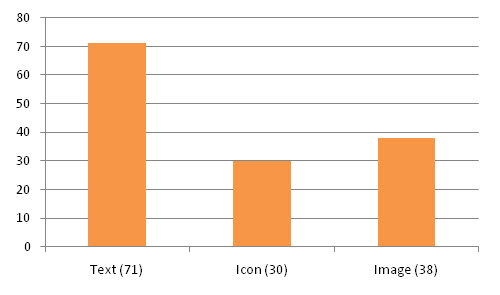
Figure 54: A distribution of websites making use of text, icon, or image-based navigation styles
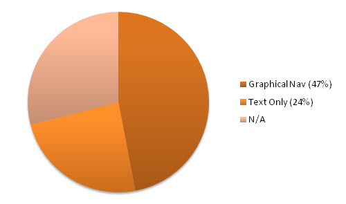
Figure 55: The percentage of icon- and image-based navigation against conventional text

Figure 36: The percentage of websites using external JavaScript or jQuery within their designs

Figure 37: Wikipedia makes use of the jQuery library within its mobile-orientated website.
While you would have thought that most websites would immediately break the style and behavior from their mobile pages in order to improve performance, a moderate number of the websites did have all of their code directly tied into the page. In addition, only a rare number of those mobile websites took advantage of the jQuery framework, and an equally small number made use of CSS3 media queries to dynamically scale the layout. The numbers for CSS3 usage were, predictably, similar to HTML5 usage.
Font Family Types
Typography is an essential element of the Web, and of how information is visualized. This particular test was created to not only see which Websafe typefaces are being implemented on the Web, but to see what font families are being used. In addition, any websites which rely on the default typefaces by not providing a font stack (or which have a stack with multiple typefaces), would be noted. The elements for which this test was created were not only based on headings, but on all manner of content in the page.

Figure 38: A distribution showcasing the typefaces used within the primary font stack

Figure 39: The percentage of mobile designs with no font stack declared (using defaults)

Figure 40: A graph showcasing the number of fonts declared within a family, per website

Figure 41: m.naver.com was slightly more adventurous with non-Websafe typeface usage
The results are quite surprising. In every case where a font family was declared, the category of typefaces used was always sans serif (for both headings and body text). In no instances did serif or another classification get used, and in some cases no font family was declared at all (which could be due to inconsistencies in available fonts for such devices). In addition, the number of occasions where no font stacks were built–resulting in the use of system defaults alone–was fairly significant.
Heading Contrasts
Since the evolution of the cellphone, the ability to have color screens with as much depth and clarity as a desktop PC (using high definition graphics) has increased the ability for us to give our headings and content the colors of the rainbow, both in the foreground and in the background. This test was added to the study in order to see if any trends existed, the range to which color is used within headings, and to determine whether mobile websites made use of background effects such as gradient colors.

Figure 42: Showcasing the number of colors used within the foreground or background of headings

Figure 43: A distribution of websites using a black foreground or white background in headings

Figure 44: The percentage of mobile websites using a gradient background within a header

Figure 45: 56.com made use of a wide range of colors and contrasts within it’s headings
As you may have expected, the majority of websites showcased in the list made use of either black or white as the primary colors (in certain cases, shades of grey were used). This stands to reason as a method to keep the contrast ratio high on small screen devices, in order to boost the readability of the content. Another trend uncovered was the preferred use of gradients within the background of headings to give them an added layer of texture, instead of using solid colors or an increased text size.
Body Content Contrasts
The ability to showcase color in our designs is central to how we subtly influence our visitors. Carrying on from the previous test targeted at headings, this one involved examining the colors used within non-heading level elements and determining which colors they used. As this has a big impact within accessibility and the general scope of design, a mixture of visible foreground and background variants were recorded (though as with the previous test, the results were limited to the front page).

Figure 46: Showcasing the number of colors used within the foreground or background of body content

Figure 47: The percentage of websites using a black foreground on a white background in body content

Figure 48: eBay uses a one-paneled black and white contrast ratio for the body text, like most websites
Within the previous set of results for headings, black and white were shown to be dominant within the text in order to maintain a visible level of contrast. This set of results, as you might expect, follows the same trend and uses less additional colors in the palette. While the color contrasts were only built up from a sample of each website’s front page (and then contrasted against each other for the comparison), the results clearly show that a sensible approach to text visibility has been maintained.
Authentication Required
Many places require visitors to login before full access to a service is granted. On most desktop websites, a bunch of information is provided without a user needing to be registered (explaining features or contact details). However, an interesting trend seemed to exist in which mobile users were expected to have an account and know what the service did, as if the mobile website were simply a bonus feature of the service (thereby only offering a login form). The aim of this test was to see if this was the case.

Figure 49: The number of websites requiring the visitor to login before accessing pages

Figure 50: Facebook requires you to authenticate before accessing the website
While it’s understandable that some websites do not require users to authenticate themselves–and this means that the number of recorded “forced logins” will be drastically reduced–the results of this test are quite shocking. While it should be considered bad practice to require logins on a website without any description of the service being present (for mobile-only traffic), a number of popular websites which were contained within the top 100 list proved positive for doing this, as they had no useful site information!
Returning to a Full Website
The next test depended entirely on the mobile website’s ability to follow common requirements and return the visitor back to a non-optimized website upon request. While a website’s mobile experience will be enough for some, it’s important to realize that some people may not adjust well to new a UI or may request functionality that only exists on the main website, and offering a fallback mechanism is worthwhile. The test also aimed to uncover any naming conventions used to represent this link (if one exists).

Figure 51: A graph of the various naming conventions used in links toward a full website link

Figure 52: The percentage of websites which do not have a link returning you to the full website

Figure 53: Daum.net allows gaining access to the full website by clicking the “PC Version” link
In the results, some websites offering mobile versions of their services used common words in their links to indicate returning to the main website, such as “full site” or even “desktop version.” In these cases, no common preference could be found even though usage was spread fairly evenly. What is quite surprising however is that many who force-redirected visitors to the mobile website, refused to link or to allow access the full website. This in turn limited the ability of mobile visitors to access some services.
Navigation Conventions
This test was focused upon what could be considered one of the most important elements of a website. A successful navigation scheme can be the difference between an easy-to-use interface, and a complex and potentially unusable website. When carrying out this test, four types of navigation conventions were checked as to whether they were being used on the home page (most sites used more than one): text links, icon-based navigation, image links, and special menus (such as dropdowns or panels).

Figure 54: A distribution of websites making use of text, icon, or image-based navigation styles

Figure 55: The percentage of icon- and image-based navigation against conventional text
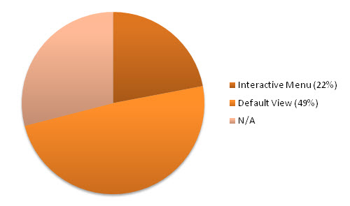
Figure 56: The percentage of websites which employ the use of menus (or content on demand)

Figure 57: HP’s mobile website enlists a menu to determine your country of origin
The results of this test were fairly conclusive in that every single website (as you might imagine) had standard text anchor links, though some menus were formed of plain text. In addition, image-based menu options were quite popular and were actually used more often than icon-based navigation–which, for devices that depend on icons representing apps or services, was quite a surprise. Special menus also saw some popularity, especially when used with content-on-demand scrolling mechanisms.
Home Page Link Ratio
Having a relatively small amount of space can be a real problem in mobile devices, and therefore the potential for confusion as to navigation options, and how many links are provided, can potentially increase the difficulty for users to know the extent of where their choices will lead. If a website has too many links (or too few), the choice can quickly overwhelm a user’s sense of perspective. As such it seemed worthwhile to see how many options were provided in the form of links on a single page.
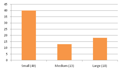
Figure 58: The number of websites using a small, medium, or large number of links on the front page
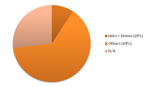
Figure 59: The percentage of websites using a large number of links as a result of a menu convention
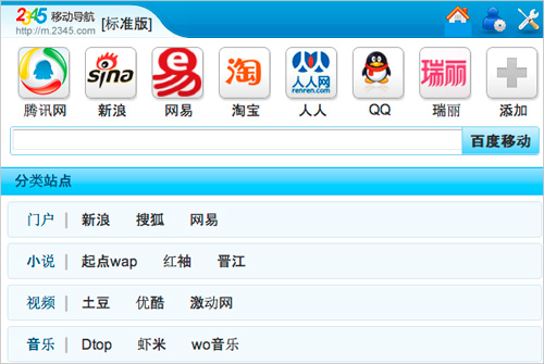
Figure 60: 2345.com has loads of links within its home page, but is that really a good thing?
When testing the websites, the results were categorized based on the number of links that existed in the front page of a website (these were labeled as small, medium, or large as per the link ratio). For the websites being measured, the results indicated that fewer links were visible on a mobile website than on the desktop variant (even when complex layouts were used). This seems to follow conventions, in that a reduced viewing space should hold less information to avoid unnecessary scrolling, and to reduce complexity.
Golden Image Ratio
Images on a mobile website can be a tricky affair, as these devices often require more bandwidth than anything else and therefore can reduce the loading times. Within this test, the trend of using small, medium, and large as a representation of the number of images on the page were used, similar to the link testing. Primarily focused upon the home page, the amount required to fall into each category was reduced as most websites will naturally hold more text links than images (per page, on average).
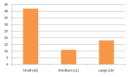
Figure 61: The number of websites using a small, medium, or large number of images on the front page
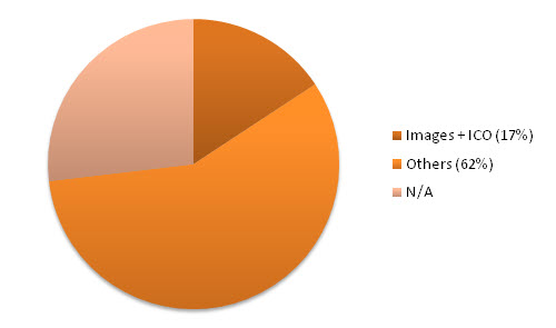
Figure 62: The percentage of websites using a large number of images resulting from icon navigation
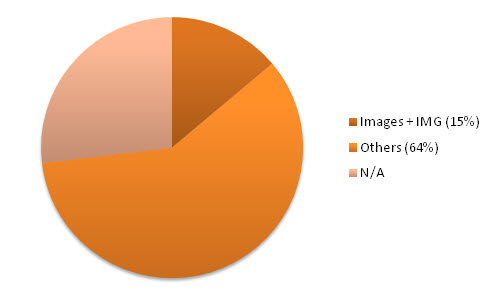
Figure 63: The percentage of websites using a large number of images resulting from image navigation

Figure 64: Russian Mail.ru uses icons and images to highlight specific link usage within the page
As you might imagine, on mobile websites the results backed up many assumptions that mobile websites will have not only fewer images on the page, but will have smaller images presented on the screen (to match the kind of experience available on small screens). This in turn helped reduce the file sizes in earlier tests (and the speed benchmark). What makes this result particularly interesting is that websites (such as Flickr) which oriented around images, also followed this reductionist trend.
Link Click Region
The purpose of this test was to go beyond the mere presence of links (and images with links) and to examine how large the click region actually was on the page. With mobile devices and small screens supporting touch sensitivity, there is a need to keep link click regions as large as possible to ensure the usability and accessibility of such devices (to help with big, imprecise fingers). The scale used followed small, medium, or large, and focused upon the link click’s size compared to other elements on the page.
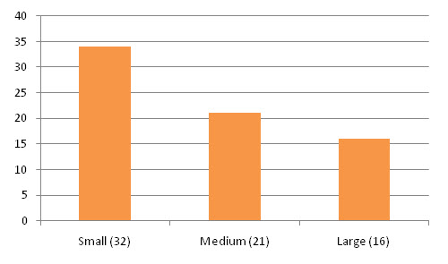
Figure 65: A graph with the average size of a website’s link click region (small, medium, or large)
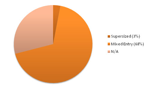
Figure 66: The percentage of websites with a large number of links, images, and large click regions

Figure 67: Flickr uses image links to provide a more visible click ratio, for easier usability
The results of this particular test were evenly spread, showcasing a good number of websites using large- to medium-sized links that ensured navigating could be accomplished without an accident occurring. While this trend was especially present in more image-oriented websites (as linking often occurred in image thumbnails), there was also an interesting trend in which Asian or Russian websites were more likely to have smaller click regions (fewer characters in words also reduced the click region further).
Block Placement Ratios
The next test looked at the visual layout of the page and examined how the design was broken down into either physical or visual blocks of information. It’s worth stating that all of the websites measured used a single column layout, but that the way in which links and segments of content are split may give the visual indication of separation, which was worth examining further. As mobile websites require a lot more scrolling than desktop websites, the separation of blocks becomes more critical to visual identity.
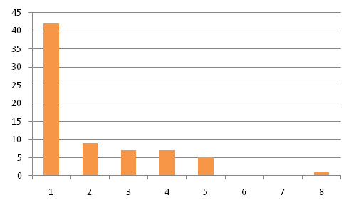
Figure 68: Distribution of horizontal elements (columns or table cells) within the viewport
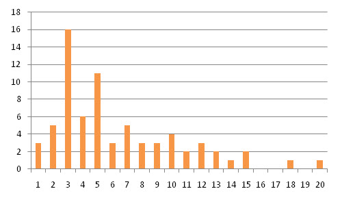
Figure 69: Distribution of vertical panel segments (headings or separated rules) per page
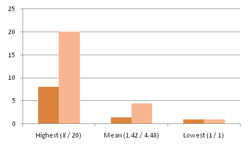
Figure 70: The highest, mean, and lowest range of blocks, both in column and panel distribution

Figure 71: The Zol website makes use of visible blocks, which separate content by heading
Interestingly, while the majority of websites held no horizontal panes (including table cells, navigation links, and other side-by-side elements), a number of websites defied convention and had anywhere between two and eight points of reference within a single line on the viewport. This visual separation was also backed up by how a number of websites had vertical breaks, which split the content into separate sections. Most mobile websites’ readability was increased due to such content organization.
Scrolling Experience
The final test was included as a representation of how scrolling is experienced within the mobile website. The variables analyzed included the number of fingers required to initiate a scroll (as when content scrolls using an overflow, two fingers rather than one are required), and whether the window supported the fancy flourishes of jQuery, JavaScript, or CSS3 in providing paneled scrolling–where panes of content would rotate at specific intervals, or sections could be scrolled by request.
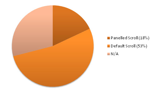
Figure 72: The percentage of mobile websites using paneled navigation over conventional scrolling
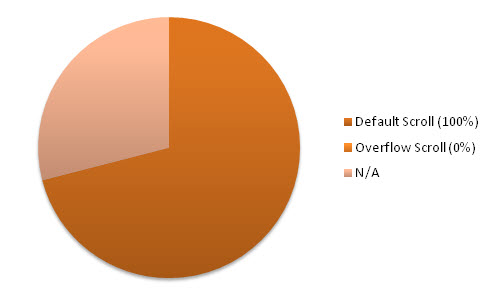
Figure 73: The percentage of overflow-based scrolling in preference to a full page scrolling effect

Figure 74: Yahoo splits it’s content into several panels which can be activated on-demand
The results of this test show a general lack of paneling in general (which is representative of the lack of “flourish” scripting in most mobile websites). This may have been partly due to the nature of the websites being studied (portfolio or showcase websites are more likely to have paneled mechanisms). What is interesting however is that to increase the simplicity of the designs (as none of the sites used overflow text), they also maintained a liquid layout to reduce the complexity of required scrolling.
Going Beyond the Basics
While the sample used did constitute a wide array of Web presences, it’s worth noting that different niches may produce varying levels of results. For example, a study of the same variables upon websites which primarily act as a designer’s portfolio (as denoted in the results) will obviously account for different usage needs, and the experience may therefore vary. That said, the trends which the websites employ do bear a resemblance to many others (and therefore can be deemed as reliable).
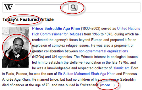
Figure 75: Different websites will follow different trends, but they still have comparative similarities
To ensure that the results were not simply a result of the top 100 websites’ own popularity bias, an extra 10 websites were browsed too (their results weren’t logged as it was an exercise of conformance) in order to see the accuracy of the top 100 findings. Within these were a mixture of varying website types, but the overwhelming majority of websites followed similar practices, or made changes which would logically make sense under the usage scenario. Therefore, the trends do seem to apply consistently.
Note: In addition to the above, it’s worth stating that a couple of the websites within the top 100 listings were either subdomains, or international versions of a website which has already been mentioned. While this could prove an issue for repeat conventions, the results varied enough to qualify their inclusion.
Common Factors at Play
The common factors which were widely implemented included the trend of using scripts to redirect mobile-friendly users, in preference to giving visitors a choice (which is interesting, as it constitutes a double-edged sword in terms of usability). In addition, the trend of subdomains also followed a well-trodden pattern in order to be recognised easily by end users. A final example, which showcases the common factors, is the unfortunate issue that few of the websites’ code validated!

Figure 76: Some websites actually generate their mobile layouts using automated tools like Mobify
Models for Other Genres
Expanding this study across a different cohort of website types may have varying differences as to how trends are implemented. Examples include the increased use of CSS3 and “flourishes” in portfolio websites, a reduced number of mobile apps on small business websites, and increases in the amount of required authentication if the study were applied primarily to social networks. In addition, if a website is more content-focused (like Smashing Magazine), an increase in file sizes will be an obvious side effect.

Figure 77: Professional designers such as Simon Collison may use CSS3 media queries to account for display sizes
Potential Improvements
Taking this study forward, improvements could be made. While the websites were tested using a range of real mobile devices including an Apple iPhone4, a Blackberry device, a Nokia device, a phone using WinMo, and a couple of phones using Android, a greater level of compatibility could be established if an increased number of devices were used (excluding emulators). In addition, a larger range of websites may boost the general accuracy of the results (such as if all 1,000 websites were tested).

Figure 78: Additional studies could be undertaken on particular niches, like newspaper websites. Example: The Guardian.
The Future of Mobile Design
As interesting as these results are, hopefully they will inspire you not just to follow design trends, but to seek them out. While the Web may still be in its infancy, mobile design is literally only a few years old. This means that trends will likely evolve ever more rapidly, as more usability studies and additional research are carried out to determine how user needs are being catered for. The future of mobile Web design is an up and coming industry, and we need to pay it plenty of attention.
As an increasing number of handheld devices appear (with different renderers and viewport sizes), the way we design is being affected by frameworks like jQuery, the advancement of standards such as HTML5 and CSS3, and the way applications are gradually being pulled toward the cloud. While this study showcases that rudimentary trends exist for mobile designs (such as single column layouts), it will be an interesting next few years as more designers account for the booming mobile audience.
Buy our eBook “Mobile Design For iPhone And iPad”!
This article is a free sample of our new eBook Mobile Design For iPhone And iPad (just $9.90). This eBook presents articles on professional mobile design for the iPhone as well as the iPad, including studies of trends in mobile design and guidelines for the development of mobile web pages.
These articles are a selection of the best from Smashing Magazine in 2009 and 2010, dealing with mobile design for the iPhone and iPad
The authors are: Alexander Dawson, Alexander Komarov, Cameron Chapman, Jen Gordon, Jon Raasch, Kim Pimmel, Luke Wroblewski, Marc Edwards, Michael Flarupp, Nick Francis, Rachel Andrew and Steven Snell.
The eBook is available in PDF, ePub and Mobipocket formats.


 SurveyJS: White-Label Survey Solution for Your JS App
 Agent Ready is the new Headless


