Creative Use of Video in Web Design: Background Videos
A visually appealing video is an excellent way to present a product, service or brand and take user experience to a much more interactive level. For this reason, elegant, creative and professional videos are becoming increasingly popular in Web design today.
Some designers go even further, creating Bluray-like experience in the browser, with interactive navigation menus, soft transitions and exceptional visual effects — all supported with background videos. This can be done with Flash or HTML5, however, most websites incorporate background videos using only Flash. To enable the rich cross-device experience, it is worth considering adding fallback-videos for those users who have a browser that does not support Flash. Nevertheless, we didn’t want to go into technical details just yet and wanted to see what actual approaches designers take within their websites.
Further Reading on SmashingMag:
- Backgrounds In Web Design: Examples And Best Practices
- The Future Of Video In Web Design
- Backgrounds In CSS: Everything You Need To Know
- Best Tutorials For Cinematic Visual Effects
The performance of a website including a background video depends significantly on the speed of the user’s internet connection. Video backgrounds certainly do not fit in every setting; they wouldn’t be meaningful in online magazines or blogs. However, they can work really well in entertainment and certain corporate settings which are supposed to communicate artistic qualities, exclusivity, branding or even high quality standards. As you will see, they work very well in portfolio websites, fashion websites and promotional campaigns. Below you’ll find a showcase of good and not so good websites that implement this dynamic eye candy at full screen.
Fashion Websites: Clothes, Shoes, Jewellery
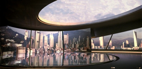
Bulgari B.Zero1 Bulgari, an Italian jeweller and luxury goods retailer, uses a background video to showcase (or “celebrate”) its new B.Zero1 line. Although the implementation is natural and done well, once again there is a strong potential for making the browser slow that would cause the website to run less than optimally. This may be the reason that Bulgari avoids using background videos on every page and use small versions instead; but then those videos feel underwhelming as a result, given the grandeur of the products being sold. The overall feel is very much like on DVDs, with interactive navigation menus, soft transitions and visually exceptional graphics.
Uniqlock Uniqlock is an advertising campaign for Uniqlo, one of Japan’s largest casual wear retailers. By including the video dance routines, time-signal music and clock utilities, the designers craft a unique experience using the background video technique. This is a virtual 24⁄7 presentation of Uniqlo clothing done with creativity and style. It won one of six Black Pencils in the online advertising category at the D&AD Awards 2008 in London.
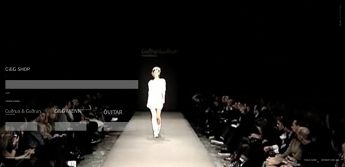
Gudrun og Gudrun Gudrun og Gudrun is a hand-made clothing brand by two knitwear designers from the Faroe Islands. The designers use background video to showcase their fashion show, and they use it throughout the website, with subtle transitions via various elements. An interesting use case, even if somewhat taxing on some users’ systems. The site is a bit older than others, yet it still is interesting and attractive.
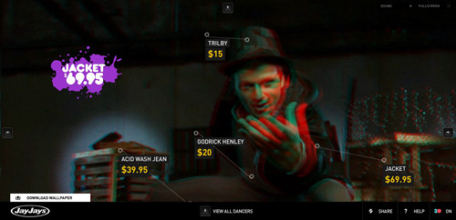
Jay Jays Dance/Off Dance/Off is an interactive 3-D online catalogue for the new line by youth fashion brand Jay Jays. This website is truly exceptional in concept, but not so in execution. The 3-D approach is innovative but also makes the website (which is effectively a fashion ad) impractical. Without 3-D capabilities (and that would be most homes thus far), users would find the videos pixelated and visually unappealing. The interactive element is also conceptually intriguing, but with the long loading time and numerous instructions for using the website, most users would probably just move on. Besides, the page takes way too much time to load, even on the broadband connection. A nice touch: you can navigate the website using your keyboard.
Yves Rocher: Tout le Film “Ce qui est essentiel rend belle” is a promotional short video that anchors this website. The video challenges the taboo of sexuality at any age, highlighting its biological benefits. The rest of the website is subtle and stylistically simple, making it easy on system resources. The video doesn’t start playing automatically, but requires user to click on the large green “Play” button first. Simple and user-friendly.
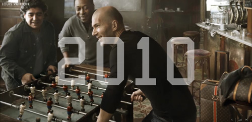
Louis Vuitton Journeys Louis Vuitton Journeys is an advertising campaign features three soccer legends, Zinedine Zidane, Pele and Diego Maradona. The intro to the video plays a little too fast to catch everything as it loads, but otherwise it is handled well. The video navigation and transitions are smooth, and the videos themselves are somewhat interactive.
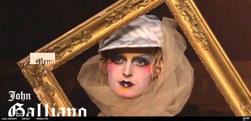
John Galliano John Galliano is a Gibraltarian-British fashion label; here, the video begins on the main page and takes over your sound and drains your system resources. The navigation is a little too fluid, making it difficult at times to quickly jump around to where you want to go. As you move deeper into the website, the background becomes less system-intensive, and each page opens in the current tab, freeing up the sound and CPU from the home page. The video introduction on the front page is interesting and not too obtrusive, but the music should not start automatically when the page is loaded.
Valentino Valentino is an international clothing company based in Italy. It does a much subtler and less intrusive variation on this technique. Although video elements play throughout the website (e.g. on the “Haute Couture” page), the home page does not automatically start a big video until you select one navigation item. And because you are prompted to begin the videos, your sound is not taken over until you decide. More user-friendly, better, cleaner design.
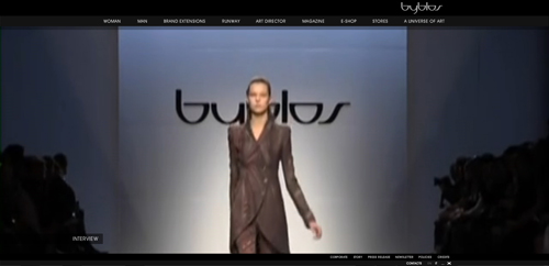
Byblos (-> Runway) Byblos is an Italian fashion house that uses video backgrounds very subtly. The splash page is a single frame, and sound runs continuously through the website unless you turn it off. But once you get past the splash page, the only really resource-sapping videos are limited to certain sections of the website, namely the “Runway” section. This feels like a more natural use of this technique; the whole website is not overly resource-dependent and prone to lagging on slow connections.
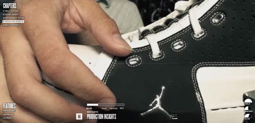
Nike: M6 Jordan Melo’s sixth signature shoe by Nike is the subject of the background video featured here; it is a multi-part behind-the-scenes look at the new product design. Once again, there is a potential lag issue because the videos are very big and looped continuously. Rather than automatically transitioning from one video segment to the next, the website could just as easily have paused and prompted the user to move on, giving them a breath to digest what they just saw. Controls for pausing the videos are available, so the user has the option, but automatic pauses would have helped here.
Anti Sweden Anti Sweden is a Norwegian fashion brand that subtly employs background video to complement its minimalist approach. Without the heavy graphics and sound that usually accompany this technique, the website is not as resource-intensive as some others, which is a nice change. The website demonstrates how the technique can be a lightweight yet completely engaging concept.
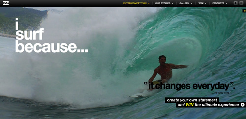
I Surf Because The “I Surf Because” site is part of Billabong’s digital marketing campaign. Here, Billabong uses a background video on the home page to push its campaign, but the technique is absent on deeper pages. This makes the website more CPU friendly, even though the embedded YouTube videos inside feel a bit lacking after the effect of the home page. An interesting idea: sometimes videos pause, show a tagline allowing for a comfortable reading and then continue again.
Vibram FiveFingers (Be cautious: NSFW!) FiveFingers is a shoe brand manufactured by Vibram, which has conceived an entire website driven by background videos. The execution is certainly interesting. With unique fluid navigation elements throughout the website, this interactive video features both the product itself and relevant data, making for a truly unique concept that is perfect for this technique. The splash page lets users choose if they want to see a normal site, a fullscreen site and if they are on low bandwidth connection.
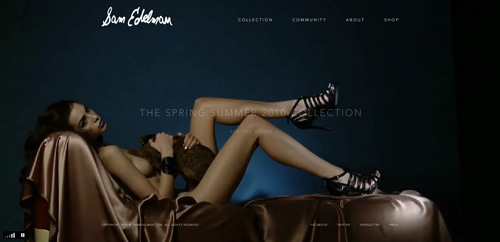
Sam Edelman Sam Edelman, a fashionable shoe brand, shows that one can achieve certain level of interaction without videos. In this case, subtle animations are used instead of streaming videos. The overall website is understated, as is the tone and theme of the background video, which is nicely done. Also, no sound takes over your system, a refreshing change up till now. A nice alternative to video backgrounds.
Car Websites
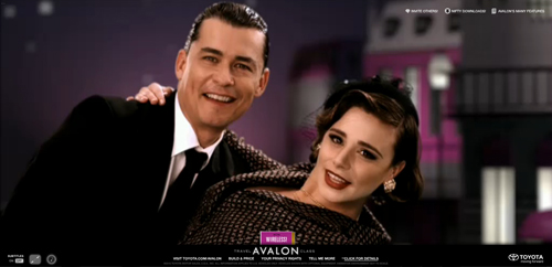
Toyota Avalon The promotional website for the Toyota Avalon is a fully interactive trip through five destinations and five of the vehicle’s features. The website creatively employs background video to some of its fullest and funnest potential. A promotional website which is essentially an interactive show-off with rich, creative, sophisticated imagery and navigation. Created by North Kingdom (Stockholm, Sweden) in collaboration with Saatchi & Saatchi LA (Los Angeles, USA).
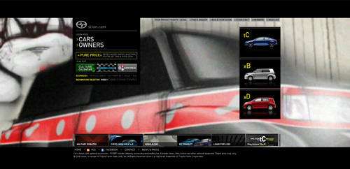
Scion The official website for the Toyota Scion is another website where video background seems a bit underused. The website does not take over your sound to add to the video background, although numerous video transitions feel like they should have had sound; thus the videos feel lacking or somewhat broken in parts. Other videos open in smaller separate windows, once again feeling like a missed opportunity to employ the technique. By the way: the font size on the page is way too small.
Beverages And Food Websites
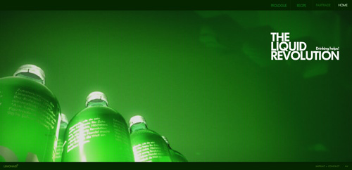
LemonAid LemonAid is an organic drink made entirely of a few organic, fair-trade ingredients, and the company uses a retro-styled background video to tell everyone what it’s all about. On entering the main website, system resource usage goes up significantly, which for some users will mean a bit of drag on the video and sound. Despite this, the concept is fairly simple, and the implementation works well for the product. One major drawback: the font size is way too small.
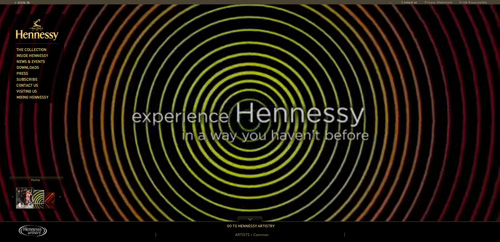
Hennessy Hennessy is a well-known French cognac brand. The video background gives this website a fitting elegance but with a twist. The video is resource-intensive in some areas and simpler in others. In both cases, the visuals are quite vivid and remarkable. Overall, a good, elegant fit for the brand.
Russian Standard Vodka Russia’s leading premium vodka is low key and unobtrusive with most of the information on its website; the main section automatically scrolls through a selection of promo material. The navigation is context-sensitive, being displayed only when users hovers over the menu. You can click on the video to pause it.
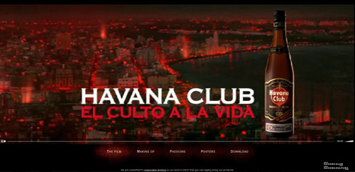
El culto a la vida “El culto a la vida” is an advertising campaign for Havana Club, a brand of rum made in Santa Cruz del Norte, Cuba. Background videos are employed for several uses throughout the website. With everything from live footage to interactive elements, the videos fully complement the look and tone of the brand.
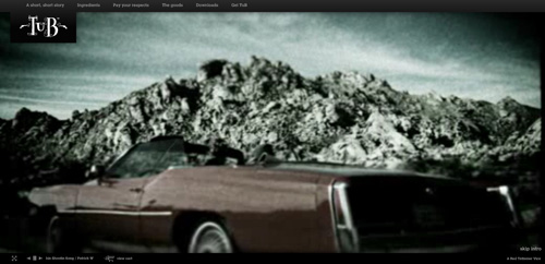
Tub Gin Tub Gin is a premium gin brand that uses video to humorously project its grungy and tough image while providing useful product information. Your CPU will take a bit of a hit as you peruse the various offerings, but given how entertaining the website is, you will barely notice it.
Battle of the Cheetos Battle of the Cheetos is a promotional online multi-player game with a low learning curve, but still complex enough to keep users engaged. Notice how well various video-elements are incorporated in the Flash-movie, vividly inviting the users to join in. Developed by North Kingdom (Stockholm, Sweden) and Goodby, Silverstein & Partners.
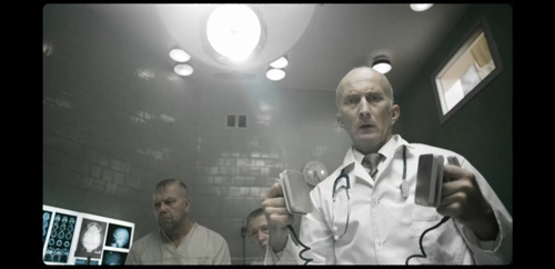
Asylum626 Asylum 626 is an advertising campaign for Doritos, which went with an interactive horror experience for this campaign. The “treatment” is available only between 6PM and 6AM and users can book an appointment to “participate”. According to the website, the experience is a scare that is too personal for the cinema. But for all the time required to go through the website, one ends up seeing little correlation between the product and these overproduced horror sequences.
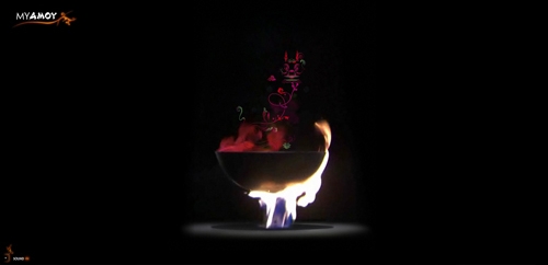
MyAmoy Amoy Food, one of the food and sauce brands in Southeast Asia, uses background video to complement its interactive promotional website. The site allows you to actually visually add ingredient and see them being prepared. Get ready to lose some time in the recipe-maker section, which is the highlight and focus of the campaign.
Music And Dance Websites
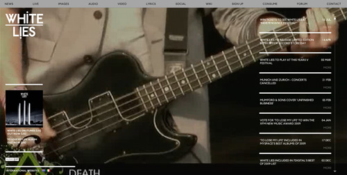
White Lies White Lies is an alternative rock band from Ealing, west London, that uses background videos to play its music videos while the user browses the rest of the website. Designers have made a poor choice for the resolution of the displayed video: at large resolutions, it looks very pixelated and blurry — even a bit larger resolution would work much better. Most navigation actions do not disrupt the playing either, because external links open in new tabs, leaving the slightly resource-heavy video to continue playing. Also, even though the website is for a music band, the website opens with the sound muted by default, which is a nice change.
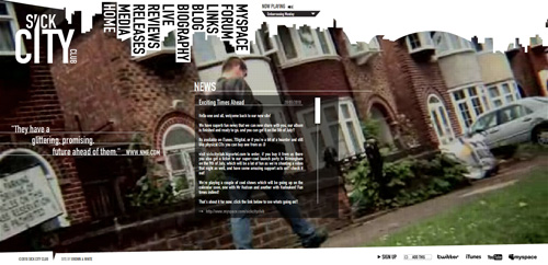
Sick City Club Sick City Club is an indie rock quartet from Birmingham, England, that employs the technique of playing its videos while the user looks around. New content slides in from the side, never disrupting or creating lag for the video. This is somewhat unusual among the websites featured here, most of which have elements that are complex or resource-heavy. The elements here seem to be simple and lightweight, which suit the website well.
Tomato Jaws Tomato Jaws is an electronic band from the Ukraine. It uses background video for ambience as the user engages with the unique navigation. The difference here, though, is that the music videos that play in the background are not necessarily theirs. In fact, in a bit of short-sightedness, the band’s music videos open in smaller players while the background video continues, thereby draining the CPU even more than necessary and causing both the music and background video to skip and drag.
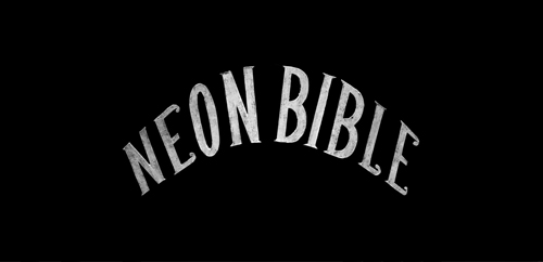
Arcade Fire: Neon Bible Canadian indie rock band Arcade Fire employs video backgrounds in a fun and unique way for its Neon Bible interactive music video. The website looks sparse at first and it features just a single music video, but with several interesting elements thrown in so that the viewer can sort of play along as the video plays. Still a bit heavy on resources, even for such a minimal approach, but that is to be expected.
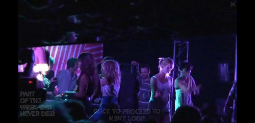
Radio Soulwax “Part of the Weekend Never Dies” is a documentary about Radio Soulwax’s summer 2006 tour, filmed by director Saam Farahmand. The website features a particularly creative use of background video: it enables the user to create their own mix by triggering various loops and video clips from the click of the mouse. While resource-intensive, it is an interesting use case.
Destroy Rankin To celebrate Youth Music’s 10th birthday, 70 of the world’s greatest musicians and visual artists have created a groundbreaking body of collaborative artwork based on Rankin’s iconic portraits of musicians. Simple, artistic and a worthy complement to the photographer’s work.

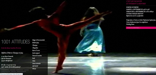
1001 Attitude 1001 Attitude is a dance school in Montfermeil (Paris) that uses background video to show its students dancing and, at times, warming up. This is a good use for a dance school, but the video is stretched to fit the background and so becomes distorted, which is unfortunate because it detracts from the elegance of the effect.
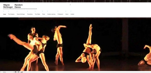
Random Dance Random Dance, an internationally renowned British dance company, puts background video on full display on its home page. As you move deeper in, a smaller video player is used, which fits the flow and structure of the website.
Hotel, Restaurant, Bar and Nightclub Websites
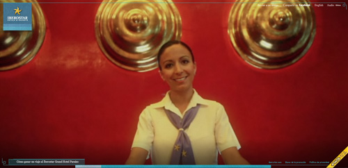
Iberostar “On vacation, we’re all stars” is the slogan for the Iberostar Hotels & Resorts campaign featuring Antonio Banderas. A partly interactive background video walks you through a virtual tour of what your actual experience at a resort would be like. The tour is an interesting way for hotels to deliver this experience.
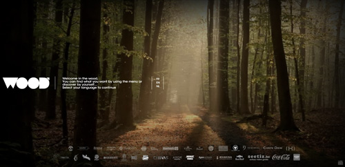
The Wood The Wood is a brand new bar/restaurant in the heart of Brussels and the famous “Bois de la Cambre.” The designers use background video to craft a soft atmosphere, which seems to fit the feel and decor of the restaurant in its unique woodsy way. The navigation plays into the rest of the website’s structure wonderfully, tying together the whole experience.
Jazzownia Liberalna Jazzownia Liberalna is a music club and restaurant that uses this technique in a stylish way. Adding various elements outside of the menu, the owners have gathered a lot of information on the history of jazz and displayed it in an simple interactive timeline of sorts. The rest of the website appears fluidly over top of the video. Breaking from the background once or twice might actually help here.
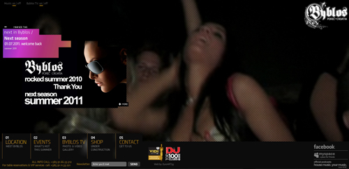
Byblos Byblos is a dance club in Porec, Croatia. It uses video background not only to show footage of the club itself, but to establish the tone and attitude of this hotspot. The website is hard on the system, but you are told that from the start, so be prepared. The transitions and overlays fit right in with the background, and they work well together and don’t detract from each another.
Advertising, Design Agencies and Film Studios
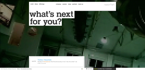
Razorfish Razorfish is an interactive agency for marketing, experience and enterprise design. Its use of background videos is both subtle and nearly unobtrusive in implementation. With minimal sound and graphic-heavy inclusions, the website is smooth and fluid throughout.
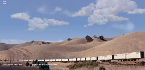
Less Rain Less Rain is a digital creative agency with offices in London, Berlin and Tokyo. Its site uses background video to complement the ambience of the rest of the website. However, as on other websites, the videos in the gallery open in a separate player, rather than in the background (where the main video stops playing). With the kind of work being showcased, a bigger presentation seems more suitable.
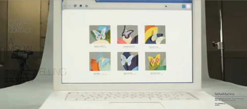
1stAveMachine 1stAveMachine is an NYC-based CGI, visual effects and animation studio that uses video background to enrich its website experience. Video sequences that play in the background do not always complement the navigable elements; they make the content displayed over top of it illegible in many instances.
IDEAL Production Company Ideal Production Company is a motion-design studio from Warsaw, Poland, that uses an interactive navigation element to enhance the background video employed throughout the website. This navigation also seems to be the reason that most videos on the website play in a smaller separate player. Still, given the nature of these videos, the smaller presentation does work here.
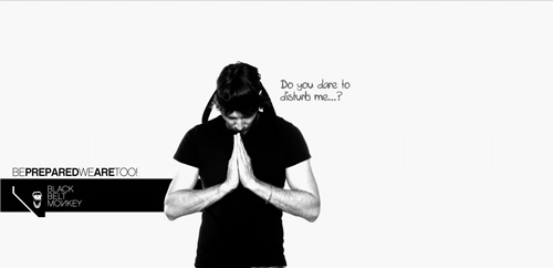
BlackBeltMonkey BlackBeltMonkey is a German communications and interactive design agency that has a subtler variation on background videos. While adding unique and whimsical interactive elements, the designers manage to keep the background from interfering with the content almost perfectly. There are some instances of text and background colors matching, rendering some of the headings partially illegible.
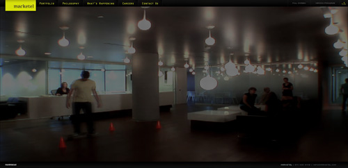
Marketel Marketel, one of the largest advertising agencies in Quebec, Canada, uses background video and with a responsive hover element to boot. The stylish background adds sophistication, and it remains active during all of the other interactions on the website. But when the television ads run in the gallery, the background can create a heavy lag for some users.
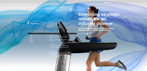
Designkitchen Designkitchen is an interactive design agency that delivers award-winning digital branding across multiple channels: social, viral, mobile and Web. It uses background video throughout its website, with various supplementary videos depending where you navigate to. The videos, especially in the news section, repeat themselves (sometimes alternating, but rarely) making them a bit distracting. Also, the portfolio has some white text against a white background, creating some difficulty there as well.
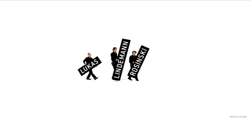
Lukas Lindemann Rosinski Hamburg-based advertising agency LLR (Lukas, Lindemann, Rosinski) also takes a minimalist approach with this technique and its overall website. With their unique and responsive navigational elements, the designers instill a sleek yet stylish feel throughout the website and leave a lasting impression.
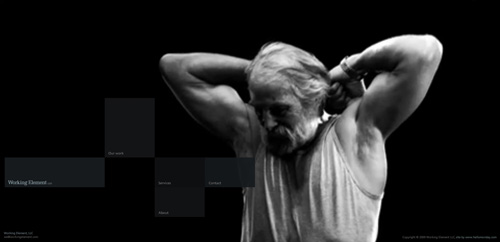
Working Element Working Element LLC is a collective made up of directors, photographers, writers, compositors, editors, photo illustrators, designers and cinematographers. The site uses background video to show the truth of its name. But as the large still gallery opens up, the video continues to play behind it, feeling a bit overstimulating. Again, the idea has promise but could use some tweaking.
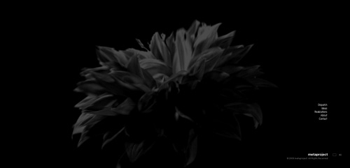
Metaproject Metaproject is a creative agency based in New York. Its background video is in some ways subtler and in other ways grander than others we’ve seen, but never intrusive or distracting, which is not always easy to achieve as we have seen. The transitions are smooth, and the background varies with the pages and projects in the gallery.
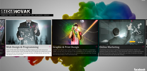
MediaNovak Media Novak’s background video is handled impressively, with little overstimulation. But it drops the ball in the portfolio section. The background fills with a wall of thumbnails, but it scrolls too quickly at times depending on the position of your mouse. There is no resting point. When you open a window, the wall continues to scroll behind it, which can be distracting or unpleasant for some users.
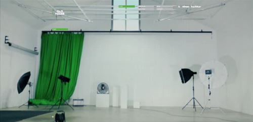
Filmhouse Filmhouse is a film production studio that uses a combination of background video techniques throughout its website (ranging from moderate to heavy use of system resources as well). As on other websites, this one opens up the videos in its portfolio in smaller windows, even shutting down the background entirely. But after the grand tour of the facility in the background, these smaller portfolio pieces feel a bit underwhelming.
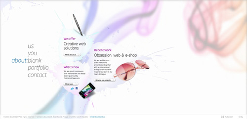
About:blank About:blank uses this technique harmoniously throughout. With the fluid, smoke-like effect playing through a halftone overlay in the background, the website comes across as sleek and well crafted. And the fact that the video continues to play without impeding the readability of the text over top of it shows how well this effect can be implemented with such simplicity.
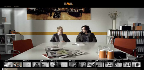
BM8 BM8 Bildmacht is a Hamburg-based film production studio that uses background video in two distinct ways. First, you can play with its portfolio of projects, which opens in the full browser window; and once you enter the website, the background is a continuously flowing video that entertainingly introduces you to the company. The videos are also available as lightboxex, so you can skip to specific parts or simply let them play through.
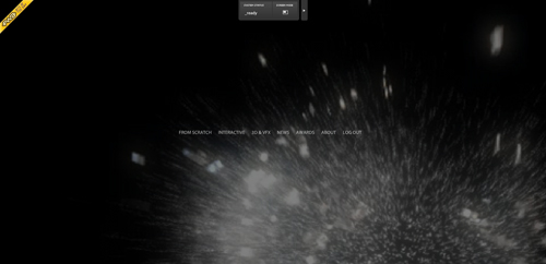
From Scratch Design Studio From Scratch’s background video is heavy and as results it often causes problems with navigating the website. However, the implementation here shows some interesting ideas. For example, while the videos in the portfolio section open in smaller windows, separate from the page, they do not feel like a break in the flow of the website. The transition feels like a natural fit.
Hipopotam Studio This small talented design studio of two people from Warsaw, Poland, implements this technique site-wide. Thus, the lag factor can get a bit much at times. However, when viewing projects in the portfolio, system usage drops rather significantly; even though video is used here, it is done in a subtle yet still interactive way.
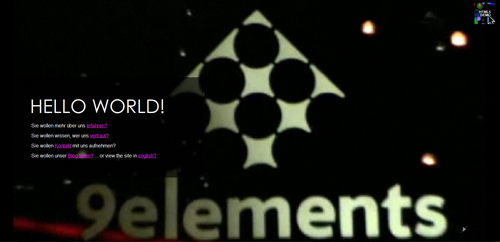
9elements 9elements uses background video for its main website and all accompanying material but abandons it on its blog. The background on the main website does not distract in any way from the content displayed over top, which is nice to see. Fluid transitions make for less chance of video disruption.
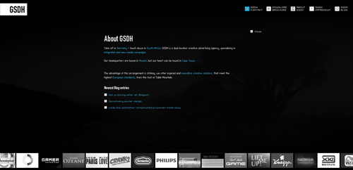
GSDH Werbeagentur GSDH’s background video is very subtle, almost imperceptible. Whereas many sites displayed above use the technique as a focal point, here it serves simply as the background, and without interfering with the content, as a background should.
Further Examples
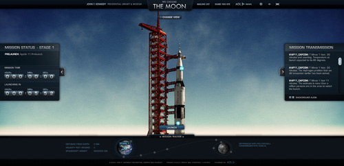
We Choose the Moon We Choose the Moon is a real-time immersive, interactive website for the John F. Kennedy Library and Museum. It commemorates the 40th anniversary of the Apollo 11 mission, the result of JFK’s pioneering vision to land the first person on the moon. Background video is implemented so that the user can track the entire mission through its various stages, with interactive stops and elements added along the way.
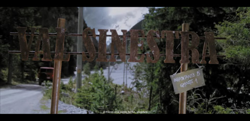
Lost in Val Sinestra The Lost in Val Sinestra is a viral marketing campaign by Swisscom to promote its TV offerings. It allows users to create a personalized movie trailer starring their Facebook friends or with pictures uploaded from their hard drive. The website adds interactivity by allowing users to choose their cast and the thrill-level for the story. To get the most out of the experience, use a big cast.
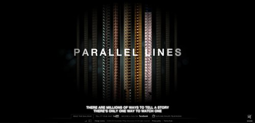
Philips: Cinema Parallel Lines is a Carousel short-film project to promote Philips TV sets. The films explore the most popular genres of filmmaking — including drama, action, animation, sci-fi and thriller — a nice examples of a site using video to provide a very memorable, rich user experience.
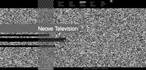
Neave Television Neave Television uses background video to present a truly original and entertaining concept. A series of seemingly context-free, weird and bemusing video clips are presented one after the other, allowing the user to skip to the next clip with the click of the mouse.
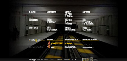
MTL12 MTL12 is a documentary television series (12 episodes) about Montreal and the people who live there. A stylized and interactive take on the background video technique gives this website its unique look and feel, highlighting the project and its segments in the process.
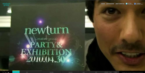
Newturn Group’s Webart Exhibition The first online art exhibit website of the Newturn Group streams resource-heavy background video leading up to and following the event. However, the videos can lag a lot and be at times unwatchable. The website gets a bit lighter once you start browsing around and move away from the main videos.
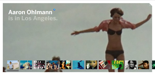
Aaron Ohlmann Aaron Ohlmann is an editor, producer and documentarian with an interest in projects that focus on the arts, political structures and social architecture. His website has a scaled-back, resource-friendly background video. But given the appearance of the home page, we expected to see each project in the same format; unfortunately, the other videos on the website open in a smaller player.
Yodabaz Yodabaz is the portfolio of Basile Tournier, co-founder of Web creation studio FCINQ. Once more, we have a main background video element that acts simply as a background, with the website’s other elements seamlessly laid over top. The background is integrated into the website without any interference or lag.
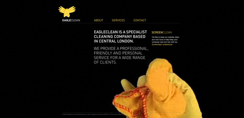
EagleClean EagleClean is a specialist cleaning company based in Central London that takes a subtle, minimalist approach with both its website and background video. It effectively markets its services with quick, once-over cleanings now and again to clean up any smudges on your screen. A creative use of the technique.
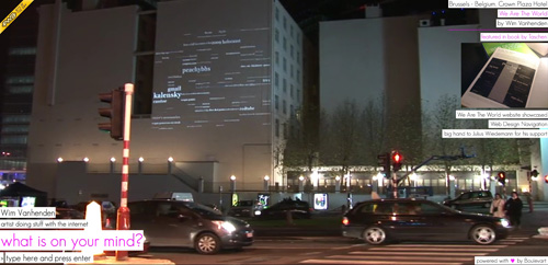
Wim Vanhenden Wim Vanhenden is a creative Internet artist from Belgium who uses background video not only to highlight his previous work, but to enhance the art project built right into the website. Upon prompting users to type in their thoughts and other information, the website searches the Web for related images and morphs them into an artistic background slideshow.
Futuretainment
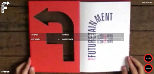
Futuretainment: Yesterday the World Changed, Now It’s Your Turn is a book written by Mike Walsh. Background video is used somewhat obtrusively on the website, looping repeatedly through a series of short segments. The segments themselves are so repetitive that they become distracting, and most of the footage is grainy and pixelated which is not a good thing.
Walt’s Warning Walt’s Warning is a first-person interactive experience website from Sony Pictures for Breaking Bad. Using background video to suck the user into the show’s world, the designers add another element of interactivity with responsive mouse-over scrolling. Overall, the experience is short-lived and a bit high on the resource-sapping end of the spectrum.

What Do You Think?
As you might have noticed, this article doesn’t really go into details explaining how to actually implement cross-browser video backgrounds in Web design, but if you’d like to have it as a follow-up, please let us know in your comments below.
Also, in general, what is your opinion of background videos in Web design? Do you think that it makes sense to use it? If yes, in which particular designs? If not, why not?
Poll: Would you like to see a HTML5 (or Flash) tutorial on creating video backgrounds in web design as a follow-up?
Would you like to see a HTML5/Flash tutorial on creating video backgrounds in web design as a follow-up?customer surveys
(al) (ik) (vf)


 JavaScript Form Builder — Create JSON-driven forms without coding.
 Register For Free
 Get a Free Trial
 Smart Interface Design Patterns, 45 lessons + UX training
 Devs love Storyblok - Learn why!