Mobile Auto-Suggest On Steroids: Tap-Ahead Design Pattern
In contrast to desktop Web search, auto-suggest on mobile devices is subject to two additional limitations: typing avoidance and slower bandwidth. The new patent-pending design pattern, Tap-Ahead, uses continuous refinement to create an intuitive, authentically mobile auto-suggest solution.
This helps dramatically reduce the amount of typing needed to enter queries, and utilizes slower mobile bandwidth in the most efficient manner. Using this novel design pattern, your customers can quickly access thousands of popular search term combinations by typing just a few initial characters.
Auto-Suggest: Mobile vs. Desktop Web
As John Ferrara wrote in his November 2010 UXMagazine article, “Psychic Search: a quick primer on search suggestions”, today auto-suggest is practically ubiquitous in desktop Web search. In contrast to desktop Web, auto-suggest on mobile is (at least for now) fairly rare. The only mobile Website that currently implements auto-suggest is Google.com, and a handful of mobile auto-suggest implementations that currently exist come from native mobile apps built by leading online retailers like Amazon and Booking.com.
Mobile auto-suggest is non-trivial and quite expensive to implement, but even a large investment does not guarantee a good experience on the mobile device. In many cases, it is not enough to simply transfer the existing successful desktop Web implementation of the auto-suggest to mobile space. Why not? Our recent study revealed that mobile space is subject to two unique limitations that affect customers’ expectations and their use of the auto-suggest feature:
- Typing Avoidance. Typing on the mobile keyboard is much harder and more error prone than typing on the full-size desktop Web keyboard. Most people prefer to search using only a few characters — the fewer, the better.
- Slower Bandwidth. Mobile signal strength is unpredictable, as is the speed of the Internet connection. Yet the customer expectation is often shaped by their broadband desktop Web experience. Mobile auto-suggest interface must be optimized for slower bandwidth.
The Limitations Of The Typical Mobile Auto-Suggest Flow
As I wrote in my UXmatters article, “Mobile Search: Turning Limitations into Opportunities”, mobile phones are notoriously difficult to type on and their Internet connection is often spotty at best. This is especially true in the mobile context of use — that is when the customer is being jostled and bounced around in the moving taxi or metro. In a July 2009 blog post on Alertbox, Jakob Nielsen called the mobile experience “miserable” and reported, “Text entry is particularly slow and littered with typos, even on devices with dedicated mini-keyboards.”
Although 3G networks are finally becoming more commonplace, the average speeds US users experience on mobile devices are sometimes as low as one-quarter of the average speeds advertised, according to the Federal Communication Commission (FCC). This implies download speeds of 100-500 Kbps or lower, compared to the speeds of 1 to 1.5Mbs under ideal conditions.
As shown in Figure 1 below, the difficulty of typing coupled with frequently spotty download speeds of mobile context of use introduce some challenges into the typical auto-suggest process:
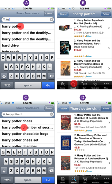
In the example above, the customer (let’s call her Anna) is looking for a book called “Harry Potter and The Chamber of Secrets”. To begin the search process, Anna types in the first two letters “ha”. Using these first letters of the query, the auto-suggest function performs a call to the keywords server, retrieving most frequently used keywords that begin with “ha”. The keywords server then quickly returns with a populated auto-suggest layer shown in 1-A, that helpfully suggests “Harry Potter”, along with nine other likely queries.
Although the “Harry Potter” does not completely match the query Anna is looking for, it gets her part of the way there and saves a lot of typing. Thus, Anna selects the system recommendation, causing her original query “ha” to be replaced by “Harry Potter”. The system then performs a search against the product server, returning up to 50 actual products along with product descriptions, thumbnails, and other pertinent information, as shown in 1-B.
With a fast Internet connection available on the desktop Web, the difference between hitting the keyword server and the products server is negligible — both come back almost as quickly. On the slower mobile connection, however, the difference is not only noticeable, but actually quite annoying because Anna never actually wanted to view “Harry Potter” products, but instead used this auto-suggest query as an interstitial search page — a jumping off point on the way from “ha” to “Harry Potter and The Chamber of Secrets”. The only reason why the interstitial search results page shown in 1-B was loaded was to avoid typing the full query on the mobile device.
After the products finally load, Anna again taps the search box to recall the keyboard and adds the letters “ch” to the query, creating the new query “Harry Potter ch”. The auto-suggest again goes to work, this time serving up as a suggestion what looks like the entire query Anna is actually looking for, “Harry Potter and The Chamber of Secr…” as shown in 1-C. Anna taps the suggestion, and the system finally serves up the second search results page, 1-D — the search results page she was originally looking for.
The first search results page is not just annoying and unnecessary — it distorts and pollutes an important asset, the frequently used queries database. The increased frequency with which the query “Harry Potter” is executed in fact helps push it to the top of the most frequently used query list again and again, creating a negative feedback loop in the frequently used queries server. The more something is selected as a jumping off page, the more the interstitial query (and it’s accompanied search results) appears to rise in popularity. Avoidance of typing in conjunction with a slower bandwidth available on mobile devices results in an overall sub-par experience.
Fortunately, there is a better way: Tap-Ahead Auto-Suggest design pattern that avoids the need to load the interstitial results page and all of the associated problems. I created Tap-Ahead based on my user research specifically to handle typing avoidance and slower bandwidth and optimize the search experience for the way customers use auto-suggest on mobile devices.
Tap-Ahead: A Novel Way of Resolving Typing Avoidance and Slower Bandwidth
Typing avoidance and slower bandwidth are two limitations inherent in mobile devices. Together, these two forces shape how people behave when they search. Tap-Ahead design pattern converts these mobile limitations into opportunities to create a better experience by minimizing the amount of typing and maximizing the use of the limited bandwidth.
The idea for the tap-ahead is simple: avoid serving the interstitial search results page by giving customers a way to narrow their search query using popular keywords without typing. To implement the additional narrow down functionality, I used the established iOS “more actions” icon — a blue circle with an arrow that was familiar to most iPhone users because of its prominence in the Contacts application, shown in Figure 2:

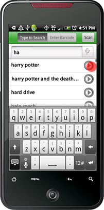
Of course, the same pattern can be applied on other platforms such as Android, Palm, BlackBerry and Windows 7 Mobile, by replacing the blue iOS arrow with the native platform’s standard “more actions” icon. Figure 3 shows what an implementation of the Tap-Ahead on Android might look like:
Let me show you how this feature works in the context of auto-suggest. In this example, the customer (let’s call him Ben) is again looking for “Harry Potter and The Chamber of Secrets”, but in contrast to Anna who we followed in the example above, Ben is using the Tap-Ahead auto-suggest interface. Figure 4 shows how this search would proceed using the Tap-Ahead design pattern instead:
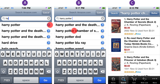
To begin the search process, Ben also types in “ha” as shown in 4-A. Using the first two letters of the query, the auto-suggest function performs a call to the keywords server, retrieving 10 most frequently used keywords that begin with “ha”, among which is “Harry Potter”. Auto-suggestion “Harry Potter” does not completely match “Harry Potter and The Chamber of Secrets”, so instead of selecting the “Harry Potter” suggestion as Anna did in the example above, Ben hits the blue “narrow query” arrow.
This searches through the keyword server for popular queries that contain the keywords “Harry Potter”, serving up the next auto-suggest layer, which contains “Harry Potter and The Chamber of S…”, along with nine other suggestions, as shown in 4-B. This is the query Ben is looking for, so he taps this suggestion and the system serves up the search results page as shown in 4-C — the actual search results page Ben was originally seeking.
Allowing Ben to narrow down the initial auto-suggestion directly using the blue circle with an arrow offers several key user experience benefits:
- Faster Search. As we discussed above, hitting the product server to retrieve interstitial search results is expensive, slow and unnecessary. By tapping the blue circle with an arrow, Ben bypassed the useless interstitial search results page and executed his second query, “Harry Potter” against the keyword sever — a much faster process, which also returned useful search suggestions. Ben only had to hit the product server once, when he had the right search query.
- Less Typing. Ben did not need to type in “ch” to find the popular auto-suggestion that contained his second query, “Harry Potter and The Chamber of Secrets”. Although this is not always going to be the case, quickly serving up the popular keyword suggestions upfront, without forcing the customer to type anything, increases the chances of being able to select the desired query faster.
- Seamless Flow. Instead of jumping between the auto-suggest list and search results, the system maintained flow by serving pertinent keywords quickly and remaining in the auto-suggest mode until the entire desired query has been entered. This optimized user’s attention on task and maintained flow.
- Flexibility. At any point, the customer retained the ability to select the keyword suggestions in a traditional manner or type into the search box or exit the auto-suggest flow. The new mechanism of tapping the blue circle with an arrow to narrow down the search is merely an optional feature that provided additional functionality, allowing the customer to enter his desired query faster and easier.
- Database Integrity. Because the interstitial query “Harry Potter” was never actually executed against the product server, it did not “accidentally” count toward the popularity of this query. “Harry Potter and The Chamber of Secrets” was the only query executed against the product server and therefore the only one that counted as a legitimate hit, preserving the integrity of the keyword popularity database.
In our quick usability testing, we found the technique of tap-ahead to be both intuitive and useful. I theorized that this was in part because tap-ahead takes advantage of how people already use the auto-suggest functionality on the mobile device, so the entire process seemed natural and intuitive to our participants. Also, many people remarked that tap-ahead design pattern seemed somehow already familiar. This was because it did not require people to learn anything new: the design uses the established iOS “more actions” icon that most iPhone users already tap several times a day when they use the Contacts application.
Although tap-ahead is very useful when combined with the traditional auto-suggest database, its real power comes from redefining the way auto-suggest is used in the context of a mobile device.
Tap-Ahead: From One-Shot to Step-Wise Refinement
Typical auto-suggest on the desktop Web is structured around a one-shot approach: when the customer types in the query, the auto-suggest server attempts to bring back the one exact match to the query the customer is trying to type in. Clicking the auto-suggestion replaces the query the user was typing with the one the system recommended. It’s meant to be a one-shot deal: one goal, one query, one suggestion, and one set of results. While this is a decent initial model, in practice, we now know that this is not how people really search. As I describe in my book, “Designing Search: UX Strategies for Ecommerce Success” (Wiley, 2011), modern-day search is a multi-step process that takes place in multiple contexts, with the customer moving fluidly between keyword searching and browsing, multiple devices, locations, Web sites and social networks.
One-shot refinement is ill suited to this multi-faceted search paradigm, but after long practice, people on the desktop Web have learned to satisfice. It helps that the Internet connection is often blazingly fast and feedback in the form of suggestions and results is nearly immediate. Additionally on the desktop Web, it’s really not that difficult to type in the query again or delete some parts of the query auto-suggest has over-delivered using the mouse and keyboard after the interstitial search results page is loaded.
In contrast, on mobile, things are very different. Connection speeds are slower and more sporadic. Also, editing a query string on touch phones is quite a bit harder than doing it on the desktop: for example, on the iPhone, the user must tap and hold the finger on one of the query’s keywords, then scroll the tiny handles left and right to select just the right number of letters — not a trivial exercise while bouncing around in the moving vehicle or multi-tasking. Android, Palm and BlackBerry mobile devices require similarly awkward query editing acrobatics.
A more usable way of implementing auto-suggest on the mobile device is through step-wise refinement implemented through the Tap-Ahead interface. Instead of trying to guess the entire query the customer is trying to type in and offer the best one-shot replacement, Tap-Ahead design pattern guides the auto-suggest interface through the guessing process one word at a time — a much more natural, flexible and robust auto-suggest method, optimized to solve low bandwidth and fat finger issues people experience on mobile devices.
This is how the step-wise refinement Tap-Ahead interface works. Suppose our two customers, Anna and Ben, are both searching for “Harry Connick Jr.” Anna is using a one-shot auto-suggest flow for this query, shown in Figure 5. Ben, on the other hand, is using the new step-wise tap-ahead refinement alternative as shown in Figure 6:
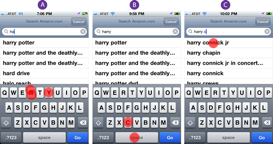
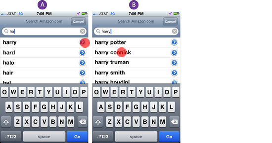
When Anna types in “ha”, the interface suggests “harry potter”, “hard drive”, “halo reach”, “harry potter and the deathly” and a rather redundant “harry potter and the deathly…” as shown in Figure 5-A. On the other hand, Ben, who is using a step-wise refinement sees a much more humble top 10 one-word suggestions such as “harry”, “hard”, “halo”, “hair” and “hat” shown in Figure 6-A.
Because none of the query terms match the desired query “Harry Connick Jr.” exactly, Anna, who is using the traditional one-shot interface, is forced to keep typing the word “harry”. In contrast, Ben can tap the blue circle with an arrow next to the suggestion “harry”, filling in the entire keyword with one tap.
Once both customers enter the keyword “harry”, Anna again sees one-shot auto-suggestions which include “harry potter”, several variations of the “harry potter and the deathly…”, “harry potter dvd”, “harry potter wand” and many other “harry potter” variations, as shown in Figure 5-B. Unfortunately, the set does not include a “harry connick jr.” suggestion, so Anna is again forced to keep typing “c” in order to get the full one-shot auto-suggestion of “harry connick jr.”, shown in Figure 5-C.
In contrast, Ben receives only single keyword suggestions, so his second set of suggestions includes only a single instance of the keyword “potter”, which successfully covers all of the variations of the query “harry potter”, which had to be listed individually in Anna’s one-shot interface. Thus instead of 10 variations of the “harry potter” query, Ben’s single-word auto-suggestions include a rich set of 10 one-word complements of “harry”: “potter”, “connick”, “truman”, “smith”, “houdini”, “harrison”, “dent”, “david”, “eastwood” and “hendersons”, as shown in Figure 6-B. A one-tap selection selects “connick” which yields the query “harry connick” that is sufficiently close to the desired query “harry connick jr.”. Note that although in this case it was not needed, the addition of the word “jr.” can be easily accomplished with one more tap on the blue “narrow down” arrow.
To summarize this comparison, after both Anna and Ben typed in the initial “ha”, Ben was able to finish entering the entire query in only 2 easy key-strokes — by selecting two successive auto-suggestions, whereas Anna had to type in the additional “rry c” and select one auto-suggestion, a total of 6 keystrokes. In this quick demo task, tap-ahead interface provided a huge improvement, given how hard and error-prone typing has proven to be on the mobile device.
The advantage of the tap-ahead step-wise refinement interface is that the refinement keywords can be loaded asynchronously for each of the 10 auto-suggestions even while the customer is making the selection of the first keyword. Given that most queries are between two and three keywords long, and each successive auto-suggest layer offers 10 additional keyword suggestions, tap-ahead with step-wise refinement allows customers to reach between 100 (10 * 10) and 1,000 (10 * 10 * 10) of the top keywords through typing only a few initial characters. Tap-ahead allows the mobile auto-suggest interface to maintain flow and increase speed and responsiveness on tiny screens that is simply not possible to currently achieve with the traditional one-shot auto-suggestion interface.
In Conclusion
I want to close out with this quote from Google, the company that invented the original auto-suggest design pattern, which clearly inspired my tap-ahead design:
“At Google, we often think that speed is the forgotten ‘killer application’ — the ingredient that can differentiate winners from the rest. We know that the faster we deliver results, the more useful people find our service.” — Matt Brittin, Managing Director, UK & Ireland Operations, Google
I hope that you find the Tap-Ahead design pattern useful in improving the speed and responsiveness of your own auto-suggest mobile interface and that Tap-Ahead contributes to further experimentation and evolution of search design patterns. For more mobile search design ideas, check out my book, “Designing Search: UX Strategies for Ecommerce Success” currently available for pre-order from Wiley and Amazon.com.
References
- Brittin, Matt. “About Think Data.” Think Quarterly, May 15, 2011. Retrieved May 15, 2011.
- Ferrara, John. “Psychic Search: a quick primer on search suggestions.” UX Magazine, November 23 2010. Retrieved May 15, 2011.
- Kamvar, Sepandar D. et.al. “Anticipated query generation and processing in a search engine.” United States Patent # 20050283468, Google. June 22, 2004.
- Nielsen, Jakob. “Mobile Usability.” Alertbox July 20, 2009. Retrieved May 15, 2011.
- Nudelman, Greg. “Anticipated query generation in a search engine with refinement option.” United States Patent Application # 61477606, April 21, 2011.
- Nudelman, Greg. “Designing Search: UX Strategies for Ecommerce Success_, Wiley & Sons, 2011.
- Nudelman, Greg. “Mobile Search: Turning Limitations into Opportunities.” UXmatters, March 8, 2010. Retrieved May 15, 2011.
- PricewaterhouseCoopers, LLC. “Technology Forecast: Unleashing enterprise mobility.” Center for Technology and Innovation, issue 1, 2011. Retrieved May 15, 2011.
Further Reading
- A Study of Trends in Mobile Design
- Designing for iPhone 4 Retina Display: Techniques and Workflow
- How To Build A Mobile Website
- Mobile section on Smashing Magazine


 Take a break with a 3D game built on Netlify!
 Start with a free demo —
 Click here to kickstart your project for free in a matter of minutes.

 Check the frontend report!

