A User-Centered Approach To Web Design For Mobile Devices
For the past few years, we’ve heard pundits declaring each year as “year of the mobile Web”; each year trying to sound more convincing than the previous. Whether 2011 will be the real “year of the mobile” remains to be seen, but what is indisputable is the fact that the mobile usage of the Web is growing and evolving. As it evolves, so does the mobile user experience, driven by advances in mobile device technology — from better browsers on basic mobile phones (or feature phones — remember the Motorola RAZR?) to the increased adoption of smartphones and tablets.
The term “Mobile Web” (although often criticized) is commonly used to describe accessing the internet using a mobile device. This definition is broad enough to cover everything from using a browser on a feature phone, to using highly customized apps on smartphones or tablets. “There’s an app for that” has made device-specific applications the rage of the day.
Some companies starting off backwards with “we need an iPhone app” instead of first understanding what their users actually need when they are mobile, the devices that they use, and then deciding the best approach for going mobile, which may not be an app, but could be a mobile website instead. Mobile websites are universally accessible, less expensive to develop and maintain, and can be searched and accessed by most mobile phones.
(The term “Mobile Web” is criticized because it implies that there are “different” Webs which just isn’t true — there is no Desktop Web, for example. It makes more sense to speak of the websites optimized for users accessing those websites through mobile devices. We will be using this perspective in this article. — Smashing Editorial Team)
This article focuses on designing the user experience for mobile websites accessed from mobile phones with small screens, though the process can be applied to building apps as well. As a Web designer, the good news is that the process is similar to designing desktop websites — with some additional mobile-only considerations that go hand-in-hand with small screens, device features and constraints, and connectivity issues. The user-centered mobile design life cycle can be thought of as an ongoing process as shown below:
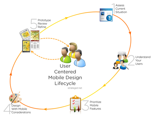
Let’s discuss each phase of this life cycle in more detail.
1. Assess Current Situation: Do You Really Need A Mobile Website Now?
Silly as this may sound in an article about creating mobile website user experiences, it is important to first figure out whether you actually need a mobile website. True, there will be 91.4 million mobile internet users in the US by the end of this year, but how many of them are in your target audience? Mobile commerce sales in the US in 2010 were $3.4 billion, but if you are not selling anything online, does that matter to you? The more relevant statistic is how many of your users are accessing your website using mobile devices. A quick way to find out is of course by looking at your existing desktop website analytics to identify the percentage of mobile visitors, along with the types of devices and operating systems they use to access your full desktop site. Dig deeper to understand why these users visit your site using a mobile device — what they are trying to do, and the content and functionality they are using.
Now, think about what else would be relevant to these mobile users, and for some competitive insight (and possibly inspiration), take a look at what similar sites are doing with their mobile presence. Your desktop site was created to support some business goals — it may have been a simple goal of creating awareness or a more complex goal of generating revenue through online sales. How will a mobile website complement that existing website? Identify the content and functionality that will be useful for your mobile users while supporting your business goals, including any new goals for mobile. Save these “business requirements” — we’ll need them when deciding what goes on the mobile website.
If, at the end of this exercise, you realize that you have very few mobile users, and they occasionally use just a couple of features (like finding your phone number, or hours of operation), you may be better off for now just optimizing your desktop site to make that information easily accessible by mobile users instead of building and maintaining a separate mobile site. If your website happens to be running on WordPress, there are plugins that can easily mobile-enable that website with little effort.
Not all websites need to go mobile now. Companies that need to extend their core services to their users (like those in travel and banking) certainly do, but a manufacturer of commercial jetliners and military aircraft or a provider of specialized industrial gases would probably not need a separate mobile website now, though that may change in a few years. But if you realize that you need a mobile website, let’s focus on the reason you need it: your users!
2. User-Centered Mobile Design Starts With The User
User-centered design relies on user involvement throughout the design process, leading to a solution that users will find useful and want to use. To achieve that, you first need to have a clear understanding of your users, grouped into a prioritized set of user groups whose needs can be thought of individually. For a pharmaceutical company, those groups could be patients, healthcare professionals and caregivers, with the first two groups being the primary user groups, and caregivers being a secondary user group with very similar needs to patients. Identifying your key user groups and creating personas will help you design better for your main users, the way BBC did when building their future mobile strategy.

To develop a mobile user experience that aligns to the needs and expectations of your targeted users, you must involve representative users and their feedback throughout the process. Direct input from your users through primary research methods like observing users, contextual interviews and focus groups will give you insights about their mobile behavior, including what they want to do on the mobile Web, and when and how they will use it. Primary research will give you answers to questions like:
- Why do they use your site on a mobile device?
- What features are they using?
- What features are crucial for them when mobile?
- What are some sources of frustration?
- What devices do they use to access the mobile Web?
As you build a detailed picture of your users and their usage patterns, supplement it with secondary research about industry and mobile market trends from Forrester, eMarketer, Nielsen and comScore, comScore Data Mine, DeviceAtlas and Opera’s State of the Mobile Web. Apart from an understanding of your user and their needs, you will also get a better understanding of the types of mobile devices you have to consider while designing.
3. Prioritize What Your Mobile Website Should Offer
While evaluating the need for a mobile website, you had a list of features you would like to offer on your mobile website. Ideally, these business requirements would align closely with the user requirements identified during user research. If they do not align, look at the requirements asking yourself “what value will this add to the users?” to ensure that your business requirements meet user needs and goals — this is user-centered design after all.
As is often the case, if you end up with more features than you can handle at launch, prioritize what you can initially offer, taking into consideration time, effort, and resources available. Hard as it may be, resist the temptation of trying to build in all the features right from the start. As 37signals so eloquently put it: “Build half a product, not a half-ass product.”
4. Mobile Design Considerations
Now that the groundwork has been completed, it’s time to get to the fun part: actual design! The basic design steps and principles of desktop website design apply to mobile design, with the addition of a few important mobile design considerations. Mobile devices are personal devices with small screens, always turned on, have intermittent slow connections and are mostly used when the user is — you guessed it — mobile.
This brings us to the big “C” of mobile: Context. Mobile users are not captive like computer users are. A user using your desktop website is sitting comfortably, and in a worst case scenario, may be simultaneously listening to music and intermittently tweeting. They are however, not doing all that with one hand, while walking around. Picture a mobile user trying to find directions using a tiny phone with intermittent connectivity, while strap hanging and swaying in a subway train with sub-optimal lighting conditions, deafened by the screeching of wheels on tracks — that gives you some context of use. Simply put, context is about the environment and conditions of usage, including distractions, multitasking, motion, lighting conditions and poor connectivity as you can see in the video below:
Designing for Mobiles: Users & Context from Niek Dekker on Vimeo.
In Tapworthy - Designing Great iPhone Apps, author Josh Clark boils down the mobile user’s mindset to one of three possibilities:
- Microtasking: Using the phone for short bursts of activity.
- Local: Finding out what’s around the user.
- Bored: Using the phone for distraction/entertainment.
Keeping all these factors in mind, here are some specific mobile design considerations to pay attention to while designing for the mobile Web:
Design for Smaller Screen Sizes
The most visible difference between a mobile device and a desktop is the screen size. For years, we have been increasing the minimum screen resolution we design for (remember the days of “optimized for 640 × 480”?). Mobile phone screen sizes have also been increasing, but even the gorgeous screen of the iPhone 4 is still small in comparison to a standard 1024x768 desktop design (designed by someone using a 2560 × 1440 display).
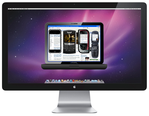
This gets more complicated when you factor in the range of screen sizes used by your mobile users. And let’s not forget that some smartphones can change orientation and their users’ expect the website to resize accordingly. Even though many smartphone browsers today can miniaturize desktop websites, they inadvertently break the user experience by making users zoom in and out, which brings us to the traditional approach of creating a separate website for mobile devices.
Bryan Rieger addresses the issue of designing for multiple screen sizes with a 4-step process:
- Define device groups by grouping screens with similar widths together resulting in a manageable number of groups,
- Create a default reference design that will adapt to smaller and larger screens,
- Define rules for content and design adaptation for it to display well and
- Opt for Web standards and a flexible layout.
While you should ideally be designing for mobile devices used by your users, for a more generic list of browsers to support, follow Peter-Paul Koch’s recommendations of supporting Safari iPhone, Opera Mini, Android WebKit, BlackBerry (WebKit & older for US), Nokia WebKit (Europe).
The other approach advocates a single website that caters to all devices, mobile or not, based on Luke W’s Mobile First principle (see presentation). Mobile First starts with a design for mobile, which can then be progressively enhanced for desktop websites. To see it in action, take a look at Yiibu’s proof of concept site based on Mobile First.
Selecting your design approach is not a black and white option. Think about which will work better for your situation. Irrespective of the approach you select, there still are other considerations that go into building a mobile Web.
Simplify Navigation
Without a mouse to point and click, mobile users have to rely on tiny keypads, trackballs and touch to navigate mobile websites. Add in the small screen with the need to complete tasks quickly and efficiently, and clear and intuitive navigation becomes crucial:
- A common approach that works for the start pages of most sites is a list of links to main features and content, prioritized based on user needs. These often end up being presented vertically instead of the horizontal model used on desktop websites.
- Reduce the number of categories and levels of navigation, and rearrange based on priority, presenting the most important categories first.
- Use clear, concise and consistent labels for navigation across the site.
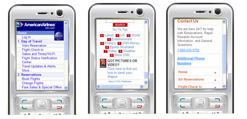
- Provide access key shortcuts for feature phones, so users can enter a keypad number (0-9) to quickly access a link (AA and CNN examples below).
- When designing for touch, make sure the tap size (width or height) for the navigation item is at least 30 pixels.
- Make links obvious, and provide clear and immediate visual feedback to show the selected link.
- When displaying the main navigation links on internal pages, put them at the bottom instead of the top, to avoid users having to tab through all of them to get to the main content on the screen (CNN example below). If not displaying all the links, Southwest’s approach of listing key links (Home, Air Reservations and Flight Check In) on secondary screens works well.
- At the bottom of the mobile homepage, offer a link to the full site so users can switch over to the desktop site, and vice versa.
- Breadcrumbs are not usually not used on mobile sites since navigation is not usually so deep that users need a trail back.
Prioritize Content
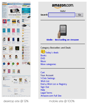
Be succinct. Smaller screen sizes require even more careful attention to the content displayed to the user. Put on your editor’s hat and cut unnecessary content, then cut some more. When you’re done, prioritize the content and display the most important content first.
Minimize User Input

Having used tiny numeric keypads and touchscreens on these Casio DataBank watches for over 20 years (yes, I admit it), I know the pain involved with entering data on miniscule screens. Feature phones have tedious numeric keypads for input, while smartphones have tiny keyboards, either real or virtual, which are subject to fat-finger errors.
- Keep your URL as short as possible, keeping in mind, feature phone users have to repeatedly press a key for most alphabets (key presses for “com” are 222-666-6). Follow URL naming conventions that users are used to, like m.site.com or mobile.site.com.
- Use alternate input mechanisms where possible. While apps can use device capabilities for input including motion, camera, gyroscope, and voice, mobile websites are slowly starting to use some of these features, like geolocation.
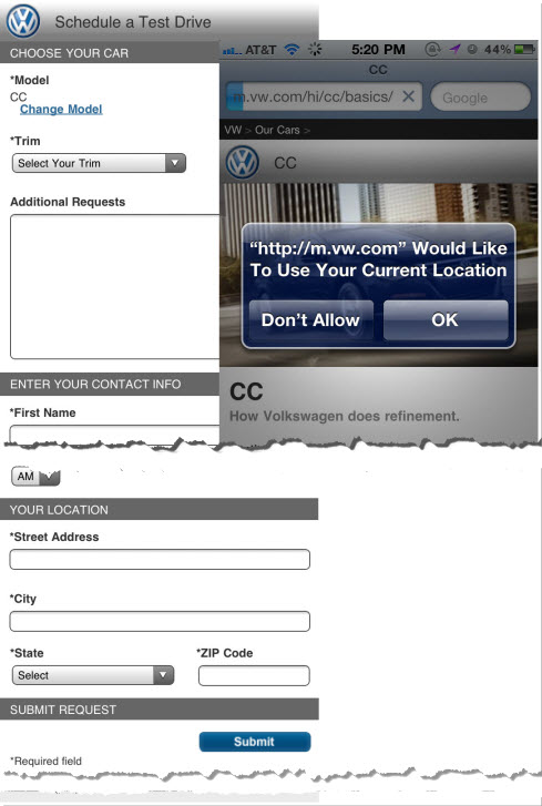
- Limit input to essential fields. For instance, if registration is required, limit it to the minimum required fields, and use shorter alternatives like a zip code instead of city and state. Volkswagon mobile captures geolocation, but does not use it when trying to schedule a test drive. Not only that, the mobile form is longer and more tedious than the desktop one.
- Select the best mobile input option (e.g. allowing users to select from a list of options is often faster than typing).
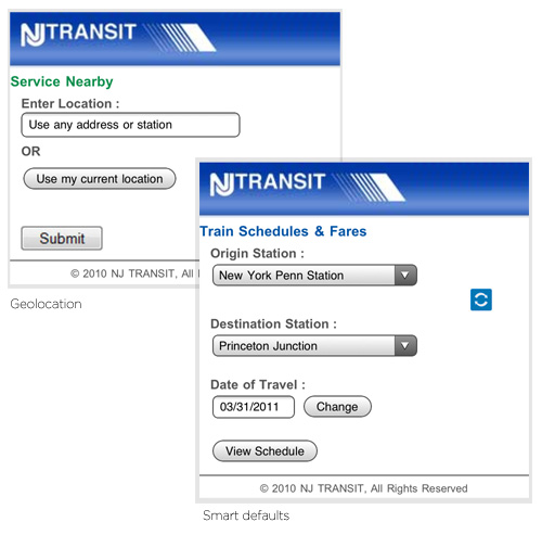
- Use smart default values. NJ Transit’s mobile website remembers your last selections and defaults the date to today’s date.
- When users need to log in, offer the option to stay signed in, especially since mobile devices are personal and not usually shared.
Design for Intermittent Connectivity
Even with mobile service providers rolling out faster G-speeds, mobile connectivity remains intermittent and does not even approach broadband speeds we are so used to on our wired and wireless connections (not even Justin Bieber’s 6G phone!). Users pay for internet access on their phones, and not everyone has unlimited data plans, so as mobile designers, we should think small when designing for mobile:
- Keep page sizes small so they can load quickly and are within the memory limitations of most phones.
- Remove unnecessary code, comments and optional tags.
- Reduce images to sizes and resolutions appropriate for mobile devices.
- Minimize the number of embedded images to reduce the number of HTTP requests and to speed up page load time.
Offer Cross-Channel Consistency & Integration
When you create a mobile website, you cross over into multi-channel territory, and with it, the need to maintain a consistent and integrated user experience across channels.
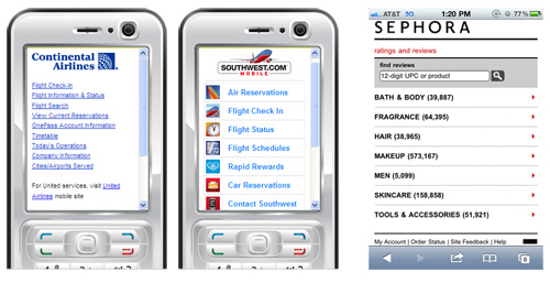
- Balance form and function. Continental Airlines takes a minimalistic, no-frills approach, using just their logo for visual branding, while Southwest makes their mobile website a little more visual with color and icons.
- Maintain continuity. By signing in on the Amazon mobile website, users can view and manage their shopping cart, wishlists and view and track orders, just as they would on the full site. Another good example in the making is Kindle for the web which, when launched, would allow you to continue reading a Kindle ebook where you left off, irrespective of the device you last used. It would also synchronize your library, bookmarks, notes, and highlights.
- Extend the user experience. Sephora mobile users can look up user reviews and ratings of products (by UPC or name) when trying to decide between two or more products in-store.
- Build a consistent user experience. Citibank users going from the full site, to the smartphone website or an iPhone app have the same user experience across all these channels (though some feature phone users cannot use the site at all).
Other Considerations
- Detect if your users are using a mobile browser and direct them to the mobile website (with a link on that screen to switch to the full site).
- Do not rely on technology that is not universally supported by your audience devices like Java, JavaScript, cookies, Flash, frames, pop-ups and auto refreshes.
- If you must make the user scroll, make them scroll in only one direction (most sites scroll vertically).
- Use short, descriptive titles for your pages for easy bookmarking and recall.
- While there are advocates for creating separate mobile sites for feature phones, smartphones and iphones (yes, their own website), others have gone down this road and are opting for a single mobile site. Facebook, one of the most visited mobile properties, recently decided to unify its mobile websites into one interface.
5. Prototype Review & Refine
Prototyping is important in an iterative user-centered design process, allowing designers to quickly visualize parts of the website, review with users and refine the design. Prototype early and often through the design process, starting with low fidelity paper sketches, refining them into medium fidelity wireframes and subsequently into high fidelity designs, continually testing with users and iterating based on their feedback.

Double check your code for compliance by validating your mobile site using the W3C mobileOK Checker or mobiReady to uncover and fix potential issues your users may face. Mobile emulators and simulators are useful during development, but nothing beats testing your site on actual devices that your users are using.
Ongoing Improvements
Your job is not done when you launch your mobile site — you’ve just come full circle. It’s time to monitor site usage and user feedback to identify changes and requests for new features, in addition to any features that did not make it in the first release. Periodically evaluate your mobile site against competitors using a scorecard (sample from Yankee Group [pdf]) to identify potential areas for improvement.
In Conclusion
The mobile Web is different, and may be daunting, but the design process is similar enough for Web designers to ease into mobile design. Designing the perfect mobile website is an impossible task even for experts, but using an iterative user-centered design process can help create the best experience for our users with their help.
Resources
- Browser statistics (drill down for mobile):
https://gs.statcounter.com/ - Browser overview of the mobile market:
https://www.quirksmode.org/mobile/mobilemarket.html - Mobile browser list and test advice:
https://www.quirksmode.org/blog/archives/2010/04/mobile_browsers.html - Mobile data and trends by Nielsen:
https://blog.nielsen.com/nielsenwire/category/online_mobile/ - HTML5 capabilities of mobile devices:
https://www.netbiscuits.com/external_content/marketing/Netbiscuits_Mobile%20Web%20Metrics%20Report_11-1_Feb.pdf - TIME’s 50 Best Websites: The Mobile Edition (more apps than web):
https://techland.time.com/2010/08/25/times-50-best-websites-the-mobile-edition/ - Mobile Web Best Practices:
https://www.w3.org/TR/mobile-bp/ - The 2010 Mobile Year In Review:
https://www.comscore.com/Press_Events/Presentations_Whitepapers/2011/ 2010_Mobile_Year_in_Review
Tools
- 8 Tools For Easily Creating a Mobile Version of Your Website (Mashable): https://mashable.com/2010/12/16/create-mobile-site-tools/
- HTML5 Mobile Boilerplate Template: https://html5boilerplate.com/mobile
Books
- Designing the Mobile User Experience, by Barbara Ballard
- Mobile Web Design, by Cameron Moll
- Strategic Mobile Design: Creating Engaging Experiences, by Joseph Cartman and Richard Ting
- Mobile Design and Development: Practical Concepts and Techniques for Creating Mobile Sites and Web Apps, by Brian Fling
Further Reading
- How To Build A Mobile Website
- A Study of Trends in Mobile Design
- How To Use CSS3 Media Queries To Create a Mobile Version of Your Website
- Why We Shouldn’t Make Separate Mobile Websites


 SurveyJS: White-Label Survey Solution for Your JS App
 Agent Ready is the new Headless


