The Lost Art Of Design Etiquette
Endless layers in Photoshop. Overstuffed image folders. That jQuery plug-in that has 12 files associated with it. Hundreds or thousands of individual pieces go into making a website. No wonder we go off the deep end when we can’t find a closing div — er, section tag. We work with a ridiculously large number of things, and how we organize them (or choose not to) is often left to personal preference. But our messy habits result in confusion for the designer or developer who inherits your work. Does it really need to be this way?
Us Vs. Them?
The great divide between designers and developers is well documented. Designers complain when developers would rather backgrounds not have any images. Developers gripe when given a Photoshop document with missing fonts. If those were the only problems we face, we’d be thrilled.
Unfortunately, not every studio is a breeding ground for pixel-crafting harmony. Sometimes designers work on one floor, developers on another. If you asked a good number of them, they’d say they were content with that arrangement. No wonder communication breakdowns are so frequent. The only brains we have to pick are those of our fellow designers or fellow developers, with little crossover it seems. Proximity doesn’t always improve proficiency, but don’t tell that to bees.

Web designers have the unique ability to communicate through layout, shape, typography and, ultimately, simplicity. That same discipline must be exercised internally when sharing their artwork with colleagues — using, coincidentally, those same tools. As challenging as it may be, we can bring sophistication to our interfaces in Photoshop, so that our artwork achieves clarity through order. Just as our client has a target audience, we should also be considerate of the internal audience that uses our work.
We’re nibbling at the edges of websites that deliver a happy marriage between remarkable aesthetic and solid function. Seeing some websites already achieving that is exciting. But to fill the Web with more of it, designers and developers will need to combine their skills in even more proficient and efficient ways.
A Call To Arms
Let’s start a revolution that has less to do with being nice and more to do with holding one another to higher standards. Let’s get caught up not in the sexy pixels of tomorrow, but rather in attention to detail in our workflow. What if we made it easier for others to actually use and edit our work? Yes, my friends: let’s start an etiquette revolution.
More Than Just Chivalry
Why etiquette? I agree: at first it does sound stuffy and time-consuming, especially if what we’ve done has always worked. The client won’t see the etiquette, we’ll still get paid, and all is well. But let’s reason here: whether you’re in a group or creating websites all by yourself, the level of detail in your craft reflects how much you value your profession and should be apparent in the finished product.
Even so, internally, inheriting messy artwork can be a point of contention for developers. A design could be the most beautiful and useful thing in the world, but if it’s not practically built, it will waste precious time and money. All of the investigative work of the developer in posing questions to the designer about what’s confusing in their PSD should not have been necessary; the work should have been clear from the beginning, and the designer as organized as ever.
Can both the individual and group benefit from some good ol’ fashioned etiquette?
Personal Gain
Here’s a plain illustration of my point. Think of the designer or developer whose work inspires you most. Imagine you had the opportunity to work with them on a project. They got the ball rolling with a PSD or a directory of coded files, and handed it off to you for editing. How surprised would you be if the layers were unnamed? Or the code wasn’t indented, all smushed together? You likely wouldn’t see that, right? Every layer, every line of code reflects on who they are.
Even if you’re a one-person shop, holding yourself to high standard of organization has always been good practice. By doing so, you make less work for yourself when you need to go back to edit something. More importantly, if you were ever to pass off a PSD to a developer or client, you’d want it to speak to your attention to detail and professionalism.
(Aside to Fireworks users: I’m about to make a ton of references to PSDs, so feel free to substitute “Fireworks PNGs.”)
Collective Gain
Have you ever inherited a PSD from a designer and, on seeing the missing fonts, unnamed layers and myriad of masks, knew you were in for about four hours of work just to get started? No? Must be just me, then.
Indulge me, then. Those hours, even if few, are time spent by someone less familiar with the file than the designer and, thus, unnecessary. Our job as Web designers is to run a tight PSD ship. In theory, I should be able to organize my PSD in a fraction of the time that someone else could, just because of my familiarity as the designer. The result? An easier process for the inheritor and less time billed for the company.
Equally important, how much less disgruntled would developers be if designers handed over their work without so many blunders? How many projects would come in under budget? How about world peace? Too far?
Let’s apply the same clarity that we bring to the canvas to the “Layers” panel, too. Now we’re on our way to higher standards.
Let’s look at some recurring issues and see how to resolve them.
Common Mistakes
Didn’t Put the File on the Server
Just your luck. A deadline is fast approaching, and you’ve set aside a good amount of your day to plough through editing a PSD that a fellow designer has just finished working on. Problem is, you can’t get to it because it’s sitting on their desktop instead of the server. How convenient. And doesn’t this always happen when they’re on vacation?
The remedy
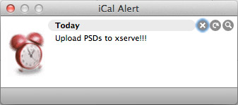
Depending on the hardware, designers should work directly off a networked server, and use their computers only for local back-ups. Alternatively, you could set an alert (in iCal or your app of choice) at the end of each day to remind you to commit your files to a shared spot.
Unnamed or Unused Layers
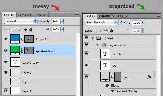
The developer didn’t expect to need a machete to use your file. Thicker than the Amazon rainforest, your PSD has layers-a-plenty, some even with such distinguished names as “Layer 0 copy.”
The remedy
Name layers and make folders as you go in Photoshop. Yes, it takes discipline, but it’s easier than having to go back to rename and delete after the fact. Use folders, too: they’re there for a reason.
Unpurchased Stock Photos
Hello there, Mr. iStockphoto watermark. Curious to see you in the final PSD. If we could have only mustered the $3 for credits, I could have gotten rid of you myself.
The remedy
For everything, proofread, proofread, proofread. Your text and your images.

Inaccurate File Names
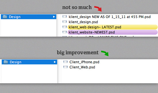
You look confused, developer. Clearly, you should be using website_LATEST-v3_FINAL.psd instead of website_USE_THIS_ONE_ULTIMATE.psd.
The remedy
One file, named accurately. Archive the rest if you think you might need to go back to the third of your nine iterations for some reason.
Missing Fonts
Does this sound familiar?
The following fonts are missing for text layer “myFont, notYours”:
Guilty Culprit Extra CondensedFont substitution will occur. Continue?
Ain’t that something? Confirming wouldn’t be a good solution in this case, because then the developer would be doing some guesswork to match the font that the designer presumably has more knowledge of. This usually happens when a font needs to be used as image text, so a straight substitution might not be an option.
The remedy
Ideally, the designer would be considerate enough to include the (licensed) font somewhere within arm’s reach of the PSD. Alternatively, the studio could install common fonts on all production computers. Apps like Fontcase, Suitcase Fusion and Linotype FontExplorer X will manage your fonts for you.
Inconsistent Or Inaccurate Content
If I’ve learned anything from working with developers, it’s that they don’t like to do things twice. Rightfully so. Whether it’s unpurchased stock photos, inconsistent type sizes or inconsistent colors, when they’re not caught the first time around, images need to be reproduced and code needs to be altered. And sadness overcomes all those involved.
The remedy
Develop a brand guide if one doesn’t exist, and have someone check your work before you hand it off. Think of it as quality control.
Tips And Tools
Name Files For Function
Be descriptive but practical when naming PSDs, JPEGs, etc. Something like header_bg.jpg is a little more indicative than blue_box.jpg, isn’t it?
Conserve File Size
I may sound like an old curmudgeon, but file size is still pertinent today. When exporting images, remember that a background at 80 quality will still look close to one at 100 quality but will likely be at least 33% smaller in size. Everyone still likes pages that load quickly, even if our Internet connection speeds have increased over the years.
Snap To Pixels
When I’m cutting up a PSD, one of the most common things I have to negotiate are those 1-pixel semi-transparent lines on the outer edges of shapes. The best way to remove them is pretty well cloaked in the vastness of Photoshop’s settings. When choosing a shape to draw, such as a rectangle, look towards the top of the screen at a row of those same shapes, with an arrow at the end of the row. Click that arrow, and you’ll see more options. Check the box “Snap to Pixels,” and you’ll see that the shape you draw will have much more precise edges.
Use Version Control
A fantastic way to cut down on the chaos of sharing files is to use a version-control system such as Git or Subversion. You designers, don’t feel that only developers can geek out about this. Using some type of revision control for our PSDs and other artwork files is equally important, because those files tend to get revised and transferred quite a bit. Version control is crucial when multiple people are working on front-end and back-end development, because overwriting someone’s work when uploading your own is all too easy.
Communicate
The saying “Communication goes both ways” never meant so much as it does here. Designers should freely communicate their decisions to developers, who themselves should express their concerns about programming said decisions. Nothing new, but it just doesn’t happen as openly as it should. If you consult with each other frequently, you’re bound to have more etiquette.
Be Teachable
Part of practicing good Web design manners is having the humility to know you’re not the best at what you do (except for one of you out there, Mr. Best Web Designer).
Implement Standards
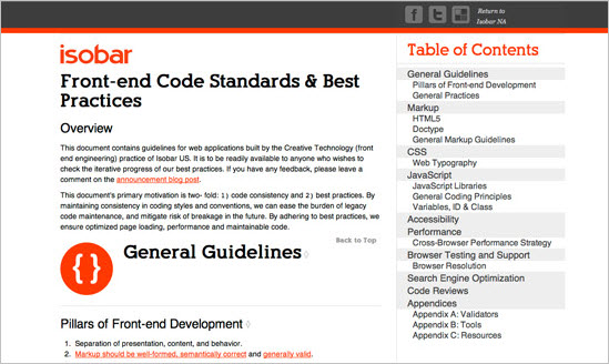
The best way to force your Web team to adhere to standards is to come up with a list of best practices, on that holds each person accountable for their PSDs, HTML, CSS and beyond.
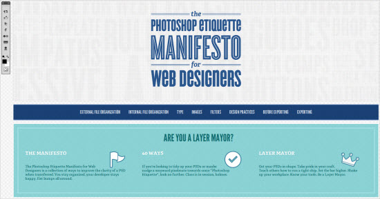
The Photoshop Etiquette Manifesto for Web designers was created to give both beginner and seasoned designers a crash course in keeping PSDs organized and understandable for others. With helpful visual comparisons of “Do this” and “Not this,” the website serves as both an educational resource and a checklist. With the crown of “Layer Mayor” at stake, why not take more pride as the resident PSD pro in your office?
Moving Forward
Having said all this, it’s encouraging to see more designers learning and understanding the process of developers, and vice versa. Some have done it out of necessity, such as freelancers who are hybrid designers/developers. Others have done it in order to understand their co-workers better, in the hope of a better product.
Hopefully, it’s become apparent that being on the same page, especially in Web development, is crucial to success. What are you doing to emphasize a high standard and clarity in your own craft and to make your team’s job easier?
Further Reading
- Designers And Developers: No Longer A House Divided
- Why You Should Include Your Developer In The Design Process
- Useful Glossaries For Web Designers and Developers


 SurveyJS: White-Label Survey Solution for Your JS App
 Agent Ready is the new Headless


