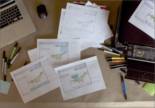
The Messy Art Of UX Sketching
Although starting a prototype on a computer is sometimes easier, it’s not the best way to visually problem-solve. When you need to ideate website layouts or mobile applications or to storyboard workflows and context scenarios, sketching is much more efficient. It keeps you from getting caught up in the technology, and instead focuses you on the best possible solution, freeing you to take risks that you might not otherwise take.
Further Reading on SmashingMag:
- UX Sketching & Wireframing Templates For Mobile Projects
- Sketching For Better Mobile Experiences
- Design Better And Faster With Rapid Prototyping
- Free Printable Sketching and Note-Taking PDF Templates
Many articles discuss the power of sketching and why you should do it, but they don’t go into the how or the methods involved. Sketching seems straightforward, but there are certain ways to do it effectively. In this article, we’ll cover a collection of tools and techniques that I (and many other UX and design folks) use every day.
Sketching ≠ Drawing
Some of the most effective sketches I’ve seen are far from perfect drawings. Just like your thoughts and ideas, sketches are in a constant state of flux, evolving and morphing as you reach a potential solution. Don’t think that you have to be able to draw in order to sketch, although having some experience with it does help.
- Sketching is an expression of thinking and problem-solving.
- It’s a form of visual communication, and, as in all languages, some ways of communicating are clearer than others.
- Sketching is a skill: the more you do it, the better you’ll get at it.
When evaluating your sketches, ask yourself, “How could I better communicate these thoughts?” Getting caught up in evaluating your drawing ability is easy, but try to separate the two. Look at your sketch as if it were a poster. What’s the first thing that’s read? Where is the detailed info? Remember, the eye is drawn to the area with the most detail and contrast.
Just as one’s ability to enunciate words affects how well others understand them, one’s ability to draw does have an impact on how communicative a sketch is. The good news is that drawing and sketching are skills, and the more you do them, the better you’ll get.
OK, let’s get started.
Work In Layers
Often when I’ve done a sketch, the result looks more like a collage than a sketch. Efficiency in sketching comes from working in layers.
Quick video showing how you can use layers to effectively build your sketches.
Technique
Start with a light-gray marker (20 to 30% gray), and progressively add layers of detail with darker markers and pens.
Why?
Starting with a light-gray marker makes this easy. It allows you to make mistakes and evaluate your ideas as you work through a problem. Draw a crooked line with the light marker? No big deal. The lines will barely be noticeable by the time you’re finished with the sketch.
As the pages fill up with ideas, go back in with a darker marker (60% gray) or pen, and layer in additional details for the parts you like. This is also a great way to make a particular sketch pop beside other sketches.
Sketching in layers also keeps you from getting caught up in details right away. It forces you to decide on the content and hierarchy of the view first. If you are sketching an interface that contains a list, but you don’t yet know what will go in the list, put in a few squiggles. Later, you can go back in and sketch a few options for each list item and append them to the page.
Caution
If you start drawing with a ballpoint pen and then go in later with a marker, the pen’s ink will likely smear from the alcohol in the marker.
As you get more confident in your sketching, you will become more comfortable and find that you don’t need to draw as many underlays. But I still find it useful because it allows you to experiment and evaluate ideas as you sketch.
Loosen Up
Technique
When sketching long lines, consider moving your arm and pen with your shoulder rather than from the elbow or wrist. Reserve drawing with your wrist for short quick lines and areas where you need more control.
Why?
This will allow you to draw longer, straighter lines. If you draw from the elbow, you’ll notice that the lines all have a slight curve to them. Placing two dots on the paper, one where you want the line to start and one where you want it to end, is sometimes helpful. Then, orient the paper, make a practice stroke or two, and then draw the line. If you look closely, you’ll see this in the video above.
A bonus to drawing from the shoulder is that much of the motion translates to drawing on a whiteboard; so, in time, your straight lines will be the envy of everyone in the room.
Play To Your Strengths
Technique
Rotate the page before drawing a line in order to draw multiple angles of lines more easily.
Why?
Very few people can draw lines in all directions equally well. Rotating the page allows you to draw a line in the range and direction that works best for you. Don’t try to draw a vertical line if you find it difficult; rotate the page 90 degrees, and draw a horizontal one instead. It’s super-simple but amazingly powerful.
Caution
This does not translate well to a whiteboard, so you’ll still need to learn to draw vertical lines.
Sketching Interactions
Technique
Start with a base sketch, and then use sticky notes to add tooltips, pop-overs, modal windows and other interactive elements.
Why?
Using sticky notes to define tooltips and other interactive elements lets you quickly define interactions and concepts without having to redraw the framework of the application. They are easy to move around and can be sketched on with the same markers and pens you are already using.
- Define multiple interactions on one sketch, and then strategically remove pieces one at a time before scanning them in or copying the sketch.
- Use different colors to represent different types of interaction.
- Is one sticky note not big enough for your modal window? Add another right next to it.
- Is one sticky note too big for your tooltip, user a ruler as a guide to quickly rip the note down to size.
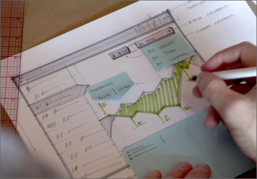
Explore a variety of interactions and ideas in a single sketch using sticky notes.
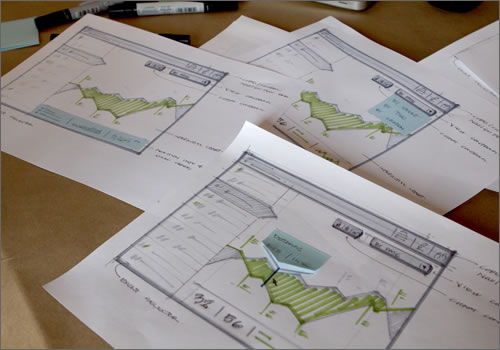
Upon photocopying various versions of a sketch, each with different sticky notes, you’ll end up with various distinct sketches.
Copying And Pasting For The Real World
At times, you may want to manually redraw a UI element multiple times in a sketch. This is not always a bad thing, because it gives you the opportunity to quickly iterate and forces you to reconsider your ideas. That being said, an all-in-one scanner or photocopier could dramatically increase your efficiency.
Technique
Use a photocopier to quickly create templates from existing sketches or to redraw an area of a sketch.
Why?
A photocopier is the old-school version of Control + C, Control + V. It makes the production of templates and underlays more efficient. It also boosts your confidence, because if you mess up (and you will mess up), you can easily fix it.
- Does one part of your interface need to be consistently redrawn in multiple sketches? Run a few copies, and then sketch directly on the print-outs.
- Did you mess up a part of the sketch? No problem. Cover up that portion of the sketch with a piece of paper or with correction fluid, run off a copy, and then start sketching directly on the print-out.
- Are you working on a mobile project? Or do you want to make a series of sketches all of the same size? Create a layout and copy off a few rounds of underlays. Easier yet, print off underlays of devices or browsers; a good selection can be found in the article “Free Printable Sketching, Wireframing and Note-Taking PDF Templates.”
- Do you want to change the layout of a sidebar in your last five sketches? Sketch the new sidebar, run off a few copies, and then tape the new sidebars over the old ones. It’s that easy.
- To use a sketch as an underlay of another similar one, adjust the density or darkness setting on your photocopier to run a copy of the sketch at 20% of it original value.
Another advantage to photocopies is that marker will not smear on a print-out the way a ballpoint pen does. So, whenever you have an area of a sketch to highlight or add color to, run a few copies first.
Caution
Paper cuts.
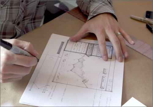
Sketching over a photocopy of the original to reevaluate the sidebar.
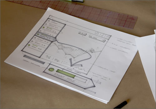
The final sketch. Notice how the sidebar and its detail are darker than the photocopy. This is intentional, because it allows you to explore ideas in the context of the overall design.
The Design Is In The Details
Use a ruler; specifically, a quilting ruler. Quilting rulers are translucent and are normally printed with a ⅛″ grid screen, letting you see the line you’re drawing relative to the rest of the sketch.
Technique
Use a ruler and a light-gray marker to draw an underlay for a detailed sketch.
Why?
This lets you quickly draw a series of lines that are offset a set distance from each other. This works great for elements such as lists items, charts, buttons and anything else that needs to be evenly spaced. It’s like an analog version of “smart guides.”
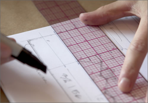
Quickly creating evenly spaced lines with a quilting ruler and 30% gray marker.
Technique
After using a light-gray marker to lay out a sketch, use a ruler and ballpoint pen or black marker to finalize it.
Why?
When sketching in layers, you want the final design or layout to “pop.” A ruler enables you to be more precise in detailed areas and ensures that long edges are straight.
There is no shame in using a ruler. The key is knowing when to use it. Don’t start sketching with a ruler; rather, bring one in when you need the detail and precision. Remember, you’re sketching, not drawing.
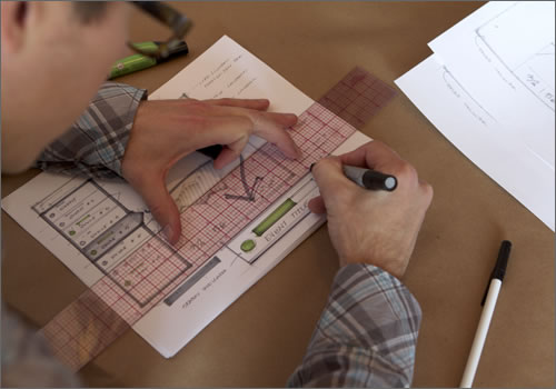
Using a ruler to make sections of a sketch drawn with a 70% gray marker pop.
Technique
Use a ruler to quickly rip paper or sticky notes by firmly holding the paper with one hand and ripping away the edge with the other hand.
Why?
It’s quicker then grabbing scissors; you already have the ruler with you; and you can take it through airport security.
After lightly sketching an interface with a light marker, finalize it or make one area pop by using a ruler to lay down darker lines.
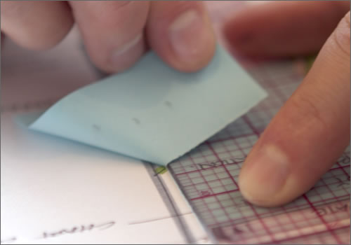
Ripping a sticky note with a ruler.
Tell The Whole Story
Technique
Draw the application in the context of where and how it being used, or frame it with the device it will be used on.
Why?
This forces you to think about the environment that the application will be used in, instills empathy for your users, and establishes understanding of the challenges unique to this application.
I get it. No one wants to sketch out a monitor every time they draw a wireframe. I’m not saying you have to, but a few sketches with context go a long way. Especially with mobile devices, the more context you add to a sketch, the better. Moreover, I always sketch the device for a mobile interface as an underlay, and I often try to sketch the UI at full scale. This forces you to deal with the constraints of the device and makes you aware of how the user may be holding the device.
Caution
Drawing the surrounding environment can be challenging and requires a higher level of sketching competency. Don’t let this intimidate you. If you’re not comfortable sketching the environment or you find it takes too long, use a picture as an underlay instead.
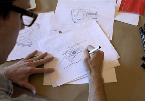
Sketching ideas for a mobile application in the context of where it will be used.
Ditch The Sketchbook
Technique
Draw on 8.5 × 11″ copy paper.
Why?
Sketches are for sharing. You can easily hang 8.5 × 11″ sheets on a wall to share ideas with others or to see a project in its entirety. When you need to save a sketch or two, you can easily batch scan them into a computer without ripping them out of the sketchbook. Still not convinced? Copy paper is cheaper; it allows you to use sketches as underlays without photocopying; and you don’t have to choose between book-bound or spiral-bound.
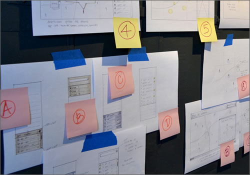
One of the many walls of sketches in our office.
What Are You Waiting For?
Sketching is not reserved for designers. Developers, project managers and business analysts can get in on the fun, too. It’s the best way for teams to quickly communicate, explore and share ideas across disciplines. Also, I’ve found that others are more receptive to give feedback and make suggestions when shown sketches than when shown print-outs or screenshots.
Remember, it’s about getting ideas out, reviewing those ideas and documenting them, not about creating a work of art. When evaluating your sketches, ask yourself, “How could I better communicate these thoughts?” Getting caught up in evaluating your drawing ability is easy, but try to separate the two, and know that the more you do it, the better you’ll get.
It’s worth repeating that sketching is the quickest way to explore and share thinking with others. It focuses you on discovering the best possible solution, without getting caught up in the technology.
Go for it! Don’t get caught up in the tools. Make a mess. And have fun!
Tools
Here are links to some of the tools described in this post.
- Quilt Ruler - Collins Quilt & Sew Ruler 2”X18”
- Prismacolor Markers - Cool Grey Prismacolor 12/set
All images by Michael Kleinpaste.
(al) (fi)


 Agent Ready is the new Headless


 SurveyJS: White-Label Survey Solution for Your JS App
