Stop Designing Pages And Start Designing User Flows
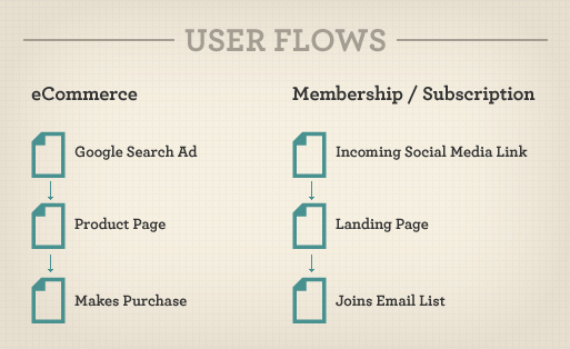
For designers, it’s easy to jump right into the design phase of a website before giving the user experience the consideration it deserves. Too often, we prematurely turn our focus to page design and information architecture, when we should focus on the user flows that need to be supported by our designs. It’s time to make the user flows a bigger priority in our design process.
Design flows that are tied to clear objectives allow us to create a positive user experience and a valuable one for the business we’re working for. In this article, we’ll show you how spending more time up front designing user flows leads to better results for both the user and business. Then we’ll look in depth at a common flow for e-commerce websites (the customer acquisition funnel), as well as provide tips on optimizing it to create a complete customer experience.
Further Reading on SmashingMag:
- Improving User Flow Through Page Transitions
- The UX Of Long-Term Relationships
- All You Need To Know About Customer Journey Mapping
- Lean UX: Getting Out Of The Deliverables Business
Start With The User
When starting a new Web design project, we’re often handed a design brief, branding standards, high-level project goals, as well as feature and functionality requirements. Unfortunately, these documents typically amount to little more than the technical specifications of the project, with almost no thought given to how exactly the website will fulfill the multiple user objectives that lead to successful interactions.

If you start with a detailed look at the objectives of the user and the business, you would be able to sketch out the various flows that need to be designed in order to achieve both parties’ goals. User objectives could range from finding a fact to replacing a product to learning a new skill to buying a gift for someone. Business objectives could be getting a lead, a like, a subscriber, a buyer, a download or a phone call. Identifying each user and business objective is the first step to creating design flows that meet all of them.
Map User Flows Into Conversion Funnels
Not all website visitors are created equal. Users come from different sources, with varying levels of knowledge and engagement, and with different goals. It’s up to you as a user experience designer to map those in-bound user flows to conversion funnels that provide value to the user as well as the business.
You should prioritize the flows and focus your effort on the few that will impact the most users and have the greatest gain. Custom flows allow you to architect experiences according to traffic source or visitor type and enable you to set the experiential pace, build user confidence and get buy-in on the way to the ultimate conversion.
Typical User Flows
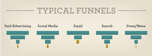
Some typical user flows are:
- Paid advertising. A user coming from a banner or Google AdWord ad.
- Social media. A user coming from a friend’s post on a social network.
- Email. A user coming from an email newsletter or referral invitation.
- Organic search. A user coming from a deep link that was surfaced by a search.
- Press or news item. A user coming from a mention in the news or a blog post.
Each of these visitors has their own needs, expectations and level of knowledge, and they need to be treated accordingly.
Diving Into Funnels: A Closer Look At Customer Acquisition
Let’s look at a critical flow for many websites — paid online customer acquisition — and break down its various elements. For this example, we’ll examine the experience flow from new visitor to email subscriber to purchaser.

Consider a company that uses display advertising to generate new customers for its business.
Display Media
With display advertising, it all starts with the banner. The design of the banner needs to achieve one precious goal: get a click from the right person. Here are some key questions to answer when designing the ads that represent the very front of your user flow:
- What type of user am I targeting?
- Are they actively seeking a solution to a problem, or are they casually browsing?
- What problem are they trying to solve?
- How can I best capture the user’s attention?
- How do I relate to the user?
- Is there a message that will resonate with the user?
- Is there a pain point that my product or website alleviates for the user?
- How can I articulate this solution clearly and quickly?
- What compelling calls to action will get our target user to click?
Your ads should address these main motivations and provide a compelling hook to get that all-important click. Up-front research and real-world testing will help to optimize the experience. Using this model, ReTargeter improved its banner click-through rate by four times. Its blog post [Offline] lays out exactly how it achieved this success.
The Landing Page
The point when the user hits the landing page is when the user flow work really begins. Because these users are coming from a low-information source (such as a banner, as opposed to an in-depth blog post), you must design a flow that fills in the gaps of information by providing the user with the data that they need to be converted.
In our example, the user will hopefully be converted to an email subscriber; but depending on the business, the conversion could be to create an account, download a white paper or make a purchase. Whatever the conversion goal for the business, the key is to give the user a reason to keep moving through the flow, down the funnel.
Use the following methods to keep the user moving down the funnel:
- Build user confidence by clearly articulating key benefits, backed by easy-to-digest proof points.
- Streamline the content and design to focus on a clear call to action (in this example, to sign up for an email newsletter).
- Remove friction at every step. Ask for the minimum amount of information, and reduce the number of fields, extra clicks and page-loading time.
- Create an enticing hook, an itch that can only be scratched by completing the registration step.
KISSmetrics’ “Anatomy of a Perfect Landing Page” details the design, UI and copy elements that can help you meet your users’ need and drive conversions for your business.
Stacking Flows For A Complete User Experience Life Cycle
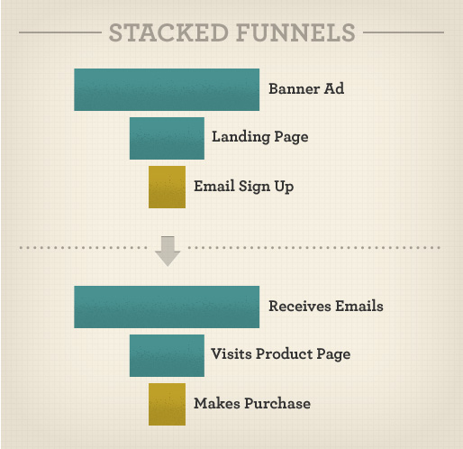
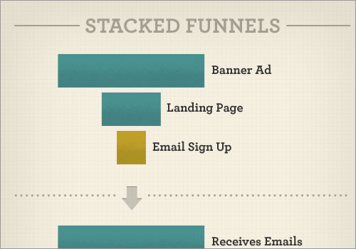
While viewing a funnel as something like Click on banner ad → Land on Web page → Register email is easy, designing and building stacked flows that drive the business’ ultimate objectives takes a bit more thought. In our example, we’ve successfully gained an email subscriber from the banner ad campaign, but the real business objective is to generate revenue through new purchases.
Treating the email subscriber flow and the e-commerce purchasing flow as two separate conversion funnels is an easy trap. In reality, the experiences are connected, and by looking at them as stacked flows, we can create a more cohesive interaction, one that drives optimal results for the business.
In our example, this stack is made up of the customer acquisition funnel and the customer relationship management (CRM) flow.

When designing this flow, you need to consider what the biggest levers are for converting the subscriber into a buyer. Many of the earlier principles apply, but this time you have more touch points to consider and leverage.
In this flow, you need to look at all elements of your CRM strategy and the purchase flow of your website, including:
- Email communication back to the subscriber,
- Pages that the subscriber lands on when returning to the website,
- The flow from internal content pages to check-out.
Here are a few key considerations when designing the flow from subscriber to purchaser:
- Tell a visual story that the subscriber can identify with and wants to be a part of.
- Ensure that your emails reinforce the story, and give proof points to remind users why they subscribed.
- Include compelling calls to action to give the subscriber an opportunity to relate to and be a part of the story.
- Include prominent calls to action and easy, direct paths to the check-out process from the website’s internal content pages and blog posts. These validate the user’s hope about their role in the story.
- Make the check-out process as frictionless as possible, and reinforce confidence along the way to help the buyer commit to being a part of it.
By considering how the two flows interact, you can create a seamless experience that builds confidence and deepens the user’s connection to your website, leading to the ultimate purchase conversion. Equally important, this flow also increases customer satisfaction because the stacked funnels keep the user experience smooth and on track to meeting their needs, with little confusion or ambiguity.
Putting Flow Design To Work For You
Whether you’re mapping out a brand new website or looking to optimize an existing user experience, flow design will keep you out of the trap of designing individual pages and interactions and instead focus you on fulfilling users’ needs. By prioritizing your user flows and focusing on the ones that drive the most value to the most users and to the business, you can make the greatest impact with your initial flow design.
When considering user flows, think past the first conversion, and design for the ultimate conversion, which might lie a few steps behind. This is particularly important with any type of commerce-driven business, for which the first conversion is often just a prelude to the primary revenue event. By stacking these complementary funnels, you create a more cohesive user experience that drives better results for both the user and your business.
So, the next time you’re asked to create a new design, step back and ask yourself and your team what user flows you are trying to create through the website, and let that insight drive the design process.


 SurveyJS: White-Label Survey Solution for Your JS App

 Agent Ready is the new Headless


