How To Sketch A New Mobile Web
The mobile Web has gotten a bum rap. It spends most of its time either in the shadow of the desktop or playing the role of the native app’s frumpy friend. Luckily, we’ve got the tools to change that. Progressive enhancement, mobile-first and responsive design can help lead us towards a more unified, future-friendly Web. That’s the good news. The bad news? These tools are worthless if you don’t have license to use them.
What’s holding us back, in many cases, is our clients and the conceptual models they cling to. If our clients are to embrace the potential of the mobile Web, then we need to get them thinking beyond desktops and apps.
Further Reading on SmashingMag:
- The Messy Art Of UX Sketching
- Sketching For Better Mobile Experiences
- Things You Didn’t Know Your Doodles Could Accomplish
- UX Sketching And Wireframing Templates For Mobile Projects
The Promise Of The Mobile Web Is a Tough Sell
Let’s face it: designing responsively takes longer and costs more.
When we introduce different screen sizes, resolutions and device capabilities, there’s a lot more to design. We’ve got more layouts to wireframe, different gestural interactions to consider, and a broad range of functional capabilities to support. All of this packs on significant testing time as well. Still, time and expense can be justified, especially when compared to the cost of trying to retrofit device-specific optimizations onto your design. You can make rational arguments to justify longer timelines, and most companies can find additional resources when they want to. There’s an obstacle much bigger than time or cost: it’s the obstacle of change.
Change Is Hard
Changing the way we do things is hard. Breaking from convention is scary. As humans, we’re naturally averse to this. Saying, “Got no time, got no money” is much, much easier than investing in a forward-thinking strategy that requires a fundamental shift in our notion of what a website is. We’re battling against stereotypes that we’ve collectively created for the Web. Ask someone to envision a website, and they’ll picture a 960-pixel-wide layout, comfortably nested in their desktop browser window. Ask them to envision a mobile website, and they’re bound to think of apps. They’ll picture a simple task-based interface with limited content, minimal navigation and elegant transitions. Desktop and mobile: two entirely different beasts.

We continue to fracture the Web every time we prompt users to choose a path: desktop or mobile website.
Expectations Are Project Baggage
We need to wean ourselves and our clients off the baggage that these expectations introduce into projects. We need to abandon outdated conventions. That’s easier said than done, so let’s attack the problem head on. Below, I’ll share the methods we use to change the way people think of the mobile Web; if you have other or different methods, let’s hear about them. How do we get ourselves and our clients to let go of the conceptual models they cling to?
Rational Appeal Is Effective (Until It’s Not)
Begin by creating a compelling business case for a more responsive approach to the Web. Bombard your stakeholders with mobile statistics, research and real use cases. If they seem to be hung up on creating mini-websites with arbitrary portions of content, then discuss the fragmentation of screen sizes. Focus specifically on that murky area between large smartphones and small tablets. Challenge them to define at exactly which screen size the interface should turn on its head and snatch the content from users’ reach. If you’re able to build a strong case, you should have a room full of people who see the light and are amenable to this new approach. Until they’re not… until later when they seem to have relapsed into their old ways. Rational arguments for adaptive design will get you only so far because:
- You are asking people to discard a conventional system that they’re familiar and comfortable with;
- The concept remains abstract, creating a gap between theory and reality.
If a client can’t envision how their website will adapt across a range of screen sizes, then they’ll have trouble committing to this approach. In the wake of uncertainty, people will retreat to the security of convention.
If you want to lead clients to a new way of thinking, collaborative sketching can help shape the path.

When guiding clients down an unconventional path, the first steps are always easy. How do you keep them moving forward, and stop them from turning back halfway?
Use Sketching as a Form of Exorcism
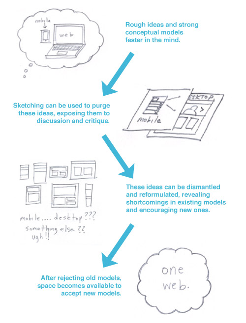
Expectations of a design start to form the moment team members begin to envision the project. As planning and discussion go on, the mental images that take shape become more defined. This can lead to situations in which you find yourself designing for what’s in the client’s head, instead of designing for the project’s goals and users’ needs. In order to get people to accept new ideas, you need to exorcise the old ones. This is where sketching comes in. We often think of sketching as a way to generate and communicate ideas, but we can also think of it as a weapon to dismantle them. The goal of sketching here isn’t to produce drawings that inform the final design. We are not replacing the UX process. The goal is to drive out those stubborn, thorny ideas and make room for new ones.
Developing A Workshop Plan
The steps outlined below reflect our current process. Although each one has value independently, consider how they work in combination to guide the group’s thinking along an intended path. Try to continually approach the design from different angles, alternating between techniques that require the group to focus (convergent thinking) and those that require the group to explore (divergent thinking). As you do so, conflicting ideas may emerge. Embrace these points of dissonance, because they can be key to breaking stubborn mental models.
The current process of our design workshop is this:
- Set up, define objectives Prioritize the goals that everyone is working toward. Establish the rules and the criteria through which ideas will be discussed and evaluated.
- Stick-figure comic strips Set some context that exists beyond the screen. Give people a world to design within.
- Mobile-first Ask the group to focus on information hierarchy and user goals. Get the small-screen ideas (especially those thorny app-centered ones) out of people’s minds and onto paper.
- 6-up templates Introduce conflict. There is likely a gap between what the group just drew for mobile and what it’s been envisioning for the “desktop” website — explore these incongruities. Purge as many ideas as you can from the minds of the participants.
- Concept sketches Collaboratively reconstruct ideas into new models that work regardless of screen size or device.
Set Up
Define the website’s business objectives and users’ needs
Stakeholder group Time: 30 to 60 minutes.
- Establish and prioritize objectives. Before any drawing happens, we try to set some parameters. We begin by establishing the website’s objectives, all of which we make sure can be tied back to the organization’s broader goals. Steering clear of anything that describes particular features or functionality is important. “Quick links” and “Rotating slideshow” are not objectives. We list as many objectives as we can on a whiteboard or large sheet of paper, assigning a priority to each one.
- Define audiences and user needs. Next to that, we create a new list of user needs. This information should really be drawn from actual user research and interviews. Worst case scenario, if you are not able to get any, you could draw on your clients’ understanding of the target audience and what they perceive their needs to be. Start by identifying the primary user group and listing the tasks they will need to complete on the website. If you’re having trouble coming up with a list of actionable tasks, think about questions these audience types might have when coming to the website. What is motivating them to come in the first place, and what information would be most valuable to them? After brainstorming the needs of your primary target audience, move on to any key secondary audiences.
- Brainstorm mobile opportunities. Now that you have created a list of website objectives and user needs, it’s time to start planting the mobile seed. When we approach this, our goal is to start shifting people away from the mindset that mobile needs to be an add-on or a website-lite experience. I’ll challenge the group to think about what opportunities are created when a user is not tethered to a desk. What if they’re on a couch, at work or standing around somewhere? How do the capabilities of different types of devices open up possibilities for interacting with content that didn’t exist before? The goal here is to generate a lot of different ideas, even if some of them are implausible. Get people pumped up by the possibility of adding to rather than subtracting from the website.
This exercise is not meant to be exhaustive, so we try not to spend more than an hour total on it.
Start Sketching
With the set-up out of the way, it’s time to start sketching. These sketching exercises seem to change a bit from time to time and depending on the dynamic and size of the group we’re working with. Counting people on both sides, we try to limit the workshops to around 10 people or just under. This allows everyone a chance to work individually, but the group is also big enough that you can break into small teams. The more clout the group has, the better. Sketches should be simple and, more importantly, fun. Which brings us to our first exercise: stick-figure comic strips.
Stick-Figure Comic Strips
Teams of two or three Time: 30 minutes plus discussion.
Stick-figure comics are simple to do. Break your group into teams of two. Give each team a piece of paper filled with square panels, and ask them to draw a crude comic that depicts a member of the target audience coming to the website and ultimately completing a task. We used this technique most recently when working with Marian University in Wisconsin. To give our burgeoning comic artists a little more direction, we specified, “Begin your comic strip with a character who is representative of your target audience. Your character’s story does not begin on your website. Think of a place where the story begins. What motivates them to visit your website, and what actions do they take when they get there? What device are they using?”
In the university workshop, one team described the story of a teen who is attached to his friends and home town and doesn’t want to move away for school. He loves sports but doesn’t quite have the level of talent to play at a larger university. He’s excited to see that this university offers sports and has great student residences. He’ll be able to experience campus life while being just a short drive from home. The sketches showed the protagonist coming to the website with a purpose and interacting with different pages.
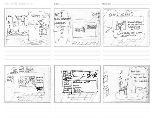
Drawing comics can be a fun way to imagine new use cases, whimsical though they may be.
These storyboard-type comics are great because they make people turn lists of needs and objectives into narratives. Layers of abstraction peel away as participants relate detailed accounts of how they envision individuals using the website. This also moves conversation in the right direction, getting your stakeholders excited about how the website plays a role that extends beyond the screen and into people’s lives.
3-Up Mobile-First Templates
Solo sketching Time: 30 minutes plus discussion.
We’ve got people thinking in the right direction: stories about people using the website. Then we’ll start to focus on the website’s interface. I’ll point to the whiteboard, filled with scribbles and notes about users and objectives, and remark that including all of that on one page wouldn’t work. After a brief refresher on the mobile-first approach, we hand out 3-up mobile templates to every person in the room and then establish which key page(s) to focus on. The challenge for this exercise is to “Assume that your user is using a device with a small screen. There is not a lot of room for complex interactivity, and you have limited space to present your content. What do you show on this page? Focus on the priority of content and the actions you want to encourage.”
With this and the other sketching exercises, keep everyone focused on the adaptability of the content, not the container.
Whereas the brainstorming and storyboards encouraged everyone to think big and to explore a wide range of ideas, this exercise is designed to rein in those ideas. The narrow page templates require people to focus and draw only the most important ideas and page elements. Many of the sketches will still look like apps at this point. This is a natural starting point and to be expected. Once sketching is complete, ask each participant to explain their ideas to the rest of the group.
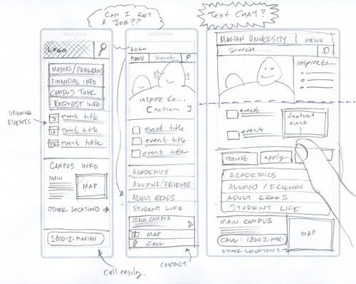
Mobile templates challenge participants to focus on important content and actions.
6-Up Responsive Templates
Solo sketch Time: 30 minutes (no discussion)
If we could get through the entire sketching and design process without relapsing to age-old conventions, that would be great. But although we’ve come up with a lot of new ideas so far, we haven’t really done anything to get rid of those sleeper agents — those notions of “what a website should be” ingrained so deeply that they are bound to reemerge.
In the 6-up sketching exercise, we’ll ask each team member to take their original ideas from the 3-up mobile sketches and think about how to adapt them to different screen sizes. If new page elements are introduced, they should be justifiable and tie directly back to the user goals or website objectives established earlier. We’ve modified the traditional 6-up exercise slightly so that there’s an inconsistency between the proportions of the six panels; the boxes are still small, so that drawings stay crude. What I like about this exercise is that it encourages participants to move beyond their initial ideas and grasp for new ones. This is where you’ll see people desperately try to work in some sort of horizontal navigation bar or sliding image rotator. They are trying to reconcile their impulse to include these standard elements with the goals and stories that the group has already worked on. Of all the exercises, this one seems to give people the most challenge.
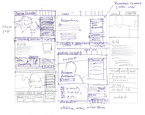
The 6-up template encourages people to move beyond their initial ideas and push for new ones. It can get pretty messy.
About 10 minutes in, after most people have sketched the low-hanging fruit ideas, I’ll often walk around and hand out Mental Notes (see below) to inspire participants to begin thinking about intent and the behavior they would like to encourage. When the sketching time is complete, we move directly into the concept sketches, without any group discussion.
1-Up Concept Sketches
Teams of two or three Time: 30 minutes plus discussion.
If the exercises have gone well so far, people will be in a state of utter confusion. The website they were originally able to picture so clearly should now be a big cloudy mess — and that’s great! This is right where you want them. It’s like the part of spring cleaning when the house is messier than it was to begin with. In the wake of this confusion, you can begin to rebuild. Get people back into teams and have them work together on each other’s ideas. Have each team develop a single concept that represents an adaptive solution. When finished, post a large blank sheet of paper on the wall and have each team pin their drawings to it and present their concept to the group. Ask them to describe the evolution of their design. Walk through your own as well, which ideally will have also evolved beyond your original ideas. Use the paper backdrop to add notes about which ideas resonate with people or to flag parts that might require rethinking. You can then roll up the whole sketchboard and bring it back to your team.
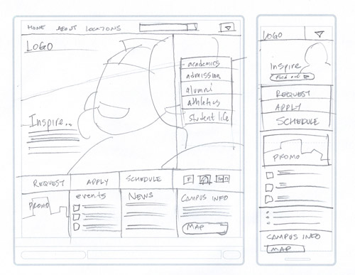
Concept sketches should reflect an evolution in thinking as the initial 3-up mobile sketches are adapted and modified to take into account different-sized canvases.
Tips for Group Sketching
- Pack a bag with pens, markers, pencils, paper and any other supplies you might need.
- Show examples of everything.
- If you are a Picasso, then intentionally drawing crudely might not be a bad idea. Make people feel like they can do it just as well.
- Play music, because silence is awkward and it shouldn’t feel like your conducting a test. Chutes Too Narrow by The Shins and The Kinks are the Village Green Preservation Society are two pretty solid go-to albums.
- Introduce Mental Notes. I like to allow people to draw from a deck of Mental Notes and promise “prizes and glory” to people who can incorporate the given principles into their design.
- No sketch is bad. The quality of the drawing doesn’t matter — drawing is thinking. Praise ideas and encourage exploration.
- When forming teams, don’t pair up Bert and Ernie; they will only enable each other. Pair up people who don’t typically work side by side.
- Some people won’t want to participate in the drawing. Offer to draw for them, or let them just participate in the dialogue.
- Minimize the amount of time that elapses between sketching and delivering wireframes, designs or whatever is next in your process. The longer the span of time, the more time it gives for people to relapse.
Finishing Up
By the end of the workshop, everyone will feel creatively exhausted, every possible idea drained out of them. The concepts presented at the end of the day will lack the stamp of individual ownership, since everyone has had a hand in shaping them. While these sketches might not directly inform the final design, people will know that they’ve been able to contribute. More importantly, you’ll have removed the layers of abstraction that surround adaptive, device-agnostic solutions. Something that was once hard to envision has now been made much more attainable. You’ve hopefully also purged those thorny ideas buried in your clients’ heads that seem to resurface at the most inopportune moments. Collaborative sketching can help people make the leap to understanding the real potential of mobile to extend, not limit, how we interact with the Web. Fueled by possibility, they might even become advocates for more future-friendly approaches in their organizations. If you’ve ever been crushed by seeing a project not live up to its potential, you’ll recognize the importance of this.
There is no secret way to change what people believe or to overcome the conceptual models they cling to. We’ll always battle against stubborn personalities and decisions that seem to be driven by fear rather than strategy. Hopefully, you’ll find that incorporating collaborative sketching workshops into your client work helps you win more battles and build a more accessible Web. What techniques do you use?
Resources
- Stick-figure comic strip (PDF)
- 3-up mobile template (PDF)
- 6-up template (PDF)
- Concept sheet (PDF)


 Devs love Storyblok - Learn why!

 How To Measure UX and Design Impact, 8h video + UX training
 Register For Free
 JavaScript Form Builder — Create JSON-driven forms without coding.