Mobile Design Practices For Android: Tips And Techniques
Android is an attractive platform for developers, but not all designers share our enthusiasm. Making an app look and feel great across hundreds of devices with different combinations of screen size, pixel density and aspect ratio is no mean feat. Android’s diversity provides plenty of challenges, but creating apps that run on an entire ecosystem of devices is rewarding too.
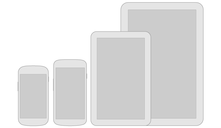
There are hundreds of Android devices with different screen sizes and resolutions. (Image credit: Android Design. Used under Creative Commons license.)
At Novoda, we build Android software for brands, start-ups and device manufacturers. We often work with visual designers who are new to Android. The new Android Design site is the first resource we recommend. You should definitely check it out. However, there is plenty more to pick up! The goal is to create apps that people love to use. Thoughtful UX and aesthetically pleasing visual designs help us get there.
Further Reading on SmashingMag:
- What Every App Developer Should Know About Android
- How To Design For Android
- Designing For A Maturing Android
- How To Design For Android Tablets
This article provides a set of practical tips and design considerations for creating Android apps. I’ve tried to include something useful whether you’re crafting pixel-perfect graphic assets, finding an optimal user flow or getting your hands dirty developing XML layouts.
Pixels
Visual design is hugely important in the perceived quality of an app. It might even improve usability. Most developers have some exposure to UI patterns, but developers with visual design skills are rare. They really need you. Delivering high-fidelity mock-ups, drawable resources (i.e. graphic assets) and guidance to developers is the best way to deliver an aesthetically pleasing experience to the end user.
Scale Nicely
Android is a platform of many screen densities. There is no set of resolutions to target, rather a density independent measurement scheme for graphics, widgets and layouts. This is covered in depth in a previous Smashing article and the official documentation, so I’ll just add a mention of this neat web tool for calculating density pixels.
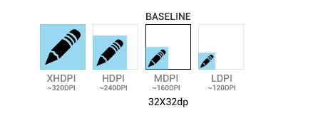
Optimize graphics for different screen densities. (Image credit: Android Design. Used under Creative Commons license.)
It’s not always practical to hand optimize graphic assets for each density. The platform can scale resources down reasonably well. However, it’s always worth testing designs on low-end devices and optimizing resources that scale badly.
Be State Friendly
Touch states provide important confirmation of clicks and selections. When customizing widgets such as buttons, it’s important to create drawables for all necessary states (such as default, focused, pressed and disabled). The focused state is essential user feedback on devices that support directional pad or trackball navigation.
Size is important too. Touch input is imprecise and fingers occlude the UI as they interact with the screen. Touch targets should normally be at least 45 density pixels in width and height.
Use Fonts
Android has two fonts: Droid Sans and Roboto. Roboto was released in Ice Cream Sandwich (Android 4). It’s been compared to Helvetica, but it’s a little condensed, which is great for small screens. You’re not limited to Roboto or Droid Sans, though. Any font can be packaged within an app in TTF format (with some memory overhead).

Roboto is Android’s new font, introduced in Ice Cream Sandwich. (Image credit: Android Design. Used under Creative Commons license.)
Use 9-patch Drawables
9-patch drawables allow PNGs to stretch and scale nicely in pre-defined ways. Markings along the top and left edges define the stretchable areas. The padded content area can optionally be defined with markings along the bottom and right edges. 9-patches are essential for creating and customizing UI widgets.
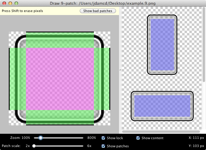
Create scalable widgets with Draw 9-patch.
It’s possible to create 9-patches manually, but the Android SDK comes with an nice, simple tool called Draw 9-patch. This makes it quick and easy to convert a regular PNG in to a 9-patch. It highlights the stretchable area and displays previews of the resulting drawable with different widths and heights.
Handle Design Legacy
Honeycomb (Android 3) and Ice Cream Sandwich (Android 4) modernized Android’s visual design with the Holo theme. However, some device manufacturers have a poor reputation for keeping platform versions up-to-date. Some of today’s most popular devices will never be upgraded to Ice Cream Sandwich.
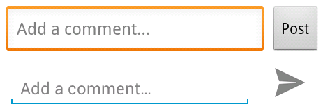
The Meetup app makes everybody feel at home with separate Gingerbread (Android 2.3) and Ice Cream Sandwich widgets.
So what can be done? There are two options. Deliver the current look, feel and experience to all devices or use a separate set of widgets styles and drawables for Gingerbread and below. Both approaches are valid. Would your users prefer modern or comfortably familiar?
Showcase the Brand
Sometimes clients fear that sticking to recognized UI design patterns will make their apps less distinctive. I think the opposite is true. As patterns like the action bar become ubiquitous, they fade into the background. Users can spend less time wondering how to use an app and more time appreciating how elegantly your app solved their problem. That experience is much more valuable for the brand than a one-of-a-kind UI for the sake of differentiation.

The original Color app had an online FAQ for the UI controls. Make sure that navigation is intuitive.
Branding can be expressed through design of icons, drawables and widgets, as well as in the choice of colours and fonts. Subtle customization of the standard platform widgets can achieve a nice balance of brand values and platform consistency.
Create High-Fidelity Mock-Ups
High fidelity mock-ups are the best way to communicate visual design to developer responsible for implementation. The Android Design website provides templates in PSD and other formats. It’s important to try mock-ups out on real devices to confirm that they feel right, with UI components sensibly sized and placed. The Android Design Preview tool allows you to mirror mock-ups directly from your favourite design software to an attached Android device.
A practical approach for mock-ups is to work against the screen characteristics of the most popular devices. Ideally, create mock-ups for each alternative layout required by screen size or orientation.
Polish
Attention to detail is key. Become involved in the development process to ensure that your designs are realized. As a developer, I would always prefer to work with active designers than those who deliver mock-ups and resources before disappearing into thin air. Designs need to be iterated and refined as the app develops.
Animated transitions provide some visual polish that many Android apps lack. Developers might not include such things on their own initiative. Make them part of the design when they make sense. Aside from transitions, animations are a great way to keep users distracted or entertained when the app needs to make them wait.
User Experience
Android has patterns and conventions like any other platform. These help users to form expectations about how an unfamiliar app will behave. Porting an iOS experience directly to the Android platform almost always results in a poor user experience.
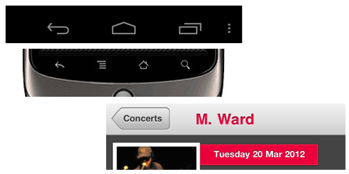
Back is a platform affordance in Android. In contrast, labeled back buttons within the app layout are the norm for iOS.
The back button is the best illustration of the interaction differences between Android and iOS. All Android devices have a hardware back button or on-screen navigation bar (including back button). This is universally available as a feature of the platform. Finding a back button within an Android app layout feels weird as an Android user. It makes me pause to think about which one to use and whether the behaviour will differ.
Design User Flows
At the very simplest level, Android apps consist of a stack of screens. You can navigate in to the stack with buttons, action bar icons and list items. The platform back button allows you to reverse out of the stack.
The action bar mirrors a web convention, where the app icon to the left of the action bar usually takes you to the top level of the app. However, there is also the up affordance, intended to take advantage of structural rather than temporal memory. This is represented by a backwards facing chevron to the left of the app icon. This signals that pressing the icon will navigate one level up in the information hierarchy.

The up affordance allows the user to navigate up an information hierarchy instead of going to the top level of the app.
The purpose of the up affordance might be subtle at first. Android apps can have several entry points in addition to the launcher. The Intent system allows apps to deep link each other and home screen widgets or notifications might take you directly to specific content. The up affordance allows you to navigate up the information hierarchy regardless of where you came from.
Try user flows on potential users with wireframes or mock-ups and iterate. Prototypes on real devices are ideal because they allow you to test in realistic mobile environments. This might seem like a lot of effort, but remember, you only need to try things out with a few users.
Be Platform Consistent
UI patterns are your friend. It’s much better to think of these patterns as tools than constraints. Users would prefer not to have to learn to use your app, so patterns provide familiar hints about how to navigate and interact.
Action bar is the most widely adopted Android pattern. It tells you where you are and what you can do. It’s a native feature of the platform since Honeycomb and the excellent Action Bar Sherlock library makes it available on older platform versions too. An example of the dashboard and action bar patterns.
The dashboard pattern is also quite widely used. These grids of icons are usually presented to the user when they launch an app. Dashboards provide top level navigation and describe the primary areas of the app. I worked on the Songkick app, where we used a dashboard draw out the content of the app with full-bleed images.
The workspaces pattern can be implemented with the ViewPager component. This allows users to swipe screens left and right between content. This can be used in conjunction with tabs to provide a more fluid browsing experience with tabbed data.
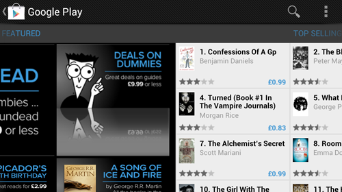
ViewPagers allow users to swipe left and right. Page indicators or tabs make this navigation discoverable.
The ribbon menu is an emerging navigation pattern. This allows us to launch the user directly into content and provide the top level navigation in a menu, which slides in from the left side of the screen when you press up. The ribbon menu is an alternative to dashboard navigation.
Tablet optimized apps often take advantage of multi-pane layouts. A single tablet screen can display the content of several separate phone screens side by side. Optimising for tablets can involve creating several alternative layouts for different screen widths. Sections of UI can be designed once and laid out in different configurations for different screen sizes. Multi-pane layouts help to avoid overly wide list items and sparse layouts.
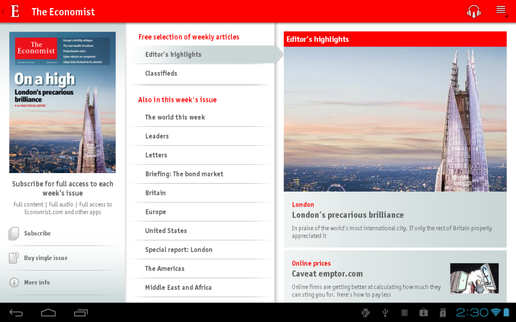
The Economist news app uses multi-pane tablet layouts so users can explore the hierarchy of content on a single screen.
These are familiar and proven UI patterns. They’re the best tools for starting to sketch out your app layouts and navigation. However, they shouldn’t discourage you from trying something new. Just ensure that the app behaves predictably.
Design Responsively
Android is a platform of many screen sizes. The devices that I can lay my hands on in our office compose a spectrum of screen sizes from 1.8 to 10.1 inches (as long as we ignore the Google TV). With variable screen area, Android has something in common with responsive web design. There is no getting away from the fact that design and implementation of a responsive experience across the full range of devices takes a lot of work. Supporting every screen is the ideal, but there are also sensible strategies for coping with the diversity of the platform.
Knowing a little about your target users and popular devices can help focus efforts and avoid premature optimisation. A good default strategy is to target popular, middle sized phones (3.2” - 4.6”) and then optimize as necessary with alternate layouts and user flows for particularly small (<3”) devices and tablets.
It’s always best to be orientation agnostic. Some devices have physical keyboards that require the device to be held in landscape. The on-screen keyboard is also easier to use in landscape. Text entry on touch screens is awkward an error prone, so let’s at least give our users the benefit of the landscape keyboard.
Understand Mobile Interactions
People interact with mobile apps differently from websites or desktop software. Mobile apps rarely have the undivided attention of a user and most interactions use touch input, which is not as precise as we might like.
Mobile interactions can often be measured in seconds. We recently developed a location-based app that allows users to check-in at bars. We counted the clicks on user paths such as check-in, considering whether each step could be avoided or simplified. We specify everything that an app should do as user stories. The most frequent stories should be as quick and easy to accomplish as possible. It’s particularly important in this scenario, because the user might be under the influence of alcohol…
Optimize First Use
First launch experience is crucial. Apps are often installed in response to a real world problem. If the first run isn’t satisfying then the user might never return. If the app requires sign up, offer preview functionality so that users get a feel for the experience. They probably need to be convinced that it’s worth filling out that sign-up form. Also consider using analytics to measure points where users drop off in the launch and sign-up process.
Many apps launch with a tutorial. This is usually an admission that the app is too complicated, but if you’re sure that you need one, keep it brief and visual. You might also want to use analytics to confirm that a tutorial serving a purpose. Are users that complete the tutorial more active? How many users just skip the tutorial?
Bring the App to Play
User experience considerations shouldn’t end in the app. It’s worth putting a bit of thought in to the Google Play Store listing to ensure that it’s immediately obvious what the app does and why the user would want it.
These Graphic Asset Guidelines will help you to create promotional material suitable for the various contexts and scales in which they appear. Some of these graphics are a pre-requisite for being featured too.
Layouts, Styles and Themes
Android has a visual layout editor and it’s getting better all the time. However, I still find myself developing XML layouts by hand. This section gets down to implementation details, covering some best practices for crafting maintainable and performant layouts. Visual designers might want to skim this section, but some awareness of implementation details can’t hurt.
The most general purpose layouts are RelativeLayout and LinearLayout. RelativeLayout should be favoured for efficiency, whilst LinearLayout is useful for distributing space between views using weights. GridLayout was new in Honeycomb. This is useful for creating complex layouts on large screens without nesting. Nesting layouts too deep is bad for performance and code readability alike!
Let the Framework Do the Work
The Android framework provides automated resource switching based on folder structure. This means that you can have separate graphic assets and layouts for different screen sizes and densities by arranging them in the correct folders. It goes much further than that. For example, you could switch color resources for different platform versions or even animation durations for different screen sizes.
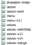
The framework provides automatic resource switching.
Since Honeycomb, it’s also possible to switch resources on available screen width in density pixels. This is a move away from the bucketed small, normal, large and extra-large screen size switching. It facilitates responsive design and allows multiple layout switching points (perhaps switching to a tablet-optimized layout at 600dp with another alternative at 800dp). It’s typical to have multiple layout files with different configurations of the same components for different screen characteristics.
State list drawables make being state-friendly easy. These allow you to specify different drawables for different states of a UI component in an XML file. As mentioned earlier, representing states properly provides important user feedback.
<selector xmlns:android="https://schemas.android.com/apk/res/android">

  <item
    android:state_focused="true"
    android:state_pressed="true"
    android:drawable="@drawable/my_button_pressed_focused" />

  <item
    android:state_focused="false"
    android:state_pressed="true"
    android:drawable="@drawable/my_button_pressed" />

  <item
    android:state_focused="true"
    android:drawable="@drawable/my_button_focused" />

  <item
    android:state_focused="false"
    android:state_pressed="false"
    android:drawable="@drawable/my_button_default" />

</selector>
Extract Values
It’s good practice to keep layout XML clean of explicit colours and dimensions. These can be defined separately and referenced in your layouts. Defining colours and dimensions separately promotes visual consistency and makes things easier to change later on. Extracting these values allows switching of dimensions on different screen sizes, orientations and platform versions. This is useful for tweaking padding for small screens or increasing text size for readability on large screens, which tend to be held further away from the face. Perhaps res/values/dimens.xml contains:
<dimen name="my_text_size">16sp</dimen>whilst res/values-sw600dp/dimens.xml contains:
<dimen name="my_text_size">20sp</dimen>.
Use Styles and Themes
A good technique to keep layout XML maintainable is to separate the styling concern from the positioning concern. Every View in a layout needs to have at least a width and height attribute. This results in a lot of boilerplate, which you can eliminate by inheriting from a set of base parent styles.
<style name="Match">
  <item name="android:layout_width">match_parent</item>
  <item name="android:layout_height">match_parent</item>
</style>

<style name="Wrap">
  <item name="android:layout_width">wrap_content</item>
  <item name="android:layout_height">wrap_content</item>
</style>

<style
  name="MatchHeight"
  parent="Match">
  <item name="android:layout_width">wrap_content</item>
</style>

<style
  name="MatchWidth"
  parent="Match">
  <item name="android:layout_height">wrap_content</item>
</style>
Recurring sets of attributes can be moved into styles. Widget styles that occur almost universally throughout the app can be moved into the theme. If a particular type of button always has the same text color and padding, it’s much cleaner to specify the style than duplicate these attributes for each occurrence.
<style
  name="MyButtonStyle"
  parent="MatchWidth">
  <item name="android:padding">@dimen/my_button_padding</item>
  <item name="android:textColor">@color/my_button_text_color</item>
</style>
We save four lines of attributes when we add the button to a layout. The layout file can be concerned with just the positioning and unique attributes of widgets.
<Button
  android:id="@+id/my_button"
  style="@style/MyButtonStyle"
  android:text="Hello, styled world!">
You can take this further by overriding default button style in a theme and applying it to an Activity or the entire app in the AndroidManifest.xml.
<style
  name="MyTheme"
  parent="@android:style/Theme.Holo">
  <item name="android:buttonStyle">@style/MyButtonStyle</item>
</style>

<style
  name="MyButtonStyle"
  parent="@android:style/Widget.Button">
  <item name="android:padding">@dimen/my_button_padding</item>
  <item name="android:textColor">@color/my_button_text_color</item>
</style>
Optimize
The include and merge XML tags allow you to drop reusable sections of UI into your layouts, minimizing duplicate XML when the same set of views occurs in multiple layout configurations.
<include
  layout="@layout/my_layout"
  style="@style/MatchWidth" />
A relatively new addition to the Android Developer Tools is Lint. This tool scans the resources in a project and creates warnings about potential performance optimizations and unused or duplicated resources. This is incredibly useful for eliminating clutter as an app changes over time and it’s certainly worth checking lint for warnings regularly during your development process.
Debug
Sometimes layouts just don’t turn out how you expected. It can be hard to spot bugs amongst all those angle brackets. This is where Hierarchy Viewer comes in. This tool allows you to inspect the layout tree of an app running in the emulator. You can inspect the detailed properties of each view.
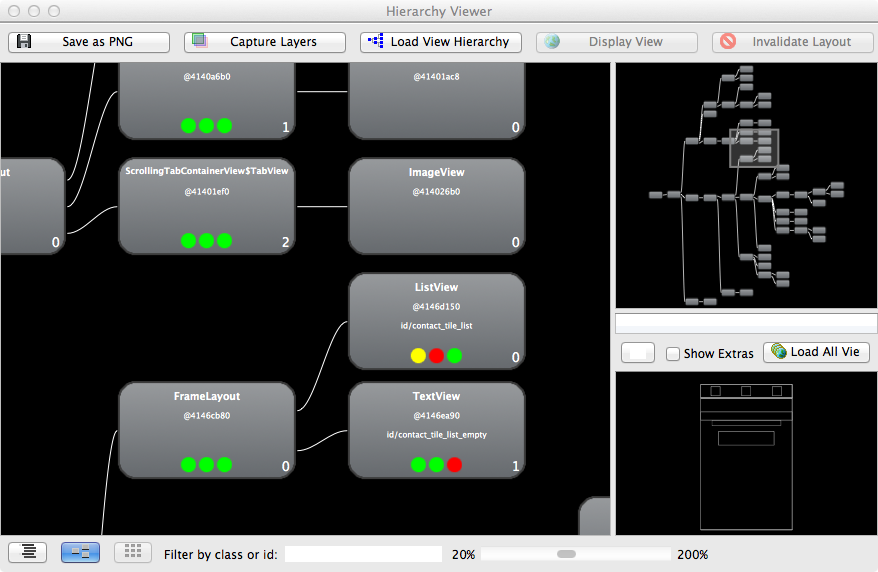
Inspect your layout trees with Hierarchy Viewer. Those colored dots can tell you about your layout performance.
Hierarchy Viewer has a couple neat tricks for visual designers too. It allows you to inspect screens in zoomed pixel perfect mode and export the layers of a layout as a PSD.
Conclusion
So you’ve been introduced to the platform and the tools. What next? Ultimately, the best way to get a feel for Android is to use it every day. The most satisfying app designs have a few things in common: platform consistency, attention to detail and clean visual design. The first two, at least, can be picked up by using and analysing existing Android apps.
Android has come a long way in the last few years. The platform and the apps have become gradually more refined. Functionality is not enough at this point. There are almost half a million other apps out there, and users want polish.
Resources
- Android Design The official Android design guidelines.
- Android UI Utils Asset generators, device frames (for screenshots) and the design preview tool.
- Android UI Design Patterns A blog covering Android UI patterns, best practices, anti-patterns and more.
- Android Patterns A crowd-sourced Android UI pattern directory.
- Android Niceties Design inspiration from some of the prettiest and most interesting apps.
- Holo Everywhere Design inspiration highlighting use of the Holo theme.
- Android App Patterns Nicely categorized UI pattern examples and design inspiration.
- Improving App Quality A blog post packed with tips on pleasing your users.
- Deep Dive Into Responsive Mobile Design A four part epic on responsive design, with Android’s Google Play Store as a case study.
- Android Icons A nice pack of action bar icons styled for Ice Cream Sandwich.


 SurveyJS: White-Label Survey Solution for Your JS App
 Agent Ready is the new Headless

