Coding Q&A With Chris Coyier: Responsive Sprites And Media Query Efficiency
Howdy, folks! Welcome to more Smashing Magazine CSS Q&A. It works like this: you send in questions you have about CSS, and at least once a month we’ll pick out the best questions and answer them so that everyone can benefit from the exchange. Your question could be about a very specific problem you’re having, or it could even be a question about a philosophical approach. We’ll take all kinds.
If you’re interested in exploring more Q&A, there’s a bunch more in my author archive.
Resolution Aware Sprites
Joshua Bullock asks:
“Your last round of questions was titled ‘Box-Sizing And CSS Sprites’ which offered some great answers for two separate items, but didn’t take them that one step further for responsive design. Ultimately, my question is this: Is there a preferred/suggested way of handling responsive sprites at all for multiple resolutions and image scaling? Is this even possible?”
This is a hot topic lately because of the rise in “retina” displays. But really, this problem has been building up for a while. Us Web designers often work in “pixels”, for instance, setting the width of an image: img { width: 100px; }. But what is 100px? It’s been a long time since that literally referenced a pixel on the screen. These days it’s a rather arbitrary measurement. 100px ends up being around an inch on a physical screen, regardless of its resolution.
Retina displays made a really quick and big jump in resolution. Apple’s 27 “Thunderbolt Cinema display has 109 PPI (pixels per inch) while the 15” Retina MacBook has 220 PPI (literally twice as dense) meaning there are more pixels on the drastically smaller screen.
If you are drawing a solid red box on the screen, no problem at all! The higher resolution display will simply draw it with more pixels. But what about a little icon that you designed at 16x16 “pixels” in Photoshop? Both a high-resolution display and low-resolution display need to display that icon at the same physical size, but the high-resolution display needs to essentially fake a lot of those pixels. It’s like when you enlarge a photo in Photoshop, it immediately starts looking like crap.
One solution is to make all your original images bigger. Instead of a 16x16 “pixel” image, you can actually make it 32x32 in Photoshop but have CSS size it to 16x16. Then the information is there for the high-resolution display.
Your question was explicitly about sprites. How can we make a sprite image that is twice the size for retina screens without making it a huge pain in the butt? Fortunately, Maykel Loomans recently published a very simple and clever technique for this.

Essentially, you make the sprite exactly (and literally) twice as big, while maintaining its proportions. Then in your ‘normal’ CSS, you load up the ‘normal’ sprite and do all the background-position and sizing stuff to make your sprite work. Then using media queries, you overwrite the background-image with your new retina sprite (when the conditions are correct). You use background-size to shrink the retina sprite, so you don’t have to touch the tedious positioning/sizing stuff. Yay!
span.rss-icon {
   /* Size of sprite image is 200px ✕ 200px */
   background: url(sprite-1x.png)  72px 181px;
   width: 16px;
   height: 16px;
}

@media
  (min--moz-device-pixel-ratio: 2),
  (-o-min-device-pixel-ratio: 2/1),
  (-webkit-min-device-pixel-ratio: 2),
  (min-device-pixel-ratio: 2) {

  span.rss-icon {
    /* Size of retina sprite image is 400px ✕ 400px */
    background-image: url(sprite-2x.png);
    /* Bring down size to 1x size */
    background-size: 200px 200px;
  }

}
Here’s a demo of that.
Liquid — Fixed — Liquid
Niels Matthijs asks:
“The layout I’m trying to create is L1F2L3, meaning the first and third column are both liquid, while the center column is fixed. I’ve been trying some stuff out, and even though I came close a couple of times, the solution never really pleased me. Do you have anything on this?”
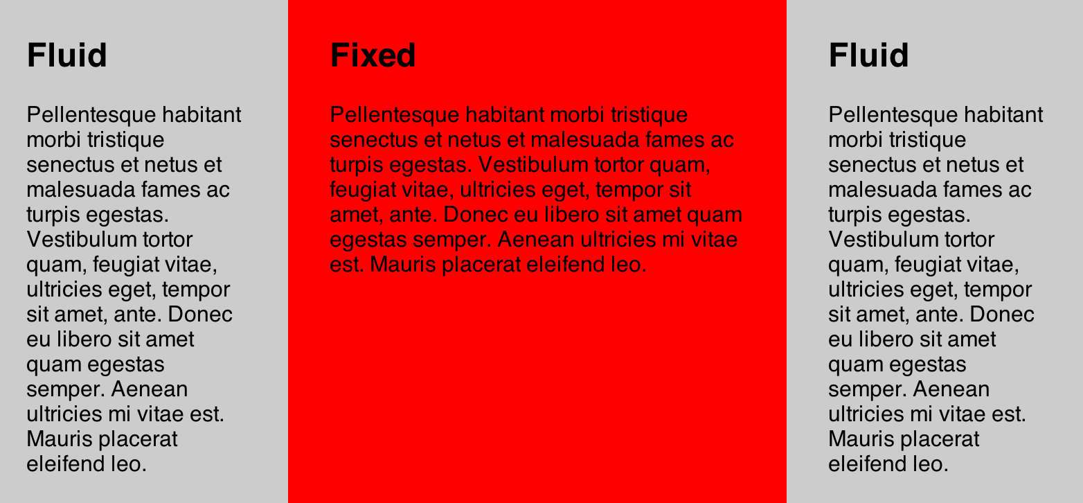
The Flexbox method in CSS can hook you up with this solution, and it’s pretty easy:
<div class="grid">
  <div class="col fluid">
    ...
  </div>
  <div class="col fixed">
    ...
  </div>
  <div class="col fluid">
    ...
  </div>
</div>
.grid {
display: -webkit-flex;
display: flex;
}
.col {
padding: 30px;
}
.fluid {
flex: 1;
}
.fixed {
width: 400px;
}
See demo. I’m hesitant to recommend this as a “real world” solution because the spec for flexbox has changed rather dramatically recently. The code above is the newer syntax which is supported only by Chrome 21+ at the time of this writing (see support charts). There is an older syntax (see demo) that has wider browser support, but will probably someday stop working.
If you are in a position where you know that the middle column will be the longest, you could have the parent container have percentage padding on the right and left sides and absolutely position the left and right columns within it (at the width of that percentage). And if you don’t know that, you could always measure the three columns with JavaScript, and set the parent container’s height to the tallest of the three.
The New
Peter Karlstein asks:
“What are the most useful CSS tips, techniques, tricks that you’ve learned recently? Can you present a couple of your recent ‘Aha!’ moments with CSS?”
Messing around with the latest flexbox stuff (as I did above) was pretty fun, although not really useful quite yet.
In the past few months I’ve moved entirely to using Compass, which has been tremendously useful. Over time I’ve grown tired of the repetitive and finicky things in CSS. But Sass and Compass make authoring CSS fun again for me.
As far as little CSS “tricks”, I’ve had to use this one several times lately. Essentially, if somehow some super long string of text gets into a container with no spaces, it will break out of the container in a super awkward overlapping fashion. This is most common with user-generated content and users pasting in URL’s. I like applying this class to any user-generated text containers:
.prevent-text-breakouts {
  -ms-word-break: break-all;
      word-break: break-all;
      word-break: break-word;
  -webkit-hyphens: auto;
     -moz-hyphens: auto;
          hyphens: auto;
}
Before:

After:

Also, Uncle Dave’s Ol’ Padded Box is a good one to have in your toolbox.
Relative Font Sizing
Greg Nelson asks:
“Do you think there will one day (hopefuly soon) be a way to set a font-size to be in direct relationship to the width of it’s parent element, or some other truly responsive measure? e.g. <p> font size could be a percentage of the width of a sidebar div it sits inside of, so that as screen width’s change (and width of sidebar changes, if it’s also a percentage of <body> width), the size of the font will change too?”
Yep, that’s coming! You’ll be able to set font-size with vw and vh units. Those stand for “viewport width” and “viewport height”. 1vw = 1% of the current browser window’s width. Here’s the CSS spec for that. And here’s a tutorial on using them. This is how it will work:
At the time of writing this, there is only support in Chrome 20+ and IE 10. If you need full browser support now (and don’t mind using a bit of JavaScript), you can use FitText.js (best for headers only).

Media Query Efficiency
Mark Roland asks:
“When organizing media queries in a CSS file, is there any advantage or disadvantage to how they are grouped? For instance, is there a browser performance difference between using several media query blocks (e.g. ‘@media screen and (max-width: 480px) { }’ ) so that element styles are defined together (header, nav, footer, etc.) versus placing all of the element styles for the specific media query into one single media query block? The former allows for easier development, but costs increased file size. Are there browser rendering costs for redundant media queries?”
Technically, probably yes. The worst offense is the extra file-size that it causes. Using one is clearly less text than using multiple. But the fact is if you gzip/deflate content (you probably are), that will eat that repetitive code for breakfast and it won’t even increase file-size too much. As far as CSS parsing time, that stuff happens so fast that you really don’t need to think about it.
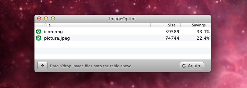
So on a practical level: don’t worry about it. If you have some time to spend on making your website faster, losslessly optimizing your images will make a way bigger difference.

If anyone is confused on why Mark is asking this, it’s most likely because of the abilility that Sass and LESS have to “nest” media queries (see). This is a really neat feature that makes working with media queries a lot more clean an intuitive, as you the author. However, the final output results in many duplicated media queries. I know that addressing this issue is on the mind of the lead developer from Sass.
Onward!
Keep up the great questions, folks! Got a good one? Send it in, and we’ll be picking the best ones for the next edition.
Image source of picture on front page.
Further Reading
- Coding Q&A: CSS Performance, Debugging, Naming Conventions
- SVG Fallback, Vertical Rhythm, CSS Project Structure
- Coding Q&A With Chris Coyier: Code Smell And Type On A Grid
- CSS Baseline: The Good, The Bad And The Ugly


 JavaScript Form Builder — Create JSON-driven forms without coding.
 Register for free today!
 Try if for free!
 Get a Free Trial

