A Guide To iOS App Development For Web Designers
As a designer looking to broaden your skill set, you’ve decided that learning how to make native apps for Apple’s iOS platform is an attractive and potentially lucrative prospect. With a frisson of excitement, you start to do some research. The euphoria is short-lived however, as you quickly discover that unless you are an experienced programmer, the task is far from easy.
The documentation provided by Apple is aimed at those with a degree in computer science. Books on iPhone and iPad development ask that you have a good grasp of Objective-C from the opening page. Online tutorials vary in quality, with many appearing out of date or contradictory.
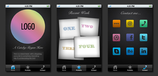
This post will help you get to know the iOS development tools a little better. It leads you through some choreographed steps of iPhone app development, even if you have little or no programming knowledge. It covers some key principles and applies these directly to something useful and relevant: the creation of a simple but functioning portfolio app.
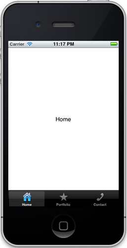
The result will look like this:
Going Native?
By “native” iOS development, we mean using Apple’s software development kit (SDK) and the programming language Objective-C to author apps for the iPhone, iPod Touch and iPad. Before we learn how to do this, it is worth mentioning why we would want to make an app this way, and what the alternatives might be.
In relaxing the App Store’s submission review guidelines in September 2010, Apple made it easier for developers to use third-party frameworks and more familiar languages, such as HTML, CSS and JavaScript, to create apps. Examples of such tools are Appcelerator’s Titanium Mobile, Nitobi’s PhoneGap (acquired by Adobe in 2011) and appMobi’s XDK (now belonging to IBM), among others. In addition to the benefit of using the more familiar Web languages of HTML, CSS and JavaScript to author apps, these methods enable developers to output to other mobile platforms, such as Android and BlackBerry, with minimal rewriting of the source code.
The disadvantage of using third-party tools is that the resulting app will not be quite as efficient as one that is natively authored, and the newest features of the operating system and hardware will not be available, at least until the framework catches up. Each framework also has its own fairly extensive library of functions that have to be learned, along with its own idiosyncrasies, bugs and workarounds. Plus, to publish your app to the App Store, you will need to use Apple’s Xcode, the application used to work with the iOS SDK, so limited familiarity with native processes is still necessary.
A few “third way” solutions, such as Cocos 2D for iPhone and Baker, are also available, allowing you to connect framework files to an Objective-C project for a particular aim, such as to create a game or digital magazine. To make use of these and any others that come along in future, you will need at least a basic understanding of the SDK.
Therefore, if you are interested in developing for the iPhone, iPod and iPad and you accept that whatever authoring method you choose means having to find your way around Xcode, then getting familiar with the native SDK is a recommended first step.
Getting Started
You will need two things to be able to start working with the iOS SDK:
- A Mac, running the latest version of OS X (there is currently no way to author natively for iOS on Windows or Linux, although apparently there is a workaround);
- Apple’s Xcode application.
To get Xcode, download it from the Mac App Store. It’s free but weighs in at nearly 1.5 GB and can take about half an hour to install, so you’ll need to put aside a bit of time to get it up and running.
Preparing Graphics
While waiting for that download to complete, we can look at how you might prepare and export graphics for iOS using Photoshop.
Because all iOS applications have one of two possible pixel densities (standard or Retina), you should aim to work in Photoshop using non-destructive techniques to reduce the need to design twice. This means creating buttons and interface elements using vector shapes and layer styles, and using smart objects for images, where possible. The recommended approach is to work at a Retina-display resolution first, and then scale down to standard resolution once the design is complete. Sometimes you will find that scaling down produces poor results, and you will have to tweak your smaller designs.
Plenty of templates with pre-built iOS system elements are available on the Web. Teehan + Lax has one that is pretty good and widely used. Apart from saving you from having to draw iOS system components from scratch, they also demonstrate how much space is left for content, once elements such as the status, navigation and tool bars are in place.
To set up a new blank iPhone document in an image editor, these are the settings you will need:
- 640 × 1136 pixels,
- 72 ppi,
- RGB color mode.
The above is for a iPhone 5 or iPod Touch 5th generation.
The screen dimensions for the iPhone 4, 4S and iPod Touch fourth generation are slightly shorter, at 640 x 960 pixels. You can denote this in the same document using a ruler guide. Older non-retina devices are 320 × 480 pixels, which is exactly half the size of the fourth-gen retina display.
See Marc Edwards’ “Designing for iPhone 4 Retina Display” for more information on iOS design techniques and workflows.
Some Quick Image Exporting Tips
- iOS accepts a number of image formats, but PNG is recommended because of its support for alpha-transparency and its lossless compression.
- Graphics for buttons should, in most cases, be exported just as background images, without accompanying text, because this allows for localization (in different languages), accessibility and text resizing between the Retina- and standard-display resolutions.
- If exporting a button graphic, ensure that the pixels of the actual button are centered in the frame of the exported image, because Interface Builder doesn’t give you precise control over the positioning of button background images or foreground text. You might need to manually compensate for a drop shadow on the opposite sides, for instance.
- Where possible, flatten design elements made from multiple layers into a single image file. Rebuilding layered UI components in Interface Builder can be a pain; plus, reducing the number of resources that your app uses will make it run quicker and take up less memory. Only interface components that need to respond to user interaction should be animated, and only interface components that will be controlled by the application should be exported as separate image files.
- You will need to produce Retina and standard versions of every exported image and give them identical names, with a
@2xsuffix for the Retina version, like so:image.pngimage@2x.png
- You can use my SuperSlicr Photoshop action (included in the package) to automate the scaling and exporting of elements from your PSD file.
- Every pair of images that you make will need a unique and descriptive file name, because they are all stored in the same directory in the app bundle. File names should have only alphanumeric characters (no symbols), and underscores or hyphens instead of spaces. You may use capitalization.
- Photoshop isn’t very good at compressing PNGs, so run them through porneL’s ImageOptim to reduce their size before importing into Xcode. Xcode will also try to apply its own compression to imported images, which can sometimes increase file size, but this can be disabled.
Xcode Overview
You’ve successfully installed Xcode? Great!
Next, you will need to download and unzip these template files. The package includes a source PSD, some exported PNGs and the required starter code.
In the package, navigate to the folder named Begin Here. Locate the Xcode project document named Portfolio.xcodeproj. Double-click on this file to open it in Xcode.
Once the document has loaded, click on the blue project icon on the left named Portfolio, 1 target, iOS SDK, and you should see a project summary screen in the main Xcode interface, as shown below. We will look at the contents of the summary screen in detail later.
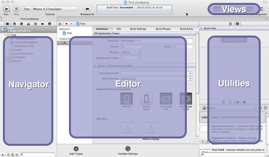
The “Navigator” area on the left lists all of the files already associated with your project. These can be expanded out from the blue project icon. We will be mostly interested in those contained in the yellow Portfolio folder, or “group.” Three types of files are here:
.hA “header” (or interface) file..mA “message” (or implementation) file..xibAn “XML interface builder” file, sometimes referred to as a NIB.
The “Editor” area will change depending on what task you are performing. Because we currently have the blue project file selected in the navigator, we are given the “Target Summary” screen. This gives us some basic options for our app, including which device types, iOS version and display orientation we want our app to support. We can also specify images to use for our app’s icon and launch image, which we will look at in detail later.
Single-click on AppDelegate.m. The editor area will now turn into a code editor and display the code contained in this file.
Now single-click on MainWindow.xib in the navigator area. The editor area will display Interface Builder, an integrated graphical user interface (GUI) for putting together the front-end of your application.
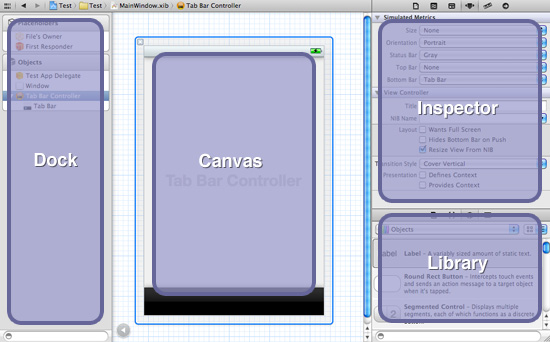
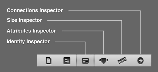
The “Inspector” has some tabbed controls at the top that you will need to be familiar with. The last four are the most important:
The other important control is the big “Run” button in the top-left corner of Xcode. Pressing this will compile your project code into an app and then run it in an iOS simulator so that you can see whether it works without having to load it onto an actual device. If you press it now, it should launch the simulator and present you with a big virtual iPhone on your desktop.
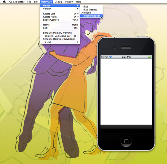
The simulator works similar to an actual device. Have a play to see how it behaves. Under the “Hardware” menu, you can select different devices and iOS versions and simulate rotating and shaking the device. Holding alt allows you to pinch and zoom. The home button works, taking you to the springboard where there is even a functioning version of mobile Safari (which, incidentally, is great for testing locally hosted websites).
A more detailed guide to the interface is available in Apple’s “Xcode 4 User Guide.”
Importing Graphics Into Xcode
The template package that you downloaded earlier contains some sample image files. You can either use these or use your own for the next section.
To import images into your project, Control-click on the “Images” group in the project navigator and select “Add Files to ‘Portfolio.’”
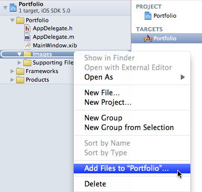
Browse to the “PNGs” folder in the downloaded package and select all of the images. Check the “Copy items into destination group’s folder” box, and then click “Add.”
The images have now been imported into your project and are available to Xcode and Interface Builder. You can add more graphics to the “Images” group at any time by following this same process.
Editing The Template Without Writing Any Code
There is a debate in the iOS development community about whether one should build an app purely in code or with XIB files generated by Interface Builder and its GUI. Both methods seem to be supported by Apple, and each project necessitates its own approach. Developers who frown on the use of Interface Builder perhaps overlook the power of this tool, which enables us to establish the structure and outward appearance of our app efficiently and visually. For designers used to working with Adobe’s Creative Suite, this will be (almost) familiar territory. For this reason and because our app will be very “view-based,” we will use Interface Builder to begin with.
First, we will look at setting up some different screens, or “views,” that can be switched using some Tab Bar controls. Click on MainWindow.xib in the project navigator to bring up Interface Builder. In the library, select the “Show the Object Library” tab icon (the one that looks like a cube), and scroll through the list of objects until you find “View Controller.”
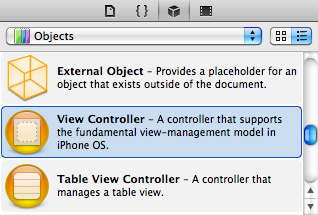
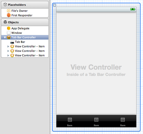
Expand the dock using the circular “Expand document outline” button at the bottom, then drag an instance of the View Controller object from the library onto the “Tab Bar Controller” in the dock. The Tab Bar Controller should expand, showing the View Controller nested inside.
Repeat this process twice more, until you have three View Controllers nested inside the Tab Bar Controller. The canvas area should also show the Tab Bar as having three unnamed tabs.
View Controllers?
If you are wondering what a “View” and a “Controller” are, they are part of something called the “Model View Controller” (MVC) paradigm. This is an approach to programming that separates application data, logic and presentation to make things easier to work with. “Model” refers to the back-end aspect that manages data. “View” refers to the front-end user interface. “Controllers” bridge the front and back ends and enable things to happen in your app. We won’t be working with any ’persistent’ data in this article, so we will only be encountering Views and their corresponding Controllers.
Creating Classes
We need to create some “classes” to generate each of our views; and because we are new to programming, this requires a bit of explanation first.
In object-oriented programming languages such as Objective-C, classes are used as a way to define elements within the application called “objects.” A class defines the qualities (or properties) that an object may have and what it can do (methods). It can then be asked to generate one or more “instances” of an object based on this definition, and these instances are used to make your application work.
Each of the three views that we want to make are objects, so we need to create some classes to be able to conjure them into existence.
To add a new View Controller class, Control-click on the yellow “Portfolio” folder in the navigator, and select “New File” from the contextual menu. In the sidebar of the options sheet that follows, select “Cocoa Touch,” then “Objective-C class.”
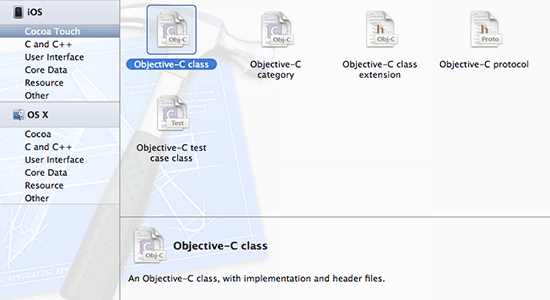
Click “Next.” Then, in the sheet that follows, enter “HomeViewController” in the “Class” field, select “UIViewController” in the “Subclass of” drop-down menu, and ensure that the “With XIB for user interface” box is checked.

Clicking “Next” will give you a save dialogue box. Select the “Begin Here > Portfolio” folder, and then hit “Create.”
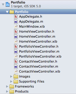
Repeat this process for the other two views, naming each class “PortfolioViewController” and “ContactViewController,” respectively.
You can rearrange the order of the files in the navigator by dragging and dropping if you want. It should now look something like this:
Configuring Tabs And Views
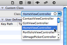
Return to MainWindow.xib. Select the first View Controller icon in the dock, then the Identity inspector. Select “HomeViewController” from the “Class” drop-down menu.
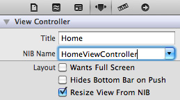
Now go to the Attributes inspector. Type “Home” in the “Title” field, and select “HomeViewController” as the NIB name.
Expand the View Controller in the dock and select its “Tab Bar Item.” In the Attributes inspector, set the title as “Home,” and select tab-icon-home.png from the Image drop-down menu. You don’t need to specify the @2x Retina version when selecting images in Xcode because they are called automatically when the application is running.
![]()
Repeat the above process for the Portfolio and Contact views, choosing the relevant classes, titles and image files.
The color of the tab bar highlight can be changed by selecting the main “Tab Bar” object in the dock, then “Image Tint” in the Attributes inspector. Although custom tints will only show up in devices running iOS 5 or higher, iOS 4 and below will safely fall back to showing a default blue highlight color.
Our views within tabs are now all set up! To check that they are working properly, we’ll need to add some dummy content to each view.
Select HomeViewController.xib in the navigator, then drag a “Label” from the library (at the top of the list) onto the view represented in the canvas. Double-clicking on the label in the canvas will allow you to edit its text. Change it to “Home.”
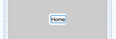
Repeat this for PortfolioViewController.xib and ContactViewController.xib, naming the labels appropriately.
Now hit the “Run” button, and check out your already functioning tabbed app in the simulator!
Adding Graphics And Text To The Views
As with desktop publishing applications, inserting images and text in Interface Builder requires you to make a containing element first. These can be dragged onto the canvas from the library, and they are called “Image View” and “Text View,” respectively. They can be repositioned and resized visually with the cursor, or you can type pixel measurements into the Size inspector for more precise control.
The Attributes inspector allows us to specify an image to place in the Image view. We may only choose from images that have been imported into the project.
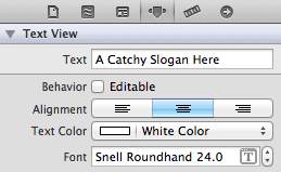
The Attributes inspector also lets us set text for the Text view, and it gives us typography controls, a background color-picker and scrollbar options.
Arrange the graphics for HomeViewController.xib. Delete the label, and drag on an Image view from the library, setting its image’s name to home-bg.png and its mode to “Top Left” using the Attributes inspector.
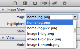
In the Size inspector, check that the Image view has an X value of 160, a Y value of 220, a width of 320 and a height of 480.
Now bring in Image Views for logo.png and twitterbox.png. Resize and position them appropriately.
Next, position a Text view over top. Edit it’s content, center-align the text, set the text’s color to white, set a custom font (Snell Roundhand, Regular, 24 pixels), and set the background color to “Clear.”
The result should look like this:
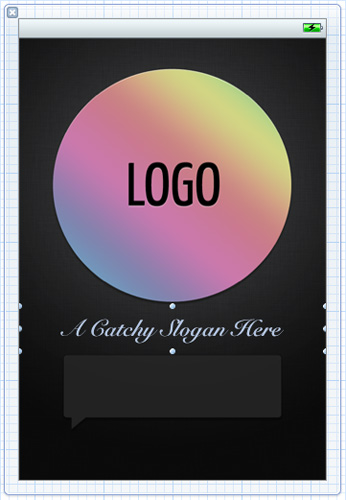
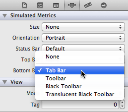
Because our views are being placed inside a tab bar interface, we also need to simulate the black strip at the bottom of each view so that we can arrange items with this in mind. To do this, select the main “View” object in the dock. Then, in the Attribute inspector, under “Simulated Metrics,” choose “Tab Bar” from the “Bottom Bar” drop-down menu:
This won’t actually add a tab bar to our view. It simply provides a visual reference to help us position the layout.
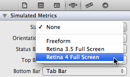
Another useful option under simulated metrics is “Size”. At the moment the dimensions of our views are that of the 3.5 inch iPhone 4 or below. To switch the views to the 4 inch iPhone 5 dimensions, select “Retina 4 Full Screen” from the “Size” drop-down:
Now, have a go at arranging the graphics and text for the Portfolio and Contact views. Either use the sample images at the top of this article, or refer to the source PSD provided in the template package.
When creating the thumbnail images in the Portfolio view and the social media buttons in the Contact view, use the “Round Rect Buttons” from the library instead of Image views. If you set the button type to “Custom” in the Attributes inspector, you can then set the button’s image in the same way as you would for an Image view. Set the button size in the Size inspector based on the image’s original dimensions. Using a “Round Rect Button” instead of an Image view allows us to add interactivity to them later.
Now, build and run to check that everything works OK in the simulator.
Extra Finesse
If you press the simulator’s home button, you will notice that your app has an uninspiring white icon on the springboard and a blank screen when it relaunches. Let’s fix that now.
Clicking on the blue “Portfolio” project icon in the navigator will take you back to the summary screen. Scrolling to the bottom of this screen will reveal empty wells awaiting custom images. Adding images is simply a case of dragging them from the Finder to the relevant well.
You will find the images you need for this project in the “App Icons” directory in the downloaded package.
If you want to make your own app icon, the images need to conform to the following sizes:
- Standard: 57 × 57 pixels
- Retina Display: 114 × 114 pixels
The launch images need to be the same as the display’s overall dimensions:
- Standard: 320 × 480 pixels
- Retina (3.5 inch): 640 × 960 pixels
- Retina (4 inch): 640 × 1136 pixels
You will at a later date need some more sizes to display your app correctly in various contexts. An excellent resource detailing the required sizes has been produced by Neven Mrgan. Apple’s “iOS Human Interface Guidelines” also give a good breakdown and include icon and launch image sizes for the new iPad.
iOS automatically rounds the corners of your app’s icon and overlays the standard glossy sheen on it, too, so you don’t need to include these elements in your design.
If, however, you want to create your own non-standard glossy effect or you don’t want gloss on your icon at all, then check the “Prerendered” box to the right of the App Icon wells.
To change the name that appears below the icon, select the “Info” tab next to the “Summary” tab at the top of the editor. This will reveal an editor for the app’s .plist (property list) file, which is an XML document containing the main settings for your app:
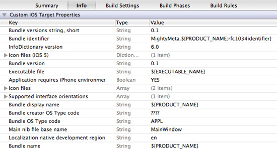
Some of the information here, such as “Main nib file base name,” points to resources required by the app when it first launches. Other information, such as “Bundle Identifier,” is used in the black art of provisioning and uploading to iTunes Connect for distribution on the App Store.
To change the name below the icon, change the “Bundle display name” value from ${PRODUCT_NAME} to whatever you want.
The Minor Miracles Of The Xcode Assistant Editor
When we test our app, the custom buttons will respond to being tapped but won’t actually do anything. To make them work, we’ll need to write some code. Luckily, something called the Assistant Editor can help us with the first part of this process.
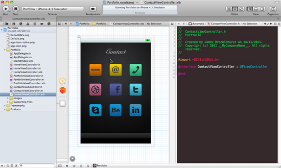
Select ContactViewController.xib from the navigator. Then, press the “Assistant Editor“ button in the top right of the Xcode window.

This will display an Interface Builder window detailing ContactViewController.xib, alongside a Code Editor window, which shows the associated ContactViewController.h interface document. In the example below, the dock has been minimized, and the Utility area hidden to give the two editors more room. The Code Editor is also using the “Dusk” theme, which can be found under “Fonts and Colors” in Xcode → Preferences.
Miracle 1: Declaring Properties And Methods
Features of a class generally fall into two main types: a “property,” which is a characteristic that the class might possess, and a “method,” which is something that it can do. When adding a button to ContactViewController, we need to declare the button as a property of the class and create a method for what happens when the button is tapped by the user.
The .h document should contain the following code:
#import <UIKit/UIKit.h>
@interface ContactViewController : UIViewController
@end
The #import statement at the top gives the class access to the required iOS user interface classes stored within the UIKit framework.
The @interface declaration starts by defining ContactViewController and stating that it is a subclass (meaning that it inherits all the features) of the UIViewController class, which is defined within UIKit.
We can add in extra items between the opening @interface declaration and its @end, to build on the foundation provided by the UIViewController class.
To do this, Control-click on our orange “WWW” button on the canvas in Interface Builder, drag the cursor to be just above @end in the code editor, and then release. A little dialogue box will pop up with some settings:

Check that the “Connection” is set to “Outlet,” type in the name websiteButton, and then press “Connect.” Xcode will insert a line of code into the .h document for you.
Repeat the process, this time changing “Connection” to “Action” and providing the name openWebsite.
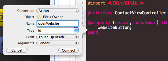
The code in your .h document should now look like this:
#import <UIKit/UIKit.h>
@interface ContactViewController : UIViewController
@property (retain, nonatomic) IBOutlet UIButton *websiteButton;
- (IBAction) openWebsite:(id)sender;
@end
So, what does this all mean?
The @property declaration states that the ContactViewController class has a property. It begins with some parameters: retain, which has to do with memory management (more on this later), and nonatomic, which means that it is not “multithreaded,” something that is common to all iOS properties. Next, there is a definition for the property return type, IBOutlet, which allows us to bind our code to the button we created in Interface Builder. UIButton states that the property will inherit from the UIButton class, defined within UIKit, and then the name of our property is given, which is websiteButton.
The second line of code is a method declaration. It starts by saying that it is an IBAction, which again lets us bind the code to the button object in the XIB. Then it is given a name, in this case, openWebsite. The (id)sender parameter allows us to find out which object called the method. This is handy in certain situations, although we don’t need it right now.
You might have noticed that when we created our View Controller classes, their names began with an uppercase letter, whereas the names we gave our property and method didn’t. This is an Objective-C naming convention and should be adhered to.
Hand-coding those two lines is possible, but using the Assistant Editor to do it saves a bit of time and ensures that the syntax is correct. It also performs a whole series of other tasks for us as well. Let’s look at what else it does.
Miracle 2: Method Generation and Memory Management
Return to “Standard Editor” mode, and select ContactViewController.m. Near the bottom, we will find the following line of code that the Assistant Editor has created:
- (IBAction)openWebsite:(id)sender {
}
This is the method implementation for our button action. In a minute, we will put some code in there to make our button work.
You should also find another method implementation that looks like this:
- (void) dealloc {
[_websiteButton release];
[super dealloc];
}
This method has to do with memory management and is defined within the Cocoa framework, which is why we haven’t needed to mention it in our interface.
Managing memory is very important when programming because a mobile device doesn’t have much to play with. When the websiteButton property is defined, a chunk of memory is allocated to it using the retain command. This command asks iOS to reserve a bit of memory for the button until we tell it to let it go. The dealloc method is activated only when the View instance is destroyed; so, by putting websiteButton release in there, we are asking iOS to free up the memory set aside for the button when this event occurs. If we don’t do this, then the memory keeps getting allocated, even when the button object isn’t in use anymore. This is called a “memory leak.” If left unchecked, these leaks will add up, affecting the app’s responsiveness and the device’s battery life and causing all sorts of other misdemeanors.
Thankfully, once again, the assistant editor has set this all up for us, so we don’t need to remember to do it.
It is probably worth mentioning that version 5+ of the iOS SDK comes with something called “Automatic Reference Counting” (ARC), which seeks to further automate memory management for iOS developers. When creating a new project, you have the option to turn ARC on and off. We are not using ARC in this project, so we can learn a bit about how memory management works. Integrating freely available components found on the Internet (many of which are written using manual reference counting) with an ARC-enabled project can also be difficult. With each subsequent release of the SDK, however, Apple is pushing more and more for developers to embrace ARC, and there are many advantages in doing so. ManiacDev has compiled some useful resources to make this transition smoother.
Miracle 3: Code Binding
The Assistant Editor has also connected our code to the button object in the XIB. Select ContactViewController.xib, expand the dock, and under “Placeholders” select “File’s Owner.” This represents the ContactViewController class. Now, select the Connections inspector. It should look like this:
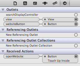
Under “Outlets,” we can see the websiteButton property linked to the Button XIB object.
Under “Received Actions,” we can see that the openWebsite method is also connected to the Button.
Under it, there is also an associated event, “Touch Up Inside.” This means that the method will be called when the user touches and then releases their finger while still inside the button. This is the default touch event.
Handwriting Your First Bit Of Objective-C
Lets make that button do something!
Change the openWebsite method implementation in ContactViewController.m so that it looks like the following:
- (IBAction)openWebsite:(id)sender {
NSURL *webAddress = [NSURL URLWithString:@"http:www.mightymeta.co.uk"];
[[UIApplication sharedApplication] openURL:webAddress];
}
The syntax for a method is fairly straightforward. Simply provide the name of the method, and then put what you want to happen when the method is called between the pair of curly braces.
In this case, we are doing two things. First, we are creating a temporary variable named webAddress and assigning it a string of text that contains our email URL.
It is worth noting that this is something called a “convenience method.” It creates an instance of the NSURL class and automatically allocates some memory to it. It also sorts out the memory deallocation for you, so you don’t have to worry about releasing the webAddress variable.
The second line asks the OS to open the URL in a relevant application, which in this case would be the default Web browser.
Build and run to test whether it works.
To make the other buttons work, simply repeat the steps that we went through to create this button. Any mailto: URLs will work and will launch the default mail client. To make a phone call, put tel:, followed by the number you want to dial in place of the URL. You can change the name of the temporary variable to suit the purpose for each button.
Making A View Appear Modally
The portfolio section currently has some thumbnail images. Wouldn’t it be great if the user could tap on these to get bigger versions?
This can be achieved by creating what is called a “Modal View.” This is essentially a new view that is placed over top the previous one, and it comes with a range of animated transitions.
Create The Modal View
Modals are easy to create. First, generate a new class called BigImageViewController (Control-click on the “Portfolio” folder in the project navigator, then select “New File” and go through the options, like before).
Open the corresponding XIB in Interface Builder, add an Image view that fills the entire view, and set its image as portfolio-modal-bg.png. Add a custom Round Rect button, give it a background of button-close.png, set the color of the “Close” title to white, and place it in the top-left corner.
Next, place another image view over top the first. Fit it to near the edges of the paper background, but don’t assign an image to it:
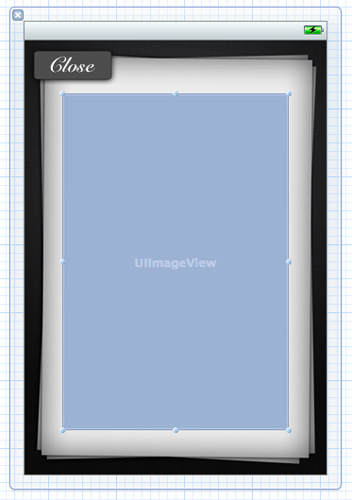
Use the Assistant Editor to declare the empty Image view as an outlet named imageFrame, and connect the button to an action named closeView in BigImageViewController.h (you can select which file the right-hand window will display from the bar at its top):
@property (retain, nonatomic) IBOutlet UIImageView *imageFrame;
- (IBAction)closeView:(id)sender;
Then type the following into the closeView method in BigImageViewController.m:
- (IBAction)closeView:(id)sender {
[self dismissModalViewControllerAnimated:YES];
}
This code will close the modal view when the button is tapped.
Code For Launching The Modal
Now, using the Standard Editor, type in PortfolioViewController.h so that it looks like the following example:
#import <UIKit/UIKit.h>
#import "BigImageViewController.h"
@interface PortfolioViewController : UIViewController
@property (nonatomic, retain) UIImage *bigImage;
- (IBAction) selectImage1;
- (void) openBigImageView;
@end
Make sure to include the #import statement for the BigImageViewController header file. This is required so that we can send a message to this class and ask it to create an instance of itself.
A property and two method declarations are there. The second, openBigImage, doesn’t need to be connected to any objects in the XIB; so, it has a return type of (void), meaning… well, a big black hole of nothingness.
We haven’t used the Assistant Editor here because we are doing something a little different from before. Because of this, we need to manually release the bigImage property at the start of PortfolioView.m, like so:
- (void) dealloc {
[_bigImage release];
[super dealloc];
}
Underneath the dealloc method, implement the two methods that we declared in the header:
- (IBAction) selectImage1 {
self.bigImage = [UIImage imageNamed: @"image1-big.png"];
[self openBigImageView];
}
- (void) openBigImageView {
BigImageViewController *bigImageView = [[[BigImageViewController alloc] initWithNibName:@"BigImageViewController" bundle:nil] autorelease];
bigImageView.modalTransitionStyle = UIModalTransitionStyleFlipHorizontal;
[self presentModalViewController:bigImageView animated:YES];
[bigImageView.imageFrame setImage:self.bigImage];
}
Wow, that’s a lot to take in. Lets go through it.
The selectImage1 method sets the bigImage property to the image file that we want to use, and then calls the openBigImageView method.
The openBigImageView creates an instance of the BigImageViewController class named bigImageView, presents it as a modal using the “flip” transition style, and then sends its imageFrame the image file held by the bigImage property.
Because we have manually allocated memory to the instance of BigImageViewController, we need to release it at some point, but we don’t know how long the object will be needed for because it depends on how long the user keeps the modal active. The autorelease command helps us with this problem because it asks iOS to hold on to the memory for a bit and then release it later on, when it is deemed safe to do so.
Manual Code Binding
Now we need to connect our code to the objects in the XIB. Select PortfolioViewController.xib, and then the “File’s Owner” object in the dock, and then the Connections inspector.
Under “Received Actions,” you will find the selectImage1 method, and an empty circle to the right of it. Click and drag a connection from this circle over to the relevant thumbnail button:
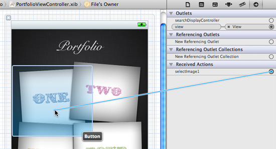
Select “Touch Up Inside” from the list of button events that appears.
Build and run to see whether it works. If everything is in place, you should be able to tap the thumbnail to reveal the bigger image.
See if you can work out how to do the same for the other images on the portfolio page. You will need to create selectImage2, selectImage3 and selectImage4 methods, but you won’t need another openBigImage. You could also try using different transition styles; you have four to choose from:
UIModalTransitionStyleCoverVerticalUIModalTransitionStyleCrossDissolveUIModalTransitionStyleFlipHorizontalUIModalTransitionStylePartialCurl
If you get really stuck, have a look at the completed project in the “End Result” folder of your downloaded template package.
In Conclusion
We’ve covered quite a lot of ground, having looked at the basics of the Xcode interface and how to arrange visual elements in Interface Builder. We’ve also been introduced to the key concepts of classes, properties, methods and memory management in Objective-C.
In the process, we have built a functioning, albeit limited, app. Making it ready for submission to the App Store would require a unique design and some additional functionality, such as adding Tweets to that empty speech bubble on the home page. Now that you have a grasp of the basics, take advantage of the great resources out there to help you with this next step.
Further Resources
App Design
- “iOS Human Interface Guidelines Part 1: Platform Characteristics,” Dinosaurs with Laserz A summary of the “iOS Human Interface Guidelines.”
- Pttrns App design screenshots to inspire your next masterpiece.
App Development
- “Learn Objective-C,” Cocoa Dev Central A summary of the basics of Objective-C.
- Cocoa Controls Open-source UI components, such as carousels, maps and Twitter aggregators, to integrate in your project.
- ManiacDev.com iOS libraries, controls, tutorials, examples and tools, many of which are open source.
- Baker Ebook Framework and PugPig These enable you to build an interactive book or magazine using HTML5 and then wrap it into an app using Xcode.
- Creator, GameSalad Want to make a promotional iPhone game using drag-and-drop behaviors and your new-found Xcode skills? Then GameSalad’s Creator is for you.
Further Reading
- How To Build A Mobile Website
- Responsive Web Design: What It Is And How To Use It
- Getting Ready For HTTP/2


 SurveyJS: White-Label Survey Solution for Your JS App
 Agent Ready is the new Headless

