Stefan Sagmeister Interview
Stefan Sagmeister is a designer who has been following his instinct and intuition to the fullest, having gained recognition for his unique, and often provocative, visual explorations. It’s possibly his very personal and almost self-centric way to design that leads to his original approach. On May 31, 19 years after starting his NYC studio he once again surprised the crowds with renaming to Sagmeister & Walsh in a ‘trademark’ Sagmeister fashion - naked in the studio.
A bit of history. When the Austrian-born Sagmeister moved to New York, he made it his mission to work for the legendary designer Tibor Kalman (1949-1999), at M&Co before starting his own studio in 1994. Sagmeister inc. Kalman, one of the two names that changed graphic design in the 80’s—as AIGA proclaims—was well respected for his social responsibility polemic and then as the editor-in-chief of Colors magazine.
Sagmeister earned Grammys for his iconic music packaging art (see his David Byrne CD covers). With his poster designs for the AIGA, as well as a slew of heralded personal projects, it’s safe to say that his status as a design superstar has been cemented. He also obtained a Lucky Strike Designer Award in 2009. There are two published monographs on his work, “Things i have learned in my life so far” (2008) and “Sagmeister, Made You Look” (2001) that are often found on designer’s bookshelves.
He’s also known for taking yearlong sabbaticals every seven years out of studio, which is obviously good for creativity and well being (if one can afford it).


He advocates keeping it simple, which he believes has huge benefits and routinely takes a sabbatical break every seven years to recharge and reflect creatively.
This is yet another timeless and in English previously unpublished interview conducted by Spyros Zevelakis, when he met with Sagmeister at TypoBerlin ’Image’ in 2008.
Q: Do we have to gather in the economical centres of the world in order to do better graphic design?
Design by its own definition, not only communication design but also product design—from a broader point of view, they’re about the interaction of humans. Now, you have more interactions of humans in cities. Bigger concentration, much higher density than you’d have in the countryside. Consequently, as a designer, I’m invited a lot to different places around the world, and they’re almost without exception cities. So, there is now just much higher usage of design and products, but also in the making of them, and in the thinking about them.
At the same time though, technology allows us to do fantastic work anywhere. And this is true for young designers. I’ve seen colleges outside of cities. They do amazing work that uses the remoteness, as part of their limitations [as designers], and turn it to their advantage. I’ve also seen design companies, being in provincial areas, who do brilliant work.
Q: So, in the years to come, will designers be more able to live anywhere and do work anywhere?
In a sense, I would say, because you can technically do it. But, obviously, the density of information and the experiences will be probably more for the cities than the countryside. So, I could see this working beautifully for a limited period of time, and I’m actually going to move for a year to the countryside to do exactly that—try a different style of working. I will be in Indonesia, quite far away from any urban centre. I’d have to fly to Jakarta or Singapore. That’ll be for a year, but I don’t think that I’d want to do this for the rest of my life.
Q: Which was there the point in your career that you managed to start working on your own terms? Was it difficult in the beginning?
From a single point of view, even as a student, I looked for jobs that allowed work that I thought was good. And for sure, when we started the studio, right from the start, we tried to do work that we could be satisfied with. That’s what I felt it was best doing. I don’t think that you can open a studio and do mediocre work to make money and somehow switch over to good stuff. I haven’t seen it happen. Because everything that they [your clients] do, reflects on everything that you do. If you do a lot of mediocre work, it’s going to attract a lot of mediocre clients.
Q: Where there sacrifices you had to do to allow yourself this freedom?
There were not many sacrifices involved. What I did, was that I designed a situation for myself, where the studio would need very little money. Our overheads were very, very small, so we didn’t get into this “difficulty” of having to have a lot of income coming in and then having to take on jobs that we wouldn’t be happy with.
Q: Are you bothered about the distinctions between the arts and design?
As a consumer or viewer of art and design I don’t care. As a consumer my question is if it’s good or not, not if it’s art or design. As a do-er [creator/maker of it], somehow I have to care. I’ve been asked here and there about it… and on a daily basis there is a distinction as far as the media, distribution methods and functionality of the pieces is concerned. I think that design pieces at large need to be functional, while art pieces at large don’t have to be functional, just be—they don’t have to actually do anything.
Q: In this way you differentiate your work from a fine artist’s work?
Yes, exactly.
Q: Designers are active in the discussion of more ethical and responsible practice. Many seek to work for clients committed to a social responsibility (charities etc). In general however, the designer is working for the industry, and often, it may be questionable how seriously big corporations take contemporary issues (like sustainability) outside their PR and marketing agenda. What’s your view on this contradiction? On the one hand designers are sensitive to issues, on the other hand, they do best in strong economies (capitalism).
I’m not sure I have very interesting things to say about it. I do believe that it’s going to be some middle-ground over the two. I think that capitalism long ago has found the middle ground. I talked yesterday to a woman who works at Mercedes. She said that they are investing $14 Billion over the next 3 years in environmentally friendly technology. Now, so much money from this company, I actually didn’t believe her at first and then she emailed her boss to get the actual numbers. Mercedes’s annual profit is $4 Billion dollars. So to put [nearly] 3 years worth of profits, solely into environmentally friendly technologies…
I would like to see the design company who puts its entire profit into the same thing. It seems to me, if those numbers proved to be true, that some big industry people are much more responsible than the design community. I do see big businesses having some quite inspiring leadership. Therefore, I don’t see that one has to go above the other. In general, I’m a big believer in the human spirit and I think that, centuries after centuries, we are actually getting better and better. By looking at our past and our progress, it seems that we have a good future.I’m not sure that the PR and marketing of big corporations is the mere drive for a more responsible approach.
On the other hand, I have seen the design community react to catastrophes in the most superficial and silly fashion. I remember back at 9⁄11, the overall response of the design community in New York was to design stupid logos, and load them to the AIGA website. But I do know a lawyer who organised the law community. They did actual beneficial things for their communities. I don’t think that the design community can claim at all to have a leadership in any of these subjects. And even because it’s quite fashionable to slag large corporations, I sometimes see a much more efficient and much more professional and effective way from individual designers.

Q: Back to graphics, you’re a letterer and you enjoy the craftsmanship. Is it equally important for you, the form of the letterforms and the medium (that dictates the outcome)?
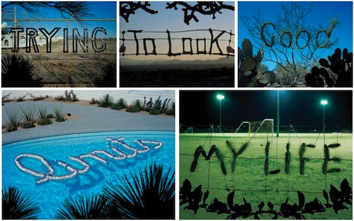
Both yes. Actually, even when we produce something that is made out of something, the form is not totally driven by that one medium. I’ll give an example. When we did the world limits swimming around in the swimming pool, we sketched that out before, because I didn’t want this air conditioning, tubing material, that we made it out from, solely to dictate the form of that work.
Q: Is craftsmanship a way to be unique in the digital era?
Well, I think it was maybe 10 years ago. Specifically, when modernism first came back, and everything was suddenly cold and machine-like, it made a lot of sense to introduce handwriting, but also to introduce a higher level of craft. Right now, craft in almost all artistic directions is a very hot topic. Start with product design, but in art, crafts coming back big time, you see the German painters, who can actually paint, having an unbelievable career. We went through such a long term, maybe two or three decades, where craft didn’t play a role at all, and I mean consciously it didn’t. People who could paint, consciously did not paint.
In general, craft is just a function of knowing your tools really well. Knowing your tools very well, on the one hand can be an advantage. On the other hard, I’ve also seen people hooked back into their tools that they know so well, and they stay in their small little section [world] and can’t really get out to see the bigger picture. Personally, I’m most comfortable to go in and out.

Q: Art colleges in Europe don’t seem to teach much crafts any more, do they?
In design education, they are much more about what the world does right now. Interestingly, in most graduate schools, being technically good at something is almost a bad word if you’re talking about contemporary craft. Somebody who is very good in photoshop, is almost universally despised at a grad school. It’s silly. I’m not saying that I’m a friend of people who can do just that and can’t think, but I think a combination of skills matters.
Q: Where do you think design education is going?
I could only give you a superficial answer to it, simply because colleges are a very vast system. There are colleges and universities that do a fantastic job. I just came back from the Royal College of Art in London. I saw the work of six design students. And five of them were fantastic, work of a very high level. I also see people in Holland doing work that I can assure you, is far more advanced that anything I was thinking of when I was 23. Much more sophisticated. Their education is so much better, they know much more, they have much more experience than I had at that age. I’m not quite sure why this is. Is it because I have the chance to see these people now? Or because I just never met them when I was 23? But then I see the opposite, people who are being taught by bad professors, and they’re not that successful. So there is a very wide spectrum out there, and if I would be a student now, I would have to do some serious research. Which is relatively easy to do—just look at the work of graduate students, you can tell immediately.

Q: So, do you think that it depends massively on the school and their practice or philosophy, or the country of study?
Oh no, of course there are a couple of star schools across the world, and there are some countries that really figured out how to school design education—Germany being one of them. If I would have to pick one, anywhere in [the world] where I can see the most, I’d think of Germany. Considering that these four, five schools, don’t refer to themselves as being the best… I think education here (Germany) is fantastic! If I would live in a country, like the US, where art education is unbelievably expensive, I’d probably go through the trouble to learn the German language and get my education there. I know that there are protests here because they are now paying €500 a semester here. And you pay $18,000 a semester in the in the US. And education is really good. I talked to teachers that are very good designers, and the government pays them salaries that they can give up a part of their profession, and it’s actually doable.
In the US if you teach you can do it as a hobby. I do teach 3 hours a week, but I can’t be available to my students during the week. I just talked to [a designer who] I think is the best poster designer alive. He’s teaching in Stuttgart, and he has all he needs, [which] allows him to leave a part of his practice and take teaching seriously. And he does that. And you see the outcome, because he’s available to his students. On the contrary, in the US and many other countries you have to do either teaching or design. Although there are great designers also doing full time teaching, you have mediocre [medium level] designers who become full time faculty staff.
This may be a generalization, but you certainly have people who flee to academia because they’re not that good in real life. Then, of course, they will have the time to lead the students. At the same time, people who are very good outside, they can only come in very punctually. That’s why I think, actually, the current system here seems to work brilliantly, where very good designers can dedicate a serious amount of their lives to teaching.
Be sure to check out the Sagmeister studio live via the website.
Further Reading
- Examining The Design Process: Clichés And Idea Generation
- Milton Glaser Creator Of The I Love New York Logo – An Interview
- Group Interview: Expert Advice For Young Web Designers
- Women In Web Design: Group Interview


 Smart Interface Design Patterns, 45 lessons + UX training

 Devs love Storyblok - Learn why!
 Register For Free
 Get a Free Trial

