The Immersive Web And Design Writing
I have an idea for a new product — can I tell you about it? It will take months to develop, and even though this kind of thing is usually given away for free, I’m going to charge for it. Oh, and the market for it probably won’t be very big… Wait, come back! Where are you going?!
It does sound like a crazy idea, but it’s exactly what a small group of designers and writers have been doing for the past year or so. On a Web littered with SEO-ified headlines (“17 Jaw-Dropping Responsive Design Templates and Funny Cat Pictures”), easy-to-share design gallery slideshows and quick tutorials that help you recreate the latest texture fetish in Photoshop, these people are taking a step back from what we have now come to refer to as the “fast Web.” In the words of Jack Cheng:
“What is the Fast Web? It’s the out of control Web. The oh my god there’s so much stuff and I can’t possibly keep up Web. It’s the spend two dozen times a day checking Web. The in one end out the other Web. The Web designed to appeal to the basest of our intellectual palettes, the salt, sugar and fat of online content Web. It’s the scale hard and fast Web. The create a destination for billions of people Web. The you have two hundred twenty six new updates Web. Keep up or be lost. Click me. Like me. Tweet me. Share me. The Fast Web demands that you do things and do them now. The Fast Web is a cruel wonderland of shiny shiny things.”
A new wave of publications are avoiding this trap, and they appear almost quaint or old school compared to the fast Web. Or worse, as n+1 magazine points out:
“But all contemporary publications tend toward the condition of blogs, and soon, if not yet already, it will seem pretentious, elitist, and old-fashioned to write anything, anywhere, with patience and care.”
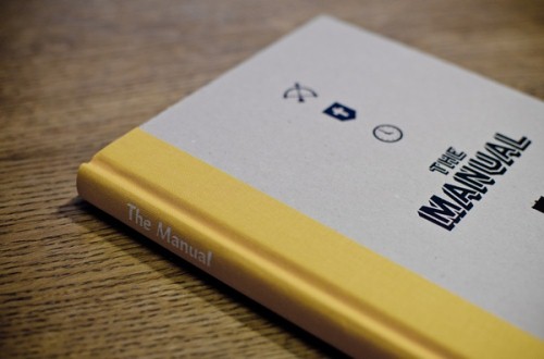
I’m talking about collaborative print and digital publications such as The Manual, Distance, Codex, 8 Faces and Ferocious, and even books such as Frank Chimero’s The Shape of Design. These publications all have two things in common:
- First, they’re about the meaning of creativity and design, more than they are about the doing of these things.
- Secondly, they are written with patience and care, and they are designed to be read and enjoyed in the same way.
This kind of thing is, admittedly, a hard sell. There are two main reasons for this.
First, we’re not trained to spend time doing things with patience and care on the Web. As Robin Sloan points out in his brilliant essay “Fish”:
“On the internet today, reading something twice is an act of love.”
And the reason for this is that we’re being fed junk food, and we love it. Clay Johnson talks about this in his book The Information Diet:
“Driven by a desire for more profits, and for wider audiences, our media companies look to produce information as cheaply as possible. As a result, they provide affirmation and sensationalism over balanced information. […] Just as food companies learned that if they want to sell a lot of cheap calories, they should pack them with salt, fat, and sugar — the stuff that people crave — media companies learned that affirmation sells a lot better than information. Who wants to hear the truth when they can hear that they’re right?”
So, instead of looking for nutrition, we settle for the quick fast-food rush. Short articles fit nicely into lunchtime breaks. They don’t distract us from the Twitter feed long enough for us to lose track of the day’s most important discussions. Most of all, this bite-sized information effectively manages one of our biggest fears: the sunk cost phenomenon, whereby we worry that if we “waste” time on a long piece of writing, we can never get that time back to do something else instead.
Secondly, convincing people to care about why they do something is much harder than getting them to learn how to do it. One is about meaning, the other is about doing. And only one of these things brings cash directly into the bank account. As Frank Chimero points out in The Shape of Design:
“The relationship between form and purpose — How and Why — is symbiotic. But despite this link, Why is usually neglected, because How is more easily framed. It is easier to recognize failures of technique than those of strategy or purpose, and simpler to ask “How do I paint this tree?” than to answer “Why does this painting need a tree in it?” The How question is about a task, while the Why question regards the objective of the work. If an artist or designer understands the objective, he can move in the right direction, even if there are missteps along the way. But if those objectives are left unaddressed, he may find himself chasing his own tail, even if the craft of the final work is extraordinary.”
The irony in all of this is that taking a break from doing, to look slowly and carefully at why we do things and how they fit into the world around us, will almost certainly make us better at the doing part. All creative pursuits have importance and meaning only through their audience, so understanding that audience and the world it operates in is an essential ingredient in our craft.
At least, that’s what I think. But I could be wrong. So, to find out more, I got in touch with some of the publishers who work on these publications and asked them a series of questions about what they’re doing and why they’re doing it. What follows are excerpts from email discussions with the following publishers:
- Andy McMillan, of The Manual;
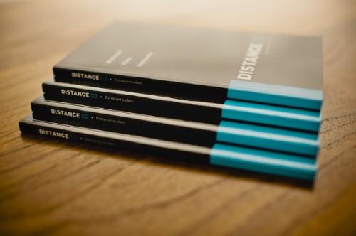
- Nick Disabato, of Distance;
- John Boardley, of Codex.
Why should you care about what these people have to say? The purpose of this article is not to convince you to stop reading articles that help you learn the techniques of your craft. Its purpose is to make the case for a more balanced information diet, with which we all take the time to nourish the parts of our brain that give us much-needed context to understand and effectively use the techniques that we see in galleries and tutorials. So, let’s get to it.
Q: What Made You Start Your Publication? Why Do You Think It’s Important To Do?
Andy McMillan: “For the past two decades, we’ve done an incredible job as a community of discussing, debating and sharing, all of which has contributed to driving our techniques and technologies forward at a staggering pace. This is the energy that provided us with the Web standards movement, and I would argue we’re on the cusp of another major shift. Web design is beginning to define itself as less of a technical skill, but rather as a mature and distinct design discipline.
“Our extraordinary passion for prototyping, experimenting, documenting and sharing the how has gotten us to where we are today. But we believe that as Web design matures as a discipline, there is an additional requirement for greater discussion around the why of what we do. The manual aims to give a home to deeper explorations of our work through sharing stories behind the why of Web design and who we are as designers.”
Nick Disabato: “I started figuring out the ideas behind Distance in April 2011, when I noticed a few problems in design writing. Most long-form stuff was either hyperbolic and incendiary, thin on citation and high on personal opinion, or it involved this hand-wavy, un-actionable “it depends” kind of conclusion. But it’s possible for writing to take a confident stand without turning into flame bait — by providing justification and offering a way forward. Otherwise, we risk losing something tremendously important about the exchange of meaningful ideas. This is the gap that Distance hopes to help fill.”
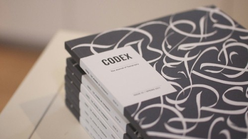
John Boardley: “I started I Love Typography, We Love Typography and Codex all for the same reason: they are ways to share my obsession with typography. I never imagined that these projects would become so popular. I had no grand plan. And that reminds me: I still don’t. I think these projects are important simply because type matters. And type matters because words matter — whether they are words that inspire (in prose or poetry), words that guide us (wayfinding), beseech, implore, persuade (advertising) — they all matter. Beyond the fundamentals of legibility and readability, the choice of typeface and the typography, the mise en page, imbue those words with a voice beyond words, with a personality that sets the scene. The choice of typefaces is analogous to the music score for a movie — the very same scene made more sober, more exuberant, more frightening, more comical, more beautiful, more inspiring, simply through the accompanying music score.”
{% ad-panel-leaderboard %}}
Q: What Have Been Some Of The Biggest Challenges In Getting It Off The Ground?
Nick: “It’s been challenging to have no idea what I am doing. Let’s say you have this principle: you believe that online discourse is degrading, and that design writing could do better by being slower, more thoughtful and more focused on research. How do you work in a way that fulfills that principle? You’d probably get others involved, because leading by example often carves a niche vacuum on the Internet. It probably involves writing; actually, it probably involves long writing. In order to keep the scope from getting too insane, you’d probably want to constrain it somehow.
“But that’s only the beginning of an avalanche of questions. How do you execute on it? How do authors react to a hands-on editor? How do you make money? Do you sell digital, print or both? How do you market it? How do you conduct outreach without coming off as a shameless, desperate Willy Loman type? How do you handle fulfillment on the print editions?
“All that for well-researched essays about design and technology. Each one of those questions needs to be addressed, because each one is critical to the final success. Every day is a new challenge, a new step forward — all done with the risk that it may never pay off (figuratively and literally).”
John: “Launching Codex was quite different from launching the blog projects. It necessitated hiring a small team, paying a small team, finding advertisers and sponsors, commissioning articles, finding a printer, a distributor, choosing paper, doing art direction — the list is endless. I guess the biggest challenge is finding the right collaborators — those who share your vision and those who you can work with night and day without wanting to put a hit out on them.”
Andy: “Of course, it’s been a lot of hard work, but I think a lot of what we might have considered initially “challenging” was negated by having the first issue funded through Kickstarter. While Kickstarter is a great tool for pre-selling an idea into reality, it’s really much more valuable as a tool for gauging interest and support. While we thought The Manual should exist, and friends agreed, we needed the support of the Web design community at large to know there was demand for a publication like this. Having The Manual successfully funded through Kickstarter let us know that it was something the community wanted, too.
“While there are always a lot of challenges that come with each issue, it’s always worth it in the end. What we have so far are three beautiful books, with some of the strongest editorial ever written about designing for the Web by some of the most exceptionally talented people in our field. We’re incredibly proud of what we’ve produced so far.”
Q: What Are Some Of The High Points You’ve Experienced Throughout The Process?
Nick: “The past year of my life has been a ridiculous emotional roller coaster. I haven’t felt “meh” about anything in a very long time. You know the stereotype about startup life being prone to intense mood swings? That applies to Distance, too.
“We funded our beginnings on Kickstarter. Our campaign was funded on a Friday afternoon in the dead of winter, a couple of hours before I was about to leave work and go to a gallery show that many of my friends were exhibiting in. After trudging through snow for a mile, my girlfriend and I walked inside to cheering and hugs in a packed room. I couldn’t have asked for a better way to celebrate.
“Receiving a first draft never gets old. Watching an essay come together is intensely gratifying and humbling. I wouldn’t trade it for the world. I throw down everything every single time one hits my inbox. One time I excused myself from a bar at 2:00 am to read the whole thing outside, without a jacket, in the middle of winter, drunk and shivering.
“And then, of course, taking a shipment of the print edition feels amazing. Carrying 25 boxes full of six months’ hard work by several people is a big catharsis.”
Andy: “One of my all-time favorite memories will always be opening the first box of the first shipment of the first issue and holding it in my hands for the first time. As someone who had, up until that point, only created by pushed pixels and writing code, there was an immense satisfaction of seeing months of work distilled into a single physical artefact. All the writing, editing, production, discussions, emails, to-do lists, Skype calls, arguments, debates, victories and celebrations — every one of them was contained in this thing I was holding in my hand.
“I get emails every day from people who have read The Manual for the first time, telling me it’s changed how they view their work, or motivated them to think differently, or led them to try something different. I’ll never get tired of receiving and replying to those emails. It’s been immensely satisfying to know we’re having that kind of impact with people.”
Q: What Is The Purpose Behind The Publications? What Would You Like People To Do Once They’ve Read It?
John: “To be frank, purpose is not something I give much thought to. I enjoy making things. If people find value in what I’ve created, then the purpose comes ex post facto. I’ve always believed that if you have the opportunity, you should create what you want. There is no guarantee that what you create will find a large audience, but if it does, then you’ve had your cake and eaten it, so to speak.
“Share your passions passionately; never be condescending; don’t ever present yourself as an expert (let others be the judges of that). Again, when it comes to what I would like people to do once they’ve read I Love Typography or Codex, well, I’d hope that they come out with a richer appreciation of typography; but I have no roadmap for where they should head next. That is best determined by the reader.”
Nick: “I hope people learn from our essays, so that they can be more thoughtful and considerate in their own work. It would also be great if Distance inspired somebody to write a long essay of their own: this model isn’t exactly proprietary, and I happily invite others to participate.
“And if our readers disagree with anything, they should critique the essays. Tell us what you think is wrong about them and what could be done to improve them. We all have blogs — there’s no excuse. And we’d love to hear from you; our essays aren’t complete without your thoughts.”
Andy: “We’re proud to be part of the conversation, to be contributing to and encouraging further discourse about what it is we do and why exactly we do it. We like to think we’re giving a home to more ideas and contributing to the intelligent, critical thinking around our design discipline.
“This is a conversation that’s been stewing and bubbling up for a good while now, and we’re proud to give a home to part of it. What we hope people do once they’ve read The Manual is to continue doing what we’ve always done as designers of the Web: discuss, debate and share and, by doing so, continue to drive us forward.”
Conclusion
As I wrote and edited this article, reading through the responses over and over, it struck me how lucky we are to work in an industry and at a time where there is so much passion for the work we do. It is inspiring to realize that these authors and publishers do what they do without knowing whether their projects will succeed. And then it all came full circle as it dawned on me that it is up to us as a community to help them succeed, not just by supporting their projects, but by allowing their passion and the words they put out into the world to encourage us to do something about the topics we obsess over every day.
So, maybe what I initially thought was an article about design publications is actually an article about all of us instead. The point is not just that we should have a balanced information diet, but that the real power of that balanced diet lies in the energy it gives us to get started on our own projects. Seek out these nutritious words. You won’t regret it.
{% ad-panel-leaderboard %}}
Further Reading
- Useful Print And Online Magazines For Web Designers
- Print Magazines for Web Designers, Digital Artists
- Printed Smashing Books


 Agent Ready is the new Headless
 SurveyJS: White-Label Survey Solution for Your JS App
